Search the Community
Showing results for tags 'earl'.
Found 2 results
-
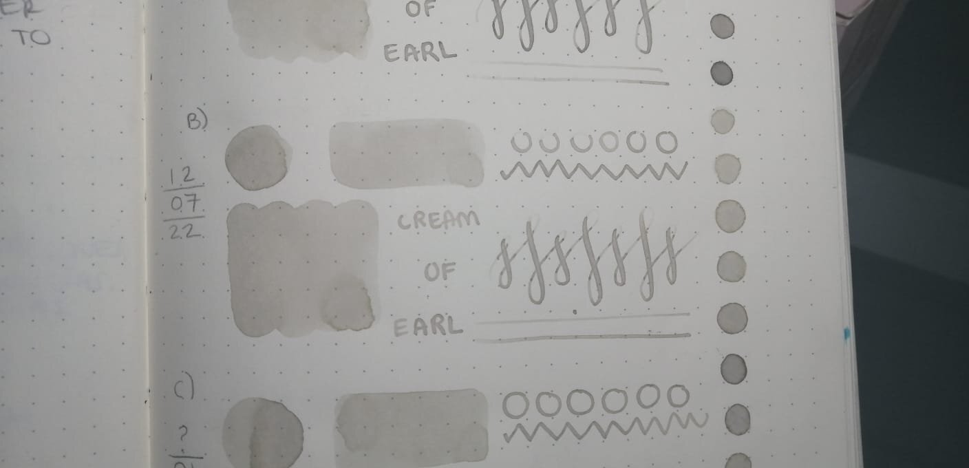
Hello! I felt the need to create this post since I can't find anyone else talking about it and maybe it's just me that I happened to contaminate two (maybe three?) different ink bottles of the same color. I hope the pictures I took serves as good reference to demonstrate what happened over the course of a year. I've been using Cream Of Earl for the past year until recently, because I thought I had contaminated my bottle of ink (fig. 3) since I sometimes use it to paint with brushes. Lucky me I had a second opened bottle at work (fig. 5), I cleaned every single piece of my pen before refilling it, to my surprise the color on that bottle also had lost its pinkish appearance. I thought maybe I had convinced myself the ink had some pink hues, so I went through my notebook to find the very first time I used the ink and it looked just as I remembered it, also found the swatch I made that year on Tomoe River's white paper (fig. 2) and compared them. As I put the ink on paper, it looks kind of green until it fully dries looks like a grey-beige-sand color, i'm not mad about it but I'm very intrigued, also Ferris Wheel Press has no info about the ink changing its color over time and people haven't talked about it, maybe everyone owning this ink think they messed it up and are too embarassed to speak about it? I also checked my other pinkish inks from Ferris Wheel Press to see if they lost their true color (Strawberry Macaron, Lady Rose & Definetely Peachy) and they look just as the first time I opened them. Anyone else has had this happened to them before with this or any other low saturated ink? fig 1. First swatch from when I first filled my pen with CoE back in 2021 fig 2. Left one is on Tomoe River's white paper, swatched back in 2021. Right ones on Leuchtturm1917 paper. fig 3. Bottle opened January 21st on 2021. fig 4. I received this ink bottle the same day as the other two, except this one I'm sure it has never been opened before nor seen daylight until past week that I opened it to compare the rest. It appears to be slightly lighter than the other two. fig 5. Can't remember the day I opened this bottle but it was around the same week I first opened A) fig 6. Swatch from FWP's page. Thanks for reading! Have a great week xx

-
Diamine have informed me that a new ink, EARL GREY will soon be available as part of their general range, but ONLY in 80ml bottles. This will not worry me at all! By way of explanation, I've included a comment from Phil Davies at Diamine who said the following: "This ink colour was chosen by the members of r/fountainpens, a wonderful Reddit community of fountain pen enthusiasts. If you aren't a part of the community, join in - www.reddit.com/r/fountainpens! "The EARL GREY will become part of our standard line but only available in 80ml." My short review below was done using a Lamy Vista with M nib and on the usual Rhodia dot 80gsm paper. However, I think that this ink could well benefit from being used with finer nibs so I have included two other examples. A Lamy Vista with F nib and a Sailor Sapporo, also with F nib. Although never having used many grey inks, I have shown comparisons with the only other three I have. I found Earl Grey to be a nice mid to dark neutral colour, whereas Graphite has green undertones and Chopin, blue. That's of course a personal opinion. Silver Fox is too 'light' for my liking, and eyesight/legibility. It has no waterproof qualities at all. I will be using this ink as a frequent addition to my rotation, and unlike Graphite, there's no 'interesting' smell - which we all know is just a factor in the dye components of that ink. Also, Earl Grey is dark enough to be easily distinguished from some of the 'pale' black inks that are knocking about. I have no idea when it will be available but it's certainly worth considering.
12_58_52.thumb.png.e1966e2f738e9054f7f9141326018311.png)
13_46_31.png.8d4da56ca7f0670ab61cf0b0bac800cb.png)
13_46_44.png.e2f3beba9bb3a83bd931d0bd2db4abb6.png)
13_47_32.png.5921629837f65e73fc8dc7b887013dd4.png)
.jpeg.3fb6cefa506627917f519adf776a7696.jpeg)
13_53_04.png.dbc459861d528a392292b1a30af637c1.png)