Jump to content

Search the Community

Showing results for tags 'deep sea green'.

  • Search By Tags

    Type tags separated by commas.
  • Search By Author

Content Type


Forums

  • FPN Community
    • FPN News
    • Introductions
    • Clubs, Meetings and Events
    • Pay It Forward, Loaner Programs & Group Buys
  • The Market Place
    • The Mall
    • Market Watch
    • Historical Sales Forums
  • Writing Instruments
    • Fountain & Dip Pens - First Stop
    • Fountain Pen Reviews
    • Of Nibs & Tines
    • It Writes, But It Is Not A Fountain Pen ....
    • Pen History
    • Repair Q&A
  • Brand Focus
    • Cross
    • Esterbrook
    • Lamy
    • Mabie Todd Research/Special Interest Forum/Group
    • Montblanc
    • Parker
    • Pelikan
    • Sheaffer
    • TWSBI
    • Wahl-Eversharp
    • Waterman
  • Regional Focus
    • China, Korea and Others (Far East, Asia)
    • Great Britain & Ireland - Europe
    • India & Subcontinent (Asia)
    • Italy - Europe
    • Japan - Asia
    • USA - North America
    • Other Brands - Europe
  • Inks, Inc.
    • Inky Thoughts
    • Ink Reviews
    • Ink Comparisons
    • Co-Razy-Views
    • Th-INKing Outside the Bottle
    • Inky Recipes
  • Paper, and Pen Accessories
    • Paper and Pen Paraphernalia
    • Paper & Pen Paraphernalia Reviews and Articles
  • Creative Expressions
    • Pen Turning and Making
    • Pictures & Pen Photography
    • The Write Stuff
    • Handwriting & Handwriting Improvement
    • Calligraphy Discussions
    • Pointed Pen Calligraphy
    • Broad (or Edged) Pen Calligraphy

Blogs

  • FPN Board Talk
  • Incoherent Ramblings from Murphy Towers
  • The Blogg of Me
  • FPN Admin Column
  • Rules, Guidelines, FAQs, Guides
  • Musings on matters pen
  • Marketing & Sales
  • Iguana Sell Pens Blog
  • Newton Pens' Blog
  • Peyton Street Pens Blog
  • holygrail's Blog
  • A Gift For Words
  • I Don't Have a Name; So This Will Do
  • Karas Kustoms' Blog
  • Debbie Ohi's Inky Journal
  • Sus Minervam docet
  • Crud!
  • Clut and Clutter
  • Federalist Pens

Product Groups

  • FPN Pens
  • FPN Inks
  • FPN Donations
  • Premium/Trading/Retailer Accounts

Categories

  • Fonts
  • Tools & Software
  • Rules for Notepads & Paper

Find results in...

Find results that contain...


Date Created

  • Start

    End


Last Updated

  • Start

    End


Filter by number of...

Found 4 results

  1. It helps to explore this yourself, revisiting once in a while if need be, and keep in mind where each of those personal info fields are entered. Don't leave it until the urge to change something specific to come upon you, and only then bother to ask the question! Invest the time surveying upfront, instead of waste it later waiting for an answer from nobody in particular. Most of the fields shown above are self-evident as to what they are. I think the only ones that could do with explanation are: Security and Privacy: There is only one setting under there, and that is a toggle for whether your online status (including ‘last active’ date or time) is visible to others Content View Behavior: That has nothing to do with what others can see about you, but only where you would like to start reading when accessing content Enable status updates: This toggle enables/disables the public feed on your profile page; if you disable it, then nobody (including you) can post publicly visible ‘status updates’ or any other message against your profile, but if you enable it, then anyone — friend, foe, or complete stranger — can post something there whenever, without waiting for you to initiate and then only reply to what you wrote Notification Settings have nothing to do with what others can see about you, and so is out of scope for this article, and I'm not going to delve into those right now. (You can look here, here, and here to wrap your head around how notifications work with respect to followed content.) N.B. There is a possibility that some of the above settings and data fields may not be available to Bronze members and/or Silver members, but I have no way of testing that or scoping it out. — • — Another way of getting to the Edit Profile dialog, and the way to change your profile photo (or ‘avatar’), is here: — • — Freeform, custom member titles that one enters for oneself are long gone, and have not been a thing since FPN came back from a long hiatus and platform upgrade late in 2020.
  2. A Smug Dill

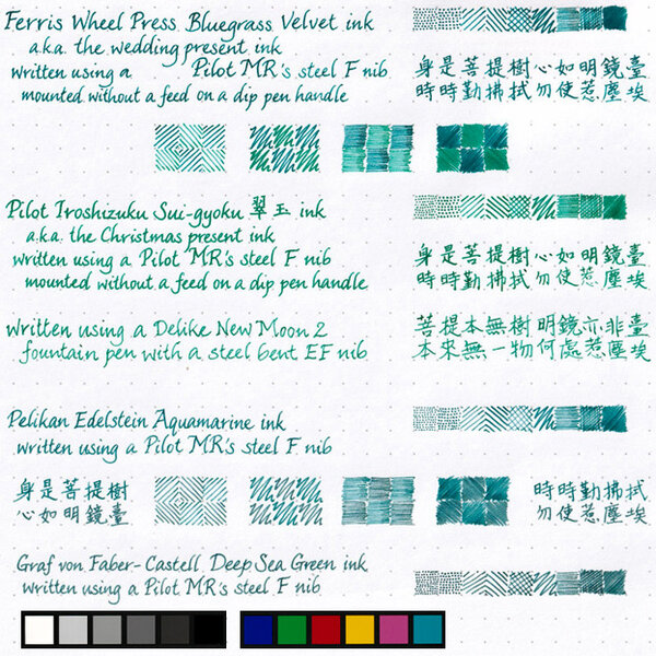
    Four blue-green inks on Rhodia Dotpad

    From the album: Shades of colour

    Since I just did this for my wife to select ink colours with which to fill her pens, I may as well scan and post it.

    © A Smug Dill


    • 0 B
    • x
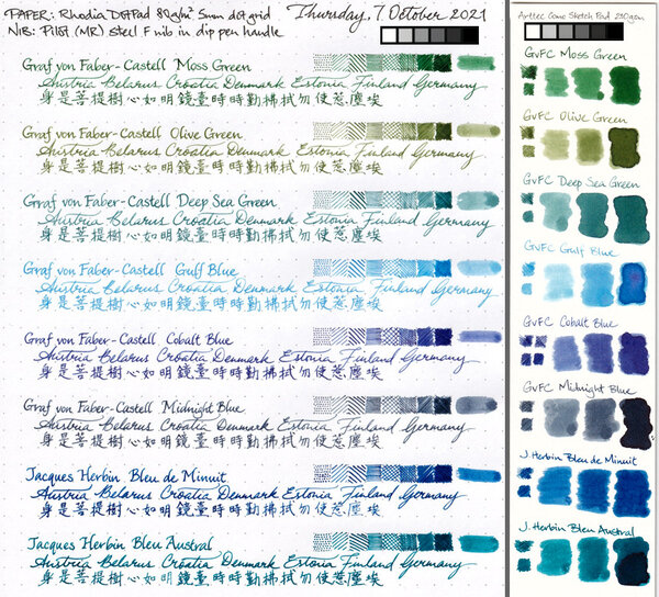
  3. Disclaimer: I enjoy doing mini ink reviews for my personal reference, and I'd like to share them with others if they might be of help to gain an insight into the ink's appearance and performance. I generally don't have time to put together super comprehensive reviews, like some of our fantastic reviewers here do (thank you so much for your hard work!), but hopefully these mini reviews will still be useful as another point of reference. Graf von Faber-Castell - Deep Sea Green Recently I became interested in GvFC inks. They seemed overpriced before, and I was severely disappointed with my first encounter with Deep Sea Green. I had bought a set of DSG cartridges for a trip, and when I popped one into a pen in my hotel room and saw the watery, pale tealy green, I thought "This is not what I expected". This is a very dry ink with low lubrication, so that did not predispose me toward it either. I went to a local fountain pen shop next day, bought a set of Visconti Sepia cartridges, and did not look back. That was over a year ago. Fast forward to a few months back. I kept looking at the writing made with this ink as well as at reviews. I have also since become more enamored with inks that 1. have a kind of watercolor look with color complexity (can see constituent dyes separate a bit) and 2. inks that are not so wet that they can provide high line definition with very thin hairlines. To that extent, high lubrication and wet flow are generally exclusive of good line definition and are more synonymous with increased line thickness. There was a good sale on GvFC inks around Black Friday, and so I ended up with 5 bottles of various colors, including this one. I'm very happy to own this ink and other Graf von Faber-Castell inks. It is true: the bottles are absolutely luxurious--the best I have experienced to date of any brand. The way the bottle cap opens so smoothly and is very heavy is just so pleasant. I even love the scent of color print dyes in the cardboard packaging. It's all just perfectly appealing and tactile. The inks themselves tend to be dry, with varying degrees of lubrication depending on color. Deep Sea Green in particular is not well lubricated. However, it is a sacrifice I am now willing to make given the aforementioned conditions. What's cool about this ink is that it is not monochromatic, and it really does look like watercolor. It can be more or less gray or blue, or green depending on concentration, paper, and illumination. Drying time is very fast to super slow--depends on whether you've let it sit and concentrate in a pen. At the end of this review, I am attaching a photograph of how this ink looks once it sits in a pen for a month and becomes fairly concentrated. The periods take close to half an hour to dry at that point (or even longer), until they stop smearing easily. That's an extreme case, but some inks do this more than others. Another ink that behaves like this in concentrated form is J. Herbin Lie de The, which can take multiple hours to fully dry in the dotted spots. Water resistance is quite good: well-defined gray line remains. This ink is an excellent candidate for watercolor-type drawings. While Deep Sea Green can look somewhat similar to J. Herbin Vert de Gris, the two are very different in details. Vert de Gris has a very chalky pastel finish with some watercolor wash, Deep Sea Green looks like watercolor with more in-line hue variation. Bottom line: A+ art and specialty ink. Beautiful and soothing for personal journaling for those who appreciate nuances of color and finish on good paper. I would not recommend it for note taking or professional environment due to lack of lubrication, dry flow, and rather pale appearance when fresh. If you let it concentrate, you will encounter long drying times, which is also not good on-the-go. Papers used in this review are: Fabriano Bioprima 4mm dot grid - a kind of ivory color, lightly textured, uncoated Kokuyo loose leaf A5 - lightly coated white Japanese paper Nakabayashi Logical Prime notebook - coated and super smooth ivory-toned Japanese paper, shows things like sheen and hue variation pretty well Photographs: Scans: Fabriano Bioprima, ivory: Highly concentrated version that took forever to dry in the "dots"; paper is Kokuyo Loose Leaf A5. Ignore the comment about using this for notes and professional environment -- that's before I realized just how long it takes to dry like this..


×
×
  • Create New...