Search the Community
Showing results for tags 'custom 823'.
-
I've done some searching but couldn't quite find what I'm looking for. I recently purchased a VP with a Fine nib and it's just finer than I would like, so I'm planning on getting a Medium nib unit later in the month. Later in the year I'm hoping to get my hands on a Custom 823. Before I got my VP I was thinking about getting the 823 in a Fine but now I'm likely to go with the medium. Only thing is, from what I've read on the forums, Pilot's VP Medium writes rather similarly to a Western Medium and that there's no real happy medium. Is this the case with the 823? How does a VP Medium compare to a 823 Medium? Thanks in advance for any input
- 10 replies
-
- pilot
- vanishing point
-
(and 3 more)
Tagged with:
-
I started my Japanese pen journey with a Sailor pro gear slim (F) a fun but finicky small pen. Quickly a Platinum #3776 Century (SF) and a Sailor 1911 large (MF) followed. I discovered that Japanese fine nibs really suit my handwriting. I eyeballed this Pilot Custom 823 for quite a while before I decided to buy it. I painstakingly read reviews and watched many videos of other people talking about this pen, both loving and disliking it. Due to Covid restrictions I couldn’t visit a brick-and-mortar store to test it out, so instead I turned to the web shop of my favorite Dutch retailer, Akkerman in Den Haag. I know that if I disliked the pen, I could return it without any problem. So, the facts: Manufacturer: Pilot Model: Custom 823 Material: Semi translucent amber acrylic (injection molded) Nib: Pilot #15 14kt Gold (F) Filling system: Vacuum-filler Capped: 149 mm Uncapped: 133 mm Posted: 162 mm Section: 10 - 11 mm ______________________________________________________________________ Appearance & Design - Classic cigar-shaped design At a glance the pen has the same classic cigar-shaped design as so many others. The material is semi translucent and that gives you a nice view on the pen’s inner workings. The details on this pen really stand out. The big ball on the clip end seemed quite odd to me but actually, it’s very practical. The engraving on the cap band is filled with black enamel which makes the letters crisp and stand out. The glossy finish is prone to catch fingerprints easily. Normally I’m not that fond of gold trimmings but with the amber acrylic is really works for me. Construction & Quality - Japanese precision The pen feels more solid than it looks, my first visual impression was that of a flimsy plastic pen but looks can deceive. The pen feels solid in the hand, and everything works and fits well. The threads on the blind cap as well as on the cap are smooth. There is a small stepdown to the cap treading (which is unintrusive) but it’s small enough not to be in the way. The injection molding seems are visible on the threading and on the top rim of the section. On the barrel and section, they are not visible. The pen posts very securely due to the step-ups in the cap. The cap comes off with just over 1¾ turn, which is not bad but not great eighter. Weight & Dimensions - Slender yet comfortable The length and weight of the pen suits me quite well, I can comfortably use it unposted. When posted it is still well balanced and not too long or back weighted. The section is a bit on the slim side for my licking, it could do with a bit more girth. So, I hold the pen a bit closer to the barrel to solve this. Nib & Performance - Glorious The 14kt gold #15 (equivalent of a #6 nib) fine nib writes like a dream. It’s the smoothest nib I currently own and lays down a good amount of ink on the paper, but isn’t a gusher by any means. It has a lovely design and is a joy to look at. So far, I only used this pen with Montblanc Toffee Brown and Akkerman #23 Bekakt Haags as I really like to have a brown ink in this pen. And with both these inks it performs well, never had a hard start or any skipping. The nib is not flexible but had a decent amount of bounce to it. It always puts a smile on my face when I put this nib to paper. Filling System & Maintenance – Smooth vacuum-filler The vacuum filling system works well and operates smoothly. With some effort you can easily fill this pen to the brim and then it holds close to 2,5 ml of ink. This is great if, like me, you don’t like to change inks a lot. But is bad news for those who like to write with a different ink every day. Especially if you know that cleaning out this pen is quite the hassle. Pilot provides no tools or instructions on taking this pen apart. No, instead of that they void you warranty if you tinker with this pen. (a TWSBY wrench of a VAC-700 fits this pen, just a tip. Do with it what you will, at your own risk). So yeah, maintenance and cleaning of this pen is a thing to think about before you decide to buy this pen. Cost & Value – Well, it’s not cheap I’ve got this pen for just a little over € 315,- and that makes quite an expensive pen. But considering the joy of writing with this pen due to its glorious nib in my opinion it’s worth it. If it would break, I would most certainly replace it and that say’s a lot for me. Conclusion – One of my favorites As a daily carriage I have a 4-pen rotation, and this is one of the two pens that are always in there (the other is my Sailor 1911 large with a 21kt MF nib). If I go somewhere without my pen pouch this pen is in my shirt pocket. So yeah, I really like it.
- 7 replies
-
- pilot
- custom 823
-
(and 1 more)
Tagged with:
-
The Pilot Custom 823 has been my grail since long and I finally got one last year as a high school graduation present. Now, this review might seem heavily biased, but I assure you that isn’t the case. This truly is a perfect pen for me and I can find NO faults with it, whatsoever. That being said, hope you like the review. Design and Appearance: The pen has a classical cigar design. It has rounded ends with slight tapers, a few accent bands and a ball ended clip in yellow gold trim. The center band is engraved with ‘CUSTOM 823’ and ‘PILOT MADE IN JAPAN’ each group of text separated by three stars. It is also filled with a black lacquer that sharpens the look a bit. I love that little detail. The clip has PILOT engraved vertically, but no lacquer filling. The resin used here is a translucent black, or smoke as Pilot calls it. It looks classy yet not boring as that slight translucency kind of glows with the shade of the ink filled. Overall, I find it quite nice in terms of looks. Quality and Construction: The pen feels solid. It’s nothing like the Platinum 3776 which feels slightly flimsy, in my opinion. Construction is also quite good. You can see the seams on the section but they are smoothed out so you don’t really feel them. The threaded cap is liquid smooth. The blind cap for the vacuum filling knob unscrews with some roughness but I don’t really notice it at all since I keep the knob unscrewed always. The one caveat about the 823 is that the material is susceptible to cracks if you were to disassemble and over tighten anything. I’ve made a promise to myself to never disassemble the thing. Filling System: One of the main USPs of the 823 is the vacuum filler. I’m not a huge fan of the system itself, because it is tough to clean, but I LOVE the heft and balance it provides to the pen. Mine works smoothly. It also has a good ink capacity so I like using it for notes. I know it’s not going to run out anytime soon and being with a fine nib, that helps too. One thing about the system is that it seals off the section if screwed all the way in. This helps in things like air travel and avoids any leakage. But what it also does is limit supply to the feed so once you’re out of all the ink already stored in the feed, you’ll have to unscrew the blind cap and saturate it once more. It might be troublesome to unscrew it each time you write, so I just keep it unscrewed all the time. I’ve taken this pen on the flight with half a barrel of ink and there was no leakage whatsoever Comfort and Writing: The pen fits my hand like a glove. The balance is perfect. The section has a gentle curve that allows a nice grip and the threads on the barrel are smooth enough to not bother my grip. As I mentioned earlier, the vacuum filling rod really helps with the heft and balance of the pen. As for writing, Pilot has nailed this 14k fine nib. It is unbelievably smooth for how fine it is. The grind is also slightly unusual in that I sense a slight architect character in it if I were to lower my writing angle a bit. The nib itself does have a very slight bounce to it. The paired blue-grey feed has no ink starvation problems and I think it looks pretty good too. I have it inked with Waterman Mysterious Blue but the sample is written with Krishna Paakezah. I do prefer using slightly wetter inks in it, they feel so much nicer to write with. Final Thoughts: I got this pen used, but it was only inked once and then stored. It still had the stickers and all. For the price I paid, I don’t know if there’s any other pen delivering this much value. Yes, the 823 doesn’t have an award-winning design. Yes, the 823 does not have fancy Italian resins or celluloids, neither does it have the elegance of a German pen. But what it does have is a fantastic writing experience coupled with a perfect balance (at least for me). It is a pen that just works.
- 18 replies
-
- pilot
- pilot japan
- (and 5 more)
-
My Pilot Custom 823 has started to leak small amounts of ink from the lower barrel and the trim ring. There appears to be a tiny hairline crack in the area. The pen has not been disassembled. The problem began after a normal flushing due to an ink change. Any way to repair this?
- 3 replies
-
- pilot
- custom 823
-
(and 1 more)
Tagged with:
-
Maintenance Advice Needed For The Pilot Custom 823 (Greasing Seal)
Heretechnocrat posted a topic in Fountain & Dip Pens - First Stop
Hello all, I am pondering a possible acquisition of a Pilot Custom 823 and I only have one concern. I have recently become more sensitive to being able to maintain my pens over the length of time I own them. Specifically, I want to be able to address common issues that are likely to emerge for a pen over its operational lifetime. With the Custom 823 and other pens with filling mechanisms that use a seal (viz. piston-fillers), it is likely that the seal will lose its lubrication and cause the operation of the mechanism to become stiff. It happened before with my Lamy 2000 but I was able to unscrew the section and access the interior of the barrel, enabling me to apply a dab of silicon grease to restore full smoothness to the piston seal. As far as I know, pilot does not advise unscrewing the section with the barrel to reach the rod's seal without removing the whole housing from the rear of the pen. I know it is possible to do this, but I am uncertain of the risk that it entails. Based on your experience with the Custom 823 (if any), how difficult is it to lubricate the seal if it causes the mechanism's operation to become stiff? Do I risk serious damage or causing performance issues with the pen if I unscrew the section with the barrel (viz. cracking the resin) to perform this maintenance task? Thank you for reading, I look forward to your responses.- 14 replies
-
- pilot
- custom 823
-
(and 3 more)
Tagged with:
-
I love dark purple ink. Currently I have my Pilot Custom 823 inked up with Poussière de Lune but I almost run out. Im looking into Montblanc Lavender Purple now. I wonder whats the difference? Herbin Poussière de Lune is great for me. Since its dark enough but still have some shade. It is quite nice to take academic notes with. I have the following questions: 1. Is Montblanc darker or lighter? 2. How does the inkflow compare? 3. Saturation? 4. Any side by side comparison? 5. Anything else you would like to elaborate on. Thank you all!
-
A Comparative Review - Pilot Custom 823, Justus 95, And Falcon
Zlh296830 posted a topic in Fountain & Dip Pens - First Stop
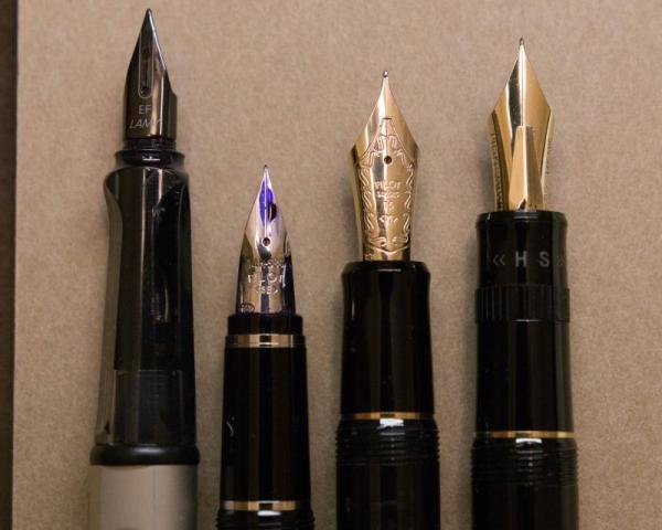
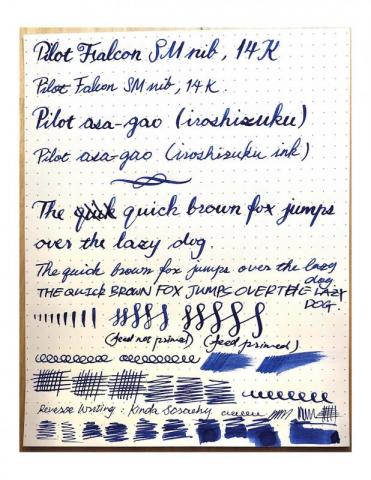
I recently posted two topics requesting suggestion for a new pen and I finally decided to get a Pilot Justus 95, with a F nib. I promised to do a comparative review after I get my hands on the Justus, and here it is. Here are the links to those two reviews just incase if you want to see all the great suggestions I received: 1. https://www.fountainpennetwork.com/forum/topic/345205-seeking-suggestions-for-my-next-pen/?do=findComment&comment=4189695 2. https://www.fountainpennetwork.com/forum/topic/345550-which-pen-should-i-get-justus-95-or-custom-743/?do=findComment&comment=4195283 Here are some pictures of my Justus 95 (F), currently inked with Monteverde Jade Nori: First, let me talk about the appearance of this pen. I like the design. The black body and the gold clips/rings of this pen is a perfectly classic design that I enjoy very much. I enjoy classic style and I don't like any thing with a big brand logo on it. When it comes to the nib, I enjoy its clean and sharp design. In short, i t is elegantly understated. As mention in my other topics, a very big reason that I don't want to commit to a Montblanc is because of that white star. Since I am a college student, I will not feel comfortable taking it out to take notes with. Next, let me talk about the writing experience. I was specifically looking for fine nib that can be used as a daily driver and this nib certainly fulfills my recrements. 1. The hardness can be adjusted for a different writing experience. I find the hardness adjusting nob very interesting to use. I agree that you will get approximately the same line variation no matter you set the pen all the way to hard or soft. However, you will also need different amount of pressure to flex the nib - it requires much less pressure to flex when set to soft, and the hard setting is really helpful when you don't want to have too much line variation in the writing. Also, the ink flow is directly proportional to the hardness setting - soft setting gives a much wetter nib and the hard setting restrict the ink flow. Both of the extreme points of the settings gives very pleasant writing experience and it allows me to switch "the feel" after a long writing session so that I can always find it interesting to write with. 2. If you are concerned that this is too soft a nib and it is hard to control therefore not good for daily (fast) notes taking - please don't. It is not meant to be a flex pen. It is really just giving you a very springy writing experience - more springy than a Pilot Custom 823 (M) but definitely much easier to control when compered to a Pilot Falcon (SEF). Yes, if you slow down (Iroshizuku ink makes it much less prone to railroading), then you can get some decent line variation to make things looks fun once in a while. Please remember though, this is NOT a FLEX pen. In my opinion, its is a fantastic BOUNCY academic (science oriented) notes writer/daily driver. 3. Smoothness. It is not as smooth as the Custom 823 (M) but much smoother than the Falcon (SEF). It has a very slight feed back that I enjoy very much. This also makes it not having any hard-starting issue. 4. Thanks to the Con-70 converter, the ink capacity of this pen is great! I always have enough ink in it, and I do not have worry about running out in the middle of my writing session. I had problem with the Falcon, when falcon was my only gold nib pen, I had to carry additional Con-40 (not 50) converter filled with ink(sealed with a little cap I made out of a used Muji roller ball refill). 5. Love the size and weight!! It is a perfect fit in my hand, so is the Custom 823. Now I want to show you my current daily carries with some beautiful pictures of them: 1. Pilot Custom 823 (M) 2. Pilot Falcon (SEF) 3. Lamy Al-Star (EF) 4. Finally, some comparative pictures: 5. Writing samples (sorry that the color of the ink is inaccurate since my scanner is my iPhone) I will include generic writing samples and things I writes a lot. These pictures will explain to you why I enjoy finer nibs. REMARK ON PILOT FALCON: It is a fun pen to use but I will not recommend using it as a daily driver for science oriented writing. It is too flexible that I always get distracted from the things I am trying to learn. I had to put a lot of attention on controlling the nib. You might noticed that I did not talk about the Lamy steel nib. I also go two Pilot Kakuno pens (F & M). They are both great pens but . I find the Kakuno M nib to be as thick as the Lamy EF by much wetter than it. The Lamy is smoother than both Kakuno, though I enjoy the pencil-like feed back of Kakuno very much. I believe they are all great entry level pens. I have to say, though, that I enjoy a 14k gold nib much more than any the steel nibs I have (I also had a lot other steel nib pens throughout my academic career). This is probably because that I started with fountain pen very early (elementary school) but never had my own gold nib pen until college. I am just kinda tired of the steel nibs. This is what holds me back from the Italian pens that are in the same price range as the Japanese pens. Please PROVE to me if you think I am worrying too much. I am also not sure about the how quality of the pens differ between a Japanese pen and an Italian pen in the same price range. I do care about the design (appearance) of the pen. But as I said in the beginning, I actually love the classical understated design! Therefore the design of Italian pens will not be an excuse that can let me ignore how they differ in writing. For me, WRITING EXPERIENCE OVERRIDES EVERYTHING. Now, I am officially looking for suggestions for my future pen. Should I try Sailor? should I go with Custom 742/72 for more varieties in nibs and cheaper in price? or should I go for an Italian pen? Which pen do you think will fulfill my needs the best? Please let me know if you have any question! I would love to answer them. Thank you all!- 8 replies
-
- pilot
- custom 823
- (and 4 more)
-
A Comparative Review - Pilot Custom 823, Justus 95, And Falcon
Zlh296830 posted a topic in Fountain & Dip Pens - First Stop
I recently posted two topics requesting suggestion for a new pen and I finally decided to get a Pilot Justus 95, with a F nib. I promised to do a comparative review after I get my hands on the Justus, and here it is. Here are the links to those two reviews just incase if you want to see all the great suggestions I received: 1. https://www.fountainpennetwork.com/forum/topic/345205-seeking-suggestions-for-my-next-pen/?do=findComment&comment=4189695 2. https://www.fountainpennetwork.com/forum/topic/345550-which-pen-should-i-get-justus-95-or-custom-743/?do=findComment&comment=4195283 Here are some pictures of my Justus 95: First, let me talk about the appearance of this pen. I like the design. The black body and the gold clips/rings of this pen is a perfectly classic design that I enjoy very much. I enjoy classic style and I don't like any thing with a big brand logo on it. When it comes to the nib, I enjoy its clean and sharp design. In short, it is elegantly understated. As mention in my other topics, a very big reason that I don't want to commit to a Montblanc is because of that white star. Since I am a college student, I will not feel comfortable taking it out to take notes with. Next, let me talk about the writing experience. I was specifically looking for fine nib that can be used as a daily driver and this nib certainly fulfills my recrements. 1. The hardness can be adjusted for a different writing experience. I find the hardness adjusting nob very interesting to use. I agree that you will get approximately the same line variation no matter you set the pen all the way to hard or soft. However, you will also need different amount of pressure to flex the nib - it requires much less pressure to flex when set to soft, and the hard setting is really helpful when you don't want to have too much line variation in the writing. Also, the ink flow is directly proportional to the hardness setting - soft setting gives a much wetter nib and the hard setting restrict the ink flow. Both of the extreme points of the settings gives very pleasant writing experience and it allows me to switch "the feel" after a long writing session so that I can always find it interesting to write with. 2. If you are concerned that this is too soft a nib and it is hard to control therefore not good for daily (fast) notes taking - please don't. It is not meant to be a flex pen. It is really just giving you a very springy writing experience - more springy than a Pilot Custom 823 (M) but definitely much easier to control when compered to a Pilot Falcon (SEF). Yes, if you slow down (Iroshizuku ink makes it much less prone to railroading), then you can get some decent line variation to make things looks fun once in a while. Please remember though, this is NOT a FLEX pen. In my opinion, its is a fantastic BOUNCY academic (science oriented) notes writer/daily driver. 3. Smoothness. It is not as smooth as the Custom 823 (M) but much smoother than the Falcon (SEF). It has a very slight feed back that I enjoy very much. This also makes it not having any hard-starting issue. 4. Thanks to the Con-70 converter, the ink capacity of this pen is great! I always have enough ink in it, and I do not have worry about running out in the middle of my writing session. I had problem with the Falcon, when falcon was my only gold nib pen, I had to carry additional Con-40 (not 50) converter filled with ink(sealed with a little cap I made out of a used Muji roller ball refill). Now I want to show you my current daily carries with some beautiful pictures of them: 1. Pilot Custom 823 (M) 2. Pilot Falcon (SEF) 3. Lamy Al-Star (EF) 4. Finally, some comparative pictures: 5. Writing samples (sorry that the color of the ink is inaccurate since my scanner is my iPhone) I will include generic writing samples and things I writes a lot. These pictures will explain to you why I enjoy finer nibs. REMARK ON PILOT FALCON: It is a fun pen to use but I will not recommend using it as a daily driver for science oriented writing. It is too flexible that I always get distracted from the things I am trying to learn. I had to put a lot of attention on controlling the nib. You might noticed that I did not talk about the Lamy steel nib. I also go two Pilot Kakuno pens (F & M). They are both great pens but . I find the Kakuno M nib to be as thick as the Lamy EF by much wetter than it. The Lamy is smoother than both Kakuno, though I enjoy the pencil-like feed back of Kakuno very much. I believe they are all great entry level pens. I have to say, though, that I enjoy a 14k gold nib much more than any the steel nibs I have (I also had a lot other steel nib pens throughout my academic career). This is probably because that I started with fountain pen very early (elementary school) but never had my own gold nib pen until college. I am just kinda tired of the steel nibs. This is what holds me back from the Italian pens that are in the same price range as the Japanese pens. Please PROVE to me if you think I am worrying too much. I am also not sure about the how quality of the pens differ between a Japanese pen and an Italian pen in the same price range. I do care about the design (appearance) of the pen. But as I said in the beginning, I actually love the classical understated design! Therefore the design of Italian pens will not be an excuse that can let me ignore how they differ in writing. For me, WRITING EXPERIENCE OVERRIDES EVERYTHING. Now, I am officially looking for suggestions for my future pen. Should I try Sailor? or should I go for an Italian pen? Which pen do you think will fulfill my needs the best? Thank you all!-
- pilot
- custom 823
- (and 4 more)
-
Which Pen Should I Get? Justus 95 Or Custom 743?
Zlh296830 posted a topic in Fountain & Dip Pens - First Stop
I am currently a college student and I love using fountain pens. They just make writing much more enjoyable for me. Currently my everyday pens are Pilot Custom 823(M), Pilot Falcon(SEF), and Lamy All-Star(EF). I have them inked with different colors which is great for me to take clear notes. I love, love, love using the 823 and it is the pen I that use the most. I have a medium-heavy hand and I really enjoy the springy but not-too-soft nature of the 823 nib since it allows me to take notes with very fast hand writing (it is also very smooth!). Harder bibs are not bad writing by any means, but they are certainly not my favorites: Lamy All Star, Pilot Kaküno (F, M). I have them in the pen box simply to have more colors and to use them once in a while to switch the feel a little bit. I am currently looking at Justus 95 and Custom 743 because the size and weight of them are very similar to the 823. I have tried the Justus 95 in store with dipping ink, and I find the hard setting very practical for taking notes on even cheaper paper while the soft setting gives more room to flex since it requires less pressure to spread the tines. I am aware that the 743 probably have a silightly bigger nib than the Justus 95 just like the 823 do, and has a lot more nib to choose from, such as SFM, SF, and of course the regular Fine nib. You might noticed that I am not considering the broader nibs since Japanese M is the broadest nib to be practical for everyday acdemic notes, and I already got it on my amazing 823. Im only considering F-FM. The F nib I tried on Justus 95 is close to what Im looking for. After the long explanation about my situation, let ask some specific questions I wish you could address. I will give a comment for each of the questions I ask to let you know what Im looking for specially. Also, please dont use price as a criteria. 1. Should I just get an 823 in F? (I kinda want to branch out a bit, I dont know whether it would be worth the investment to stay with the same model). 2. Does the nib options of 743 significantly better than the Justus 95? (Comparing the #15 SFM SF of the 743 to the Justus 95 F nib) 3. Is the 743 FA even worth me looking at? (I think it will be a fun nib, but Im concerned about its practiality for my every day use. I am also concerned about the railroading issue it potentially have) 4. I heard Sailor has great nibs. But I am concerting about the size/weight of 1911 L or pro gear L (I am not considering the King of Pen) and their ink capacity. With this in mind, should I shift my focus to Sailor? 5. What are some other pens with very similar size and weight has a springy (but not-too-soft) nib I should consider? (I care nothing about a flourished look, practicality is the most important thing. Its not that I dont enjoy a more colorful look, I just dont think it worth the money for me to just buying the look of the pen for my purpose) Thank you all and I hope to hear from you guys soon!!- 13 replies
-
- pilot
- custom 743
-
(and 5 more)
Tagged with:
-
A Tale Of The Lesser Flagship Of Montblanc : The Meisterstück 146
sannidh posted a topic in Fountain Pen Reviews
Loved the MB's flagship pen review by Betweenthelines. And then realized, I was yet to post a review on FPN for the lesser one, the 146. As for me, I came across a real Montblanc pretty much later in life, though used to love a pen called Camlin Premier during school days. It came with a 1-pen leather pouch, an additional screw-fit nib and it did have those striped ink windows. I say I loved it, but never wrote with it since it belonged to my dad and I was a small kid. Back in 1999-2000, it cost around USD 5.00 and it was a hefty price tag for any locally made fountain pen. Later I did realize that it was yet another MB 146 inspiration, when I went to a pen store in Calcutta. So here goes my review @ blogger too with some more pics: A Tale of the lesser flagship of Montblanc : The Meisterstück 146 A BRIEFER HISTORY IN TIME MONT BLANC As most of you would know, Montblanc was started in 1906 a Hamburg banker, Alfred Nehemias, and a Berlin engineer, August Eberstein as Simplizissimus-Füllhalter which means Simplistic Fountain pens, after they learnt about fountain pens with ink tanks from the US. By 1908, three other people by the name of Wilhelm Dziambor, Christian Lausen and later Claus Johannes Voss had taken over the business and the company took the name “Simplo Filler Pen Co.” which referred to a fountain pen design with a built-in ink-tank. In 1909, a safety fountain pen made up of hard rubber called “Rouge et Noir” was launched, which actually means Red and Black. The pen consisted of a red cap and a black body, perhaps inspired from a card-game. You can also find a limited edition of the same. In 1910, the company became Mont Blanc, inspired by the highest peak of the Alps (4810 m) and a pen called Montblanc was introduced with a white tip (which would later evolve into a white star in 1913). In 1926, the Meisterstück was launched. By 1929, the nibs were engraved with 4810, the official height of Mont Blanc peak, as an allusion to supreme quality and craftsmanship. The flagship Meisterstück 149 was launched in 1952, evolving from celluloid & brass mechanism to resin & plastic mechanism over the years. For the Meisterstück 146, the ink windows were modified to striped version somewhere around the 1970s from clear blue window and the the two-tone nib was introduced in 1993-94. As far as the model numbers XYZ (146) are concerned, MB did traditionally follow a naming convention, albeit in a rather loose mannerX or 1: Tier of pen, 1 - Top class or Meisterstück 2 - Medium range & 3 - EconomyY or 4: 0 - Safety filler, 2 - Button Filler, 3/4 - Piston FillerZ or 6: Nib size, 9 being the largest MB eventually stopped production of all economy pens in 1992. DESIGN (5/6) The pen is made of glossy 'precious resin' (a custom variant of Polymethyl methacrylateaka PMMA) and is adorned plated rings and bands. Glistening golden with the subtle shine of black preserve a culture while adding a modern luxurious touch. This specific cigar shape was later copied around the world by many leading pen makers, over decades till date. The cigar shape was invented by Sheaffer Balance in 1928. The 146 also comes with platinum plated trims. The resin does feel substantial to hold, but it's also prone to scratches, if due care is not exercised. http://2.bp.blogspot.com/-Bdf5EwHxYco/VaEdqGTo-GI/AAAAAAAAEw0/d-mgo1330LE/s1600/DSC_1786.jpgWith a minimalist piece of design, the clip does start with a tiny piece of elevated ramp. The cap bands and the rings follow the same equation till a ring separating the piston end concludes both dazzle and design. The clip is tension fit and carries a serial number and GERMANY along the ring. On its underside it may or may not carry the engraving of Pix, depending upon the year of manufacture. Montblanc included the trademark post 1997. There are a lot of Chinese fakes flooding both online and offline channels, which is why Montblanc has to come up with newer and innovative trademarks with every model. http://2.bp.blogspot.com/-NRQ0HCyiSbE/VaEdpgbgWkI/AAAAAAAAEww/t6HaP1PAD-I/s1600/DSC_4304.jpgThe cap unscrews with a single turn revealing a dazzling two tone nib along with a striped ink window. I like the ink-windows very much. http://2.bp.blogspot.com/-JDI6YLg1mQs/VaEeC3KPgeI/AAAAAAAAExI/PpEzAndAV40/s1600/DSC_4322.jpg The cap does mention MONTBLANC - MEISTERSTÜCK etched across the broader of the concentric golden bands, in a cross-hatched font while two thinner bands above and below render the differential aesthetics. The finial carries the white-star.http://4.bp.blogspot.com/-t_EFEBqFTIg/VaEdWzZ1XtI/AAAAAAAAEwg/tn6K260KlYI/s1600/CapC.jpg FILLING SYSTEM (6/6) The piston is distinguished by a golden band and has an easy and a hassle-free mechanism. The piston end unscrews with less than three rotations and as the white piston head moves along the ink-windows, ink gushes into the barrel. A brass connector gives the necessary weight to the barrel.http://2.bp.blogspot.com/-OOGMOsyTrIg/VaEd-CQOqHI/AAAAAAAAExA/0Y8dcje74k4/s1600/DSC_4323.jpg NIB - ALL THAT MATTERS (6/6) The dazzling two-two nib is tested by hand, and it comes in eight different widths including the common widths of EF, F, M & B. And this silvery rhodium finish provides both glitter and glamour. A golden decor runs along the shoulders of the nib and it converges across the outer tines onto an iridium tip, while the rhodium silvery finish diverges from the breather hole across the inside of the tines and over to the tail. A bounded layer of arabesques & curves segregates the rhodium and gold decors. Then, there is a dazzling white M logo resting inside the encircled star, above which rest the height of Mont Blanc peak, 4810 (m). This one is a fine nib and writes quite wet and smooth. The tail end specifies the composition (58.5% Au) of the gold-alloy used. Above it rest the specification 14K and brandname of MONTBLANC. There is no width specified on the nib itself, unlike others.http://2.bp.blogspot.com/-15f8N4cwztg/Vf0EnKnBu6I/AAAAAAAAFhM/Yve04cKG-ns/s1600/DSC_6351.jpgA standard black plastic feed with finely spaced fins (earlier ones had ebonite feeds) ensures a good ink buffer for the awesome wetness and prevents hard starts. By the way, I just love the ink windows.http://3.bp.blogspot.com/-tRJBu8G6-gw/Vf0Et4j5lZI/AAAAAAAAFhY/ffaTbAgFWvs/s1600/DSC_6360.jpg PHYSICS OF RELATIVITY (6/6) It does give a comfortable feel to write with the pen without posting the cap. The overall capped length is around 14.2 cm. The pen can be used posted without any feeling of top-heaviness as the weight of the cap is less than a third of the total weight, with a comfortable grip of 1.2 cm.Uncapped Length ~ 12.4 cmPosted Length ~ 15.6 cmNib Leverage ~ 2.4 cmOverall Weight ~ 31 g (Cap Weight ~ 9 g)Below are the pictures along with a Pelikan m805 and a Pilot Custom 823 for your reference. http://2.bp.blogspot.com/-9cEZUiQx1Ow/VaEeVgzlMiI/AAAAAAAAExQ/ebKpXBCOoak/s1600/DSC_4360.jpghttp://4.bp.blogspot.com/-b4ug3mQy5cY/VaEee7RkPyI/AAAAAAAAExg/JKVrY2iUfOc/s1600/DSC_4379.jpghttp://2.bp.blogspot.com/-IXL8Je6WvTI/VaEeZFRv8GI/AAAAAAAAExY/zsBQQ5L1UUM/s1600/DSC_4371.jpgECONOMIC VALUE (3/6) This one defies both logic & gravity and the pen retails at more than USD 750. The price puts most of the fountain pen people off, while getting a pre-owned one from your uncles (well nothing like that! or buying it at a good discount) can save some money. You can also get hold of a MB boutique sales person selling off some older generation demo pens at a good discount. When it comes to the internet, one has to be careful regarding the abundance of fakes in the online marketplaces and the best fakes are costly and are quite difficult to identify without experience. Value for money? I doubt. Heritage Value? High. You can probably pass on the pen to your next generation and they would still recognise it as a brand. Can I pass on the same emotional value with a say, Pilot Custom 845, outside of Japan? I doubt. This will probably need some internet searches, before one realizes the true value of the pen. OVERALL (5.2/6) The writing experience is amazing although I do find the pilot custom 823 and m805 being equally good when it comes to nibs of similar size and constituency. There is a hint of spring and softness in the nib and an absence of any line variation between the horizontal and vertical strokes. The lines dry relatively quickly with a MB Toffee Brown ink taking around 25 seconds on MD Paper. And you get a nice shading too!http://1.bp.blogspot.com/-dDdiKKFeJ94/Vf0ExcEcTAI/AAAAAAAAFhk/gsIvnhXgG20/s1600/DSC_6286.jpgComparatively, a custom 823 with a medium nib, draws a line, thinner than both 146 and m805 fine points and dries quickly. On a smooth MD paper with stock pelikan 4001 inks, it took more than 30 seconds to dry the dots put by the 146 (as well as the m805). Final Toffee Posehttp://2.bp.blogspot.com/-aFyTIagg_s4/Vf0EyWgzXJI/AAAAAAAAFho/-d2kcXs6_UU/s1600/DSC_6304.jpg REFERENCES Montblanc WebsiteGentleman's GazetteForbes Article Model Numbers Thank you for going through the review. You can find some more pen and paraphernalia reviews here.- 22 replies
-
- montblanc
- meisterstück
-
(and 5 more)
Tagged with:
-
Hi Recently, after watching a few reviews online, I decided that I'd like to get a Pilot Custom 823. I've heard they have great nibs, and I'd love to get a vac filler. The problem is that they're not available from any UK sellers that I know of. And importing from Japan would lead to import costs, and any issues with the pen/nib would be a pain to solve. Has anyone else in the UK imported the 823? If so, how much did the import duty/VAT cost you? Also, when I do figure out the best way to get one, I can't decide between broad or medium. Some people say the medium is just like a western medium, but some reviews say its more like a fine. Any advice? Thanks
- 20 replies
-
- pilot
- custom 823
- (and 4 more)
-
Hello pen people. I am posting this in dire need of advice. I might buy a Pilot Custom 823 next week or so from the Nibsmith. I am not convinced on the nib size. I am either going for a fine nib or a medium ground to a medium-fine according to Sailors mf width. Can anyone say how the fine nib compares to other fines like TWSBI or Platinum 14k fines on the Century model? If you can provide a writing sample of the Custom 823 fine or medium with other nibs like Jowo fines, mediums or Sailor mf etc, it would be of great help. Any help in decision making would be very much appreciated. I have to say that the Pilot waverley nib is almost the perfect line width for me. I have tried it on a friends pen. Also can anyone tell me about the blue ink that comes with it? And any comparison photos with well known blue inks would be much appreciated. Arigato Gozaimasu!
- 16 replies
-
- pilot custom 823
- custom 823
-
(and 1 more)
Tagged with:
-
Pilot Custom 823 Vs Visconti Homo Sapiens
s_t_e_v_e posted a topic in Fountain & Dip Pens - First Stop
Apart from being vacuum filled pens, these two are quite different pens. I feel like the Homo Sapiens, though a very cool and unique pen, has more drawbacks than the Custom 823. Here's what I currently like and don't like about each of them: Visconti Homo Sapiens Like Cool design with the unique basaltic lava composite materialPalladium nib that many rave about. I like soft nibs like the OMAS 18K nibs. No, I don't plan on even semi-flexing the nib, I just want to enjoy the cushioning these nibs provide.Vacuum fillerLarge size and heftyThere's nothing currently out there that compares directly to the Homo SapiensDislike Material absorbs ink and the section can stain after dipping in a bottle of ink if not diligently cleaned (this could drive me crazy)No ink window (kind of important to me)Power filler difficult to maintain, clean outnot user serviceableexpensive (double the price of the Custom 823)Generally more cumbersome to maintainThe Homo Sapiens limited editions take care of many of things I dislike about the original but the those are waaayyy out of my meager budget. Even the HS is a bit of a stretch. I'm selling a few pens to raise funds for it. Pilot Custom 823 Like Legendary Pilot reliabilityVacuum fillerLarge size and balancedLarge soft 14K nibSubtle demonstrator (smoke and amber versions) that looks cool without looking too cheapReasonable pricedDislike Very generic design, nothing too fancyHaving to open the blind cap before writing is very annoying to me, though I'm aware of the trick to work around this problemPower filler difficult to maintain and clean out but since the pen can be disassembled easily, it makes life much betterOnly available in gold trimI have used the Custom 823 before but never ever used or held the HS. What are your thoughts on these two pens? Which one would you choose and why? Are there any modern alternatives to these pens?- 23 replies
-
A month or so ago, I bought a Pilot Custom 823 in M from an Amazon reseller. However, the pen just doesn't write about 30% of the time, regardless of blind cap openness, ink, or paper type. Is this a common issue with a common fix, or should I contact Pilot? I bought this pen from Japan and I live in Canada. Resultingly, who should I contact? I've already emailed Crestar and Pilot USA. I've heard about this issue before, but I don't know what to do about it. Thank you so much, FPN!
- 31 replies
-
- pilot
- custom 823
-
(and 2 more)
Tagged with:
-
How Limited Are Pilot Limited Edition Pens? ( 823 Demonstrator)
kvnlau7 posted a topic in Japan - Asia
Hi guys, I just ordered a pilot custom 823 demonstrator which is supposed to be a limited edition. But how limited are pilots limited edition? I know pilot itself is a huge company what numbers should i think of? Do pilot limited edition pens raise / retain value? thanks for your insight guys new here all info and comments greatly appreciated. -
I've seen this combination appear on so many people's wish-lists that I got tempted too! I found one retailer who would provide the FA nib fitted to a Custom 823; the interestingly-named Tokyo Pen Quill Shop, which is not strictly in Tokyo and doesn't actually sell quills, but they do seem to have a good relationship with Pilot. Communication was excellent and, barring some customs charges, delivery was fairly effortless too. The ink capacity is absolutely huge, the pen is nicely balanced, and it writes well - and I think will get better with further use, too. Somewhat to my surprise, the slightly larger #15 FA nib is rather stiffer than the #10 FA (which I have in a Custom 742 and Heritage 912), but it does still flex and it's a pleasure to use. There's a photo of the pen in action and some of my own scribbles at my review blog here.
- 25 replies
-
- custom 823
- fa nib
-
(and 1 more)
Tagged with:
-
OMAS as you already know is a 90 year old Italian manufacturer of fine writing instruments and related luxury goods. Founded in 1925, it does carry the name of its founder, Armando Simoni. OMAS as it is, stands for Officina Meccanica Armando Simoni, which means workshop for machinery And initially from 1919 - 1925 this workshop had been producing parts and safety mechanisms for pens.. OMAS had launched its first fountain pen in 1927 and had also copied Duofolds for a while. The turning point for the company came in 1932 with the Omas Extra, a faceted celluloid pen. Today, OMAS is no longer a 100% Italian company as it was earlier, after international acquisitions, first with the French LVMH stake in 2000 and then a 90% controlling equity investment of the Hong Kong based luxury conglomerate Xinyu Hengdeli Group in 2007. Below is a link to this review on my blog with more eye-candy . So here it goes: Omas Art Vision Review As for the Arte Italiana Collection, the twelve faceted or dodecagonal pens were first launched in 1930s and they never got out of fashion over all these years. In Italy it’s called Faccettata, which is also representative of Greek Doric Columns. The Vision along with Milord and a larger Paragon belong to the same collection. They are still assembled in Omas boutique job shop one after the other, manually. The Vision comes in two distinct designs - Liquid Blue & Liquid Green limited to 331 pieces per colour. However these pieces are not individually numbered like the Ogiva Vintage runs. Liquid Blue comes trimmed with bright rhodium decor while Liquid Green is trimmed with dark ruthenium decor. The colours are inspired from watercolour shades. http://3.bp.blogspot.com/-rwB2R_oPcX4/Vebk2XYHZdI/AAAAAAAAFXc/1dU-X7ggqak/s1600/1Designs.jpg PRESENTATION The Art Vision comes in a luxurious cardboard box encased within a silvery grey paper box. The heavy box is inlined with grey felt resembling the shades of steel grey. Once you remove the top cover, you can find the pen nesting inside a grey pen sleeve, placed on a custom made bed. The inside of the lid muses with the following motto customary to Omas: Italian Creativity, History, Craftsmanship. The Pleasure of Writing. Once you flip open the velvety separator, you would notice that there are two beds for two of your pens. Underneath rest the manuals and warranty card for this pen in a separate section. http://1.bp.blogspot.com/-KtUuS-0Y-wg/VeblYyOvHKI/AAAAAAAAFZE/79L3CKGNrVA/s1600/box2.jpg DESIGN - THE SONG OF DARK & EMERALD (6/6) It’s the Game of Thrones playing in my mind or these colours of liquid green and dark ruthenium play a beautiful symphony of light and dark. These pens are made of Omas proprietary Cotton Resin which constitutes of blended cotton seeds and resin polymer derivatives. The cotton resin feels quite substantial and does reflect a luxury in its own terms of rendering hues. The entire pen gleams with emerald tunes, entrapped within hushed darkness of ruthenium giving something that is not very common to this world of art. You can actually visualise the pen as a doric column which separated long ago and fell right into your palms. The clip gleams like an arc quite subservient to an emerald haze. http://1.bp.blogspot.com/-ragZY5aUAho/Vebk9mVwxeI/AAAAAAAAFXs/iT_R5_AXqHU/s1600/DSC_5849.jpg The piston knob concludes the structure with a raised dome. The cap feels light and unscrews with a single turn, revealing a dark ruthenium plated nib converging with gleaming shades of its metallic section. It reminds me of my gun-metal frames. The section starts with a dodecagonal structure (12 sides) stepping down for commencement of the efficient threads before tapering down to a comfortable grip section, before ending with a raised loop. These are the times when soulful geometry transforms into art. I did not find the grip uncomfortable or slippery and I hold the pen 0.4 - 0.5 cm above the nib. http://1.bp.blogspot.com/-HtVo0taFm3k/VeblKWrDUyI/AAAAAAAAFYY/SlThMQlpxdc/s1600/DSC_5863.jpg Now in case you are wondering about palladium, rhodium and ruthenium icing, along with some silver cake, here goes a picture. The other one (m625) has a silver section, coated with palladium along with a rhodium coated nib. http://1.bp.blogspot.com/-8ykeiq8Kqy8/VeblGlyDApI/AAAAAAAAFX8/BeNvKoeSwGk/s1600/DSC_5869.jpg The clip acquires the shape of a convex arc before ending with a tender concavity. It has the OMAS classic roller disc (since the 1930s) which slips and secures the pen in your pocket. The finial has a dome like the piston knob and its polygonal planes define triangular precision finally being betrothed to the famous OMAS O dazzling subtly in dark ruthenium. You can see the distinct outlines of the cap insert. The centre band is engraved with OMAS and ITALY at either ends, interlocked with an architectural pattern known as the Greek key or Meandros. http://3.bp.blogspot.com/-Fln51t2uEzg/VeblZS_bRtI/AAAAAAAAFZM/UtGH4GfPblE/s1600/cap.jpg FILLING SYSTEM (5/6) The piston filling system has a sturdy but small knob and is embellished with what seems to be a single loop. The knob requires three turns for the piston to move to its end stop which reveals the loop to be a part of the piston connector. The piston is smooth and efficiently draws ink from the bottle. The piston end does go down inside the metallic grip section of the pen while filling ink, which provides the additional ink capacity compared to the similar cartridge/converter model of the Milord models. The barrel along with the grip provides a decent ink capacity of 1.2-1.4 mL http://1.bp.blogspot.com/-ZcK9uDBWbk8/VeblJ7_r6II/AAAAAAAAFYQ/F5WehzFwoxY/s1600/DSC_5920.jpg NIB - ALL THAT MATTERS (5/6) The nib comes rhodiated or rutheniated in 14k (Extra Flessible ones) or 18k alloys across four stock widths - EF (14k, Extra-Flessible), F (14k, Extra-Flessible), F & M and seven special widths - BB, OM, OMD, OBD, OBBD, Stub & Italic (untipped). This has a 18k semi-flex and comparatively responsive nib with the usual shaded geometries of the Milord/Paragon series. The size M is mentioned on the wings of the nib while the gold content is mentioned towards the tail. The content resides within an elongated hexagon. It’s kind of hard to describe the parallel hatching and geometrical patterns on the nib and you can see it for yourself. It has got some thick inclined hatching around the breather hole with OMAS branding residing in between the symmetry of it, and thinner lines of straight hatch and plains keep recurring as you move towards either of the tines. The nib is a darling to write with. http://1.bp.blogspot.com/-OYydDE20yew/VeblJjtJEEI/AAAAAAAAFYI/ETlXcPzKJKg/s1600/DSC_5936.jpg The heat set black ebonite feed has thinly spaced fins and two capillaries which ensure a good ink buffer and an extremely wet ink flow. Ebonite attract water (these are hydrophilic) as opposed to hydrophobic plastics which repel water, thereby wetting it more efficiently under the nib. Having said this, I find my plastic pelikan feeds even more efficient in this regard. http://1.bp.blogspot.com/-56Cm-GHTpXM/VeblLJIYzYI/AAAAAAAAFYc/7bIhFrpWbYQ/s1600/DSC_5961.jpg PHYSICS OF IT (6/6) – RELATIVELY SPEAKING For me, this pen is very comfortable for writing without posting the cap. The overall uncapped length is around 13.2 cm, with a decent girth of more than 1 cm. Cap has heft and weighs a third of the total weight. The section is dark and metallic with the signature ruthenium coating although I did not find it slippery as such. The section feels quite substantial along with the cotton resin and I happen to grip the pen around 0.4-0.5 cm away from the nib. Its does feel a delight to write with, simply with the responsive nib. It’s a heavy and long pen to post and you may not prefer posting the Vision. Closed Length ~ 14.5 cmPosted Length ~ 17.7 cmNib Leverage ~ 2.4 cmOverall Weight ~ 33 g (without ink, Cap ~ 11 g)Capped and uncapped comparisons with a TWSBI 580 and a Pilot Custom 823 go below for your reference. http://3.bp.blogspot.com/-PAKrd4EbDuY/VeblSHBosxI/AAAAAAAAFYo/cL8P8mDnd5o/s1600/DSC_5972.jpg http://4.bp.blogspot.com/-jtl9O4qfY74/VeblSKnTcGI/AAAAAAAAFYs/zCzzTTslBEY/s1600/DSC_5992.jpg ECONOMIC VALUE (3/6) The Visions retail at USD 495 and I am not sure if it’s a good or bad price since I do not usually find Omas pens selling at great discounts. I had a got a good, I will say steep discount from my longtime local distributor/reseller on this one. Since I have a lot of blue demos with rhodium trims, I rather went ahead with this song of dark and emerald. After the steep discount, the pen again could not make sure of value for money, but let’s not judge a piece of Art by monetary values alone! OVERALL (5/6) These 18k nibs are extremely smooth, somewhat flexible with a very wet flow. A little pressure increases the ink flow and results in thicker lines. The horizontal lines are a tad thinner than the verticals. I am not allured by flex, partly because of my bad handwriting, but I can assure these are delightfully soft and springy nibs, the best perhaps for a long long time. Being extremely wet writers out of the box, the Medium nib puts a line which takes around 30 seconds to dry GvFC Moss Green ink on MD Paper. Go for it, if you love this pen, substantial, differentiated & limited (331) with a befitting nib! http://3.bp.blogspot.com/-GblHlov2XAc/VeblUPJPe6I/AAAAAAAAFY0/Qp6MI6AlW7I/s1600/DSC_5998.jpg OTHER DEMONSTRATOR REVIEWS Pilot Custom 823 Pelikan m605 Pelikan m625 Pilot Custom Heritage 92 TWSBI 580 REFERENCES Omas Art Vision Manufacturing Process Steps Factory Visit Greek key Thank you for going through the review. You can find some more pen and paraphernalia reviews here.
- 30 replies
-
Here is another take on a TWSBI 580 Diamond FP with a Fine nib. The reviews at fpn did make me finally buy a TWSBI, just for the fun of dis-assembly and maintenance. In case there are any problems with pictures you can go to the below link on my blog. http://iwonder-thecartographer.blogspot.in/2014/11/twsbi-diamond-580-review.html Why did I get one ?Well, just to disassemble the pen and have all the fun. Plus, I get a clear demonstrator and a nice-looking wrench. What on earth is a TWSBI? (For the uninitiated like me, I doubt there are any left )TWSBI (called Twiz-Bee) refers to “San Wen Tong”, i.e when TWS is spelled backwards and it means ‘Hall of Three Cultures’ according to their website. BI at the end refers to “writing instruments”. And the company, Ta Shin Precision manufactured everything from toy lego parts to high-end writing instruments (as an OEM) for several luxury brands (American & Japanese) for well over 40 years. So that’s plastic, metal & precision, precisely what’s required to make and sell a lovely writing instrument, under your own brand name. Which luxury brands? They don’t tell it due to privacy agreements. I have reasonable doubt from various reviews that one of them is Levenger. Also, TWSBI Nibs are said to be sourced from JoWo, Germany (same as for Faber-Castell Design Pens). PackagingThat’s probably one of the great aspects of marketing the pen. For the lack of any other word, let’s call it ‘Apple’ packaging inside a brown cardboard box. http://s25.postimg.org/r1745r4mn/DSC_1025.jpgThere is an instruction sheet on disassembly of the pen, highlighting the pen parts.http://s25.postimg.org/m53he24hb/DSC_1029.jpghttp://s25.postimg.org/p5fqguqen/DSC_1031.jpgBelow the white pen-holding shelf, you will find the 7mm TWSBI wrench and a small bottle of silicone grease fitted into slots.http://s25.postimg.org/8j2rlimun/DSC_1036.jpg 580 DiamondWith a screw fit cap and relatively technical construction right from the nib unit to the end cap, this pen endorses practical utility rather than art (with which you will probably associate a Pelikan or a Visconti or an MB with). The entire pen along with the cap is made to disassemble, clean and reassemble. With a 13 cm length and comfortable grip diameter of 1cm, it can be used unposted with ease. The polygonal planes (Diamond-cut) shape of the barrel (almost a decagonal cross-section) prevents the pen from slipping and makes it quite photogenic for posing too . Cap has a circular cross section though. Embossed on the tail (steel bracket) band of the cap is TWSBI on one side and Diamond & 580 & TAIWAN on the other. http://s25.postimg.org/4k0yoy8tr/DSC_1043.jpghttp://s25.postimg.org/6fscdun1r/DSC_1048.jpg Posting gives it a space shuttle like appearance and the posted thing is altogether heavy and way too long.http://s25.postimg.org/9g96udycv/DSC_1056.jpgThe finial carries the TWSBI trademarked logo on a red background. Clip has a smooth modern design with a diamond cut and quite springy to use. http://s25.postimg.org/ddwgjsl67/DSC_1060.jpg Nib has an industrial sword like look, and the unit is easy detachable and can be unscrewed from the grip section. Embossed is a brief arabesque along the tines with TWSBI logo, name and nib size mentioned at the tail-end. The metal cross section does amplify the industrial design of the pen. http://s25.postimg.org/f0lo50x7z/DSC_1068.jpg Along with the Custom 823 I am making a comparison with custom 823 only for its size. The nib and construction are very different for these two pens. And a pilot custom 823 is a heavier pen with a really big nib. http://s25.postimg.org/qklwjbgvj/DSC_1070.jpg http://s25.postimg.org/krbuir57z/DSC_1072.jpg Disassembly For this phase, rather than from the manual, you can have a look at a 580 disassembly video. I like the one with gouletpens or srebrown. However, do check the warranty terms, if you are not very sure of fixing it yourself. Make sure you flush the pen completely before doing it . By rotating the piston end-cap counter-clockwise, the piston seal is lowered to a hinged stop inside the barrel. The wrench then can be fitted just below the piston-end-cap (below the metal band), which is unscrewed in a clockwise direction from the piston-top. http://s25.postimg.org/64fhetvzj/DSC_1074.jpg The piston mechanism has five different parts as you can see in the picture, though it’s might not be necessary to remove the rubber piston seal from the piston rod. The nib unit can be easily removed by first unscrewing the grip section from the barrel and then the nib unit can be removed. Since, nib is friction fit, you may remove the nib and feed from the unit, in case there is some heavy cleaning required (in case of a bad flow, sometimes the feed is coated with grease which restricts ink-flow). However, if your flow is good, I don’t think there is anything broke to fix in the first place . http://s25.postimg.org/hob4fdq9b/DSC_1078.jpg Rest, reassembly might be an initial frustration and it took me a while to learn to fit the piston parts properly.Initially, I was left with the piston seal and rod inside (while everything else was outside!), while I tried to reassemble the pen for the first time. Tried many different things with tweezers, ear-buds and finally could remove it by using the piston parts only. My guess is that a little bit of experiment is required to get used to this. Make sure you apply an adequate amount of silicone grease to the sides of the rubber piston seal (you may ignore the bottom surface) at the end of the piston-rod, so that it glides smoothly along the barrel. I did that in the second reassembly attempt, because the piston seal seemed to have too much of friction, after the first reassembly. Inking & Writing Inking is easy piston filling and writing is kind of ‘ok’ smooth (not butter), with a rather wet flow. Initially, the ink feathered a little, on a moderate quality paper, but later on it adjusted well once the excess ink was used up.http://s25.postimg.org/hs9j9dl4f/DSC_1082.jpghttp://s25.postimg.org/b0j46iw4v/DSC_1085.jpg RatingsAlong with my own biases*Diamond 580 Feature - Rating (of 10)* Length - 10Capped ~ 14 cmPosted ~ 18 cm Unposted ~ 13 cm Nib Leverage ~ 2.0 cm - Unposted length is comfortable for long sessions Weight - 1028 g (~ 14g body + 14 g cap) - Balancing is good Design - 9Silver Steely Accent(Demonstrator) - Non-slip diamond (polygonal cross-section) design of barrel- Clip is quite innovative- Ease of disassembly & cleaning- Reassembly needs piston seal to be lubricated well else it won’t move Filling System - 9Piston - Ink capacity can be adjusted to be > 2.1 ml- Some play with the piston parts and end cap is required to get used to it Nib - 7Steel nib Balancing Length ~ 2.0 cm - Small Nib compared to the overall volume of the pen- Wet Flow- ‘Ok’ for smoothness Economic Value - 6- Retails in India at ~ INR 5500 ($90) and $ 50 in the US- Available at $70 (usually shipping would be around $20-25 if ordered from TWSBI site) - Should be priced at $50 in India too- A bit steep for a steel nib, when you can get a Pilot CH92 for a little more Accessories - 10- Elegant Packaging – Let’s call it ‘Apple’ packaging for the lack of any other word (iPhones/iPods come in a similar packaging)- 7mm steel TWSBI branded wrench- 1 small bottle of silicone grease for lubricating piston (seal) - Overall a nice set Overall Rating 8.7 / 10