Search the Community
Showing results for tags 'couleurs de paris'.
-
Jacques Herbin – Les toits de Paris / Gris toits (couleurs de Paris)
yazeh posted a topic in Ink Reviews
Jacques Herbin – Les toits de Paris/Gris toit (couleurs de Paris) The last of the Paris inks, in J Herbin packaging. Again the naming is confusing, it's sold under Gris Toits (Grey roofs) but on the bottle, It's written Paris rooftops in French, bien sûr! You can find the previous reviews here: Rue de la Verrerie Jacques Herbin - Moulin Rouge Jacques Herbin – Tour Eiffel/ Brun Eiffel (Couleurs de Paris) Jacques Herbin – (Vert) Métropolitain (Couleurs de Paris) The name is a nod to the zinc rooftops of Paris. When the colour is applied lavishly with a brush you get that, but in writing it's a pale blue grey. I was looking forward to this ink. But it turned out to be my least favourite for writing. It’s pale and lacks lubrication (think Kyoto Tag). It was so bad, that I didn’t want to touch the pens anymore. When I filled a vintage Conway Stewart with an oblique flex nib the ink redeemed itself. Now the interesting part, when I tried the pens a few week later, they writing experience was much, much better. Maybe @InesF can shed some science, about that. Evaporation? 🤫 So to make it work you need a nice soft, smooth nib, preferably wet pen and good paper (absorbent or Iroful), and patience This would be an instant hit with @mizgeorge & @namrehsnoom As for the colour it’s a gorgeous blue grey, somewhere between the J Herbin Vert de gris and Diamine Celadon Cat. I enjoyed it most on Rhodia (it became darker, thus legible) and Iroful, (the line become wider) and the pastel colour more pronounced. Chroma: Writing Samples: Photo: Comparison: This is the blue version of Diamine Celadon Cat. Water test: Left side 10 seconds under running water. Not bad. Art Work: A room at the top (a nod to the tiny rooms at the rooftop in Paris) Jacques Herbin Les toits de Paris (rooftop), Moulin Rouge, Rue de la Verrerie, Tour Eiffel and Noolder's Lexingtion Gray · Pens used: Pilot F3A Ef, Lamy (EF/F/M/B), vintage Conway Steward Oblique flex. · What I liked: Colour for drawing. Writing experience after forgetting it in a pen. · What I did not like: Very dry, long dry times. Lack of lubrication. · What some might not like: Very dry, long dry times. Lack of lubrication. · Writing experience: Awful in the beginning, ok after letting the pen rest for a while, good with a soft vintage nib · Shading: Subtle on most papers. Extreme on Iroful · Ghosting: Yes, on cheap paper. · Bleed through: Yes, on cheap paper. · Flow Rate: Wet with a wet pen, restrained with a dry pen. · Lubrication: Non-existent. But surprisingly if you forget your pen it gets better. · Nib Dry-out: Did not notice. · Start-up: Ok · Saturation: Pastel · Shading Potential: Very good, even on copy paper · Sheen: No. · Spread / Feathering / Woolly Line: A bit on copy paper. · Nib Creep / “Crud”: Did not notice. · Staining (pen): No. · Clogging: Did not notice. · Cleaning: Very easy · Water resistance: Not bad. · Availability: 10 ml bottles/ 30 ml bottles, or a set of 5 X 10 ml bottles Please don't hesitate to share your experience, writing samples or any other comments. The more the merrier- 35 replies
-
- jacques herbin
- les toits de paris
- (and 3 more)
-

Jacques Herbin – (Vert) Métropolitain/ Métro Parisien (Couleurs de Paris)
yazeh posted a topic in Ink Reviews
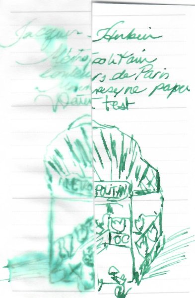
Jacques Herbin – (Vert) Métropolitain (Couleurs de Paris) This is the 4th of the new Jacques Herbin inks, Colors of Paris, in J Herbin packaging. The ink bottle or on the Herbin website I don't see "Vert"=Green mentionned and to add to the confusion it's named Métro Parisien. You can find the other three here: Jacques Herbin - rue de la Verrerie Jacques Herbin - Moulin Rouge Jacques Herbin – Tour Eiffel/ Brun Eiffel (Couleurs de Paris) Named after the Paris Métro (subway/underground), the colour evokes the the Art Noveau entrances of the Paris Métro. Photo: Courtesy of Wikipedia This is an unusual ink, the wetter the pen the darker becomes. It has a teals element, much like a mallard and a monster shader. I could even discern shading on copy paper, and while reverse writing an Ef nib. It's one of those inks, that the writing experience is so pleasant (read lubrication ) that you just want to use your pen over and over again. If you like shading, miss Paris, it’s crowded métro, enjoy art nouveau or want to travel without breaking the bank, this ink might be for you. Photo: Courtesy of Wikipedia Chroma: Writing Samples: Photo: Comparison: Water test: Left side 10 seconds under running water. Lamy Safari M nib Art Work: Paper in both works in a Talens mixed media pocket book. Strangers: Jacques Herbin (Vert) Métropolitain Jacques Herbin Toit de Paris Noodler's Lexingtion Gray Lost in Paris (or where is that Cat) Jacques Herbin Métropolitain, Moulin Rouge/Tour Eiffel, Toits de Paris (background) and Sailor Kiwa-guro · Pens used: Lamy (Reverse Ef/ EF/F/M/B) Waterman W2 vintage flex · What I liked: Shading, colour, drawing with. Writing experience. · What I did not like: Actually I really liked this ink, despite the colour · What some might not like: Colour? · Shading: Extreme even some on copy paper. · Ghosting: Yes, on cheap paper. · Bleed through: Yes, on cheap paper. · Flow Rate: Wet · Lubrication: Good · Nib Dry-out: Did not notice. · Start-up: Ok · Saturation: Pastel · Shading Potential: Massive · Sheen: No. · Spread / Feathering / Woolly Line: A bit on copy paper. · Nib Creep / “Crud”: Did not notice. · Staining (pen): No. · Clogging: Did not notice. · Cleaning: Very easy · Water resistance: Depends on the.amount of water but don't bank on it · Availability: 10/30 ml J Herbin bottles or a set of 10 ml bottles. Please don't hesitate to share your experience, writing samples or any other comments. The more the merrier- 24 replies
-
- jacques herbin
- vert métropolitain
- (and 5 more)
-
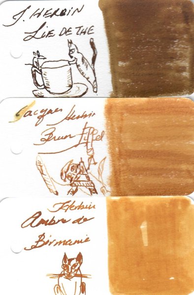
Jacques Herbin – Tour Eiffel/ Brun Eiffel (Couleurs de Paris) This is the 3rd review of the new Jacques Herbin set, Colors of Paris, in J. Herbin packaging. You can find the previous two reviews here: Jacques Herbin - rue de la Verrerie Jacques Herbin - Moulin Rouge Ink is sold as Brun (Brown) Eiffel but I don't see any mention of it as such on the Herbin website. According to the Stylo.ca website, "The yellow-brown refers to the Eiffel Tower, repainted from 2019 to 2022 in its original color (1907 - 1953)" The tour (=Tower in French) was built for the Exposition Universelle of 1889 to o celebrate the 100th anniversary of the French revolution. It was planned to be dismantled in 1909 but thankfully it wasn't it Photo: Courtesy of Wikipedia Ink is a golden sepia, lovely, especially on Japanese Paper, with beautiful shading. It really doesn’t like copy paper. It’s wet and not surprisingly low in lubrication, with very long dry times on Rhodia, so not suitable for lefty over writers. In my initial water test, with an Ef nib, most of the test washed away. When I redid the test, with a glass nib the result was the contrary. I'm concluding the more ink you lay on the paper, the better the water resistance. I wonder what our professor @InesF thoughts, hypothesis are about it It was slightly a pain to clean, which truly surprised me. I had to resort to a short soaking in cleaning solution All in all it’s a lovely colour, for those who want to have a memento of La Dame de fer (Iron Lady) as its nicknamed in France. Chroma: Writing Samples: Photo: Comparison: Water test: I lost my first water test. So I did a new one with a glass dip pen, which lays way more ink. In my first test, most of the ink disappeared, hence my surprise for the cleaning difficulty. In my second test ink is water resistant, so now I get it why it was difficult to clean. Left side 10 seconds under running water. The water test was done 12 hours after writing. I left the pad under the fan Art Work: Liberté Jacques Herbin Tour Eiffel /Moulin Rouge, rue de la Verrerie Noodler's Polar Brown (The cat) Sailor Kiwa-guro · Pens used: Lamy (Reverse Ef/ EF/F/M/B), Kanwrite with an Ahab nib. · What I liked: Shading, colour, drawing with. · What I did not like: The colour isn’t that of the Eiffel Tower, cleaning · What some might not like: Low lubrication, needs a soft smooth nib, cleaning · Shading: Lovely. · Ghosting: Yes, on cheap paper. · Bleed through: Yes, on cheap paper. · Flow Rate: Wet · Lubrication: Below average. · Nib Dry-out: Did not notice. · Start-up: Ok · Saturation: Pastel · Shading Potential: Great. · Sheen: No. · Spread / Feathering / Woolly Line: Yes on copy paper. · Nib Creep / “Crud”: Did not notice. · Staining (pen): No. · Clogging: Did not notice. · Cleaning: I needed to soak it for 15 minutes in cleaning solution. · Water resistance: The wetter the pen, the better the water resistance. · Availability: 10/30 ml J Herbin bottles or a set of 5 x10 ml bottles. Please don't hesitate to share your experience, writing samples or any other comments. The more the merrier
- 30 replies
-
- jacques herbin
- brun eiffel
-
(and 3 more)
Tagged with:
-
Jacques Herbin – Moulin Rouge (Couleurs de Paris) This is the 2nd ink, of the new Jacques Herbin collections, Couleurs de Paris (Colors of Paris), sold in J Herbin 10 ml or 30 ml bottles. The first ink of the series I reviewed is Rue de la Verrerie. Moulin Rouge is the famous French cabaret, birthplace of can-can etc. 💃 Photo Courtesy of Wikipedia I cannot describe the colour; it hovers between red/ orange and a touch of pink. I believe the Herbin inkmeisters have managed to capture the Moulin Rouge mystique It changes depending pen, paper & nib. Shading is paper dependant, but best with M/B nibs, extreme on Iroful paper, subtle on Rhodia and Midori. Ink is not as wet as Rue de la Verrerie and lubrication is slightly below average. It ghosts and there is some bleed through on copy paper. Long dry times on Rhodia, makes it unsuitable for lefty over-writers and water resistance is ok, but it won't survive a swim Chroma: Writing Samples: Quotes are by the French painter Touluse-Lautrec commissioned to do posters for Moulin Rouge. Photo: Comparison: Water test: Left side 10 seconds under running water. Art Work: My artwork serves to show case the inks, I tired to include as many as the new Herbin inks Paper is a Talens mixed media paper. Here is a tiny homage to the Moulin Rouge Cabaret: Jacques Herbin Moulin Rouge / rue de la Verrerie (Royal blue), Les toits to Paris (grey blue) Noodler's Lexington Gray, and Sailor Kiwa-guro rue de Chat. Apparently the narrowest street in Paris is named rue du chat qui pêche (the cat that fishes ) Jacques Herbin rue de la Verrerie (Blue) Métropolitain (Green), Moulin Rouge and Tour Eiffel (golden Brown). And Sailor Kiwa-guro for the outlines · Pens used: Pilot Kakuno Ef, Lamy (EF/F/M/B), Waterman W2 vintage flex. · What I liked: Undefinable colour. · What I did not like: Long dry times. · What some might not like: Long dry times. · Shading: Paper dependant. Best with M/B nibs. · Ghosting: Yes, on cheap paper. · Bleed through: A bit on cheap paper. · Flow Rate: Wet · Lubrication: Pen dependant. Agreeable with M/B nibs. · Nib Dry-out: Did not notice. · Start-up: Ok · Saturation: Pastel · Shading Potential: Paper/nib/ pen dependant. · Sheen: No. · Spread / Feathering / Woolly Line: Did not notice. · Nib Creep / “Crud”: Did not notice. · Staining (pen): No. · Clogging: Did not notice. · Cleaning: Surprisingly alright. · Water resistance: A lot of ink washed away. · Availability: 10/30ml J Herbin bottles. Please don't hesitate to share your experience, writing samples or any other comments. The more the merrier
- 20 replies
-
- jacques herbin
- couleurs de paris
-
(and 2 more)
Tagged with:
-

Jacques Herbin – rue de la Verrerie - Bleu Verrerie (Couleurs de Paris collection)
yazeh posted a topic in Ink Reviews
Jacques Herbin – rue de la Verrerie/ Bleu Verrerie (Couleurs de Paris collection) Couleurs de Paris (Colours of Paris) is a 5-set ink inks by Jacques Herbin: Rue de la Verrerie - "Royal" blue Moulin Rouge - orangish-red. Tour Eiffel/ Eiffel Tower - Sepia gold Métropolitain - Paris subway/underground mint green Les Toits de Paris (Paris rooftops)- Blue grey Here is a snap shot of the colours: They are also sold separately in 10 ml/30 ml J Herbin format /bottles, which is kind of surprising, but a clever marketing move, IMHO. I prefer the small 10 ml bottles. Of the 5 inks, 4 are Parisian icons/ landmarks. Rue de la Verrerie, one of the oldest streets in Paris (11thcentury) is in this collection because it was Jacques Herbin’s address in 1810. (Many thanks to @Mercian for researching that). Goulet has marketed these inks differently. This one as Bleu Verrerie. The colour reminds me of the blue in the enamel street signs of Paris, but it might be inspired by the stain glass blue of Notre-Dame. In the 12th century several Verreries or glass makers, resided in this street. Photo Courtesy of Wikipedia. I decided to start with this ink as it seemed a very typical /boring royal blue, even though the chroma seemed promising: It seems almost identical the top two swatches But boy in writing these inks are so different When I started writing, I was in awe. I didn’t want to empty my pens and wanted to savour every single drop. It’s a very wet saturated royal blue. But it changes colour depending what paper /pen combination you use. This ink sings on Japanese Papers with dry pens and has maximum shading. It varies from pastel Royal blue, blurple up to navy. The wetter the pen, the darker the colour and the shading disappears. Very long dry times on Rhodia, so lefty over-writers, this ain’t for you. It has decent water resistance. Cleaning was easy but it needed a nice overnight soak. You can see the gorgeous chroma, on tissue paper, when I finally cleaned the pen. ( for ink nerds ) My experience with royal blues has been limited in the past years, but this one has been a very pleasant surprise Writing Samples: Photo: Water test: Left side 10 seconds under running water. Art Work: This ink and Tour Eiffel /or Eiffel Tower Brown are very complementary. So I had fun playing around, inventing stained glasses: My first attempts. (Note the blue grey in the top right has a bit of Lexington gray in the mix) Stained glass from the Cathédrale de Notre Chat et souris (cat & mouse) 😸 and finally both inks iwith maximum saturation: · Pens used: Pilot F3A, Lamy (EF/F/M/B, BB) · Writing experience: Inky heaven! · What I liked: Colour, shading, writing experience. · What I did not like: Long dry times, wetness · What some might not like: Same as above · Shading: Subtle on Rhodia, amazing on Japanese paper. · Ghosting: Depending paper, nib size, wetness, yes on cheap paper. · Bleed through: Yes, with a wet pen. · Flow Rate: Very wet · Lubrication: Excellent. · Nib Dry-out: Did not notice. · Start-up: Ok · Saturation: Saturated. · Shading Potential: Great on Japanese paper. · Sheen: No. · Spread / Feathering / Woolly Line: Depending pen, nib wetness, flexing etc. · Nib Creep / “Crud”: Did not notice. · Staining (pen): No. · Clogging: Did not notice. · Cleaning: Not as easy as R&K royal blue. It needs a nice overnight soak. · Water resistance: Quite good. · Availability: 10 ml, 30 ml bottles and a set of 5x 10 ml bottles. Please don't hesitate to share your experience, writing samples or any other comments. The more the merrier- 20 replies
-
- jacques herbin
- rue de la verrerie
- (and 3 more)
-
- 3 comments
-
- jacques herbin
- les toits de paris
- (and 3 more)
-
- 1 comment
-
- jacques herbin
- les toits de paris
- (and 3 more)
-
-
- jacques herbin
- les toits de paris
- (and 3 more)
-
-
- jacques herbin
- les toits de paris
- (and 3 more)
-
-
- jacques herbin
- les toits de paris
- (and 3 more)
-
-
- jacques herbin
- les toits de paris
- (and 3 more)
-
-
- jacques herbin
- les toits de paris
- (and 3 more)
-
-
- jacques herbin
- les toits de paris
- (and 3 more)
-
-
- jacques herbin
- les toits de paris
- (and 3 more)
-
-
- jacques herbin
- couleurs de paris
- (and 4 more)
-
-
- jacques herbin
- couleurs de paris
- (and 4 more)
-
-
- jacques herbin
- couleurs de paris
- (and 4 more)
-
-
- jacques herbin
- couleurs de paris
- (and 4 more)
-
-
- jacques herbin
- couleurs de paris
- (and 4 more)
-
-
- jacques herbin
- couleurs de paris
- (and 4 more)
-
-
- jacques herbin
- couleurs de paris
- (and 4 more)
-
-
- jacques herbin
- couleurs de paris
- (and 4 more)
-
-
- jacques herbin
- couleurs de paris
- (and 4 more)
-
-
- jacques herbin
- j herbin
- (and 6 more)
-
-
- jacques herbin
- couleurs de paris
-
(and 3 more)
Tagged with:


