Search the Community
Showing results for tags 'chromatography'.
-
desaturated.thumb.gif.5cb70ef1e977aa313d11eea3616aba7d.gif)
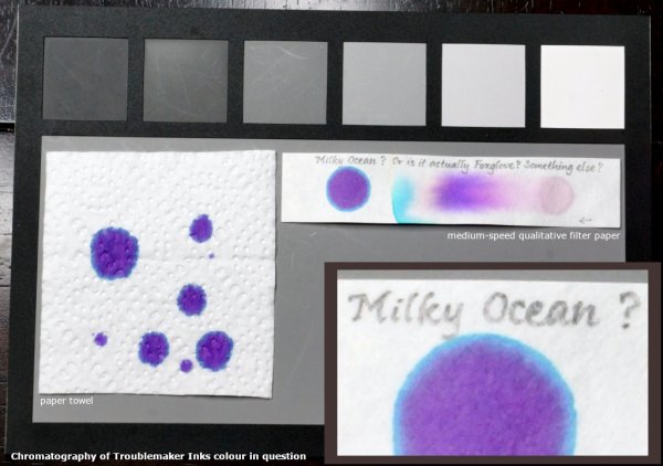
Chromatography of Troublemaker Inks colour in question
A Smug Dill posted a gallery image in FPN Image Albums
From the album: Chromatography
I have a bottle of Troublemaker ink that is clearly labelled Milky Ocean on the cap, but writes more violet than blue on any paper I've tried. There is some doubt as to whether it's actually Milky Ocean, or actually something else in a mislabelled bottle. I showed the photos and scans to Gab at Troublemaker Inks, who then asked for chromatography of the ink I have. Gab opined that it looks like Milky Ocean but couldn't be sure (that it wasn't a mislabelled bottle), and so is sending me a new bottle of Milky Ocean.© A Smug Dill
- 0 B
- x
-
- troublemaker
- milky ocean
- (and 5 more)
-

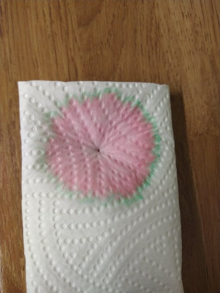
Waterman Havana (aka Absolute Brown) ‘chromatography’.jpeg
Mercian posted a gallery image in FPN Image Albums
From the album: Some of Mercian’s inks
This is a photo of what was left on the kitchen towel when I was wicking plain water through a pen to try to flush out the remnants of its fill of Waterman Havana (aka Absolute Brown). This is, clearly, not an example of ‘proper’ chromatography, but it does show the preponderance of the magenta/pink dye component in this ink. I am trying to justify my description of this ink’s colour as ‘maroon’, rather than ‘brown’.
- 0 B
- x
-
desaturated.thumb.gif.5cb70ef1e977aa313d11eea3616aba7d.gif)
Suggestions For An Approach Or Methodology To Chromatography?
A Smug Dill posted a topic in Inky Thoughts
With too much "spare" time on my hands, I'm gearing up to catalogue (at least, say, two-thirds of) the 300 commercial inks I have. The format on which I've more or less decided is to use pages of polypropylene pockets for 2ʺ×2ʺ slides, with 20 pockets in five rows on a page, using a row of four pockets for each ink. That will allow me to store up to eight 'slides' per ink, and I'll probably keep a small writing sample on the five most common or numerous types of journal paper we have, perhaps a sixth 'slide' on my personal idea of an international standard of fountain pen friendly paper — Rhodia Dotpad 80gsm bright white paper — to capture summary information, leaving the two sides of the remaining pocket for 'swatch cards'. Taking my inspiration from Mountain of Ink, I ordered a rubber stamp and a stamping pad for waterproof pigment ink, to print ink bottles on 210–220gsm mixed media paper cut to the right size, and make it easier to (develop and) adhere to a format for information-dense swatch cards. The tentative format is shown in the image below. The swab will tell me about the ink's potential for shading, the saturated splat will tell me about its potential for sheen, the part of the image representing the ink will be close to the ink's colour as it is in the bottle, and the sections of the vane on the feather quill to show cross-hatching before and after washing with a water brush pen, in part to tell me about water resistance. That leaves one side of the last pocket available for displaying the chromatography of the ink. But what is the 'right' or best approach to putting down just the right amount of ink on the piece of lab filter paper? I want that 'slide' to aid in identification of inks, comparing inks for similarity in constituent colours, as well as tell me about water resistance; all that in a squarish area instead of a long rectangular strip that is traditionally used for chromatography. As shown below, I've tried writing on the paper with a pen (fitted with an EF nib, in this case), using an O-ring to pick up and dump ink onto the paper (which produces quite inconsistent results), and placing a tiny droplet of ink on the paper using a blunt tip syringe needle of very fine gauge. Chromatography of the drawn lines seem to show the most consistent results, but can look anaemic, and when compared to the chromatography of the droplets it seems there is something not achieved simply because there was insufficient ink to spread fully. The chromatography of the droplets come out richest in colour, but due to the small area, I'm unsure whether if given sufficient area to run the larger volume of ink in a droplet will eventually give similar colour breakdowns to the drawn lines. The chromatography of the thick rings seem to be a good middle ground between the two, but I find it difficult to get a relatively even line width around the circle. What would you do?- 31 replies
-
- cataloguing
- swatches
-
(and 1 more)
Tagged with:
-
desaturated.thumb.gif.5cb70ef1e977aa313d11eea3616aba7d.gif)
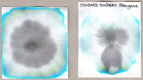
Standard Bindery Stargaze chromatography - mad koala.jpg
A Smug Dill posted a gallery image in FPN Image Albums
- 2 comments
-
- filter paper
- chromatography
-
(and 2 more)
Tagged with:
-
It’s taken a while, but at long last, the mission has been accomplished. Multi-purpose fountain pen inks. Inks that one can write with and inks that one can use for painting and illustration. The perfect limited palette that one can take ‘on the road’ and use however one wishes, whether its writing down one’s thoughts or recording what’s going on around you. What I didn’t want to do, was label up 4 pure off the shelf colours and call it a job done. No. I wanted to create 4 unique colours that would stand up as four beautiful unique fountain pen inks each with their own personality and chromatic behaviours BUT also have the ability to blend with each other and create secondary and tertiary colours. Not as easy as it sounds and as always, there have been compromises along the way. So how do they shape up? Well at this moment in time they don’t have any names, but the recipes are finalised and I’m very happy with them. And they all react with bleach. Blue – this is a deep blue colour that reacts easily with water bleeding out bright turquoise, cyan with a hint of pink. There is also evidence of a delicate red sheen at the edges when dry. As a writing ink, it flows well with evidence of some shading. Red – this is a deep magenta that reacts easily with water bleeding out rose reds but also with yellows at the very edges. This took a long while to get right. As a writing ink, it flows well with some shading. Yellow – I needed to darken this, to give it a darker tone, otherwise it would be difficult to write with it as it wouldn’t read. The ink reacts easily with water bleeding out mottled ambers and lemon at the edges. Because of the deeper tone one needs to add plenty water when wishing to achieve those lighter greens and oranges. This took a long while to get right. As a writing ink, it flows well with great shading. Black – My favourite of them all. This a dark black that reacts easily with water bleeding out greys, blues and reddish browns. For some ochre brown colours this mixes with the yellow superbly. This also took a long while to get right. As a writing ink, it flows well with a hint of shading. So how do they mix? Please see the colour wheel below: The inner ring is a light wash of the black showing the tertiary colour possibilities. And below are some very quick secondary and tertiary colour mixing experiments: I’m confident that these inks can produce most of the colours that a traveller would need without taking up much space in the rucksack. These are now going to be put into production. The food on table image is rendered in the style of John Minton. A simple and graphic example to demonstrate how these vibrant inks can be utilised as well as the wet in wet watercolour techniques. I used 2 Da Vinci travel brushes – an 8 and 5 – as well as a Serendipity dip pen. The palette plate was a cheap plastic 10 dimple dish. Paper used was heavy cartridge, Bockingford 200lb rough and Rhodia dot matrix. For more info, check out my profile page. Thanks. Nick
- 12 replies
-
- nick stewart
- cmyk
- (and 8 more)
-
If you follow my blog - https://quinkandbleach.wordpress.com - you'll know that I'm on a mission to find ways of utilising fountain pen inks for other purposes other than just handwriting. Below are four artworks achieved through utilising the ink's natural chromatic qualities and trusting to serendipity to deliver a visual spectacle: Noodler’s Rome Burning Noodler’s Whaleman’s Sepia Noodler’s Burma Road Brown Parker Quink Black
- 13 replies
-
- fountain pen ink art
- chromatography
-
(and 2 more)
Tagged with:
-
I have started performing paper chromatography on various inks, starting with the color brown. Although the pigments seperate well there is little banding present rather contiguous bleeding with distinct color bands. The lack of banding makes it difficult to calculate movement ratios and hinders the distinctions between inks of similar color. I have read articles on changing the solvent ( using water now) by adding various alcohols or even small amounts of ammonia. Before I starting mixing various solvents in different ratios has anyone had particular success with one solvent vs another? i am using good quality chromatography paper so this is not the problem. Thanks


