Search the Community
Showing results for tags 'charcoal'.
-
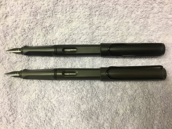
Lamy Safari ‘All Black’ and ‘Charcoal’/‘Umbra’.jpeg
Mercian posted a gallery image in FPN Image Albums
From the album: Mercian’s pens
My most recently acquired Lamy Safari - the ‘L44’ ‘All Black’ LE from 2018. Shown below it is the first Safari that I bought - the ‘Charcoal’/‘Umbra’. The difference in appearance between these two pens is a bit more obvious in ‘real life’ than it is on my photograph, but it is subtle.
- 0 B
- x
-
- lamy
- lamy safari
- (and 4 more)
-
Have just seen a first generation charcoal Safari being sold on the bay for an inordinate sum but am very interested in the W Germany imprint, which Ive never seen before. Does anyone have anything similar to this imprint on their Savanna, Terracotta and/or Umbra from the time please? Photo attached.
- 13 replies
-
- lamy safari
- charcoal
-
(and 1 more)
Tagged with:
-
Hello guys. I need some suggestions regarding my Lamy Safari Charcoal. I am attaching three pictures. The nib as seen in the picture has developed some sort of stain near the slit of the nib. I have tried soaking the nib in water for a couple of hours as well as washing it some liquid handwash. Nothing seems to remove the stain mark. Is it because of the ink I am using? Next to the cartridge converter, if you zoom and observe carefully you will be able to see that some little amount of ink is trapped between the contact of the piston edge and the body of the converter. I have disassembled the converter, applied some silicone grease but still, ink gets trapped. It started from after one month of using the converter after the cartridge emptied.( I bought the safari around August last year). How to prevent this?
- 3 replies
-
- lamy
- lamy safari
-
(and 1 more)
Tagged with:
-
Another light review, with a few snaps... Preamble (as usual, skip this bit if you don’t like preambles): We have been incredibly fortunate to be able to get our hands on some pretty nice pens over the last few years. The posting of my last review prompted quite a lengthy conversation between “She who must be obeyed” and myself, about the difference between luxury pens, affordable pens and just pens that we have enjoyed. There is such a wide range in the wild, of pens that can be regarded as affordable. However, when a pen costing $2 can indeed be described by some as expensive, and conversely, a $200 pen has been recently described as affordable/reasonably priced. Factor in, the diverse disposable income between different individuals, affordability and value for money can vary widely between from person to person. So, although being fortunate to be able to do a couple of reviews on what are regarded as “high end” pens, I seem to have missed out on having a go at doing a reasonable review on a couple of pens that are family workhorses. In this case, the review here is part of a review of pens “we like”, rather than, “oooh look what we got”. We would like to introduce to you, the Lamy Safari. The Pen Lamy Safari, in charcoal finish, with matching black nib, supplied with cartridge convertor and a free ink cartridge. Purchased online from either eBay or amazon (can’t remember to be honest, but it was one of those two) at the same time as I ordered a pack of A4 writing pads. I think the cost was about £15 at the time, with a matching convertor for another £5. First Impression Arrived in a jiffy bag which contained a small pen sized cardboard box. The box had a small divider in the centre with the convertor on one side. Very business like, no wasting of material in packaging, pen, convertor, box. Done. Box consigned to recycling bin, and now possibly back in the system as brown wrapping paper somewhere. Without a doubt, it felt well made in the hand. It is a light feeling pen, and I believe it is made from similar materials to what lego bricks are made from. Stand on a lego brick with a bare foot, and the brick wins. Every time. The finish is a sort of matt rather than shiny finish and end to end, has no sharp edges or mould flashing. So far so good. More diving into the details. The pen comes with a black finished nib to match, in fine. The cap has a matching clip, in black. More later. Unboxing. Although covered above, if I was new to the pen hobby (takes a huge step back), I would have to say, that it is simple but impressive. Recyclable cardboard packaging, cartridge already in the pen with a cardboard ring to keep it from piercing inside the section, and the convertor by it’s side. Again, if I was new to the hobby, I would have been quite impressed. The pen doesn’t exit from it’s packaging in need of a fanfare, it is too business like. It is obvious straight away that this is intended to be used and used and used. Take the pen out, ink it and get that letter written. Remember, the fancier and bigger the packaging, the more cost is passed to the consumer OR less goes into the pen itself in materials and quality. In this case, I felt that we had at this point, got good value for money. One thing I DID do, is recycle the box and the separator ring, then drop the free cartridge straight into the pen to get it in action. More about that later. Overall Look of the pen. When I was a youngster, many many many years ago, I started my love affair with fountain pens, and have handled some interesting designs (parker 25 as an example). Well, that was (coughs) 40 years ago now. The Lamy looks briefly reminiscent of an old school fountain pen I once came across. Minimalist, functional. However, the Lamy is much more modern looking and for sure looks better made. The aforementioned Parker 25 was a regular fave of mine, futuristic looking and, at the time, a couple of weeks saving with school pocket money was sufficient to snare it. Unfortunately due to youth and the passing of time, it is no longer in my possession. The Lamy seems to have some of the same minimal/modernistic look about it. The nib. This one came in a “fine” and finished in black, to match the pen. The nibs are VERY easily removable, small bit of sticky tape and tug. Brilliant for any tinkerers or cleaning. The size looks in keeping with the overall size and design of the pen, again, functional looking. Had I been that schoolboy once again, this would have been definitely on the list to save up for. Loaded the pen with it’s free Lamy cartridge and tried to write. The best I can now say is that it wrote. It felt dry (definitely NOT scratchy) but wasn’t pleasant. Out with the 30x loupe and there was NOTHING visibly wrong with the nib. Took the nib off completely, again, all good. Then came the lightbulb moment. Lamy cartridge went to the bin, did not stop at go, did not collect £200. Convertor fitted and Waterman serenity blue sucked up. 3, 2, 1, bingo. Instant writing karma. Nice fine line, not scratchy, but not over smooth. Needed using, to smooth it down for sure, but definitely an extra fine to fine line. Nice and wet. The nib is not flexy, but didn’t feel like a hard nail. The nib material is simple pressed steel with some sort of tipping material, which means the nib does have a tiny amount go “give. Again, the nib definitely feels like it is going to deliver years of use. The cap. Functional, furnished with a black shiny clip. It contrasts with the charcoal finish, which is a nice touch. It will post, if you HAVE to, but it doesn’t add anything to the look or usability and looks awful posted. It is a click fit/push fit (slip cap), which is not my favourite method of connecting cap to body, but it is quick and works. Positive with a nice soft click, and I going to say it again, functional. Overall, it works well and should return the owner a good operating life. Filling system. Cartridge convertor. Comes supplied with a free blue Lamy cartridge. I purchased the optional convertor as I do prefer bottled ink. However, I did try the cartridge, and in my honest personal opinion, was just a waste. The ink didn’t play nice at all with the pen so binned it. The convertor is VERY well made, and locates positively, aided by a couple of small locating lugs. Very smooth to fill, doesn’t leak, and reinforces the overall impression of good design and function. The section. Interesting section, it has two shaped facets to promote a “correct” grip. At first, I thought “school pen”, but after a little use, I started to appreciate it. I am not sure if left handers or people with different pen gripping techniques will appreciate it, but, I really liked it. The matt material is not slippy, the end of the section has a nice shaped raised bit to stop fingers going near the nib. Again, good design. Section diameter is a tad on the smaller side for my fat fingers, but for the majority, I am sure will find it reasonable. So what now? It is stuffed into my work bag, in the little area where pens are kept, no case, next to a metal ballpoint. It is loaded with Waterman ink and is in every day use. The nib has indeed polished itself now and writes exactly as it should. I would say the EF nib runs more towards F, but that could be due to the flow properties of the ink, which, the Lamy inks being dry in this pen, MAY now deliver a true EF. However, I won’t go there. Waterman in this pen plays nice. Yes. You read correctly. It is stuffed into my work bag. The pen is robust, and can not only take a good beating, the finish just doesn’t seem to easily pick up scratches, so always looks pretty nice! Keep it in a proper pen pouch and it should stay looking new for a number of years. Cost? £15 for the pen and an extra £5 (approx) for the convertor. Not the cheapest combo on the market, but it is well made for the money (haven’t said value here as it really is subjective). In comparison, a pack of 50 Bic biro’s can be obtained online for approx £10, which, although would last anyone a considerable amount of time, every single bit is disposable and would head direct to landfill. Pics As usual, a few “show and tell” snaps. And Finally The big question. If I was in the market for such a pen, would I buy one? A resounding yes. As either a beginner to the hobby, or for someone who wants a daily beater, yes. If you are saving up to be able to get one of these, again, yes. BUT, if it is going to be your only pen, I would try and save a little longer, and look towards the Lamy Al-Star, which has a range of coloured anodised aluminium bodies/caps and do look a bit higher quality/look/feel. A colleague has had a silver grey al-star for a number of years now, he was gifted as a leaving present from his previous company and it’s his only pen. He loves it. The Al-Star will NOT write any better, it is merely look and feel. But then again, Safari’s come in a huge variety of colours and release different colours from time to time, so plenty of choice. Oh, and DO get the convertor.
-
Robert Oster Signature - Charcoal Robert Oster is an Australian ink maker that is well-known for its unique range of colours. On his website, he describes our shared love quite eloquently: “Robert Oster Signature originates from one of the most famous wine producing regions of the world, the Coonawarra district of South Australia, an idyllic setting with great influence on the senses. There is my inspiration. It’s a joy to share it with you.” Well, we are certainly fortunate to have inspiring ink makers like Robert Oster to satiate our thirst for glorious inks. In this review, the center stage is taken by Charcoal. Catherine from Sakura provided me with a sample of this ink to play around with – much appreciated! This particular incarnation of a Robert Oster ink is a purple-leaning grey. The ink provides good contrast with the paper, which is good. On the other hand, I found it to be quite dry in smaller nib sizes, which is not good (this with my Lamy Safari, which is itself on the dry side). Only with broader nibs did I achieve a pleasing writing experience. I liked the writing experience a lot when paired with a B-nib. Charcoal shows some heavy shading, with quite a bit of contrast between the light and darker parts. I prefer my shading to be more subtle though – for me personally, heavy shaders are less aesthetically pleasing. The ink itself is a complex mixture, with multiple undertones. When used for drawing, you can bring these blue, red and green undertones to the surface in washes. To show you the impact of saturation on the ink’s look & feel on paper, I made some scribbles where I really saturated portions of the paper with ink. This gives you a good idea of what the ink is capable of in terms of colour range. Like most Robert Oster inks, Charcoal has zero water resistance. Short exposures to water completely obliterate the text, leaving next to nothing on the page. This is evident from the chromatography – the ink detaches easily from the paper, as can be seen in the bottom part of the chroma. Smudge resistance is quite good though. I’ve tested the ink on a wide variety of paper – from crappy Moleskine to high-end Tomoe River. On every small band of paper I show you:An ink swab, made with a cotton Q-tip1-2-3 pass swab, to show increasing saturationAn ink scribble made with an M-nib fountain penThe name of the paper used, written with a B-nibA small text sample, written with an M-nibDrying times of the ink on the paper (with the M-nib)Charcoal behaved perfectly on all paper types, with no visible feathering – not even on Moleskine paper, which is quite a feat. On the other hand, the ink shows some unusual chemistry on Moleskine paper, resulting in a sickly greenish colour. Really strange, and something I also observed with Purple Rock, which is also an ink with purple components. Could it be something with the chemistry of Robert’s purple dyes that clashes with the Moleskine paper ??? The same occurred – to a lesser degree – with Tomoe River paper. Charcoal manages to look quite ugly on Tomoe River. Overall, the ink dries quickly near the 5-second range, with makes it a suitable ink for lefties. I also show the back-side of the different paper types at the end of the review. No troubles there, except with the Moleskine paper, which shows a bit of bleed-through. All in all, a very well-behaving ink. ConclusionRobert Oster Charcoal is a purple-grey ink, that is at its best in broader nibs, where it truly shows off its colour range and heavy shading. Unfortunately, the ink has no water resistance – the briefest touch of water completely obliterates your writing. The ink also has trouble with some types of paper – it looks horribly green on Moleskine paper, and looks rather sickly on Tomoe River. All things considered, I’m personally not impressed by this particular Robert Oster creation as a writing ink. For drawing, this ink has some potential, due to the complex undertones that easily surface in washes. Technical test results on Rhodia N° 16 notepad paper, written with Lamy Safari, M-nib Back-side of writing samples on different paper types
- 7 replies
-
- robert oster
- signature
-
(and 2 more)
Tagged with: