Jump to content

Search the Community

Showing results for tags 'callifolio'.

  • Search By Tags

    Type tags separated by commas.
  • Search By Author

Content Type


Forums

  • FPN Community
    • FPN News
    • Introductions
    • Clubs, Meetings and Events
    • Pay It Forward, Loaner Programs & Group Buys
  • The Market Place
    • The Mall
    • Market Watch
    • Historical Sales Forums
  • Writing Instruments
    • Fountain & Dip Pens - First Stop
    • Fountain Pen Reviews
    • Of Nibs & Tines
    • It Writes, But It Is Not A Fountain Pen ....
    • Pen History
    • Repair Q&A
  • Brand Focus
    • Cross
    • Esterbrook
    • Lamy
    • Mabie Todd Research/Special Interest Forum/Group
    • Montblanc
    • Parker
    • Pelikan
    • Sheaffer
    • TWSBI
    • Wahl-Eversharp
    • Waterman
  • Regional Focus
    • China, Korea and Others (Far East, Asia)
    • Great Britain & Ireland - Europe
    • India & Subcontinent (Asia)
    • Italy - Europe
    • Japan - Asia
    • USA - North America
    • Other Brands - Europe
  • Inks, Inc.
    • Inky Thoughts
    • Ink Reviews
    • Ink Comparisons
    • Co-Razy-Views
    • Th-INKing Outside the Bottle
    • Inky Recipes
  • Paper, and Pen Accessories
    • Paper and Pen Paraphernalia
    • Paper & Pen Paraphernalia Reviews and Articles
  • Creative Expressions
    • Pen Turning and Making
    • Pictures & Pen Photography
    • The Write Stuff
    • Handwriting & Handwriting Improvement
    • Calligraphy Discussions
    • Pointed Pen Calligraphy
    • Broad (or Edged) Pen Calligraphy

Blogs

  • FPN Board Talk
  • Incoherent Ramblings from Murphy Towers
  • The Blogg of Me
  • FPN Admin Column
  • Rules, Guidelines, FAQs, Guides
  • Musings on matters pen
  • Marketing & Sales
  • Iguana Sell Pens Blog
  • Newton Pens' Blog
  • Peyton Street Pens Blog
  • holygrail's Blog
  • A Gift For Words
  • I Don't Have a Name; So This Will Do
  • Karas Kustoms' Blog
  • Debbie Ohi's Inky Journal
  • Sus Minervam docet
  • Crud!
  • Clut and Clutter
  • Federalist Pens

Product Groups

  • FPN Pens
  • FPN Inks
  • FPN Donations
  • Premium/Trading/Retailer Accounts

Categories

  • Fonts
  • Tools & Software
  • Rules for Notepads & Paper

Find results in...

Find results that contain...


Date Created

  • Start

    End


Last Updated

  • Start

    End


Filter by number of...

  1. Triple Ink Shoot-Out : Callifolio Cassis vs Diamine Earl Grey vs Sailor chu shu A couple of weeks ago I did a review of Sailor Jentle chu shu, and noticed I had some other purple-grey inks that look fairly similar in writing – Diamine Earl Grey and L’Artisan Pastellier Callifolio Cassis. All three of these inks are lovely, so a comparison is definitely in order. But which two of them to compare? Then @yazeh suggested to throw all three of them in the ring to fight it out. Interesting idea … Enter... the Triple Ink Shoot-Out – a special edition of the usual brutal fight. In five rounds, these three inks must engage in fierce battle to determine who is the winner. Choreographing a one-on-one battle is easy, but how to make it work with three contestants? Well… the triple shoot-out idea immediately brought to mind the iconic gun-fight in the final scene of Sergio Leone’s 1966 masterpiece “The Good, the Bad and the Ugly”. A memorable spaghetti western with an excellent musical score by Ennio Morricone. The ideal setting for a duel between three great inks. The hot summer sun shines brightly above the totally forgettable town Desierto in New Mexico. The shimmering heat creates wavering pictures of three lone riders that approach from different directions. Dust bowls blow through the only street in town when these strangers meet at the saloon. These are serious hombres that are not to be messed with. Tipping his hat, the tall blond stranger introduces himself – L’Artisan Pastellier Callifolio Cassis (“the Good”). The second rider – clearly a dark and silent type – simply nods his head in acknowledgement. Let’s introduce him: Diamine Earl Grey (“the Bad”). The third rider is the most extravagant of the bunch, and loudly and obtrusively makes his acquaintance: Sailor chu shu (“the Ugly”). Together they head for the saloon, eyeing each other wearily. Three dominant alpha males that come together… that can only mean trouble. A fight is in the air. May the best ink win … Round 1 – First Impressions The three strangers head to the bar. “Whiskey” … “Make that two” … “Tequila”. In one gulp, the glasses get emptied. “Another one”. The barkeep refills the glasses. Gulp … “Another one”. Seems like we are in the middle of a drinking contest, neither man willing to be outdone by the others. All three of these inks make a stellar first impression. Wonderful colours, that look great on paper – both in written text and in swabs. These are inks that can be used for any occasion, both for personal journaling as well as in a business context where they make a great alternative for the more standard blue or black. Also technically solid inks: good contrast with the page, nice and aesthetically pleasing shading, smooth writing. Great looking stuff! In this first round, the three champions give their best, and down their liquor without blinking an eye: Cassis is at heart a grey ink with strong purple undertones that easily surface in swabs. Sailor chu shu is more of a grey-purple, where purple seems to be the base colour but muted and toned down (it gets a bit lost in the picture, but to the naked eye the purple is much more obvious). Earl Grey definitely is the odd one out: a cool blue-grey ink, but also with definite purple undertones. I personally like the looks of this one the best. In swabs, both Cassis and Earl Grey show lots of depth: you can easily see the purple undertones that are prominently there just below the surface. In contrast, chu shu looks a bit flatter – there is that mix of purple and grey, but it’s all at the surface with less of a layered and multi-dimensional feel to it. Bonus points for the first two. Shading is most prominent with Earl Grey and chu shu: strong but well balanced, enhancing your writing with some extra oomph. Cassis shows more subtle shading with a lot less contrast between light and darker parts. The chroma comparison clearly shows that Earl Grey is the odd duckling – a totally different combination of dyes, resulting in a cool grey ink with a subtle purple undertone. Cassis and chu shu share a similar lineage, with chu shu having more purple in the mix. Of these two, I prefer the darker grey looks of the Callifolio ink. All three inks stand up well to one another, with neither of them giving in. They are all technically solid inks, with great looks both in writing and in swabs. Any of them would be a good choice, but the rules of the game demand that we express a preference. For this first round, Diamine Earl Grey must be the winner – it’s overall the best looking of the three. Second place goes to Callifolio Cassis, simply because of its grey-er looks, and that extra depth in the swabs. Sailor chu shu finishes third – not last, because that makes it sound inferior, and that’s certainly not the case. Round 2 – Writing Sample “Ola amigos! Fancy some cards?” Locals and strangers gather around the tables, cards are shuffled, a friendly game of poker starts. Money changes hands until suddenly… five aces on the table… that can’t be right?!? “Cheating bastardos!” Tables get overturned, fists get clenched and a serious brawl develops. The writing sample was done on Rhodia N°16 Notepad with 80 gsm paper. All inks behaved flawlessly, with no feathering and no show-through or bleed-through. With the EF nib, Cassis feels a bit “grippy” on the page, with sub-par lubrication. This improved considerably when using broader nibs. Earl Grey delivers solidly throughout: smooth and well lubricated in all nib sizes, with good contrast and some really nice shading. Sailor chu shu is also excellent, but a touch less smooth than the Diamine ink. At the start of the fight, “the Good” got a blow to the head, but quickly recovers; “the Bad” immediately grabbed a chair and is mostly untouchable. Chu shu “the Ugly” turns out to be a dirty fighter, dealing some serious damage. Overall, a memorable saloon fight that will be the talk of town for many weeks to come. Counting the points, Earl Grey is the clear winner, followed closely by chu shu and Callifolio Cassis. Round 3 – Pen on Paper After the fight, our trio feels no longer welcome in town. “I heard rumours about a stash of gold hidden by a soldier of the Confederates. Let’s move in with the military to find out more. They have a camp just a couple of miles from here.” The threesome mount their horses and depart town. “Last one at the camp buys the cold beers!”… and the race is on. This round allows the batlling inks to show how they behave on a range of fine writing papers. From top to bottom, we have : Clairefontaine Triomphe, Midori, Tomoe River 52 gsm, Paperblanks and Original Crown Mill cotton paper. All scribbling and writing was done with a Lamy Safari B-nib. All our champions did well, with no show-through nor bleed-through. But this round is not about technicalities, it is about aesthetics and beauty. Are the fighters able to make the paper shine ? One thing is immediately apparent: these inks might all share grey & purple, but they have totally different characters. Cassis is a purple-grey with the grey dominating. Earl Grey is a cool blue-grey with a purple undertone and Sailor chu shu is clearly a purple ink but toned down and muted. All three of them look superbly on the high quality papers in this writing sample. Earl Grey’s bronco consistently takes the lead. Wonderful shading, and lots of depth in the swabs. I love the looks of this ink. Next up rides Callifolio Cassis, closely matched by Sailor chu shu. Very close these two, but the darker hue of Cassis looks just a bit better on the page. When looking at crappy paper, we see that all three inks behave unexpectedly well with no visible feathering. There is some bleed-through – as is to be expected with Moleskine – but minimally so with Cassis. So in this race, Callifolio Cassis manages to enter camp just before chu shu. Earl Grey is already sitting at the bar, awaiting his first cold beer… Up to this round, Earl Grey is defnitely in the lead with Cassis and chu shu coming closely behind. I wonder whether the following rounds will change this picture? Round 4 – Ink Properties Given their experience as outdoors-men, the lieutenant asked our trio to tame some broncos. Fierce horses that are not to be trifled with. Given that this will most surely allow them to gain the soldiers’ trust and thus find out more about that stash of gold, our heroes agree. With some soldiers firmly holding the reins of the semi-wild horses, our heroes mount the saddle. Once the reins are released, the buckling starts… The inks have drying times in the 15 to 20 second range, with chu shu being the faster drying ink. On the smudge test, the text always remains easy to read, but with the Callifolio ink a lot of the dyes are rubbed off. The droplet test is the most conclusive: Earl Grey shows no water resistance at all, while chu shu easily survives a 15 minute soak in water. Some of the dyes get displaced, but what remains on the paper is certainly easy to read. Cassis retains just enough ink to be able to reconstruct your writing. After only a few seconds, Earl Grey is thrown from his bronco … not a good show! After a minute or so, Cassis’ bronco starts rolling on the ground, and “the Bad” must quickly jump aside in order to avoid getting crushed. But Sailor chu shu demonstrates his prowess and remains firmly in the saddle, calming the bristling horse until it follows his every command. Nicely done! The outcome leaves no doubt: chu shu solidly wins this round in spades. And Earl Grey is the obvious loser – horse-taming is clearly not his forte. Round 5 – The Fun Factor Welcome to the final round. Here I give you a purely personal impression of the three inks, where I judge which of them I like most when doing some fun stuff like doodling and drawing. And for this round, these inks are simply amazing. I did the drawing on HP Advanced Photo paper. The background uses heavily water-diluted ink. The flowers were added with a glass dip pen and pure ink. Their investigations led our trio of inks to a forgotten graveyard and a nameless tomb. Within lies buried the stash of gold. But which of them will take the treasure home? In the spirit of Christmas, they decide that instead of simply trying to kill one another, they will demonstrate their prowess with the revolver by shooting at canteens instead. Each will throw a canteen in the air and try to hit it as often as possible. Three… two… one… go! All three inks masterfully show their purple undertones that easily surface when drawing. Choosing between the inks will be difficult. The revolvers blast, and the canteens get a real pummeling, careening through the air with each solid hit. Unexpectedly, Sailor chu shu shows some really nice red-pink undertones surfacing among the more dark purple hues. Really nice. Cassis is also a really nice drawing ink, with more grainy grey showing in the drawing. I really liked the warmth showing in both these ink drawings. Earl Grey looks great, but looks a bit too cold compared to the other two. After the canteens have fallen to the ground, we start counting holes. Three holes for Earl Grey, four for Cassis and a whopping 6 solid hits for Sailor chu shu. By all rights, the gold is his! The Verdict All three inks in this shoot-out are winners in my book. But a choice has to be made, and so I will tally up the points as they were gained in each round: L’Artisan Pastellier Callifolio Cassis: 2 + 1 + 2 + 2 + 2 = 9 points Diamine Earl Grey: 3 + 3 + 3 + 1 + 1 = 11 points Sailor Jentle chu shu: 1 + 2 + 1 + 3 + 3 = 10 points The heroes of our story have been through a lot together – chu shu therefore decides to split up the loot. After all, there’s enough gold for the three of them! And even though the points indicate that Diamine Earl Grey is the ultimate winner of this triple shoot-out, the difference in outcome is small. Each one of these inks is a solid and beautiful one. You owe it to yourself to try at least one of them. Satisfaction guaranteed! Best wishes to you all for a splendid 2025 !
  2. Ink Shoot-Out : Rohrer & Klingner Verdigris vs L’Artisan Pastellier Callifolio Equinoxe(6) A couple of months ago, I did a review of R&K Verdigris, and was pleasantly surprised by the ink’s colour and performance – it’s truly a classic. When looking at related inks, I noticed that L’Artisan Pastellier Callifolio Equinoxe(6) showed a similar vibe. Both are fabulous inks with great aesthetics and a solid presence on the page. This deserves a more in-depth comparion: I wonder if one of them outshines the other. The morning sun rises above the desert, its first golden rays illuminating the central square of Bartertown. Despite the ungodly hour a large crowd has gathered, and bookmakers are already taking bets. A big fight is on its way. Today, fate and fighting skills will determine who gets to be the new sheriff in town. Two candidates remain: on the left side the giant from Leipzig – Hans “The Crusher” with his ball chain flail. On the right side, the muscleman from France – Jean-Paul “Bone Breaker” carrying his 2m steel pipe. Silence descends when Aunty Entity appears: “Today we choose our new champion, and the Thunderdome will decide. Two men enter, one man leaves!” Enter... the Ink Shoot-Out. A brutal fight spanning five rounds, where two inks engage in fierce battle to determine who is the winner. Today’s fight is a gladiator spectacle: a brutal fight within the confines of the metal cage of the Thunderdome. A huge crowd clings to the dome’s bars… expectations are high for what promises to be a brutal and bone-breaking event. Aunty Entity drops her handkerchief, signaling the start of the first round. May the best ink win… Round 1 – First Impressions This first round is all about peacocking. The champions strut across the ring, impressing the public with their strength and showcasing their weapon mastery. Attacks are meant to explore weaknesses, and to express dominance over the opponent. It’s a wonderful display of battle skills! Both inks show wonderful qualities. Their dark blue colours are simply amazing, with a solid presence on the page and showing lots of depth and character. Both are muted dark blues with good saturation and some lovely shading that is never overdone and always aesthetically pleasing. The force is strong in these two! In this first round, both champions showcase their ability, and both throw serious punches, trying to impress their opponent and explore weaknesses. These champions are on fairly equal footing, but there are obvious differences: Verdigris is what I would call a teal dark-blue – it’s a blue-black by nature, that has strong teal influences. The resulting colour is simply beautiful and great-looking on paper. Equinoxe(6) is more of a dark-blue teal – first and foremost a teal colour, with strong dark-blue leaning undertones. A bit more heavy in the shading, and with a similarly strong presence on the paper. Verdigris is serious and business-like, while Equinoxe(6) expresses more emotion and playfulness. It’s Mr Spock vs Mc Coy … both equally valuable to Kirk, but having totally different characters. This is a great first round, and both inks effortlessly impress the crowd. But neither one manages to outshine its opponent. Starting from wildly different backgrounds, both inks lean towards the dark-blue, showcasing mastery of the paper – saturation, wetness, shading, colour … all combine to make these great inks to use. But in the end, neither ink dominates. As such, this first round ends in a draw. Round 2 – Writing Sample The writing sample was done on a Rhodia N°16 Notepad with 80 gsm paper. Both inks behaved flawlessly, with no feathering and no show-through nor bleed-through. With the EF nib, Verdigris feels a bit wetter-writing, and looks just a little bit more solid on the page. With broad nibs, Verdigris tends to over-saturate – it’s a bit too wet-writing, and leaves a bit too wide a line. Equinoxe(6) is more consistent and shows a same level of wetness and saturation across the nib range. This is especially noticeable in broader nibs. With the EF-nib, Hans The Crusher strikes a glancing blow on his opponent's shoulder. The French champion stumbles a bit, but quickly recovers. With the broad nib, Equinoxe(6) swings his steel pipe at Verdigris’ legs, causing the German giant to fall. But Verdigris turns the fall into a roll, quickly regaining its footing before the French champion can press for an advantage. The crowd is going wild… the fight is getting serious. Hard blows are exchanged. A good thing these fighters are wearing armour, or bones would have been crushed. Both inks work wonders with the paper, writing really well without any technical difficulties. Wetness, saturation, shading … all these are present and work nicely together to enhance your writing. I noticed no feathering, nor any hints of show-through or bleed-through on the Rhodia paper. As such, these inks really measure up to one another. This was a satisfying round, where both champions clearly show what they can do. Either one would make an excellent sheriff, that single-handedly could control a crowd. And the public agrees… they roar their approval, with equal enthousiasm for both inks. Again, no clear winner emerges, and this round also ends in a draw. Round 3 – Pen on Paper This round allows the battling inks to show how they behave on a range of fine writing papers. From top to bottom, we have: Midori notebook paper, Tomoe River 52 gsm, Original Crown Mill cotton paper, Clairefontaine Triomphe 90 gsm and Paperblanks 120 gsm journal paper. All scribbling and writing was done with a Lamy Safari B-nib. Both champions did well, with no show-through nor bleed-through. But this round is not about technicalities, it is about aesthetics and beauty. Are the fighters able to make the paper shine? One thing is immediately apparent: these inks work well with both white and creamy paper. A slight advantage goes to Verdigris: on creamy paper, it just looks a bit more solid. The Callifolio ink feels a bit more playful, more suited for personal journaling. When seriousness is needed, Verdigris seems the obvious choice to me. I also tested the inks on crappy Moleskine paper. Both inks handle that paper really well, with only a tiny amount of feathering. But there is quite some bleed-through – for both inks. I would say that they handle lousy paper equally well: really good behaviour in the writing department, but you will not be able to use the backside of the paper. With that creamy paper, the Rohrer & Klinger ink manages to swing its flail under Equinoxe(6)’s defenses, delivering a bone-crushing blow to the left leg. That clearly hurts! The public groans in empathy. But the French fighter ignores the pain, and continues to nimbly dance around his opponent, using blindingly fast strikes with its steel pipe to explore for weaknesses, which Verdigris masterfully evades. When the bell sounds the end of this round, it’s still clear that both champions have some fight left in them. But in this round, there was that slight breakthrough for Verdigris on the creamy paper. Not a huge thing, but enough for Aunty Entity to grant this round to Verdigris on points. Round 4 – Ink Properties Both inks have fairly long drying times, but for the first time we see a real difference: 20 seconds for the Callifolio ink, but a really long 30 seconds for Verdigris (with M-nib on Rhodia N°16 80 gsm paper). That difference is significant! From the chroma, it’s also obvious that Verdigris has less water resistance. To test this, I dripped water on the grid and let it sit there for 15 minutes, after which I removed the water with a paper towel. In reality, the difference turns out to be less prominent than the chroma suggests. Equinoxe(6) is definitely NOT a water-resistant ink, but there remains a faint grey residue that allows you to reconstruct your writing. With Verdigris, all dyes are flushed away with the water, leaving nothing readable on the page. During this round, the French fighter is in the lead, with solid strikes from his steel pipe that Verdigris can barely avoid. Drying times… bang! The steel pipe connects with Verdigris’ shoulder armour. That hurts! Water resistance… klaboom! The German barely manages to parry a solid steel pipe blow with his flail. He’s clearly on the defensive, and Callifolio Equinoxe(6) totally has the initiative. When the bell sounds, both inks remain standing. But this round is without any doubt a clear win for the French fighter. No bone-breaking hits, but Verdigris has certainly felt the pain. The crowd is going wild… at last the fight is becoming serious. Which ink will remain standing in the end? Round 5 – The Fun Factor Welcome to the final round. Here I give you a purely personal impression of both inks, where I judge which of them I like most when doing some fun stuff like doodling and drawing. And for this round, both inks are simply amazing. I did the drawing on HP Permium Plus Photo paper. The background uses heavily water-diluted ink, applied with a Q-tip. I then painted in the trees, adding more and more ink for the trees in the foreground. For the details in the first row of trees, I used pure ink in a B-nib Safari. The photo paper tends to enhance the ink’s characteristics, and this shows. Verdigris displays a more strongly present blue-black vibe. With Equinoxe(6), the green influence come to the surface and the ink looks definitely more like a teal. Both inks are lovely to draw with, but the Verdigris side of the painting simply looks more beautiful and balanced. At the end of this fifth round, Verdigris’ steel-ball flail extends with tremendous force, hitting the Frenchman squarely on the breastplate. Equinoxe(6) staggers to his knees, clearly suffering from this tremendous blow. The bell sounds, saving the Frenchman from certain defeat. This round is a solid win for Verdigris, and Aunty Entity agrees. The Verdict Both inks are great-looking dark blues, which work well with any type of paper: saturated, wet-writing, lovely shading, beautiful looks. Totally different characters, but true champions each. You can’t go wrong with either of these. But that final round really sealed the deal … Verdigris will be the new sheriff in town and is the winner of this exciting shoot-out. And Equinoxe(6) … well, Aunty Entity decides to be merciful. The Frenchmen can live: you should never waste a good ink!
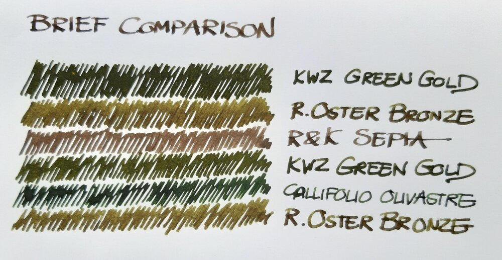
  3. Just a brief note on a recent comparison: a bottle of Robert Oster Signature Bronze had been lingering in my ink drawer until I decided to use it a new acquisition by Atelier Veleray (more on that in the near future). It turned out greener than I'd expected, similar to KWZ Green Gold but slightly lighter. The attached image is an unprocessed photograph hastily taken with a smartphone. Still, it comes close to what I see on paper, especially in the lower part, where Bronze and Green Gold are separated by Callifolio Olivastre. In the upper part, where the two inks are next to each other, Green Gold appears a bit too dark. The other two inks included as a kind of control in the comparison are Callifolio Olivastre (in a Diamond Point with a flexible broad nib) and Rohrer & Klingner Sepia (in a Delta Tech & Web with a stub nib). KWZ Green Gold came from a Montblanc 149 with a medium nib and the Atelier Veleray pen sported a broad nib I had from a Visconti Rembrandt. Bottom line: nice colour and a well-behaved ink. As my interest in shading increases, Bronze may replace the darker KWZ Green Gold among my favourites.
  4. jmccarty3

    Callifolio diluent

    Does anyone know a US source for the Callifolio diluent?
  5. L'Artisan Pastellier Callifolio - Bleu Ultramarine L'Artisan Pastellier is a small company in southern France that specialises in natural pigments, and offers customers authentic and reliable products in beautiful colours based on mineral or vegetable pigments. In a collaboration with Loic Rainouard from Styloplume.net, the chemist Didier Boinnard from L'Artisan Pastellier created the line of Callifolio fountain pen inks. These pastel-coloured inks are traditionally crafted, and can be freely mixed and matched. Overall these inks are only moderately saturated, and have low water-resistance. The inks were specifically designed to work well with all types of paper, and all types of fountain pens. Being pastel-tinted, these inks have a watercolour-like appearance, and are not only fine inks for journaling, but are also really excellent inks for doodling & drawing. I only recently discovered them, and they are already the inks I gravitate towards for personal journaling. In this review the spotlight is on Bleu Ultramarine, one of the many blue inks of the series. From Wikipedia we learn that Ultramarine is a deep blue colour and a pigment which was originally made by grinding lapis lazuli into a powder. The name comes from the Latin ultramarinus, literally "beyond the sea", because the pigment was imported into Europe from mines in Afghanistan by Italian traders during the 14th and 15th centuries. Ultramarine was the finest and most expensive blue used by Renaissance painters. Sounds interesting, but unfortunately - for me - the ink doesn't live up to its name. I find it to be a rather standard blue, in line with the run-of-the-mill Royal Blues of other ink manufacturers. Nothing wrong with that, but I'm not exactly a fan of this type of colour. Personally I find that this ink lacks complexity, making it rather dull and uninteresting. This is not an ink that captured my attention. Technically, the ink feels well lubricated even in my rather dry Lamy Safari test pens. That's a welcome change from other Callifolio inks that often feel a bit dry on the nib, and work best with wetter pens. Bleu Ultramarine shows some nice shading in broader nibs, with an aesthetically pleasing balance between the light and darker parts. With fine nibs though, this shading is mostly absent, and makes the ink look flat and dull. To show you the impact of saturation on the ink's look & feel on paper, I made some scribbles where I fully saturated portions of the paper with ink. This gives you a good idea of what the ink is capable of in terms of colour range. Bleu Ultramarine disappoints a bit in this area - the ink has a rather limited dynamic range. On the smudge test - rubbing text with a moist Q-tip cotton swab - Bleu Ultramarine showed a lot of smearing, but without impacting readability of the text which remains crisp and clear. Water resistance is low: most of the dyes quickly wash away under running tap water, leaving only a faint residue, that is quite unreadable. With still water though, even a 15 minute soak leaves a perfectly readable result on the paper. Not a water resistant ink, but if you spill some fluid on the page and quickly dry it with a paper towel, your text will survive. The soak test nicely shows the purple undertones in this ink - the more water-resistant dyes are a bit purple-leaning. This subtle purple undertone can be used to good effect when drawing with the ink. For me, this under-the-surface purple component saves the ink from being a total bore. I've tested the ink on a wide variety of paper - from crappy Moleskine to high-end Tomoe River. For the Callifolio reviews, I'm using small strips to show you the ink's appearance and behaviour on different paper types. On every band of paper I show you:An ink swab, made with a cotton Q-tip1-2-3 pass swab, to show increasing saturationAn ink scribble made with an M-nib fountain penThe name of the paper used, written with a B-nibA small text sample, written with an M-nibDrying times of the ink on the paper (with the M-nib)Bleu Ultramarine behaved perfectly on all the paper types, with no apparent feathering even on the lower quality papers in my test set. Drying times are mostly around the 5 to 10 second mark, making it a fast drying ink. Not really suited for lefties though, because it lays down a rather wet line, albeit one that dries super fast. The ink is equally at home with both white and off-white creamy paper. It shows a consistent look across all the papers in my test set - quite impressive.I also show the back-side of the different paper types, in the same order. With the low-end Moleskine there is some show-through and bleed-through. With the other papers, Bleu Ultramarine's behaviour is impeccable. The ink copes really well with a wide variety of paper types. Inkxperiment – Village at the LakeAs a personal challenge, I try to create interesting drawings using only the ink I’m reviewing. I find this to be a fun extension of the hobby, and these single-ink drawings certainly present a real challenge at times. With these small pictures, I try to give you an idea of what the ink is capable of in a more artistic setting. For this drawing I used 300 gsm rough watercolour paper. The background was brushed in with water-diluted ink. I then added more and more ink to the mix, to paint the darker layers of the "Village at the Lake". Due to Bleu Ultramarine's limited dynamic range, it wasn't easy to add depth to the picture. In some parts, the purple undertones show through, adding a bit of complexity to an otherwise monotone picture. In the foreground, I painted in some plants with bleach - just to show you that this ink reacts nicely with the bleach, resulting in a golden-yellow colour. Conclusion Bleu Ultramarine is a run-of-the-mill standard blue, with a consistent look across different paper types. The ink writes really well, and can even cope with lower quality paper. Technically, this is a good ink! Personally, I'm not a fan of this type of blue, which to me lacks a certain appeal (which is a nice way of saying that I find this type of blue boring as hell ;-). But if you like Royal Blues, you owe it yourself to give Bleu Ultramarine a try. Technical test results on Rhodia N° 16 notepad paper, written with Lamy Safari, M-nib Backside of writing samples on different paper types
  6. Calling all L’Artisan Pastellier fans, please! I am preparing an order from L'Artisan Pastellier and having trouble picking a blue-black/blue-grey. Online samples of their Callifolio blue-blacks/blue-greys can look very similar. I already have Baikal, Gris de Payne from the Classique inks (which leans a little bit green), and I plan to order Callifolio Gris de Payne & Equinoxe (5), so I am interested in Bosphore, Botany Bay, Byzance, and Bonne Esperance. For those of you who have used these inks: which would best complement (i.e. be most different from) Classique Gris de Payne, and Callifolios Baikal, Gris de Payne, and Equinoxe (5)? (I'm happy to hear other considerations with these blue-blacks/blue-greys, as well.)
  7. InkShift – L'Artisan Pastellier Callifolio Heure Dorée to Noir With their Callifolio line of inks, L'Artisan Pastellier has produced some really nice ink colours. Some of them are better than others, though. I really like Heure Dorée as a drawing ink, and it is undoubtedly a beautiful ink for journaling with wet & broad pens. But... I'm typically using F/M nibs on my pens, and with these Heure Dorée is definitely too light for my taste. Time to darken it up a bit by adding a bit of Noir - the black ink of the Callifolio series, and see what this produces. Below is a set of progressive mixes I used while looking for an interesting combination. This mixing experiment turned out really well. In fact, I like almost all combinations. The mixes shift from a yellow- to a green-olive colour. I even like the dirty-green 1:1 mix. I have several favourites this time: The 1:15 mix makes for a very readable yellow-olive The 1:5 mix looks like a nice green-olive The 1:1 mix is an intriguing dirty-green I haven't made up my mind yet about my absolute favourite. I would be interested to know what people on the forum consider theirs - please let me know. My plan is to choose one of the mixes in the coming days, and do a more comprehensive review which I will post here on the forum.
  8. L'Artisan Pastellier Callifolio - Bosphore L'Artisan Pastellier is a small company in southern France that specialises in natural pigments, and offers customers authentic and reliable products in beautiful colours based on mineral or vegetable pigments. In a collaboration with Loic Rainouard from Styloplume.net, the chemist Didier Boinnard from L'Artisan Pastellier created the line of Callifolio fountain pen inks. These pastel-coloured inks are traditionally crafted, and can be freely mixed and matched. Overall these inks are only moderately saturated, and have low water-resistance. The inks were specifically designed to work well with all types of paper, and all types of fountain pens. Being pastel-tinted, these inks have a watercolour-like appearance, and are not only fine inks for journaling, but are also really excellent inks for doodling & drawing. I only recently discovered them, and they are already the inks I gravitate towards for personal journaling. In this review the center stage is taken by Bosphore, one of the many blue inks of the series. The blue Callifolio inks are named after rivers, lakes and oceans. In this case the ink takes its name from the Bophorus or "The Strait of Istanbul", which forms part of the continental boundary between Europe and Asia. The ink's colour is best described as a dark grey-blue. I'm known to be a fan of muted colours, and this one doesn’t disappoint... a bit gloomy, a bit vintagy... and the greyish undertones are just lovely. I immediately took a liking to Bosphore as a writing ink. I found the ink to be a bit on the dry side in my Lamy Safari test pens, with lubrication being somewhat subpar. Saturation is good though, even with finer nibs. Shading is subtle, and becomes more pronounced with broader nibs. There is not too much contrast between the light and darker parts of the text, which makes it aesthetically pleasing. Well executed! To show you the impact of saturation on the ink's look & feel on paper, I made some scribbles where I really saturated portions of the paper with ink. This gives you a good idea of what the ink is capable of in terms of colour range. As you can see, this ink has a moderately wide colour span ranging from a light greyish blue to a reasonably dark blue-black. On the smudge test - rubbing text with a moist Q-tip cotton swab - Bosphore shows its weakness. Lots of smearing, although the text remains legible. Water resistance is also quite low. Almost all of the colour quickly disappears, but a light grey ghost image of the text remains that is still readable without too much trouble. The chromatography shows that this is a rather monochromatic ink, without much colour variation in the component dyes. I've tested the ink on a wide variety of paper - from crappy Moleskine to high-end Tomoe River. With this review, I have added several new papers to my test set. Among these are Semikolon notebook paper (a laid paper from Leuchtturm), Endless Recorder notebook paper (which is Tomoe River 68 gsm paper), Ciak notebook paper, and Optiimage 100 gsm printing paper. On every small band of paper I show you: An ink swab, made with a cotton Q-tip 1-2-3 pass swab, to show increasing saturation An ink scribble made with an M-nib fountain pen The name of the paper used, written with a B-nib A small text sample, written with an M-nib Drying times of the ink on the paper (with the M-nib) Bosphore behaved perfectly on all the paper types, with no apparent feathering even on the lower quality papers in my test set. Even Moleskine paper behaved quite well with this ink! Drying times are mostly around the 10 second mark. The ink looks nice on both white and more yellowish paper. The ink also shows a remarkably consistent appearance across a wide range of paper types - very well done! At the end of the review, I show you the back-side of the different paper types, in the same order. With the low-end Moleskine there is prominent show-through and a bit of bleed-through. With the other papers, Bosphore's behaviour is impeccable. The ink copes really well with a wide variety of paper types. Writing with different nib sizes The picture below shows the effect of nib sizes on the writing. All samples were written with a Lamy Safari, which is typically a dry pen. I also added a visiting pen - a wet-writing Pelikan M101N Grey-Blue with a fine nib. With this wet nib, the ink writes much more pleasantly. It also shows a substantially darker line. Related inks To compare Bosphore with related inks, I use my nine-grid format with the currently reviewed ink at the center. This format shows the name of related inks, a saturation sample, a 1-2-3 swab and a water resistance test - all in a very compact format. Compared to blue-blacks like Tanzanite and Midnight Blue, Bosphore is definitely greyer. Inkxperiment – dark & gloomy castle As a personal challenge, I try to create interesting drawings using only the ink I'm reviewing. For me, this brings extra fun to the hobby, and these single-ink drawings are great for stretching my creativity. With these small pictures, I try to give you an idea of what the ink is capable of in a more artistic setting. For this drawing, I got my inspiration from some drawings I saw on Pinterest. I started off with HP Premium photo paper, and painted in the background with heavily water-diluted ink. I then started a process of layering on ever more saturated ink. Apply a layer, let it dry, and repeat with the next layer. Finally I penciled in the birds with my Lamy Safari, and added the windows with a fine brush and some bleach. The end result is not too bad, and gives you an idea of what can be obtained with Bosphore as a drawing ink. Conclusion Callifolio Bosphore is at its best as a writing ink. It has a vintage-looking grey-blue colour, that manages to look very pleasing on all my test papers. Water resistance is quite low though, which makes the ink unsuitable for the workplace. I found the ink quite challenging to draw with - this is definitely an ink that's best used for writing. Overall, Bosphore is a great writing ink, and the greyish undertones set it apart from other blue-blacks. Technical test results on Rhodia N° 16 notepad paper, written with Lamy Safari, M-nib Back-side of writing samples on different paper types
  9. L'Artisan Pastellier Callifolio - Téodora L’Artisan Pastellier is a small company in southern France that specialises in natural pigments, and offers customers authentic and reliable products in beautiful colours based on mineral or vegetable pigments. In a collaboration with Loic Rainouard from Styloplume.net, the chemist Didier Boinnard from L’Artisan Pastellier created the line of Callifolio fountain pen inks. These pastel-coloured inks are traditionally crafted, and can be freely mixed and matched. Overall these inks are only moderately saturated, and have low water-resistance. The inks were specifically designed to work well with all types of paper, and all types of fountain pens. Being pastel-tinted, these inks have a watercolour-like appearance, and are not only fine inks for journaling, but are also really excellent inks for doodling & drawing. I only recently discovered them, and they are already the inks I gravitate towards for personal journaling. In this review the spotlight is on Téodora, one of the two green inks of the series (the other one being Olivastre). But where Olivastre is an awe-inspiring green, Téodora fails to woo me. The ink tries to be green, but has an off-putting blue tinge to it. In my opinion, the resulting colour just doesn’t work. If you want to be a teal – be boldly blue-green! Not this faint trace of blue that distracts from your green nature. To tell you the truth, Téodora is my first Callifolio ink that I dislike. Technically, Téodora behaved really well, with good performance and good contrast with the paper. The ink looks flat in an EF-nib, works well in F/M, and exhibits heavy shading in the broader nibs. On the smudge test – rubbing text with a moist Q-tip cotton swab – the ink starts to show its weakness with heavy smearing of the text. Water resistance is near zeo, both on the droplet test (15 minute soak) and on the running water test. The colour completely disappears, leaving nothing of the words you’ve written. Not good! I’ve tested the ink on a wide variety of paper – from crappy Moleskine to high-end Tomoe River. For the Callifolio reviews, I’m using a new format to show you the ink’s appearance and behaviour on the different paper types. . On every small band of paper I show you:An ink swab, made with a cotton Q-tip1-2-3 pass swab, to show increasing saturationAn ink scribble made with an M-nib fountain penThe name of the paper used, written with a B-nibA small text sample, written with an M-nibDrying times of the ink on the paper (with the M-nib)Callifolio Téodora worked well with all the paper types, without any feathering even on the lower quality papers in my test set. Drying times are fairly short in the 5-10 second range on most papers. The ink works well with both white and more cream-coloured paper. At the end of the review, I also show the back-side of the different paper types, in the same order. The ink behaved well on all paper types, with the exception of Moleskine (which is a notoriously bad paper for almost all fountain pen inks). Conclusion Callifolio Téodora is a well-performing green ink, but one with a complete lack of water resistance. Well… I have other inks without water resistance that I still like. Unfortunately, Téodora is not one of them: in the looks department, I personally consider it a complete failure. The ink leans towards the blue, but fails to go all the way and become a real teal (and I happen to like bold blue-greens). In this case though, the ink stays stuck in ugly-land! I’m sure some people will still like the colour, but for me this is one ink that L’Artisan Pastellier could have done without. Technical test results on Rhodia N° 16 notepad paper, written with Lamy Safari, M-nib Backside of writing samples on different paper types
  10. L'Artisan Pastellier Callifolio - Olifants L’Artisan Pastellier is a small company in southern France that specialises in natural pigments, and offers customers authentic and reliable products in beautiful colours based on mineral or vegetable pigments. In a collaboration with Loic Rainouard from Styloplume.net, the chemist Didier Boinnard from L’Artisan Pastellier created the line of Callifolio fountain pen inks. These pastel-colored inks are traditionally crafted, and can be freely mixed and matched. Overall these inks are only moderately saturated, and have low water-resistance. The inks were specifically designed to work well with all types of paper, and all types of fountain pens. Being pastel-tinted, these inks have a watercolor-like appearance, and are not only fine inks for journaling, but are also really excellent inks for doodling & drawing. I only recently discovered them, and they are already the inks I gravitate towards for personal journaling. In this review I take a closer look at Olifants, one of the many blue inks of the series. The blue Callifolio inks are named after rivers, lakes and oceans – this one gets its name from the Olifants river in South-Africa. Olifants not only has a cool name, it’s also a cool ink – a kind of blue-black with strong green undertones or a very dark teal. It’s a strange and unusual colour… I really have no other blue to compare it to. The ink writes well, with good flow, and is nicely saturated. Lubrication is on the low side, resulting in noticeable feedback from the paper when writing, especially with the finer nibs. Olifants is comfortable with all nib sizes – it even looks good and nicely saturated with an EF nib. The ink also exhibits a pleasing shading, even with the finer nibs. I typically use smaller nib sizes because of my small handwriting, so I appreciate an ink that shows character in EF/F nibs – Olifants definitely delivers. Olifants is smudge-resistant – there is very little spreading of the ink. The ink’s water resistance however is really low. With both the running tapwater test and the soak test almost all of the colour disappears and only faint greyish markings remain. These markings are still decipherable with some effort. But this is definitely not an ink to use for signing important documents. When using a water-brush when doodling & drawing, you get a nice light-blue shading effect, that contrasts well with the inky lines. Like all Callifolio inks, Olifants is a very fine choice for inky drawings. I’ve tested the ink on a wide variety of paper – from crappy Moleskine to high-end Tomoe River. For the Callifolio reviews, I’m using a new format to show you the ink’s appearance and behaviour on the different paper types. On every small band of paper I show you: An ink swab, made with a cotton Q-tip1-2-3 pass swab, to show increasing saturationAn ink scribble made with an M-nib fountain penThe name of the paper used, written with a B-nibA small text sample, written with an M-nibDrying times of the ink on the paper (with the M-nib)Olifants behaved perfectly on all the paper types, with no apparent feathering even on the lower quality papers in my test set. Drying times are mostly in the 10 to 15 second range, with a low of 5 seconds on the more absorbent paper. The ink looks really nice on the white papers in my test set, and is positively stunning with Fantasticpaper. Personally, I don’t care for the colour on the off-white, creamy papers – I find the combination rather unpleasant with such a pairing. I also show the back-side of the different paper types, in the same order. With the low-end Moleskine and generic paper, there is significant show-through and bleed-through. With the other papers, Olifant’s behaviour is impeccable. The ink copes really well with all paper types. Conclusion Callifolio Olifants is a very well-behaving ink on all types of paper, with a rather unusual green-blue-black colour – I have no other blue similar to it. The ink works really well with finer nibs, which is a big plus for me. I also find Olifants very enjoyable for doodling & drawing. Unfortunately, the ink only combines well with pure white paper, and is – in my personal opinion – rather unpleasant when paired with off-white creamy paper. A fine ink, but not one of my best.
  11. L'Artisan Pastellier Callifolio - Sepia L'Artisan Pastellier is a small company in southern France that specialises in natural pigments, and offers customers authentic and reliable products in beautiful colours based on mineral or vegetable pigments. In a collaboration with Loic Rainouard from Styloplume.net, the chemist Didier Boinnard from L'Artisan Pastellier created the line of Callifolio fountain pen inks. These pastel-coloured inks are traditionally crafted, and can be freely mixed and matched. Overall these inks are only moderately saturated, and have low water-resistance.The inks were specifically designed to work well with all types of paper, and all types of fountain pens. Being pastel-tinted, these inks have a watercolour-like appearance, and are not only fine inks for journaling, but are also really excellent inks for doodling & drawing. I only recently discovered them, and they are already the inks I gravitate towards for personal journaling. In this review the center stage is taken by Sepia, one of the ochre-type inks of the series. This one is an earth-toned pastel-type sepia-brown, that is great for drawing, but - in my opinion - too undersaturated for writing in many of my pens. In finer nibs with dry pens, the ink lacks character for writing. Only with wet pens does the ink obtain decent saturation and starts to look good on paper. I found the ink to be a bit on the dry side in my Lamy Safari test pens, with lubrication being somewhat subpar. A wet pen solves this problem. The ink shows little shading with fine nibs or wet pens. With broader nibs in dry pens (like the Lamy Safari) Sepia becomes a strong shader, even a bit too harsh for my personal tastes. As a writing ink, this one does not really convince me. To show you the impact of saturation on the ink's look & feel on paper, I made some scribbles on Tomoe River where I really saturated portions of the paper with ink. This gives you a good idea of what the ink is capable of in terms of colour range. As you can see, this ink has a fairly wide colour span ranging from a very light pastel-like sepia to a reasonably dark brown. This explains the harsh shading you get with broad nibs in dry pens. With wet pens, you get the darker version (right part of the saturation swab), with very little shading. On the smudge test - rubbing text with a moist Q-tip cotton swab - Sepia behaved very good. There is limited smearing, and the text remains very sharp and readable. Water resistance is quite good for a non-waterproof ink. An easily readable brownish residue remains even after longer exposures to water. This is also apparent from the lower part of the chromatography. I've tested the ink on a wide variety of paper - from crappy Moleskine to high-end Tomoe River. On every small band of paper I show you: An ink swab, made with a cotton Q-tip 1-2-3 pass swab, to show increasing saturation An ink scribble made with an M-nib Lamy Safari The name of the paper used, written with a Lamy Safari (B-nib) A small text sample, written with an M-nib (also Lamy Safari) The source of the quote, written with a wet Pelikan (F-nib) Drying times of the ink on the paper (with the M-nib Safari) Sepia behaved fairly well on most paper types, but did show some light feathering on papers where I didn't expect it (like the 100 gsm Optiimage printing paper, which usually works really well with fountain pen inks). Drying times are around the 10-second mark with the M-nibbed Lamy Safari. The ink looks best on pure white paper, and looks fairly underwhelming on more yellowish paper. At the end of the review, I show you the back-side of the different paper types, in the same order. With the low-end Moleskine there is prominent show-through and a bit of bleed-through. The GvFC paper also suffers from some show-through - a characteristic I have seen with several inks, and which you wouldn't associate with 100 gsm premium paper. With the other papers, Sepia's behaviour is impeccable. Overall, the ink copes well with a wide variety of paper types. Writing with different nib sizes The picture below shows the effect of nib sizes on the writing. All samples were written with a Lamy Safari, which is typically a dry pen. I also added a visiting pen - a wet-writing Pelikan M101N Bright Red with a fine nib. With this wet nib, the ink writes much more pleasantly. It also shows a substantially more saturated line. Personally I prefer the ink's more saturated look with the wet Pelikan pen. Related inks To compare Sepia with related inks, I use my nine-grid format with the currently reviewed ink at the center. This format shows the name of related inks, a saturation sample, a 1-2-3 swab and a water resistance test - all in a very compact format. I have only a limited number of browns in my ink collection, and no close match to this ink. This Callifolio ink is the most pastel-tinted brown that I own. Inkxperiment - a day at the farm As a personal challenge, I try to create interesting drawings using only the ink I'm reviewing. For me, this really brings extra fun to the hobby, and these single-ink drawings are great for stretching my drawing skills. With these small pictures, I try to give you an idea of what the ink is capable of in a more artistic setting. For this drawing, the earth-toned colour of the ink triggered memories of childhood holidays at my grandparents farmhouse. I started off with 300 gsm watercolour paper, on which I painted a background with water-diluted Sepia. The fields in the foreground were drawn with Q-tips, and multiple water/ink ratios. I then added the farmhouse and tree on the horizon line with a B-nibbed fountain pen. Finally I painted in the wheat stalks, and added some texture to the fields with my M-nibbed Lamy Safari filled with Sepia. The resulting picture gives you an idea of the colour range you can expect when using Sepia as a drawing ink. Conclusion Callifolio Sepia is a pastel-toned sepia-brown ink, that is at its best in wetter pens where it produces a dark and saturated line, and where it doesn't suffer from the subpar lubrication present wih dry pens like the Lamy Safari. Sepia fails to impress me as a writing ink, but shows some promise for use in pastel-toned drawings. Technical test results on Rhodia N° 16 notepad paper, written with Lamy Safari, M-nib Back-side of writing samples on different paper types
  12. L'Artisan Pastellier Callifolio - Gris de Payne L’Artisan Pastellier is a small company in southern France that specialises in natural pigments, and offers customers authentic and reliable products in beautiful colours based on mineral or vegetable pigments. In a collaboration with Loic Rainouard from Styloplume.net, the chemist Didier Boinnard from L’Artisan Pastellier created the line of Callifolio fountain pen inks. These pastel-coloured inks are traditionally crafted, and can be freely mixed and matched. Overall these inks are only moderately saturated, and have low water-resistance. The inks were specifically designed to work well with all types of paper, and all types of fountain pens. Being pastel-tinted, these inks have a watercolor-like appearance, and are not only fine inks for journaling, but are also really excellent inks for doodling & drawing. I only recently discovered them, and they are already the inks I gravitate towards for personal journaling. In this review the center stage is taken by Gris de Payne, a classy grey ink with a teal-blue undertone. I’m quite a fan of grey inks – they are subtle and subdued, not bold and harsh like black inks. And I also enjoy the slightly off-grey variety that hints at other colours in its undertones. As such, Gris de Payne delivers. It’s a cool grey colour with teal-blue leaning undertones, which clearly show in the chromatography. Gris de Payne works well with all nib sizes, providing excellent contrast with the paper even in the finer nibs. The ink also provides impressive and aesthetically pleasing shading, without too much contrast between the light and darker parts, just as I like it. I also appreciate that this shading shows up with finer nibs – really well executed! The ink looks best on pure white paper. It’s less satisfying on more yellowish paper – in my opinion. Callifolio inks are often on the dry side, but that is not the case with this ink. It wrote very smoothly and with good lubrication in my Lamy Safari test-pens (which are dry writers). That’s another plus. To show you the impact of saturation on the ink’s look & feel on paper, I made some scribbles where I fully saturated portions of the paper with ink. This gives you a good idea of what the ink is capable of in terms of colour range. Gris de Payne shifts effortlessly from a very light blue-grey to a more deeply saturated dark-grey. Quite nice. On the smudge test – rubbing text with a moist Q-tip cotton swab – Gris de Payne behaved really well, there is smearing but this doesn’t impact the readability of the text. Water resistance is a mixed bag. Most of the ink quickly disappears, even after short exposure to water. On the plus side, a very light-grey outline of the text remains, which is still readable without too much effort (this is not immediately obvious in the scan, but trust me – in real life I had no trouble reading what is left on the paper). I’ve tested the ink on a wide variety of paper – from crappy Moleskine to high-end Tomoe River. For the Callifolio reviews, I’m using a format that shows you the ink’s appearance and behaviour on the different paper types. On every small band of paper I show you: An ink swab, made with a cotton Q-tip1-2-3 pass swab, to show increasing saturationAn ink scribble made with an M-nib Safari fountain penThe name of the paper used, written with a B-nibA small text sample, written with the M-nibDrying times of the ink on the paper (with the M-nib)Gris de Payne behaved perfectly on all the paper types, with no apparent feathering even on the lower quality papers in my test set. Drying times are in the 10 second range, except on some of the more absorbent papers. The ink looks fabulous on Paperblanks, which I use for daily journaling. In fact, it works really well with all of the white paper types in my test set. On more yellow paper, I’m not enthralled by the looks of this ink. I also show the back-side of the different paper types, in the same order. The ink behaved very good with almost all paper types. Even Moleskine paper behaved surprisingly well – there was only minimal bleed-through. All in all a really well-behaving ink. Inkxperiment – winter walk I’ve recently started to experiment with ink drawings, keeping things simple and more-or-less abstract. I find it to be a fun extension of the hobby, and have found single-ink drawings a nice challenge. It also gives you an idea of what the ink is capable of in a more artistic setting. In this drawing I used 300 gsm rough watercolour paper. I started off with Gris de Payne, heavily diluted with water to obtain a very light-gray background. I then gradually added more ink to the mix, and added darker and darker layers to the drawing. With this I obtained a broad spectrum of different shades of grey… perfect for a winter landscape. The end result gives you a good idea of what Gris de Payne is capable of when used for doodling & drawing. Conclusion Callifolio Gris de Payne from L’Artisan Pastellier is a quite beautiful and subdued blue-grey ink, that is equally at home with both writing and drawing. The ink has good contrast with the paper, and works well with all paper types. I also appreciate the fact that it shows shading even with the finer nibs (F and M) that I typically use. Overall, I’ve nothing but positive things to say about this ink. In my book, this is one of the better inks in the Callifolio line-up. Well worth your attention. Technical test results on Rhodia N° 16 notepad paper, written with Lamy Safari, M-nib Back-side of writing samples on different paper types
  13. L'Artisan Pastellier Callifolio - Baikal L’Artisan Pastellier is a small company in southern France that specialises in natural pigments, and offers customers authentic and reliable products in beautiful colours based on mineral or vegetable pigments. In a collaboration with Loic Rainouard from Styloplume.net, the chemist Didier Boinnard from L’Artisan Pastellier created the line of Callifolio fountain pen inks. These pastel-coloured inks are traditionally crafted, and can be freely mixed and matched. Overall these inks are only moderately saturated, and have low water-resistance. The inks were specifically designed to work well with all types of paper, and all types of fountain pens. Being pastel-tinted, these inks have a watercolour-like appearance, and are not only fine inks for journaling, but are also really excellent inks for doodling & drawing. I only recently discovered them, and they are already the inks I gravitate towards for personal journaling. In this review I take a closer look at Baïkal, one of the many blue-toned inks of the series. Callifolio’s blue inks get their name from seas, rivers and the like. Baïkal is no exception – it is named after lake Baïkal, a rift lake in southern Siberia. The lake’s age is estimated at 25 million years, making it the most ancient lake in geological history. The ink is aptly named – it is in essence a blue-black ink, but one with a faded and worn-out look. It feels old and ancient within a few minutes after writing. There’s also a bit of a purple undertone that provides a vintage feeling. At first, I almost dismissed this ink as yet another blue. But I quickly grew fond of that aged look, which makes your writing look like it’s decades old. Really nice, and sufficiently different from my other blues. Technically, Baïkal behaved very well, with good performance in all nib sizes and good contrast with the paper. The contrast with the paper is just right – with high contrast inks, a full page of text can look crowded and eye-searing. That’s certainly not the case with this ink. Baïkal flows well, but I found it a bit lacking in lubrication. Shading is almost absent in the finer nibs. It’s only with the broad and calligraphy nibs that you get some subtle shading. I personally like that the ink deals well with F and M nibs, which are my typical nib sizes. On the smudge test – rubbing text with a moist Q-tip cotton swab – Baïkal behaved very well with only minimal smearing. Water resistance is almost totally absent though. Reconstructing text after a 15 minute soak in still water might just be possible, but running tap water almost immediately obliterates your writing. There is less ink left on the page than you might infer from the chromatography. I’ve tested the ink on a wide variety of paper – from crappy Moleskine to high-end Tomoe River. For the Callifolio reviews, I’m using a new format to show you the ink’s appearance and behaviour on the different paper types. For this review I’ve added OCM Moyen Age to the paper mix. On every small band of paper I show you: An ink swab, made with a cotton Q-tip1-2-3 pass swab, to show increasing saturationAn ink scribble made with an M-nib fountain penThe name of the paper used, written with a B-nibA small text sample, written with an M-nibDrying times of the ink on the paper (with the M-nib)Baïkal behaved perfectly on all the paper types, without any feathering even on the lower quality papers in my test set. Drying times are fairly short in the 5-10 second range on most papers. The ink works well with both white and more cream-coloured paper. I really like the way it looks on Tomoe River paper. My personal favourite though is OCM Moyen Age – a more toothy paper with a name that matches the faded and worn-out look of the ink. At the end of the review, I also show the back-side of the different paper types, in the same order. The ink behaved superbly on all paper types. Only with Moleskine there was very visible show-through and bleed-through. Baïkal is a really well-behaving ink. Conclusion Callifolio Baïkal from L’Artisan Pastellier is a well-performing ink that you might at first sight dismiss as just another blue. But look again, and you will see a really nice vintage-style ink with a faded and worn-out look. Your writing immediately looks as though it was written decades ago. Personally, I’ve grown really fond of it. If you’re into vintage-style inks, this one certainly deserves your attention. Technical test results on Rhodia N° 16 notepad paper, written with Lamy Safari, M-nib Backside of writing samples on different paper types
  14. L'Artisan Pastellier Callifolio - Bleu Méditerranée L'Artisan Pastellier is a small company in southern France that specialises in natural pigments, and offers customers authentic and reliable products in beautiful colours based on mineral or vegetable pigments. In a collaboration with Loic Rainouard from Styloplume.net, the chemist Didier Boinnard from L'Artisan Pastellier created the line of Callifolio fountain pen inks. These pastel-coloured inks are traditionally crafted, and can be freely mixed and matched. Overall these inks are only moderately saturated, and have low water-resistance. The inks were specifically designed to work well with all types of paper, and all types of fountain pens. Being pastel-tinted, these inks have a watercolour-like appearance, and are not only fine inks for journaling, but are also really excellent inks for doodling & drawing. I only recently discovered them, and they are already the inks I gravitate towards for personal journaling. In this review the center stage is taken by Bleu Méditerraneé, one of the many blue inks of the series. The blue Callifolio inks are named after rivers, lakes and oceans. In this case the ink takes its name from the Mediterranean Sea, that seperates Europe from Africa. The ink's colour is best described as a light-blue - definitely not a sky/cerulean blue. It's a really nice soft blue colour, that I find quite appealing. For a Callifolio ink, this one wrote quite well in my Lamy Safari test pens. It didn't show the typical dry feeling with subpar lubrication that is a staple of many Callifolio inks. Shading is strongly present but still subtle due to the light blue nature of the ink. The result is an aesthetically pleasing look. Overall quite a nice writing ink. Well executed! To show you the impact of saturation on the ink's look & feel on paper, I made some scribbles where I really saturated portions of the Tomoe River paper with ink. This gives you a good idea of what the ink is capable of in terms of colour range. As you can see, this ink has a wide colour span ranging from a wispy light blue with a tiny bit of purple to a relatively dark light-blue. Heavily saturated parts also show a bit of a red sheen. On the smudge test - rubbing text with a moist Q-tip cotton swab - Blue Méditerranée shows its weakness. Lots of smearing, although the text remains legible. Water resistance is also quite low. There is still some ink left on the paper, but what remains is heavily smudged and near unreadable. The droplet test with non-moving water sitting on the paper for 15 minutes is still acceptable. But once running water comes into play, the dyes quickly disappear leaving only an unreadable residue. The chromatography shows that this is a rather monochromatic ink, without much colour variation in the component dyes. I’ve tested the ink on a wide variety of paper – from crappy Moleskine to high-end Tomoe River. On every small band of paper I show you: An ink swab, made with a cotton Q-tip 1-2-3 pass swab, to show increasing saturation An ink scribble made with an M-nib fountain pen The name of the paper used, written with a B-nib A small text sample, written with an M-nib Drying times of the ink on the paper (with the M-nib) Bleu Méditerranée behaved perfectly on all the paper types, with no apparent feathering even on the lower quality papers in my test set. Even Moleskine paper behaved quite well with this ink - no visible feathering, but still some bleed-through. Drying times are mostly around the 10 second mark. The ink works really well with both white and more yellowish paper. The ink also shows a remarkably consistent appearance across a wide range of paper types - well done! Writing with different nib sizes The picture below shows the effect of nib sizes on the writing. All samples were written with a Lamy Safari, which is typically a dry pen. I also added a visiting pen - a wet-writing Pelikan M120 Green-Black with an M-nib. With this wet nib, the ink writes much more saturated, losing a bit of the more prominent shading you get with a drier pen. Related inks To compare Blue Méditerranéé with related inks, I use my nine-grid format with the currently reviewed ink at the center. This format shows the name of related inks, a saturation sample, a 1-2-3 swab and a water resistance test - all in a very compact format. Inkxperiment – Rendez-Vous with Rama As a personal challenge, I try to create interesting drawings using only the ink I'm reviewing. These single-ink drawings are great for stretching my drawing skills, and - above all - they are lots of fun. With these small pieces, I try to give you an idea of what the ink is capable of in a more artistic setting. This drawing is inspired by the 1973 novel of Arthur C. Clarke, where a huge cylindrical spaceship moves through our solar system. I started off with 300 gsm watercolour paper, on which I painted the background using heavily water-diluted ink. I next used Q-tips to draw in the Rama landscape, using different water/ink ratios. The cylindrical horizon line with the mysterious Rama machinery and vegetation was added with an M-nibbed Safari using pure Bleu Méditerranée. I finished the drawing by adding some accents to the Rama landscape with my Lamy Safari pen. I quite like the colour variation that this Callifolio ink allows. The end result gives you a good idea of what can be obtained with Bleu Méditerranée as a drawing ink. Conclusion Callifolio Bleu Méditerranée is an ink that works great as both a writing and drawing ink. It has a pleasing light-blue appearance with prominent but still subtle shading. Overall a good-looking blue ink, that rightfully deserves your attention. Technical test results on Rhodia N° 16 notepad paper, written with Lamy Safari, M-nib Back-side of writing samples on different paper types
  15. L'Artisan Pastellier Callifolio - Equinoxe(5) L’Artisan Pastellier is a small company in southern France that specialises in natural pigments, and offers customers authentic and reliable products in beautiful colours based on mineral or vegetable pigments. In a collaboration with Loic Rainouard from Styloplume.net, the chemist Didier Boinnard from L’Artisan Pastellier created the line of Callifolio fountain pen inks. These pastel-coloured inks are traditionally crafted, and can be freely mixed and matched. Overall these inks are only moderately saturated, and have low water-resistance. The inks were specifically designed to work well with all types of paper, and all types of fountain pens. Being pastel-tinted, these inks have a watercolour-like appearance, and are not only fine inks for journaling, but are also really excellent inks for doodling & drawing. I only recently discovered them, and they are already the inks I gravitate towards for personal journaling. In this review the center stage is taken by Equinoxe(5), one of the many blue inks in the series. You could say that Equinoxe(5) is a blue-black, but that would be selling it short. This is not your typical run-of-the-mill blue-black. This one is gray-leaning and has a faded look straight out of the nib, resulting in a nice vintage look. I like it a lot. And on top of that, the ink has a beautiful red sheen, that is always there right beneath the surface. It gives a special twist to the ink’s appearance. Really nice! I can safely say that I loved this ink on first sight. Let’s see if this ink can also convince me on the technical front. I found the ink to be a bit on the dry side in my Lamy Safari test pens, with lubrication being somewhat subpar. A wet pen solves this problem. Saturation is very good though, even with finer nibs. The wetter your pen, the darker the colour and the more the red sheen surfaces. The ink shades very prominently: there’s quite some contrast between light and darker parts, but not so much that it becomes too harsh. To show you the impact of saturation on the ink’s look & feel on paper, I made some scribbles on Tomoe River where I really saturated portions of the paper with ink. This gives you a good idea of what the ink is capable of in terms of colour range. As you can see, this ink has a moderately wide colour span ranging from a dark blue to a true blue-black. On the smudge test – rubbing text with a moist Q-tip cotton swab – Equinoxe(5) starts to show its weakness: this is an ink that has absolutely no water resistance. It smudges very badly, though the text remains quite readable. Bring it in contact with water though, and all ink quickly disappears. Both the droplet test and the running tap-water test result in a fail. This is not an ink to use if any form of water resistance is on your list. For personal journaling, I couldn’t care less. But this is definitely not an ink to use in the workplace. Don’t let the chromatography fool you – from the lower part, it looks like quite some ink remains on the paper, but unfortunately what remains are unreadable smudges. Not readable at all. I’ve tested the ink on a wide variety of paper – from crappy Moleskine to high-end Tomoe River. I recently added a number of fine writing papers to my test set, bringing the total to twenty. On every small band of paper I show you: An ink swab, made with a cotton Q-tip1-2-3 pass swab, to show increasing saturationAn ink scribble made with an M-nib fountain penThe name of the paper used, written with a B-nibA small text sample, written with an M-nibDrying times of the ink on the paper (with the M-nib)Equinoxe(5) behaved perfectly on all the papers in my test set, with no apparent feathering even on the lower quality papers. Even the Moleskine paper behaved flawlessly with this ink (which is quite unusual). Drying times are mostly around the 5 to 10 second mark. The ink looks beautiful on both white and more yellowish paper. A fine grey-blue-black with a classic look & feel. This ink truly has a vintage vibe! At the end of the review, I show you the back-side of the different paper types, in the same order. None of my papers had problems with show-through or bleed-through. Equinoxe(5) can cope really well with a wide variety of paper types. Writing with different nib sizes The picture below shows the effect of nib sizes on the writing. All samples were written with a Lamy Safari, which is typically a dry pen. I also added a visiting pen – a wet-writing Pelikan M205 Demonstrator with an M cursive italic nib. While writing with this ink, I noticed a small hiccup with fine nibs. Here the ink is prone to drying out on the nib. If you don’t write with it for a short while (a minute or so), you might experience a hard start. I could consistently reproduce this with a number of F-nibs. Starting with M-nibs or using wetter pens (like Pelikans) makes this behaviour disappear. Related inks To compare Equinoxe(5) with related inks, I use my nine-grid format with the currently reviewed ink at the center. This format shows the name of related inks, a saturation sample, a 1-2-3 swab and a water resistance test – all in a very compact format. Inkxperiment – pine tree mountain As a personal challenge, I try to create interesting drawings using only the ink I’m reviewing. I love to experiment with inks outside the usual writing frame, and these single-ink drawings are great for stretching my drawing skills. With these small pictures, I try to give you an idea of what the ink is capable of in a more artistic setting. For this drawing, I used 300 gsm watercolour paper. I started off with heavily water-diluted ink to paint the sky background. I then used a Q-tip and multiple water-ink ratios to draw in the mountain section. The cracks in the mountain and the pine trees were added with pure Equinoxe(5) using my B-nib Safari. As a finishing touch, I added the birds in the sky. The final picture gives you a good idea of the colour range that Equinoxe(5) is capable of when used as a drawing ink. Conclusion In my opinion, L’Artisan Pastellier produced a very fine ink with Callifolio Equinoxe(5). This ink is a beautiful grey-leaning faded-looking blue-black, with a definite vintage vibe. It also shows a really nice red sheen, that lifts this ink above the crowd. Equinoxe(5) has zero water resistance, and some technical shortcomings. Nevertheless, I am totally enamored by its looks, and heartily recommend it. Technical test results on Rhodia N° 16 notepad paper, written with Lamy Safari, M-nib Back-side of writing samples on different paper types
  16. L'Artisan Pastellier Callifolio - Yalumba L'Artisan Pastellier is a small company in southern France that specialises in natural pigments, and offers customers authentic and reliable products in beautiful colours based on mineral or vegetable pigments. In a collaboration with Loic Rainouard from Styloplume.net, the chemist Didier Boinnard from L'Artisan Pastellier created the line of Callifolio fountain pen inks. These pastel-colored inks are traditionally crafted, and can be freely mixed and matched. Overall these inks are only moderately saturated, and have low water-resistance. The inks were specifically designed to work well with all types of paper, and all types of fountain pens. Being pastel-tinted, these inks have a watercolor-like appearance, and are not only fine inks for journaling, but are also really excellent inks for doodling & drawing. I only recently discovered them, and they are already the inks I gravitate towards for personal journaling. In this review the spotlight is on Yalumba, one of the ochre-type inks of the series. According to Wikipedia, "Yalumba" is an indigenous Australian word referring to "all the land around". And it must be said: the orangy ochre colour of this particular Callifolio ink reflects the mood of the dusty Australian outback. Yalumba has an orange-leaning ochre colour that looks quite nice. I like its looks, and find it especially suited for personal journaling. The ink is a bit unpredictable though, in that the colour you get depends heavily on the particular combination of pen and paper. Sometimes quite orangy, sometimes more ochre-brown leaning. Personally, I find this to be one of the charming characteristics of this ink. I found the ink to be a bit on the dry side in my Lamy Safari test pens, with lubrication being somewhat subpar. A wet pen solves this problem. Saturation is good though, even with finer nibs. The wetter your pen, the more the colour shifts from orange to brown ochre. Shading is subtle, and becomes more pronounced with broader nibs. The contrast between the light and darker parts of the text is just right, which makes it aesthetically pleasing. To show you the impact of saturation on the ink's look & feel on paper, I made some scribbles on Tomoe River where I really saturated portions of the paper with ink. This gives you a good idea of what the ink is capable of in terms of colour range. As you can see, this ink has a fairly wide colour span ranging from a light orange-ochre to a reasonably dark brown-ochre. On the smudge test - rubbing text with a moist Q-tip cotton swab - Yalumba behaved quite well. There is some smearing, but the text remains very sharp and readable. Water resistance is also quite good for a non-waterproof ink. An easily readable brownish residue remains even after longer exposures to water. This is also apparent from the lower part of the chromatography. I like this water resistance, since it means I can use this ink for notetaking at work (where this non-conventional colour is sure to draw some attention). I've tested the ink on a wide variety of paper - from crappy Moleskine to high-end Tomoe River. My test-bank of papers has expanded to 20 different types, so you're sure to get a good impression of the ink's behaviour. On every small band of paper I show you: An ink swab, made with a cotton Q-tip 1-2-3 pass swab, to show increasing saturation An ink scribble made with an M-nib fountain pen The name of the paper used, written with a B-nib A small text sample, written with an M-nib Drying times of the ink on the paper (with the M-nib) Yalumba behaved perfectly on all the paper types, with no apparent feathering even on the lower quality papers in my test set. Even Moleskine paper behaved quite well with this ink! Drying times are mostly around the 5 to 10 second mark. The ink looks nice on both white and more yellowish paper. With this ink, paper makes a difference... the ink's look can differ significantly depending on the type of paper you use. At the end of the review, I show you the back-side of the different paper types, in the same order. With the low-end Moleskine there is prominent show-through and a bit of bleed-through. With the other papers, Yalumba's behaviour is impeccable. The ink copes really well with a wide variety of paper types. Writing with different nib sizes The picture below shows the effect of nib sizes on the writing. All samples were written with a Lamy Safari, which is typically a dry pen. I also added a visiting pen - a wet-writing Pelikan M400 Tortoiseshell Brown with a fine nib. With this wet nib, the ink writes much more pleasantly. It also shows a substantially darker line. Related inks To compare Yalumba with related inks, I use my nine-grid format with the currently reviewed ink at the center. This format shows the name of related inks, a saturation sample, a 1-2-3 swab and a water resistance test - all in a very compact format. Inkxperiment – shadow people As a personal challenge, I try to create interesting drawings using only the ink I'm reviewing. For me, this brings extra fun to the hobby, and these little single-ink paintings are great for stretching my drawing skills. With these small pictures, I try to give you an idea of what the ink is capable of in a more artistic setting. For this drawing, I got my inspiration from some pictures I saw on Pinterest. I started off with HP Premium photo paper - which is rapidly becoming one of my favourite drawing media because it makes the ink look really vibrant. The lightly dotted background is obtained by soaking a kitchen towel in heavily water-diluted ink, and pressing the photo paper on top of it. The door frame and the shadow people were painted in using ever more saturated ink, ending with pure Yalumba for the darkest parts. The resulting picture gives you an idea of the colour range you can expect when using Yalumba as a drawing ink. Conclusion Callifolio Yalumba is an eye-pleasing orange-ochre ink, that is both at home with writing and drawing. The ink is at its best in wetter pens, where it produces a dark and saturated line, and where it doesn't suffer from the subpar lubrication you notice wih dry pens like the Lamy Safari. I especially liked Yalumba as a drawing ink, where its relatively broad colour spectrum is a big advantage. In my opinion, one of the nicer inks in the L’Artisan Pastellier Callifolio series. Technical test results on Rhodia N° 16 notepad paper, written with Lamy Safari, M-nib Back-side of writing samples on different paper types
  17. senzen

    Mixing Out Of Desperation

    So I really didn't want yo get into mixing inks, it took me a while to match the right pen to each of my 29 inks and I didn't want even more complications, but... Seeing Équinoxe 6 was depleting I got a 50ml pouch only to find it doesn't look like what I liked, which has been widely reported: perhaps there is an error in a batch, or perhaps it just got mixed, in any case there doesn't seem to be an equivalent in the Callifolio line. Solution: 2/5 Équinoxe 6 (the greener version) and 3/5 Sheaffer Skrip Blue which I had laying around and didn't use. The result looks like what I like, although the original went a bit darker and with a lot of sheen. What is looks like out of the pouch: http://i64.tinypic.com/2d8s1np.jpg Now: http://i67.tinypic.com/4qiedi.jpg No starting or clogging up issues (my original less greenish Équinoxe 6 did have a tendency on its own to clog up some pens). If anyone likes this colour and doesn't need the hassle, I got the colour I liked from jetpens (no affiliation), perhaps their entire batch looks like that... Or not.
  18. L'Artisan Pastellier Callifolio - Cassis L’Artisan Pastellier is a small company in southern France that specialises in natural pigments, and offers customers authentic and reliable products in beautiful colours based on mineral or vegetable pigments. In a collaboration with Loic Rainouard from Styloplume.net, the chemist Didier Boinnard from L’Artisan Pastellier created the line of Callifolio fountain pen inks. These pastel-colored inks are traditionally crafted, and can be freely mixed and matched. Overall these inks are only moderately saturated, and have low water-resistance. The inks were specifically designed to work well with all types of paper, and all types of fountain pens. Being pastel-tinted, these inks have a watercolor-like appearance, and are not only fine inks for journaling, but are also really excellent inks for doodling & drawing. I only recently discovered them, and they are already the inks I gravitate towards for personal journaling. In this review the spotlight is on Cassis, which presumably gets its name from the drink “Crème de Cassis” – a beverage distilled from blackcurrants, and also the favourite beverage of the famous Belgian detective Hercule Poirot. If you’ve set your sights on a dark purple colour, you’ll be disappointed. In reality, Callifolio Cassis is a nicely saturated dark grey with subtle purple undertones. Cassis is a nicely saturated ink, that works well with all nib sizes. It can live perfectly with an EF nib, laying down a well-defined line that contrasts nicely with white or cream paper. In broader nibs it additionally shows some really classy shading. Nice ! The purple undertone is there, but very subtle. With normal writing it’s barely visible, but nevertheless it gives this grey a certain panache. Personally, I really like it. Like all Callifolio inks, this one is also great for doodling & drawing. Depending on the paper used, the purple undertones will show their appearance when using a water brush. On the smudge test – rubbing text with a moist Q-tip cotton swab – Cassis behaved acceptably. There is definite smearing, but the text remains very legible. Water resistance however is almost completely non-existent. The droplet test leaves only greyish smudges with a ghost image of the original lines. The test with running tap water washes away all the colour – leaving only a barely readable residue of the original text. This is not an ink to consider if you require some measure of water resistance. When using Cassis for drawing, the lack of water resistance can be a plus. As the chromatography clearly shows, there are purple tones hidden within the ink. With waterbrushing it’s possible to bring these purple undertones to the surface in your drawings. I’ve tested the ink on a wide variety of paper – from crappy Moleskine to high-end Tomoe River. For the Callifolio reviews, I’m using a new format to show you the ink’s appearance and behaviour on the different paper types. On every small band of paper I show you: An ink swab, made with a cotton Q-tip1-2-3 pass swab, to show increasing saturationAn ink scribble made with an M-nib fountain penThe name of the paper used, written with a B-nibA small text sample, written with an M-nibDrying times of the ink on the paper (with the M-nib)Cassis behaved perfectly on all the paper types, with no apparent feathering even on the lower quality papers in my test set. Drying times with an M-nib varied from 5 to 20 seconds, depending on the paper used. Surprisingly, the ink looks consistently similar across all paper types. The purple component is really apparent in the ink swabs – here you are reminded that this is not a pure grey. When writing the purple undertones are nearly invisible, but tantalizingly present, lifting this ink above a pure neutral grey. I also show the back-side of the different paper types, in the same order. The ink behaved perfectly with almost all paper types. Only with the Moleskine paper, there was significant show-trough and some minor bleed-through. All in all a really well-behaving ink. Conclusion Callifolio Cassis is a really nice dark grey ink with subtle purple undertones. I found it a pleasure to use, both for writing and drawing. The ink works really well with finer nibs – leaving a well-defined and nicely saturated line with good contrast on the paper. I also liked the way the ink shades in the broader nibs. The barely noticeable purple undertones lift this ink above a neutral grey – personally I consider this a plus that provides some extra character to the ink. If you like grey inks, this one is certainly worth looking at. Technical test results on Rhodia N° 16 notepad paper, written with Lamy Safari, M-nib
  19. L'Artisan Pastellier Callifolio - Bleu Azur L'Artisan Pastellier is a small company in southern France that specialises in natural pigments, and offers customers authentic and reliable products in beautiful colours based on mineral or vegetable pigments. In a collaboration with Loic Rainouard from Styloplume.net, the chemist Didier Boinnard from L'Artisan Pastellier created the line of Callifolio fountain pen inks. These pastel-coloured inks are traditionally crafted, and can be freely mixed and matched. Overall these inks are only moderately saturated, and have low water-resistance. The inks were specifically designed to work well with all types of paper, and all types of fountain pens. Being pastel-tinted, these inks have a watercolour-like appearance, and are not only fine inks for journaling, but are also really excellent inks for doodling & drawing. I only recently discovered them, and they are already the inks I gravitate towards for personal journaling. In this review the spotlight is on Bleu Azur, one of the many blue inks of the series. The blue Callifolio inks are named after rivers, lakes and oceans – in this case I think of the azure blue colour of a tropical lagoon. This is more or less a traditional royal blue ink, with a bit of a purple undertone. I'm not myself a fan of this ink style, so this one didn't exactly wow me. I found the ink to be on the dry side in my Lamy Safari test pens, with lubrication being somewhat subpar. I also find the shading a bit too pronounced to my liking. In fine nibs, the ink shows a rather bland appearance. It's only with broader or italic nibs that I start to appreciate what I see. To show you the impact of saturation on the ink's look & feel on paper, I made some scribbles where I really saturated portions of the paper with ink. This gives you a good idea of what the ink is capable of in terms of colour range. As you can see, this ink has a broad colour span ranging from a light purple-blue to a really dark royal blue. On heavily saturated parts, you get a reddish sheen. I like the ink most in the middle tones, where the purple comes to the foreground. On the smudge test - rubbing text with a moist Q-tip cotton swab - Bleu Azur shows a lot of smearing. The text remains legible though. Water resistance however is almost non-existent. The droplet test leaves only unrecognisable blue smudges. The test with running tap water washes away almost all the colour - only faint traces remain. If you need some measure of water resistance in your ink, look elsewhere. When using a water-brush with doodling & drawing, you get a nice light-blue shading effect. Like all Callifolio inks, Bleu Azur is an excellent choice for inky drawings. I've tested the ink on a wide variety of paper - from crappy Moleskine to high-end Tomoe River. With this review, I have added Viking Vektor paper to my test set - Catherine from Sakura generously gifted me a pad of this paper to try out. On every small band of paper I show you: An ink swab, made with a cotton Q-tip 1-2-3 pass swab, to show increasing saturation An ink scribble made with an M-nib fountain pen The name of the paper used, written with a B-nib A small text sample, written with an M-nib Drying times of the ink on the paper (with the M-nib) Bleu Azur behaved perfectly on all the paper types, with no apparent feathering even on the lower quality papers in my test set (with the exception of Moleskine, which is a nightmare for fountain pen writing). Drying times are mostly around the 5 to 10 second mark. The ink looks best on white paper. In my opinion, it's not a good ink for yellowish paper, where it looks underwhelming. My advice: stick to white paper with this colour. At the end of the review, I also show the back-side of the different paper types, in the same order. With the low-end Moleskine there is prominent show-through and a little bleed-through. With the other papers, Bleu Azur's behaviour is impeccable. The ink copes really well with a wide variety of paper types. Writing with different nib sizes The picture below shows the effect of nib sizes on the writing. All samples were written with a Lamy Safari, which is typically a dry pen. I also added a visiting pen - a wet-writing Pelikan M120 with a fine nib. With this wet nib, the ink writes much more pleasantly, but also shows much harsher shading, which I personally dislike. Related inks To compare Bleu Azur with related inks, I use a nine-grid format with the currently reviewed ink at the center. This format shows the name of related inks, a saturation sample, a 1-2-3 swab and a water resistance test - all in a very compact format. I hope that you'll find this way of presenting related inks useful. It's a bit more work, but in my opinion worth the effort for the extra information you gain. Inkxperiment – reach for the sky As a personal challenge, I try to create interesting drawings using only the ink I'm reviewing. For me, this brings extra fun to the hobby, and these single-ink drawings are great for stretching my creativity. With these small pictures, I try to give you an idea of what the ink is capable of in a more artistic setting. For this drawing I started off with HP Premium photo paper and a Scotch Brite dishwashing sponge. I used the soft side of the sponge with water-diluted ink to draw in the background. The rough side with less diluted ink was used to sponge in the foreground. I cut out a round section of sponge, and used this to stamp in the flower halos. Next I used a brush with pure Blue Azur to paint in the flower stems. I quite like the end result - and the dishwashing sponge has been added to my drawing toolset. This mini-picture gives you a good idea of what can be achieved with Callifolio Bleu Azur as a drawing ink. Conclusion Bleu Azur is a royal-blue style ink that looks best on pure white paper. The ink works well with all nib sizes, but is on the dry side. You need wet pens to make for a pleasing writing experience. Unfortunately, with wet pens you get contrast-rich harsh shading, with I personally dislike. Like most Callifolio inks, water resistance is almost non-existent . All in all, not an ink that I would recommend. Technical test results on Rhodia N° 16 notepad paper, written with Lamy Safari, M-nib Back-side of writing samples on different paper types
  20. Ink Shoot-Out : J.Herbin Vert de Gris vs L'Artisan Pastellier Callifolio Olifants In 2018, J. Herbin released a number of new inks in their "Perle des Encres" series. The one I fell in love with is Vert de Gris, a terrific grey-green-blue ink that rightfully deserved a spot in my favourite inks of the year short-list. Recently I accidentally discovered that Callifolio Olifants has a very similar hue... in fact, these inks are really close matches. Time to do a detailed comparison and find out which of these inks I like the most. Enter... the Ink Shoot-Out. A brutal fight spanning five rounds, where two inks engage in fierce battle to determine who is the winner. And today truly is a special fight - our French champions are masters in the art of Savate - also known as French kick-boxing. In the left corner, the deadly weapon from Paris - J. Herbin Vert de Gris aka the "Grey Reaper". In the right corner, from southern France, the steel-footed "Elephant Kicker" – L'Artisan Pastellier Callifolio Olifants. The champions enter the ring! The crowd is roaring! The bell rings and the first round begins... may the best ink win! Round 1 – First Impressions These French inks are well matched, and make a great first impression. They show a muted grey-green-blue colour, that really appeals to me. The colour contrasts nicely with the Rhodia N°16 paper in my Lamy Safari M-nib. The inks show character, with nice shading even in finer nibs. I especially like their dusty appearance. These inks are definitely teals, but also lean towards the grey, giving them a vintage appearance. I really like what I see here. Both inks look very much alike, but there are some differences: Vert de Gris is more saturated, and leaves a wetter line on the page. In contrast, Olifants is a much drier ink, which feels less lubricated. This is especially noticeable in finer nibs. Olifants has a bit more blue in it, which is most obvious in swatches. Both inks make a great first impression. In the looks department, they are well matched. But Vert de Gris feels nicer in the pen due to its superior lubrication. A small difference, but the first kick goes to the Grey Reaper. Just enough for a win on points. Round 2 – Writing Sample The writing sample was done on Rhodia N°16 Notepad with 80 gsm paper. Both inks behaved flawlessly, with no feathering and no show-through or bleed-through. With the EF nib, the better saturation of Vert de Gris comes into play, resulting in more contrast-rich writing. With broad nibs though, Vert de Gris becomes a bit too saturated and loses some of its character. Here the drier Olifants looks more pleasing to me. Colourwise both inks look very similar in writing. Both inks also shade nicely, without too much contrast between light and dark parts. This aesthetically pleasing shading gives more character to your writing, and shows up even with the finer nibs. For this round, the focus is on writing, and here both inks are strong performers. Vert de Gris works a bit better in EF/F nibs, producing a more saturated line. On the other hand, Vert de Gris tends to oversaturate in broader nibs. Here the drier Callifolio Olifants manages to gain the upper hand in the looks department. But both inks are jewels, that are really on par with each other. Some nice punches, some good kicks, but neither ink gets the upper hand. As such, this round ends in a draw. Round 3 – Pen on Paper This round allows the batlling inks to show how they behave on a range of fine writing papers. From top to bottom, we have : FantasticPaper, Life Noble, Tomoe River and Original Crown Mill cotton paper. All scribbling and writing was done with a Lamy Safari M-nib. Both champions did well, with no show-through nor bleed-through. But this round is not about technicalities, it is about aesthetics and beauty. Are the fighters able to make the paper shine ? One thing is immediately apparent: these inks are at home on a wide range of papers, both white and off-white ones. On more absorbent paper like Fantasticpaper (top), the drier Olifants makes the best of the paper. But on less absorbent paper, the roles are reversed - due to its better saturation, Vert de Gris definitely looks better in these circumstances. The inks both consistently produce great-looking writing on all the papers I tested them with. Swatch saturation varies across paper types (depending on absorption and roughness of the paper), but for writing these inks manage to produce consistently contrast-rich lines on the page. Both champions move with lightning speed - throwing kicks and punches - but neither champion gives ground. As such, round 3 also finishes with a draw. The crowd is going nuts... what a fight! These inks show no weakness! Awesome! Round 4 – Ink Properties Both inks have drying times in the 15-20 second range on the Rhodia paper. But... oh my god... look! ... the Grey Reaper explodes in a flurry of kicks, and finally punches through the defenses of the Elephant Kicker. In the smudge resistance test - rubbing the text with a moist Q-tip cotton swab - Vert de Gris shows itself to be less prone to smudging. This better water resistance also shows up in the droplet test, where I drip water on the grid and let it sit there for 15 minutes. Vert de Gris definitely shows better water resistance, losing colour but showing a crisp greyish residue that remains very readable. Olifants behaves quite well on itself, but can't reach the level of water resistance shown by Vert de Gris. What a spectacle! J. Herbin Vert de Gris pulled some kicks and punches worthy of Jean-Claude van Damme, the Muscles from Brussels. Callifolio Olifants totally caved! The crowd is cheering... More! More! More! There is no doubt... this round is a solid win for Vert de Gris. Round 5 – The Fun Factor Welcome to the final round. Here I give you a purely personal impression of both inks, where I judge which of them I like the most when doing some fun stuff like doodling and drawing. Both inks do well, and show off a broad colour spectrum, ranging from very light greyish-blue to a really dark teal. I really enjoyed using them. Personally I prefer the greyer looks of Vert de Gris. This ink shows a bit more character, and provides more of a gloomy feel that I really like. The accompanying drawing was done on HP photo paper, and on this medium Callifolio Olifants definitely shows its blue-er nature. For this round, both champions are again well matched. They both look beautiful, but this judge prefers the greyer gloominess of Vert de Gris over the more bluish tones of Olifants. A personal judgement, but still... this round goes to Vert de Gris on points. The Verdict Both inks are real jewels, that look beautiful on all types of paper. And it took a while to notice some worthwhile differences. But in the end, round 4 is the decisive one : Vert de Gris clearly dominates when water resistance comes into play. It also wins on points in some of the other rounds - but that's more of a personal impression of the judge. Both J.Herbin Vert de Gris and Callifolio Olifants are top quality inks. But put them next to each other, and the result is clear: Vert de Gris throws the better kicks and punches, and is the definite winner of this exciting fight.
  21. L'Artisan Pastellier Callifolio - Bordeaux L'Artisan Pastellier is a small company in southern France that specialises in natural pigments, and offers customers authentic and reliable products in beautiful colours based on mineral or vegetable pigments. In a collaboration with Loic Rainouard from Styloplume.net, the chemist Didier Boinnard from L’Artisan Pastellier created the line of Callifolio fountain pen inks. These pastel-coloured inks are traditionally crafted, and can be freely mixed and matched. Overall these inks are only moderately saturated, and have low water-resistance. The inks were specifically designed to work well with all types of paper, and all types of fountain pens. Being pastel-tinted, these inks have a watercolour-like appearance, and are not only fine inks for journaling, but are also really excellent inks for doodling & drawing. I only recently discovered them, and they are already the inks I gravitate towards for personal journaling. In this review the spotlight is in Bordeaux, one of the purples of the Callifolio collection. Bordeaux is presumably named after its namesake French wine - capturing the colour of this delicious produce of red grapes. The ink captures the wine's colour really well, but as an ink it is underwhelming. The ink has low saturation, and fails to give an "acte de présence" on the paper. Colourwise, I consider the ink to be too light a purple, leaning towards the pink side. I prefer my purples a lot darker. The ink also suffers from sub-par lubrication, giving it a scratchy feel while writing. Shading is present, but only in broader nibs (starting at M). With fine nibs the shading is almost absent, giving the ink a flat look on the paper. With broader nibs, I find the shading a bit too aggressive, with a tad too much contrast between light and darker parts. Overall, the looks of Bordeaux failed to wow me. To show you the impact of saturation on the ink's look & feel on paper, I made some scribbles where I fully saturated portions of the paper with ink. This gives you a good idea of what the ink is capable of in terms of colour range. Bordeaux shows an average dynamic range. The image shows that this is an ink with low saturation - even the heavily saturated part remains rather underwhelming. For me, this ink lacks personality, and did not impress me. On the smudge test - rubbing text with a moist Q-tip cotton swab - Bordeux behaved very well, with limited smearing and without impacting readability of the text, which remains crisp and clear. Water resistance is almost totally absent though. Both still and running water quickly obliterate all colour, leaving only a faint brownish ghost image on the page, which is barely decipherable. I've tested the ink on a wide variety of paper - from crappy Moleskine to high-end Tomoe River. For the Callifolio reviews, I'm using small strips to show you the ink's appearance and behaviour on different paper types. On every band of paper I show you: An ink swab, made with a cotton Q-tip 1-2-3 pass swab, to show increasing saturation An ink scribble made with an M-nib fountain pen The name of the paper used, written with a B-nib A small text sample, written with an M-nib Drying times of the ink on the paper (with the M-nib) Bordeaux behaved perfectly on all the paper types, with no apparent feathering even on the lower quality papers in my test set. Only with the infamous Moleskine paper, a tiny bit of feathering is present. Drying times are mostly around the 10 second mark, making it a fast drying ink. Not really suited for lefties though, because it lays down a rather wet line, albeit one that dries relatively fast. The ink looks at its best on pure white paper. On more yellowish paper, I quite dislike the colour. Overall, the ink fails to impress me... it looks too much like writing with wine, leaving low saturated wine stains on the paper. Writing with different nib sizes The picture below shows the effect of nib sizes on the writing. All samples were written with a Lamy Safari, which is typically a dry pen. I also added a wet visiting pen - a Pelikan M101N Lizard with M-nib. This pen shows a much more saturated line, but loses most of the shading. Related inks I have recently changed my format for presenting related inks to a nine-grid format, with the currently reviewed ink at the center. The new format shows the name of related inks, a saturation sample, a 1-2-3 swab and a water resistance test - all in a very compact format. I hope that you'll find this way of presenting related inks more useful. It's a bit more work, but in my opinion worth the effort for the extra information you gain. Inkxperiment - cabin in the woods As a personal experiment, I try to produce interesting drawings using only the ink I'm reviewing. I find this to be a fun extension of the hobby, and think of these single-ink drawings as a nice challenge to stretch my drawing skills. Lately I have been experimenting with painting on photo paper. I find this to be a terrific medium for small drawings, making the ink look much more vibrant than on traditional watercolour paper. For this drawing I used HP Advanced photo paper. I started by outlining the horizon line and the cabin. Next I painted in the foreground and the treeline, using different mixtures of water and ink. Once dry, I painted in the tree details with pure Bordeaux, and added detail to the cabin using a fountain pen with M-nib. The birds in the sky are the finishing touch for this small 10x15cm drawing. The end result gives you a good idea of what can be obtained with Callifolio Bordeaux in a more artistic setting. Conclusion Bordeaux from L'Artisan Pastellier is a wine-coloured purple ink with low saturation. I find this to be a rather dull ink, without much character. Technically, the ink worked fine with all the papers in my test set, albeit with sub-par lubrication. Overall, not an ink I'm impressed with. I like the wine a lot better! Technical test results on Rhodia N° 16 notepad paper, written with Lamy Safari, M-nib Backside of writing samples on different paper types
  22. L'Artisan Pastellier Callifolio - Havane L'Artisan Pastellier is a small company in southern France that specialises in natural pigments, and offers customers authentic and reliable products in beautiful colours based on mineral or vegetable pigments. In a collaboration with Loic Rainouard from Styloplume.net, the chemist Didier Boinnard from L'Artisan Pastellier created the line of Callifolio fountain pen inks. These pastel-coloured inks are traditionally crafted, and can be freely mixed and matched. Overall these inks are only moderately saturated, and have low water-resistance. The inks were specifically designed to work well with all types of paper, and all types of fountain pens. Being pastel-tinted, these inks have a watercolour-like appearance, and are not only fine inks for journaling, but are also really excellent inks for doodling & drawing. I only recently discovered them, and they are already the inks I gravitate towards for personal journaling. In this review the spotlight shines on Havane, one of the many ochre-brown-orange tints in the Callifolio line. Havana is a light-brown ink without much of a red undertone... you could call it cigar-brown, to stay in line with the ink's name. Brown inks are often constructed from a mixture of primary colours, but this one seems to be based on light-brown dyes, as shown by the chromatography. The colour is subdued, and stays in line with the pastel-like character of most Callifolio inks. Havane works well with all nib sizes, providing excellent contrast with the paper even in the finer nibs. The ink also provides subtle but still very visible shading, which is aesthetically very pleasing. The shading is mostly absent in the finer nibs of my dry Lamy review pen, but shows up really nice in broader nibs, or wetter pens (like the visiting pen in the nib-size sample below). The ink looks good on both white and more yellowish paper. It writes smoothly and with good lubrication - even in my dry Lamy Safari test pen. To show you the impact of saturation on the ink's look & feel on paper, I made some scribbles where I fully saturated portions of the Tomoe River paper with ink. This gives you a good idea of what the ink is capable of in terms of colour range. Havane has an average colour span - with not too much colour difference between light and dark parts. This reflects in the shading the ink exhibits, which stays in the background but is definitely present. Quite nice, actually. [Edited] When posting the review, I noticed that the colour looked much redder than I see it with my eye. Turns out that this is another example of a "chameleon" ink, i.e. an ink that changes tone with the wavelength of ambient light. Below you find two other saturation photos of exactly the same ink swab: the first one is taken in daylight, the second one under artificial light. Under artificial light, this ink really turns into an orange-brown (that I quite like, but that is alas only a disguise). On the smudge test - rubbing text with a moist Q-tip cotton swab - Havane behaved really well, there is smearing but this doesn't impact the readability of the text. Water resistance is not great though. A faint orange-brown residue remains on the paper, which can still be deciphered with some effort. But I wouldn't go so far as calling this ink water-resistant. I've tested the ink on a wide variety of paper - from crappy Moleskine to high-end Tomoe River. For the Callifolio reviews, I'm using a format that shows you the ink's appearance and behaviour on the different paper types. On every small band of paper I show you:An ink swab, made with a cotton Q-tip1-2-3 pass swab, to show increasing saturationAn ink scribble made with an M-nib Safari fountain penThe name of the paper used, written with a B-nibA small text sample, written with the M-nibDrying times of the ink on the paper (with the M-nib)Havane behaves really well on most paper types: no feathering, and very limited show-through. Moleskine paper is the exception: here the ink exhibits some minor feathering, and very prominent show-through and bleed-through. Drying times are in the 10 second range on most papers. The ink works well with both white and yellow paper. I quite like the way it looks on Paperblanks, which I use for daily journaling. At the end of this review, I also show you the back-side of the different paper types, which gives you an idea of the amount of show-through / bleed-through. [Edited] On scans, the writing samples show a bit more red than in daylight. Below I show you a photo taken in daylight of some of the same writing samples. These show a lighter brown that the one captured by the scan: Writing with different nib sizesThe picture below shows the effect of nib sizes on the writing. All samples were written with a Lamy Safari, which is typically a dry pen. I also added a visiting pen - my wet Pelikan M400 Brown Tortoise with an F-nib. Here the ink leaves a very saturated line, which shows off the subtle shading that is exhibited by Havane. You can also see that this ink works well in all nib-sizes, even the finer ones. [Edited] And again, here is the same writing sample, but now as a photo taken by daylight: Related inksTo compare Havane with related inks, I use a nine-grid format with the currently reviewed ink at the center. This format shows the name of related inks, a saturation sample, a 1-2-3 swab and a water resistance test - all in a very compact format. I hope that you'll find this way of presenting related inks useful. Bringing the reviewed ink in close proximity with eight related inks makes it easy to spot the sometimes subtle differences. Inkxperiment - flying the tardisAs a personal challenge, I try to produce interesting drawings using only the ink I'm reviewing, keeping things simple and more-or-less abstract. I find this to be a fun extension of the hobby, and these single-ink drawings usually provide a nice challenge. It also gives you an idea of what the ink is capable of in a more artistic setting. My inspiration in this case came from the Doctor Who intro, which shows the Tardis spinning into a spiral. For the drawing I used 300 gsm rough watercolour paper. I thoroughly soaked the paper with water, and then applied Havane with a brush, adding some highlights with a 20% bleach solution. This forms the background for the drawing. On a separate piece of paper, I saturated the surface with pure ink, giving a nice dark-brown shade. This paper I cut into squares, and glued them in a spiral shape on the painted background. Et voilà... flying the tardis. The end result gives you a good idea of what can be obtained with Havane when using the ink for doodling & drawing. ConclusionCallifolio Havane from L'Artisan Pastellier is a cigar-coloured light-brown ink with a pastel-like character. The ink works great in all nib sizes, looks good on any paper type and exhibits some very sophisticated shading. I quite liked reviewing this ink, although it's not one of my favourite colours (I prefer my browns much darker than this). If you enjoy light-brown inks though, this one might well be worth your attention. [Edited] Be aware that this ink shows a totally different character depending on the lighting conditions. In daylight, the ink is more of a true brown, while under artificial light it turns into a much nicer orange-brown. Technical test results on Rhodia N° 16 notepad paper, written with Lamy Safari, M-nib Back-side of writing samples on different paper types
  23. Ink Shoot-Out : J.Herbin Poussière de Lune vs L'Artisan Pastellier Callifolio Bourgogne Over the course of the past few years I have developed a taste for dusty, murky inks. Excellent colours for gloomy autumns and dark winter evenings... Two of the inks I love very much are J. Herbin’s Poussière de Lune and L’Artisan Pastellier Callifolio’s Bourgogne. Both are nice dusty purples that fit very well with the autumn season. A perfect time to do a detailed comparison, and find out which of these inks I like the most. Enter... the Ink Shoot-Out. A brutal fight spanning five rounds, where heavyweight inks do battle to determine who is the winner. In the left corner - the well-known J. Herbin champion – Poussière de Lune. In the right corner, also from France, the challenger from L’Artisan Pastellier – Bourgogne. Which champion will remain standing at the end of the fight ? Let's find out... Round 1 - First Impressions Both inks are wonderful murky purples. These are dark and moody inks, well suited to writing on gloomy autumn evenings. Count Vladimir Dracula would have loved them both, and so do I. There are some differences though: Poussière de Lune is much more saturated and lubricated – the pen flows over the paper and leaves a very well saturated line. Bourgogne writes drier with noticeable feedback from the paper. As a result, Bourgogne leaves a finer line with less saturation.Bourgogne is a darker purple with more grey-black undertones. This is a matter of personal taste, but I definitely prefer the darker purple of Bourgogne.Both inks appeal to me. Poussière de Lune is technically the better ink for writing, but colour-wise I really consider Bourgogne to have the edge. For this round, both champions are on par with each other. Let’s call it a draw. Round 2 - Writing Sample The writing sample was done on Rhodia N°16 Notepad with 80 gsm paper. Both inks behaved flawlessly, with no feathering and no show-through or bleed-through. J. Herbin’s Poussière de Lune wrote wonderfully, with very good ink-flow, and leaving a well saturated line. In contrast, Callifolio Bourgogne is much less lubricated, and leaves a consistenly thinner line on the paper. With normal writing, the colour difference between both inks is less apparent. Although Callifolio has more grey-black undertones, in everyday writing this is not immediately obvious. You need to look carefully to see the difference. Both inks also exhibit an aesthetically pleasing shading. Being dark inks, the shading is not very prominent – from dark to darker purple – but it is there, and gives extra character to the writing. For this round, Poussière de Lune clearly has the upper hand, and showed the best technique. A clear and definite win. Round 3 - Pen on Paper I added this round to indicate how the battling inks behave on a range of fine writing papers. From top to bottom, we have : FantasticPaper, Life Noble, Tomoe River and Original Crown Mill cotton paper. All scribbling and writing was done with a Lamy Safari M-nib. Both champions did well, with no show-through nor bleed-through. But this round is not about technicalities, it is about aesthetics and beauty. Are the fighters able to make the paper shine ? In my opinion, Callifolio Bourgogne is the more able of the champions – It’s dustier and murkier on a wider variety of paper. The only exception is with Tomoe River paper, where I like the result of Poussière de Lune better. For this round, Bourgogne gets the upper hand and gets a win on points. Round 4 - Ink Properties Both inks have drying times in the 15-20 second range on the Rhodia paper. Both inks also do fine on the smudge test, where a moist Q-tip cotton swab is drawn across the text lines. There is some smearing, but the text remains perfectly legible. For the droplet test, I dripped water onto the grid and let it sit there for 15 minutes, after which I removed the water droplets with a paper kitchen towel. Neither of the champions exhibits good water resistance – although with some patience you might be able to reconstruct the written word. Also Poussière de Lune leaves more of a purple mess on the page. The chromatography shows that both inks leave a greyish residue, with Poussière de Lune leaving more purple smearing. You can also see that Bourgogne is the darker of the two, with more grey-black undertones in the ink. Overall though – the chroma’s look very similar. In this round, both inks show more or less the same behavior, resulting in a draw. Round 5 - The Fun Factor Welcome to the final round. Here I give you a purely personal impression of both inks, where I judge which of them I like most when doing some fun stuff like doodling and drawing. Both inks do well, and the lack of water resistance allows for nice effects when using a water brush. But I must admit that I like L’Artisan Pastellier Callifolio Bourgogne a lot better than J. Herbin Poussière de Lune. Bourgogne is much nicer to draw with, and has a much more pleasing dark dusty purple colour. The dark grey in this ink is what really makes it shine. In comparison, Poussière de Lune is too purple in appearance. This is of course a personal decision, but it is the judge’s conclusion that this round is clearly won by the more artistic ink – Callifolio Bourgogne. The Verdict Both inks find a proud place in my collection, and both are suitably gloomy inks for the dark autumn season. If you are in search of some dusty dark purples – no need to look any further. But counting the points, I find that L’Artisan Pastellier Callifolio Bourgogne has a slight edge over J. Herbin Poussière de Lune. A fight needs a winner, and in this fight I grant the victory to Callifolio Bourgogne.
  24. L'Artisan Pastellier Callifolio - Bonne Esperance L'Artisan Pastellier is a small company in southern France that specialises in natural pigments, and offers customers authentic and reliable products in beautiful colours based on mineral or vegetable pigments. In a collaboration with Loic Rainouard from Styloplume.net, the chemist Didier Boinnard from L'Artisan Pastellier created the line of Callifolio fountain pen inks. These pastel-coloured inks are traditionally crafted, and can be freely mixed and matched. Overall these inks are only moderately saturated, and have low water-resistance. The inks were specifically designed to work well with all types of paper, and all types of fountain pens. Being pastel-tinted, these inks have a watercolour-like appearance, and are not only fine inks for journaling, but are also really excellent inks for doodling & drawing. I only recently discovered them, and they are already the inks I gravitate towards for personal journaling. In this review I take a closer look at Bonne Esperance, one of the many blue inks of the series. The blue Callifolio inks are named after rivers, lakes and oceans - this blue liquid gets its name from Cap de Bonne Espérance in South-Africa. Colourwise this is a more or less washed-out dark grey-blue ink, with a bit of a vintage feel. For me personally, the ink lacks a certain complexity, and as such looks a bit dull and uninteresting. Not an ink that I'm excited about. Technically, the ink feels rather dry in my Safari test pens, and really needs wetter nibs for a pleasant writing experience. When left uncapped, I experienced hard starts after a minute or so. Not so good. On the plus side, Bonne Esperance shades nicely, with an aesthetically pleasing balance between the light and darker parts. This shading is even present in finer nibs, but really comes to the front in B-nibs and above. To show you the impact of saturation on the ink's look & feel on paper, I made some scribbles where I fully saturated portions of the paper with ink. This gives you a good idea of what the ink is capable of in terms of colour range. Bonne Esperance disappointed me a bit here: it's dynamic range is rather limited, which might explain why the ink feels a bit dull and flat. On the smudge test - rubbing text with a moist Q-tip cotton swab - Bonne Esperance showed a lot of smearing, but the text remains readable. Water resistance is low: most of the dyes quickly wash away, leaving only a faint greyish residue, that is barely readable. Not an ink to use when water resistance is high on your list. I've tested the ink on a wide variety of paper - from crappy Moleskine to high-end Tomoe River. For the Callifolio reviews, I'm using small strips to show you the ink's appearance and behaviour on different paper types. On every band of paper I show you:An ink swab, made with a cotton Q-tip1-2-3 pass swab, to show increasing saturationAn ink scribble made with an M-nib fountain penThe name of the paper used, written with a B-nibA small text sample, written with an M-nibDrying times of the ink on the paper (with the M-nib)Bonne Esperance behaved perfectly on all the paper types, with no apparent feathering even on the lower quality papers in my test set. With Moleskine, a tiny amount of feathering shows, but you almost need a magnifying glass to spot this. Drying times are mostly around the 10 second mark, with a low of 5 seconds on the more absorbent paper. The ink is equally at home with both white and off-white creamy paper. The ink looks really nice on Paperblanks and Fantasticpaper - on the other papers I found the ink's expression to be underwhelming (too washed out, and - dare I say - a bit boring). I also show the back-side of the different paper types, in the same order. With the low-end Moleskine there is some show-through and bleed-through. With the other papers, Bonne Esperance's behaviour is impeccable. The ink copes really well with a wide variety of paper types. Inkxperiment – Moon over GizahI've recently started to experiment with ink drawings, keeping things simple and more-or-less abstract. I find it to be a fun extension of the hobby, and have found single-ink drawings a nice challenge. It also gives you an idea of what the ink is capable of in a more artistic setting. For this drawing I used 300 gsm rough watercolour paper. The background was brushed on with water-diluted ink. I then painted in the pyramids and other details with undiluted ink. For the moon, I used a touch of bleach to create the cratered surface features. For drawing, Bonne Esperance's limited colour range makes it more difficult to obtain interesting results - definitely not an easy one for doing a single-ink drawing. ConclusionBonne Espearance is a dark grey-blue ink with a washed out look. The ink works well in all nib sizes, with some decent shading. Technically, I found the ink to be too dry for pleasant writing. You really need a wet nib to compensate for this. The ink also has zero water resistance, and is prone to hard starts when left uncapped for short periods of time. For me personally, this ink lacks somewhat in complexity, and even feels a bit dull. Not an ink that I could get excited about. Technical test results on Rhodia N° 16 notepad paper, written with Lamy Safari, M-nib Backside of writing samples on different paper types
  25. L'Artisan Pastellier Callifolio - Inca Sol L'Artisan Pastellier is a small company in southern France that specialises in natural pigments, and offers customers authentic and reliable products in beautiful colours based on mineral or vegetable pigments. In a collaboration with Loic Rainouard from Styloplume.net, the chemist Didier Boinnard from L'Artisan Pastellier created the line of Callifolio fountain pen inks. These pastel-coloured inks are traditionally crafted, and can be freely mixed and matched. Overall these inks are only moderately saturated, and have low water-resistance. The inks were specifically designed to work well with all types of paper, and all types of fountain pens. Being pastel-tinted, these inks have a watercolour-like appearance, and are not only fine inks for journaling, but are also really excellent inks for doodling & drawing. I only recently discovered them, and they are already the inks I gravitate towards for personal journaling. In this review I take a closer look at Inca Sol, one of several ochre-coloured inks in the Callifolio line. The name Inca Sol conjures up images of a dry & dusty valley, baking in the midday sun. And the ink fits this image well - a sepia-brown colour with red-orange undertones. Unfortunately, this ink also fits the dry & dusty moniker: in my fairly dry review pens (Lamy Safari), this ink definitely feels very dry, scratchy and undersaturated. You really need broad and wet pens to bring out the best in this ink. See also visvamitra's review, which shows the ink with wet/broad nibs. I tend to use F/M nibs, so this ink is not really made for me. Also, the colour doesn't really speak to me, but that is of course a purely personal matter. I much prefer the more orange-leaning sepia's in the Callifolio series (like itzamna, cannelle, ...). The ink shows some subdued shading, which is more pronounced in broader nibs. With fine nibs, the shading is almost non-existent, giving the ink a much flatter and less-appealing look. To show you the impact of saturation on the ink's look & feel on paper, I made some scribbles where I fully saturated portions of the paper with ink. This gives you a good idea of what the ink is capable of in terms of colour range. Inca Sol is capable of a broad range of sepia shades - ranging from a really light sepia, to an almost dark brown. On the smudge test - rubbing text with a moist Q-tip cotton swab - Inca Sol behaved really well. There is some small smearing of the text, but without any impact on readability. Water resistance is also remarkably good for a Callifolio ink. The residue left on the page can easily be reconstructed, so you won't lose your precious writing. This is also apparent from the bottom part of the chromatography: a sepia-brown residue remains, while the red-orange dyes drain away. I've tested the ink on a wide variety of paper - from crappy Moleskine to high-end Tomoe River. For the Callifolio reviews, I'm using a format that shows you the ink's appearance and behaviour on the different paper types. On every small band of paper I show you:An ink swab, made with a cotton Q-tip1-2-3 pass swab, to show increasing saturationAn ink scribble made with an M-nib Safari fountain penThe name of the paper used, written with a B-nibA small text sample, written with the M-nibDrying times of the ink on the paper (with the M-nib)Inca Sol behaved perfectly on all paper types, with only a tiny bit of feathering on the notoriously bad Moleskine paper. Drying times are quite short in the 5-10 second range with my Lamy Safari test pen (M-nib). The ink shows a more-or-less consistent look across paper types. For some reason, it looks more saturated on Paperblanks and HP 80gsm printer paper. Since I use Paperblanks for journaling, that's a plus for me personally. I also show the back-side of the different paper types, in the same order. The ink behaved very good with almost all paper types. Only with the Moleskine paper there is noticeable bleed-through, which means you cannot use the backside of the paper. All in all a really well-behaving ink. Inkxperiment – sun above pyramidAs a personal experiment, I try to produce interesting drawings using only the ink I'm reviewing. I find this to be a fun extension of the hobby, and have found these single-ink drawings a nice challenge. It also gives you an idea of what the ink is capable of in a more artistic setting. This drawing was done on 90gsm sketch paper. Inspiration came from the name "Inca Sol" itself. For the background I used water-diluted ink to obtain the lighter tones. Once dry, I penciled in the Inca pyramid with my Lamy Safari (B-nib), and painted the sun above the pyramid (here I added some bleach to produce the highlights - the protuberance detail looks cool, but in reality covers up a smear I made while painting in the ink ;-). I finally added the hieroglyphs to accentuate the Inca setting. The end result gives you a good idea of the colour span that Inca Sol is capable of. ConclusionCallifolio Inca Sol from L'Artisan Pastellier is a brown-red sepia ink, that's just not one of my favourites. The colour is not really for me, but that is a personal matter. But the ink is also too dry and undersaturated, especially in finer nibs. You really need wet & broad pens to get some satisfaction from this ink. As such, not really a good writing ink, but when used for drawing, this ink certainly has some potential. Technical test results on Rhodia N° 16 notepad paper, written with Lamy Safari, M-nib Back-side of writing samples on different paper types


×
×
  • Create New...