Search the Community
Showing results for tags 'café des îles'.
-
-
- brown ink comparison
- de atramentis
- (and 8 more)
-
J Herbin Café des îles According to the Herbin website: "Café des îles (Island coffee): a light brown color reminder of the great coffee smell enjoyed at the terrace of a café in a far away island." You be the judge 😛 This is a dryish, Ovaltine colored, reddish brown, which shines on Japanese paper, mostly with Iroful and 68 gr Tomoe River Paper. It doesn’t remind me of coffee. One can say, it's a lighter version of Private Reserve Vampire Red, but easier to clean. Surprisingly long dry time on Rhodia, so not suitable for lefty overwriters It's not a good candidate for copy paper. It ghosted and bled through Hammermill 20lb copy paper. I didn't bother to scan the horror show Chroma: Writing Samples: I've added Iroful paper to the lineup. For a lot of inks, it can bring out extreme shading and enhance colours. Note this paper is very sensitive to hand oils as you can see in the Stub and flex lines. The coating has been removed and the ink doesn't adhere to the paper. Close up scan of Tomoe River and Iroful. Note how shading is accentuated in Iroful. Photo: Comparison: Water test: Left side 10 seconds under running water. Paper is Mnemosyne Art Work: Café and Ovaltine - What happens if you order a Café des îles coffee in a Parisian café. They'll serve you Ovaltine Paper is a Talens Mixed media pocket book. I used different dilutions of Café des îles. At the bottom it is most concentrated. I used a glass nib tipped in bleach to create the "foamy" part on the top. Noodler's Lexington Gray / Polar Green Rohrer and Klingner Königsblau & Helianthus with bleach · Pens used: Lamy (Reverse EF/F/M/B, BB), Osmiroid Copperplate nib. · What I liked: Name. · What I did not like: Color doesn’t remind me of coffee. It's a bit reddish pale for my taste. · What some might not like: Dryish ink, It isn’t black coffee. · Shading: Very nice on Japanese Paper, especially Iroful · Ghosting: Yes, on cheap paper. · Bleed through: Yes, on cheap paper. · Flow Rate: Wet · Lubrication: A bit dry · Nib Dry-out: Did not notice. · Start-up: Ok · Saturation: Pastel · Shading Potential: Great on Japanse Paper. · Sheen: No. · Spread / Feathering / Woolly Line: Did not notice. · Nib Creep / “Crud”: Did not notice. · Staining (pen): No. · Clogging: Did not notice. · Cleaning: Easy · Water resistance: decent. · Availability: 10 ml, 30 ml bottles and I believe cartridges. Please don't hesitate to share your experience, writing samples or any other comments. The more the merrier
-
-
-
-
-
-
-
-
-
Here's one I found interesting. I've only played with J. Herbin's 1670 series of inks, so it was nice to try something a bit more conventional. I had bought an empty bottle just for the style. I'm surprised I was able to get so much leftover ink out of it.
-
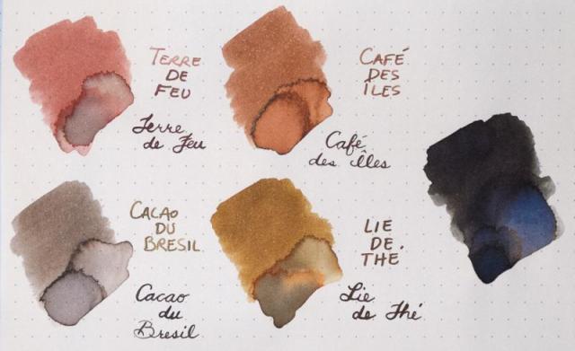
I thought it would be interesting to compare the four Herbin browns. Top is Rhodia dotpad; bottom is Strathmore watercolor paper. Terre de Feu and Cacao du Bresil are two of the best sketching inks I've found. Lie de Thé is a gorgeous drawing ink that washes into a bold orange and sepia, but I never draw with it because it is such an ugly color to write with. I haven't found much use for Café des Îles. I considered including Ambre de Birmanie (one of my new favorites), but I consider it a yellow. Parker Quink Black (really a dark, dark blue) on the far right was added because Cacao du Bresil reads grey among the other browns. Anyone have a favorite? Hate them all? Prefer something else similar?


