Search the Community
Showing results for tags 'burgundy red'.
-

Ink Shoot-Out : Mont Blanc Burgundy Red Vs Papier Plume Red Beans And Rice
namrehsnoom posted a topic in Ink Comparisons
Ink Shoot-Out : Mont Blanc Burgundy Red vs Papier Plume Red Beans and Rice The other day I was playing around with Mont Blanc Burgundy Red, enjoying the ink a lot. I just love these toned down colours that move towards pastel territory, and this ink fits the bill. This definitely is NOT a bright and vibrant red! It occurred to me that Red Beans and Rice from Papier Plume is from the same colour family. Time to do a detailed comparison, and find out which of these inks I like the most. Enter... the Ink Shoot-Out. A brutal fight spanning five rounds, where truly formidable inks do battle to determine who is the winner. This time around, it's a battle between a prominent heavyweight, and a new kid on the block. In the left corner, the Mont Blanc muscle-man: Burgundy Red. In the right corner, from the French Quarter in New Orleans, Red Beans and Rice - a relatively new talent from the Papier Plume stable. Both champions enter the ring, the crowd starts cheering! Let the fight begin and may the best ink win… Round 1 – First Impressions The fighters immediately engange one another with a flurry of strikes and counterstrikes. They make a great first impression. These inks have a really nice toned-down dusty dark-red colour with a faded look, like text in an ages-old manuscript. Both inks are well-saturated, even in finer nibs, and provide excellent contrast with the page. Shading is delicate and subtle, without too much contrast between the light and darker parts - just as I like it. These inks are definitely on par with each other, but there are some differences: Burgundy Red's colour is a bit more purple-leaning, while Red Beans and Rice has more of a brown undertone. This is most obvious in swabs, less so in normal writing. The Mont Blanc ink writes really smooth. In contrast, Red Beans and Rice has sub-par lubrication, and feels a bit scratchy, especially in smaller nibs. With broader nibs - e.g. with the scribbles made with a 1.5 mm calligraphy nib - the Mont Blanc ink tends to be a bit oversaturated, drowning out most of the delicate shading. Red Beans and Rice, being a drier ink, looks better in these circumstances, and shows a bit more character. Both inks make a great first impression. Personally I like the Mont Blanc colour a little bit better, but that's not what counts. When exchanging the first punches, Burgundy Red showed much smoother and fluid play, in stark contrast with the scratchy performance of the Papier Plume ink. With broader nibs, Red Beans and Rice recovers, becoming a smooth writer that manages to keep the delicate shading, while the Mont Blanc ink blows out most of the subtle shading with its wetness. But from this round, it's mostly the scratchiness from Red Beans and Rice that you'll remember - and not in a good way. As such, the first point goes to Mont Blanc Burgundy Red. The chromatography clearly shows that both inks have lots in common. They have a really similar composition, with only a touch more blue instead of grey in Mont Blanc's mix of dyes. Round 2 – Writing Sample The writing sample was done on Rhodia N°16 Notepad with 80 gsm paper. Both inks behaved flawlessly, with no feathering and no show-through or bleed-through. With the EF nib, the wet Mont Blanc ink lays down a smooth line with excellent contrast and saturation. Red Beans and Rice struggles with the fine nib, and feels really scratchy. The low lubrication in fine nibs is a recurring theme with the Papier Plume inks. With broader nibs, the scratchy feeling of the Papier Plume ink disappears. In fact, it's more at home with broad nibs than the Mont Blanc ink. Look at the broad nib sample: Red Beans and Rice maintains the delicate shading present in the ink, while Burgundy Red loses some of the shading's appeal, flooding it away with its wetness. Colourwise both inks look similar in writing, although there is definitely more of a red-purple undertone in the Mont Blanc ink. Both inks also shade nicely, without too much contrast between light and dark parts. This aesthetically pleasing shading gives more character to your writing. For this round, the focus is on writing, and here both inks show strengths and weaknesses. Burgundy Red is definitely the better ink with fine nibs. But with broader nibs, I feel that Red Beans and Rice gets the advantage. Overall, these strengths and weaknesses cancel each other out, so this round ends in a draw. Round 3 – Pen on Paper This round allows the batlling inks to show how they behave on a range of fine writing papers. From top to bottom, we have : FantasticPaper, Life Noble, Tomoe River and Original Crown Mill cotton paper. All scribbling and writing was done with a Lamy Safari M-nib. Both champions did well, with no show-through nor bleed-through. But this round is not about technicalities, it is about aesthetics and beauty. Are the fighters able to make the paper shine ? These muted red inks look best on pure white paper. In my opinion, they lose some of their appeal on more yellowish paper like that of Life Noble. With the Tomoe River paper, Red Beans and Rice looks a bit too faded, certainly compared with the more robust presence of Burgundy Red (the latter's wetness gives it an advantage here). Overall, I personally prefer the slightly more reddish look of the Mont Blanc ink. Both inks are on par with each other, but Burgundy Red has a slight advantage in the looks department. For this round, victory is granted to the Mont Blanc ink. Not a knock-out, but definitely a win on points. Round 4 – Ink Properties These inks are not fast-drying, requiring 20-25 seconds to dry completely (with an M-nib on Rhodia paper). Red Beans and Rice takes a bit more time to dry. Both inks are reasonably smudge-resistant. Some colour rubs off when using a moist Q-tip cotton swab, but the text itself remains crisp and clear. The smudging is more pronounced with Burgundy Red. To test water resistance, I dripped water on the grid and let it sit there for 15 minutes, after which I removed the water with a paper towel. Here, the Papier Plume ink scores a real uppercut, drawing a roar from the crowd! Red Beans and Rices shows amazing water resistance! The red colour disappears, but a crisp grey line is left, that remains very readable. Really impressive. For this round, the American ink floors its opponent, in a big way. A thundering uppercut... Burgundy Red drops to the floor. The crowds get on their feet, the applause is booming through the stadium. What a spectacle! This round is a well-deserved win for Papier Plume. Round 5 – The Fun Factor Welcome to the final round. Here I give you a purely personal impression of both inks, where I judge which of them I like most when doing some fun stuff like doodling and drawing. Both inks do well, and allow for some nice effects. They both have a fairly broad colour span, making them interesting inks to draw with. I really enjoyed using them. In the picture, I used different water/ink ratios to draw in the background. The buildings were painted with pure ink, using bleach to draw in the windows. Both inks work well as drawing inks. With water added, Burgundy Red becomes a much more red ink, while Red Beans and Rice becomes more of a dirty grey-red. I personally prefer the more reddish looks of the Mont Blanc ink. For drawing, Burgundy Red looks more vibrant and alive - in my opinion of course. And since it's the Belgian judge that awards the points, this round goes to Mont Blanc Burgundy Red. The Verdict Both inks are real vintage-vibed beauties, that work on all types of paper. And being water-resistant, they make fine inks for use at work in an EDC pen. Despite the uppercut in round 4, the Mont Blanc champion showed a more consistent play, and raked up the points across rounds. Counting the points, this makes Burgundy Red the winner of this exciting fight!- 6 replies
-
- ink shoot-out
- mont blanc
-
(and 3 more)
Tagged with:
-
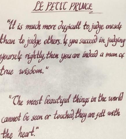
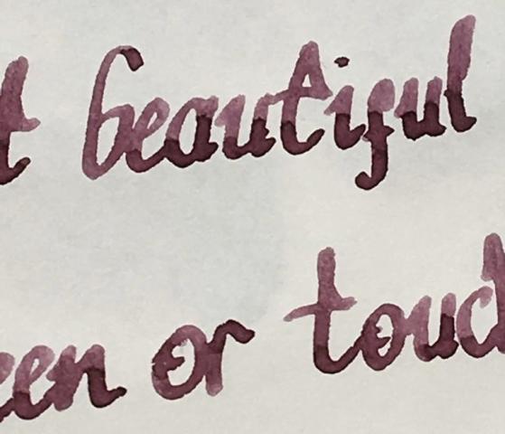
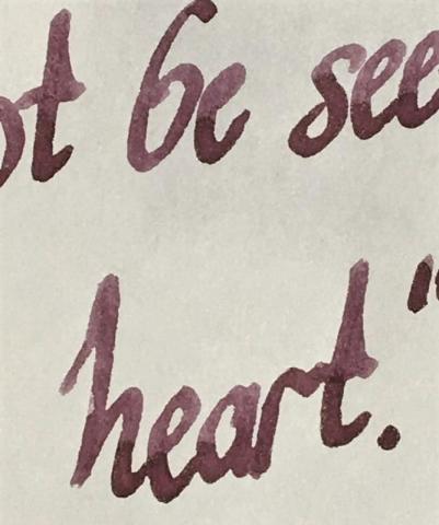
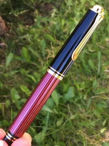
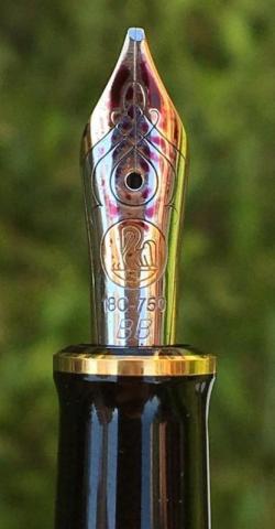
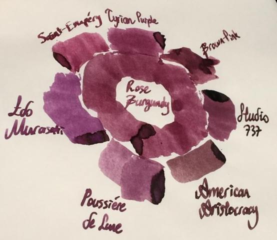
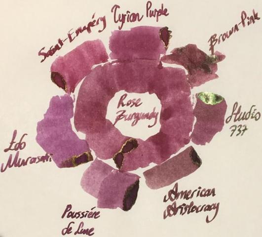
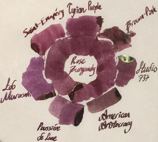
Hello dear FPNers, We have a common enemy. An enemy who is obsessive to take out what we have in our bank accounts or even what we got in our purses. A decisive, a talented, a perfectionist, a world wide known enemy who keeps releasing some magnificent items which we really don't need to but have to buy. Please welcome, Montblanc Le Petit Prince The Planet - Rose Burgundy: It is part of Le Petit Prince The Planet collection. It has the standard 50 ml cube-shaped bottle of Montblanc. It is freshly released. As far as I see, it is not claimed to be "limited edition", but it seems like. Don't know. The colour is a dusty burgundy red with hints of brown: I specifically did not filter this photo. Note that the photo is taken in a very bright time of day. The ink seems to be more vivid and more red than it really is. Actually, above version is what most people would expect to see when reading the name of the ink, I think. However, the colour seems to be more realistic in this tuned photo below: Yes, it is a bit brownish, maybe a litte bit greyish than what a burgundy red name recalls. This ink does not have an exact match of colour in ink literature as far as I know, but KWZ Brown-Pink is the closest one I suppose, which is a bit brighter, more vivid ink. Here are some writings with two lovely quotes from the book: Some close-up shots: Lovely shading, isn't it.. Note that, before moving on to ink properties, the pen I chose for this review is a Pelikan M605 in red: This pen normally comes with a 14k nib, but I found an 18k BB nib on Ebay and upgraded (!) it. Really, upgrade? It is a debate issue. Some likes 14k more since they are likely to be more springy. Of course it is also related to nib shape and the other contributors of alloy. Whatever, this nib is not a nail like my Aurora 88's 18k nib, but not amazingy soft either. It just has a small cushioning, that's all. I tuned its wetness and worked on the tip so that it is a wet stub now: Lovely. Saturation: Rose Burgundy has medium saturation. It is partially a washed out colour, but it cannot be said that it has low saturation I think. Sheen: Very little. Shows a distinct bronze sheen when you pour over huge amounts on Tomoe, but during normal writing, you will probably not see any sheen. Shading: Has a lovely shading. I loved it. Not the most shading ink, though.. But still above average. Shimmer: None. Wetness: Rose Burgundy is a dry ink, just like most Montblanc inks. I had specifically chosen a wet BB nib to compansate the potential dryness of this ink before I got the ink. But still, with very light pressure, this pen made some skippings on smooth Clairefontaine paper. Ink makes you really feel it is dry; not as dry as a Pelikan 4001, but still a dry ink. Feathering: Not detected, not likely to feather. In this term, quite a well behaved ink. The back page of Tomoe: Bleeding: Not detected, not likely to bleed. In this term, quite a well behaved ink. Showthrough: Some distinct showthrough on Tomoe but every ink has a showthrough on Tomoe, so it shouldn't be a criteria I think. So I tried it on 80 gr white Rhodia paper: And the back page is: An acceptable level of showthrough. If you zoom in at a sunny day outside, every ink will showthrough a little bit. So I can say this ink has a low amount of showthrough, like many other Montblanc inks. Water Resistance: I made a water test on Tomoe only: Let's see: Veeery little water resistance, nearly none. If you were about to find the equation of travelling in speed of light and if a cup of coffee spills over your papers, humanity would probably lost a few decades until some other person finds it. For me, it is nice. I love inks with low water resistance because they are cleaned easily. Similar Colours: As stated above, I think the closest ink in terms of colour is KWZ Brown-Pink. But there are some other powerful candidates: Diamine Tyrian PurpleMontblanc Antoine de Saint-Exupery, Encre du DesertJ. Herbin Poussiere de LuneSailor Studio 737I know it is not a very matching colour, but I wanted to compare it with Iroshizuku Edo-Murasaki also. Because Edo-Murasaki has the similar slightly washed out pastel characteristic of Rose Burgundy, except the former is a purple, not a burgundy brown. Another weak candidate is Noodler's American Aristocracy. It is not a very similar colour to Rose Burgundy, but I wanted to show the answer of question "What would happen if this ink was a bit browner?", so I added this one. Here are the swabs on Tomoe: And on Rhodia: I thought a rose of colour on Tomoe would help in exact comparison of Rose Burgundy with others. Again, I thought providing both the unfiltered and filtered versions would give some insight about the true colour. Unfiltered shot, slightly taken from side: Too bright, too warm, colours are more vivid than they used to be. Rose Burgundy is not this red normally. So here is filtered version: which suits better to reality I think. Another shot from a more perpendicular angle, which shows some sheen, again unfiltered first: And filtered version: Well, this last picture summarizes the results in terms of colour pretty well. Compared to Rose Burgundy: American Aristocracy is too brown, they seem like irrelevant. But with naked eye, American Aristocracy has some purple or burgundy red tones. If both inks are written with wet vintages, I think they will be likely to seem similar.Studio 737's base colour is much more pinkish, but it has high amount of green dye in it, making it a more complex, a darker colour with brilliant green sheen. Note that 737 is my favourite purple.Poussiere de Lune is closest in terms of being dustiness, but it is much more purpler and a bit greyish compared to Rose Burgundy. Besides, Poussiere de Lune gives green sheen whereas Rose Burgundy gives bronze sheen, which is of course valid when poured over Tomoe paper at high amounts for both inks.Edo-Murasaki is the most magenta ink out of all mentioned candidates. It does not have a vivid pinkish structure as much as 737 does, less greyish than Poussiere de Lune and it has definitely a more magenta undertone than Poussiere de Lune. It is pinker than what a medium purple should be. It has similar dusty characteristic evoking the Rose Burgundy.Saint-Exupery is the most red ink in this comparison. It is much redder than dusty Rose Burgundy, and definitely a more vivid colour.Tyrian Purple is a close colour to Rose Burgundy, but a bit pinker than it. It is a bit more "burgundy red" than Rose Burgundy, actually. Also, Tyrian Purple is more vivid, though being not a very saturated colour, it shows its colour better than Rose Burgundy.This part is a bit tricky. I said KWZ Brown-Pink is the closest colour I have in my inventory. Note that I am responsible of my own samples and pictures I provided you. I made a literature research on Brown-Pink's colour, and saw veeery different tones. Compared to those photos of KWZ on internet, Brown-Pink's colour provided by me is not that purplish, but rather a dusty pink with some chestnut hints. Actually, I think, base colour of Brown-Pink is lighter than Rose Burgundy, but Brown-Pink includes a considerable amount of green dye, making it a darker, a more vivid colour. CONCLUDING REMARKSThis is a dusty brownish burgundy red. A "unique colour" description would not be very wrong. This is a pale pastel colour with high shading.If you want saturated, vivid lines of colour, this ink doesn't seem to satisfy you.If you are on the train of sheen-craziness like me, this ink is not for you.There is no shimmer. It has a medium saturation I can tell. Doesn't deserve to be called "lowly saturated".It has nearly no water resistance. Didn't try yet but seems like it will be cleaned from pen very easily.It's kind of a dry ink. Try using it in wet nibs, even gushers or vintage pens, to get the maximum of it.Price is about 35 Euros, same as Montblanc Petrol Blue. It is definitely not a cheap ink, but not the most expensive one either. I am not sure if it deserves this price. I would buy it anyway since I am an ink nerd. There are cheaper alternatives in terms of colour, but not the exact same. Right now, I am suspicious that I will buy another bottle, because the colour seems to be a bit pale for my taste. But it is a unique colour, and it has the potential to be the ink of serious writings in moody days with a wet, unproblematic, reliable pen. If I start to enjoy the colour much more by putting it in my vintage Pelikan M400 with OBB nib, I may continue to buy this ink. Hope you enjoyed. Thank you..
- 16 replies
-
- montblanc
- montblanc rose burgundy
- (and 8 more)


