Search the Community
Showing results for tags 'brown'.
-
Long due thread... In a page devoted to Italian pens, this topic is calling all the expressions of one of the most recognizable Italian materials ever used in fountain pens: the mythical Arco celluloid! Made worldwide famous by the Officine Meccaniche Armando Simoni (OMAS) in Bologna in their Extras and Paragons, Milords and Princesses and Damas, and proposed here and there by other brands and independent manufacturers, the Arco celluloid is the quintessence of "italianity" in pens: warm, refined, flamboyant and unique. Judging by the prices fetched by Arco celluloid pens in these days, is seems that the "Arco fever" is strongest than ever, and I can understand why... Let me begin with a few photos of some of my Arco:
- 148 replies
-
- arco celluloid
- omas
- (and 4 more)
-
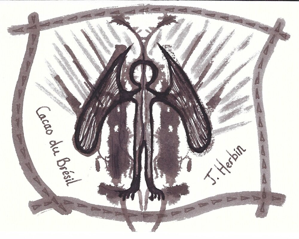
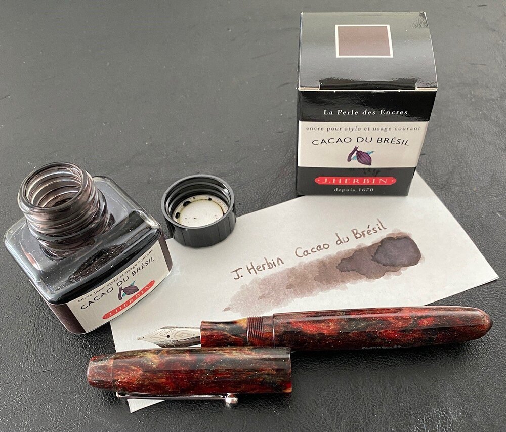
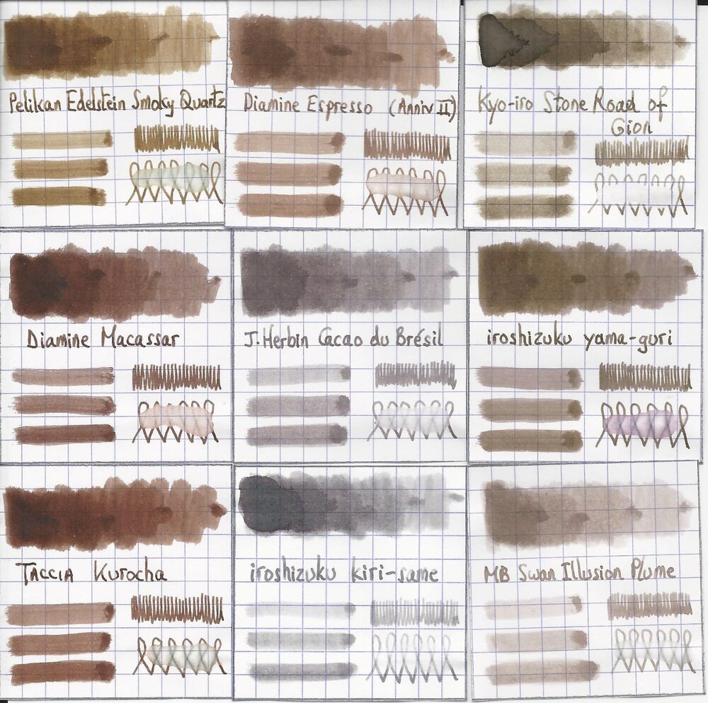
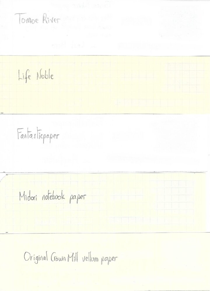
J. Herbin - Cacao du Brésil This is my first review after the "Fall" - the November 2020 outage of FPN. I wanted to take this opportunity to express a heartfelt thank you for the huge amount of effort by Wim and the FPN Admin team to bring our favourite forum back online. You guys rock! La Société Herbin, Maître Cirier à Paris, was established in 1670. This makes J. Herbin probably the oldest name among European ink makers. Today, Herbin produces a range of beautiful fountain pen and calligraphy inks, writing instruments, gift sets and accessories. Herbin inks are made in France, and the finishing touches on the bottles are still done by hand in Paris. J. Herbin is probably best known for their inks in the “La Perle des Encres” series. In this review, the spotlight shines on Cacao du Brésil, which is one of the stars in this line-up. This ink immediately managed to seduce me — it’s simply a superb writing ink, a gorgeous cool grey-brown colour with excellent saturation even in the finer nibs. Also tons of elegant shading, that starts to appear with F nibs, and really delivers with broads. Definitely my type of ink, and — in my opinion — one of Herbin’s best! J. Herbin inks come packaged in simple 30 ml bottles. These bottles are merely adequate, and not really well-suited for piston-fillers — they are not very deep, and piston-filling from a half-empty bottle can be a challenge. My trick is to fill an ink-sample vial with ink, and piston-fill my pen that way. Cacao du Brésil makes a great match for my Edison Collier Red Dragon, which is the beauty in the pic below. Cacao du Brésil writes a saturated line with quite satisfactory lubrication, even in drier pens like my Lamy Safari. With wetter pens the ink leaves a deeply saturated grey-brown line, and loses a bit of its prominent shading. To illustrate the colour span of Cacao du Brésil, I did a swab on Tomoe River paper where I totally saturated portions of the paper with ink. This J. Herbin ink shows a medium colour range, without too harsh a contrast between light and darker parts. This translates to elegant shading when writing. On the smudge test — rubbing text with a moist Q-tip cotton swab — the ink behaved perfectly, with only minimal smearing. Water resistance is quite good — the ink survives even longer exposures to water, leaving a light grey residue on the paper which remains very readable. This is also apparent from the lower part of the chromatography. This makes Cacao du Brésil an ink that is perfectly usable at the office. Drying times for this ink are in the 5-15 second range, depending on the type of paper (with the Lamy Safari M-nib). With the more absorbent copy paper that you’ll find at the office, it’s close to 5 seconds. With less absorbent paper, drying times are more in the 10-15 second range. I’ve tested the ink on a wide variety of paper — from crappy Moleskine to high-end Tomoe River. On each scrap of paper I show you: An ink swab, made with a cotton Q-tip 1-2-3 pass swab, to show increasing saturation An ink scribble made with a Lamy Safari M-nib fountain pen The name of the paper used, written with a Lamy Safari B-nib A small text sample, written with the Lamy Safari M-nib Source of the quote, written with a Platinum 3776 Century B-nib Drying times of the ink on the paper (with the M-nib Safari) Cacao du Brésil looks great on both white and more yellowish paper. I didn’t detect any noticeable feathering, just a hint on the notoriously bad Moleskine paper. With Moleskine and GvFC paper, there is some show-through and a tiny bit of bleed-through — but nothing too bad. Overall, Cacao du Brésil behaves exceptionally well. Writing with different nib sizes The picture below shows the effect of nib sizes on the writing. All samples were written with a Lamy Safari, which is typically a dry pen. I also added a visiting pen — a wet-writing Platinum 3776 Century with a broad nib. Here the ink leaves a very saturated line, which leans towards black-brown, taking away some of the more prominent shading you get in drier pens. Related inks To compare Cacao du Brésil with related inks, I use my nine-grid format with the currently reviewed ink at the centre. This format shows the name of related inks, a saturation sample, a 1-2-3 swab and a water resistance test — all in a very compact format. I don’t really have any close matches to this grey-brown in my collection though. Iroshizuku kiri-same — a grey ink with brown undertones — appears to be a distant cousin. My other browns are just … more brown. Inkxperiment – The Fall (Last Leaf Standing) As a personal challenge, I try to create interesting drawings using only the ink I’m reviewing. I find this to be a fun extension of the hobby, and these single-ink drawings often present a real challenge. These inkxperiments allow me to explore the colour-range nuances that are present in the ink. I love doing them! The grey-brown tones of Cacao du Brésil match perfectly with the autumn season in my part of the world. No need to look any further for inspiration. Dark-brown earth, glistening wetly from yesterday’s rain, and on the trees a last leaf clinging to the branch. I started with a piece of 300 gsm watercolour paper, that I thoroughly wetted with water to which I added a bit of ink. I then used a broad brush to draw in the outline of the field and the sky. Next I drew in the tree with the last leaf standing. To complete the drawing, I used a fine brush to add the striped pattern that adds texture to the earthen field. The end result gives you a good idea of the colour range that can be achieved when using Cacao du Brésil in a more artistic context. Conclusion J. Herbin Cacao du Brésil is a great ink: a really special cool grey-brown, that works with all nib sizes and on all types of paper. The ink is also fairly water-resistant, and well suited for the workplace. And it shows some beautiful shading that really gives that extra oomph to your writing. This is an ink that really gives me pleasure — heartily recommended! Technical test results on Rhodia N° 16 notepad paper, written with Lamy Safari, M-nib Backside of writing samples on different paper types
- 26 replies
-
- j.herbin
- cacao du bresil
-
(and 2 more)
Tagged with:
-
I have a new vintage Mentmore. It is a burgundyish/brownish marble pattern. I would like to ink it with something in the burgundy brown family, and I'm not a big fan of watery-looking inks(I know, then I should stay away from vintage, but the vintage are lovely writers and better values at this point). Has anyone had any luck with inks in this family that they have used in vintage pens for more than one or two fills, without incident? I have many brown around the home and I know my Yama-budo will be a no-no, though it would be aesthetically a good match. But form follows function...
- 55 replies
-
- ink for vintage pens
- burgundy
-
(and 2 more)
Tagged with:
-
From the album: Some of Mercian’s inks
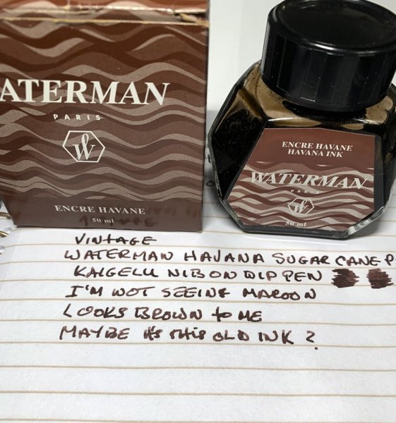
A photograph of a writing sample made with my Waterman Havana. I bought this bottle some time between 1999 and 2004. I strongly suspect the date to be near the end of that period, but cannot remember for certain. I perceive this ink to be ‘maroon’ in colour, rather than ‘brown’. This is particularly evident in the sentence at the bottom of the paper, which was written with a Parker 45 with a steel ‘M’ nib. But it can also be seen in the curve of the ‘D’ in the word ‘BROADER’ in the phrase “BROADER (& WETTER)” that I wrote with a Parker Vector fitted with an italic nib. I do perceive the first sentence that I wrote with the Vector as being more ‘brown’ than the writing that was done with less ink (with the finer nib), but in my ‘normal’ pens (which have ‘F’ or ‘M’ nibs) I always perceive this ink to be ‘maroon’, not ‘brown’.
- 0 B
- x
-
- waterman havana
- havana
-
(and 3 more)
Tagged with:
-
From the album: Some of Mercian’s inks
I have copied this photo from @USG, in order to compare it to a photo that I have taken of my own ‘vintage’ bottle of Waterman Havana. I bought my bottle some time between 1999 and 2004 (I strongly suspect that the purchase date was nearer 2004, but cannot remember for certain). I perceive my Havana as being so red that I regard its colour as ‘maroon’, rather than ‘brown’. That said, in this photo of the Havana owned by USG, the writing does look ‘brown’ to me. This makes me wonder whether Waterman changed the formulation of Havana some time in the late 1990s.
- 0 B
- x
-
- waterman havana
- brown
-
(and 1 more)
Tagged with:
-

Waterman Absolute Brown (aka Havana) from the review by Intensity.jpeg
Mercian posted a gallery image in FPN Image Albums
From the album: Some of Mercian’s inks
Waterman Havana (now known as Absolute Brown). I have taken this photo from this review of this ink that was made for FPN by Intensity. I have ‘borrowed’ it in order to illustrate how very ‘maroon’ (rather than ‘brown’) this ink can appear to be.
- 0 B
- x
-
- waterman havana
- havana
-
(and 4 more)
Tagged with:
-

Waterman Havana (aka Absolute Brown) ‘chromatography’.jpeg
Mercian posted a gallery image in FPN Image Albums
From the album: Some of Mercian’s inks
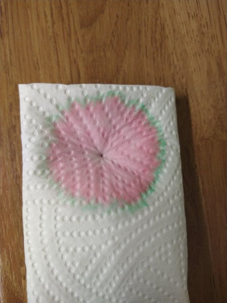
This is a photo of what was left on the kitchen towel when I was wicking plain water through a pen to try to flush out the remnants of its fill of Waterman Havana (aka Absolute Brown). This is, clearly, not an example of ‘proper’ chromatography, but it does show the preponderance of the magenta/pink dye component in this ink. I am trying to justify my description of this ink’s colour as ‘maroon’, rather than ‘brown’.
- 0 B
- x
-

Waterman Havana (aka Absolute Brown) and Diamine Chocolate Brown.jpeg
Mercian posted a gallery image in FPN Image Albums
From the album: Some of Mercian’s inks
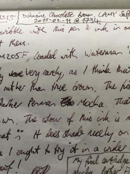
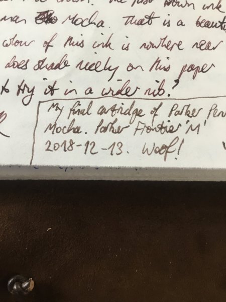
A photo of the scrawl in my ink-testing book. This is a comparison of Diamine Chocolate Brown (top) with Waterman Havana (nowadays sold as Absolute Brown) underneath. At the bottom of the frame is some text in Parker Penman Mocha. My intent in this photo is to illustrate how ‘maroon’ the Havana appears to be.
- 0 B
- x
-

Waterman Havana (now aka Absolute Brown) in comparison to Parker Penman Mocha.jpeg
Mercian posted a gallery image in FPN Image Albums
From the album: Some of Mercian’s inks
A close-up of my scrawl in my ink-testing book. The text at the top of the picture is in Waterman Havana (nowadays sold under the name ‘Absolute Brown’). The text at the bottom is in Parker Penman Mocha.
- 0 B
- x
-
- waterman
- waterman havana
- (and 7 more)
-
Here's my scans of Monteverde Brown both bottle and cartridge. I was excited when I got the carts as the packaging had "copyright 2010" on it, possibly the original formula but in testing it sure seems to be the same as the bottled ink. With the bottle ink, I had bad problem with hard starts and really bad skipping on block letters with first 2 pens I tried, a Kaweco Sport M and a Hemisphere M (wasn't as bad with cursive's long, continuous strokes). Had same problem with Jinhao Safari M so tried a Luxor Vector and it worked perfectly there. But I left the Jinhao sit overnight and when I tried it the next day, the hard stops and skipping were gone, so probably didn't let ink feed completely on 1st 2 pens. Tried a Baoer 801 F after the Vector and was surprised when a big drop of ink fell on paper during a pause while writing! I saw that if I just held the pen, nib down, a drop of ink would form fairly quickly (maybe 1 1/2 mins?) on the end of the feed and then drop onto the paper unless I started writing before it fell. The ink can really be described as "gushing" on that Baoer, laying down a then but very wet line. That 's the 1st time I've encountered ink dripping from a pen like that. Carts arrived and I flushed the Jinhao and put one in it; for the bottle ink, I kept the Vector and added a Pelikano M, a pretty wet writer with a broad line. The Jinhao is also fairly wet, though not like the Baoer was. On cheap memo book paper, all 3 pens performed well, not too wet as the paper absorbed quickly. Color was like the 3 bears - Vector F a nice medium shade, Jinhao a little darker and Pelikano definitely darker. That matched the line width - Vector thin, Jinhao a smidge thicker, Pelikano thick. Feathering on the memo was really minimal, only the Jinhao showed an ever-so-slighty fuzziness. I've added a new test book for trying out inks, a Strathmore Sketch pad; it has thick, very white paper with a "fine tooth surface" and is actually intended for dry media. I like it because it is so white and doesn't absorb the ink so readily; I've come to realize how much the absorbency of cheap paper, especially the little memo books I was using, can affect the color I'm seeing and that the hard white surface of the Strathmore pad gives me a better idea of what the ink should look like. The difference between the three pens was even more pronounced on the Strathmore. The Vector's line seems a little thinner while the Jinhao's seems a little heavier. Ink glistens as it's laying down, indicating the wetness. Most surprising is the color, though; now the Jinhao line is darker than the Pelikano. Results on the scan are closer to the memo paper than to the sketch pad in that regard. Some shading is also noticeable on the Strathmore, most obviously on the Pelikano but some on the Vector, as well. Overall, I like this particular color of brown. I would call it medium-dark brown that's not too light or too dark, it's not reddish or orange-ish, it's not really yellow-ish, either, it's just a nice brown. It's very wet - watery, I guess you'd call it, so you might have to try it in a few pens before you find one it works well in. By the same token, there's lots of good browns in this range from other manufacturers so there's no particular reason to chose this one over others unless you like this particular shade, like I did when I saw Sandy1's review. Price on ebay runs $14-15 (incl ship) for a generous 90ml bottle. I stumbled on a bargain (spurring me to buy), $5 +$4 ship. The cartridges, I paid $4.45 for 3 6-packs w/ free shipping; that works out to 19 cents each - can't beat that. So, without further ado, onto the scans. Scans seem reasonably accurate. My thanks to Sandy1 for both the original review and the encouragement to post one myself.
- 16 replies
-
- monteverde
- brown
-
(and 2 more)
Tagged with:
-
I just noticed these today on AliExpress: which are purportedly new limited-edition, market-exclusive colours for China. They are listed by that seller at the same price as the gold-trimmed translucent colours in the regular line-up (Bourgogne, Laurel Green, Chartres Blue); the available nib options are F and M only. The net price of US$112.55 (plus tax, where applicable), after automatic and/or easily accessible discounts, is marginally less than the Japanese domestic market MSRP of ¥18,000(+tax) for the regular colours going by today's exchange rates. Free international shipping included (at least for Australia, Belgium, Mexico, UK, US and Zimbabwe, as far as I've checked just now). The inclusion of a converter with silver trim in the retail package seems a bit out of place for either of those colours, especially when previously the silver-trimmed converters are sold at a slight premium over the ‘standard’ gold-trimmed ones.
- 10 replies
-
- xihu (west lake)
- cha (tea)
- (and 8 more)
-
As well documented in Visvamitra's epic review of all the Sailor Kobe inks, there are many interesting inks in this line. Sumiyoshi brown is one. Many, if not most, browns on the market today have a strong red component, and there are very few cool browns available. This ink is one. I find it has a very vintage vibe to it. The origin of this ink could be in the Japanese brush painting tradition, but perhaps someone with better knowledge of this could confirm that. This ink is not a match for the classic Parker Penman Mocha, but it leans much more in that direction than many other brown inks available today. I like this ink quite a bit. The change from the usual fare is welcome, and the handling is classic Sailor. The ink is also almost totally waterproof. The usual papers were tested: Mohawk via Linen=MvL, Tomoe River=TR, Hij=Hammermill 28 lb inkjet. The images were taken with an old Canon Powershot P50 indoors in natural light or in the shade. While some ink is washed away, the vast majority stays behind. Quite impressive.
-
desaturated.thumb.gif.5cb70ef1e977aa313d11eea3616aba7d.gif)
Pilot Iroshizuku Kiri-same vs Herbin Cacao du Brésil
A Smug Dill posted a gallery image in FPN Image Albums
-
- pilot iroshizuku
- kiri-same
-
(and 5 more)
Tagged with:
-
TAG Kyoto – kyo-iro Stone Road of Gion TAG is a stationery shop in Kyoto (Japan) that produces some interesting soft watercolour-style inks. With the kyo-iro series they produce a line of inks that that are inspired by the city’s many beautiful and historic sights. Each of these inks is dedicated to a specific town in the Kyoto area. The inks come in 40 ml bottles, packaged in luxurious thick paper with a texture that feels like heavy watercolour paper. In this review the center stage is taken by Stone Road of Gion. The cool grey-brown colour of this ink is a reference to the stone-paved streets of Kyoto’s Gion district, where it’s still possible to glimpse a traditional geisha-san with her apprentice. This ink’s colour ranges from a soft almost sepia-brown to a a much darker grey-brown. A cool-toned brown that I like best in its most saturated grey-brown incarnation – wet pens are your friend here. Personally, I would have preferred that the ink would be a tad darker-looking, with more of that lovely grey-brown at the lighter side of the spectrum. This ink is a heavy shader, with quite some contrast between light and darker parts. Shading looks best with drier pens, where contrast is more subtle. With wet pens the shading looks harsher, due to the increased contrast between the sepia-brown light parts and the much darker grey-brown. For optimal results, you need to hunt a bit for the right pen/nib combination. In my case, the ink looks great with my Pelikan M405 Tortoise Brown with a F cursive italic nib. This combination delivered the right combination to get both good saturation and not-too-harsh shading. Be aware that Stone Road of Gion is a very dry ink. It’s not a pleasant experience when using dry-writing pens or EF nibs – it feels like you’re fighting the paper. Stick to wet pens with this one! To show you the impact of saturation on the ink’s look & feel on paper, I made some scribbles where I really saturated portions of the 52 gsm Tomoe River paper with ink. This gives you a good idea of what the ink is capable of in terms of colour range. Stone Road of Gion has a fairly wide colour span, which translates to strong shading that can sometimes be a bit harsh. I personally prefer my shading to be soft & delicate, so with this ink I had to hunt for the right pen/nib combination. The ink’s chromatography clearly shows the grey undertones in the ink, with hints of pink and orange in the mix. It’s also clear that most colour dissipates with water – this is not a water-resistant ink, which is confirmed by the water test at the end of the review. I’ve tested the ink on a wide variety of paper – from crappy Moleskine to high-end Tomoe River. On every small band of paper I show you: An ink swab, made with a cotton Q-tip 1-2-3 pass swab, to show increasing saturation An ink scribble made with an M-nib Lamy Safari The name of the paper used, written with a B-nib Lamy Safari A small text sample, written with the M-nib Safari Source of the quote, with a Platinum 3776 Century with B-nib Drying times of the ink on the paper (with the M-nib Safari) The ink looks good on all papers, but is really at its best on off-white paper (not yet creamy, but moving in that direction). I noticed a tiny amount of feathering on lower-quality papers (mostly Moleskine and the printing paper in my test set). Also a small amount of bleed-through on the lower quality paper. Overall, a nice-looking cool brown, but personally I would have preferred an even darker brown colour. Since scans alone are not always enough to give you a complete picture of the ink, I also provide you with a few photos for an alternative look at Stone Road of Gion. In this case, the photos work best to represent the ink – in the scans, the contrast in the ink’s shading is too exaggerated. Writing with different nib sizes The picture below shows the effect of nib sizes on the writing. Stone Road of Gion writes with good contrast in all nib sizes, but feels very dry in the EF/F nibs (with the Lamy Safari). Writing quality improves substantially with wet pens. With wet-writing pens, the ink gets more saturated and moves to much darker grey-brown tones. In my opinion, that’s the sweet spot for this ink. Combine it with an off-white paper, and it just looks great. Related inks To compare this kyo-iro brown with related inks, I use my nine-grid format with the currently reviewed ink at the center. This format shows the name of related inks, a saturation sample, a 1-2-3 swab and a water resistance test – all in a very compact format. My personal preference would be an ink that looks like iroshizuku yama-guri at the low saturation point, and Stone Road of Gion at high saturation. Inkxperiment – walking home I love to experiment with my inks in an artistic context. With these inkxperiments, I limit myself to the single ink I’m reviewing, allowing me to explore all of its colour range nuances. I love this part of the review: experimenting with different techniques, and trying to coax many different shades of colour from the single bottle. For this drawing, I used an A4-sized piece of HP photo paper. I wanted to do a landscape with a dark sky, but the clouds turned out to be way too dark and weird-shaped. Instead of starting over, I tried to salvage the drawing, turning the clouds into trees, and adding the town on the horizon line. I finally added the walking people as a foreground subject. The trees lacked life, so I sprinkled bleach on top of them to add some sparkle (a bit too much, to be honest – at the right side the bleach burned away too much of the ink). Nevertheless, the end result is not too bad for a salvage operation – I’m quite satisfied with it. The picture definitely gives you an idea of the many colour tones you can extract from this kyo-iro ink. Conclusion TAG Kyoto kyo-iro Stone Road of Gion is a cool-toned grey-brown with a wide contrast range. A heavy shader that looks best in wet pens and on off-white paper. The ink is really dry, and you need to hunt for the right pen/nib combination with this one. A nice enough ink, but not one that really wow-ed me. Technical test results on Rhodia N° 16 notepad paper, written with Lamy Safari, M-nib Back-side of writing samples on different paper types
- 13 replies
-
Mont Blanc - Swan Illusion Plume When Mont Blanc brings out a new pen, you can be sure that there is an LE ink to accompany it. With the MB Patron of Art Ludwig II pen comes the mysteriously sounding "Swan Illusion" accompanying ink. A bit of digging on Wikipedia removes the mystery though: Ludwig II from Bavaria (1845-1886) is also known as the Swan King, hence the ink's name. The ink's packaging looks lovely, and shows a not so easily described colour... brown? sepia? grey? I'm not quite sure what to make of it. But for me, grey-brown best captures the mood of this ink. The box also suggests a broad colour spectrum spanning from very faint light greyish brown to a really dark grey-brown colour. Looks promising. Swan Illusion delivers on the promise: the ink has a unique colour. I would definitely classify it as a brown that leans heavily towards the grey. Quite a captivating colour, and one that I really like. The ink has relatively low saturation, which translates into a subdued and somewhat faded look. The result on the page is well-balanced though, and makes for easy reading. There is tons of shading in this ink, but this only shows up in broader nibs. This is not an ink for fine nibs, use a B or above to bring out its beauty. The ink itself lacks a bit of lubrication, especially in drier pens like my Lamy Safari. With my wetter Pelikan pens this was not a problem; here the ink writes like a dream. The ink also has a wonderfully dynamic colour span. To illustrate this, I did a swab on Tomoe River paper where I really saturated portions of the paper with ink. This beautifully illustrates the ink's broad colour range. Swan Illusion moves from a very light sepia-brown to a very dark brown-grey. Impressive! On the smudge test - rubbing text with a moist Q-tip cotton swab - the ink behaved perfectly. Water resistance is amazing - the ink effortlessly survived even longer exposures to water. Kudos! This is also apparent from the lower part of the chromatography, which shows that the grey components of the ink remain on the paper. If you need a water-resistant ink, Swan Illusion certainly fits the bill. The chromatography also shows that this is a wonderfully complex ink, with tons of undertones - orange, yellow, blue… Swan Illusion is also a fast-drying ink - with typical drying times in the 5-10 second range with my Lamy Safari (M-nib). As such, this ink is also suitable for lefties. Also: fast drying times and water resistance make it a perfect ink for the workplace. And the ink's classy looks will certainly draw attention. I've tested the ink on a wide variety of paper - from crappy Moleskine to high-end Tomoe River. On each scrap of paper I show you:An ink swab, made with a cotton Q-tip1-2-3 pass swab, to show increasing saturationAn ink scribble made with a Lamy Safari M-nib fountain penThe name of the paper used, written with a Lamy Safari B-nibA small text sample, written with an M-nibDrying times of the ink on the paper (with the M-nib)Swan Illusion looks really nice on most papers, but not on Tomoe River. Here the ink looks too washed out for my taste. On Moleskine, there is some bad chemistry going on, resulting in a hideous look. The ink looks simply gorgeous on Fantasticpaper, Paperblanks and OCM cotton paper. With the exception of Moleskine, I didn’t notice any feathering or bleed-through. All-in-all a well-behaving ink. Inkxperiment – Cubistic Dimensions As a personal experiment, I try to produce interesting drawings using only the ink I'm reviewing, keeping things simple and more-or-less abstract. I find this to be a fun extension of the hobby, and have found such single-ink drawings a nice challenge. It also gives you an idea of what the ink is capable of in a more artistic setting. For this drawing I used 300 gsm rough watercolour paper. I started off with water-diluted ink for the lighter parts in the drawing, gradually adding more ink to the mix for the darker parts. The highlights in the drawing were obtained by painting in some bleach - the ink reacts nicely with the bleach producing a golden-yellow colour. The end result gives you a good idea of the colour span that Swan Illusion is capable of. ConclusionMont Blanc's Swan Illusion LE ink is a great ink with a unique grey-brown colour, that immediately attracted me. The ink totally fits my taste: nice complexity, subdued and with non-aggressive shading. And as a welcome bonus: fast-drying and water-resistant. What more can you want. Personally, I really really dig this ink ... it's currently in my top 3 of best inks of 2018. In my opinion, an ink to grab while it's out there. Technical test results on Rhodia N° 16 notepad paper, written with Lamy Safari, M-nib Backside of writing samples on different paper types
- 77 replies
-
- mont blanc
- swan illusion
-
(and 2 more)
Tagged with:
-
As many know from Visvamitra's epic review of the Kobe Nagasawa line of inks made by Sailor, these are the most extensive line of Sailor inks. Originally they were 50 inks. But they've been adding a new ink every now and then so the line is up to #55 or #56 now. This is #52. I love sepia inks, but as dpritch's epic review of Sepia inks shows, the color range on this ink is quite large. And this one is kind of over at the red-brown range which often gets called "sepia" in the labeling and marketing romance of inks. This is one of the few inks that when I received it and inked up, I was a bit disappointed. The color wasn't anything what I would call "vintage sepia". Now perhaps the folks at Kobe Nagasawa and Sailor have an example of a vintage sepia ink that appears now like this hue. And to it's credit the ink does have a nice golden-brown undertone instead of the typical red. But whenever I look I it I still see "red-brown". I have so many of these kinds of inks that I'm reluctant now to consider a new brown ink for the collection. There's nothing wrong with the handling of this ink. It's classic Sailor. Wet, lubricated, saturated. There is some nice subtle shading with the ink that probably isn't captured in the images. My typical test papers are: Mohawk via Linen=MvL, Tomoe River=TR, Hammermill 28 lb inkjet paper. The last is the driest of these papers in that an ink that feels nice on other papers can have some resistance there. Somewhat water resistant but a lot of ink washes way and that could obscure what one wants to save. A very interesting ink drop. There's possibilities here.
-
Noodler's isn't a brand that needs an introduction. One of the first of the "new" ink brands, Mr. Nathan Tardiff produces an almost dizzying array of inks, many with specialized applications (non-freezing Polar inks) and unique qualities (bulletproof and security inks) or incredible dye load and saturation (the Baystate colors) as well as regular old good inks. The labels for his inks are equally noted for their wit and creativity, and sometimes you just have to have a bottle of one of his inks just because the label is so cool or outrageous even though you know you'll never use that color. Be that as it may, Kiowa Pecan is a lovely golden brown ink. Many ink brands have a brown ink, but the golden browns are much more rare. Sailor has some in their store-exclusive line, and I'm sure there must be something in the extensive Diamine and DeAtramentis lines, but I'm not so familiar with their inks, which is probably my loss. The ink shades well, dries fairly fast, and is quite water resistant, but not waterproof. On Tomoe River the shading is wonderful. I can only imagine what calligraphic beauty flex nib lovers can create with this ink. No staining on the converter at all but because the ink is mostly waterproof, you do need extra effort to fully clean the feed. Definitely a good ink to have in your repertory if the color is to your fancy. Now my only issue is that the swabs and samples on the web show very different inks. This ink was purchased from Anderson Pens in February of this year. And the color here looks like what I see in their sample and swab. But other online shops show a much darker color and swab. So you may want to check if that's important to you. The usual papers here: Mohawk via Linen=MvL, Tomoe River=TR, Hammermill 28 ln inkjet=Hij. A very unusual mixture of dyes to produce this ink. For those doing ink washes and the like you may get some interesting separations.
-
TAG Kyoto – kyo-no-oto ochiguriiro TAG is a stationary shop in Kyoto (Japan) that produces some interesting soft watercolour-style inks. With the kyo-no-oto series they produce a line of inks that replicates traditional Japanese dye colours. According to available only info, the manufacturing process of the kyo-no-oto inks follows traditional dying techniques dating back to the Heian era between the years 794 and 1185. The inks come in 40 ml bottles, packaged in luxurious thick paper with a texture that feels like heavy watercolour paper. In this review I take a closer look at ochiguriiro, a soft warm brown that works great as a journaling ink for the late-winter season in my part of the world. The colour is supposedly named after the colour of freshly fallen chestnuts. An interesting brown, this one, with a colour that sits somewhere between iroshizuku yama-guri and J. Herbin Lie de Thé. Quite different from the other brown inks in my collection. This ink was a welcome surprise after the dry to very dry kyo-no-oto inks I tried earlier. It writes wet with excellent lubrication, even in the drier Lamy Safari pens. It’s also a well-saturated ink that can handle all nib sizes, including the finer ones. I prefer the ink’s look in finer nibs, where it produces a softer pastel-brown line. My perfect pairing is with a Pelikan M400 Tortoiseshell Brown with a fine cursive-italic nib (see nib sizes sample below) – this combination of ink & pen looks simply gorgeous. To show you the impact of saturation on the ink’s look & feel on paper, I made some scribbles where I really saturated portions of the Tomoe River paper with ink. This gives you a good idea of what the ink is capable of in terms of colour range. Ochiguriiro has a fairly broad contrast range. Fortunately, there is no harsh contrast between the light and dark parts. As a result you get strong shading that avoids being excessive, giving extra elegance to your writing. Well executed! The chromatography shows the complex nature of this kyo-no-oto ink, with dark red-orange and grey-blue in the mix. The bottom part of the chroma suggests a fair amount of water resistance, but this is not reflected in the real world. With water tests, there does remain a ghosting image of your writing on the paper, but it’s very faint making it nigh impossible to reconstruct your writing. Not an ink that can survive watery accidents. I’ve tested the ink on a wide variety of paper – from crappy Moleskine to high-end Tomoe River. On every small band of paper I show you: An ink swab, made with a cotton Q-tip 1-2-3 pass swab, to show increasing saturation An ink scribble made with an M-nib Lamy Safari The name of the paper used, written with a B-nib Lamy Safari A small text sample, written with the M-nib Safari Source of the quote, with a Pelikan M400 wit F cursive italic nib Drying times of the ink on the paper (with the M-nib Safari) Ochiguriiro works well with all test papers, with just the tiniest bit of feathering on the low quality papers (Moleskine, cheap notepad & copy paper). No issues with show-through or bleed-through, with the exception of the crappy Moleskine. Drying times are mostly in the 5 to 10 second range with the Lamy Safari M-nib. I like this kyo-no-oto ink best on the creamy paper, where it gains extra warmth and softness. Very nice-looking brown! I’ve also added a few photos to give another view on the ink. In this case, the scanned images seem to capture the ink’s actual colour best. Writing with different nib sizes The picture below shows the effect of nib sizes on the writing. Kyo-no-oto ochiguriiro lays down a wet and fairly saturated line in all nib sizes. This one easily handles F and EF nibs – it evens shows some shading with the EF nib, which is not a mean feat. My perfect pairing for this ink is my Pelikan M400 Tortoiseshell Brown with an F cursive italic nib I bought from fpnibs.com. With this combo the ink looks gorgeous – you get really elegant shading and line variation. Just perfect! Related inks To compare this soft warm brown with related inks, I use my nine-grid format with the currently reviewed ink at the center. This format shows the name of related inks, a saturation sample, a 1-2-3 swab and a water resistance test – all in a very compact format. Ochiguriiro is quite different from my other browns. My first thought when using the ink was that it looked similar to Lie de Thé or Edelstein Smoky Quartz. But in a side-by-side comparison, ochiguriiro looks more of a grey-brown. Not as grey a brown as iroshizuku yama-guri though. This ink sits somewhere in the middle between grey- and yellow-brown. Inkxperiment – playtime I find great satisfaction in creating inkxperiments using only the ink I’m working on. A fun and at the same time challenging way to show off the colour-range nuances that are present in the ink. And I definitely enjoy the monochromatic look of the resulting drawings. For this inkxperiment, I decided on an interpretation of a cat playing with a mouse. I’m lousy at realistic-looking drawings, and therefore tend to go for a more abstract interpretation. Ochiguriiro with its broad colour span made it easy to get a good-looking result. I started with an A4 piece of watercolour paper. I first drew in the cat figure with a pencil, and then painted in the checkered background with heavily water-diluted ink. As a next step, I coloured the cat figure while adding ever more ink to the mix. Final accents on the cat and the drawing of the mouse were added with my Lamy fountain pen and pure ochiguriiro. The resulting picture shows what can be achieved when using this kyo-no-oto as a drawing ink. Drawing with ink is fun but challenging. You can’t paint over ink to correct mistakes – it just doesn’t work. So I learned to live with less than perfection, and tolerate errors in the drawing as being part of the creative process. And this drawing definitely has its number of mistakes: the square next to the cat’s head is too wide, some bleed-out of ink in the cat’s body, and the cat’s ears are out of proportion. But who cares… I had great fun drawing this one. Conclusion I’ve tried a number of TAG Kyoto inks to date, and love them all. This line of inks really fits my taste – I’m glad I discovered them. Ochiguriiro is a surprisingly wet and satured ink in the kyo-no-oto series. An earthy brown – sitting somewhere between grey-brown and yellow-brown - that looks great on creamy paper. I was impressed with the shading in this ink – quite heavy but still not harsh – really well executed in my opinion. If you enjoy warm brown inks, this one is certainly worth a closer look. Technical test results on Rhodia N° 16 notepad paper, written with Lamy Safari, M-nib Back-side of writing samples on different paper types
- 8 replies
-
- tag kyoto
- kyo-no-oto
-
(and 2 more)
Tagged with:
-
Recommendations for a warm medium-dark brown ink!
collectorofmanythings posted a topic in Inky Thoughts
Hello! Unfortunately I can’t seem to find an ink that makes me completely happy. I would like a warm medium-dark brown ink, but that doesn’t have an olive-y look and has good shading. Noodler’s Walnut has a purplish undertone, Jacques Herbin Terre D’Ombre is too olive-y and on Apica paper it is so dark. Herbin Lie de Thé is a little too light, and Diamine Chocolate Brown is just a little bit too dark. I know this is very specific, but do any of you have recommendations? I am not sure if this is the place to put this post, if not please say so. Thank you so much for your help! W. H. Major -
Three 'taupe' (grey brown) fountain pen inks, two French, one German: J. Herbin La Perle des Encres Cacao du Bresil L'Artisan Pastellier Classique Brun Ours Rohrer & Klingner Schreibtinte Sepia These three colors are very close. Two of them are nearly indistinguishable, at least to me, but there are differences. I'm tentatively planning a combined review of these three similarly-colored inks but, in the meantime, here's a teaser quiz: three writing samples with my normal, quick note-taking hand, all using the same type of pen - 3 different Pilot 78Gs with 'B' nibs, a dry pen with a fairly crisp italic nib that I enjoy a lot - Rhodia paper from a pad, and each writing sample uses a different one of the above three inks. The photos were taken in the same light at nearly the same time (late afternoon indirect sun). The goal of this quiz is to match the ink - Cacao du Bresil, Brun Ours, & Sepia - used with each writing sample: A, B, & C. After you have had a few days to take a guess I will try to post chromatography photos. And your impressions of the inks are welcome and encouraged, of course!
- 21 replies
-
- taupe
- grey brown
-
(and 5 more)
Tagged with:
-
James Purdey & Sons Single Malt scented ink was released in 2018 by Montblanc as part of a series in collaboration with James A. Purdey, a gunmaker and hunting lifestyle brand. The ink surprised me! Single malt scented ink sounded at first like a (overpriced) gimmick and to some extend it is of course. But the color is a deep, beautiful orange-brown with amazing shading. Definitely a fall color which can be used in both a business environment (note taking) as well as for personal writing and correspondence. Be careful though, when opening the bottle or the pen cap the whisky scent is quite strong. It might be frowned upon at 830am when the meeting starts... The scent fades quickly though, within minutes. After 20-30 minutes the smell of the paper itself always wins. The ink behaves like most Montblanc inks I own. Perfect behavior in a broad, wide nib. A bit dry and with a strong dislike for TWSBI pens. The shading is wonderful, no feathering, and no show-through. Drying time is well below average at roughly 22 seconds. As can be seen, the ink doesn't really appreciate water. This ink is the most bright, orange-brown ink I have. SBRE brown (P.W. Akkerman) is not far off, Comte de l'Or (produced by Diamine) is much more gold (of course), Herbin's café des Îles and Caroube de Chypre have far less orange in them and are a more true brown. The ink will definitely gain some attention in the office, but I will use it for a while. I really like it. N.B. Review written on Original Crown Mill Vellum paper
-
- 4 replies
-
- waterman
- absolute brown
- (and 4 more)
-
This is the second brown ink I am reviewing together with the Vaikhari - it is a nice medium brown from Noodler's - called Kiowa Pecan. I haven't had much good luck with Noodler's inks - for one reason or the other, most of them havent worked well for me. This one though, is probably the Noodler's that I like the most and gives me least trouble. In comparison with Vaikhari and Iro Yama Guri. N-KP is lighter than both , though some shades are very similar to Vaikhari - However, the Vaikhari has auburn/ burnt sienna tinges on the lighter shades and Kiowa Pecan's lighter notes tend toward golden browns. Dry times are on the longer side; about 30 secs on these scrubbies with a Bock F nib. But real life writing seems to dry much faster. Overall: I really like the color and how the ink behaves with most papers. the shading is beautiful, encompassing a wide variety of browns. This is a great ink from Noodler's.
- 18 replies
-
- noodlers
- kiowa pecan
-
(and 3 more)
Tagged with:
-
Manufacturer: Parker Quink Series, colour: Washable Brown Pen: Waterman Hemisphere „F” Paper: Image Volume (gramatura 80 g / m2) Specifications: Flow rate: good Lubrication: good Bleed through: unnoticeable Shading: noticeable Feathering: unnoticeable Saturation: very good A drop of ink smeared with a nib The ink smudged with a cotton pad Lines Water resistance Ink drying time Ink drops on a handkerchief Chromatography Sample text in an Image Volume (80 g / m2) Sample text in an Oxford notebook A5 (90 g / m2) Sample letters in a Rhodia notebook No 16 (90 g / m2) Palette of shades
-

Waterman Aztec And Absolute Browns Reviews And Comparison
IThinkIHaveAProblem posted a topic in Ink Comparisons
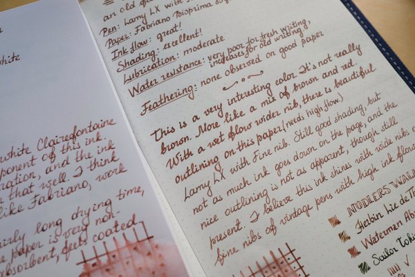
I like vintage ink I like the idea that ink that was made in the 30s, 40s, 50s and 60s HAD TO WORK It had to be relatively trouble free and it had to perform as expected. This was after all, a time when fountain pens were simply PENS. They were expected to write and write well. On that note, I recently bought a bottle of Waterman's Aztec Brown. The bottle is almost NOS. Using it, I found that I really like it. This is a problem as the stuff is getting expensive. So, I decided to get a bottle of the current Absolute Brown and compare them to one another. Here are the results: Waterman's Aztec Brown 2oz bottle, vintage (1940s-50s)Bought on eBay Jun 2020for $10 This brown leansonly a little red-ishInk has that vintage Waterman's smell (Phenol?)Flows great, no surprisethere. No bleed or feathering except on the worst quality paper Goodshading + lots of vari-ation depending on thepen used. (Dry Times) Wouldbuy again?Yes Shading: Good/MediumSaturation: Good/MediumFeathering: Some/Low-ishSpread: Low-NilBleed: Low-NilCleaning: Very Easy Waterman Absolute Brown50ml bottle The PaperyJun 2020. This is Waterman'scurrent brown formu-lation. It used to be called Havana BrownAs a Waterman ink itflows well and behaveswell. Like Aztec Brown there is a lot of differencefrom pen to pen. It isslightly redder + darker thanAztec Brown. That may be due to Aztec's age. (Dry Times) Would Buy Again?Yes! Shading: Good/MediumSaturation: Good/MediumFeathering: NilSpread: NilBleed: NilCleaning: Easy Notes: Good butSlightly redder replacementfor Aztec Brown










.jpg.fb9f536b1a0944c4538729b10ffcff79.jpg)

