Search the Community
Showing results for tags 'bronze age'.
-
I've been looking at this fountain pen for a while, and based on people's positive reviews, I thought I should buy this unique pen. I went for an offer on Ebay that is lower than the retail price. Is this legit? Or did I get a fake?
- 20 replies
-
- visconti
- homo sapiens
-
(and 1 more)
Tagged with:
-
Fine Writing Bronze Age Ef (Expanding Long-Term Review)
TheDutchGuy posted a topic in Fountain Pen Reviews
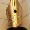
Context Fine Writing is a Taiwanese company, making mostly high-end pens. Their more affordable pens tend to have striking designs and consist of a series of time-limited models. What's in stores now will not be there forever and what Fine Writing might cook up next is unknown until they release it. There are two earlier Fine Writing reviews here on FPN, as far as I could determine: one for the Bronze Age and one for the Golden Armour. When I first saw photos of the Bronze Age, I knew I had to have one, even though I'd vowed never to buy another pen with a generic Jowo or Bock nib (not that those nibs are inferior, just a matter of personal preference). In other words, this is the first pen that I've ever bought purely because of its design. Packaging, pricing, nib options These pens can be bought in various online stores for prices ranging from €85 ro €99. The nib options are EF, F, M, B and 1.1 mm stub. Nib colours are chrome, gold or black. The pen is packaged in a brown cardboard box and comes with a small booklet, a converter and a pipette. There is no clip. While some may wish for a more lavish box, personally I am happy with the cardboard box. Lavish boxes cost money and I'd rather spend my money on the pen itself. Also, for those who discard boxes, the cardboard can be recycled and is free of plastic and metal. The pen is C/C but can also be eye-droppered, hence the pipette. In eye-dropper mode, the pen holds a HUGE amount of ink, even more than the Opus 88 Demonstrator (which is also an eye-dropper). The converter seems to be identical to the ones that Kaweco uses and appears to be a generic design. Design The design of this pen is striking and I love it, though of course beauty is in the eye of the beholder. The engraved brass cap and filial and the brass section look really nice and the clear acrylic (I assume it is acrylic) barrel make for a unique appearance. The nib is a Jowo #6 engraved with the Fine Writing feather logo. You can unscrew the collar that contains the nib and feed from the pen, which is both easy to do and convenient. I chose an EF. Here are some photos of the various parts of this pen: Dimensions and ergonomy In terms of size, the pen is larger than I'd expected it to be. It's halfway between an Pelikan M800 and an Opus 88 Demonstrator. Below is a picture that compares the Bronze Age to these two pens and to some other pens: a Parker Vacumatic Jr, a Torca, an Onoto #5601, the M800, the Bronze Age, the Opus 88 Demonstrator, an Esterbrook SJ and three Boston pens. Despite its size and appreciable weight, the pen fits my hand very well indeed. To my surprise, it is very comfortable to hold and I can use it for longer periods of time without fatigue. I don't have to search for the right way to hold it. For me, that is quite rare. Only a few of my pens offer me such ease and comfort, though of course this is very personal and subjective. The nib and how it writes Because I prefer narrow lines and an uncluttered, open, clean appearance of text, I chose an EF. That is somewhat of a risk with generic nibs from brands like Jowo and Bock. I've seen many such EF's with asymmetric nib cuts, misaligned tines and other maladies. A good EF, which writes a crisp, narrow line with enough smoothness to be pleasant and comfortable, but also with enough tactile response for good control, that's not easy to do. The F nib on my Opus 88 Demonstrator is also a #6 Jowo and I lucked out with that one - it's a really good steel nib that gives me pleasure every time I use it. So, how well does the EF of the Bronze Age hold up...? Well, pros and cons, really. Proper flow of ink right out of the box, not too dry, not too wet. But it will become a lot wetter once more ink goes out of the barrel and more air comes in (if you don't want that, use a cartridge or a converter). Only a few words of writing were enough to alert me that the tines were not completely aligned. Visual inspection quickly confirmed what my hand had already told me: they were slightly but noticeably misaligned. Something else that I immediately noticed was a certain degree of 'character' to the writing, a very subtle difference in line width between downstrokes, sidestrokes and diagonal strokes. While I adore such an appearance of the written text, in an EF nib it is usually a sign of an asymmetric nib cut and indeed my Bronze Age has such an asymmetric cut (though I have seen much worse). Basically this means that the slit is not in the middle, so one tine is larger than the other. Sometimes the smaller of the two tines is slightly rotated so that the slit is not of equal width from top to bottom. As I mentioned, this is not uncommon and I have seen it on steel nibs from Kaweco, Leonardo (both Bock), Bock itself and Jowo. If you're lucky, the asymmetric cut will add character to your writing without feeling rough, without drag and without flow issues. In this sense I've been lucky several times, but initially the Bronze Age was sub-par. The nib offered good control, had good flow but it just did not feel right. On Rhodia, there was noticeable drag and on all papers that I tested on, some styles of writing just had too much unpleasant feedback, whereas other styles felt smooth. I had to search for a pleasurable writing experience and I don't want to do that - I want the pen to please me, instead of me finding a way to please the pen. Anyway, it took me half a minute to align the tines and another minute to find and remove the minuscule burr that caused the unpleasant feedback. In terms of control, tidiness, character and comfort of writing, the pen immediately became a pleasure to use in every style of writing that I know. Of course, this is a rigid nib and you should not try to flex it in any way. Here are some writing samples on Rhodia, Oxford and Tomoe and a comparison with some other well-known pens: ^--Oxford 90 g/m^2, comparison with Sailor 1911 Standard (M) in top row ^---Tomoe ^--Rhodia ^--Comparison of various other well-known pens Verdict A pen is meant for writing, and the writing is done with the nib, so the business end of a pen has to be really good and really pleasurable. That steel Jowo #6 is the least expensive but most important part of this pen. It required a few interventions on my part to make it do what it is supposed to do, but to be fair many pens using nibs like this require some tuning. Once that was done, wow. The design, execution, comfort, size, ink volume (4 mL!!)... just wow. I can see myself putting in a gold nib at some point in the future, but I did 90 minutes of non-stop writing with the pen and every minute was rewarding, relaxing and enjoyable. The luxury of being able to choose a cartridge, a converter or to eye-dropper it is quite nice. For what this thing costs, you get one helluva pen. I can see myself becoming very attached to this pen very fast. Edit: added additional info on nib removal.- 18 replies
-
- fine writing
- bronze age
-
(and 4 more)
Tagged with:
-
I've found (and bought) the Visconti Homo Sapiens Bronze Age Oversize for 400€ on the german Ebay (the same seller also has the Dark Age for 429€). Link: https://www.ebay.de/itm/VISCONTI-Homo-Sapiens-F%C3%BCllhalter-Bronze-OVERSIZE/ Within Germany, it arrived within 24 hours after ordering it - and you are able to return it within 30 days (if Viscontis QA failed on the pen you received for example).
- 2 replies
-
- visconti
- homo sapiens
-
(and 2 more)
Tagged with:
-
My Homo Sapiens Bronze Age has always been a little problematic - prone to hard starts, skipping, and also ironically gushing and burping into the cap - but now it's developed a new problem that renders it all but unusable: It's got a slow leak at the center band on the body. Ink seeps from the bottom of the band, under the letter H in Homo Sapiens, spreads all the way around the bottom of the band, and then starts to spread slowly down the body of the pen. I can clean the body and the band thoroughly, but holding any kind of absorbent material to the band shows new ink seeping from under the H, and in a matter of minutes enough ink spreads around the bottom of the band to stain fingers when handling the pen. It's become a pen that cannot be uncapped without staining the fingers. Couple of questions: Is this a "known problem" that others have experienced? Is there really a seam of some sort at the band on the body that ink could be coming through? Any ideas for investigating/fixing the problem?
-
Dear friends, I bought a fountain pen Visconti HomoSapiens bronze age (oversized) on ebay from a seller who declared the pen as new. When I received it, I noticed that the letter "I" of the logo had a defect (according to the photo). Do you think it's possible that the whole logo will peel? Is it common for these pens to happen?
-
Hi! I'm probably going to purchase one in the next few weeks but I have never owned a Visconti and I was wondering if anyone here could tell me if I can refill it with standard international European cartridges. Thanks! Kind regards, Dingan
- 12 replies
-
- visconti
- homo sapiens
-
(and 1 more)
Tagged with: