Search the Community
Showing results for tags 'broad nib'.
-

Review of the ONOTO Magna Rosso w/ 18K broad nib
donnweinberg posted a topic in Great Britain & Ireland - Europe
This is my review of a new, currently produced Onoto Magna Classic Rosso fountain pen, with a broad 18K nib. First, some photos of what I'm talking about. (1) Onoto gives you a choice of box for your new pen, either a "high gloss lacquered presentation box" or a "leather pen roll with a leatherette box." I chose the former, which is pictured here: The lacquered box is quite attractive and solid and comes in the cardboard box. When one unwraps everything and opens the wood box, here is what you get (I don't show the polishing cloth, but one comes inside a glossy cardboard holder): The blue "Onoto" ribbon actually is on the outside of the black cardboard box's paper wrapping, so the effect is that of a fancy gift. Next, here are photos of the pen itself: I ordered this pen with only two extra-cost options; I got the 18K nib (in broad width), which cost $209.16, and the "extra weight" option (shown in the photo looking into the barrel; the brass insert), which cost $20.92. Other options available are: (a) nib modification to stub, italic, or other ($87) ; (b) customized engraving ($40.67) ; (c) an additional rollerball conversion kit ($87.15) ; or (d) a plunger-fill converter ($290.50), which you can't get with the extra weight option (that special converter won't fit). The base price of the pen with a bi-color steel nib in either F, M, or B is $463.63. These costs reflect the exchange rate between Pound and Dollar at the time of the order in January. According to the Onoto website page for this pen, the following are the important measurements: Length capped: 127mm = 5.0" Length posted, including nib: 166mm = 6.535" Length of cap: 67mm = 2.638" Barrel Diameter range: 11 - 13.2mm = 0.433" - 0.52" Cap Diameter range: 14 - 15.8mm = 0.55" - 0.622" Weight: 25g (standard) or 32g (with extra weight option) Cap Weight alone: 13g The cost of shipping from the U.K. to Baltimore was approximately $25 (19.99 pounds), using today's exchange rate. So, this is an expensive pen, and many of you justifiably will want to compare it's value with that of it closest competitors. I'll leave that exercise to you all. In the meantime, here are my relatively early impressions of this pen: The 18K broad nib is two-toned. It writes with a medium-to-broad stroke and is on the firmer side, but is by no means a "nail." In fact, it writes with a silky smoothness, gliding across nice paper in a satisfying way. Depending on how you write, but considering how I write, there was some subtle shading in the various strokes of the pen. I provide a writing sample a bit lower here. The cap takes about 4-5 turns to remove and relocate on the barrel. For some, that is too many turns, and I'm inclined to agree, but for me this issue is minor. The cap can be posted quite easily and sits securely on the end of the barrel. I don't generally post my caps, and on this pen I see no reason to with this pen. As this pen has the extra weight option in which a brass (or other metal) cylinder is inserted into the barrel, this pen could not be purchased with the plunger-filler converter option. I purchased the pen with the standard twist converter, as shown. I filled the pen in the typical manner, and it wrote immediately and smoothly. I have been writing with it every day for 3 weeks, and I have not had any hard starts or skips. The pen writes beautifully. The resin body and cap feel warm and solid. The color is a bright red and is quite beautiful to my eyes. The ink being used in this pen is Private Reserve Black Cherry. Here is a writing sample: I am happy that I purchased this pen. I welcome any comments or questions you may have about it. -
I am interested in why people don’t change their handwriting to accompany their nib size.
collectorofmanythings posted a topic in Fountain & Dip Pens - First Stop
So I just have a little question.. Why don’t people just change the size of their handwriting to accommodate the nib size? I hear so many people say some things like, ”I would love this pen, but it has a medium nib and it makes my handwriting look blobby.” Or, “I just dislike extra-fine nibs so much, they put down too fine a line for my handwriting.” And when I hear this I just wonder, “Well why don’t you write a little bit bigger or smaller?” I am not talking about people complaining about extra-fine nibs being too toothy or broad nibs being too smooth, but the specific things about people’s upset on how it makes their handwriting look blobby or shaky or whatever else. It just seems like people have their handwriting size set in stone, when I know my handwriting personally gets larger or smaller depending on whether I am using a broad or fine nib. Thank you all for your responses, William- 81 replies
-
- question
- questioning
-
(and 4 more)
Tagged with:
-
From the album: OldTravelingShoe's Random Pics of European Fountain Pens
© (c) 2022 by OldTravelingShoe. All rights reserved.
- 0 B
- x
-
From the album: OldTravelingShoe's Random Pics of European Fountain Pens
© (c) 2022 by OldTravelingShoe. All rights reserved.
- 0 B
- x
-
From the album: OldTravelingShoe's Random Pics of European Fountain Pens
© (c) 2022 by OldTravelingShoe. All rights reserved.
- 0 B
- x
-
From the album: OldTravelingShoe's Random Pics of European Fountain Pens
© (c) 2022 by OldTravelingShoe. All rights reserved.
- 0 B
- x
-
From the album: OldTravelingShoe's Random Pics of European Fountain Pens
© (c) 2022 by OldTravelingShoe. All rights reserved.
- 0 B
- x
-
Interesting observation going from a Broad to XF nib
dftr posted a topic in Fountain & Dip Pens - First Stop
Getting ready to start hoboniching next month so I had to start using my one XFine FP... since my favored Broad nibs are just too overwhelming and write too big. But here's the wacky thing I started noticing with my journal that my default writing w/ the XF doesn't get me that many more words per line, words per page than the Broad! For the past week, I had been thinking I was writing twice as much to fill the page... With that being said, if I concentrate I can scrunch up the writing to increase word density, and the hobonichi has 3mm grids so that may encourage that kind of writing. It just cracked me up to see my cognitive bias exposed! Hell, maybe I'll use my broad nib after all... except I have a 140 XF I ordered on the way as a backup -
Shadow nibs make for interesting writing, but they are really a useful tool when learning a script written with a broad nib. They make your nib angle and stroke direction more obvious. Thus, they make it easier to identify (and correct) errors. David
- 3 replies
-
- broad nib
- shadow nib
-
(and 3 more)
Tagged with:
-
Shadow nibs make for interesting writing, but they are really a useful tool when learning a script written with a broad nib. They make your nib angle and stroke direction more obvious. Thus, they make it easier to identify (and correct) errors. David
-
- broad nib
- shadow nib
-
(and 3 more)
Tagged with:
-
Hi folks, I had my eye on a 51 on Ebay that only had four fairly uninformative photographs and fairly minimal description (made in Canada, Parker 51), but the nib looked potentially interesting (though a little out of focus) It could have been blurriness - or a very broad nib. I made an offer of £20, and figured at worst I would have a parts pen. Turned out to be a 1947 vac-fill 51 in reasonable condition, with a seriously broad stub nib. I've only dipped it so far, but it writes really nicely. I'm waiting for a diaphragm & shellac in the post (my last bottle of shellac dried out), and I've been soaking the nib in clean water for the last couple of days. I can't wait to get it up and running! 51 Vac, broad stub nib by Robin Inkysloth, on Flickr 51 Vac, broad stub nib by Robin Inkysloth, on Flickr
-
Your Favorite Pen You Have (With A Twist)
sub_bluesy posted a topic in Fountain & Dip Pens - First Stop
Not exactly your prettiest pen or your best writer but the pen that you get along with the best. The one you would never flip for whatever reasons ignoring sentimental value. An absolute keeper. For me it's my Omas Paragon Ludovico Einaudi signature edition with a broad nib. I know we have pens on the opposite spectrum that have been combative every step of the way for no reason at all. I have one in mind right now so there must be something to this both positive and negative. I ordered this Omas new after they went under. It was one of their last pens and the only year of the "signature" collection as far as I know. I got the pen from a retailer in Germany about a year ago. The deal almost didn't go through though due to a clash in price and some translation issues but cooler heads prevailed, and I'm glad they did! I've never had a seller simply respond to a reasonable offer with just "no". Then there was the USD to Euro exchange rate. Lots of obstacles in this transaction. This is the only Omas in my collection that was tuned at the factory and it's just perfect! It's never had a bad day and looks great no matter what. Always a perfect writer regardless of ink. It's even my girlfriend's favorite pen, connoisseur of pilot G2's with only a Platinum Preppy to her name. There's something about this pen. I swear it was blessed by the Pope himself! Let's hear your stories of special pens that can do no wrong! -
Bonjour - having experienced some stops / drying out with BayState Blue in a 146 90th anniversary edition Broad nib, I tried some other inks in addition to the bottle of J. Herbin Éclat de Saphir on hand. The Éclat de Saphir looks the most vibrant after BSB, then MB Royal Blue. Thanks for your thoughts.
- 16 replies
-
- ink
- montblanc 146
- (and 7 more)
-
Visconti Homo Sapiens Corsani 90 Limited Edition, Broad Nib
MCWB posted a topic in Fountain Pen Reviews
Visconti Homo Sapiens Corsani 90 limited edition, broad nib Stylograph Corsani is an Italian shop selling pens, watches, leather goods and accessories since 1924. For their 90th anniversary in 2014, they commissioned Visconti to make a limited edition of 79 fountain pens (corresponding to the shop's street number) and 11 rollerballs (to make 90 pens in total). These pens are based on the Homo Sapiens, using the grey stacked celluloid as used in the Wall Street (and others). The Visconti Homo Sapiens probably needs no introduction for many people here, and if it does there are many reviews in this forum alone, so I will try to focus on things particular to my pen and gloss over things that are common to other Homo Sapiens models. I purchased this pen in June 2016. I had certainly seen it before and contemplated buying one, but given its rarity and the time since it was first offered for sale, I just presumed that it would have long since sold out. To my surprise, an email from Stefano Senatore at Stylograph Corsani revealed that this was not the case! 1. Appearance & Design (10/10) I am a massive sucker for the Visconti stacked celluloid, and it goes beautifully with the Homo Sapiens design. A functional bonus of using this material is that it is partially transparent, so you get a very subtle ink window through which you can inspect the remaining ink level (unlike the lava Homo Sapiens, which doesn't have an ink window). The trim ring just above the section has "Corsani 1924-2014" instead of the usual "Homo Sapiens", which is a nice touch. Instead of the normal Visconti logo, Stefano personalised the pen with my initials on the end of the cap (at no charge, using the Visconti MyPen system). He also included the normal Visconti logo with the pen; this can be easily swapped in or out using a magnet. This is a nice additional personal touch. 2. Construction & Quality (10/10) Not much to say here, everything works as expected and the cap latch system ensures that the reflective surfaces in the celluloid all line up when you cap the pen in a particular orientation. This is excellent attention to detail and is certainly not always the case with pens made from these stacked celluloids. 3. Weight & Dimensions (10/10) Like the Homo Sapiens, this is not a tiny pen but it's not ridiculously big and heavy either. For a size comparison, from top to bottom: Homo Sapiens Corsani 90 LE, Wall Street LE, Opera Master LE, Skeleton (titanium). 4. Nib & Performance (6/10) This pen comes with Visconti's 23 K Pd "Dreamtouch" nib. It's a dual tone nib, which is fine, but I think an all-rhodium nib might have suited this pen better asthetically. Not a massive deal either way though. Nibs are where Visconti falls down far too often IMO. I asked Stefano if he had this pen with a broad nib that didn't have a case of baby's bottom (as I have had on other Visconti B and BB nibs). He tested 3 (!) for me, and reported that he had found one that didn't hard start. Fantastic customer service, but says a bit about Visconti's QC! When the pen arrived, it indeed did not hard start, but it was quite scratchy. A quick investigation revealed that the tines were misaligned. I am confident enough with adjusting tine alignment, so I sorted the problem out myself (took me about an hour all up, over a couple of days). It now writes very well, but at this price point I don't think that's really good enough. The other thing I didn't expect about this nib is that for a broad Visconti nib it's actually very stubby (in the writing sample below, compare the figure 8s against the WSLE 18K B nib). I like writing with stubs so don't mind this but if I was expecting a rounded broad nib (and I was) then it's something a bit unexpected and potentially undesirable. Again, it doesn't exactly inspire confidence in Visconti's nib QC procedures. 5. Filling System & Maintenance (9/10) Visconti's Double Reservoir Power Filler has been discussed at length elsewhere; I like it overall. It certainly allows a lot of ink to be taken up in one fill (especially if you push out the air remaining in the barrel after the first fill and fill a second time), but it can be a bit of a pain to clean out. Great if you need to cut the ink supply off from the nib (e.g. if you're flying). 6. Cost & Value (9/10) As mentioned, Stefano included my initials on the cap using the Visconti MyPen system for no charge; he also included a Markiaro leather pen case as a gift (unbeknownst to me). Added to the excellent customer service already mentioned, I think these add some value to the experience. As a non-EU customer, I paid € 483.61 for this pen. This is certainly not a cheap pen by any stretch of the imagination, but for a rare and attractive pen I think it's fair, especially considering the normal cost of Homo Sapiens LEs. Shipping to Australia was by DHL Express and cost € 45. Again this is certainly not cheap, but I finalised payment on Tuesday night Australian time and had the pen in my hands on Friday afternoon, which is seriously impressive. 7. Conclusion The Homo Sapiens line includes quite a few different limited edition materials, including the Crystal, Florentine Hills and London Fog. Pairing up the Homo Sapiens body with the beautiful stacked celluloid is genius. If this pen also came in the blue, green and red celluloids I would be seriously tempted to buy all of them! After a bit of work the nib is now to my liking, so there's now nothing I don't like about this pen. Expensive? Yes. Worth it? Absolutely.- 12 replies
-
- visconti
- homo sapiens
-
(and 3 more)
Tagged with:
-
Can anyone tell me how broad the broad nib used by Delta on their Dolce Vita series is? Do they run a little narrower than most?
-
First let me start off by saying I recommend flushing a Lamy Safari right when you get it. I had some starting issues at first. However after awhile the ink flowed pretty well. I am aware now that in the factory they are tested and ink will be left in the feed. This pen is very broad in my opinion, after using a medium Japanese Nib it feels massive. However that is because it is a broad german sized nib, from what I understand. Ink flow is dry at the moment for my liking but i still havent flushed it because i've not gotten my converter and have no bulb syringe. I like the pen but the ink that comes with it is sub-par after using Noodlers Blue in my Pilot Kakuno. (Review soon to come) All in all a good pen for someone who likes very a broad nib. Happy writing!
- 10 replies
-
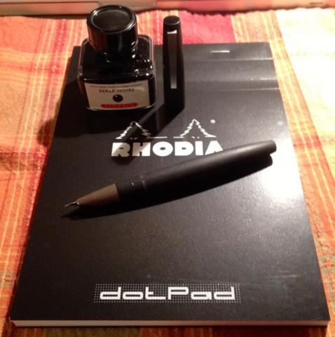
Be nice, this is my first review and I'm new. LAMY 2000 REVIEW Body: makrolon Nib: broad Ink: J. Herbin “Perle Noir” Paper: Rhodia Dot pad # 16 Vendor: Pen Chalet (for all items) This fountain pen has been written about for a long time and at length, by much more experienced people than myself. That said, I think those who are relatively new to FPs and a certain pen may offer a perspective that is beneficial or informative to other newbies or people who have not owned or wrote with this pen. That said, I feel like I am late to the party. APPEARANCE: I would imagine that this pen either speaks to people or it doesn’t. I don’t think it is polarizing, if you will, as much as people either “get it” when it comes to the whole purity of form following function, or they don’t. I can only speak for myself and the aesthetics of this pen are right smack in my wheelhouse. I think the design is simple, sleek, and drop dead beautiful. 5/5 BUILD QUALITY: I have looked, felt, and tested every centimeter of this pen and I am impressed. The body is perfect and uniform in color. The transition between barrel and piston-knob is practically invisible to see and feel. I am astonished by the fact that I LITERALLY have to hold it under a bright light and angle perfectly in order to even see the transition. The same goes for the transition of barrel to grip section, only more so, as in totally and completely seamless by touch. The clip springs with just the right amount of feedback and flexibility. The cap snaps securely and is removed easily, with just the right amount of effort. Even the “grip clips” or extensions, or whatever you want to call them, are not that big a deal unless you are your grip is high and heavy. I wrote with my fingers on them so I could say I did and wanted to know what it felt like. To me it felt like no big whoop. YMMV. 5/5 SIZE & WEIGHT: It is hard to grade a pen on these qualities given that we are all different and these qualities are inextricably linked to the size of our hands, fingers, grip, etc., so on, ad infinitum. For me, it felt perfect. The material and purchase I was able to achieve was ideal, the pen seemed neither light nor heavy, and perfectly balanced. As a rule, I don’t post. I just don’t. I think pens don’t look as good and usually, and this is just my opinion, become back heavy. I posted this pen so I could write about what it felt like and I HONESTLY plum forgot. Now, it does post deeply and securely, all without much pressure, so that is atypical, in and of itself, IMHO. The pivotal moment for me was when I had pen in hand I no longer wanted to just ogle and or study it, I wanted and NEEDED to ink it up and start writing! I am new to this game and that was a first for me. Full disclosure, I am a modern minimalist at heart, so do with that information what you will. 5/5 ß-- for ME, YMMV PERFORMANCE: Threw caution to the wind, didn’t flush with water or anything else, just filled and put nib to paper. I was rewarded with a nice wet line and consistent flow of ink. I have read about this pen having a small or smaller “sweet spot,” and that was certainly the case for me. The nib, due to being semi-hooded and small to begin with, exacerbates this quality. If you have a tendency to roll your pen, I can see how this might be frustrating for some. Again, a number of variables to consider if you will decide to make this pen worth the trouble and keep it, or a nightmare of annoyance and dump it. I don’t roll my pen and adjusted rather quickly. 4/5 FILLING SYSTEM: Who doesn’t love a lot of ink and being easy to fill, right? I can’t speak about capacity, ease of filling completely, or how difficult and time consuming it is or isn’t. I filled it using only one attempt and the pressure was neither light nor difficult, and gave me the same kind of feedback that when closing a well-designed door. It feels solid and secure, but surprises you by how easy it is to maneuver. The pen is not huge and I am sure the capacity is neither monumental, nor puny. Again, I always seem to come back to a balance of proportion and good design in all things. 4/5 BOTTOM LINE: Okay, lets not beat around the bush here. With an MSRP of $200 and street price of $160, I got mine for $135 on a Cyber-Monday sale from Pen Chalet. At any of the aforementioned prices, this pen is a steal. It is an iconic piece of art that functions superbly. The quick and easy removal of its cap, size and weight, coupled with higher than average ink capacity and what appears to be all but unbreakable (nib aside, of course), I totally get why people use this as their day-to-day, go-to workhorse. I obviously don’t have to worry about paying $200 for this pen, but if I was in a shop and could try it in a variety of nibs and was new and know what I know now, I would pay it and be quite happy. As a matter of fact, this might be the pen you buy multiples of with varying nib sizes for different tasks if you like the design. This pen has stood the test of time and Lamy should be congratulated for not fixing something that isn’t broken, but only addressing ways of making it better. People can say what they want about QC all day long, but in the grand schemata, I have noticed that the people who are most vocal about these kind of issues take these matters personally instead of bad luck or that the world isn’t a perfect place. There, I said it. 4.5/5
-
How broad and wet is the twsbi bold nib? Most of the reviews here are for the other nib sizes. I've got a twsbi 580al with bold nib coming my way in about a week, so I was wondering. For comparison, I've been using my only fp so far (platinum 3776 century m nib).
-
I recently ordered a new pen with a broad nib, and got an old classic with what seems to be a broad as well. I have been liking the two stub nibs I have, but the broad rather eludes me...it's just a thick wet line. Any tips for writing with broads (other than bigger writing, I know that one) as far as technique or paper preferences? I have tried several different notebooks and have not yet found a clear paper partner for the broads. Thanks!
-
A very kind person and friend in Chennai, India sourced this pen for me. The P381 aka the "New Classic" was apparently produced between 1992 to 1995 as per this source. link I had heard from some friends that the pens were being sold for really cheap in markets like Singapore. Anyway I came to know that recently the pens had started to become available in Chennai as well, so I requested my friend to enquire which he did. I got the pens for a really good price from the Chennai market, almost too good for a gold nib pen, IMO. The only issue was that only one color, the Vintara-green was available, that too in Broad. Now broad is a nib size that I prefer so I said OK. The pens arrived yesterday. I inked one up today and here is the review: The pens are made of brass with a lacquer coating and gold plated trim. All the Pelikan elements are present, Pelikan logo on cap top, beak clip, and the trim at the ends... It is a slim pen, nearly 5 1/2 inches capped, slightly more than 6 inches with cap posted and nearly 8mm at the ribbed gripping section. The pen employs the Pelikan C/C system, one converter was included. http://i991.photobucket.com/albums/af39/hari3171/Pelikan-P381-B-Green/IMG_8991.jpg http://i991.photobucket.com/albums/af39/hari3171/Pelikan-P381-B-Green/IMG_8992.jpg http://i991.photobucket.com/albums/af39/hari3171/Pelikan-P381-B-Green/IMG_8993.jpg The nib: http://i991.photobucket.com/albums/af39/hari3171/Pelikan-P381-B-Green/IMG_9004.jpg http://i991.photobucket.com/albums/af39/hari3171/Pelikan-P381-B-Green/IMG_9006.jpg http://i991.photobucket.com/albums/af39/hari3171/Pelikan-P381-B-Green/IMG_9005.jpg The pen's ends http://i991.photobucket.com/albums/af39/hari3171/Pelikan-P381-B-Green/IMG_8996.jpg Nib width sticker: http://i991.photobucket.com/albums/af39/hari3171/Pelikan-P381-B-Green/IMG_8999.jpg Ergonomics: Due to my grip, any pen and any size is comfortable for me. This is a slim pen but comparatively heavy at 26gms capped and 18gms without cap. Due to the length I like to use it unposted. First inking: I put in Pelikan Turquoise first, the flow was good initially but it tapered and became sad. I found that the feeder was not conducting properly. Had to remove everything, clean and refit, I then used Waterman's Green after the refit and everything seems to be ok now. Ink still tends to stick to the converter walls maybe it will take some more exposure to the ink to stop this tendency. hopefully. The nib disassembled: http://i991.photobucket.com/albums/af39/hari3171/Pelikan-P381-B-Green/IMG_9008.jpg It is a tiny 23mm nib, made of very thin sheet of gold. Some writing samples: http://i991.photobucket.com/albums/af39/hari3171/Pelikan-P381-B-Green/IMG_9009.jpg http://i991.photobucket.com/albums/af39/hari3171/Pelikan-P381-B-Green/IMG_9010.jpg Line variation: http://i991.photobucket.com/albums/af39/hari3171/Pelikan-P381-B-Green/IMG_9011.jpg I hope people considering purchase will find this useful. Cheers! Hari
- 28 replies
-
Dear pen fans and experts, I recently ordered yet another Pelikan (my fifth), and it arrived in the mail today. It's an M200 with a broad nib. I tried three different inks (Diamine Syrah, Green/Black, and Rustic Brown), and each of those inks looked much lighter in this pen than in the other pens that I have used these inks in. The pen also skipped a bit. I grabbed my loupe, took a look, and saw that the tines were misaligned (weird, because the pen didn't feel scratchy, just dry and a bit skippy). I aligned the tines with my nails (well, I don't think they are perfectly aligned now either, but it's certainly better than before). Result? The pen got much skippier! Apart from that Hero that I have long given up on, this is by far the skippiest pen in my collection. So... Any thoughts/advice before I give up and just order an M400 nib for this pen? I'll buy a new nib if I need to, but then again, I'd kinda prefer saving my money... BTW, I have another M200, only with an M nib. I like that pen very much, but for some purposes, I wanted a broader nib: something comparable to the M400 medium, which is quite a bit broader than the M200 medium. Hence, I ordered another M200, but with a broad nib; and at the moment, this pen isn't doing its job at all... (Yes, I know, some of you will suggest contacting the seller. Well... The problem is that the seller is Amazon.de - the German Amazon - and I don't speak one word of German. Plus, the pen came without a warranty, just as the previous M2xx's that I ordered from Amazon did. So I'm not really sure how I'd go about returning the pen...)
- 27 replies
-
- pelikanm200
- broad nib
-
(and 2 more)
Tagged with:
-
I'm Sure This Has Been Done Many Times Before... But Look At My New Baby!
vmv84 posted a topic in Pelikan
http://media-cache-ec0.pinimg.com/originals/15/de/97/15de9734c8d4fb9be730838d8ac2beb4.jpg Pelikan M805 capped http://media-cache-cd0.pinimg.com/originals/37/3d/4c/373d4c8b9d9d018e565d5f384dad1485.jpg Uncapped ... http://media-cache-ec0.pinimg.com/originals/69/5d/a7/695da7756c1c98b7c8ebe34b12d9c81f.jpg Please excuse the scrabbly writing Oh, and I know the pics are kind of dark but I was working with quickly fading sunlight and a rubbish camera phone... I just wanted to share my joy at finally getting the fountain pen I've been wanting for the best part of 4 or 5 years. The only other expensive fountain pen I own is a Montblanc and that was a gift from my grandfather. My other fountain pens are quite cheap in comparison. The other pen that was my 'grail pen' for some time (and in the back of my mind still is really), was the Pelikan M400 white tortoise - that thing is sooo beautiful. Maybe one day I'll get that. Oh, and if you can't read my writing, the pen is a Pelikan M805 in blue/black with a broad nib. The ink is Diamine Teal. The paper is Kokuyo College notebook. The quote is the opening sentence of Pride and Prejudice by Jane Austen. I originally got the fine nib, which while very smooth I found to be skippy, and I don't think I liked the line it created so much so I exchanged the nib for a broad, which I think suits my writing better. It's a very smooth, wet writer with minimal skipping. I'm happy with the line variation it gives and the shading it adds to the more vibrant ink colours I sometimes use. I also find the nib to be quite springy - when I press harder on the page I get a much broader line and that's nice when I want to write really large curly letters. All in all, I'm very happy with this pen and look forward to using it in my notebooks at home and at work.


