Jump to content

Search the Community

Showing results for tags 'brick red'.

  • Search By Tags

    Type tags separated by commas.
  • Search By Author

Content Type


Forums

  • FPN Community
    • FPN News
    • Introductions
    • Clubs, Meetings and Events
    • Pay It Forward, Loaner Programs & Group Buys
  • The Market Place
    • The Mall
    • Market Watch
    • Historical Sales Forums
  • Writing Instruments
    • Fountain & Dip Pens - First Stop
    • Fountain Pen Reviews
    • Of Nibs & Tines
    • It Writes, But It Is Not A Fountain Pen ....
    • Pen History
    • Repair Q&A
  • Brand Focus
    • Cross
    • Esterbrook
    • Lamy
    • Mabie Todd Research/Special Interest Forum/Group
    • Montblanc
    • Parker
    • Pelikan
    • Sheaffer
    • TWSBI
    • Wahl-Eversharp
    • Waterman
  • Regional Focus
    • China, Korea and Others (Far East, Asia)
    • Great Britain & Ireland - Europe
    • India & Subcontinent (Asia)
    • Italy - Europe
    • Japan - Asia
    • USA - North America
    • Other Brands - Europe
  • Inks, Inc.
    • Inky Thoughts
    • Ink Reviews
    • Ink Comparisons
    • Co-Razy-Views
    • Th-INKing Outside the Bottle
    • Inky Recipes
  • Paper, and Pen Accessories
    • Paper and Pen Paraphernalia
    • Paper & Pen Paraphernalia Reviews and Articles
  • Creative Expressions
    • Pen Turning and Making
    • Pictures & Pen Photography
    • The Write Stuff
    • Handwriting & Handwriting Improvement
    • Calligraphy Discussions
    • Pointed Pen Calligraphy
    • Broad (or Edged) Pen Calligraphy

Blogs

  • FPN Board Talk
  • Incoherent Ramblings from Murphy Towers
  • The Blogg of Me
  • FPN Admin Column
  • Rules, Guidelines, FAQs, Guides
  • Musings on matters pen
  • Marketing & Sales
  • Iguana Sell Pens Blog
  • Newton Pens' Blog
  • Peyton Street Pens Blog
  • holygrail's Blog
  • A Gift For Words
  • I Don't Have a Name; So This Will Do
  • Karas Kustoms' Blog
  • Debbie Ohi's Inky Journal
  • Sus Minervam docet
  • Crud!
  • Clut and Clutter
  • Federalist Pens

Product Groups

  • FPN Pens
  • FPN Inks
  • FPN Donations
  • Premium/Trading/Retailer Accounts

Categories

  • Fonts
  • Tools & Software
  • Rules for Notepads & Paper

Find results in...

Find results that contain...


Date Created

  • Start

    End


Last Updated

  • Start

    End


Filter by number of...

Found 2 results

  1. namrehsnoom

    TACCIA Ukiyo-e Syaraku akasakura

    ink review : TACCIA Ukiyo-e - Syaraku - akasakura TACCIA is a Japanese stationery company, that - as far as I know - is now part of the Nakabayashi group. They offer high-quality fountain pens, inks, pen-rolls, notebooks, etc. More specifically, TACCIA produce a line of inks, inspired by the unique look of Ukiyo-e paintings from Japan’s Edo period (17th century). Ukiyo-e prints are woodblock prints where the work of an artist is carved into wood by woodworkers, and pressed onto paper by printers. This allows the production of multiple prints of an artwork with some different colours as well. The star of this review is akasakura, a brick-red ink that is inspired by the work of Syaraku (Sharaku), an artist that is best known for his iconic portraits of kabuki actors. Inspiration for this ink comes from the portrait of Ichikawa Omezõ I (1781-1833) playing a warrior named Yakko Ippei who was unsuccessful in his attempt to defeat his enemy. This portrait, created by Syaraku in 1794, is part of the collection of the Metropolitan Museum of Art in New York. Akasakura’ s cherry red is modelled after the colour of the actor’s kimono. 
Akasakura is a muted & understated brick-red, that is slightly pink-leaning. It’s a warm red colour that looks quite nice on all types of paper. Not vibrant at all, but soft and easy on the eye. The ink writes with average flow, and works well with all nib sizes - even the finest ones. The ink comes in a 40 ml bottle, that is packaged in a beautiful box showing the corresponding Ukiyo-e painting. Lovely packaging for an excellent ink. 
As is often the case with red inks, this one stains heavily, and requires extra pen-care. It needed a double cleaning cycle to remove all traces of the ink from my pens. 
To show you the impact of saturation on the ink’s look & feel on paper, I made some scribbles where I really saturated portions of a strip of 52 gsm Tomoe River paper with ink. This gives you a good idea of what the ink is capable of in terms of colour range. Akasakura has a fairly narrow dynamic range, ranging from a soft brick-red to a more saturated pink-leaning red. The contrast between the light and dark parts is fairly low, which translates to some beautiful soft shading. The shading appears in all nib sizes - just a hint with the EF nib, but really present with F-nibs and above. The aesthetics are superb, adding lots of character to your writing. That’s why we use fountain pens instead of ballpoints! 
The ink’s chromatography is a work of beauty, and shows the craftsmanship of TACCIA’s ink makers. Ink sommelier Hiroshi Ishiguro and colour consultant Hanse Matsumoto used a mix of mainly pink & yellow dyes to create this soft brick-red akasakura. The chroma shows that most of the dyes migrate with the water, leaving only some residue behind. What’s left on the paper is not really readable, just some smudges that hint at the original text. TACCIA akasakura is not an ink that can survive watery accidents. 
I’ve tested the ink on a wide variety of paper – from crappy Moleskine to high-end Tomoe River. On every small band of paper I show you: An ink swab, made with a cotton Q-tip 1-2-3 pass swab, to show increasing saturation An ink scribble made with an M-nib Lamy Safari The name of the paper used, written with a B-nib Lamy Safari A small text sample, written with the M-nib Lamy Safari Source of the quote, with a Pelikan M600 with M-nib Drying times of the ink on the paper (with the M-nib Safari) Akasakura looks good on all types of paper – both white and creamy ones. I personally like this ink best in combination with the more yellow paper. The ink shows a tiny amount of feathering on lower quality paper, together with some show-through and bleed-through. This is mostly the case with the broader nibs. Overall, it worked really well, even with the notoriously bad Moleskine paper. Drying times with the M-nib Safari are in the 5 to 10 second range. 
I’ve also added a few photos to give you another view on the ink. Scanned images and photos often capture different aspects of the ink’s colour & contrast. That’s why I present them both. In this case, the photos capture akasakura’ s colour best – the scans of the writing samples seem to be a bit too pink. Writing with different nib sizes The picture below shows the effect of nib sizes on the writing. The EF-nib already shows a hint of shading. But it is with the F-nib and above that the ink’s soft & elegant shading really comes into play. It’s this lovely shading that lifts this brick-red above the pack. I personally prefer to use this ink with the wet Pelikan with M-nib, where the shading looks at its best. The shading also looks truly gorgeous with really broad italic nibs - like the 1.9 mm calligraphy nib (but that’s not a typical nib for daily journaling, more something to use on greeting cards). Related inks To compare akasakura’ s brick red colour with related inks, I use my nine-grid format with the currently reviewed ink at the center. This format shows the name of related inks, a saturation sample, a 1-2-3 swab and a water resistance test – all in a very compact format. Kyo-Iro Flaming Red of Fushimi is of the same colour family, but a bit more vibrant. In contrast, TACCIA akasakura looks more muted and dusty. Inkxperiment – fire demon With every review, I try to create an inkxperiment using only the ink I am presenting. These one-ink drawings are perfect to show off all the colour-range nuances within the ink. And they are certainly fun to do - definitely my favourite part of every ink review. In previous reviews, I introduced a river goddess and forest god - these also happen to represent the elements water and earth. I therefore decided to continue on this theme, and create the full series with the four elements. For this red ink, that element definitely is fire - hence the fire demon at the erupting volcano. 
I started with an A4 piece of HP photo paper, and a small doodle in my daily journal. To paint the background, I dripped ink in different water/ink ratios on a piece of kitchen towel. The ink transfers to the photo paper through the kitchen towel, creating the background pattern of the volcano’s lava stream. I used a paper cutout to draw the demon’s silhouette on the photo paper, and then used a brush and fountain pen to paint in the figure, adding the wings and horns. The volcano on the left was drawn in with a piece of cardboard and pure akasakura, and for the lava bubbles I used a fine brush with pure ink. Final touches were added with a B-nibbed Safari. The resulting drawing shows what can be achieved with this TACCIA ink in a more artistic context. Conclusion TACCIA Ukiyo-e Syaraku akasakura turned out to be a really nice brick-red ink with truly phenomenal soft & elegant shading. I also liked that this is a muted and non-vibrant ink - easy on the eye even with a full page of text. Overall a very good ink, that could handle all nib sizes and papers really well. I’m looking forward to further explore this ink series. Technical test results on Rhodia N° 16 notepad paper, written with Lamy Safari, M-nib Back-side of writing samples on different paper types
  2. jasonchickerson

    J. Herbin - Terre De Feu

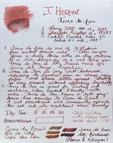
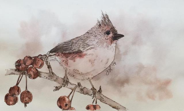
    Forgive my reviewing an ink that has been reviewed thoroughly before. This is my first review and I wanted to start with an ink that I have a lot of experience with. The written review was done in the Rhodia dotpad. The Titmouse sketch was done with J. Herbin's Terre de Feu and Cacao du Bresil in a Stillman & Birn Gamma Series sketchbook. Edited to add color wash detail, which I previously forgot to upload. Reasonable care was taken to ensure color accuracy.


×
×
  • Create New...