Jump to content

Search the Community

Showing results for tags 'blue'.

  • Search By Tags

    Type tags separated by commas.
  • Search By Author

Content Type


Forums

  • FPN Community
    • FPN News
    • Introductions
    • Clubs, Meetings and Events
    • Pay It Forward, Loaner Programs & Group Buys
  • The Market Place
    • The Mall
    • Market Watch
    • Historical Sales Forums
  • Writing Instruments
    • Fountain & Dip Pens - First Stop
    • Fountain Pen Reviews
    • Of Nibs & Tines
    • It Writes, But It Is Not A Fountain Pen ....
    • Pen History
    • Repair Q&A
  • Brand Focus
    • Cross
    • Esterbrook
    • Lamy
    • Mabie Todd Research/Special Interest Forum/Group
    • Montblanc
    • Parker
    • Pelikan
    • Sheaffer
    • TWSBI
    • Wahl-Eversharp
    • Waterman
  • Regional Focus
    • China, Korea and Others (Far East, Asia)
    • Great Britain & Ireland - Europe
    • India & Subcontinent (Asia)
    • Italy - Europe
    • Japan - Asia
    • USA - North America
    • Other Brands - Europe
  • Inks, Inc.
    • Inky Thoughts
    • Ink Reviews
    • Ink Comparisons
    • Co-Razy-Views
    • Th-INKing Outside the Bottle
    • Inky Recipes
  • Paper, and Pen Accessories
    • Paper and Pen Paraphernalia
    • Paper & Pen Paraphernalia Reviews and Articles
  • Creative Expressions
    • Pen Turning and Making
    • Pictures & Pen Photography
    • The Write Stuff
    • Handwriting & Handwriting Improvement
    • Calligraphy Discussions
    • Pointed Pen Calligraphy
    • Broad (or Edged) Pen Calligraphy

Blogs

  • FPN Board Talk
  • Incoherent Ramblings from Murphy Towers
  • The Blogg of Me
  • FPN Admin Column
  • Rules, Guidelines, FAQs, Guides
  • Musings on matters pen
  • Marketing & Sales
  • Iguana Sell Pens Blog
  • Newton Pens' Blog
  • Peyton Street Pens Blog
  • holygrail's Blog
  • A Gift For Words
  • I Don't Have a Name; So This Will Do
  • Karas Kustoms' Blog
  • Debbie Ohi's Inky Journal
  • Sus Minervam docet
  • Crud!
  • Clut and Clutter
  • Federalist Pens

Product Groups

  • FPN Pens
  • FPN Inks
  • FPN Donations
  • Premium/Trading/Retailer Accounts

Categories

  • Fonts
  • Tools & Software
  • Rules for Notepads & Paper

Find results in...

Find results that contain...


Date Created

  • Start

    End


Last Updated

  • Start

    End


Filter by number of...

  1. Rohrer & Klingner - Limited Edition 2024 - Blue Eyed Mary Special limited edition 2024 by R&K. It is named after the plant Omphalodes verna, creeping navelwort or blue-eyed-Mary. Photo: Courtesy of WIkipedia. After the gorgeous Ebony, this one is superbly underwhelming. It’s a basic turquoise, with some curious behavior. It doesn’t like copy paper, but to my surprise it sporadically bled through Iroful (but ironically didn’t ghost), and only bled through Rhodia with the Pilot F3A semi-flex when I applied it a bit too enthusiastically. It was well behaved on Midori and Tomoe River 68 gr. It's very difficult to scan, so I omitted most of the scans as they took looked fluorescent There is some shading, but it’s barely visible from M/B above nibs. The best shading is with B nib on Iroful paper, @LizEF favorite paper Chroma: Writing Samples: The Stub line was mistakingly written by another "turquoise/teal" ink. I had to blot it out and put this one. Photo: Now some bleed through scans: Comparison: Water test: Left side 10 seconds under running water. I tried to draw a mouse hiding in a bunch of blue eyed Mary flowers. Thankfully, it all washed away Art Work: I was really uninspired by this ink. Paper is Talens Mixed media. Note when the ink was applied and dried it was difficult to wash it off. So, I had to lighten the "sky" with Octopus Polar Bear White. I also used a glass pen and bleach to create waves. Other inks are: Noodler's Lexington Gray/ Polar Brown Kakimori Kurun Sailor Storia Mix Red · Pens used: Pilot F3A Ef, Semi-flex, Lamy Safari (EF/F/M/B, 1.1) · What I liked: Let me get back at you, cleaning · What I did not like: Limited Edition Hype, behavior. Ink lacks depth. · What some might not like: There are too many inks like that. · Shading: Subtle on most papers, best B nib on Iroful. · Ghosting: Yes, on cheap paper. · Bleed through: Yes, on cheap paper, sporadically on Iroful and Rhodia. · Flow Rate: Wet · Lubrication: Good. · Nib Dry-out: Did not notice. · Start-up: Good · Saturation: Pastel · Shading Potential: Not exciting. · Sheen: No. · Spread / Feathering / Woolly Line: A bit if the feed is saturated on copy paper. · Nib Creep / “Crud”: Did not notice. · Staining (pen): No. · Clogging: Did not notice. · Cleaning: Easy · Water resistance: Non-existent. · Availability: 50 ml bottles. Please don't hesitate to share your experience, writing samples or any other comments. The more the merrier
  2. namrehsnoom

    Pelikan Edelstein Golden Lapis

    Pelikan Edelstein Golden Lapis Ink of the Year 2024 In 2011 Pelikan introduced the Edelstein series of high-end inks, available in a variety of colours. The theme of the Edelstein concept is the gemstone – each ink corresponds to the beautiful colour of a gem. The Edelstein line of inks is presented in 50 ml high-value bottles, that are truly beautiful, and worthy of a place on your desk. In this review the spotlight shines on the shimmering presence of Golden Lapis, the Edelstein Ink of the Year 2024. This is a limited edition glitter ink, that will most probably be gone in the near future. At heart, Golden Lapis is a bright light-blue ink with added golden shimmer particles. I’m not a fan of shine & shimmer, so will mostly ignore this aspect of the ink. Just one word of warning: the gold particles tend to accumulate at the surface, and will easily come off the paper when the ink has dried. It’s almost unavoidable. The ink’s colour is quite enjoyable. My first thought was: “Oh, this is Topaz with shimmer”. But that’s not really the case. Topaz is a lighter turquoise blue, while this Golden Lapis definitely is a touch darker. Still a light & bright blue though. Most Edelstein inks work well across the nib size range, and can handle all types of paper. This one is a bit more finicky. It mostly has problems with absorbent paper: the ink gets sucked right in and through the paper, with bleed-through as a result. Yikes! On hard-surface coated paper, the ink looks great, but it needs its time to dry… for a long time. In return, you get strong and truly nice shading, and a bit of a purple-reddish sheen. Overall, a good-looking ink with some technical issues. The chromatography shows a light-blue dye with some purple component in the mix that darkens up the ink a bit. Water resistance is fairly good: although a good deal of the dyes are washed away, enough is left to easily reconstruct your writing. Not bad. Golden Lapis writes well in all nib sizes. A nicely lubricated and well-saturated ink that always leaves a strong and contrast-rich line on the paper. I like it best with the broader nibs, where the shading really comes into play. I’m not usually a big fan of heavy shading, but for this ink I make an exception. Golden Lapis looks at its best when the shading is strongest – the contrast between light and darker parts is really well balanced, and looks just darn good. But you only get this lovely and aesthetically pleasing shading on the hard-surface paper. On absorbent paper, shading is just barely there and the ink loses much of its appeal. To show you the impact of saturation on the ink’s look & feel on paper, I made some scribbles where I really saturated portions of a piece of 52 gsm Tomoe River paper with ink. This gives you a good idea of what the ink is capable of in terms of colour range. Golden Lapis has a medium colour span, gradually darkening as saturation increases, but always keeping true to its light-blue nature. The light-to-dark ratio in writing is just right, with really great aesthetics. You get prominent shading, not too extreme, which looks absolutely gorgeous – but only on the hard-surface paper. Technically, the ink has the typical Edelstein feel: well lubricated, good saturation. It’s a shame it doesn’t work well with absorbent paper, and that includes all types of copy paper. The ink then gets sucked into and through the paper, making a mess of the opposite side. For some reason, it also didn’t work well with the paper in my Paperblanks journal, which usually is not that fussy about the inks I use. Looks like the Paperblanks paper is just a touch too absorbent to work well with this ink. Below you’ll find photos of the writing samples on loads of different paper types. This should give you a good feel for the ink. On each scrap of paper I show you: An ink swab, made with a cotton Q-tip 1-2-3 pass swab, to show increasing saturation An ink scribble made with an M-nib Safari fountain pen The name of the paper used, written with a B-nib Safari A small text sample, written with the M-nib Safari Title of the quote, with a Pelikan M120 with M-nib Drying times of the ink on the paper, with the M-nib Lamy Safari I’ve also added a scan of some writing samples to give you another view on the ink. Scanned images and photos often capture different aspects of the ink’s colour & contrast. That’s why I present them both. The ink swabs look closest in colour in the scanned image. The character of writing shows best in the photos. Below you also find some blow-ups on coated paper to really show you that beautiful shading. Writing with different nib sizes The picture below shows the effect of nib sizes on the writing. The top samples were written with a Lamy Safari, which is typically a dry pen. I also added a few visiting pens. What is really visible here is the wide range of blue hues the ink produces in the different pens & nib sizes. That’s quite some variety for a single ink. Cool! Related inks To show off related inks, I use my nine-grid format, with the currently reviewed ink at the center. This format shows the name of related inks, a saturation sample, a 1-2-3 swab and a water resistance test – all in a very compact format. Golden Lapis’ base colour is fairly similar to several other inks. Iroshizuku kon-peki comes close, but is a tad lighter. In the Pelikan Edelstein line-up, Topaz would be my alternative of choice. It’s technically a better ink, and looks amazing on any type of paper. Inkxperiment – Pythagoras I’ve put myself a challenge to try to produce interesting drawings using only the ink I’m reviewing. I find this to be a fun extension of the hobby, and have found these single-ink drawings ideal for experimenting with different techniques. And creating these monochrome paintings is simply fun, and always good for a couple of hours well spent. Inspiration for this inkxperiment comes from the world of mathematics. Recently I came across an article on the internal structure of protons, which captured my attention. So I grabbed a book on particle physics, and on page 10 or so I got lost in the math... a bit embarrassing 😉. So I’m refreshing my math now, starting from the basics. And right there at the very beginning is that Greek philosopher genius of about 2500 years ago who had that great insight into the geometry of triangles. I tried to capture his wisdom into this little inkxperiment. I started with an A4 sheet of 300 gsm watercolour paper, and painted in the temple background, using Golden Lapis with multiple water/ink ratios. I then used pure ink and lots of glitter to frame the sky. Next I added the visualization of the Pythagorean theorem, and our philosopher sitting at the temple wall. The end-result gives you an idea of what can be achieved with Golden Lapis as a drawing ink. Inkxpired – computational art I love experimenting with pen/ink/paper and have added another layer as part of the hobby. I’m exploring computational art, inspired by the ink drawings I do during ink reviews. Another fun offshoot of the hobby… and all that starting with a few drops of dye-coloured water on paper. I started by using a duo-tone colour filter and added a graph paper backdrop. I then used a “tiny world” filter with focus on our philosopher. Next I used a grid-filter which also added colour to the image. The end result shows the mathematical lens through which Pythagoras viewed the world. Conclusion With this Ink of the Year, Pelikan continues to present us with a shimmer ink (please stop doing that 😉). This time with a nice bright-blue base colour that looks gorgeous on hard-surface, good-quality paper. Unfortunately, the ink suffers badly when using it on absorbent paper, with loss of shading and quite some see-through and bleed-through. A nice enough ink to try, but not one that falls in the must-have category (my opinion). Technical test results on Rhodia N° 16 notepad paper, written with Lamy Safari, M-nib Backside of writing samples on different paper types
  3. Ink Review : Diamine Blue Velvet (150th Anniversary Ink) Pen: Lamy AL-star Ocean Blue, M-nib Paper: Rhodia N° 16 notepad 80 gsm Review This ink is part of the 8-color set that Diamine released to celebrate their 150th anniversary (1864-2014). The set has quite a number of interesting colors. This pure blue ink is one of them. Blue Velvet... the name evokes the image of a bright late-spring day with a deep blue sky. At the banks of the mighty river Anduin, Galadriel - the beautiful queen of Lothlórien - dominates the scene with her blue velvet reginal robe, waving her goodbyes to the Fellowship... This ink captures the setting well. It is a deep pure-blue ink with no colored undertones, as shown in the chromatograpy. The ink flows well in my pens, and shows some nice - but not too much - shading. A simple but elegant blue for everyday writing, at home in your journal as well as in the workplace. Fortunately for Galadriel, it is a bright sunny day without rain, because this Blue Velvet ink has no water resistance at all. Both the droplet and running water tests show without any doubt that water obliterates this ink. No legible traces remain. A shame, because this ink is otherwise very well-behaving. Let's have a look at how it behaves on paper. For this, I did some tests: Rhodia N° 16 notepad 80 gsm - drying time 15-20 seconds, no feathering, no show-through nor bleed-throughPaperblanks journal paper - drying time ~20 seconds, no feathering, no show-through and no bleed-throughGeneric notepad paper 70 gsm - drying time ~15 seconds, no feathering, no show-through nor bleed-throughMoleskine journal - drying time ~5 seconds, no feathering (that's nice!), but significant show-through and very noticeable bleed-through (making the backside of the paper unusable)Blue Velvet is a very well-behaving ink. Only with the awful Moleskine paper it leaves to be desired. On other paper, it behaves perfectly. You can't go wrong here. Conclusion Blue Velvet is an all-around true blue ink, that behaves well om a wide variety of paper. It's big downside is that it has zero water resistance. Myself, I don't care much about that. But... for me the ink doesn't strike a chord. It's a decent ink for everyday use, but no queen material. This is one dress that will spent more time in the wardrobe than being worn. my overall score: B+
  4. Rohrer and Klingner Isatis Tinctoria (2021 Limited Edition) Rohrer and Klinger – founded in 1892 in Leipzig, Germany – is a company that is mainly focusing on inks for all purposes, including fountain pen inks. Like every self-respecting company these days, they have started the tradition of releasing a limited edition ink every year. In 2021, they introduced this splendid Isatis Tinctoria, a dusty blue with purple undertones. The ink comes in a 50 ml bottle presented in a stylish box. Isatis Tinctoria is already quasi impossible to find, and has reached “unobtainium” status. Fellow member @JulieParadise was so kind to provide me with a generous sample of this ink, with the request to compare it to kyo-iro Soft Snow of Ohara (resulting in an ink shoot-out). Afterwards, enough of the sample was left for a complete review of this wonderful ink. Thank you Julie for providing this opportunity. This Limited Edition R&K ink is a soft dusty blue with definite purple undertones. A really elegant & beautiful ink that totally fits my tastes. According to Wikipedia, Isatis Tinctoria (also called dyer’s woad) is a flowering plant in the family Brassicaceae. Since ancient times, woad was an important source of blue dye and was cultivated throughout Europe. Rohrer & Klingner definitely succeeded in translating this inspiration into a fantastic ink colour. The chromatography shows a mix of blue, purple and grey. The dusty looks of the ink are clearly present. This combination of dyes translates to a soft and muted grey-blue with purple undertones. Definitely not a vibrant colour! But nevertheless an elegant ink – soft, quiet, shy. Part of my education comes from the 5-year old in the family, so I’m fluent in Frozen… for Isatis Tinctoria, think Anna, not Elsa. Isatis Tinctoria looks best in broader nibs, where it shows some really nice shading. But it can handle the complete nib range with ease – even with the EF nib, you already get hints of shading. To show you the impact of saturation on the ink’s look & feel on paper, I made some scribbles where I really saturated portions of a piece of 52 gsm Tomoe River paper with ink. This gives you a good idea of what the ink is capable of in terms of colour range. Isatis Tinctoria has a fairly narrow colour span, with limited contrast between light and darker parts. This translates to soft shading, that is very present but remains delicate and aesthetically very pleasing. The shading on this ink is really well executed! Technically, the ink felt a bit dry-writing in my Lamy Safari test pens, especially with the finer nibs. Not so much an issue of wetness, but more of lubrication. With the finer nibs, you definitely feel more feedback from the paper while writing. With broader nibs, lubrication improves, and the ink starts writing much more fluently. In the writing samples below, I added a new paper to my test-set: Clairefontaine Smart Print Paper 60 gsm – a very fine fountain pen-friendly paper (Tomoe River-like in weight, but not as smooth but with some feedback while writing). On each scrap of paper I show you: An ink swab, made with a cotton Q-tip 1-2-3 pass swab, to show increasing saturation An ink scribble made with an M-nib Safari fountain pen The name of the paper used, written with B-nib Lamy Safari A small text sample, written with the M-nib Lamy Safari Source of the quote, with an Edison Collier 1.1 stub Drying times of the ink on the paper, with the M-nib Lamy Safari I’ve also added a few photos to give you another view on the ink. Scanned images and photos often capture different aspects of the ink’s colour & contrast. That’s why I present them both. In this case, both scan and photo capture the ink’s colour well. Isatis Tinctoria looks good on all types of paper, both white and more creamy ones. I personally prefer it on pure white paper, where its soft and delicate character is best presented. The ink prefers high-quality paper. On lower quality papers (Moleskine, printing paper) you can see a tiny bit of feathering, and you also get some see-through and bleed-through. Writing with different nib sizes The picture below shows the effect of nib sizes on the writing. Isatis Tinctoria writes a well-saturated line in all nib sizes, notwithstanding its softness. The saturation sample already showed the limited contrast range of the ink. As a result, this R&K ink manages to look really consistent in colour across the complete nib range, both in wet and dry pens. Personally, I like this ink best in the broader nibs, where the soft shading is a bit more prominent. Related inks To show off related inks, I use my nine-grid format, with the currently reviewed ink at the center. This format shows the name of related inks, a saturation sample, a 1-2-3 swab and a water resistance test – all in a very compact format. Isatis Tinctoria has a quite unique colour. It sits somewhere between kyo-no-oto keshimurasaki (which is greyer) and kyo-iro Soft Snow of Ohara (which is more purple). Inkxperiment – neuromancer As a personal challenge, I try to create interesting drawings using only the ink I’m reviewing. I find this to be a fun extension of the hobby, and these single-ink drawings often present a real challenge. It also gives you an idea of what the ink is capable of in a more artistic setting. Inspiration for this inkxperiment comes from the book “Neuromancer” by William Gibson. This book from 1984 is considered one of the earliest and best-known works in the cyberpunk genre. In the book you are presented with a drab and dystopian physical world, with the characters spending most of their time in the matrix of cyberspace. The whole book is written in adrenaline-high turbo-language – a quote: “He’d operated on an almost permanent adrenaline high, a byproduct of youth and proficiency, jacking into a custom cyberspace deck that projected his disembodied consciousness into the consensual hallucination that was the matrix.” I started with an A5 sheet of 300 gsm watercolour paper, and used heavily water-diluted Isatis Tinctoria to paint in the light-blue background. The data towers in the matrix were coloured with a felt-tip pen, dipped in pure ink. The code in the matrix flows from the data towers, and was written with a 1.1 stub Edison Collier. Gravity has no place in the matrix – so the people living in it can assume any position. The reality in the upper-left corner was drawn with a fine brush and Q-tips. The main character is ready to leave reality, and dive into the vortex of cyberspace. The end-result gives you an idea of what can be achieved with Isatis Tinctoria as a drawing ink. Conclusion With this 2021 Limited Edition, Rohrer and Klingner delivered a beautiful soft & muted blue with purple undertones, that is already reaching “unobtainium” status. If you thrive on vibrant inks, this one will not be for you. But if you enjoy dusty and toned-down inks, then Isatis Tinctoria is sure to please you. In my opinion, it sits among the great ones in this category. If you can still get hold of a bottle, don’t hesitate and buy it immediately. You will not be disappointed! Technical test results on Rhodia N° 16 notepad paper, written with Lamy Safari, M-nib Back-side of writing samples on different paper types
  5. Being a bit of a Montblanc fan, wanting to add a blue or blue/grey variant, and wanting to add more to the MB herd, I found a few potential candidates. Glacier La Petit Prince Skywalker Cool Blue Guilloche Starwalker Space Blue I have other LeGrand/146 pens and have never owned or experienced any of the Skywalkers. I believe one of the 146 sized pens has a fine nib, others are medium and a broad 146. I have fines, mediums and broads from MB already also. Getting the Glacier or Prince would be more or less for aesthetic purposes over having a new writing experience. Getting one of the Skywalkers would give me a different writing experience to add to the other 9 MB pens I have. In the end, I like how all of my Montblanc pens write and enjoy having a variety depending on my mood or whim. What I would ultimately like, however, would be to get BBB nibs and have a nibmeister grind them to my specifications. But finding BBB nibs are rare. In the meantime I can enjoy having a set of fun pens. Of the four, the most eye catching, to me, is the Cool Blue Guilloche. That said, I also like the blue/grey color of the others. Each one have an appeal. I do not want all four. I'd rather pick one and move on to a completely new version to bring into the family. Possibly a Patron of Art sometime down the road? Who knows? Montblanc has a vast catalogue to choose from. Plus I'm still awaiting the 100th Anniversary of the Meisterstuck to be announced. Exclusion of price, which of the four would you choose?
  6. namrehsnoom

    Wearingeul Lost (Demian)

    Wearingeul – Lost (Demian) I’m sure I have more than enough inks already, but sometimes an opportunity rises to explore a new brand that wasn’t on my radar before. Some time ago Scrittura Elegante – a stationery shop from the Netherlands – announced that they would stop their business. Definitely a sad thing: this lovely little webshop carried some interesting and lesser-known brands, with Wearingeul being one of them. They started a sale to empty the warehouse, and I took this opportunity to place a last order, loading up on couple of Wearingeul inks. Wearingeul is a stationery brand from South Korea, that gets its inspiration from arts & literature. In their own words: “We re-interpret novels and poetry with colors. You can find characteristic inks with stories and also notes/papers which are suitable for ink users.” Lost is inspired by Hermann Hesse’s book “Demian” (1919). Between the years 1916 and 1917, Hesse went through a personal crisis as a result of illness and death in the family. His personal distress led him to seek psycho-analysis with both Carl Yung and his student J.B. Lang. The novel Demian is based on his process of self-discovery through psycho-analysis. The psychological changes and conflicts that the main character experiences in the process of “finding himself” are expressed as the ink dries and the colour changes. This is the second Wearingeul ink I tried, and again I was completely knocked off my socks by the ink’s colour. What a beauty! The colour is a pale sea-blue with a muted and toned-down feel to it, that looks absolutely georgeous on pure white paper. When heavily saturated a mysterious yellow undertone comes to the surface, adding some extra eye-candy. Totally fits my taste! But Lost is also a difficult and stubborn ink, that will not always play along with your pens and paper. The ink is too pale for fine nibs and/or dry pens and is not too friendly for lower quality paper. But when the circumstances are just right, the ink delivers beautifully and is an aesthetic marvel. Wearingeul Lost writes very light but is still quite readable. On white paper, the result is soft and restful – a pleasure for the eye. But the ink definitely has its sweet spot: a wet pen, white and good-quality paper, and preferably a wider nib (M or above). The ink doesn’t look good on creamy paper – the yellow tones of such paper don’t combine well with the pale blue colour, and the result is a more or less sickly-looking blue – not pleasant at all. The ink also writes with fairly low lubrication in dry pens (like the Safari) and is therefore best paired with wet writers. To illustrate the colour span of this Wearingeul ink, I did a swab on 52 gsm Tomoe River paper, where I really saturated portions of the paper with ink. Lost (Demian) shows a very wide saturation range, from a wispy light-blue up to a moderately saturated sea-blue with yellow undertones coming to the surface. Due to this wide contrast range, the ink is a fairly strong shader. Dry pens favour the left side of the saturation range, where the ink is too pale to be useful. Wetter pens explore the right side where the ink looks superb and shows great aesthetics. On the smudge test – rubbing text with a moist Q-tip cotton swab – the ink behaved perfectly. There is no visible smearing at all. Water resistance is also remarkably good. The colour fades away, but a pale grey-blue ghost of your writing remains that is still readable without too much trouble. The chroma also clearly shows the yellow undertones hiding within the ink’s composition. Nice! I’ve tested the ink on a wide variety of paper – from crappy Moleskine to high-end Tomoe River. On each scrap of paper I show you: An ink swab, made with a cotton Q-tip 1-2-3 pass swab, to show increasing saturation An ink scribble made with a Lamy Safari M-nib fountain pen The name of the paper used, written with a Lamy Safari B-nib A small text sample, written with an F-nibbed Wancher Dream Pen Source of the quote, written with an Edison Collier with 1.1 nib Drying times of the ink on the paper (with the M-nib Safari) Lost writes scratchy in my Safari pens with bad lubrication. It really needs wet writers. Due to the ink’s paleness, it works best with wet pens and/or broader nibs. This Wearingeul ink also tolerates only the higher quality papers – otherwise you will get visible feathering, combined with see-through and bleed-through. And it’s best not to use it on cream-coloured paper: the result is guaranteed to disappoint - a sickly-looking pale blue. On pure white paper on the other hand, this Wearingeul ink truly is a feast for your eyes. Like I hinted at before: a quirky ink that you need to get acquainted with, and that only shines in its goldilocks zone. I used photos for the writing samples above to get the most accurate results. In scans, the contrast gets blown up, and looks totally unrealistic – see the scan below. My scanner really messed this one up! Below you’ll find some zoomed-in parts of writing samples. Unfortunately for me, Lost doesn’t seem to like my Paperblanks journal, exhibiting quite some visible feathering. Damn! Writing with different nib sizes The photo below shows the effect of nib sizes on the writing (written on Rhodia N°16 80 gsm paper). The initial lines were written with Lamy Safaris. Wearingeul Lost is not an ink for these dry Safari pens – only the B-nib was more or less ok. But the ink really shines with the wet-writing Wancher Dream Pen and the Edison Collier stub. It takes some time and effort to find the perfect pairing, but it’s definitely worth it: the end result looks wonderful – a soft, pastel-toned, pale sea-blue that is a feast for the eye. Related inks To compare this Wearingeul Lost with related inks, I use my nine-grid format with the currently reviewed ink at the center. This format shows the name of related inks, a saturation sample, a 1-2-3 swab and a water resistance test – all in a very compact format. Lost stands on its own in my ink collection. A close cousin is kyo-no-oto hisoku, which is also soft & pale, but more green-leaning. Inkxperiment – The Fall of Trantor As a personal challenge, I try to create interesting drawings using only the ink I’m reviewing. I really enjoy the couple of hours I spend on these monochrome mini-paintings – experimenting with the ink to see all the shades that can be extracted from it. This is number two in my “geometry 101” series, this time with the focus on triangles. Inspiration for the drawing comes from the Foundation novels by Isaac Asimov – now also an Apple TV+ series that I’m binge-watching. On the right side sits Hari Seldon’s Vault on the planet Terminus. Top-left is a representation of the Prime Radiant, a multi-dimensional data storage device containing all of Hari Seldon's psychohistorical calculations on the fall of the Galactic Empire. This fall is symbolized by the collapse of Trantor’s Star Bridge, a space elevator linking the surface to a boarding station in geo-stationary orbit around the planet. I started with an A4 piece of HP photo paper. I drew in the background with cotton swabs dipped in heavily water-diluted ink. I then painted in the triangles representing the different elements of the “Fall of Trantor” story, using self-made stamps. I finally added some accents with a fountain pen and pure ink. The resulting picture shows what can be achieved with this Wearingeul ink in a more artistic context. Inkxpired – computational art I love experimenting with pen/ink/paper and have added another layer as part of the hobby. I’m exploring computational art, inspired by the ink drawings I do during ink reviews. Another fun offshoot of the hobby… and all that starting with a few drops of dye-coloured water on paper. I started by using a “warm” photo filter, and then used an “antique paper” filter to get a more grey-looking colour. For my “Geometry 101” series I want to use square formats. So I squeezed the end result to a square shape – and since I only used triangles in the drawing, the distortion resulting from the squeeze forms no problem at all … squeezed triangles remain triangles. Conclusion Wearingeul Lost is a stunning ink – a soft pale-blue that simply looks wonderful on good-quality white paper. But it’s also a difficult ink with a narrow goldilocks zone: you need exactly the right combination of pen, nib and paper to extract that beautiful pale sea-blue in all its glory. It makes you totally forget the dark side of this ink – bad lubrication, sick-looking on yellow paper… All is forgiven once you hit that exact goldilocks spot. I personally love this ink, but can absolutely imagine that it’s not for everyone. Technical test results on Rhodia N° 16 notepad paper, written with Lamy Safari, M-nib Backside of writing samples on different paper types
  7. Baka1969

    Back to Basics?

    Hi everyone, Is anyone else getting more practical with their ink choices? Although I have dozens of ink options, brands, and colors I find myself wanting to ink more with blues, blacks, greens and useable colors over the more whimsical colors like pinks, purples, reds, yellows or oranges. Don't get me wrong, I still love and use a sheen or shade (no shimmers). I just find myself wanting more suitable ink colors for day-to-day usage. Is it just me? My favorite inks to fill pens with recently are Organic Studios Nitrogen, Noodler's Heart of Darkness, Monblanc Irish Green, Diamine Salamander and Diamine Majestic Blue. I also have a Lamy Studio with a fine 14k nib filled with Baystate Blue that I use regularly. I have other pens filled with reds, browns and the purple/pinks, however, they rarely get used and I find aren't practical for everyday writing. I also happen to like Diamine Wagner that my Bordeaux LeGrand is inked with. It's a yellow-ish light/medium green (think olive) and I'd love to find more times to use it. Am I going nuts to want to resort to more basic colored inks? Like I mentioned above, I still use inks with sheen and I really like to see shading. Yet, when it come to colors and situations, the blues, blacks and greens are what I'm reaching for over the (to me) much less useful colors. Don't get me wrong, I love me some Claret and Apache Sunset. Who doesn't like a bit of Imperial Purple or a ribbon of Honey Blast? I just can't find a daily use for them. Sure, I can use them when I do some of my transcribing. But I don't feel the color when I'm doing so. A color switch would be more of a function of a change for the sake of the change. How do I make a color fit what I'm doing? Even if it's just the few times I write for pleasure. What do you think? Where are you at? Has anyone else here moved to more practical ink colors? Happy Holidays
  8. Recently, DCWaites sent me a sample of Faux Parker Penman Sapphire #9, and a matching sample of the real Parker Penman Sapphire. I inked up a MB 149 on loan to me from fellow FPNer, Steve D. I then wrote 40 pages for this CRV. So, here's the plan, Sign up here for one of the 40 spots. Send $5 to Sinistral1 as a GIFT to cover the shipping costs. Be sure to send your address so that I know where to send the package. I will mail to you the following: 1 Sample of Blue ink - NOT PPS.1 Paper with my writing sample of PPS.4 Sheets Fountain Pen Friendly Paper1 Postage Prepaid return label. You write or doodle with the blue that I send you and any other blue inks you want. Scan or photograph your comparison sheet and then mail the original back to me in a regular envelope. The remaining ink and sheets are yours to keep. Though you can feel free to send back the sheets with doodles for other CRVs. The goal is for us to compare at least 40 different Blue inks to the grail ink - PPS. I look forward to hearing from you.
  9. namrehsnoom

    TACCIA Ukiyo-e Hiroshige ruri

    TACCIA Ukiyo-e Hiroshige ruri TACCIA is a Japanese stationery company, that - as far as I know - is now part of the Nakabayashi group. They offer high-quality fountain pens, inks, pen-rolls, notebooks, etc. More specifically, TACCIA produce a line of inks, inspired by the unique look of Ukiyo-e prints from Japan’s Edo period (1603-1867). Ukiyo-e paintings are woodblock prints where the work of an artist is carved into wood by woodworkers, and pressed onto paper by printers. This allows the production of multiple prints of an artwork with some different colours as well. In this review, the spotlight shines on ruri, a colour that I can only describe as a dark and saturated light-blue 😉. I know – that doesn’t make much sense, but that’s what I feel you get. The ink has the softness, fragility, tenderness of a light-blue – but at the same time it is quite saturated and can get fairly dark. A really nice ink colour with a lot of depth to it. The ink’s inspiration comes from a woodprint design by the Japanese artist Utagawa Hiroshige, more specifically from his first print “Sunny Morning after Snow at Nihonbashi Bridge” (1856) in the “One Hundred Famous Views of Edo” series. The ink’s colour is derived from the different shades of blue appearing in the river. The print has a limited palette of bright blues and soft red, grey and brown. Particularly striking is the vivid ruri blue of the river and the sky, for which Hiroshige took advantage of the new European pigment Prussian blue. Although far from realistic, the colours evoke the crisp light of a bright winter’s morning. Ruri is an inspired vivid blue, wet and saturated, and with a complexity of dyes that really add depth to the colour. The ink shows little shading with fine nibs, but with M-nibs and above the shading is really prominent while still being aestetically pleasing. The darker parts of the ink show an impressive and beautiful red-purple sheen on the right type of paper (more specifically Japanese papers like Tomoe River, Kobeha GRAPHILO, Yamamoto bank paper). The ink writes really wet though, a bit too much for me in wet & broad-nibbed pens. The sweet spot for this ink is in the M-B-1.1 range with a dry-writing pen: great shading, and the vivid saturated blue looks particularly lovely. The ink comes in a 40 ml bottle, that is packaged in a beautiful box showing the corresponding Ukiyo-e painting. Lovely packaging for an excellent ink. To show you the impact of saturation on the ink’s look & feel on paper, I made some scribbles where I really saturated portions of a strip of 52 gsm Tomoe River paper with ink. This gives you a good idea of what the ink is capable of in terms of colour range. TACCIA ruri has a narrow dynamic range, with limited contrast between the light and darker parts. This translates to very gently but still prominently visible shading. With wet pens, the increased saturation tends to burn away most of the shading though. Dry writers lean towards the left side of the saturation range, showing that nicely saturated light-blue with excellent shading. The chromatography shows the complex nature of this ink: ruri mixes sky-blue and rose-pink dyes that magically combine to give us that elegant vivid blue. Lovely stuff! The bottom part of the chroma shows that most of the dyes detach from the paper when coming into contact with water. Not a water-resistant ink, as is confirmed by the water test at the end of this review. I’ve tested the ink on a wide variety of paper – from crappy Moleskine to high-end Tomoe River. On every small band of paper I show you: An ink swab, made with a cotton Q-tip 1-2-3 pass swab, to show increasing saturation An ink scribble made with an M-nib Lamy Safari The name of the paper used, written with a B-nib Lamy Safari A small text sample, written with the M-nib Safari Source of the quote, written with a B-nib Platinum 3775 Century Drying times of the ink on the paper (with the M-nib Safari) This vivid and well-saturated blue ink can handle both white and cream-coloured paper. For me, it looks best on pure white paper, like the Clairefontaine Triomphe. The ink writes really wet, and as such requires high-quality paper. With cheap & absorbent paper, you get quite a bit of see-through and bleed-through. Surprisingly for such a wet-writing ink, drying times are fairly short with the M-nib Lamy Safari: 10-15 seconds on most paper types, climbing to 20-25 seconds for the hard-surface high-sheen papers. Technically, the ink is really good too: on crappy paper, you get only the tiniest amount of feathering – fairly impressive for such a wet ink. Even on Moleskine, the results are surprisingly good. For the sake of completeness, I also add a photo of text written on a number of different papers. Writing with different nib sizes The picture below shows the effect of nib sizes on the writing. The ink’s saturation makes for a good contrast with the paper across all nib sizes. Shading is soft & gentle, almost undetectable in the finer nibs, but becoming truly stunning with the M-B-1.1 nibs. It really adds to the character of your writing. Beware that wet pens will shift the ink to the saturated portion of its dynamic range, where the shading is mostly burned away. The sweet spot for this ink are dry writers combined with broader nibs – great colour and lovely shading! Related inks To compare ruri with related inks, I use my nine-grid format with the currently reviewed ink at the center. This format shows the name of related inks, a saturation sample, a 1-2-3 swab and a water resistance test – all in a very compact format. Diamine Blue Velvet comes really close colour-wise, but lacks a bit of the depth & complexity that makes this ruri such a great-looking blue. Inkxperiment – Dark Side of the Moon With every review, I try to create an interesting drawing using only the ink I am reviewing. These small monochromatic paintings are an excellent way to show the colour-range nuances that are hidden within the ink. And I totally enjoy the fun couple of hours these inkxperiments provide me. A couple of days ago, I had my favourite rock band’s album on the speakers: “Dark Side of the Moon” by Pink Floyd. The first album I bought as a teenager, and still a musical highlight. I realized that this album got published in 1973 – making it 50 years old today. Unbelievable! The music sounds as fresh, compelling and mind-bending today as it did all these years ago. This is truly an all-time classic! No need to look any further for inspiration! For this drawing, I started with a piece of A4 HP photo paper. I started by taping out the iconic prism of the album’s cover art with washi tape. Next I drew the background, applying water-diluted ink through a kitchen towel. After removing the washi tape, I used a plastic card dipped in pure ink to draw the prism and the rays of light passing through it. I then added the psychedelic sound waves travelling across the soundscape. As a final touch, I added the iconic heartbeat from the intro/outro title tracks. The end result is my tribute to the 50th anniversary of this timeless classic. Inkxpired – computational art I love experimenting with pen/ink/paper, and have added another layer as part of the hobby. I’m exploring computational art, inspired by the ink drawings I do during ink reviews. Another fun offshoot of the hobby… and all that starting with a few drops of dye-coloured water on paper. For this computational derivation, I started with applying a negative filter to the original drawing. I then used an urban art filter to lift out the main topic (prism and heartbeats) and place them on a gritty grey & black background. Next I used an ‘antique photo paper’ filter to age the colours and arrive at a more monochromatic look. I really like the end result that keeps the main topic of the painting, and makes for a great neutral-looking computer screen background. Conclusion TACCIA Ukiyo-e Hiroshige ruri is a great-looking blue – vivid & saturated, while still keeping a soft, fragile and light apperarance with great depth & complexity. I really like the colour of this one, especially with what I consider its sweet spot: a dry writer with a broader nib, while using high-quality pure white paper. A really nice ink from TACCIA’s ink brewers. Recommended. Technical test results on Rhodia N° 16 notepad paper, written with Lamy Safari, M-nib Back-side of writing samples on different paper types
  10. namrehsnoom

    TACCIA Ukiyo-e Hokusai koiai

    TACCIA Ukiyo-e Hokusai koiai TACCIA is a Japanese stationery company, that is part of the Nakabayashi group. They offer high-quality fountain pens, inks, pen-rolls, notebooks, etc. More specifically, TACCIA produce a line of inks, inspired by the unique look of Ukiyo-e paintings from Japan’s Edo period (17th century). Ukiyo-e paintings are woodblock prints where the work of an artist is carved into wood by woodworkers and pressed onto paper by printers. This allows the production of multiple prints of an artwork with some different colours as well. In this review, the spotlight is on koiai, a dark indigo blue with a heavy reddish-purple sheen. The colour is inspired by the blue tones in the world-famous painting “The Great Wave of Kanagawa”, painted by the Japanese artist Katsushika Hokusai (1760-1849). It is the best-known painting in his “Thirty-six Views of Mount Fuji” series. The breathtaking composition of this woodblock print ensures its reputation as an icon of world art. Hokusai cleverly played with perspective to make Japan’s grandest mountain appear as a small triangular mound within the hollow of the cresting wave. Koiai is a wet and saturated ink, that can appear very dark in writing. It’s not a blue-black though, but a deep dark blue that is moving a bit towards teal territory - without actually getting there. This is an ink that I have mixed feelings about. In wet pens & fine nibs, the ink is too saturated for my taste, and the resulting very dark blue shade doesn’t do much for me. But use this ink with dry pens and/or stub nibs, and it truly blossoms, showing a wonderful indigo blue. You definitely need to hunt for the right pen/nib combination, but this extra bit of work is totally worth it. Koiai is also an ink with a fabulous reddish-purple sheen, that shows on many types of paper. Lovely! The ink comes in a 40 ml bottle, that is packaged in a beautiful box showing the corresponding Ukiyo-e painting. Lovely packaging for an excellent ink. To show you the impact of saturation on the ink’s look & feel on paper, I made some scribbles where I really saturated portions of a strip of 52 gsm Tomoe River paper with ink. This gives you a good idea of what the ink is capable of in terms of colour range. Koiai has a fairly narrow colour span, quickly moving from a stunning indigo-blue to a very saturated dark blue. Not a lot of shading in this ink, but instead you get lots of sheen in the saturated parts of the letter forms. This ink is a true sheening monster! This TACCIA ink works wonderfully well with my Edison Collier Nighthawk 1.1 stub – a beautiful indigo-blue, loads of sheen, and the pen’s colour matches the ink perfectly. I love it when all these details combine together for a wonderful experience… writer’s heaven! The ink’s chromatography shows a complex mix of dyes, with grey, purple, teal and sky-blue components in the mix. From the bottom part of the chroma you can deduce that all colour will disappear from the page when the ink comes into contact with water, leaving only a grey ghost of your writing. This is confirmed in the water test – colour washes away, with a grey-blue residue clinging to the paper, that remains quite readable. By no means a water-proof ink, but one that can survive a small accident. I’ve tested the ink on a wide variety of paper – from crappy Moleskine to high-end Tomoe River. On every small band of paper I show you: An ink swab, made with a cotton Q-tip 1-2-3 pass swab, to show increasing saturation An ink scribble made with an M-nib Lamy Safari The name of the paper used, written with a B-nib Lamy Safari A small text sample, written with the M-nib Safari Source of the quote, written with an Edison Collier 1.1 stub Drying times of the ink on the paper (with the M-nib Safari) Koiai looks good on both pure white and yellow-cream paper. The ink handles crappy paper well: on Moleskine I saw almost zero feathering, and even see-through and bleed-through are minimal. Drying time are quite long (15-25 seconds) on hard-surface paper, but on more absorbent paper the ink tends to dry almost immediately. This means you can use koiai as an office ink – I’ve used it in my Kaweco Liliput EDC pens with EF nib, and it worked perfectly on the lousy copy paper at work. I’ve also added a photo to give you another view on the ink. Scanned images and photos often capture different aspects of the ink’s colour & contrast. That’s why I present them both. In this case, the photo shows the ink a bit too dark, while the scans come closest to what my eyes can see. Writing with different nib sizes The picture below shows the effect of nib sizes on the writing. The top lines are written with my dry-writing Lamy Safari test pens and show a nice dark blue. The ink starts to blossom when you reach the broader nib sizes (B and stub-nib). With my Lamy Dialog 3 – a wet writer with M-nib – the ink gets too saturated for my taste and loses a lot of its appeal. Koiai provides low-to-medium shading. What the scan totally fails to capture is the tremendous amount of sheen – this has to be seen to believe. Related inks To compare koiai with related inks, I use my nine-grid format with the currently reviewed ink at the center. This format shows the name of related inks, a saturation sample, a 1-2-3 swab and a water resistance test – all in a very compact format. There are quite a number of similar-looking inks in my collection, so colourwise this koiai is not a must have. But that sheen… totally makes it worth it to own a bottle of this TACCIA brew. Inkxperiment – Romeo and Juliet With every review, I try to create a drawing using only the ink I am reviewing. These small one-ink pieces are an excellent way to show the colour-range nuances that are hidden within the ink. And every inkxperiment provides me with a couple of fun hours of quality time. Inspiration for this inkxperiment comes from the “Wyrd Sisters” – a Terry Pratchett novel with lots of references to Shakespeare’s Hamlet and King Lear. But also, a love story between the young witch Magrat and the King’s Fool – one that made me think of Romeo and Juliet. The inkxperiment expresses Romeo’s desperation while trying to reach his Juliet. For this drawing, I started with an A4 piece of 300 gsm watercolour paper. I divided the paper in square grids and used the age-old potato stamp (known from kindergarten times) to print a background of squares using different water/ink ratios. I then used a plastic card to add labyrinth lines to the drawing, and with a glass dip pen added Romeo and Juliet. Technically a really simple drawing, but I like the end result that gives you a good idea of what can be achieved with koiai as a drawing ink. Inkxpired – computational art I love experimenting with pen/ink/paper and have added another layer as part of the hobby. I’m exploring computational art, inspired by the ink drawings I do during ink reviews. Another fun offshoot of the hobby… and all that starting with a few drops of dye-coloured water on paper. I made a square cut-out of the inkxperiment drawing and used a metallic filter to convert the drawing to black & white. Looks great on a 75x75cm canvas poster against a white-painted wall. Conclusion TACCIA Ukiyo-e Hokusai koiai is a dark indigo-blue ink with oodles of sheen. Not an ink for a wet writer though, because it tends to oversaturate. But combine it with a stub-nib in a dry pen and you will be in writer’s heaven! This is also a wonderful ink to draw with – I truly enjoyed experimenting with it. Not the best TACCIA ink, but certainly worth a try. Technical test results on Rhodia N° 16 notepad paper, written with Lamy Safari, M-nib Back-side of writing samples on different paper types
  11. I had a wee bit of unexpected cash, and decided to treat myself to a pen I've wanted for ages....the Delta Israel 60. It also felt apt as I was 69 in May I'm looking for the perfect matching shade of blue, from a reasonably available in UK brand. Any suggestions? Alex
  12. yazeh

    Noodler's Lermontov

    Mikhail Lermontov (1814 -1841) Russian poet, novelist. Photo: Courtesy of Wikipedia. He came to prominence after Pushkin’s death, writing a poem in his memory, which landed him in hot water with the authorities and exiled him to the Caucuses. He wrote the first Russian psychological novel, A Hero of Our time. He himself, died in duel, at age 26. He was also a painter. Photo: Courtesy of Wikipedia. His mother, from Russian nobility, died young and he was raised by his rich, doting grandmother, mostly in the Caucuses due to his fragile health. His grandmother made sure that he would have least contact with his father. It is no surprise with such an upbringing, and childhood traumas, the main character of his novel, is a narcissistic male, seduced women like Don Juan, but unlike the him was aware of his emptiness. I truly appreciated discovering this very astute and self-aware writer, and his many flaws. And the beauty of his poetry. Here is Sail, translated by Vladimir Nabakov. HP 32 - Paper - With modern flex nib Apparently, the word blue does not exist in Russian (If I'm wrong, hopefully Russian-speakers will correct me). They have words for dark/navy blue or light blue. The latter is used with much emphasis in the novel. Hence, why I assume, Mr. Tardiff, used this ice blue. It's a truly agreeable ink, very well behaved, that I used with much ease even on Hammermill 20 lb paper, with no apparent ghosting or bleed through. Chroma: Writing samples: Photo: Water resistance is quite good. In Noodler's vocabulary bulletproof means that if someone attempts forgery it'll be obvious as you can see on the left side of the image. Comparison: I was inspired by the last line of his poem Sail, to do this sketch: But you, wild rover, pray for tempests, As if in tempests there was peace! For the background I used Diamine Shimmering Seas (top), Kakimori Torori (orange yellow). The sky and sea are done with Lermontov, in diluted form. And the little sail boat, I used a dab of J Herbin's Larmes de cassis. Note how eerie it looks in under the UV light It's fluorescent ink) · Pens used: Pilot Elite (Ef/Stub) Lamy Safari (Ef/F/M/B), Kanwrite Ultraflex, · What I liked: It’s a pleasure to write with. It shines with Broad nib. · What I did not like,: it’s not an ink for all seasons. You wouldn’t want to use it in the dead of winter or on cold gloomy fall days. · What some might not like: The colour moves/changes when water touches it. · Shading: None. Unless you write on a modern shiny postal card. · Ghosting: Very well behaved. Even on copy paper. · Bleed through: None. · Flow Rate: Wet · Lubrication: Good. It’s slightly dry. · Nib Dry-out: None. · Start-up: None · Saturation: Medium. · Shading Potential: None. · Sheen: None. · Spread / Feathering / Woolly Line: None · Nib Creep / “Crud”: Nope. · Staining (pen): No. · Clogging: No. · Cleaning: Easy. · Water resistance: Very good. The excess ink came off, but the rest was stable. · Availability: 3 oz/90 ml bottles, Russian Series is more expensive than the traditional line of Noodler’s. Please don't hesitate to share your experience, writing samples or any other comments. The more the merrier
  13. Diamine Tudor Blue (150th Anniversary II) The ink maker from Liverpool is one of the staple brands in ink-land. They consistently produce solid inks for a very reasonable price. In 2017, Diamine released a second ink series to commemorate their 150th Anniversary. I obtained my set shortly thereafter, but more or less forgot about them when my attention drifted to Japanese inks. About time to do the reviews. Fortunately, these anniversary inks are still easily obtainable, so if you like what you see you can still get them. At first sight, this Diamine ink looks like a fairly classic Royal Blue. On second sight, it definitely is a bit softer and darker, with a hint of purple undertones. For my personal taste though, it is too close to a standard blue to pique my interest. But it still is a solid performer, and a worthwhile workhorse ink. As can be expected from Diamine, the ink performs well, and writes a saturated line in all nib sizes. With F-nibs and above a fairly pronounced shading makes its appearance. Not too bad. The ink itself is fairly saturated. It can get quite a dark shade of blue when using wet pens. Also, wet pens tend to drown out the shading in this ink. I like it best in my drier pens – really nice in the Lamy Safari with 1.1 nib. Tudor Blue prefers good quality paper. On print/copy paper, I noticed a tiny bit of feathering (especially with a wet pen), and a fair amount of show-through and little points of bleed-through. Not an ink for the cheap copy paper in the workplace. To illustrate the colour span of this Diamine ink, I did a swab on 52 gsm Tomoe River paper, where I really saturated portions of the paper with ink. Tudor Blue has a rather low dynamic range, and quickly saturates. Dry pens tend to match with the left part of the saturation range – and you will get nice and soft shading. Wet pens match with the right side: here the ink is really saturated, with little difference between light and dark parts. So don’t expect much in the shading department with wet writers. On the smudge test – rubbing text with a moist Q-tip cotton swab – the ink behaved well. There is smearing, but the text itself remains crips and clear. Water resistance is non-existent though. All the blue dyes quickly disappear, leaving only some red-purple smudges behind. This can easily be deduced from the bottom part of the chromatography below - almost no ink remains in place. I’ve tested the ink on a wide variety of paper – from crappy Moleskine to high-end Tomoe River. On each scrap of paper I show you: An ink swab, made with a cotton Q-tip 1-2-3 pass swab, to show increasing saturation An ink scribble made with a Lamy Safari M-nib fountain pen The name of the paper used, written with a Lamy Safari B-nib A small text sample, written with the Lamy Safari M-nib Source of the quote, written with an Edison Collier 1.1 stub Drying times of the ink on the paper (with the M-nib Safari) The multi-paper writing test shows Tudor Blue’s preference for good quality paper. With cheaper copy/print paper there is a tiny bit of feathering, and you also get lots of see-through and bits of bleed-through. It’s best to use this ink with high quality hard-surface paper – that’s the paper eco-system that it prefers. In my opinion, this is a white-paper ink. On cream paper it looks a bit sickly – the yellow shining through doesn’t combine well with the blue tones of the ink. Drying times for this ink are mostly in the 5-10 second range with a Lamy Safari M-nib. Because scans don't always capture an ink's colour and contrast with good precision, I also add a photo to give you an alternative look on this Diamine ink. In this case, the phote gives the closest match. The scans show too bright a blue, but still give you a good feel of the differences in behaviour across multiple types of paper. Writing with different nib sizes The picture below shows the effect of nib sizes on the writing (written on Rhodia N°16 80 gsm paper). All samples were written with a Lamy Safari. I also added a couple of visiting pens: a Pelikan M120 with M-nib, and an Edison Collier with 1.1. stub. I personally like this Tudor Blue best with the dry-writing Safari pens. Related inks To compare Diamine Tudor Blue with related inks, I use my nine-grid format with the currently reviewed ink at the center. This format shows the name of related inks, a saturation sample, a 1-2-3 swab and a water resistance test – all in a very compact format. The ink is fairly similar to others in the grid – if you already have a blue in this range, there’s really no need to acquire this one. Inkxperiment – Singin' in the Rain As a personal challenge, I always try to draw an interesting little painting using only the ink I’m reviewing. This part of the review literally guarantees a moment of joy and creative challenge – I simply love exploring inks this way. A little while before doing this review I had a song that got stuck in my head. Everyone knows that silly tune from the 1952 musical “Singin’ in the Rain”, with Gene Kelly dancing through puddles on the street. I have no idea how that tune wormed its way into my head, but it definitely was annoying – a real earworm. Anyway… my inspiration for this inkxperiment is obvious now. I started with an A4 piece of HP photo paper. I taped out the tree trunk with washi tape, and then used a sponge with water-diluted ink to draw in the background. Next I used a paintbrush to add the cloud and rain puddles on the ground. I then used the rough end of a kitchen sponge to stamp in the foliage on the tree. After removing the washi tape, I used a plastic card with pure Tudor Blue to draw the tree trunk. The mother and child were drawn in using my B-nib Safari. To finish the painting, I used a toothpick dipped in ink to draw the raindrops. The resulting drawing is not too bad composition-wise, but Tudor Blue did not really succeed to bring the drawing to life… there is not enough contrast, which makes the drawing a bit flat-looking. On the positive side, this little picture shows what can be achieved with this Diamine ink in a more artistic context (not much, I’m afraid 😉 Inkxpired – computational art I love experimenting with pen/ink/paper, and have added another layer as part of the hobby. I’m exploring computational art, inspired by the ink drawings I do during ink reviews. Another fun offshoot of the hobby… and all that starting with a few drops of dye-coloured water on paper. I first used Irfanview with its Metallic Ice filter to create more or less a negative of the original drawing. Next, I used a PicsArt color filter to extend the colour range. A Photoleap Urban Art filter added the red & yellow tones – but I kept the blue in the umbrellas and tree trunk. I finally retouched the little girl to add more yellow to her dress. I like the thunderstorm atmosphere of the end result and the final colour palette that works quite well. Conclusion Diamine Tudor Blue is a fairly standard blue – a bit softer and darker than your run-of-the-mill royal blue. Not an exciting ink colour – my opinion of course. Not a bad ink, but also not a must-have. If you have other blues that are close, there’s no real reason to obtain this one. Technical test results on Rhodia N° 16 notepad paper, written with Lamy Safari, M-nib Backside of writing samples on different paper types
  14. Astronymus

    petrol&petrol1.jpg

    From the album: Pens & Inks

    © astronymus.net


    • 0 B
    • x
  15. Astronymus

    petrol&petrol2.jpg

    From the album: Pens & Inks

    © astronymus.net


    • 0 B
    • x
  16. Cursive Child

    Krishna Inks-Moonview

    Nice ink from Kerala, India. https://krishnainks.com/ Apologies for the poor handwriting, and wrong name in the review.
  17. DrDebG

    Skb Ink-220

    This is a review of SKB Ink-220, what I call "Sky Blue" On my recent trip to Taiwan, I found a bottle of SKB Ink-220. SKB is one of the historic fountain pen manufacturers in Taiwan. The company was established in 1959 and at one time was one of the top 3 Taiwanese fountain pen manufacturers. While not widely known here in the US, they manufacture a wide range of fountain pens. While I am not certain if SKB produces their own fountain pen ink, they market it under their name. The ink comes in a number of colors. I was only able to obtain one - Ink-220. SKB Ink 220 comes in a very nice square glass bottle with a heavy plastic screw on cap. The bottle opening is a standard size, similar to DeAtramentis or J. Herbin bottles. The bottle is fairly deep and holds 30 mL of ink. I purchased the bottle for right around $7.00. According to one of my interpreters, SKB stands for: S = Smooth; K = Knowing; B = Beauty Here is my written review of the ink. The paper used for this review is Cambridge Executive spiral notebook paper - a reasonably smooth, less absorbent paper similar to HP copier paper: Positives: There is some water resistance, although the letters do spread as the paper dries. My sample was submerged for 5 minutes until the paper was fully saturated. The ink appears fairly resistant to water droplets or simple smearing. The ink dries fairly fast - even with a wet nib on Tomoe River paper. It cleans easily from the pen and converters without staining. Negatives: The color is too pale for EF nibs or possibly F nibs. There is some bleedthrough with broad or stub nibs on more absorbent papers. While SKB Ink 220 will likely not be in my regular rotation, it is well behaved, and will be an ink that I will use for special purposes.
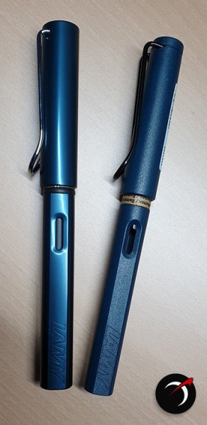
  18. I've been testing both ink samples and inexpensive Chinese pens. Yesterday I put some Private Reserve Lake Placid Blue into a Wing Sung 6359, and today I inked a Moonman 600S with some Pilot Iroshizuku Asa-Gao. I wasn't really thinking about them being similar colours. I've been working my way through the various Private Reserve blues, and today something reminded me that I'd been meaning to look at Asa-Gao. I was amazed to find the product of these two pen-and-ink combos to be virtually identical. And so I did an off-the-cuff side-by-side comparison on a page in an A6 Leuchtturm 1917. You can see some differences at the top of the page, but nothing that couldn't be explained by the Moonman laying down more ink. Both pens have F nibs, but they're different nibs from different makers. The lines of text at the bottom were written alternately with one pen and the other. I find it hard to see any difference at all. Nothing remotely scientific about this. Just a doodle for my own amusement, but I thought the result was interesting. The image is an iPhone snap under artificial light after some rudimentary photoshopping.
  19. From the album: Translated third-party content

    In reply to: https://www.fountainpennetwork.com/forum/topic/368207-platinum-president-in-bluewhen-was-it-made/

    © Platinum Pen Co.


    • 0 B
    • x
  20. namrehsnoom

    TAG Kyoto - kyo-no-oto ruriiro

    TAG Kyoto – kyo-no-oto ruriiro TAG is a stationary shop in Kyoto (Japan) that produces some interesting soft watercolour-style inks. With the kyo-no-oto series, they produce a line of inks that replicates traditional Japanese dye colours. According to available online info, the manufacturing process of these kyo-no-oto inks follows traditional dying techniques dating back to the Heian era between the years 794 and 1185. The inks come in 40 ml bottles, packaged in luxurious thick paper with a texture that feels like heavy watercolour paper. In this review I take a closer look at ruriiro, a limited edition subtle deep blue-violet ink with a silvery shimmer. Yes… this is another ink with glitter, which seems to become more popular with ink makers. If you don’t care about that, just don’t shake the bottle and the glimmer particles won’t bother you. My feeling is that ink producers simply add the glitter to up-market their inks, supposedly to a more premium level, with corresponding price tag. It’s a trend that I personally can do without. The ink’s name reflects the colour of lapis lazuli, a vivid deep blue with violet undertones. In the Buddhist cosmology, “ruri” is produced on the south side of Mount Meru, the sacred five-peaked mountain that sits in the center of all universes. Ruriiro is a beautiful blue – it looks elegant & refined, and at the same time subdued & muted. The Buddhist connection fits this ink. For a TAG Kyoto ink, ruriiro is on the wet side, which was a pleasant surprise. I also noticed that there is fairly harsh shading while you write, with wetter parts being a substantially darker blue. But while the ink dries on the paper, that harshness disappears, leaving a muted blue behind with mostly soft and pleasant shading. The ink has a tendency to absorb into the paper, with quite a lot of see-through & bleed-through on most non-high-quality papers. For me, ruriiro is a samurai ink – refined, elegant, restrained – but with a deadly attack that only high quality paper survives. To show you the impact of saturation on the ink’s look & feel on paper, I made some scribbles where I really saturated portions of a strip of 52 gsm Tomoe River paper with ink. This gives you a good idea of what the ink is capable of in terms of colour range. As you can see, ruriiro’s colour span is fairly limited – there is not that much contrast between light & dark parts (once the ink has dried). This translates to subtle-looking shading. Shading becomes more prominent with broad nibs & wet pens. What I like about this ink is that it adapts to the terrain – as you’d expect from a samurai warrior. This ink can look quite different depending on the pen/nib combination (see the nib size comparison’s below). Interesting! The ink’s chromatography clearly shows the strong violet undertones. It’s easy to overdo this, but with ruriiro, the blue & violet are nicely well-balanced. It’s definitely a blue ink, but with that violet undertone always subtly present in the background. Lovely! The bottom part of the chromatography indicates that the dyes easily detach from the paper. Ruriiro is not a water-resistant ink. I’ve tested the ink on a wide variety of paper – from crappy Moleskine to high-end Tomoe River. On every small band of paper I show you: An ink swab, made with a cotton Q-tip 1-2-3 pass swab, to show increasing saturation An ink scribble made with an M-nib Lamy Safari The name of the paper used, written with a B-nib Safari A small text sample, written the M-nib Safari Source of the quote, written with a Pelikan M101N (F-nib) Drying times of the ink on the paper (with the M-nib Safari) Ruriiro is best used with pure white paper, where its elegance & muted character is best displayed. With more creamy paper, the ink loses most of its beauty. The ink coped well with all paper types with no visible feathering, even on (bleep) paper like Moleskine. But I already explained that ruriiro is a samurai ink: the katana cuts deep into the paper, and the result is visible on the backside. Quite some see-through and bleed-through on many paper types. Drying times are all over the place: from almost zero on highly absorbent paper, to a full 20 seconds on some hard-surface papers (with the M-nib Safari). I’ve also added a few photos to give you another view on the ink. Scanned images and photos often capture different aspects of the ink’s colour & contrast. That’s why I present them both. In this case, both scanner and photo capture quite well the real-world colour. Writing with different nib sizes The picture below shows the effect of nib sizes on the writing. Kyo-no-oto ruriiro works well with all nib sizes, even the finest ones. The ink keeps its subtle character across the nib range, and always leaves a nice contrast-rich line. Be aware that this ink adapts to the terrain, and can look quite different depending on the paper used. For my nib-size test, I use Rhodia N°16 paper which has a hard surface. With Rhodia, the ink is not deeply absorbed into the paper, but dries more on the surface. With ruriiro, this seems to result in more explicit shading. With more absorbent paper, shading becomes a lot softer. I personally find this terrain-adapting character of ruriio fascinating, and one of this ink’s strong points. Related inks To compare this muted violet-blue ruriiro with related inks, I use my nine-grid format with the currently reviewed ink at the center. This format shows the name of related inks, a saturation sample, a 1-2-3 swab and a water resistance test – all in a very compact format. I have no other blue like this in my collection. There are similarities with Diamine Tchaikovsky and Callifolio Bleu Ultramarine, but they still look quite different. Inkxperiment – city rain With every review, I try to create an inkxperiment using only the ink I’m working on. This one-ink drawing is a great way to show off the colour-range nuances that are present in the ink. I really enjoy this more creative part of the review: always good for a couple of fun-packed hours. The last couple of weeks, we had some mild rain showers in the area. Not the gloomy wheather kind, but the occasional soft showers alternating with sunny periods. I love the look of the the city at the end of these showers – everything looks so fresh and sparkly. I tried to capture this “city rain” feeling in today’s inkxperiment. The concept for this drawing started with a quick outline sketch in my journal. I used water-diluted ruriiro to paint the background on a sheet of A4-sized HP photo paper. I then used cotton Q-tips to draw the city blocks on the horizon. Next, I painted the foreground details with brush & pen, using pure ruriiro. I then did a finishing pass over the drawing, adding some final touches. The resulting picture gives you an idea of what can be achieved with ruriiro in a more artistic context. Inkxpired – computational art I love experimenting with pen/ink/paper, and am now adding another layer as part of the hobby. I’m exploring computational art, inspired by the ink drawings I do during ink reviews. Another fun offshoot of the hobby… and all that starting with a few drops of dye-coloured water on paper. Conclusion TAG Kyoto kyo-no-oto ruriiro is a great-looking blue-violet with a muted character. The ink definitely looks at its best on pure white paper. But what I find really fascinating about ruriiro is that it expresses itself so differently across paper types, and even across nib sizes on a single page. Not only a beautiful blue, but also an interesting one with some unexpected moves. Technical test results on Rhodia N° 16 notepad paper, written with a Lamy Safari (M-nib) Back-side of writing samples on different paper types
  21. Hello my fellow fountain pen lovers. I love rich, vivid, deeply saturated fountain pen inks, particularly those that shade. My favorite inks are Colorverse Supernova, that shades gorgeously from a rich blue to a lighter blue, and Diamine November Rain, which in my green-and-black Pelikan M600, shades (you guessed it) from green to black beautifully. For my Lamy 2000, which I just bought to be my daily-use pocket pen, I’m searching for a waterproof ink for a specific reason: so when I sign restaurant checks with it, there is no danger of the waiter losing his tip because his check slip got wet and the ink disappeared. But my dillemma is that I love saturated, vivid inks. With one exception, all the waterproof inks I’ve tried are cloudy and unsaturated and unsatisfying. I just bought a bottle of Sailor Seiboku. To me, this is a pale, cloudy ink, the opposite of the rich, saturated colors I love. And iron gall inks are generally dry writers, so that’s a nonstarter. Got to have a wet ink. The exception is Noodler’s Baltimore Canyon Blue, which is saturated and beautiful, and in my own tests is fully waterproof, but… when I write on restaurant checks with this ink, the pen simply stops writing and has to be primed. The ink seems to react to the thermal paper restaurants use and it clogs right up. Thanks in advance for your advice! GNL
  22. Mont Blanc - Petrol Blue For the past few years, Mont Blanc has followed the tradition of bringing out a Limited Edition "Colour of the Year" ink. These come in a 50 ml square bottle, and are typically available for a limited time only. In this review, I take a closer look at Petrol Blue, the colour of the year 2019. The ink's packaging is both stylish and functional, and gives an idea of the ink's colour. In the box you'll find the nice square bottle, with a decent amount of ink (50 ml). Not so nice is the ink's price point - at about 35 EUR for a bottle, this definitely is an expensive ink. To my eye, Petrol Blue is a teal-leaning blue, and one that looks quite nice. Also well saturated - which is quite a relief after some of the more recent watered-down MB colours. I personally like teal-style colours, and this one is different enough from my other teals to make it interesting. The ink writes rather wet, even in my typically dry Lamy Safari test pens - no complaints there. The ink shades strongly... very noticeable even in finer nibs. The contrast between light and darker parts is prominent, but still aesthetically pleasing. Overall, I quite like what I see. Petrol Blue has a rather broad dynamic colour span. To illustrate this, I did a swab on Tomoe River paper where I really saturated portions of the paper with ink. This beautifully illustrates the ink's colour range. The ink moves from a light-blue to a very dark teal. You'll also notice a reddish sheen in very saturated parts. On the smudge test - rubbing text with a moist Q-tip cotton swab - the ink behaved reasonably well. There is quite some smudging, but the text itself remains perfectly readable. Water resistance is totally absent though. All colour quickly disappears from the page, leaving almost no residue. Definitely not an ink to use in the workplace. A word of warning: this ink will stain your fingers, requiring quite some scrubbing to remove it. On the positive side, I found it easy to clean from the syringe-filled cartridges that I used for my test pens. Petrol Blue is a fast-drying ink - with typical drying times in the 5-10 second range with my Lamy Safari (M-nib). As such, this ink is also suitable for lefties (when using finer nibs). I've tested the ink on a wide variety of paper - from crappy Moleskine to high-end Tomoe River. I have recently expanded my paper testbed to include 20 different paper types. As such, you will get a good idea of the performance of this ink on a broad range of papers. On each scrap of paper I show you: An ink swab, made with a cotton Q-tip 1-2-3 pass swab, to show increasing saturation An ink scribble made with a Lamy Safari M-nib fountain pen The name of the paper used, written with a Lamy Safari B-nib A small text sample, written with an M-nib Drying times of the ink on the paper (with the M-nib) This Mont Blanc ink looks really nice on all my test papers. This is an ink that looks good on any type of paper, both the white and more yellow ones. With the exception of Moleskine and the HP 80gsm printing paper, I didn't notice any feathering. With lower-quality paper, you get some see-through and even a bit of bleed-through. All-in-all though, this is a well-behaving ink. Writing with different nib sizes The picture below shows the effect of nib sizes on the writing. All samples were written with a Lamy Safari, which is typically a dry pen. I also added a visiting pen - a wet-writing Pelikan M200 Classic Green-Marbled with an F-nib. Here the ink leaves a much more saturated line, with somewhat less pronounced shading. The ink works well with all nib sizes I tested it with. Related inks To compare Petrol Blue with related inks, I use a nine-grid format with the currently reviewed ink at the center. This format shows the name of related inks, a saturation sample, a 1-2-3 swab and a water resistance test - all in a very compact format. I hope that you'll find this way of presenting related inks useful. It's a bit more work, but in my opinion worth the effort for the extra information you gain. Inkxperiment - the eagle has landed (celebrating the fiftieth anniversary of the first moon landing) As a personal experiment, I try to create interesting drawings using only the ink I'm reviewing, keeping things simple and more-or-less abstract. For me, this broadens the scope of the hobby, and allows me to stretch my drawing skills. It is great fun to explore an ink's colour range in a more artistic context. For this drawing, inspiration comes from the first moon landing fifty years ago, with Neil Armstrong announcing that "the Eagle has landed". So in this drawing, you also get an eagle ;-) I started off with a 10x15cm piece of HP Premium photo paper, on which I painted multiple layers of ever more saturated ink to create the background. I then used my Lamy Safari with pure Petrol Blue to pencil in the trees and the eagle. Overall I'm quite pleased by the use of the photo paper as a medium for ink paintings - the ink's character shows off really well. Conclusion Mont Blanc's Petrol Blue "Colour of the Year 2019" LE ink is quite a good-looking teal-leaning blue, that is at home with all types of nibs and all types of paper. I really enjoyed using it. My only real complaint is that the ink is too expensive - it's not different enough from similar inks like Diamine Eau de Nil to warrant the hefty price tag. Technical test results on Rhodia N° 16 notepad paper, written with Lamy Safari, M-nib Backside of writing samples on different paper types
  23. Hello Fellow FPNers, I have been away from fountain pens for about 10 years after many years using them almost exclusively. Now that I’m back in the fold, I’m wondering if there are any well behaved, beautiful waterproof inks out there I might not know about. I remember that most of the waterproof or bulletproof inks I used (Noodler’s Luxury Blue comes to mind) tended toward nib creep and were very hard to wash out of pens. I’ve recently received a sample of Noodle’rs Zhivago and have been very impressed by its good behavior, lack of nib creep and good flow. But it basically looks black (barely a hint of green) and I’d prefer something in the blue-teal-green spectrum. MUST be a well behaved ink. Thanks for your insights! GNL
  24. I've just got this ink and I love it so much that I'd like to share with you, although I know there've been a lot of reviews of this ink already. I used a Lamy Vista 1.9 nib on Rhodia paper for this simple review. The colour is a bright ocean/cerulean blue well worth its name. The shading is amazing (plus this nib tends to bring out the shading of an ink), from a bright clear blue to a deep ocean blue. It runs very wet on this nib, so the drying time is not accurate. The water-resistency is basically none, as can be seen from the drip test and the smear test, in which I ran a wet finger through it twice. This is my first ink in the turquoise/blue range and I love it. The photo doesn't do it much justice, because it's more vibrant and less green than it's shown in the photo. In fact I had wanted to go for Iroshizuku Kon-peki, but the price made me hesitate. After reading a post here where a FPN member compared these two inks and I was not able to distinguish one from the other, I ordered this, and I don't regret this choice! I have been eyeing Noodler's Navajo Turquoise or Turquoise Eel as well. I wonder how they compare with Mediterranean Blue.
  25. essayfaire

    MB Honore du Balzac Ink

    The brown ink from shipping made the sample label unreadable, I thought, but I have finally determined that the ink inside is MB Honore du Balzac. The se BJ page is in an Endless Notebook, the ink writes slightly wetter there (better and thicker paper). @amberleadavisplease move this to the right thread if I have it wrong. Thanks. @TheMustard, have I id'd correctly?


×
×
  • Create New...