Search the Community
Showing results for tags 'bleur myosotis'.
-
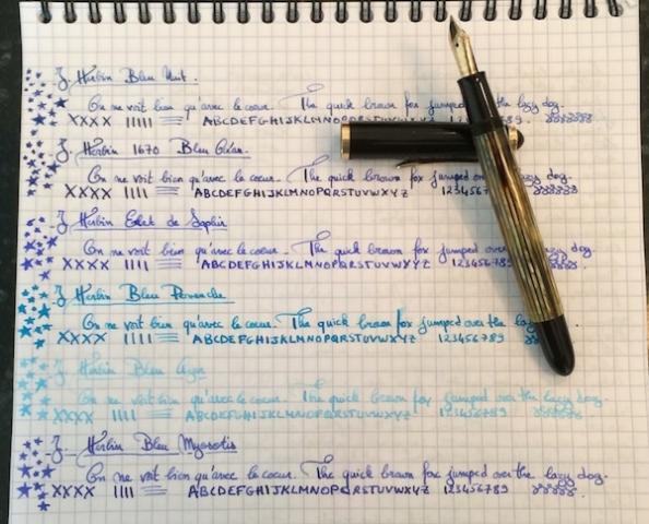
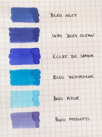
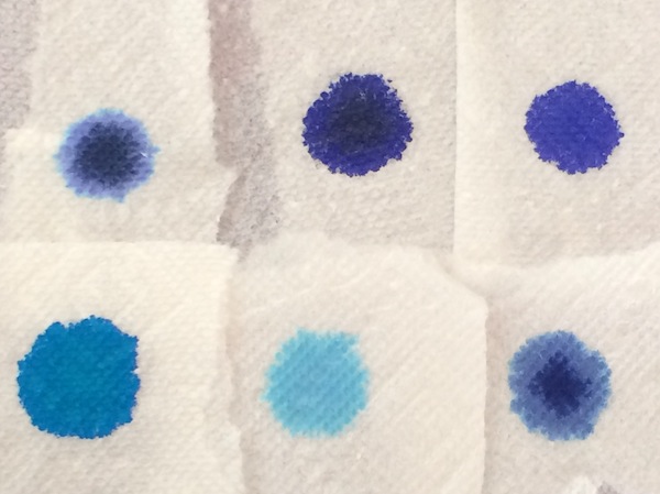
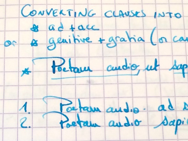
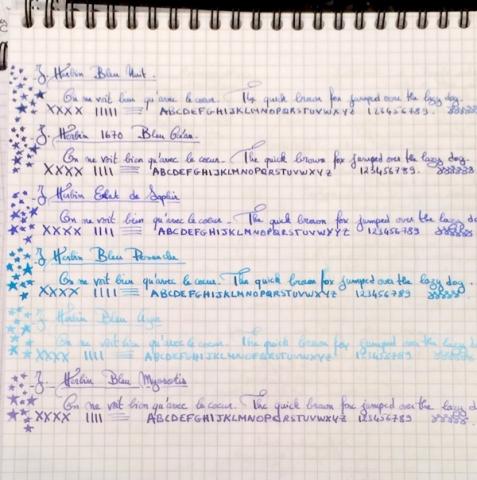
I love inks that are wet and easy to clean, so I’ve accumulated more than half of the Herbin line. And, blue is the color I use most often in my daily writers, so I thought it would be fun to do a comparison of the Herbin blues: Bleu Nuit, 1670 Bleu Ocean, Bleu Pervenche, Bleu Azur, Bleu Myosotis and Eclat de Saphir. I use all of them regularly with the exception of Bleu Azur (which I ordered a sample of to add to this comparison). The comparison was done using a Pelikan 400NN F nib on Rhodia. Ink Swabs: Ink on Paper Towel: Top Row: Bleu Nuit, 1670 Bleu Ocean, Eclat de Saphir Bottom Row: Bleu Pervenche, Bleu Azur, Bleu Myosotis As with most Herbin inks, all 6 blues are all extremely easy to clean, have never stained any of my pens, are wet and very well behaved (immediate start-up in a pen left uncapped for over a minute, no performance issues even after sitting in an unused pen for a couple of days and no skipping noticed in any pen that I’ve put them in.) Yet, as with any brand, these blues are not all created equal and differ considerably in the lubrication/smoothness they provide. So, my ranking of the inks (in addition to personal color preference) is greatly determined by this factor, since I enjoy using smooth inks: 1. Eclat de Saphir 2. 1670 Bleu Ocean 3. Bleu Pervenche 4. Bleu Myosotis 5. Bleu Nuit 6. Bleu Azur (I've included additional writing samples from my notebook to show color variation in different pens. Please excuse the Latin class notes and the nonsensical doodles ) 1. Eclat de Saphir This has become one of my benchmark inks as it has performed exceptionally well in every pen that I have put it in, and I usually have the most fun playing with a nib when a pen is inked with it. It offers some shading which appears to be determined more by the flexiness and wetness of the nib than the actual composition of the ink. In some of my pens Eclat de Saphir is a soft blue with violet undertones while in others, the wetter writers, the color is a truer, more intense jewel like blue. Although less smooth/lubricated than the 1670 Bleu Ocean, writing with the ink feels good, and all of my pens seem to reach their full performance potential (on Rhodia) when inked with this blue elixir. I imagine that a nib filled with Eclat de Saphir must feel as limber and free as the body/mind post a good yoga class! This is one of my top 3 inks and if the entire Herbin line performed the same way I would have trouble using any other brand. Lubrication: Good 2. 1670 Bleu Ocean This ink’s biggest appeal is its smoothness/lubrication, which surpasses all other Herbin blues, and is unlike any other Herbin ink I’ve tried in that regard. In some wetter nibs some might even consider Bleu Ocean to be too smooth. In fact, in the wet 1950s 146, the best comparison I can give to writing with this ink is the rush one gets from skating on slightly wet, freshly cleaned ice. The color is a dark blue with purple undertones and minimal shading. The ink can appear dull/muted in a drier nib or beautifully saturated in a wet writer. Yet, despite that saturation, it cleans out effortlessly even from high maintenance pens. Lubrication: Very good 3. Bleu Pervenche I have a huge weakness for turquoise ink and recently tried about 15 of them in hopes of finding the perfect one. Although Bleu Pervenche was not my first ranked turquoise based on color (Rohrer and Klingner Blu Mare wins hands down for me in that category!), Bleu Pervenche is the one I turn to most often because it provides the most fluid writing experience out of the samples I tried (which also included Omas, Visconti, Montblanc, Diamine, Monteverde, Pelikan, Waterman...). I would have liked for it to feel even a tad smoother (like Eclat de Saphir), and if it did I would have ranked it above Bleu Ocean, but overall this is a beautiful ink. Lubrication: Ok to good 4. Bleu Myosotis This color comes to life not when the ink first meets the page or even immediately after it has dried. Days later, it evolves into a very soft blue that sits between a cool, silvery grey and a subtle violet; the color is on the lighter side but remains perfectly legible and for some reason reminds me of the ink that a winter fairy would use (all it needs is silver shimmer...) Shading is higher than the previous three blues and, combined with the faded color, gives the ink a nice vintage quality. Lubrication: Ok to good. 5. Bleu Nuit I want to like this ink more than I do. Bleu Nuit is more of a blue grey than a blue black and shades beautifully (more than any of the other Herbin blues). Yet, whenever I use this ink, I usually like the color and the shading for about half a page and then get bored with it. Another area where the ink falls flat for me is its lubrication. This is one of the wettest inks of the bunch, but not in a good way; it does not provide the smooth, silky wetness I enjoy writing with but rather a kind of thin, watery flow. Lubrication: Ok (mainly due to extreme wetness of ink) 6. Bleu Azur I cannot really comment much on this ink, because I only used it for the writing sample in this comparison, but in that brief moment, I did not enjoy using. It felt thin and watery with even less lubrication than Bleu Nuit. On Rhodia, the color is so light that I could never use it in a daily writer. However, I will say that, when painted on the paper with a q-tip, the color is beautiful, so Bleu Azur could make for a wonderful light blue ink for anyone who uses fountain pen inks to draw, paint... Lubrication: Poor


