Search the Community
Showing results for tags 'bleu azur'.
-
L'Artisan Pastellier Callifolio - Bleu Azur L'Artisan Pastellier is a small company in southern France that specialises in natural pigments, and offers customers authentic and reliable products in beautiful colours based on mineral or vegetable pigments. In a collaboration with Loic Rainouard from Styloplume.net, the chemist Didier Boinnard from L'Artisan Pastellier created the line of Callifolio fountain pen inks. These pastel-coloured inks are traditionally crafted, and can be freely mixed and matched. Overall these inks are only moderately saturated, and have low water-resistance. The inks were specifically designed to work well with all types of paper, and all types of fountain pens. Being pastel-tinted, these inks have a watercolour-like appearance, and are not only fine inks for journaling, but are also really excellent inks for doodling & drawing. I only recently discovered them, and they are already the inks I gravitate towards for personal journaling. In this review the spotlight is on Bleu Azur, one of the many blue inks of the series. The blue Callifolio inks are named after rivers, lakes and oceans – in this case I think of the azure blue colour of a tropical lagoon. This is more or less a traditional royal blue ink, with a bit of a purple undertone. I'm not myself a fan of this ink style, so this one didn't exactly wow me. I found the ink to be on the dry side in my Lamy Safari test pens, with lubrication being somewhat subpar. I also find the shading a bit too pronounced to my liking. In fine nibs, the ink shows a rather bland appearance. It's only with broader or italic nibs that I start to appreciate what I see. To show you the impact of saturation on the ink's look & feel on paper, I made some scribbles where I really saturated portions of the paper with ink. This gives you a good idea of what the ink is capable of in terms of colour range. As you can see, this ink has a broad colour span ranging from a light purple-blue to a really dark royal blue. On heavily saturated parts, you get a reddish sheen. I like the ink most in the middle tones, where the purple comes to the foreground. On the smudge test - rubbing text with a moist Q-tip cotton swab - Bleu Azur shows a lot of smearing. The text remains legible though. Water resistance however is almost non-existent. The droplet test leaves only unrecognisable blue smudges. The test with running tap water washes away almost all the colour - only faint traces remain. If you need some measure of water resistance in your ink, look elsewhere. When using a water-brush with doodling & drawing, you get a nice light-blue shading effect. Like all Callifolio inks, Bleu Azur is an excellent choice for inky drawings. I've tested the ink on a wide variety of paper - from crappy Moleskine to high-end Tomoe River. With this review, I have added Viking Vektor paper to my test set - Catherine from Sakura generously gifted me a pad of this paper to try out. On every small band of paper I show you: An ink swab, made with a cotton Q-tip 1-2-3 pass swab, to show increasing saturation An ink scribble made with an M-nib fountain pen The name of the paper used, written with a B-nib A small text sample, written with an M-nib Drying times of the ink on the paper (with the M-nib) Bleu Azur behaved perfectly on all the paper types, with no apparent feathering even on the lower quality papers in my test set (with the exception of Moleskine, which is a nightmare for fountain pen writing). Drying times are mostly around the 5 to 10 second mark. The ink looks best on white paper. In my opinion, it's not a good ink for yellowish paper, where it looks underwhelming. My advice: stick to white paper with this colour. At the end of the review, I also show the back-side of the different paper types, in the same order. With the low-end Moleskine there is prominent show-through and a little bleed-through. With the other papers, Bleu Azur's behaviour is impeccable. The ink copes really well with a wide variety of paper types. Writing with different nib sizes The picture below shows the effect of nib sizes on the writing. All samples were written with a Lamy Safari, which is typically a dry pen. I also added a visiting pen - a wet-writing Pelikan M120 with a fine nib. With this wet nib, the ink writes much more pleasantly, but also shows much harsher shading, which I personally dislike. Related inks To compare Bleu Azur with related inks, I use a nine-grid format with the currently reviewed ink at the center. This format shows the name of related inks, a saturation sample, a 1-2-3 swab and a water resistance test - all in a very compact format. I hope that you'll find this way of presenting related inks useful. It's a bit more work, but in my opinion worth the effort for the extra information you gain. Inkxperiment – reach for the sky As a personal challenge, I try to create interesting drawings using only the ink I'm reviewing. For me, this brings extra fun to the hobby, and these single-ink drawings are great for stretching my creativity. With these small pictures, I try to give you an idea of what the ink is capable of in a more artistic setting. For this drawing I started off with HP Premium photo paper and a Scotch Brite dishwashing sponge. I used the soft side of the sponge with water-diluted ink to draw in the background. The rough side with less diluted ink was used to sponge in the foreground. I cut out a round section of sponge, and used this to stamp in the flower halos. Next I used a brush with pure Blue Azur to paint in the flower stems. I quite like the end result - and the dishwashing sponge has been added to my drawing toolset. This mini-picture gives you a good idea of what can be achieved with Callifolio Bleu Azur as a drawing ink. Conclusion Bleu Azur is a royal-blue style ink that looks best on pure white paper. The ink works well with all nib sizes, but is on the dry side. You need wet pens to make for a pleasing writing experience. Unfortunately, with wet pens you get contrast-rich harsh shading, with I personally dislike. Like most Callifolio inks, water resistance is almost non-existent . All in all, not an ink that I would recommend. Technical test results on Rhodia N° 16 notepad paper, written with Lamy Safari, M-nib Back-side of writing samples on different paper types
- 9 replies
-
- lartisan pastellier
- callifolio
-
(and 3 more)
Tagged with:
-
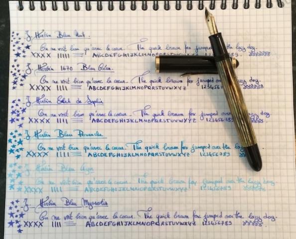
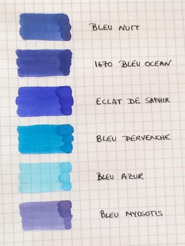
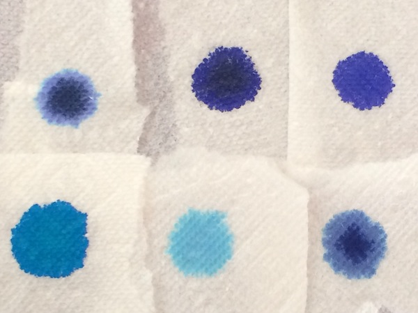
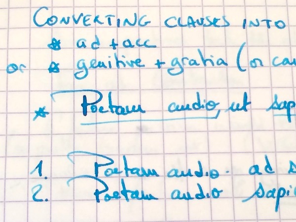
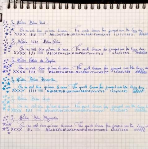
I love inks that are wet and easy to clean, so I’ve accumulated more than half of the Herbin line. And, blue is the color I use most often in my daily writers, so I thought it would be fun to do a comparison of the Herbin blues: Bleu Nuit, 1670 Bleu Ocean, Bleu Pervenche, Bleu Azur, Bleu Myosotis and Eclat de Saphir. I use all of them regularly with the exception of Bleu Azur (which I ordered a sample of to add to this comparison). The comparison was done using a Pelikan 400NN F nib on Rhodia. Ink Swabs: Ink on Paper Towel: Top Row: Bleu Nuit, 1670 Bleu Ocean, Eclat de Saphir Bottom Row: Bleu Pervenche, Bleu Azur, Bleu Myosotis As with most Herbin inks, all 6 blues are all extremely easy to clean, have never stained any of my pens, are wet and very well behaved (immediate start-up in a pen left uncapped for over a minute, no performance issues even after sitting in an unused pen for a couple of days and no skipping noticed in any pen that I’ve put them in.) Yet, as with any brand, these blues are not all created equal and differ considerably in the lubrication/smoothness they provide. So, my ranking of the inks (in addition to personal color preference) is greatly determined by this factor, since I enjoy using smooth inks: 1. Eclat de Saphir 2. 1670 Bleu Ocean 3. Bleu Pervenche 4. Bleu Myosotis 5. Bleu Nuit 6. Bleu Azur (I've included additional writing samples from my notebook to show color variation in different pens. Please excuse the Latin class notes and the nonsensical doodles ) 1. Eclat de Saphir This has become one of my benchmark inks as it has performed exceptionally well in every pen that I have put it in, and I usually have the most fun playing with a nib when a pen is inked with it. It offers some shading which appears to be determined more by the flexiness and wetness of the nib than the actual composition of the ink. In some of my pens Eclat de Saphir is a soft blue with violet undertones while in others, the wetter writers, the color is a truer, more intense jewel like blue. Although less smooth/lubricated than the 1670 Bleu Ocean, writing with the ink feels good, and all of my pens seem to reach their full performance potential (on Rhodia) when inked with this blue elixir. I imagine that a nib filled with Eclat de Saphir must feel as limber and free as the body/mind post a good yoga class! This is one of my top 3 inks and if the entire Herbin line performed the same way I would have trouble using any other brand. Lubrication: Good 2. 1670 Bleu Ocean This ink’s biggest appeal is its smoothness/lubrication, which surpasses all other Herbin blues, and is unlike any other Herbin ink I’ve tried in that regard. In some wetter nibs some might even consider Bleu Ocean to be too smooth. In fact, in the wet 1950s 146, the best comparison I can give to writing with this ink is the rush one gets from skating on slightly wet, freshly cleaned ice. The color is a dark blue with purple undertones and minimal shading. The ink can appear dull/muted in a drier nib or beautifully saturated in a wet writer. Yet, despite that saturation, it cleans out effortlessly even from high maintenance pens. Lubrication: Very good 3. Bleu Pervenche I have a huge weakness for turquoise ink and recently tried about 15 of them in hopes of finding the perfect one. Although Bleu Pervenche was not my first ranked turquoise based on color (Rohrer and Klingner Blu Mare wins hands down for me in that category!), Bleu Pervenche is the one I turn to most often because it provides the most fluid writing experience out of the samples I tried (which also included Omas, Visconti, Montblanc, Diamine, Monteverde, Pelikan, Waterman...). I would have liked for it to feel even a tad smoother (like Eclat de Saphir), and if it did I would have ranked it above Bleu Ocean, but overall this is a beautiful ink. Lubrication: Ok to good 4. Bleu Myosotis This color comes to life not when the ink first meets the page or even immediately after it has dried. Days later, it evolves into a very soft blue that sits between a cool, silvery grey and a subtle violet; the color is on the lighter side but remains perfectly legible and for some reason reminds me of the ink that a winter fairy would use (all it needs is silver shimmer...) Shading is higher than the previous three blues and, combined with the faded color, gives the ink a nice vintage quality. Lubrication: Ok to good. 5. Bleu Nuit I want to like this ink more than I do. Bleu Nuit is more of a blue grey than a blue black and shades beautifully (more than any of the other Herbin blues). Yet, whenever I use this ink, I usually like the color and the shading for about half a page and then get bored with it. Another area where the ink falls flat for me is its lubrication. This is one of the wettest inks of the bunch, but not in a good way; it does not provide the smooth, silky wetness I enjoy writing with but rather a kind of thin, watery flow. Lubrication: Ok (mainly due to extreme wetness of ink) 6. Bleu Azur I cannot really comment much on this ink, because I only used it for the writing sample in this comparison, but in that brief moment, I did not enjoy using. It felt thin and watery with even less lubrication than Bleu Nuit. On Rhodia, the color is so light that I could never use it in a daily writer. However, I will say that, when painted on the paper with a q-tip, the color is beautiful, so Bleu Azur could make for a wonderful light blue ink for anyone who uses fountain pen inks to draw, paint... Lubrication: Poor


