Jump to content

Search the Community

Showing results for tags 'balance'.

  • Search By Tags

    Type tags separated by commas.
  • Search By Author

Content Type


Forums

  • FPN Community
    • FPN News
    • Introductions
    • Clubs, Meetings and Events
    • Pay It Forward, Loaner Programs & Group Buys
  • The Market Place
    • The Mall
    • Market Watch
    • Historical Sales Forums
  • Writing Instruments
    • Fountain & Dip Pens - First Stop
    • Fountain Pen Reviews
    • Of Nibs & Tines
    • It Writes, But It Is Not A Fountain Pen ....
    • Pen History
    • Repair Q&A
  • Brand Focus
    • Cross
    • Esterbrook
    • Lamy
    • Mabie Todd Research/Special Interest Forum/Group
    • Montblanc
    • Parker
    • Pelikan
    • Sheaffer
    • TWSBI
    • Wahl-Eversharp
    • Waterman
  • Regional Focus
    • China, Korea and Others (Far East, Asia)
    • Great Britain & Ireland - Europe
    • India & Subcontinent (Asia)
    • Italy - Europe
    • Japan - Asia
    • USA - North America
    • Other Brands - Europe
  • Inks, Inc.
    • Inky Thoughts
    • Ink Reviews
    • Ink Comparisons
    • Co-Razy-Views
    • Th-INKing Outside the Bottle
    • Inky Recipes
  • Paper, and Pen Accessories
    • Paper and Pen Paraphernalia
    • Paper & Pen Paraphernalia Reviews and Articles
  • Creative Expressions
    • Pen Turning and Making
    • Pictures & Pen Photography
    • The Write Stuff
    • Handwriting & Handwriting Improvement
    • Calligraphy Discussions
    • Pointed Pen Calligraphy
    • Broad (or Edged) Pen Calligraphy

Blogs

  • FPN Board Talk
  • Incoherent Ramblings from Murphy Towers
  • The Blogg of Me
  • FPN Admin Column
  • Rules, Guidelines, FAQs, Guides
  • Musings on matters pen
  • Marketing & Sales
  • Iguana Sell Pens Blog
  • Newton Pens' Blog
  • Peyton Street Pens Blog
  • holygrail's Blog
  • A Gift For Words
  • I Don't Have a Name; So This Will Do
  • Karas Kustoms' Blog
  • Debbie Ohi's Inky Journal
  • Sus Minervam docet
  • Crud!
  • Clut and Clutter
  • Federalist Pens

Product Groups

  • FPN Pens
  • FPN Inks
  • FPN Donations
  • Premium/Trading/Retailer Accounts

Categories

  • Fonts
  • Tools & Software
  • Rules for Notepads & Paper

Find results in...

Find results that contain...


Date Created

  • Start

    End


Last Updated

  • Start

    End


Filter by number of...

  1. Who is headed to the Dallas Pen show this weekend? It's going to be a great time and the weather looks nice for the weekend. I'll be there at "The Write Pen" table selling pens for Danny Fudge and myself and Danny will be set up to refurbish vintage pens. Drop by and say hi!
  2. John T

    Sheaffer Balance cap threads

    So I was given a Sheaffer small slender Balance 857 in Golden Brown, white dot with a lifetime nib, lever filler, that had been found in an antique shop. The pen was given to me with the section slightly pulled out of the barrel and the cap was sitting loose over nib. It is a very good looking pen. I disassembled the rest of the way, cleaned it up. Replaced the sac and reassembeled it... To my total dismay when I put the cap back on it just spins with a occasional tug as it catches a bit of thread. The threads on the barrel are still in excellent condition. The threads inside the cap appear to be stripped... Is there any way to repair the damage or do I need to go in search of a donor pen?
  3. I am looking at this pen for purchase. In general, it looks darker than photos I've seen of red-veined grey pearl pens and the top of the cap seems lighter. Does it look discolored to you? Is it not the red-veined grey pearl color? [Click on photos for larger images.]
  4. It helps to explore this yourself, revisiting once in a while if need be, and keep in mind where each of those personal info fields are entered. Don't leave it until the urge to change something specific to come upon you, and only then bother to ask the question! Invest the time surveying upfront, instead of waste it later waiting for an answer from nobody in particular. Most of the fields shown above are self-evident as to what they are. I think the only ones that could do with explanation are: Security and Privacy: There is only one setting under there, and that is a toggle for whether your online status (including ‘last active’ date or time) is visible to others Content View Behavior: That has nothing to do with what others can see about you, but only where you would like to start reading when accessing content Enable status updates: This toggle enables/disables the public feed on your profile page; if you disable it, then nobody (including you) can post publicly visible ‘status updates’ or any other message against your profile, but if you enable it, then anyone — friend, foe, or complete stranger — can post something there whenever, without waiting for you to initiate and then only reply to what you wrote Notification Settings have nothing to do with what others can see about you, and so is out of scope for this article, and I'm not going to delve into those right now. (You can look here, here, and here to wrap your head around how notifications work with respect to followed content.) N.B. There is a possibility that some of the above settings and data fields may not be available to Bronze members and/or Silver members, but I have no way of testing that or scoping it out. — • — Another way of getting to the Edit Profile dialog, and the way to change your profile photo (or ‘avatar’), is here: — • — Freeform, custom member titles that one enters for oneself are long gone, and have not been a thing since FPN came back from a long hiatus and platform upgrade late in 2020.
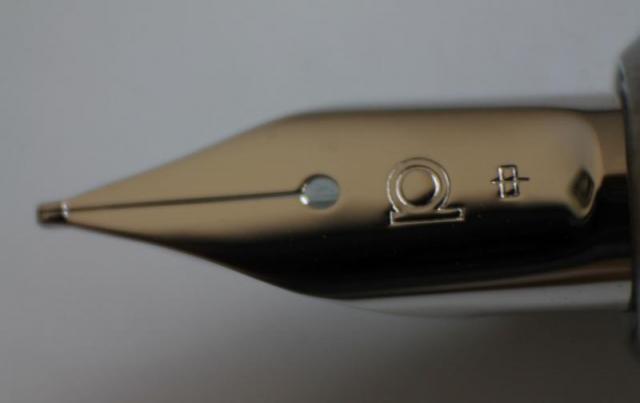
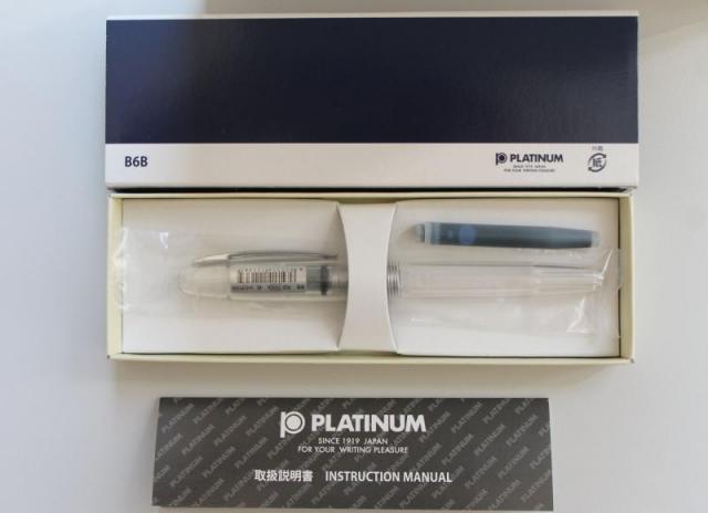
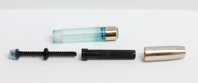
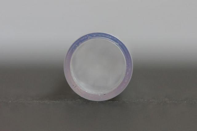
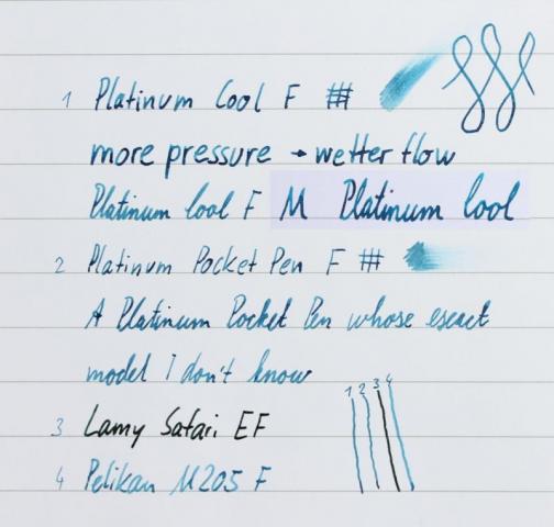
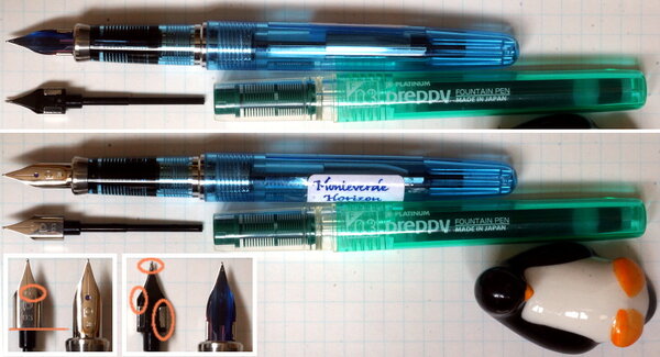
  5. There are some reviews on the Platinum Cool, which is also known as Platinum Balance, on FPN and other places. Nevertheless I think adding one more might contribute some more information, another perspective, experience and pictures. I had this pen in fine and medium and now use the fine for more than a year. Introduction This review is meant to depict my personal opinion and valuation. I wont use points to rate aspects. While I dont intend to criticize those who do, I dont want to evoke the semblance of objectivity. I am neither an expert for standards used nor could I compare this pen to dozens of others. Due to these limitations to what might be an ideal review, I will simply try my best to describe my experience with this model in a way which allows you to contrast it to your own experience and preferences. Nonetheless I will offer a few comparisons which might be useful. Platinum officially calls this model PGB-3000A and categorises it as a member of its Balance-family on its website. The Cool features a relatively springy steel nib in fine or medium, an acrylic resin torpedo-shaped body of medium size and weight. First Impressions The pen came in a nice-looking cardboard box which also included a Platinum proprietary cartridge and an instruction manual. Unfortunately there was no converter included. I was pleasantly surprised with the box. I wouldnt be ashamed to have the box be part of a present even though it was probably not necessarily meant to be displayed. While to me this pen feels solid and well made it cant keep up with the clear Platinum 3776 versions if we dont consider the price. The clear plastic with chrome trim looks modern. Appearance and Construction The Cool is available in three different colours, shining crystal, crystal blue and crystal rose. The clear one is, well, clear, the coloured ones are highly translucent. As I mentioned this pen is torpedo shaped, having a cap which becomes slightly wider towards the cap band and a barrel which then tapers towards its end. The Cool is mostly made from plastic. I like its quality because it really is clear, not prone to scratching and the material is quite thick which gives it a more sturdy impression than a Platinum Preppy. A Preppys barrel can be deformed when a lot of pressure is applied by hand, this one seems much more robust. One plastic part I strongly dislike is its cap insert. While it doesnt feature Platinums sophisticated slip and seal mechanism it still works well - but looks ugly. Being opaque white it doesnt match the design in my eyes. The point, I assume, is to hide traces of ink inside the cap. Where the insert is it does its job, however to me this isnt worth the effort as I consider it flawed in two ways. On the one hand this white insert is far more noticeable than ink stains in the cap, on the other hand at least in my case the white now is covered in blue spots all around its upper part where it occasionally had contact with the nib and these are more visible due to the higher contrast than those in the cap which exist where the insert cant cover them up. I would prefer a clear cap insert or a cap sealing reasonably without an insert. I'm aware my focus on staining might cast a negative light on the Cool. Thus I want to point out I don't consider this a weakness or criticize it - other pens suffer similarly from my decision to use such ink. I knew that and am fine with it, I simply look at this pen from this angle based on my personal experience. I am sure if you use non permanent colours you can maintain its transparency. The clip is simple, functional and sturdy adorned by a subtly engraved line around its rim only. Similarly utilitarian the cap band is narrow. On the cap directly above it JAPAN PLATINUM and Platinums Logo are engraved. A big part of the body is faceted though in a different way than a TWSBI Diamond as the facets are inside the barrel making its outside round and smooth. Thus the facets only affect the appearance and light refraction. Being clear the section allows the transparent feed and metal threads to be seen which probably is the most attractive and promotional aspect this pen offers. This feature makes the feed adopt the colour of your ink. In general lighter colours come across better, more like they look on paper than darker colours. The effect is similar to ink in a bottle or converter, the more ink light travels through the darker the colour will look like. Pigment inks however are an exception to this rule behaving less like this. Speaking of pigment inks, I already mentioned traces of ink and stains in the cap and insert, ink of course can also stain the feed. If you want to keep the feed completely transparent, I recommend to have this in mind when choosing an ink. In my photos you can see the effect of using Platinum Pigment Blue and Sailor Sei Boku for months (with regular cleaning). Cleanings results are limited with pigment inks. I dont think they damage or penetrate the plastic used but once they dry they are hard to remove because water then wont do anything. Removing dried pigment ink mechanically is possible, gently rubbing is enough, but limited to accessible areas and areas like the body and inside of the cap which are smooth. I am not able to completely remove stains from the feed. If you tried it with an ultrasonic cleaner I would love to read about your experience. The sections circumference is on the narrow side, I would say. Wider than a Pilot Metropolitan section for example or a Waterman Hemispheres one, which for me is not comfortable. I recommend Goulets Pen Plaza for comparisons. Since the connection between section and barrel is made from metal the front part is heavier than the plastic back where only the converter adds weight. The section unfortunately comes with another downside as its threads are sharp enough to abrase material from the plastic threads on the barrel, at least in my case. Im sure this wont be more than an aesthetic problem for the next few years but it doesnt improve the experience either. Weight and Dimensions Length capped: 139,5mm 5,5in Length posted: ~154mm 6,1in Length uncapped: ~126mm 5in Weight body: 13g 0,46oz Weight cap: 5g 0,18oz The more subjective assessment: This model is section-heavy but works well. Posting for me adds too much weight to the back. The Cool is about as heavy/light as a Lamy Safari. Nib and Performance As already mentioned the nib is made from steel and available in fine and medium. The nib is rather small, normal sized for the pens overall size. In contrast to most Japanese and Platinum pens in this model the line width runs similar to an average European fountain pen. I also found both the medium and fine rather wet. Combined this results in rather wide lines, maybe even compared to some fine running European brands. How it feels writing is more congruent to other Platinum pens as mine write smoothly and with some even feedback. An interesting feature is the relatively springy nib. Following the logic of what Platinum says about the new Platinum Procyon this might be due to the pentagon-shaped nib. It offers more flexibility than a Lamy Safari or Pilot Metropolitan to which I compared it before, I wouldnt call it flex though. My experience is limited but considering what I have seen it also is much less flexible than a Pilot Falcon or FA nib. When pressure is applied the line width increases, more noticeable in the fine than the medium, as well as the ink flow. You can reasonably expect the line width to become 1,5 times as wide, maybe to double. During normal writing the effect is very small, writing feels springier than with a nail-like steel nib. But I wouldnt recommend to constantly apply (a lot of) pressure, to me this nib doesnt feel like it would like this. The ink flow is even, doesnt decrease over time and easily keeps up with fast writing. Edit: The symbol on the left means 'fine', the one on the right 'medium'. Both nibs are silver coloured, the ambient light affected the reflection. Filling System and Maintenance Platinum uses a proprietary cartridge/converter system. There was no converter included which is common at this price point. Buying one is worth it I think. The converter is very well made overall, feels sturdy and can be taken apart for cleaning if you wish so. Its mouth is made from plastic surrounded by a metal ring. The clear part stood up surprisingly well against staining being still clear. The shroud is from metal again. Take a look at the pictures to see the piston mechanism inside the converter. The knob is made from plastic and features grooves, turning it feels controlled. Platinums cartridges are smaller than large standard international ones, and close in size to Pilot's cartridges. Their body is fairly thick and they contain a metal ball agitator. Cost and Value The Platinum Cool retails for about 40 US-Dollar in the US. I havent seen it at European retailers and must admit I dont know much about other markets. Some companies offer it for around 25 Dollar/Euro. Customer care usually is limited if you would have to send it back to Japan from Europe for example but these shipping costs probably exceed their benefits anyway at this price. The Cool can be considered an entry-level pen, maybe an upgrade to a Preppy or Plaisir. There are a lot of good competitors. I can name the Safari and Metropolitan again, but there are many more. I think the Cool cannot surpass them in writing experience, construction quality or filling-system but neither lacks behind. A clearer reason to buy is its transparent body and feed. Conclusion The Platinum Cool is an affordable demonstrator which offers reliable and controlled writing. Its transparent feed makes it special. If you aim for a super-smooth entry-level pen, look elsewhere. If you like the design you probably wont be disappointed by its other features. Feedback, criticism and further questions or opinions are welcome. Feel free to point out language mistakes I might have made. Edit 1: removed my remark on what the symbol on the nib stands for. It indicates the nib size,but I probably mixed up fine and medium. Edit 2: added picture for comparison of the symbols adorning the nib which mean 'fine' and 'medium'. Thanks for pointing out my mistake, Pseudo88.
  6. Hello After I got a couple of Sheaffer Balance a few days ago I had a hot conversation with a friend talking about - when can we name a pen as (vintage)!? and which aspect is more important!? time (how long), availability, quality ......etc Thank you for sharing us your opinions H1N
  7. From the album: Japanese pens

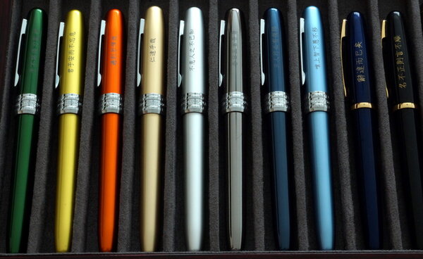
    Some Platinum Balance and Plaisir pens I ordered from Rakuten Global Market, back in the good old days when Rakuten was still operating an English-language marketplace site, and before it pushed sellers to stop shipping exports directly and steer overseas customers to use the Rakuten Global Express forwarding service. I bought these because custom engraving was included in the price, and I was looking for a bunch of cheap but reliable pens with (most importantly) effective sealing against ink evaporation when capped. The two Platinum Balance pens (on the far right) proved to be not so good in that regard, in spite of being significantly more pricey than the Plaisir pens.

    © A Smug Dill


    • 0 B
    • x
  8. A Smug Dill

    Balance of a filled Platinum Plaisir

    From the album: Hanging in the balance

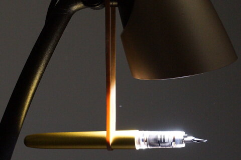
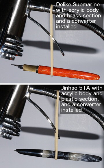
    The Platinum Plaisir show was installed with a CON-500 converter (which was not empty at the time).

    © A Smug Dill


    • 0 B
    • x
  9. From the album: Hanging in the balance

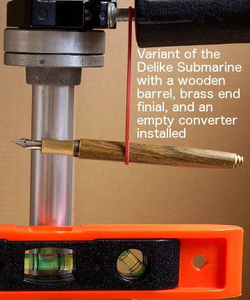
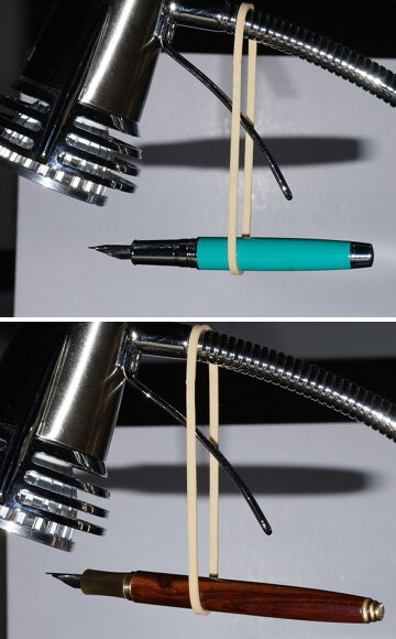
    If I recall correctly, the vendor called this pen model (with four variants in the type of wood used) a very informative “Delike Handmade Nature Wood Barrel", but it looks just like a Delike Submarine with a wooden barrel and brass finial to me.

    © A Smug Dill


    • 0 B
    • x
  10. From the album: Hanging in the balance

    If I recall correctly, the vendor called this pen model (with four variants in the type of wood used) a very informative “Delike Handmade Nature Wood Barrel", but it looks just like a Delike Submarine with a wooden barrel and brass finial to me.

    © A Smug Dill


    • 0 B
    • x
  11. From the album: Hanging in the balance

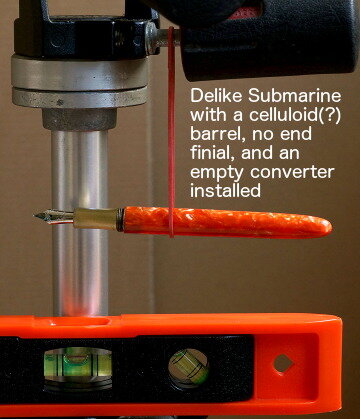
    I must admit I'm uncertain whether the Delike Submarine pen pictured has an acrylic barrel or a celluloid barrel. The item listing said celluloid, but I cannot detect any camphor smell.

    © A Smug Dill


    • 0 B
    • x
  12. From the album: Hanging in the balance

    If I recall correctly, the vendor called this pen model (with four variants in the type of wood used) a very informative “Delike Handmade Nature Wood Barrel", but it looks just like a Delike Submarine with a wooden barrel and brass finial to me.

    © A Smug Dill


    • 0 B
    • x
  13. From the album: Hanging in the balance

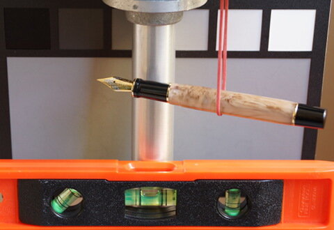
    The Kaigelu 316 has a reputation for being uncomfortably back-heavy. In 2020, it appears some design changes have been introduced in the new release colours of the model, such that the weight balance has shifted somewhat. (If I recall correctly, the converter attached to the gripping section was more than half-full of ink when I took this photo.)

    © A Smug Dill


    • 0 B
    • x
  14. Steffi

    Sheaffer Balance 2 Nibsize

    Hello, I have recently bought a Sheaffer Balance 2 in crimson glow. It has a broad nib and I`m wondering about the size of that nib, thinking of eventually fitting a vintage Sheaffer Balance nib (EF) on this pen. Will an old number 5 nib fit? Thanks in advance, Greetings, Steffi
  15. I have replaced lots of pressure bars in Sheaffer Balances but a couple of years ago I obtained one with what I have since discovered is called a Shepherds hook pressure bar. The original was horribly corroded so I removed it hoping to perhaps clean it up but the corrosion was too far advanced and the small bit that makes it not just a J bar broke off. I recently obtained a NOS replacement and sought advice on how to place it. I was told to get the bar started into the slot in the end of the barrel then lift that tab with a strong dental tool and lift that "tab" into the slot. Well, that tab seems to be caught on the lip of the slot and no dental tool I have is moving it. I am open to suggestions.
  16. I have replaced lots of pressure bars in Sheaffer Balances but a couple of years ago I obtained one with what I have since discovered is called a Shepherds hook pressure bar. The original was horribly corroded so I removed it hoping to perhaps clean it up but the corrosion was too far advanced and the small bit that makes it not just a J bar broke off. I recently obtained a NOS replacement and sought advice on how to place it. I was told to get the bar started into the slot in the end of the barrel then lift that tab with a strong dental tool and lift that "tab" into the slot. Well, that tab seems to be caught on the lip of the slot and no dental tool I have is moving it. I am open to suggestions.
  17. I am trying to rescue an estate-sale Sheaffer and am a little puzzled about what I'm finding. My main reference is the material at http://t.richardspens.com/ref/anatomy/vacfil.htm. This is my first Sheaffer teardown, so novice confusion is a possibility and I won't be insulted to be told I've misunderstood something. I'm going to try to make it clear what I've done. It looks to be a black Heritage Autograph Lifetime Balance with a vacuum filler. It has a clip ball with a flat top, a big "LIFETIME" conventional nib (with serial number) and feed, and an engraved signature on the 14K cap ring that matches the family name of the estate. The blind cap turned stiffly, and then came off, leaving a threaded stainless plunger rod sticking out, unmoved from the fully-down position. I see no hint of a brass rod-end or an aluminum lock nut, so it appears this pen had the plunger screwed directly into a threaded hole in the blind cap, as in the pictures on the page above. I presume the plastic female threads in the cap are now stripped; I'm not too worried about that. The rod does not move at all, though. I soaked the pen for a while with the blind cap off. I think I did get a little water into the barrel (probably through the feed) during this soaking; I can see liquid moving around in the barrel through the view striations, and it doesn't seem thick or dark enough to just be old ink. The nib was slightly misaligned sideways on the feed, but I was easily able to shift it back to center with gentle finger pressure. I got it to write nicely with the resulting ink reconstituted from what had dried in the feed and section. I tried just pulling the nib and feed out with my fingers, without success. No surprise. After a 24-hour soak in water with a little detergent in it, the nib and feed seemed reasonably clean, but the rod still wouldn't budge. I tried both pulling on the rod end with my fingers (not much force available there) and clamping it between wood blocks in a vise and pulling moderately on the barrel, in both cases trying to extend the rod as though starting to fill the pen. I didn't want to try too hard. Neither effort produced any motion at all. I warmed the section and lower barrel with a hair dryer, trying the section for motion every minute or so. After maybe five minutes of warming, it gave, and then smoothly unscrewed with modest torque. Nothing seemed amiss; the threads are in good shape (both section and barrel), and there was no sudden snapping, no indication of anything breaking, and no loose plastic bits. The face of the plunger looks as I expect: a conical plastic piece, not quite protruding from the end of the barrel. After a few hours of soaking, I'm still unable to persuade the plunger to move out of the barrel by pressing the back of the plunger rod down against a hardwood block. I am unable to move the conical cap nut even slightly sideways when I push at it with a nail set. When I poke at the rubber gasket with a pin, it has a little give, so I don't think it's completely hard. I suspect that the plunger is stuck because the hard conical backing washer is glued with old dried ink to the inside of the barrel right at the shoulder where the barrel ID changes. (If it was stuck only at the rear packing, I would be able to push the cone sideways at the section end.) I have not resorted to any other sort of press to push it harder; I'd rather try soaking that old ink for longer. Here's the main mystery: I expected to see a "center feed" piece, intended to deflect the plunger cap nut sideways, sticking out of the rear of the section. That's what appears in pictures 1, 4, 5, and 6 at http://t.richardspens.com/ref/anatomy/vacfil.htm. But I see no such thing. Looking into the section from the rear, I see a moderately complicated geometry, but no protruding piece; it's all basically concave. As far as I can tell the conical cap nut (plunger head) wouldn't be touching anything from the section at all. I also don't see a deep hole that a narrow center feed would have slipped into. Is it possible I could have broken that center feed off without knowing it? Did Sheaffer make a version with a conical plunger cap nut but no deflecting protrusion from the feed? Is it likely somebody has replaced the feed with a different one, or broken that bit and reassembled the pen without fixing it? Might I have misidentified the pen altogether? I'm happy to hear advice about getting the plunger unstuck, but I would even more appreciate suggestions about why the section doesn't look as expected. Thanks, George.
  18. I recently purchased a pair of Sheaffer pens. They are Balance models which are lever filll. Both are white dot, one with a lifetime nib, the other with a feather nib. Is the Section a friction fit with the body on these models, or do they screw in like the Triumph nib versions of the pens? Pictures:
  19. I snagged a couple Balance pens which are lever fill. Both are white dot, one with Feather nib, the other with Lifetime nib. The quick question is whether the Section is a friction fit in the barrel, or a threaded assembly like some of the later pens which are piston fill (which have Triumph nib). Pictures of pens:
  20. I recently purchased a pair of Sheaffer pens. They are Balance models which are lever filll. Both are white dot, one with a lifetime nib, the other with a feather nib. Is the Section a friction fit with the body on these models, or do they screw in like the Triumph nib versions of the pens? Pictures:
  21. I am curious to know what is considered the best / right / perfect balance point for a pen as it is held. This will be a centre of gravity point always locating in a narrow range regardless of pen length or weight (or else it would not be an ideal balance point). Is it measured in distance from the nib, the section (allowing for variation in grip) or somewhere else? Of course I know how comfortable I am with each of my pens, but I am wondering about the recommended or ideal position? I searched without finding a corresponding thread, in case this already exists as a topic.
  22. Hi Sheaffer Fans, I'm wondering if this pen is a Sheaffer Balance. Trying to increase my PIQ (Pen I.Q.), as well as identify this modern Sheaffer. I am in love with the Sheaffer Balance and continue the easter egg hunt for them. I'm thinking NOT, but not sure if my observations bear this out. Also, I have not been able to identify what Sheaffer model it might be, so a few of your brain cycles on this would be appreciated. Other resources to assist in identification would also be greatly appreciated. My observations: Seems like the right shape (although not as 'pointy' as the Balance on the ends, seems LESS Balanced! ), Clip seems to be different than the Balance pictures, with the White Dot on it - not on the cap directly It is a matte black - and cannot find any reference or example of this finish offering as a BalanceNib looks like SS w/ , marked Sheaffer M (Seems like it could be a "low end" offering)Thank you for any assistance in increasing my PIQ, and figuring out what model this pen is. Regards, George
  23. I have a Preppy and a Plaisir. They both have a similar nib and writes the same with a good touch of feedback. Though I love butter-y smooth pens, but I do enjoy the pleasant feedback of both the Platinums I own. I heard that Balance and Cool nibs are different from Plaisir ones, how different is the writing experience? Do they write smoothly or they give off that same feedback? Or any other parameters?


×
×
  • Create New...