Jump to content

Search the Community

Showing results for tags 'art'.

  • Search By Tags

    Type tags separated by commas.
  • Search By Author

Content Type


Forums

  • FPN Community
    • FPN News
    • Introductions
    • Clubs, Meetings and Events
    • Pay It Forward, Loaner Programs & Group Buys
  • The Market Place
    • The Mall
    • Market Watch
    • Historical Sales Forums
  • Writing Instruments
    • Fountain & Dip Pens - First Stop
    • Fountain Pen Reviews
    • Of Nibs & Tines
    • It Writes, But It Is Not A Fountain Pen ....
    • Pen History
    • Repair Q&A
  • Brand Focus
    • Cross
    • Esterbrook
    • Lamy
    • Mabie Todd Research/Special Interest Forum/Group
    • Montblanc
    • Parker
    • Pelikan
    • Sheaffer
    • TWSBI
    • Wahl-Eversharp
    • Waterman
  • Regional Focus
    • China, Korea and Others (Far East, Asia)
    • Great Britain & Ireland - Europe
    • India & Subcontinent (Asia)
    • Italy - Europe
    • Japan - Asia
    • USA - North America
    • Other Brands - Europe
  • Inks, Inc.
    • Inky Thoughts
    • Ink Reviews
    • Ink Comparisons
    • Co-Razy-Views
    • Th-INKing Outside the Bottle
    • Inky Recipes
  • Paper, and Pen Accessories
    • Paper and Pen Paraphernalia
    • Paper & Pen Paraphernalia Reviews and Articles
  • Creative Expressions
    • Pen Turning and Making
    • Pictures & Pen Photography
    • The Write Stuff
    • Handwriting & Handwriting Improvement
    • Calligraphy Discussions
    • Pointed Pen Calligraphy
    • Broad (or Edged) Pen Calligraphy

Blogs

  • FPN Board Talk
  • Incoherent Ramblings from Murphy Towers
  • The Blogg of Me
  • FPN Admin Column
  • Rules, Guidelines, FAQs, Guides
  • Musings on matters pen
  • Marketing & Sales
  • Iguana Sell Pens Blog
  • Newton Pens' Blog
  • Peyton Street Pens Blog
  • holygrail's Blog
  • A Gift For Words
  • I Don't Have a Name; So This Will Do
  • Karas Kustoms' Blog
  • Debbie Ohi's Inky Journal
  • Sus Minervam docet
  • Crud!
  • Clut and Clutter
  • Federalist Pens

Product Groups

  • FPN Pens
  • FPN Inks
  • FPN Donations
  • Premium/Trading/Retailer Accounts

Categories

  • Fonts
  • Tools & Software
  • Rules for Notepads & Paper

Find results in...

Find results that contain...


Date Created

  • Start

    End


Last Updated

  • Start

    End


Filter by number of...

  1. OMAS as you already know is a 90 year old Italian manufacturer of fine writing instruments and related luxury goods. Founded in 1925, it does carry the name of its founder, Armando Simoni. OMAS as it is, stands for Officina Meccanica Armando Simoni, which means workshop for machinery And initially from 1919 - 1925 this workshop had been producing parts and safety mechanisms for pens.. OMAS had launched its first fountain pen in 1927 and had also copied Duofolds for a while. The turning point for the company came in 1932 with the Omas Extra, a faceted celluloid pen. Today, OMAS is no longer a 100% Italian company as it was earlier, after international acquisitions, first with the French LVMH stake in 2000 and then a 90% controlling equity investment of the Hong Kong based luxury conglomerate Xinyu Hengdeli Group in 2007. Below is a link to this review on my blog with more eye-candy . So here it goes: Omas Art Vision Review As for the Arte Italiana Collection, the twelve faceted or dodecagonal pens were first launched in 1930s and they never got out of fashion over all these years. In Italy it’s called Faccettata, which is also representative of Greek Doric Columns. The Vision along with Milord and a larger Paragon belong to the same collection. They are still assembled in Omas boutique job shop one after the other, manually. The Vision comes in two distinct designs - Liquid Blue & Liquid Green limited to 331 pieces per colour. However these pieces are not individually numbered like the Ogiva Vintage runs. Liquid Blue comes trimmed with bright rhodium decor while Liquid Green is trimmed with dark ruthenium decor. The colours are inspired from watercolour shades. http://3.bp.blogspot.com/-rwB2R_oPcX4/Vebk2XYHZdI/AAAAAAAAFXc/1dU-X7ggqak/s1600/1Designs.jpg PRESENTATION The Art Vision comes in a luxurious cardboard box encased within a silvery grey paper box. The heavy box is inlined with grey felt resembling the shades of steel grey. Once you remove the top cover, you can find the pen nesting inside a grey pen sleeve, placed on a custom made bed. The inside of the lid muses with the following motto customary to Omas: Italian Creativity, History, Craftsmanship. The Pleasure of Writing. Once you flip open the velvety separator, you would notice that there are two beds for two of your pens. Underneath rest the manuals and warranty card for this pen in a separate section. http://1.bp.blogspot.com/-KtUuS-0Y-wg/VeblYyOvHKI/AAAAAAAAFZE/79L3CKGNrVA/s1600/box2.jpg DESIGN - THE SONG OF DARK & EMERALD (6/6) It’s the Game of Thrones playing in my mind or these colours of liquid green and dark ruthenium play a beautiful symphony of light and dark. These pens are made of Omas proprietary Cotton Resin which constitutes of blended cotton seeds and resin polymer derivatives. The cotton resin feels quite substantial and does reflect a luxury in its own terms of rendering hues. The entire pen gleams with emerald tunes, entrapped within hushed darkness of ruthenium giving something that is not very common to this world of art. You can actually visualise the pen as a doric column which separated long ago and fell right into your palms. The clip gleams like an arc quite subservient to an emerald haze. http://1.bp.blogspot.com/-ragZY5aUAho/Vebk9mVwxeI/AAAAAAAAFXs/iT_R5_AXqHU/s1600/DSC_5849.jpg The piston knob concludes the structure with a raised dome. The cap feels light and unscrews with a single turn, revealing a dark ruthenium plated nib converging with gleaming shades of its metallic section. It reminds me of my gun-metal frames. The section starts with a dodecagonal structure (12 sides) stepping down for commencement of the efficient threads before tapering down to a comfortable grip section, before ending with a raised loop. These are the times when soulful geometry transforms into art. I did not find the grip uncomfortable or slippery and I hold the pen 0.4 - 0.5 cm above the nib. http://1.bp.blogspot.com/-HtVo0taFm3k/VeblKWrDUyI/AAAAAAAAFYY/SlThMQlpxdc/s1600/DSC_5863.jpg Now in case you are wondering about palladium, rhodium and ruthenium icing, along with some silver cake, here goes a picture. The other one (m625) has a silver section, coated with palladium along with a rhodium coated nib. http://1.bp.blogspot.com/-8ykeiq8Kqy8/VeblGlyDApI/AAAAAAAAFX8/BeNvKoeSwGk/s1600/DSC_5869.jpg The clip acquires the shape of a convex arc before ending with a tender concavity. It has the OMAS classic roller disc (since the 1930s) which slips and secures the pen in your pocket. The finial has a dome like the piston knob and its polygonal planes define triangular precision finally being betrothed to the famous OMAS O dazzling subtly in dark ruthenium. You can see the distinct outlines of the cap insert. The centre band is engraved with OMAS and ITALY at either ends, interlocked with an architectural pattern known as the Greek key or Meandros. http://3.bp.blogspot.com/-Fln51t2uEzg/VeblZS_bRtI/AAAAAAAAFZM/UtGH4GfPblE/s1600/cap.jpg FILLING SYSTEM (5/6) The piston filling system has a sturdy but small knob and is embellished with what seems to be a single loop. The knob requires three turns for the piston to move to its end stop which reveals the loop to be a part of the piston connector. The piston is smooth and efficiently draws ink from the bottle. The piston end does go down inside the metallic grip section of the pen while filling ink, which provides the additional ink capacity compared to the similar cartridge/converter model of the Milord models. The barrel along with the grip provides a decent ink capacity of 1.2-1.4 mL http://1.bp.blogspot.com/-ZcK9uDBWbk8/VeblJ7_r6II/AAAAAAAAFYQ/F5WehzFwoxY/s1600/DSC_5920.jpg NIB - ALL THAT MATTERS (5/6) The nib comes rhodiated or rutheniated in 14k (Extra Flessible ones) or 18k alloys across four stock widths - EF (14k, Extra-Flessible), F (14k, Extra-Flessible), F & M and seven special widths - BB, OM, OMD, OBD, OBBD, Stub & Italic (untipped). This has a 18k semi-flex and comparatively responsive nib with the usual shaded geometries of the Milord/Paragon series. The size M is mentioned on the wings of the nib while the gold content is mentioned towards the tail. The content resides within an elongated hexagon. It’s kind of hard to describe the parallel hatching and geometrical patterns on the nib and you can see it for yourself. It has got some thick inclined hatching around the breather hole with OMAS branding residing in between the symmetry of it, and thinner lines of straight hatch and plains keep recurring as you move towards either of the tines. The nib is a darling to write with. http://1.bp.blogspot.com/-OYydDE20yew/VeblJjtJEEI/AAAAAAAAFYI/ETlXcPzKJKg/s1600/DSC_5936.jpg The heat set black ebonite feed has thinly spaced fins and two capillaries which ensure a good ink buffer and an extremely wet ink flow. Ebonite attract water (these are hydrophilic) as opposed to hydrophobic plastics which repel water, thereby wetting it more efficiently under the nib. Having said this, I find my plastic pelikan feeds even more efficient in this regard. http://1.bp.blogspot.com/-56Cm-GHTpXM/VeblLJIYzYI/AAAAAAAAFYc/7bIhFrpWbYQ/s1600/DSC_5961.jpg PHYSICS OF IT (6/6) – RELATIVELY SPEAKING For me, this pen is very comfortable for writing without posting the cap. The overall uncapped length is around 13.2 cm, with a decent girth of more than 1 cm. Cap has heft and weighs a third of the total weight. The section is dark and metallic with the signature ruthenium coating although I did not find it slippery as such. The section feels quite substantial along with the cotton resin and I happen to grip the pen around 0.4-0.5 cm away from the nib. Its does feel a delight to write with, simply with the responsive nib. It’s a heavy and long pen to post and you may not prefer posting the Vision. Closed Length ~ 14.5 cmPosted Length ~ 17.7 cmNib Leverage ~ 2.4 cmOverall Weight ~ 33 g (without ink, Cap ~ 11 g)Capped and uncapped comparisons with a TWSBI 580 and a Pilot Custom 823 go below for your reference. http://3.bp.blogspot.com/-PAKrd4EbDuY/VeblSHBosxI/AAAAAAAAFYo/cL8P8mDnd5o/s1600/DSC_5972.jpg http://4.bp.blogspot.com/-jtl9O4qfY74/VeblSKnTcGI/AAAAAAAAFYs/zCzzTTslBEY/s1600/DSC_5992.jpg ECONOMIC VALUE (3/6) The Visions retail at USD 495 and I am not sure if it’s a good or bad price since I do not usually find Omas pens selling at great discounts. I had a got a good, I will say steep discount from my longtime local distributor/reseller on this one. Since I have a lot of blue demos with rhodium trims, I rather went ahead with this song of dark and emerald. After the steep discount, the pen again could not make sure of value for money, but let’s not judge a piece of Art by monetary values alone! OVERALL (5/6) These 18k nibs are extremely smooth, somewhat flexible with a very wet flow. A little pressure increases the ink flow and results in thicker lines. The horizontal lines are a tad thinner than the verticals. I am not allured by flex, partly because of my bad handwriting, but I can assure these are delightfully soft and springy nibs, the best perhaps for a long long time. Being extremely wet writers out of the box, the Medium nib puts a line which takes around 30 seconds to dry GvFC Moss Green ink on MD Paper. Go for it, if you love this pen, substantial, differentiated & limited (331) with a befitting nib! http://3.bp.blogspot.com/-GblHlov2XAc/VeblUPJPe6I/AAAAAAAAFY0/Qp6MI6AlW7I/s1600/DSC_5998.jpg OTHER DEMONSTRATOR REVIEWS Pilot Custom 823 Pelikan m605 Pelikan m625 Pilot Custom Heritage 92 TWSBI 580 REFERENCES Omas Art Vision Manufacturing Process Steps Factory Visit Greek key Thank you for going through the review. You can find some more pen and paraphernalia reviews here.
  2. Hi folks I am super new to this hobby. Since I recently completed my first project I would like to post it here and get your eyes on it. Like many of you, I too found the Japanese maki-e fountain pens amazingly beautiful yet very out of my reach price-wise. I had some experience assembling car model kits, so I thought since I already have the spray paint and sandpaper and all that stuff, why not treat a fountain pen just another car model and do some experiments on it? And here's the outcome! Quite honestly, I am pretty happy with the result, although the wood finish I was using doesn't seem super scratch-resistant. Another major issue is that there doesn't seem to be a lot of cheap clip-less fountain pens out there for me to work off. If you folks have any suggestions, please let me know! I bought this one off eBay: Cheers!
  3. napalm

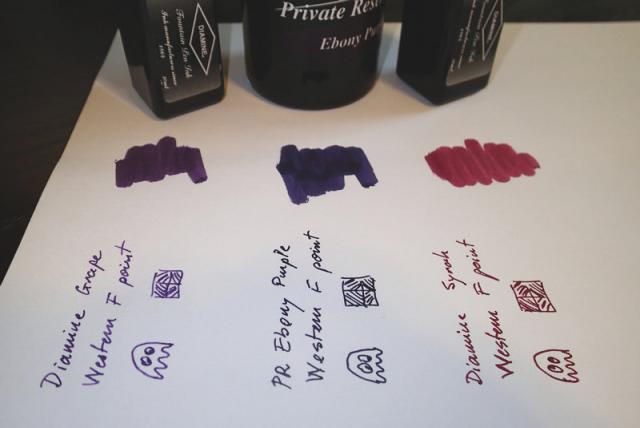
    A Few Ghosts....

    ... for Amberlea: If it were to pick from these three, which one would you chose for your daily writer?
  4. Audrey T

    Inky concertina

    Not sure if this is the right forum or if there even is a rightful place for it on FPN. I'm experimenting with a concertina prototype for my students. (The fold-and-cut concertina template isn't mine.) This first attempt is just on printer paper, as I wasn't sure if I would be messing up right from the start. It's certainly the wrong paper, as everything soaks through and you can barely tell back from front. I'll use better paper for my students, but for my purposes it was fine that the page had two inky sides. First I put down a little bit of crayon as a resist, but it didn't really do anything. Then I splashed some FP ink around, dragged some of it with a comb, picked some of it up with a wet paper towel & dabbed it around, then dried the page in the sun. After that, borrowing Nick Stewart's tip about using bleach to react with the ink, I created some random negative spaces. To play with texture, I used wadded-up plastic wrap dipped in watered-down bleach. Dried the page again. Finally, I cut & folded the paper into a concertina, and used the random shapes to prompt outlines of memories with darker ink (Brun Prévenance, Jacques Herbin Scented. Despite the cool smell, I don't care for the ink).
  5. ASCIIaardvark

    Learning Scrollwork

    I'm trying to teach myself scrollwork. For only a few days practice, it looks pretty cool already... at least when I sit back and squint at it - so continuing learning feels easy right now I'm definitely open to constructive criticism. My shading in this one is super inconsistent and the leaves' sizes and shapes are pretty inconsistent too, some don't even look like leaves.
  6. Dear fellow FP users Over the years We have successfully organized many group buys. The main motive is to facilitate all members to get Our pens at a lower price. We have recently launched a Model 8B which has created great interest among our Customer's . So we decided to do Group buy for this Model 8B. The specialty of this Group Buy is 1. Less waiting time (2-3 weeks only) 2. Lot of Ebonite colours (Beautiful 39 colours) and unlimited Nib Choices (Bock/Jowo/Schmidt/Indian nib) than ever before 3. We have worked very hard for last few weeks to make pens in all Specs for this Group Buy and take pictures for our customer's . Therefore it gives good visualization of all Specs. Model 8B is bigger version of Model 8. It is torpedo shape pen in classic style. Cap -16mm, Barrel-14mm. Section is hour glass section. All our pens are completely handmade. This Group Buy is Valid till 10th July-18 In order to participate in the group buy just fill the Google Form (Link Below) and Reply in the thread with "Form Submitted or just repost the choices in thread https://docs.google.com/forms/d/e/1FAIpQLSf5sNeR4SKNXKqoY43SX5Iarv04fV--TAcp7Ecemh8Lb0OTQA/viewform?c=0&w=1 Please find few reviews of Model 8B by fellow FPN'ers https://www.fountainpennetwork.com/forum/topic/334585-review-of-ranga-model-8b-in-blue-red-and-pale-yellow-ebonite/ https://www.fountainpennetwork.com/forum/topic/331862-ranga-model-8b/ http://https://www.fountainpennetwork.com/forum/topic/334885-ranga-8b-in-pictures-mini-review/ Available Colours are as follows: A. SpecialRegular Ebonite Colours (SE Series) Solid Forest Green (S1)Forest Green - Black Ripple(S2)Forest Green - Honey Ripple(S3)Forest Green - Khaki Ripple(S4)Forest Green - Mustard Yellow Ripple(S5)Forest Green - Teal Blue Ripple(S6)Teal Blue - Black Ripple(S7)Teal Blue - Khaki Ripple(S8)Mustard Yellow - Black Ripple(S9)Solid Maroon(S11)Rose Red - Black Ripple(S12)Rose Red - Mauve Ripple(S13)Rose Red - Forest Green Ripple(S15)Rose Red -Bottle Green Ripple (S16)Rose Red - Mustard Yellow Ripple(S17)Brick Red - Khaki Ripple(S18)Brick Red - Black Ripple(S19)Teal Blue - Orange Ripple(S20)Solid Olive Green (S23) B. Regular Colours (RE Series) Brown Ripple (R1)Green Ripple(R2) Olive Ripple (R3)Solid Black(R4)Mottled Brown(R5)Mottled Green(R6)Mottled Olive Brown(R7)C. Premium Ebonite Colours (PE Series) Solid Blue(P1)Black Yellow Swirl (P2)Blue Pink Swirl(P3)Solid Pale Green(P4)Blue White Swirl (P5)Pale Pink/ Red Black Swirl (P6)Green Yellow Swirl (P7)Solid Pink(P8)Blue Green Orange Swirl(P9)Solid Orange(P10)Blue/White /Green /Orange Swirl (P11)Green/Pale Pink(P13)Blue/ Pink/Pale Yellow Swirl (P14)Prices are as follows: RANGA Model 8B (ED Version)REGULAR or SPECIAL EBONITE: US $33 (Regular Price : 40$)PREMIUM EBONITE: US $47 (Regular Price : 55$)RANGA Model 8B (CC Mechanism)REGULAR or SPECIAL EBONITE: US $64 (Regular Price : 78$)PREMIUM EBONITE: US $77 (Regular Price : 93$)Finish - Polished or Matte (Bakul)Clip Option - Clip-less or Gold Clip or Silver ClipNib Option: For Eyedropper Kanwrite 35 mm Fine Nib - Gold Tone or Chrome Tone or Dual ToneKanwrite 35 mm Medium Nib - Gold Tone or Chrome Tone or Dual ToneKanwrite 35 mm Broad Nib - Gold Tone or Chrome Tone or Dual ToneKanwrite Nib 35 mm Flex - Chrome Tone Nib Option: For C/C mechanism (with Schmidt K5 Converter) #6 Nib Options (included in price)Bock Extra Fine Nib - Gold Tone or Chrome Tone or Dual Tone or Black Tone (7$ Extra)Bock Fine Nib- Gold Tone or Chrome Tone or Dual Tone or Black Tone(7$ Extra)Bock Medium Nib- Chrome Tone or Black Tone(7$ Extra)Bock Broad Nib- Gold Tone or Chrome Tone or Dual Tone or Black Tone(7$ Extra)Bock Calligraphy 1.1 Nib- Black Tone(7$ Extra)Bock Calligraphy 1.5 Nib- Gold Tone or Chrome Tone or Black Tone(7$ Extra)Bock 18K Broad Nib (185$ Extra)JoWo Extra Fine Nib -Dual Tone or Black ToneJoWo Fine Nib - Gold Tone or Chrome Tone or Dual Tone or Black Tone JoWo Medium Nib - Chrome Tone or Dual Tone or Black ToneJoWo Broad Nib - Chrome Tone or Dual Tone or Black ToneJoWo 1.1 Calligraphy Nib - Dual Tone or Black ToneJoWo 1.5 Calligraphy Nib - Dual Tone Or Black toneSchmidt Broad Nib - Gold Tone or Chrome ToneSchmidt Medium Nib - Gold Tone or Chrome Tone Schmidt Fine Nib - Gold Tone or Chrome ToneNo Nib - Threaded for Bock #6 (less USD -14)No Nib - Threaded for JoWo #6 (less USD -14)No Nib - Threaded for Schmidt #6 (less USD -14)Shipping: Via Registered Post which is included in Price and takes 2 -4 Weeks.Making Time: 2-3 Weeks after paymentPayment: Paypal id- mpkandan@gmail.com In order to participate in the group buy just fill the Google Form (Link Below) and Reply in the thread with "Form Submitted or just repost the choices in thread https://docs.google.com/forms/d/e/1FAIpQLSf5sNeR4SKNXKqoY43SX5Iarv04fV--TAcp7Ecemh8Lb0OTQA/viewform?c=0&w=1 Regards, Kandan.M.P Ranga Pen Company
  7. Hi all, I'm still very new to fountain pens and am looking to possibly add something specific to my collection. I have a couple Jinhaos, a couple TWSBI Ecos, an Al-Star, etc., and I love them dearly. However, I'm looking to upgrade a little bit (possibly a lot bit!) in terms of a flex pen for drawing and illustration. I am an illustrator both by passion and by trade, and I do a little of everything: graphic design, comics and graphic novels, pen-and-ink illustrations, watercolor painting, and colored pencil pieces. My first and main love, though, is pen and ink. I have used techpens (essentially very nice fine point markers), dip pens with India ink, and even Sharpie markers. I just love the stark, striking look of black ink on plain paper. Currently my combination of choice is a Nikko G-pen nib in a regular Speedball nib holder (or my Tachikawa nib holder when I can find it!), with a bottle of Dr PH Martin's Black Star India Ink. (Just to give an idea of my baseline.) Very flexible nib, and a very dark, very striking black India ink. So anyway, once I got more than 5 minutes into the fountain pen hobby, I realized "oh wow there are flex- and soft-nib pens! And there are people who draw with flex pens! I WANT TO DO THAT." My main complaint with bottled india ink is just that I have to re-dip every few seconds, and it always feels like it's taking for-freakin-ever due to that. I love that with my fountain pens I can replace the ink at will, and can keep using one pen for a long time, but I don't have to dip them. My question (yes, we're finally getting to the question) is: What are some good combinations of bulletproof or semi-bulletproof inks, and flex-nib pens? (And yes, I know not to put india ink in a fountain pen.) I am looking for essentially 2 sets: one to start with to experiment with and see if it even works for me, that should be under $50; and then possibly a much nicer pen and ink combination (upwards of $200 if necessary) that would last a lifetime, if the first combo works for me. My criteria for the ideal pen/ink combos: - Ink should be black, and bulletproof/waterproof, to some extent, at least much more bulletproof than the average non-bulletproof, very-water-soluble fountain pen ink. - Pen should be at least somewhat comfortable and have a piston or piston-converter system. (I just hate squeeze cons) - Affordable, at least the first one. (looking to hopefully spend less than $50 on that initial "experiment" but am willing to consider a lot more for the following one) Size, ink capacity, style, etc., are all pretty open - I'm not going to be picky about the initial experiment because it's not the end goal, just a test run, essentially. I have a specific question too: Is is unwise to use pigment ink (ie Platinum's Carbon Black) in flex pens? What about if I clean it diligently every week? (Again: I know not to use india ink in a fountain pen. I'm talking about superfine pigment ink designed for fountain pens.) Even more specifically, I am currently looking at testing out this whole fountain-pen-and-ink-for-art thing with a Noodler's Ahab flex pen and trying it with Platinum's Carbon Black. Is that a terrible combination? Basically, is that pen any more or less likely to have trouble with Carbon Black than any other? Even for under $50, I don't want to ruin a pen needlessly. Thanks in advance for any advice anyone has. -Taylor
  8. Hello, I am an artist who has recently moved away from India ink and rapidograph/technical pens (4x0) to UEF platinum 3776 fountain pens and dye based fountain pen ink. My style is drawing/inking on top of watercolors. As such fountain pen ink tends to spread and I lose my thin line. I’ve found I can apply spray workable fixative to the watercolor, let it dry then ink with fountain pens and fountain pen ink over it with great success. I use extremely light pressure. My question. Am I doing damage or harm to the nib? Thanks, Carol
  9. I hope this is the appropriate forum for this posting. There do not seem to be reviews of books not directly related to pen and pen history but about other pen related topics. So I thought I’d start one and see if anyone else has books that they would recommend. If anyone has books related to correspondence, pen art, handwriting etc. perhaps you could add them. The book I will start with is More than Words: Illustrated Letters from the Smithsonian’s Archives of American Art by Liza Kirwin. Illustrations in the letters were often done with the same pen, dip end in the 1800’s and fountain pens in the later letters. Frida Kahlo apologizes for a letter written in pencil, she can’t find fountain pen and ink. If you ever wondered what Winslow Homer’s, Andy Warhol’s, Dale Chihuly’s, or Marcel Duchamp’s handwriting looked like this book shows examples. Each letter represented shows how the artist integrated their correspondence with a drawing or sketch. Are there any other books out there that somebody would like to recommend?
  10. Today, You Know which video platform gave me the following suggestion: Hope you enjoy it as much as I did. Tadeo
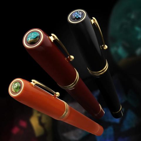
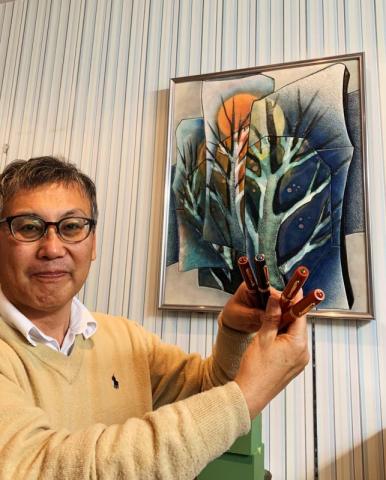
  11. I just recovered from influenza but I am so excited to tell you a story that I also just told my friends on Facebook. Around 15 years ago, Japanese Shippo artist 岡垣幸得 (Okagaki Yukie) presented me 2 big frames (1 of them is in second picture).They are handmade with Japanese Cloisonne or 七宝焼 /shippoyaki/.These two were supposed to be displayed in Museum but she chose to give to me.At that time, I thought, how wonderful it is to have this art on a fountain pen. But honestly, it seemed impossible haha.A few years later, that idea still hang over my head so I came back and talked with artist Yukie about this idea.She said "I can make a small piece of shippoyaki, but it will be harder".I was never more excited than that. I spent many more years researching and testing how I can make a fountain pen with this precious art.I tried with ebonite and plastic and celluloid but all failed. Ebonite didn't work out with piston filler mechanism I have, plastic was not a good idea for a traditional pen and celluloid is so hard to carve.But finally there was one material that made my idea become possible, it is bakelite. It is rolled up from many layer of paper.And it works best with piston filler. But most importantly, I can carve the Shippoyaki on top of the pen for forever use. Sadly, there are not many Shippo artists nowadays. I am already old and Master Yukie is also very old now but we really want to make this art continue.I would never expect that a small idea of 15 years ago would turn out to be real now. I just want to say that if we try, there will be good result. I feel thankful that master Yukie gave me this treasure.In Japanese, Shippo is written as 七宝 which means Seven Treasures. So I call this fountain pen Seven Treasures.Do you have any other name suggestion? If you might want to read more, you can go here.https://www.wancherpen.com/pages/shippoyakiI have a giveaway of one prototype for one of those who help me fill a survey about this pen.Please help if you also care about unusual arts and fountain pen. Thank you very much again!
  12. After somebody saw my Stairway to Heaven drawing, I was asked how to draw such a stairway and I though I would explain it step by step in this post. A stairway can be very effectively used as a main element leading viewers eyes towards focal points in a drawing and adds great visual appeal to a drawing. In this post, I will show how one can be drawn using very simple strokes. So, follow along and have fun. Step 1: Draw the Main OutlineMain aspect of stairway is that the stairs become smaller in size as they move away from viewer due to perspective. To account for that, draw tapered sides as shown below. Theory of perspective is quite involved and I won't go into its details here, but most importantly, make the taper believable (not too much, not too little). Also, a stair in natural setting, like here, is more forgiving from perspective point of view than a perfectly proportioned stair in an architectural setting. Step 2: Draw Stairs OutlineDepending on angle of view, the step (horizontal part) of a stair is either visible very less (when viewer is located below the stairs looking up) or if the viewer is in same/higher plain than stair, then the steps are visible more. Following shows how to draw stairs with less visible steps and when steps are more visible. In this post, we will use the first case, when steps are less visible. Stairs are drawn in this case as shown below for the outline drawn earlier. Decrease in size of stairs again follows perspective. Decrease the size (vertical distance) so that it feels plausible. Step 3: Darken the Side of StairsSide of stairs usually receive lot less light and so should be darkened as shown below. This also helps to bring the stairs out against a dark background. Step 4: Draw Horizontal StepsIn the case when horizontal steps ate not visible, we still need to give some indication for them. This is done by irregularly darkening the horizontal lines and making them bit thicker. This serves to indicate stair steps. Step 4: Texture Vertical RisersFinally, use a mix of parallel lines and tapered crevices to texture the vertical steps (risers) as shown below. Click on the drawing to see details. Make the edges zagged to give it bit broken, old feel. The amount of details also depends on the size of drawing. My Stairway to Heaven drawing is bigger in size and hence has more details on the stairs. Step 5: FinishA stairway needs to be usually complemented with other elements on its side. To give an indication of curved side, use curved parallel lines as shown below. Other elements can then be added as shown below to give it a finished feel. Very quick pleasing drawings incorporating stairs can be done as shown in following 2 examples below. A stone embankment provides a great side element with stairs leading the way between them as shown below. Drawing stone embankment is illustrated in vol. 3 of my pen and ink drawing workbooks. Following is a more involved drawing with stairway in a forest setting. Drawing forest and wooded area is discussed in detail in vol. 5 of my pen and ink drawing workbooks and also in these tutorials and this step by step drawing post. Once you learn to draw a wooded area, try incorporating a stairway in it to give it a different feel. This completes this post. Hope you found it useful and inspiring. Doing such simple drawing with pen and ink is very relaxing and rewarding. Give it a try. Check out my Free tutorials and pen and ink drawing workbooks to further learn drawing pen and ink landscapes. Pl. share this post in your social media and with others to get others to enjoy this incredible art. Happy Drawing, Rahul Older Step by Step Pen and Ink Drawings FREE Pen and Ink Drawing Tutorials Subscribe
  13. Old exposed roots of a tree convey age, strength, adaptation and commands our respect. Though they look quite complicated to draw, once simple steps and techniques as shown below are understood, they can be drawn in limitless ways. Follow along the steps below and see how fun it is to draw such old roots. Step 1: Draw Initial OutlineIt is important to get the outline right as there needs to be order in how the old roots are feeding into the trunk for it to look plausible overall. A simplest way is to start by drawing two roots on either side that feed into the trunk as shown below. Step 2: Draw other Main RootsWith the above as the base, other roots can be added as shown below. Notice that in this approach, there is a plausibility and understanding of root structure leading to trunk. Make roots slightly tapered as shown below. Step 3: Add Secondary RootsWith the outline established in step 2, other secondary roots can be drawn as show below to make it more visually interesting. Depending on the size of the drawing, other smaller roots can be added as well. Distribute them well but don't lay them out in a pattern. Give it an irregular feel. Use your instincts and have fun in this creative process. Step 4: Texturing RootsTo texture roots, use tapered crevices and marks as shown below. Darken one side more to bring out the form or roundness of the roots. Here is a close up of a textured root. Note how the edges are irregularly darkened and one side uses dark tapered irregular shapes to texture roots. Here is the outline textured using the technique described above. It is important to use irregular tapered shapes and to avoid any pattern. Click on the image below to see it in detail. Step 5: Adding Dark BackgroundTo give perception of depth, darken the areas that are NOT roots. This provides the background against which the drawn roots stand out. Notice that I have used tapered shapes for the background. Don't use rectangular shapes as they are not visually pleasant. Step 6: FinishTo finish this drawing, I added grass and other ground cover and used parallel lines to provide a kind of backdrop to it. Other elements like trees, wooden posts etc. can be used as well to create very pleasing drawings. Drawing of an old root is quite visually pleasing by itself. By using different shapes and layout for the roots, different pleasing such drawings can be easily done from imagination. Following is another example. This completes this tutorial. With the steps explained above, a complicated looking drawing like the one above can be easily broken down into easy, simple steps that anybody can attempt and be successful at drawing an old root. Give it a try. Click here to download template to practice the steps. If you want to learn drawing pleasing pen and ink landscapes, then check out my FREE tutorials and pen and ink drawing workbooks. They are a great way to learn this wonderful art and adopt this creative hobby. Pl. share this in your social media and with others of creative instinct to help then learn about it as well. Feel free to reach out to me for any help and guidance. Happy Drawing, Rahul Older Step by Step Pen and Ink Drawings FREE Pen and Ink Drawing Tutorials Subscribe
  14. With its varied texture and limitless possibilities, tree bark is always fun to draw with pen and ink. Though it looks intimidating in the beginning, with simple strokes and techniques, pen is ideal medium to draw bark. Grab a good gel pen and follow along to do this pleasing pen and ink drawing. Step 1: Draw OutlineUse interesting shape and zagged edges to draw the outline as shown below. Step 2: Draw Bark PiecesDraw individual bark pieces as shown below with bigger towards the centre and smaller near the edges. Use zagged line and keep their distribution irregular. Step 3: Initial TextureUse dots and ticks as shown below to initially texture the pieces. Click on image to see details. Step 4: Darken One Side MoreTo bring out the form (curvature) of bark pieces, there has to be change in level of tone (darkness) across a piece. Light doesn't fall uniformly on a curved object with side away from Sun more darker than side towards the Sun. A simple technique is to make one edge of every bark piece darker to bring out the form of each bark piece. Use more of ticks and dots to darken left edge of every bark piece. Notice how the pieces below have more form compared to step 3 drawing. This is the basic process. Continue in this manner to texture the bark. Following are some more illustrations of adding more tone on one edge to bring out the form. Step 5: Add More CrevicesFollowing is how the drawing looks by using simple dots and ticks to texture bark pieces and darkening one side more. It already looks finished and you may decide to stop here. Further tone can be added using ticks and dots along the edges to give more impression of deeper grooves as I have done below. The contrast of more darker grooves and lighter areas makes the drawing more visually appealing. I have darkened the bark even further below with with deep crevices. There are no rules here but make sure that there is no feel of 'straightness' in your texturing. In other words, the edges and darker areas should all feel irregular. Keep your hand moving from one stop to another to achieve this. In the final drawing below, I added further grooves and crevices to give it a feel of old bark. There is no limit to such variations that can be done. This completes this post. With just dots and ticks, you can also draw the bark as done here. The possibilities are endless by using different overall bark shape, individual bark shapes and texturing of grooves and crevices. Give it a try. Hope you liked the post and if so, do let me know. You can also check out my FREE pen and ink drawing tutorials and pen and ink drawing workbooks to get started drawing pen and ink landscapes. Happy Drawing, Rahul Older Step by Step Pen and Ink Drawings Subscribe
  15. Bark texture is ideally suited for drawing with pen and ink and one of really fun drawings in this regards is drawing an old tree stump with deep crevices and grooved bark. Here I will show how with simple stroke and technique you can draw one. There are limitless variations on this and one can be drawn from imagination anytime. Step 1: Draw the Outline. Notice the irregular edges used to draw the outline. Step 2: Draw Main CrevicesMain aspect of an old stump are deep grooves and crevices in it's body with age. Draw them as shown below with bigger towards the centre and smaller towards the edge. Use the irregular outline and taper them. Also add them irregularly to avoid any pattern. Step 3: Darken CrevicesDarken the crevices using parallel lines or you can even use a brush. Step 4: Add Bark StrokeAdd bark stroke to bring out the feel of bark on the stump. Bark stroke is discussed in detail in drawing tree trunk tutorial. Step 5: Add Small Tapered Crevices and Edge IrregularitiesAdd small tapered crevices by darkening the bark lines as shown below. Make it irregular. This starts to bring out the feel of rough bark texture on the stump. Step 6: Darken One Side MoreDarken one side more to bring out the feel of roundness for the stump. Light doesn't fall uniformly on a curved surface and such tonal differences are needed to bring out the form of a curved object. This is discussed in detail in vol 1-2 of my pen and ink drawing workbooks. Rough bark texture with deep grooves and rounded feel of stump is now established. Step 7: Texture RootsUse curved parallel lines as shown below to give a curved form to the roots. Step 8: FinishFinish by adding small tapered crevices and darkening one side of roots to bring out their form as well. This completes this drawing. As you can see above the technique and stroke used are very simple and and by using different shape of outline and size and placement of crevices different variations on this can be easily drawn from your imagination. Following is another example. In yet another variation, holes in the stump can be indicated to indicate further decay. Following are 2 additional examples. In the following examples, grass is added to ground the stump as well. This completes this post. Hopefully you found it useful and motivated you to try doing such pen and ink drawings. If so, you can further check out my FREE pen and ink drawing tutorials and pen and ink drawing workbooks to learn to draw pen and ink landscapes in step by step illustrated manner. Happy Drawing, Rahul Subscribe Older Step by Step Drawing Posts
  16. Drawing snow covered pine trees is very easy and fun to do. With simple technique as illustrated below, anybody can attempt them and draw pleasing winter landscapes based on them with pen and ink. So grab a pen and paper and follow along. Step 1: Draw the OutlineDraw a typical Christmas tree shape in dotted line as shown below. Don't use a hard line for the outline. Step 2: Drawing the EdgesUse the following strokes to texture the edges. Correctly texturing edges as shown above is very important as it gives the feel of pine trees to the outline. Step 3: Texturing InsideTo give a feel of snow, add following marks inside the tree in irregular manner. Snow usually doesn't cover a tree completely and these marks indicate those areas. These help to bring out the feel of tree and snow. The white untextured area is perceived as snow. Relative density of white vs the marks will indicate the amount/level of snow on the tree. Use the type of shapes as shown above to texture the inside. Step 4: Texture Trunk and GroundTrunk can be easily textured using 2 tone technique. Also bottom of trunk near ground is left white in irregular shape to indicate presence of snow on trunk there. This is how easily a snow covered pine tree can be drawn. Step 5: Add Other TreesOther snow covered pine trees can be similarly drawn and added per your composition to create perception of depth and visual interest. Step 6: Finish with Ground and SkyTo create perception of snow on ground, use lines as shown below along with few blades of grass and twigs poking out of ground. A path on the snow can be added as well as shown below. Addition of sky creates a nice backdrop to the snow covered trees. This finishes this tutorial. Following is another example. Notice that I have used less tone on the trees below to give them more snow covered feel compared to drawing above. Following is a more detailed example but the technique used is the same. If you find yourself with some time, then grab a pen and paper and try doing some such pen and ink drawings. They provide great relaxation and will help you appreciate beauty of nature in a new way as you will be able to capture and express that beauty through your own interpretation. You can also visit my Free pen and ink drawing tutorials for more information. You can also subscribe to receive my weekly step by step pen and ink drawing posts Happy Drawing, Rahul
  17. Dear fellow FP users We have launched Ranga Model 4S & 4CS Group Buy in lots of beautiful ebonite colours. It is Slender version of our famous Models Model 4 & 4C . The specialty of this Group Buy is 1. Lot of colours as usual. It is the first group buy from us for Slender versions. 2. Price range starts from 29$ -59$. This is the great opportunity to buy these pens at great prices Capped Length -App 5.75 Inches Cap dia & Barrel Dia-14mm Section Dia- 11mm dia at Maximum thickness Model 4S- Both ends are Flat Shaped Model 4CS- Both ends are Round Shaped Ranga Model 4S and 4CS are great every day carry for fountain pen user's. It is light weight but still very comfortable and balanced writer's. All our pens are completely handmade. This is very ideal gift for your beloved friends and neighbors. It is best Thanksgiving day gift. This Group Buy is Valid till 31st Oct -18. We have executed many Group buy's successfully in the past with tremendous support from FPN'ers In order to participate in the group buy just fill the Google Form (Link Below) and Reply in the thread with "Form Submitted or just repost the choices in thread https://docs.google.com/forms/d/e/1FAIpQLSfF9FxwacJGaklhQAITh464cInPIU49uarUtiMhtYygkcHSYw/viewform?c=0&w=1 Available Colours are as follows: A. Special & Regular Ebonite Colours RE Series: Brown Ripple (R1) Green Ripple(R2) Olive Ripple (R3) Solid Black(R4) Mottled Brown(R5) Mottled Green(R6) Mottled Olive Brown(R7) SE Series: (It has black Specs) Solid Forest Green (S1) Forest Green - Black Ripple(S2) Forest Green - Honey Ripple (S3) Forest Green - Khaki Ripple(S4) Forest Green - Mustard Yellow Ripple(S5) Forest Green - Teal Blue Ripple(S6) Teal Blue - Black Ripple(S7) Mustard Yellow - Black Ripple(S9) Khaki - Bluish Black Ripple(S10) Rose Red - Black Ripple(S12) Rose Red - Mauve Ripple(S13) Rose Red - Forest Green Ripple(S15) Rose Red -Bottle Green Ripple (S16) Rose Red - Mustard Yellow Ripple(S17) Brick Red - Khaki Ripple(S18) Brick Red - Black Ripple(S19) Teal Blue - Orange Ripple(S20) Solid Olive Green (S23) B. Premium Ebonite Colours (PE Series) Solid Blue(P1) Black Yellow Swirl (P2) Blue Pink Swirl(P3) Solid Pale Green(P4) Blue White Swirl (P5) Pale Pink/ Red Black Swirl (P6) Green Yellow Swirl (P7) Solid Pink(P8) Blue Green Orange Swirl(P9) Solid Orange(P10) Green/Pale Pink(P13) Blue/ Pink/Pale Yellow Swirl (P14) Prices are as follows: RANGA MODEL 4S/ 4CS (ED Version) REGULAR or SPECIAL EBONITE: US $29 (Regular Price : 35$) PREMIUM EBONITE: US $47 (Regular Price : 55$) RANGA MODEL 4S/4CS (CC Mechanism. This can also be used as ED) REGULAR or SPECIAL EBONITE: US $42 (Regular Price : 55$) PREMIUM EBONITE: US $59 (Regular Price : 75$) Finish - Polished or Matte (Bakul) Clip Option - 1. Gold Finish 2. Chrome Finish 3. Clipless Nib Option: For Eyedropper Kanwrite 35 mm Fine Nib - Gold Tone or Chrome Tone or Dual Tone Kanwrite 35 mm Medium Nib - Gold Tone or Chrome Tone or Dual Tone Kanwrite 35 mm Broad Nib - Gold Tone or Chrome Tone or Dual Tone Kanwrite Nib 35 mm Flex - Chrome Tone Nib Option: For C/C mechanism (with Schmidt K5 Converter) #5 Nib Options (included in price). It is Schmidt FH341 nib unit. It is smooth. Schmidt #5 Fine Nib - Gold Tone or Chrome Tone Schmidt #5 Medium Nib - Gold Tone or Chrome Tone Schmidt #5 Broad Nib - Gold Tone or Chrome Tone No Nib - Threaded for Schmidt #5 (less USD -5) Shipping: Via Registered Post which is included in Price and takes 2 -4 Weeks. Making Time: 3-4 Weeks after payment Payment: Paypal id- mpkandan@gmail.com In order to participate in the group buy just fill the Google Form (Link Below) and Reply in the thread with "Form Submitted or just repost the choices in thread https://docs.google.com/forms/d/e/1FAIpQLSfF9FxwacJGaklhQAITh464cInPIU49uarUtiMhtYygkcHSYw/viewform?c=0&w=1 Regards, Kandan.M.P Ranga Pen Company
  18. rahul_jain

    Drawing A Waterfall

    I write weekly posts such as the following to inspire anybody to learn to do simple drawing with pen and ink. ------------------------------------------------------------------------------ Drawing a Waterfall: Drawing a waterfall may sound intimating, but as we will below, it is quite easy to do with few simple strokes that any beginner can do. I even did the following drawing with an ordinary writing gel pen. So, grab a pen and follow along. Such fun drawings gives us a creative break in our lives and are always enjoyable. Try one now. Step 1: Draw Top of Waterfall Start with a slight wavy line like below, indicating the top of waterfall, may be a river or a stream. Step 2: Draw Falling Water: Use slightly curved lines like shown below to indicate falling water. Turn the paper if need be to draw it. Don't make the lines flat. Give them a slight curve or bulge as shown below. Step 3: Add Volume to Water Use tapered dark like shown below to indicate volume in falling water. Step 4: Indicate Water Flowing Out After the fall, water continues its journey towards the viewer. Use lines like below to draw ripples that indicate that. Notice how they open up and grow bigger as they go out. Add such ripples to the waterfall. Step 5: Indicating Rocks and Mist Add some darks at the bottom of fall to indicate some stones/rocks and dots going up to indicate mist. Keep it irregular. The notion of suggestion is very important in pen and ink. With just some dark irregular shape, a feel of 'something there' can be conveyed. Step 6: Indicating Foliage on the Side To give a finished feel, something on the sides of the fall should be indicated. Wooded area works very well and is very easy to do as shown below. Use open loops to indicate foliage. make the base darker and add tapered darks to indicate trunks etc. Use the above technique to indicate wooded area as banks of waterfall. Step 7: Adding Reflection in Water Use more of water stroke to darken it to indicate reflection as shown below. Use the above technique to indicate reflection of wooded areas. Step 8: Add Sky Add Sky using horizontal parallel lines to finish this quick drawing. This finishes this tutorial. Hopefully it motivated you to pick up a pen and try drawing it and see how easy and enjoyable it is to do pleasing landscapes with pen and ink. Do let me know if you liked this post and any suggestions for future posts. Happy Drawing, Rahul
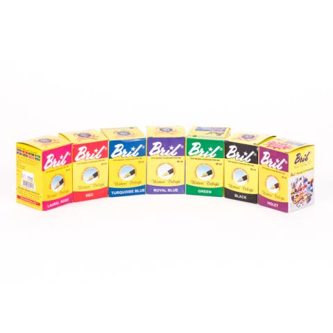
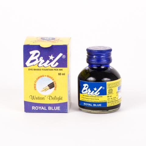
  19. Fountain pen lovers, Bril, India's leading fountain pen ink brand will ship internationally in 2019 and we have just started a Global Handwriting Movement to make children write properly again. Our crowdfunding campaign has awesome perks whether you are an adult who loves world-class, pocket-friendly ink and fountain pens or you want your kids to learn to write the proper way. Do visit our Indiegogo campaign and support us, so we can ensure that the dying art of handwriting is brought back to life again, and our children's lives are enhanced in more ways than one! Thank You! :-) https://www.indiegogo.com/projects/bril-ink-make-children-write-again#/
  20. Quick and Easy Pen & Ink Landscapes: "What can I draw from my imagination in the limited time I get from my busy schedule without any prior drawing experience" This is a question I often get asked and one that newcomers to art are often confronted with. In this post, I will describe a pleasing landscape that can be done quickly using simple steps. All you need is a good gel pen, a paper and a positive attitude. Drawing is not just for 'artists'. Every one of us can engage and enjoy this creative pursuit even with our limited time. Vol 6 of my workbook series covers this in detail. Here is a pleasing landscape that we will learn to draw step by step. The key elements of the drawing are highlighted below and in different steps, we will see how these elements can be easily drawn. Step 1: Draw Horizon First step is to draw the horizon in the shape of a flattened U using broken line as shown below. Step 2: Drawing Surface Contours: Horizon line drawn in step 1 indicates far out. In front of it lies the middle and foreground. The contour or surface shape of this area is next indicated by using curved parallel lines as shown below. These simple contour lines transforms a blank white space into pleasing indication of ground form. Step 3: Indicating Ground Cover (Grass): Grass is next drawn on these contour lines using small curved lines as shown below. Together with contour lines, this completes the drawing of ground. Step 4: Drawing Distant Tree Line: A distant tree line on horizon adds lot of visual interest and with its darker tone provides a nice contrast and a focal point for our eyes to rest. This is drawn next. Step 5: Drawing Background Element: Furthest out behind the distant tree line is the backdrop of a hill or a mountain. A backdrop like a hill below provides a very pleasing focal point for our eyes to rest as they travel from the foreground to background. A house, a church or any other such element can further be added at the top of the hill to add further interest. Step 6: Finishing with Sky: Sky is finally added to set the mood of the drawing. This contrast from lighter foreground surface to darker distant element and hills to again lighter sky makes the drawing appealing and draws viewers interest. This completes this overview of drawing quick and easy pleasing pen and ink landscapes. For more details on strokes and other considerations for drawing different elements covered above you can visit my completely free Tutorials page, or better yet, get the following pen and ink drawing workbook from Amazon. Available for only $6 from Amazon and other online retailers, this workbook covers the above steps in full details with step by step illustration of strokes and hands on activities. With coverage of lots of other options for drawing such landscapes, you will be able to draw the following in no time. For more information on the workbook, pl. click here Happy Drawing, Rahul www.pendrawings.me/getstarted
  21. An interesting blog on using fountain pens and ink from an artists perspective http://www.lizsteel.com/fountain-pen-sketching-part-4-choosing-a-fountain-pen/
  22. Hi, I am pleased to announce completely free workbooks for learning to draw simple landscapes in pen and ink. If you have ever wanted to learn how using simple pen strokes you can bring a landscape to life, then try them out. I have 2 initial volumes as following and would love to get any feedback on them in terms of their usability and content. You can get the workbooks at pendrawings.me/workbooks Pen and Ink Drawing Workbook vol 1: Draw Tree trunks and Wooden Posts This workbook with help you to be able to draw a landscape like the following in no time. Pen and Ink Drawing Workbook vol 1: Draw Trees and Bushes This workbook with help you to be able to draw a landscape like the following with fully illustrated concepts and guided exercises Get them now and happy drawing, Rahul www.pendrawings.me/getstarted
  23. There are plenty of reviews about the Desiderata out there, but most of them are from the POV of a copperplate calligrapher, which is this pen's intended use. There are few reviews that focus on drawing, which is a shame, because I think this is a nice, and also an overlooked art tool. In case you haven't heard, these are made by hand by a fine fellow named Pierre Miller in Chicago, and they take disposable Zebra G manga dip nibs. I won't re-iterate the information already available on Pierre's site, but instead I'll dive right into the stuff about drawing, that isn't widely available. Below is a sketch test with Platinum Carbon Black in an eyedropper-filled Desiderata shorty, with some white grease pencil for the highlights, and red marker in the eyes. The sketch is on gray cardstock. Initial results are very favorable. I have read one comment online claiming that, in sac-filler configuration, the pen does not flow enough to keep up with the demands of drawing. My pen does not accept a sac, so I cannot confirm or deny that claim, but an eyedropper-filler provides plenty of fluid pressure, and easily provides enough flow to keep up even with my frenetic drawing pace. The pen did not railroad at all, nor did it exhibit the belching and vomiting mishaps that eyedropper pens are known for. Maybe that's just because, if you draw quickly like I do, the heavy demand tends to stay ahead of the belching. But one way or the other, I did not have the problem. That being said, I'm not ready to junk my dip pens just yet: the Desiderata only accepts the Zebra G, and will not feed inks meant for dip pens such as Speedball Super Black. There are other nibs that I need to use sometimes for different effects, and sometimes I need to use inks that won't work in the Desiderata, and let's not forget I still need a brush for big black areas. But the Desiderata is nevertheless poised to become the workhorse of my comics inking. In comics, speed is everything, because you have to draw so much to finish a book. If you don't have to keep stopping to dip, you can go so much faster. You can also get into a mental flow that is harder to get into when you have to keep dipping, which is why Sergio Aragones has drawn all his strips with a fountain pen for the past 50 or so years. The other tools are useful, but they will be held in reserve to do the things the Desiderata can't do. The Desiderata is also going to cause all my other fountain pens to get demoted from cafe-sketchers to mere writers. For sketching on location, where carrying an inkwell is inconvenient or impossible, the Desiderata is the best pen I've ever used. The biggest technical hassle you are going to run into is nib cleanliness. If you're used to dip pens, you're no doubt familiar with the machine oil with which new nibs are coated, to protect them from rust. You also know that this stuff has to be cleaned off. Well, a nib that's clean enough to dip into a pot of bone glue and lampblack, is not clean enough to use in a fountain pen. I myself learned that I didn't even know what clean was. If there is any trace of this protectant on the nib, the ink will find any other way to flow rather than traversing a hydrophobic surface, if it flows at all. Pierre has videos posted about how to clean a new nib, and how to start the flow for the first time. Watch them. Then watch them again. The devil is in the details, as our pal Old Scratch so kindly points out in the sketch below. Oh, one more thing; make sure you carry a full Desiderata with the tip up. The feed channel is necessarily very large, to accommodate the flow demands of a flexible nib. Also, the sac filler pens can be converted to eyedropper by removing the sac. That's all in the instructions. So that's the review. Happy sketching!
  24. Haeza

    Tweaked Pens

    Ah, well I was just curious if anybody else has done this with their pens before, but have you guys ever modded or tweaked your pen with other pens? I have a Pilot Penmenship nib <ef> and 'guts' I guess you could say, but I found out you could use the Jinhao x750's body with it. I mostly did it because it gives it a good weight while I do my little sketches and such. Plus the metal body just feels better than the usual plastic. http://i1231.photobucket.com/albums/ee503/Zero1036/1206150058_zpsfm7mgwd7.jpg


×
×
  • Create New...