Search the Community
Showing results for tags 'architect'.
-
I was on the hunt for a nice Pilot Vanishing Point but my local brick & mortar (Appelboom) doesn't carry Pilot. I mentioned this while picking up some ink for a colleague and was asked if I'd considered the Dialog 3. Well, no, I hadn't. It's considerably more expensive, it's massive, it lacks fancy colour schemes and most of all... it's a Lamy... Sure, I admire the ABC but otherwise no thanks, I'll pass. Lamy and I, we're just not meant to be. Or so I thought... because I fell like a brick for the design, the materials, the amazing engineering, the retractable nib mechanism and the EF nib. When Joost offered me a really good price, that clinched it. "Perfection is not attained when there is nothing more to add. It is attained when there is nothing more to remove." --Antione de Saint Exupéry Design, materials, size, fit and finish This old quote sums up the design of the Dialog 3 quite nicely. Some might see a black cylinder. I see a very attractive, minimalistic design that's modern yet refined at the same time. My matte black version looks like it was chiseled out of rock, then smoothed. The feel of the material reminds me of my Visconti Homo Sapiens Lava Steel (not a bad reference). It's very, very pleasant to the touch and never gives me the feeling of handling plastic. As a result, I love to fondle and twiddle it when not writing. It's a substantial pen to write with because there's no cap that comes off. And it's heavy, by far the heaviest pen in my little collection. Size and weight combined mean that this pen is not for everyone - so try before you buy! I can be brief about quality of engineering, fit and finish: I don't think I've ever held a pen that inspired more confidence than this one. It's like a Mercedes. A fantastic example of Deutsche Gründlichkeit. Rotating the barrel clockwise makes the nib come out and sinks the clip lower onto the barrel (how do they do it...?). It's very addictive to do - it feels so confident somehow. Watching the nib disappear behind its concave hood and seeing the clip rise is truly a thing to behold. Rotating the barrel counterclockwise unscrews the pen and reveals über-engineerd innards with a nice, big converter and the screwed-in, removable nib/feed unit. The nib: architect! The sleek, two-tone design of the nib is a good match to the overall vibe of the pen. The F wrote too wide for me so I requested the EF and was delighted to discover that Lamy chose to grind it as an architect nib! I compared this architect to my old MB 146 EF with 14C nib, which is also a factory-made architect. Both pens write in a very similar way when using straight-up print script (I do not know the proper names of writing styles, sorry) but very different when using cursive: the MB then writes a _much_ wider line. I find the MB EF nib to be slightly more forgiving and pleasant, but the Lamy EF to be more versatile and offering very good control. It's a rigid nib and I cannot detect even a tiny bit of bounce or sag but then again I've never seen a soft architect. As with all architects, it requires attention to keep the writing angle consistent. Tactile response from the writing surface is pronounced but not in the least unpleasant. 90 g/m^2 Oxford paper is a fantastic match; Tomoe is less forgiving, Rhodia is somewhere in the middle. Personally, I love this nib! (For those not acquainted with architect nibs: try before you buy! An architect requires you to maintain a constant writing angle. You might say that you don't move your hand down the page as you write, but you move the page upwards beneath your hand. I adore a good architect, but they're certainly not for everyone.) Ink and wetness Essentially the Dialog 3 is a C/C pen that accommodates either proprietary Lamy cartridges or the included converter. Filling the converter requires unscrewing the barrel, then screwing out the converter/nib/feed unit and dipping that into an ink bottle. When using cartridges, the unit can stay in the pen and you can just remove the cartridge. Ink capacity seems generous, though I did not measure it. Several hours of writing emptied the converter halfway. I inked the pen with Kaweco Midnight Blue, a relatively dry, high-quality ink which can appear black-ish in wet pens but transforms into a transparent, complex, night-sky kind of blue-black in dryer pens. Lamy warns not to flush the Dialog 3 with any kind of detergent, only with water, so I was curious to see how well the pen would perform out of the box. During the first hours, ink flow appeared to be almost perfect. Almost, because it is a trifle inconsistent, gradually varying from slightly dryer to slightly wetter. The complex nature of the ink is pleasantly revealed by this pen. The nib never skips, never hard starts. Endurance, ergonomy and such Despite its weight and size, this pen feels great in my hand and I can write longer sessions with it without fatigue, cramp or any other kind of discomfort. Having said that... if I then switch to a similarly sized pen from another brand, it feels like stepping over from a big, fat Merc S-Class into a Ferrari. My Pilot Justus 95 feels amazingly comfortable after a session with the Dialog 3. It's like being liberated from restraints, it's not subtle... To a lesser extent, the same is true of my Visconti Homo Sapiens Midi. Switching to another pen makes the hand fly over the page. The inevitable comparison to its Japanese counterpart Compared to the Pilot VP, the Dialog 3 is much heavier, girthier, holds much more ink, has a different nib release mechanism, offers less colour schemes, has a retractable clip and is of a more minimalistic, modern design that looks less like a ballpoint and more like a monolith. For the VP, one can buy additional nib/feed units in varying nib sizes. For the Dialog 3, and at a similar price, one can buy additional 14k nibs in varying sizes that easily slip on/off the pen. This basically means that you can buy a VP or a Dialog 3 and use various nib sizes with the same pen, at will. The Lamy is considerably more expensive compared to non-LE VP models, but both the Lamy and the Pilot can be found at (much) reduced prices if one is prepared to make the search effort. Both the Pilot and the Lamy are top-quality pens but personally I'd say that the build quality of the Lamy is even higher than that of the Pilot. In the end, as always, the choice is personal. Conclusion The combination of design, degree of engineering, quality and the architect nib make this pen irresistible to me. It's not just another pen; it really is a instrument of fine writing as well as a fashion statement and a showcase of amazing engineering. I don't think it will make me forget my other pens like the Justus, the HS or some of my vintage pens, but we'll see. Opinions can change over time, which is why this will be an expanding long-term review.
-
http://i1128.photobucket.com/albums/m496/gclef1114/New%20Stuff/A1475F3F-C37A-4C43-8754-984F4DCAD63D.jpg http://i1128.photobucket.com/albums/m496/gclef1114/New%20Stuff/02D49648-F831-48B2-A911-C1019007F687.jpg http://i1128.photobucket.com/albums/m496/gclef1114/New%20Stuff/AFF39F21-BF62-4476-A54A-0BB3AA9F653A.jpg
-
Hi I am Jaspreet from India and I grind nibs. I usually post pics of my grinds on instagram ( handle - Jazzorilla). I am new to FPN and i will be posting pics of my grinds here for constructive criticism. Attaching some pics of a Broad Cursive italic grind on a Kanwrite nib which writes as a smooth B on reverse. - Jaspreet
-
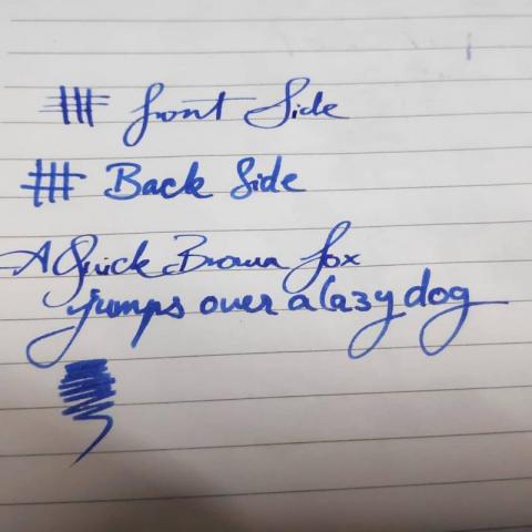
Howdy, this was my first attempt at grinding my own nibs, I spent awhile on it using 12000 grit micro-mesh. The goal was to thin down a original Lamy F nib to that of a Japanese fine, however i ended up with a Architect ground XF nib with a F sized cross stroke. The picture with the writing is that of all my current pens, the one smallest line in black is the ground nib. Will try and upload photos of nib.
-
Hi guys, I have been trying to find the information I need but am having a hard time... I am planning to get the next pen with #6 titanium nib ground to Architect point. What I don't know is which nib should I start with to be ground to Architect point. Can I use fine nib, or the nib should be broad (or other type) nib? I am having a hard time finding photos of lineworks written by Architect point (fine, medium and broad). If you have an example of your Architect nib lineworks, can you show me? It would be even better if the lineworks are in printing/lettering. Thank you!!
-
Hello everyone I always used fountain pens mostly for sketching or take quick notes from my classes. But I never took it as something serious (I mean, smoothness, tip of the nib, etc...) I´m an architect, who, since a long time, admires a spanish architect called Enric Miralles. I don´t want to bore you, but since I saw that he use FP´s, I started writing almost everyday with them. In fact , I think I started to collect them , having about 15 pens. This collection starts, trying to figuring out what pen did he use. It's funny how an image, can make you start collecting something. But , friends , I need help. I only have two images, One, there´s this guy with his wife, I think she is holding a MB 149, but his pen, I don´t know... The other image, he is lightning a cigar, and in his shirt pocket you only see the clip of the pen...I need to recognize this pen by the cap, which is the only thing visible. To me, it seems like an old Parker, but i´m not sure...I attached these images, and I already appreciate your help. Best regards Rodrigo.
- 4 replies
-
- unknown
- fountainpen
-
(and 2 more)
Tagged with:
-
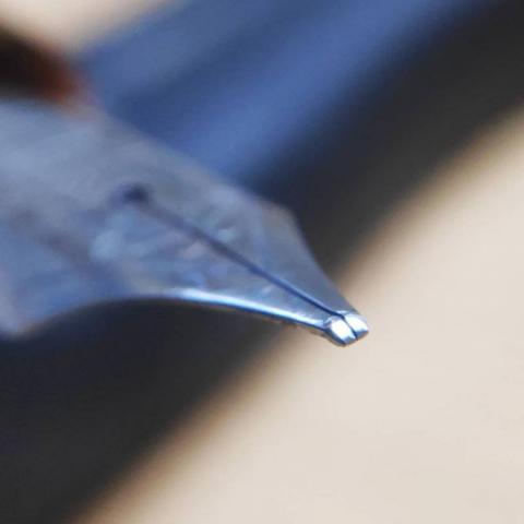
Hi, I was hoping to understand this type of grind a bit better... 1. Are there different versions of this grind? 2. Which is considered to be better for a daily use situation? 3. What is the best "start" nib to use for this kind of grind? Steel? Gold? Medium? Broad? 4. Can this nib be used on any type of feed or is the feed to be adjusted to the nib as well? Thank you for any tips and advice on this matter Regards, Shubhranshu
-
I was wondering, while scribbling with my custom Arabic nib, what would be the difference, regarding the line produced, between an Arabic/Architect point and a Fude nib... They look exactly the same to me on screen (somewhat the opposite of an italic), but since I don't own a Fude nib, I can't actually tell the difference in person, so I thought of asking here....so, is there any palpable difference between these two? Thanks!

