Jump to content

Search the Community

Showing results for tags 'akkerman'.

  • Search By Tags

    Type tags separated by commas.
  • Search By Author

Content Type


Forums

  • FPN Community
    • FPN News
    • Introductions
    • Clubs, Meetings and Events
    • Pay It Forward, Loaner Programs & Group Buys
  • The Market Place
    • The Mall
    • Market Watch
    • Historical Sales Forums
  • Writing Instruments
    • Fountain & Dip Pens - First Stop
    • Fountain Pen Reviews
    • Of Nibs & Tines
    • It Writes, But It Is Not A Fountain Pen ....
    • Pen History
    • Repair Q&A
  • Brand Focus
    • Cross
    • Esterbrook
    • Lamy
    • Mabie Todd Research/Special Interest Forum/Group
    • Montblanc
    • Parker
    • Pelikan
    • Sheaffer
    • TWSBI
    • Wahl-Eversharp
    • Waterman
  • Regional Focus
    • China, Korea and Others (Far East, Asia)
    • Great Britain & Ireland - Europe
    • India & Subcontinent (Asia)
    • Italy - Europe
    • Japan - Asia
    • USA - North America
    • Other Brands - Europe
  • Inks, Inc.
    • Inky Thoughts
    • Ink Reviews
    • Ink Comparisons
    • Co-Razy-Views
    • Th-INKing Outside the Bottle
    • Inky Recipes
  • Paper, and Pen Accessories
    • Paper and Pen Paraphernalia
    • Paper & Pen Paraphernalia Reviews and Articles
  • Creative Expressions
    • Pen Turning and Making
    • Pictures & Pen Photography
    • The Write Stuff
    • Handwriting & Handwriting Improvement
    • Calligraphy Discussions
    • Pointed Pen Calligraphy
    • Broad (or Edged) Pen Calligraphy

Blogs

  • FPN Board Talk
  • Incoherent Ramblings from Murphy Towers
  • The Blogg of Me
  • FPN Admin Column
  • Rules, Guidelines, FAQs, Guides
  • Musings on matters pen
  • Marketing & Sales
  • Iguana Sell Pens Blog
  • Newton Pens' Blog
  • Peyton Street Pens Blog
  • holygrail's Blog
  • A Gift For Words
  • I Don't Have a Name; So This Will Do
  • Karas Kustoms' Blog
  • Debbie Ohi's Inky Journal
  • Sus Minervam docet
  • Crud!
  • Clut and Clutter
  • Federalist Pens

Product Groups

  • FPN Pens
  • FPN Inks
  • FPN Donations
  • Premium/Trading/Retailer Accounts

Categories

  • Fonts
  • Tools & Software
  • Rules for Notepads & Paper

Find results in...

Find results that contain...


Date Created

  • Start

    End


Last Updated

  • Start

    End


Filter by number of...

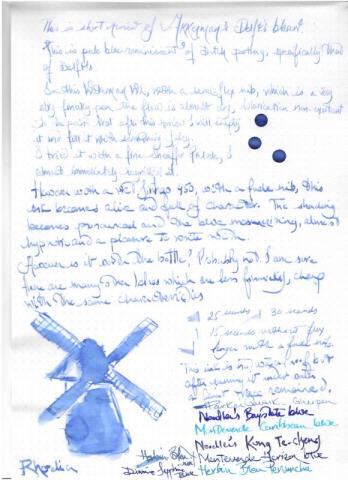
  1. Akkerman Delfts Blauw This is short impression on Akkerman’s Delfts Blauw, inspired by Delft China... At first, I was not so impressed by the ink. It was almost too pale too bare. And it didn’t agree with my dry Waterman W2, though the only ink which agrees with this pen is R & K Verdigris. But after a couple of days it grew on me. Even in Waterman W2 it was alright. But the pen was still scratchy. It looks best in a monster Jinhao 450 with a fude nib. In my opinion it needs a wet wide nib. It’s a beautiful colour to use for this time of year, and with all the suffering going about, a soft blue is quite soothing….. Shading is again obvious with fude/wet nibs to a degree, but it dries to a soft muted color, as you can see. Faint sheening only with the fude nib on Tomoe River. Dry time is decent, flow wet but not lubricated. Though it made my Stub TWISBI less scratchy You can write non ephemeral texts with it, without fear. It will survive accidental spills, but I won’t sign a check or write an envelope with it. Personally, I prefer small bottles of inks. But the packaging is simple, understated, with an antique teal to it. I would suggest a sample for those interested and many pens to try, test and enjoy…… Part I Day 1 Rhodia dot pad: Amazon fountain pen unfriendly copy paper Tomoe River Water test - Rhodia Before After
  2. alexander_k

    Three Ig Inks

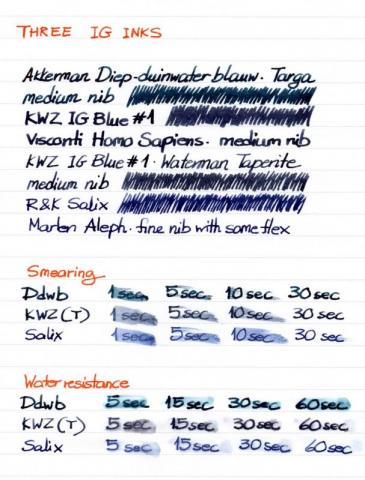
    THREE IG INKS Waterproof, bulletproof, all kinds of inks that can withstand abuse from human malice or carelessness, the weather, time; I read about them and fail to find the fascination. First of all, I like inks that wash off easily from my hands, clothes and pens. I'm not that accident-prone but when I used to carry a Pelikan M600 in by breast pocket, many were the times when the cap unscrewed by itself and the pen decorated me with large blue blots. If those blots hadn't washed off, I might have given up on fountain pens - or carrying them around, at least. Secondly, what's the use of resistant inks when I write on paper, a carrier that can be completely destroyed so easily? Does it matter that the ink is still there when the sheet of paper has become pulp? I don't write anything that important that would be severely damaged by a droplet of fluid. So, you appreciate that I didn't get the inks I'm comparing here because they're waterproof; I just liked the colours and was curious to see how they behaved in my pens. The first is IG Blue #1 by KWZ Inks. Since I now have the delight of a local store that stocks KWZ (Fontoplumo), I decided to explore their products, including their IG range, since everybody told me that they were very well behaved. I liked it immediately, although it seemed rather dry for the Waterman Taperite I first inked with it. So, I tried it in one of my gushers, too, a Visconti Homo Sapiens with a medium nib reground into a CI by Oxonian, and the combination was a success. Interestingly, with time, ink flow in the Taperite improved, not to the level of e.g. Diamine Denim, but then that was a bit too much. The second IG ink I got was Rohrer & Klingner's Salix, just so that I would be able to make a comparison. I'm quite impressed by their inks, so I decided that yet another blue ink (I must have about twenty at the moment) was not superfluous if I were to form an opinion on IG inks through a hands-on comparison (I often use this excuse, that's why I have too many inks). It also helped that Couronne du Comte at Tilburg offered a generous discount to a visiting group of pen enthusiasts. Then I remembered that one of my favourite inks, Akkerman's Diep-duinwaterblauw, is reputedly an iron gall one, too, so I decided to include it in the comparison. THE SETUP OBSERVATIONS I love the colours of all three inks. The way the colour of IG Blue #1 and Salix changes as they dry on the page still catches my attention. Diep-duinwaterblauw remains the same but then it's the richest colour of the tree. The final greyish blue of IG Blue #1 is very much to my taste but the brighter blue of Salix seems more interesting in a finer nib. All three have enough shading. Concerning smearing, Diep-duinwaterblauw is the quickest to dry on paper, some twenty seconds ahead of the other two, which seem safe to touch after thirty seconds (or slightly longer in the case of Salix). Water resistance after a minute or so was high for Salix and IG Blue #1 (with the former performing slightly better in this respect) but less so for Diep-duinwaterblauw, which is nevertheless not marketed as water-resistant. In the smearing and water tests, the Taperite was used to represent IG Blue #1, as it was more comparable to the Marlen Aleph that was inked with Salix. In conclusion, I wholeheartedly recommend all three inks to people who know how to care for their pens. I don't know yet what the long-term effects of IG inks on the pens can be. More on that in a year or more; for the moment, I can confirm that the Parker 51 and Sheaffer Targa I keep inked with Diep-duinwaterblauw for a three years now have never given me any kind of trouble. THE PROOF The paper used must be in the area of 80g and is slightly less absorbent that common 80g copy paper. In the scan the colours seem just a smidgeon darker than in real life but their differences are well captured.
  3. OldTravelingShoe

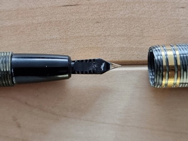
    FP Akkerman 18K F nib 02b Nib Side-View.jpg

    From the album: OldTravelingShoe's Random Pics of European Fountain Pens

    © (c) 2022 OldTravelingShoe


    • 0 B
    • x
  4. OldTravelingShoe

    FP Akkerman 18K F nib 02c Feed and Nib.jpg

    From the album: OldTravelingShoe's Random Pics of European Fountain Pens

    © (c) 2022 OldTravelingShoe


    • 0 B
    • x
  5. OldTravelingShoe

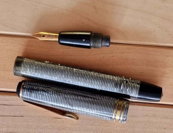
    FP Akkerman 18K F nib 03 Unpack.jpg

    From the album: OldTravelingShoe's Random Pics of European Fountain Pens

    © (c) 2022 OldTravelingShoe


    • 0 B
    • x
  6. OldTravelingShoe

    FP Akkerman 18K F nib 03 Unpack upward.jpg

    From the album: OldTravelingShoe's Random Pics of European Fountain Pens

    © (c) 2022 OldTravelingShoe


    • 0 B
    • x
  7. OldTravelingShoe

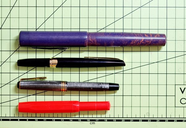
    FP Akkerman 18K F nib 01c Size Comparison.jpg

    From the album: OldTravelingShoe's Random Pics of European Fountain Pens

    © (c) 2022 OldTravelingShoe


    • 0 B
    • x
  8. OldTravelingShoe

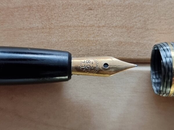
    FP Akkerman 18K F nib 02 Nib.jpg

    From the album: OldTravelingShoe's Random Pics of European Fountain Pens

    © (c) 2022 OldTravelingShoe


    • 0 B
    • x
  9. OldTravelingShoe

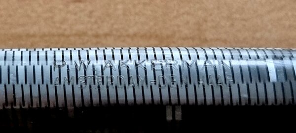
    FP Akkerman 18K F nib 04 Body Engraving.jpg

    From the album: OldTravelingShoe's Random Pics of European Fountain Pens

    © (c) 2022 OldTravelingShoe


    • 0 B
    • x
  10. OldTravelingShoe

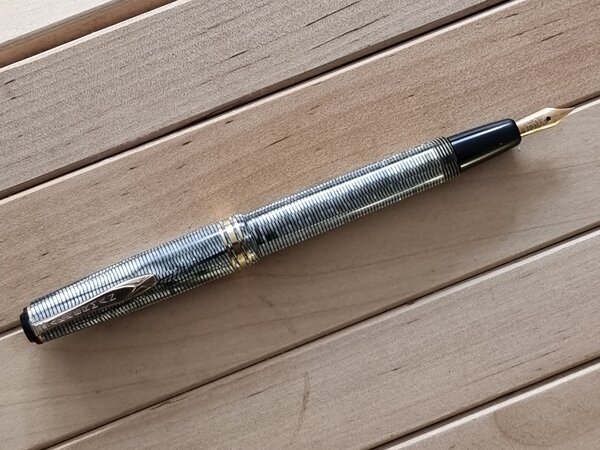
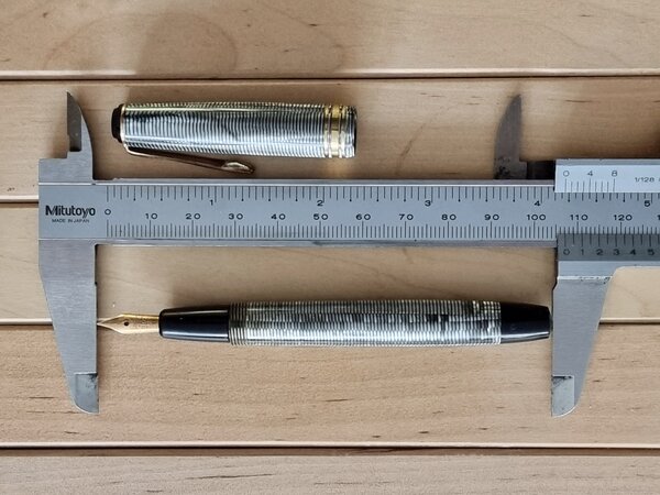
    FP Akkerman 18K F nib 01b Size Posted.jpg

    From the album: OldTravelingShoe's Random Pics of European Fountain Pens

    © (c) 2022 OldTravelingShoe


    • 0 B
    • x
  11. OldTravelingShoe

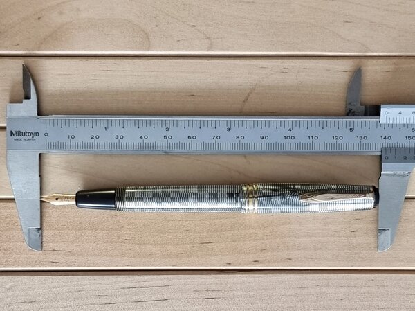
    FP Akkerman 18K F nib 01 Size.jpg

    From the album: OldTravelingShoe's Random Pics of European Fountain Pens

    © (c) 2022 OldTravelingShoe


    • 0 B
    • x
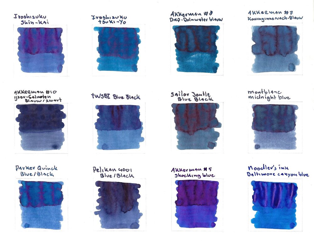
  12. Here are 10 blue-black(ish) inks and two “true” blue inks as a comparison. Just for the fun of it. I scanned the sheet and with that most of the inks don’t show their sheen (or it’s not that obvious in the scan) so here are some photos of the inks to showoff some sheen: And for those of you who care about water resistance of inks, here are the inks after 15 seconds water bath:
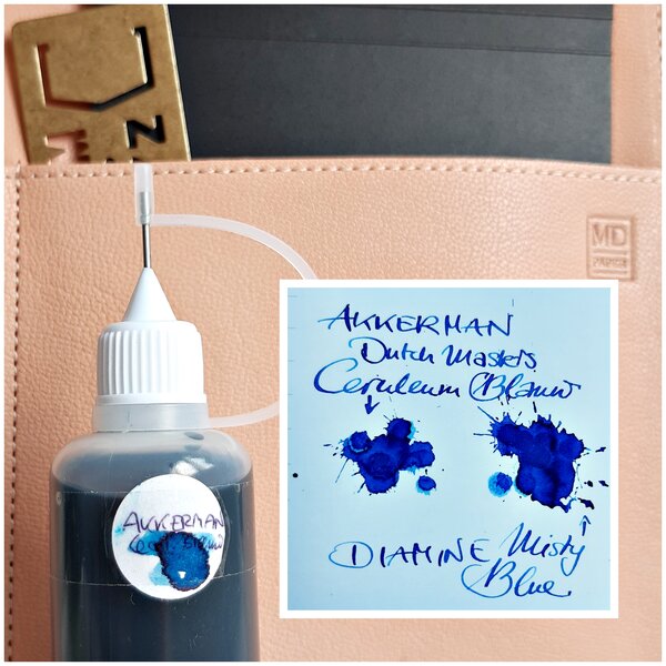
  13. In addition to the regular line of inks Akkerman in The Hague now offers a range of 'Dutch Masters' inks. Though the bottle says 'limited colors collection'I cannot find a reference to what the limited stands for (limited edition, limited range of colours,...), and I forgot to ask. I'm fortunate that the shop is just a short train ride from my home, so I could have a look at the ink before buying. Here is my review of the ink (bear with me, it's my first review). Sorry for the handwriting The bottle is the larger, non-faceted version. Just like the smaller bottles for the regular addition it uses a small chamber in the neck closed off with a marble. I love these bottles: it's so easy to fill even large-nibbed pens from them (and, by the time I get that far, allow you to get the last of the ink out of the bottle). It's already apparent that the ink contains a fair amount of purple (more so than blue). http://i.imgur.com/cZmScGsl.jpg The ink is wet, and in combination with a wet pen, puts down a very dark line. I would not label this colour as a stormy blue; it might describe a storm cloud just before a heavy thunderstorm. I do like the colour, and it's a welcome addition to the collection. It's a well-behaved ink: wet, lubricating, no feathering or spreading. It shows some shading potential, but needs a drier pen to see that. Drying times are pretty long, certainly on Clairefontaine DCP paper, but on more absorbent paper a wet line will still take quite a while to dry. Once the ink is dried, it is smear resistant. Sorry the only other blues I've inked up at the moment are other Akkerman inks. Addition regarding bleed through/showthrough. After the setting up the report I noticed some showthrough on the white Clairefontaine paper, on the Leuchtturm no such thing. (click on thumbnails for larger view) http://i.imgur.com/jdbKrCzl.jpg?1 The water drip test water drops for 1 min on paper (after that blotted, and see above). Again: once the ink is dry it seems to be http://i.imgur.com/wlCpA3Ut.jpg On leuchtturm paper: http://i.imgur.com/3wsxDqLm.jpg Now the last thing left to do is to go to the Rijksmuseum to see the original painting.... Link to a picture of the painting: https://www.rijksmuseum.nl/en/rijksstudio/artists/jacob-isaacksz-van-ruisdael/objects#/SK-C-211,0
  14. Gasquolet

    Ink Colour Changing In The Pen?

    I have recently had two pens, piston fillers, both celluiloid, filled with different Akkerman inks where over time the ink colour has changed remarkably. I have a good number of pens, many of them piston fill or self fillers because that's my wont and because most of them are older or vintage. I have never seen such a striking change of ink colour as I've just experienced though and wanted to ask if others have seen the same. The first case could be put down to time in the pen with the ink losing water and becoming more saturated: This is a Geha pen from the 60's filled with Akkerman SBRE Brown ink in mid December that I suddenly thought might be MB toffee brown after filling another pen with SBRE Brown recently. I had not noticed the change as I was not very familiar with the ink and it had been a gradual change. The second case has me a little concerned though: Akkerman Ceruleum Blauw Van Vermeer (what a mouthful) was filled into one of my NOS Tibaldis on 16th of this month and by today, 18th it has lost almost all colour and is unrecognisable. It looks like washed out Pelikan 4001 blue black.Looking back at my diary and notebook, this effect has been gradual over the last 48 hours but most noticeable since last night. Again, I have the same ink in another pen, a lever filler in that case which has been filled since beginning of February and in that pen the ink colour is absolutely true. Can celluloid nitrate affect ink colour like this? Do I have a case of the Tibaldi killing the ink? I am tempted to flush it out and refill but don't know if the ink is not compatible or the pen is going to be a problem with all inks. Obviously I'm hoping it's not the latter, I can't cope with pens that I can't use. Going to try a photo to illustrate but I've always struggles to photograph writing samples well - apologies in advance.
  15. alexander_k

    Some Blues

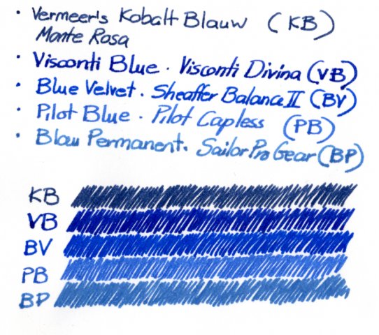
    If there were a support group for blue ink addicts, I should attend the meetings. I just can't resist the blues. I already have more than enough but still keep buying and comparing them, always in search of yet another perfect blue ink. Until recently my favourites were Diamine Midnight (dark blue), Visconti Blue and Akkerman KoninginneNach-blauw (light blue). Rohrer & Klingner Blau Permanent fell out of favour when I discovered that it was rather too washable; pity, because it's lovely. After many months of sticking to the same inks (mostly to use up the ones that failed in similar comparisons), I took some of my most reliable pens and inked them with the new candidates. In the scan (which seems quite true on my computer), Akkerman Vermeer's Kobalt Blauw and Blau Permanent are used to define the boundaries of my search.The comparison is primarily between Visconti Blue, Diamine Blue Velvet and Pilot Blue. I had expected more from Pilot Blue. In comparison to the others it appears rather watery. Blue Velvet is impressively bright and clear, and when Visconti Blue is compared to it I can see a hint of a sheen in the latter. Not been into sheens, I therefore decided to replace Visconti with Blue Velvet. So I'm off to fill pages with the Pilot and Visconti blues. It's nice when one has to use up such good inks.
  16. PICTURES HAVE BEEN UPDATED - LATER PAGES relating to the origin of the akkerman bottle, here are a few predecessors of the akkerman bottle, made by the dutch firm of gimborn. this inkbottle is the very first "longneck-bottle" or langhalsfles although this bottle doesn`t use the marble in the neck yet. this bottle is extremely rare, I know of 2 in a museum and a third I`ve dug up in a bottledump in the netherlands, which I traded with a former employe of Gimborn. the second model of the "longneck-bottle" are these ones, in two sizes "the baby-longneck" and the "longneck" to my knowledge, these bottles preceed the waterman bottle of similar design. these bottles are the third type of "longneck-bottle" and are similar to the ones produced by Akkerman today. only the size differs slightly, the Akkerman bottles are slightly smaller. this third type of langhalsfles or "longneck-bottle" later came with a different type of cap, made of yellow bakelite which was more prone to leaking.
  17. During a recent trip to The Hague I bought a couple of Akkerman inks at their store. After a fresh supply was brought in from the store room (apparently these inks are popular) I could test the inks using a toothpick. I already reviewed Ruisdael’s Stormachtig Blauw; this review deals with #9 'Steenrood van Vermeer’. The Steenrood (stone red) refers to the colour of bricks, and the picture by Vermeer illustrates the warm, mellow colour of those bricks, and so does this ink. As I said the ink catches the colour of bricks very well, a warm reddish brown (or brownish red, if you prefer). I like this colour and this ink in general. A good flow, nice and wet. Drying times on Leuchtturm and a fairly wet Lamy M are between 10 and 15 seconds, but in real life it feels faster. What’s even better is the shading this ink shows. (again apologies for my handwriting) http://i.imgur.com/6HFXdfEm.jpg On all combination of nibs and paper I’ve observed shading, Shading great, sheen none. On Leuchtturm paper http://i.imgur.com/6EFNVA1m.jpg The ink takes a little time to dry (feels less than it actually does), after that it sits pretty solidly on the paper. This ink is not waterproof. A couple of drops of water sitting for 1 min, and next to that the results after keeping the paper under a running tap. Most of the ink is washed away, leaving just a vague impression of the ink http://i.imgur.com/ydRg9pbt.jpghttp://i.imgur.com/MFZ2qxEt.jpg I like this ink, its mellow colour, shading, and nice behaviour, but it will not be my main ink (for that I have a pool of blue inks). To finish, this link shows you the painting that inspired this colour (also on display at the Rijksmuseum in Amsterdam) https://www.rijksmuseum.nl/en/rijksstudio/artists/johannes-vermeer/objects#/SK-A-2860,2
  18. milkb0at

    Swan Double-Decker Ink Bottle

    At Brooklands Museum here in the UK they have some of Barnes Wallace's (he of Dambusters bouncing bomb fame) effects, including a draughting set and this Swan ink bottle. I can't quite see through the dark glass (possibly encrusted with ink) to see if that is a marble in the top chamber, but I suppose it is. Is the Akkerman bottle based on this Swan bottle? Or were these Double-Decker type bottles common in those days? Basically, if anyone has any knowledge about this kind of bottle I'd be grateful for the education. There are various other ink bottles, desk sets etc distributed around the museum, most noticeably large bottles of Swan red ink for the clerk of the course (for the racing circuit). Always interesting to see.
  19. PW Akkerman shop has big offer of products. But so have other shops. None of them though has ink ink in such a cool bottles: Akkerman ink is PW Akkerman private label ink that can be bought in 30 colors: While it's never been officially confirmed some people (me included) believe Akkerman is actually repacked Diamine ink. There's no shame in it, guys. Just admit it Anyway a sample of Zuiderpark Blauw-Groen was sent to me by fellow FPN-er. Thanks mate. The color is rather similar to Diamine Teal. The ink behaves very well. It doesn't cause any feathering - even on Moleskine and 95 % of inks feather on my Moleskine calendar from 2015. It's the crappiest paper ever made. The flow is very good and the ink feels well lubricated. It has no useful water resistance. Some shading is present even when the ink is used in finer nibs. Ink on kitchen towel Color ID Color range http://imageshack.com/a/img633/2378/R2QafM.jpg Cheap notebook - Kaweco Sport Classic, eyedropper, broad nib http://imageshack.com/a/img904/2866/6dA2sp.jpg http://imageshack.com/a/img673/140/4DWqw6.jpg http://imageshack.com/a/img674/3797/Q5LpIR.jpg Oxford optic paper, Jinhao 922, fine nib Leuchtturm1917, Jinhao 992, fine nib Moleskine, Jinhao 922, fine nib
  20. white_lotus

    Akkerman #24 Zuiderpark Blue-Green

    I'd had this review for a while, but hadn't posted it. The ink is the Akkerman #24, Zuiderpark Blue-green, an unusual color right on the border between blue and green. I'd received a sample and decided to give it a try. The few Akkerman inks I have are quite good, though there is a rumor that they are repackaged Diamine ink. I don't know if Diamine has this color, I'm not well-versed on their range of inks. The Akkerman bottles are fantastic. If I remember correctly the ink behaved well. But it's difficult to decide whether the ink is blue or green. For this reason it was difficult to adjust the photos to accurately reflect what I see on the paper. I think of think they are pretty close. On Mohawk via Linen paper. On Hammermill 28lb Inkjet paper On Moleskine
  21. dcwaites

    Akkerman #5 Shocking Blue

    Having received a bottle of Akkerman #5 Shocking Blue, I thought I would do a review. I did it on Rhodia paper, to show the ink off to its best advantage, but I also tested it on other, lesser quality papers so I could get a better understanding of its overall performance. This is a deep, rich, saturated ink, with a tiny hint of red dye that accentuates the Blue. It shades, it sheens, it looks good, it behaves well. Just to get a better view of shading and sheening --
  22. PW Akkerman shop has big offer of products. But so have other shops. None of them though has ink ink in such a cool bottles: Akkerman ink is PW Akkerman private label ink that can be bought in 30 colors: While it's never been officially confirmed some people (me included) believe Akkerman is actually repacked Diamine ink. There's no shame in it, guys. Just admit it Anyway a sample of Diep-Duinwaterblauw was sent to me by fellow FPN-er. Thanks mate. The color is a deep blue black with a hint of turquoise that I can tolerate. Ink behaves well and feels smooth even in finer nibs. Ink on kitchen towel Color ID Color range Oxford - Waterman Hemisphere (F) and Hero 5028, stub 1.9 Oxford optic paper, Jinhao 922, fine nib Leuchtturm1917, Jinhao 992, fine nib Midori, Waterman Hemisphere, fine nib
  23. I have a number of blue black iron gall based inks, so I thought I'd do a comparison. In addition to the usual color comparisons, and water tests, I thought I'd see how they looked when newly applied vs dried for over 24 hours. I'll note that I bought Diamine's Registrar's Ink years ago, but had to get rid of it when it turned on me. After a couple of years on the shelf, the ink developed some dark gritty iron-like sediment in the bottom of the bottle which didn't mix when shaken, and the color of the remaining ink was watery grey, at best. When it was new, it was an exact match for Akkerman #10, which confirms my suspicions that Akkerman Ink is nothing more than rebottled Diamine. Not that that's a bad thing - I love Diamine Ink - but it helps with ones expectations. I hope Akkerman #10 doesn't turn on me... I found that most of the IG inks changed color almost instantly from light blue to dark blue or nearly black except for R&K Salix, which changes color gradually to a medium blue black. Already, as I write this I can see the colors darkening... My not-so-objective test also found the following: Smoothest (most lubricated) ink - Montblanc Midnight Blue (IG), followed by Akkerman #10 Driest (least lubricated) ink - ESSRI followed by Pelikan Blue Black Easiest bottle to fill from - Akkerman #10 unique glass necked 60ml bottle Hardest bottle to fill from - ESSRI's plastic 110ml bottle Fastest drying ink - ESSRI or Akkerman #10 Longest to dry - Montblanc Midnight Blue Most water resistant - ESSRI & Akkerman #10 (tie), followed by R&K Salix My favorite...hard to tell. Like my kids, I like each for a different reason. Pen used - Brause .75mm dip pen with overfeed Paper used - Clairefontaine Pupitre 90g Good luck in your own ink adventures.


×
×
  • Create New...