Search the Community
Showing results for tags 'ag925'.
-
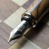
And again an earthly sinful living being gave in to all his desires and bought another enchanting piece of writing instrument. Also replicated the content with additional pictures in my blog, as the images are/will be reduced to a small thumbnail after a short-while by the image hosting service. Happy reading ! Below is a link to the same: The Sterling Pelikan Souverän m625 As you might already know, Pelikan as a company encompasses a rich heritage of 180 years – in manufacturing inks, pens and stationery (177 years to be exact, you can find a bit of history in a previous post and here). In 1929, it released its first transparent Pelikan fountain pen and was credited with the genesis of the piston-filling mechanism, using a differential spindle gear. However, the first of the silvery m625 models does not come until the next 77 years go by . M625 Pelikan launched the Souverän m625 model in 2006, which constituted of a dark blue resin barrel with rest of the visible hardware - i.e cap, piston knob and grip section, carved out of sterling silver (92.5% silver + 7.5% copper giving the required strength while preserving appearance of the noble metal). It was later followed by an aubergine model and a red model with two variations in the cap section. These had a 18k rhodium plated gold nib. Later, they also released a limited batch of m625s with a red barrel and a 14k nib, for the Asian market. The pen comes in a standard G15 gift box, essentially the same packaging as all the other standard souverän models. DESIGN (6/6) It's an amazingly stunning pen encompassed in a standard souverän series design. Closed, the sterling silver cap and the piston knob dazzle with ambient reflections, while the barrel awaits light to bedazzle you. Once exposed to the visible spectrum, a play of light reveals the inside mechanism like a demonstrator. And it's definitely more spectacular to the eyes than it is to the lenses. The barrel is made up of high grade translucent resin and is resistant to scratches in course of normal use. There is also a thin palladium coating on the sterling silver parts to avoid staining of the pen with time. This was confirmed by the Pelikan team. http://i1302.photobucket.com/albums/ag127/soniknitr/m625/pelm625%20002_zpsro9rdxyp.jpg On unscrewing the cap, you will instantly notice a resonance in design with a glittering grip section wholly carved out of sterling silver, along with a rhodium plated nib. So there is either reflection or refraction of ambient light, rendering the m625 with its characteristic trait. The silvery metallic grip is quite comfortable to hold and does not feel slippery, adjoining the barrel with threads for securing the cap. http://i1302.photobucket.com/albums/ag127/soniknitr/m625/pelm625%20004_zpsvyvlrkoy.jpg Twirls engraved around the sterling silver cap run on its surface gleaming with all possible proximate imagery. A few swirls end near the middle, where Ag 925 is etched in between, granting a somewhat finality of trust to the glitter show.The logo on the finial is the one embraced by Pelikan post 2003, that of a mother pelican and a chick, in a brushed silver finish. At the base, imbibed are the words PELIKAN SOUVERÄN GERMANY, which is common across the range of souverän series. The absence of any differential aesthetics in the cap drives the inherent singularity in appearance. http://i1302.photobucket.com/albums/ag127/soniknitr/m625/1-Cap2_zpszdjywgpt.jpg FILLING SYSTEM (6/6) A piston filler with a sterling silver knob surely distinguishes the m625 from other models in the range. Apart from enchanting looks, like any other pelikan, it's an easy and hassle-free mechanism. The piston end unscrews with three to four rotations and ink is sucked in, with quite a gush, once the piston is screwed back on. And of course, you can observe the entire thing in action. http://i1302.photobucket.com/albums/ag127/soniknitr/m625/1-Piston_zpsdurysgvm.jpg NIB (6/6) – ALL THAT MATTERS The dazzling rhodium plated gold nib with an usual iridium tip is tested by hand, and it comes in four main sizes – EF, F, M & B along one special width – BB (extra-broad). Like all its cousins, the nib is exquisite and efficient. With a screw fit mechanism and a standard m6xx feed, the nib-section is an ensemble of efficiency as well as artistry. And this silvery white finish does converge with the sterling silver grip in terms of both glitter and glimmer. The tail end specifies the nib-width and composition (14 C, 58.5% Au) of the gold-alloy used. Three arabesques diverge along the shoulders of the nib with two of them converging near the breather hole. The third arabesque runs across the tines towards the shoulders ending with the tail end of the nib. There is of-course the dazzling white mother-baby pelikan logo, resting above the tail. This one is an extra-fine nib and writes smoothly out of the box. http://i1302.photobucket.com/albums/ag127/soniknitr/m625/pelm625%20011_zpspf1dqnci.jpg PHYSICS OF IT (5/6) – RELATIVELY SPEAKING It does give a comfortable feel to write with the pen without posting the cap. The overall capped length is around 13.3 cm. The total weight of m625 has a significant contribution from the cap, which is otherwise quite well-balanced. And yes, a substantial cap does make the pen very top-heavy when posted. Uncapped Length ~ 12.4 cm Posted Length ~ 15.4 cm Nib Leverage ~ 2.3 cm Overall Weight ~ 34 g (Cap Weight ~ 17.5 g)http://i1302.photobucket.com/albums/ag127/soniknitr/m625/pelm625%20013_zpscecl30yk.jpg While not posted, a length of 12.4 cm is quite comfortable for writing because of a thicker girth and a substantial weight, due to the metallic grip and piston-knob sections, although the piston mechanism is made up of plastic rather than brass. (common across m6XXs) http://i1302.photobucket.com/albums/ag127/soniknitr/m625/pelm625%20014_zpse6jw0uaa.jpg ECONOMIC VALUE (4/6) Although the m625 retails at excess of USD 700, it is available at lower street prices. I was able to get the pen at a good discounted price in an online action at the bay. I would not undervalue the rating by much, because at the end, the m625 seems more of an art rather than science. As isn't it why we all buy, discuss and share experiences with fountain pens? OVERALL (5.4/6) I adore the distinct red translucent design of the m625 which is embraced with the glistening contours of sterling silver. This pen is blessed with a smooth extra-fine (EF) nib which delivers a thin but a very wet line. The line width closely resembles a Pilot 14k-FM nib. For a relatively dry Pelikan Royal Blue ink, it takes around 12-13 seconds to dry. I could not find any line variation with horizontal and vertical strokes for this one. And yes, nib's a nail too, when it comes to flex. http://i1302.photobucket.com/albums/ag127/soniknitr/m625/pelm625%20012_zps8dlyfwz1.jpg Hope you enjoyed the review. Thank you for your time. Best, Sonik
- 52 replies
-
- m625pelikanm805sterling silver
- souverän
-
(and 3 more)
Tagged with:
-
Sorry to those of you who have been around here a while and have read an abundance of posts. The apology is because I have not been able to find a post about these two pens, the Waterman Edson and the Visconti 14k Skeleton Demo, pitted against each other. Thus, the reason for this post is to engage in friendly discussion about which is better to purchase. Below are some details about each of them to help with the decision. Both pens are the same price (within about 20 dollars of each other) from my particular retailer. Additionally, I am a loyal customer and buy most of my pens from him. This has allowed me to work out deals with him and the winner of these two pens will be a part of a deal. The pens are roughly $450 US, or lower if the negotiating goes more my way. The Visconti comes with a M nib and the Edson is a B nib which I would send in to exchange with a M unless someone delivers a solid argument. The Visconti has caught my eye because of the demonstrator barrel and the unique skeletal design. I also do not own a Visconti pen, but I do have one piston-filled pen, which is a Stipula Ventidue 22 (although it has problems as they all do). The Edson caught my eye, because that is just what that pen does to people. I also own a Waterman Phileas and a Waterman Carene, which are both personal favorites. The Carene is a sentimental gift from my father and also is one of my two favorite pens, currently tied with a Cross Verve. The Edson is definitely a pen I want to own at some point, just not entirely sure about right now. The next is some information about me personally to help with the discussion. I have personally written with steel, titanium, and 18k gold nibs. I think the titanium flex is unique, but I write so softly that flex or spring rarely make a difference to me (with the exception of the Titanium because that flex is extreme even for soft writers). My gold nibs are definitely my favorite with the exception of the Phileas and I prefer a moderately heavy pen. The Cross Verve is an exceptional writer that I love and keep in constant rotation with my Carene. These are my two favorites with the Phileas and my Schaeffar Legacy Heritage as the runners up. When the Carene and Verve are being cleaned, these two step in. The fifth in the running, which is used occasionally for light writing, is my Cross C Series. This pen would be number 3, but it has some pretty severe ink starvation problems that I haven't had a chance to send out to get fixed, yet. I hope all this information is helpful and that you all produce friendly, helpful, and informative comments. Thanks in advance, Tim P.S. Both are NOS