Search the Community
Showing results for tags 'Mont blanc'.
-
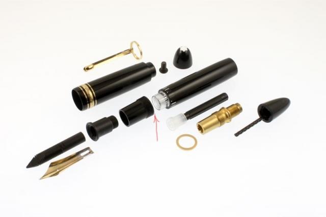
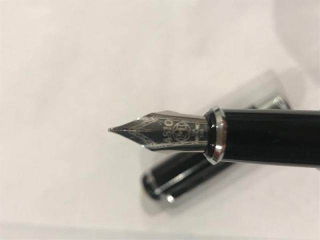
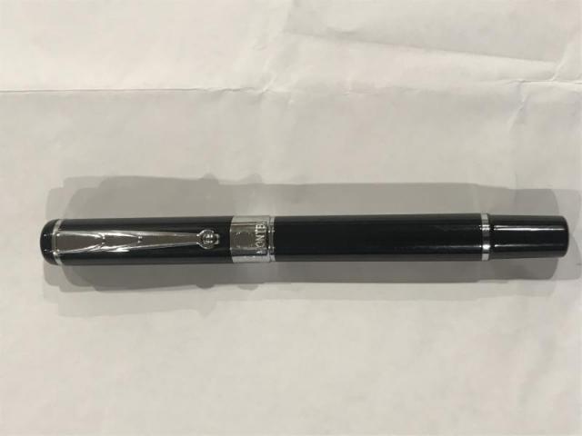
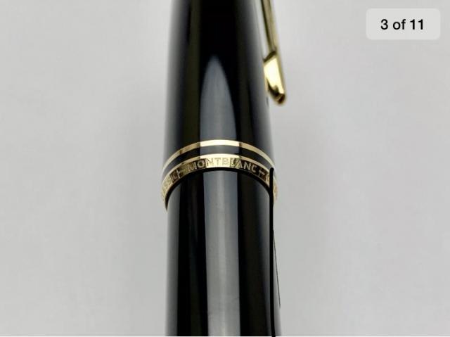
Hi All! I am a student who wrote with the same FP for many years. However, I wanted something new, so I decided to trade pens so that I could afford it and switch pens more often. I recently bought two Montblancs 144s. The price was good, but I have a few questions regarding the age, nib size and serial number. 1. How can I determen how old my pen is, even if there is no serial number. 2. I want to clean the pen a bit better, but I am not sure how to remove the nib. There is also not a good Youtube video that shows me that. Any ideas? 3. My pen has no serial number. I don't directly suspect the pen to be fake, but I am also not sure what the reason could be and if it's normal. Attached some pics for reference and age determination. Thank you all very much for your help in advance!
- 8 replies
-
- montblanc
- mont blanc
-
(and 7 more)
Tagged with:
-

What Are The Best Ballpoint Pens? Share Your Thoughts!
theodore94 posted a topic in It Writes, But It Is Not A Fountain Pen ....
Hi Everyone, I'm new to FPN and pen collecting in general. I am particularly interested in ballpoint pens... I'm a full-time student and I do most of my work in ballpoint. I have a few pens that I've bought used, and I want to know what you think are the best ballpoints you have purchased/used. These can be at any price point and a pen can be your favorite for any reason. My favorite pen (by far) is my Classique Montblanc Meiserstuck, followed by a few designer pens (Tiffany and Givenchy). I have a Waterman Maestro and a Waterman Phileas that I really like. And on the lower end of the price scale I still think Cross makes handsome, dependable, and inexpensive ballpoints. What are your favorites? Any ideas for my next pen?- 227 replies
-
Help identifying if there is problem with nib on hard-starting Mont Blanc.
ihatehardstarting posted a topic in Of Nibs & Tines
Hello, I have recently discovered an old Mont Blanc Unicef fountain pen. It was unused for a relatively long time so I flushed it with water. However, when I tried it afterwards, it had major hard-starting issues. I thought that maybe there was still some dried ink in the feed so I flushed it again with ammonia solution this time; it still had the same issue. I then left it to soak overnight in water, but it was still hard-starting. I then thought that it was perhaps the fault of the ink. I was using Pelikan 4001 royal blue ink which I have read online is a very dry ink, so I diluted it with a lot of distilled water. This still did not fix the problem. Therefore, I was wondering if the hard-starting was not due to the feed but rather the nib. I have heard of problems such as baby's bottom but I have little experience and I am not sure I can identify it. Thus I have included some pictures of the nib and kindly ask that you could take a look and tell me if everything is in order, or what steps I could take to try to fix the hard-starting. -
Mont Blanc - Petrol Blue For the past few years, Mont Blanc has followed the tradition of bringing out a Limited Edition "Colour of the Year" ink. These come in a 50 ml square bottle, and are typically available for a limited time only. In this review, I take a closer look at Petrol Blue, the colour of the year 2019. The ink's packaging is both stylish and functional, and gives an idea of the ink's colour. In the box you'll find the nice square bottle, with a decent amount of ink (50 ml). Not so nice is the ink's price point - at about 35 EUR for a bottle, this definitely is an expensive ink. To my eye, Petrol Blue is a teal-leaning blue, and one that looks quite nice. Also well saturated - which is quite a relief after some of the more recent watered-down MB colours. I personally like teal-style colours, and this one is different enough from my other teals to make it interesting. The ink writes rather wet, even in my typically dry Lamy Safari test pens - no complaints there. The ink shades strongly... very noticeable even in finer nibs. The contrast between light and darker parts is prominent, but still aesthetically pleasing. Overall, I quite like what I see. Petrol Blue has a rather broad dynamic colour span. To illustrate this, I did a swab on Tomoe River paper where I really saturated portions of the paper with ink. This beautifully illustrates the ink's colour range. The ink moves from a light-blue to a very dark teal. You'll also notice a reddish sheen in very saturated parts. On the smudge test - rubbing text with a moist Q-tip cotton swab - the ink behaved reasonably well. There is quite some smudging, but the text itself remains perfectly readable. Water resistance is totally absent though. All colour quickly disappears from the page, leaving almost no residue. Definitely not an ink to use in the workplace. A word of warning: this ink will stain your fingers, requiring quite some scrubbing to remove it. On the positive side, I found it easy to clean from the syringe-filled cartridges that I used for my test pens. Petrol Blue is a fast-drying ink - with typical drying times in the 5-10 second range with my Lamy Safari (M-nib). As such, this ink is also suitable for lefties (when using finer nibs). I've tested the ink on a wide variety of paper - from crappy Moleskine to high-end Tomoe River. I have recently expanded my paper testbed to include 20 different paper types. As such, you will get a good idea of the performance of this ink on a broad range of papers. On each scrap of paper I show you: An ink swab, made with a cotton Q-tip 1-2-3 pass swab, to show increasing saturation An ink scribble made with a Lamy Safari M-nib fountain pen The name of the paper used, written with a Lamy Safari B-nib A small text sample, written with an M-nib Drying times of the ink on the paper (with the M-nib) This Mont Blanc ink looks really nice on all my test papers. This is an ink that looks good on any type of paper, both the white and more yellow ones. With the exception of Moleskine and the HP 80gsm printing paper, I didn't notice any feathering. With lower-quality paper, you get some see-through and even a bit of bleed-through. All-in-all though, this is a well-behaving ink. Writing with different nib sizes The picture below shows the effect of nib sizes on the writing. All samples were written with a Lamy Safari, which is typically a dry pen. I also added a visiting pen - a wet-writing Pelikan M200 Classic Green-Marbled with an F-nib. Here the ink leaves a much more saturated line, with somewhat less pronounced shading. The ink works well with all nib sizes I tested it with. Related inks To compare Petrol Blue with related inks, I use a nine-grid format with the currently reviewed ink at the center. This format shows the name of related inks, a saturation sample, a 1-2-3 swab and a water resistance test - all in a very compact format. I hope that you'll find this way of presenting related inks useful. It's a bit more work, but in my opinion worth the effort for the extra information you gain. Inkxperiment - the eagle has landed (celebrating the fiftieth anniversary of the first moon landing) As a personal experiment, I try to create interesting drawings using only the ink I'm reviewing, keeping things simple and more-or-less abstract. For me, this broadens the scope of the hobby, and allows me to stretch my drawing skills. It is great fun to explore an ink's colour range in a more artistic context. For this drawing, inspiration comes from the first moon landing fifty years ago, with Neil Armstrong announcing that "the Eagle has landed". So in this drawing, you also get an eagle ;-) I started off with a 10x15cm piece of HP Premium photo paper, on which I painted multiple layers of ever more saturated ink to create the background. I then used my Lamy Safari with pure Petrol Blue to pencil in the trees and the eagle. Overall I'm quite pleased by the use of the photo paper as a medium for ink paintings - the ink's character shows off really well. Conclusion Mont Blanc's Petrol Blue "Colour of the Year 2019" LE ink is quite a good-looking teal-leaning blue, that is at home with all types of nibs and all types of paper. I really enjoyed using it. My only real complaint is that the ink is too expensive - it's not different enough from similar inks like Diamine Eau de Nil to warrant the hefty price tag. Technical test results on Rhodia N° 16 notepad paper, written with Lamy Safari, M-nib Backside of writing samples on different paper types
- 46 replies
-
- mont blanc
- petrol blue
-
(and 2 more)
Tagged with:
-
Mont Blanc - Swan Illusion Plume When Mont Blanc brings out a new pen, you can be sure that there is an LE ink to accompany it. With the MB Patron of Art Ludwig II pen comes the mysteriously sounding "Swan Illusion" accompanying ink. A bit of digging on Wikipedia removes the mystery though: Ludwig II from Bavaria (1845-1886) is also known as the Swan King, hence the ink's name. The ink's packaging looks lovely, and shows a not so easily described colour... brown? sepia? grey? I'm not quite sure what to make of it. But for me, grey-brown best captures the mood of this ink. The box also suggests a broad colour spectrum spanning from very faint light greyish brown to a really dark grey-brown colour. Looks promising. Swan Illusion delivers on the promise: the ink has a unique colour. I would definitely classify it as a brown that leans heavily towards the grey. Quite a captivating colour, and one that I really like. The ink has relatively low saturation, which translates into a subdued and somewhat faded look. The result on the page is well-balanced though, and makes for easy reading. There is tons of shading in this ink, but this only shows up in broader nibs. This is not an ink for fine nibs, use a B or above to bring out its beauty. The ink itself lacks a bit of lubrication, especially in drier pens like my Lamy Safari. With my wetter Pelikan pens this was not a problem; here the ink writes like a dream. The ink also has a wonderfully dynamic colour span. To illustrate this, I did a swab on Tomoe River paper where I really saturated portions of the paper with ink. This beautifully illustrates the ink's broad colour range. Swan Illusion moves from a very light sepia-brown to a very dark brown-grey. Impressive! On the smudge test - rubbing text with a moist Q-tip cotton swab - the ink behaved perfectly. Water resistance is amazing - the ink effortlessly survived even longer exposures to water. Kudos! This is also apparent from the lower part of the chromatography, which shows that the grey components of the ink remain on the paper. If you need a water-resistant ink, Swan Illusion certainly fits the bill. The chromatography also shows that this is a wonderfully complex ink, with tons of undertones - orange, yellow, blue… Swan Illusion is also a fast-drying ink - with typical drying times in the 5-10 second range with my Lamy Safari (M-nib). As such, this ink is also suitable for lefties. Also: fast drying times and water resistance make it a perfect ink for the workplace. And the ink's classy looks will certainly draw attention. I've tested the ink on a wide variety of paper - from crappy Moleskine to high-end Tomoe River. On each scrap of paper I show you:An ink swab, made with a cotton Q-tip1-2-3 pass swab, to show increasing saturationAn ink scribble made with a Lamy Safari M-nib fountain penThe name of the paper used, written with a Lamy Safari B-nibA small text sample, written with an M-nibDrying times of the ink on the paper (with the M-nib)Swan Illusion looks really nice on most papers, but not on Tomoe River. Here the ink looks too washed out for my taste. On Moleskine, there is some bad chemistry going on, resulting in a hideous look. The ink looks simply gorgeous on Fantasticpaper, Paperblanks and OCM cotton paper. With the exception of Moleskine, I didn’t notice any feathering or bleed-through. All-in-all a well-behaving ink. Inkxperiment – Cubistic Dimensions As a personal experiment, I try to produce interesting drawings using only the ink I'm reviewing, keeping things simple and more-or-less abstract. I find this to be a fun extension of the hobby, and have found such single-ink drawings a nice challenge. It also gives you an idea of what the ink is capable of in a more artistic setting. For this drawing I used 300 gsm rough watercolour paper. I started off with water-diluted ink for the lighter parts in the drawing, gradually adding more ink to the mix for the darker parts. The highlights in the drawing were obtained by painting in some bleach - the ink reacts nicely with the bleach producing a golden-yellow colour. The end result gives you a good idea of the colour span that Swan Illusion is capable of. ConclusionMont Blanc's Swan Illusion LE ink is a great ink with a unique grey-brown colour, that immediately attracted me. The ink totally fits my taste: nice complexity, subdued and with non-aggressive shading. And as a welcome bonus: fast-drying and water-resistant. What more can you want. Personally, I really really dig this ink ... it's currently in my top 3 of best inks of 2018. In my opinion, an ink to grab while it's out there. Technical test results on Rhodia N° 16 notepad paper, written with Lamy Safari, M-nib Backside of writing samples on different paper types
- 77 replies
-
- mont blanc
- swan illusion
-
(and 2 more)
Tagged with:
-
I just received a Mont Blanc Starwalker pen through the post and thought I would share the experience. My first impressions were what a good looking pen it is with its platinum metalwork and you would be hard pushed to know it was secondhand. I wasn't expecting it to be inked though so that was the first surprise when I opened it to see what sort of arrangement was inside and found it full of ink that I was lucky not to transfer to my lap. So I guess this is "an eyedropper" where I need to load ink directly into the pen body somehow? I was always used to one of those cartridges with a plunger and I would pull the ink out of my bottle... now I have several bottles more coming my way all diamine but exotic colours... Anyway I thought I would write a letter and see how it goes... I have only learnt to write Russian this year so I have been corresponding with friends I met travelling around Eastern Europe. Unfortunately by the second paragraph I had a few problems and realised by the fourth the pen was going dry. It has a 14ct nib which is presumably a good thing but in truth it doesn't seem to write any better than my Jinhau though I do like that the cap not only posts but screws on to the rear of the pen (and the clip aligns so that it doesn't interfere with my hand) I guess now I need to buy a syringe or something to load it with.
-
The brown ink from shipping made the sample label unreadable, I thought, but I have finally determined that the ink inside is MB Honore du Balzac. The se BJ page is in an Endless Notebook, the ink writes slightly wetter there (better and thicker paper). @amberleadavisplease move this to the right thread if I have it wrong. Thanks. @TheMustard, have I id'd correctly?
- 4 replies
-
- mont blanc
- honore du balzac
-
(and 3 more)
Tagged with:
-
InkShift – Mont Blanc Lavender Purple to Royal Blue Just for the fun of it, I occasionally resume my project exploring what happens when you move progressively from one ink colour to another. For now, I'm restricting myself to inks from the same manufacturer - mainly to avoid nasty chemical surprises. My hope is that some of these "inkshifts" result in interesting colours that I can use to write/draw with. And besides... it's just fun to watch one ink colour morph into another one. Mont Blanc Lavender Purple is a technically ok ink, but has that shade of red-purple that doesn’t really appeal to me. And so I ended up with a bottle that’s been collecting dust in my ink cabinet. Time for a change… I decided to see if I could morph Lavender Purple more toward the blue end of the spectrum, by mixing it with Royal Blue. Maybe there are some interesting combinations in the mix, maybe even a fairly decent violet-blue. Who knows... only one way to find out, and that is to carry out the inkshift experiment. In the span between the two starting inks more interesting colours appear, that certainly beat the original Lavender Purple (my personal opinion). The 1:1 mix is a blue-purple that looks quite nice. And the mix of 1 part Lavender Purple with 3 parts Royal Blue is my personal favourite: a soft blue-heavy violet that looks really appealing. For me, both of these mixes are a significant improvement to the original Lavender Purple. Another bottle of ink saved from oblivion! I continue to enjoy these ink morphing experiments. Fun adventures in ink-land, and more often than not you are rewarded with a mix that beats the original inks. Fun guaranteed!
- 7 replies
-
- inkshift
- mont blanc
-
(and 2 more)
Tagged with:
-

Ink Shoot-Out : Kyo-Iro Stone Road Of Gion Vs Mont Blanc Swan Illusion Plume
namrehsnoom posted a topic in Ink Comparisons
Ink Shoot-Out : kyo-iro Stone Road of Gion vs Mont Blanc Swan Illusion Plume In 2018, Mont Blanc presented us with the Swan Illusion Plume ink, that accompanies the Patron of Arts Ludwig II limited edition pen. A great grey-brown ink that I highly recommend. Fellow member JulieParadise suggested Stone Road of Gion as a near equal to this ink - "but a tad darker on paper". That of course peaked my interest... time to do a detailed comparison and find out which of these inks I like the most. Enter... the Ink Shoot-Out. A brutal fight spanning five rounds, where two inks engage in fierce battle to determine who is the winner. In the left corner, the martial arts champion of Japan, the man with the lightning fist - kyo-iro Stone Road of Gion. In the right corner, the iron man from Germany, tough as nails - Mont Blanc Swan Illusion Plume. Both champions enter the ring. The tension in the boxing hall goes through the roof. Crowds are cheering! The bell rings signaling the start of the first round. May the best ink win... Round 1 - First Impressions Both inks make a great first impression on me. The inks have a greyish brown dusty appearance that looks elegant and sophisticated. As such, they immediately enhance your writing. For me, the colour totally works - I like it a lot. Even though these are muted inks, they still provide excellent contrast to the page when used with my Lamy Safari M-nib on Rhodia N°16 notepad paper. Both inks also exhibit subtle shading, without too much contrast between the light and darker parts. This gives your writing an aesthetically pleasing look. The inks look nearly identical, but there are some differences:Swan Illusion leans more towards the grey end of the spectrum, which is especially notable in swatches, less so in the written text.Stone Road of Gion is a wetter ink, and produces a more saturated line. In contrast, Swan illusion feels less lubricated and a bit undersaturated. This is especially noticeable in finer nibs.With broader nibs - e.g. with the scribbles made with a 1.5 mm calligraphy nib - Stone Road of Gion shows a bit more character, with a more pleasing appearance.Both inks make a great first impression. Stone Road of Gion works better with the pen - it feels wetter and produces a bit more of a saturated line. On the other hand, I personally prefer the slightly greyer brown of Swan Illusion. These inks are well matched. No clear winner emerges, and this round ends with a draw. Round 2 - Writing Sample The writing sample was done on Rhodia N°16 Notepad with 80 gsm paper. Both inks behaved flawlessly, with no feathering and no show-through or bleed-through. With the EF nib, the slightly darker colour and better saturation of Stone Road of Gion come into play, resulting in more contrast-rich writing. With broader nibs, Swan Illusion no longer feels undersaturated and dry, and lays down a beautifully muted grey-brown line. With Stone Road of Gion, you get much more saturation in broader nibs, and a stronger presence on the paper. You could say that Swan Illusion is more of an introverted ink, while Stone Road of Gion has more of an extravert character. Colourwise both inks look similar in writing, although there is definitely more of a grey undertone in the Mont Blanc ink. Both inks also shade nicely, without too much contrast between light and dark parts. This aesthetically pleasing shading gives more character to your writing, and shows up even with the finer nibs. For this round, the focus is on writing, and here both inks are strong performers. Stone Road of Gion works better in EF/F nibs, producing a more saturated line. On the other hand, Swan Illusion looks more aesthetically pleasing, especially in broader nibs (or wetter pens). Damn... these fighters are good. They really are on par with each other. Again this round ends in a draw. Round 3 - Pen on Paper This round allows the batlling inks to show how they behave on a range of fine writing papers. From top to bottom, we have : FantasticPaper, Life Noble, Tomoe River and Original Crown Mill cotton paper. All scribbling and writing was done with a Lamy Safari M-nib. Both champions did well, with no show-through nor bleed-through. But this round is not about technicalities, it is about aesthetics and beauty. Are the fighters able to make the paper shine ? One thing is immediately apparent: these inks are at home on a wide range of papers, both white and off-white ones. On more absorbent paper like Fantasticpaper (top), the inks look really similar. With Tomoe River - definitely a non-absorbent paper - Swan Illusion shows a bit more character. But on Life Noble, the roles are reversed, with Stone Road of Gion being the more beautiful ink. Both inks are on par with each other, with neither of the champions giving any ground. As such, round 3 also finishes with a draw. The tension in the hall is now going up by the minute. Are both fighters really each other’s equal ? Will one of them show some weakness ? Let’s continue the fight to find out. Round 4 - Ink Properties Aha... now we get some differences! Stone Road of Gion - being a wetter ink - takes a bit more time to dry: 15-20 seconds with the M-nib versus 10-15 seconds for the Swan Illusion ink. To test their smudge resistance, I rubbed the text with a moist Q-tip cotton swab. Here Swan Illusion shows its dominance - the ink is almost immune to smudging. Stone Road of Gion smudges a lot in comparison, but still leaves a very readable line that is still crisp and clear. To test water resistance, I dripped water on the grid and let it sit there for 15 minutes, after which I removed the water with a paper towel. Here Swan Illusion totally dominates - this ink is strongly water resistant, while Stone Road of Gion loses all the ink on the paper. If you look for an ink to use at the office, Swan Illusion is your friend. In this round, the Japanese champion caves. Swan Illusion delivered an uppercut that floored its opponent. The public roars... the applause is deafening... What a spectacle. There is no doubt whatsoever. This round is a solid win for Mont Blanc. Round 5 - The Fun Factor Welcome to the final round. Here I give you a purely personal impression of both inks, where I judge which of them I like most when doing some fun stuff like doodling and drawing. Both inks do well, and show off a broad colour spectrum, ranging from very light ochre-brown to a really dark brown-grey. I really enjoyed using them. Personally I prefer the slightly greyer looks of Swan Illusion. This ink also feels a bit more complex, hinting at orangy undertones. This is confirmed when looking at the chromatography of these inks. Here you can clearly see the inherent complexity of the dyes that make up Swan Illusion. In my opinion, this gives the Swan Illusion side of the drawing a more vibrant look. For this round, both champions are again well matched. But for this judge, Swan Illusion showed the best moves, and wins this round on points. Mind... this is a relative comparison. Standing on its own, Stone Road of Gion is still a terrific ink to play around with. But side by side, I definitely prefer the Mont Blanc ink. The Verdict Both inks are real jewels, that work on all types of paper. And it took a while to notice some differences. But in the end, round 4 is the decisive one : Swan Illusion clearly dominates when water resistance comes into play. You might not care about this slip-up of the Japanese ink. In that case, round 5 still gives a slight edge to Swan Illusion as being the more interesting ink. For this judge, the conclusion is clear: Mont Blanc Swan Illusion is the winner of this exciting fight.- 30 replies
-
- kyo-iro
- stone road of gion
-
(and 3 more)
Tagged with:
-
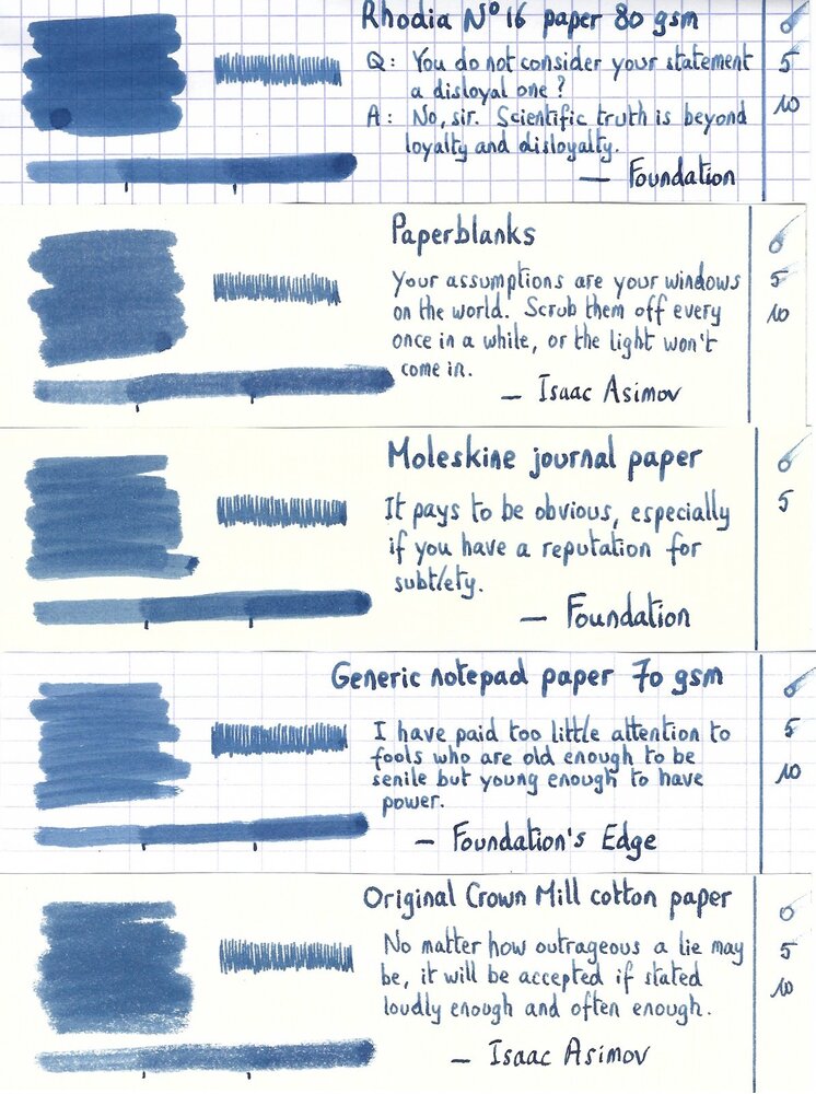
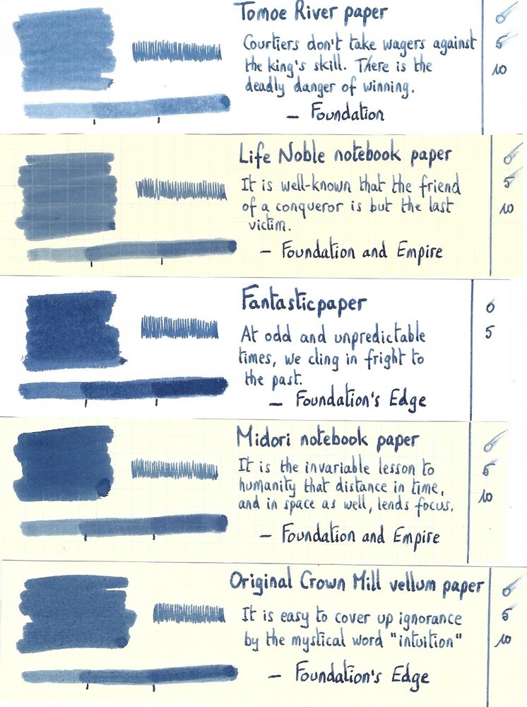
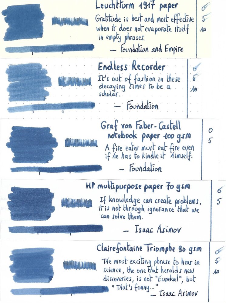
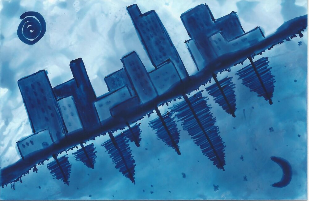
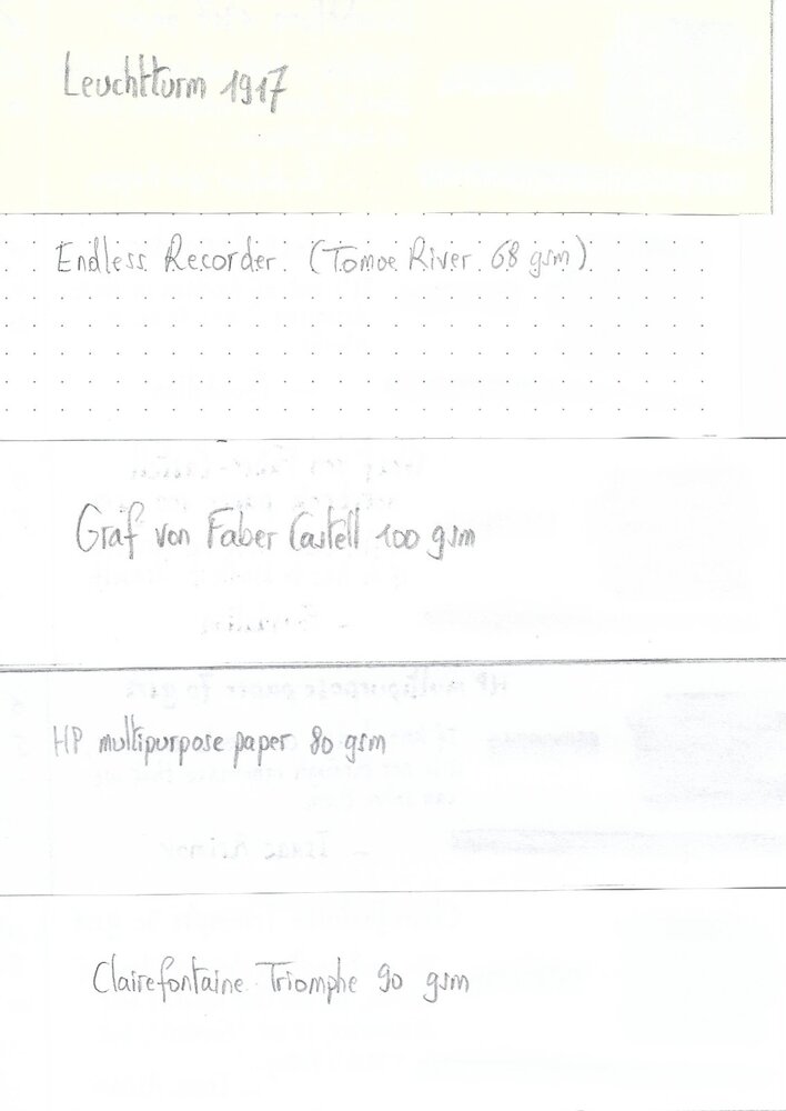
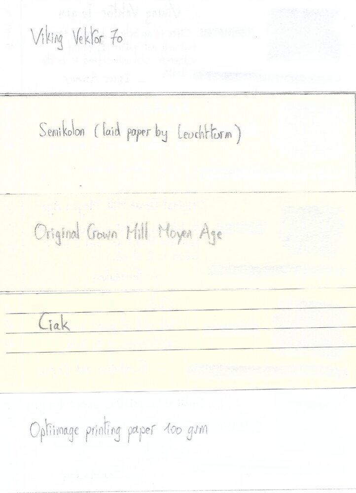
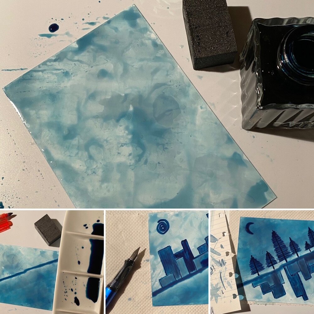
Mont Blanc – StarWalker Blue Planet The 2020 Mont Blanc StarWalker Blue Planet fountain pen pays homage to our home in the universe, and calls attention to the dark blue water in earth’s oceans. Not surprisingly, Mont Blanc also released an accompanying dark blue ink, that is the subject of this review. The ink’s packaging looks lovely, with a design that provides an inspiring view of Earth as seen from space, with swirling clouds over blue oceans. In the box you’ll find a very nice 50ml bottle of StarWalker Blue Planet. StarWalker Blue Planet is a dark blue ink that moves towards blue-black territory, without actually getting there. It’s still without question a blue ink, but quite a dark one. I like blue-black inks a lot, and this one charmed me by keeping its blue origins, while at the same time being dark enough to offer a nice alternative to the more traditional blue-black. It’s also different enough from my other blue inks to make it stand out from the pack. I personally like the way it looks! The ink is well-saturated, and looks great in all nib sizes. This dark blue ink fits perfectly in the workplace, looking serious while still standing out from the standard blue and black crowd. A great everyday writing ink. Blue Planet has a limited dynamic colour range, without much contrast between the light and darker parts. The result is soft shading that – while very present – is never harsh, but looks elegant and pleasing to the eye. The shading is most prominent in nib sizes M and above, but even with EF/F nibs you see hints of shading that lend some character to your writing. I personally think this ink’s shading works brilliantly. On the smudge test – rubbing text with a moist Q-tip cotton swab – the ink shows a bit of weakness. Lots of visible smudging, but the text itself remains very legible. Further water tests show Blue Planet’s total lack of water resistance. All that lovely dark blue quickly dissipates, leaving next to nothing on the page. This is also apparent from the lower part of the chromatography, which shows that only some shadows of the ink remain on the paper. Drying times are close to the 5-second mark with the Lamy Safari M-nib test pen, making Blue Planet a relatively fast-drying ink. I’ve tested the ink on a wide variety of paper – from crappy Moleskine to high-end Tomoe River. On each scrap of paper I show you: An ink swab, made with a cotton Q-tip 1-2-3 pass swab, to show increasing saturation An ink scribble made with a Lamy Safari M-nib fountain pen The name of the paper used, written with a Lamy Safari B-nib A small text sample, written with an M-nib Source of the quote, with a Pelikan M400 F cursive italic Drying times of the ink on the paper (with the M-nib) Since this is my first review of 2021, I start with a new set of quotes for the writing samples on different types of paper. After giving it some thought, I decided to go with quotes from Isaac Asimov and his Foundation Series. I personally think these are relevant in the current geopolitical climate. Coming from a computer science background, I also appreciate Asimovs strong belief in the power of science. Since scans alone don't give a complete picture, I also add some photos to give you an alternative look at the ink. Mont Blanc StarWalker Blue Planet looks great on all my test papers, both the white and more yellow ones. The ink behaved almost perfectly. Only with Moleskine paper and printing paper did I notice a tiny amount of feathering. See-through and bleed-through are visibly present with Moleskine paper, but not an issue with the other papers in my test set. Like most Mont Blanc inks this is a well-behaving one. Writing with different nib sizes The picture below shows the effect of nib sizes on the writing. All samples were written with a Lamy Safari, which is typically a dry pen. I also added a visiting pen – a wet Pelikan M405 Stresemann with an F cursive-italic nib. In all cases, Blue Planet leaves a well-saturated line and wrote fluently with good lubrication. I also enjoy the soft shading of this ink, which looks really elegant. Shading is hinted at in EF/F nibs, and is very present in M-nibs and above. An excellent writing ink! Related inks To compare this StarWalker Blue Planet with related inks, I use a nine-grid format with the currently reviewed ink at the center. This format shows the name of related inks, a saturation sample, a 1-2-3 swab and a water resistance test – all in a very compact format. The grid format makes it easy for you to compare the Mont Blanc ink with similarly coloured inks. The ink looks different enough from my other dark blues to stand out from the pack. Inkxperiment – Yin & Yang As a personal experiment, I try to produce interesting drawings using only the ink I’m reviewing, keeping things simple and more-or-less abstract. Making these single-ink mini-pieces allows me to show what the ink is capable of in a more artistic context. For this drawing I started with a 10x15 cm piece of HP photo paper, on which I drew the background using a piece of foam and heavily water-diluted ink. I then drew in the dividing line, and darkened up the bottom part of the background. Using a yin&yang theme, I drew in some opposing features on the day & night side: sun vs moon, cityscape vs treeline. The resulting drawing shows quite well what can be achieved with this StarWalker Blue Planet as a drawing ink. Conclusion Mont Blanc’s StarWalker Blue Planet is a serious-looking dark blue ink. It’s hinting at blue-black territory without crossing that line. And it manages to do this well. This ink is a nice alternative for blue-black ink lovers. The ink works well with all types of nibs and a broad range of papers, showing some really nice and soft shading. Unfortunately: no water resistance. I quite enjoyed this Mont Blanc ink. Just be aware that it is a Limited Edition ink, so if you like it, now is the time to grab a bottle. Technical test results on Rhodia N° 16 notepad paper, written with Lamy Safari, M-nib Backside of writing samples on different paper types
- 9 replies
-
- mont blanc
- starwalker
-
(and 3 more)
Tagged with:
-

Ink Shoot-Out : Mont Blanc Burgundy Red Vs Papier Plume Red Beans And Rice
namrehsnoom posted a topic in Ink Comparisons
Ink Shoot-Out : Mont Blanc Burgundy Red vs Papier Plume Red Beans and Rice The other day I was playing around with Mont Blanc Burgundy Red, enjoying the ink a lot. I just love these toned down colours that move towards pastel territory, and this ink fits the bill. This definitely is NOT a bright and vibrant red! It occurred to me that Red Beans and Rice from Papier Plume is from the same colour family. Time to do a detailed comparison, and find out which of these inks I like the most. Enter... the Ink Shoot-Out. A brutal fight spanning five rounds, where truly formidable inks do battle to determine who is the winner. This time around, it's a battle between a prominent heavyweight, and a new kid on the block. In the left corner, the Mont Blanc muscle-man: Burgundy Red. In the right corner, from the French Quarter in New Orleans, Red Beans and Rice - a relatively new talent from the Papier Plume stable. Both champions enter the ring, the crowd starts cheering! Let the fight begin and may the best ink win… Round 1 – First Impressions The fighters immediately engange one another with a flurry of strikes and counterstrikes. They make a great first impression. These inks have a really nice toned-down dusty dark-red colour with a faded look, like text in an ages-old manuscript. Both inks are well-saturated, even in finer nibs, and provide excellent contrast with the page. Shading is delicate and subtle, without too much contrast between the light and darker parts - just as I like it. These inks are definitely on par with each other, but there are some differences: Burgundy Red's colour is a bit more purple-leaning, while Red Beans and Rice has more of a brown undertone. This is most obvious in swabs, less so in normal writing. The Mont Blanc ink writes really smooth. In contrast, Red Beans and Rice has sub-par lubrication, and feels a bit scratchy, especially in smaller nibs. With broader nibs - e.g. with the scribbles made with a 1.5 mm calligraphy nib - the Mont Blanc ink tends to be a bit oversaturated, drowning out most of the delicate shading. Red Beans and Rice, being a drier ink, looks better in these circumstances, and shows a bit more character. Both inks make a great first impression. Personally I like the Mont Blanc colour a little bit better, but that's not what counts. When exchanging the first punches, Burgundy Red showed much smoother and fluid play, in stark contrast with the scratchy performance of the Papier Plume ink. With broader nibs, Red Beans and Rice recovers, becoming a smooth writer that manages to keep the delicate shading, while the Mont Blanc ink blows out most of the subtle shading with its wetness. But from this round, it's mostly the scratchiness from Red Beans and Rice that you'll remember - and not in a good way. As such, the first point goes to Mont Blanc Burgundy Red. The chromatography clearly shows that both inks have lots in common. They have a really similar composition, with only a touch more blue instead of grey in Mont Blanc's mix of dyes. Round 2 – Writing Sample The writing sample was done on Rhodia N°16 Notepad with 80 gsm paper. Both inks behaved flawlessly, with no feathering and no show-through or bleed-through. With the EF nib, the wet Mont Blanc ink lays down a smooth line with excellent contrast and saturation. Red Beans and Rice struggles with the fine nib, and feels really scratchy. The low lubrication in fine nibs is a recurring theme with the Papier Plume inks. With broader nibs, the scratchy feeling of the Papier Plume ink disappears. In fact, it's more at home with broad nibs than the Mont Blanc ink. Look at the broad nib sample: Red Beans and Rice maintains the delicate shading present in the ink, while Burgundy Red loses some of the shading's appeal, flooding it away with its wetness. Colourwise both inks look similar in writing, although there is definitely more of a red-purple undertone in the Mont Blanc ink. Both inks also shade nicely, without too much contrast between light and dark parts. This aesthetically pleasing shading gives more character to your writing. For this round, the focus is on writing, and here both inks show strengths and weaknesses. Burgundy Red is definitely the better ink with fine nibs. But with broader nibs, I feel that Red Beans and Rice gets the advantage. Overall, these strengths and weaknesses cancel each other out, so this round ends in a draw. Round 3 – Pen on Paper This round allows the batlling inks to show how they behave on a range of fine writing papers. From top to bottom, we have : FantasticPaper, Life Noble, Tomoe River and Original Crown Mill cotton paper. All scribbling and writing was done with a Lamy Safari M-nib. Both champions did well, with no show-through nor bleed-through. But this round is not about technicalities, it is about aesthetics and beauty. Are the fighters able to make the paper shine ? These muted red inks look best on pure white paper. In my opinion, they lose some of their appeal on more yellowish paper like that of Life Noble. With the Tomoe River paper, Red Beans and Rice looks a bit too faded, certainly compared with the more robust presence of Burgundy Red (the latter's wetness gives it an advantage here). Overall, I personally prefer the slightly more reddish look of the Mont Blanc ink. Both inks are on par with each other, but Burgundy Red has a slight advantage in the looks department. For this round, victory is granted to the Mont Blanc ink. Not a knock-out, but definitely a win on points. Round 4 – Ink Properties These inks are not fast-drying, requiring 20-25 seconds to dry completely (with an M-nib on Rhodia paper). Red Beans and Rice takes a bit more time to dry. Both inks are reasonably smudge-resistant. Some colour rubs off when using a moist Q-tip cotton swab, but the text itself remains crisp and clear. The smudging is more pronounced with Burgundy Red. To test water resistance, I dripped water on the grid and let it sit there for 15 minutes, after which I removed the water with a paper towel. Here, the Papier Plume ink scores a real uppercut, drawing a roar from the crowd! Red Beans and Rices shows amazing water resistance! The red colour disappears, but a crisp grey line is left, that remains very readable. Really impressive. For this round, the American ink floors its opponent, in a big way. A thundering uppercut... Burgundy Red drops to the floor. The crowds get on their feet, the applause is booming through the stadium. What a spectacle! This round is a well-deserved win for Papier Plume. Round 5 – The Fun Factor Welcome to the final round. Here I give you a purely personal impression of both inks, where I judge which of them I like most when doing some fun stuff like doodling and drawing. Both inks do well, and allow for some nice effects. They both have a fairly broad colour span, making them interesting inks to draw with. I really enjoyed using them. In the picture, I used different water/ink ratios to draw in the background. The buildings were painted with pure ink, using bleach to draw in the windows. Both inks work well as drawing inks. With water added, Burgundy Red becomes a much more red ink, while Red Beans and Rice becomes more of a dirty grey-red. I personally prefer the more reddish looks of the Mont Blanc ink. For drawing, Burgundy Red looks more vibrant and alive - in my opinion of course. And since it's the Belgian judge that awards the points, this round goes to Mont Blanc Burgundy Red. The Verdict Both inks are real vintage-vibed beauties, that work on all types of paper. And being water-resistant, they make fine inks for use at work in an EDC pen. Despite the uppercut in round 4, the Mont Blanc champion showed a more consistent play, and raked up the points across rounds. Counting the points, this makes Burgundy Red the winner of this exciting fight!- 6 replies
-
- ink shoot-out
- mont blanc
-
(and 3 more)
Tagged with:
-
Mont Blanc - Jungle Green (Writer's Edition 2019 - Homage to R. Kipling) The 2019 Mont Blanc Writer's Edition pen pays homage to Rudyard Kipling, the English author who's probably most remembered for his tales centering on Mowgli and the wolf pack. But Kipling was also a poet, best known for the 1910 poem "If—". When a Writer's Edition pen appears, you can be sure that there is an LE ink in its wake. Accompanying this Writer's Edition pen comes the aptly named corresponding LE ink "Jungle Green." The ink's packaging looks lovely, with a design inspired by the famous poem "If—" and images of the wolf pack. The colour of the ink is inspired by the cover of the Jungle book's first U.S. Edition. In the box you'll find a very nice 50ml bottle of Jungle Green. Jungle Green is a blue-leaning green ink that manages to perfectly ride the dangerous edge between blue and green. Not yet a teal, definitely a green ink, but the blue undertones are there simmering just beneath the surface. And this is also toned down green with some grey in it, which gives the ink a faded look and a definite vintage character. This ink immediately charmed me, and made a great first impression... I really like the way it looks. The ink is well-saturated, and looks great in all nib sizes. With really fine nibs, I noticed a bit of a subpar lubrication, resulting in more feedback from pen on paper. With broader nibs or wetter pens, the ink behaved perfectly. Jungle Green's faded grey-green look also fits well in the workplace, and can perfectly replace blue & black inks in a more business-type setting. A great everyday writing ink. Shading is very prominent, due to the ink's wide colour range. A bit strong for my taste, but still tolerable. Jungle Green has quite a broad dynamic colour span. To illustrate this, I did a swab on Tomoe River paper where I really saturated portions of the paper with ink. This beautifully illustrates the ink's really wide colour range. The ink moves from a wispy light blue-green to a very dark green-black. The broad saturation spectrum explains the heavy shading demonstrated by this ink. On the smudge test - rubbing text with a moist Q-tip cotton swab - the ink behaved quite well. There is some smudging, but the text itself remains perfectly readable. Water resistance is remarkably good. The green colour disappears completely, but you are left with a grey ghost image that is still readable without too much effort. This is also apparent from the lower part of the chromatography, which shows that the grey components of the ink remain on the paper. Drying times are close to the 5-second mark, making Jungle Green a relatively fast-drying ink. The fast drying time, combined with the relatively good water resistance make this Mont Blanc ink really well-suited for the workplace. And by deviating from the standard blue & black, your writing will be guaranteed to draw some attention. I've tested the ink on a wide variety of paper - from crappy Moleskine to high-end Tomoe River. On each scrap of paper I show you: An ink swab, made with a cotton Q-tip 1-2-3 pass swab, to show increasing saturation An ink scribble made with a Lamy Safari M-nib fountain pen The name of the paper used, written with a Lamy Safari B-nib A small text sample, written with an M-nib Drying times of the ink on the paper (with the M-nib) Jungle Green looks really nice on all my test papers. This is an ink that looks good on any type of paper, both the white and more yellow ones. The ink behaved perfectly. Only with the fountain-pen unfriendly Moleskine did I notice a tiny amount of feathering, and quite some see-through and bleed-through. Writing with different nib sizes The picture below shows the effect of nib sizes on the writing. All samples were written with a Lamy Safari, which is typically a dry pen. I also added a visiting pen - a wet Pelikan M405 Stresemann with an F cursive-italic nib (from fpnibs.com). Here the ink leaves a much more saturated dark-green line with less pronounced shading. I quite like the faded green character of Jungle Green, and the way the blue undertones remain just below the surface. Mont Blanc created a great writing ink with this release! The ink works well with all nib sizes, and shows off a subdued & serious colour. Combine this with good water resistance and relatively fast drying times, and you have an ink that is quite suited for office-related note taking. Related inks To compare Jungle Green with related inks, I use a nine-grid format with the currently reviewed ink at the center. This format shows the name of related inks, a saturation sample, a 1-2-3 swab and a water resistance test - all in a very compact format. The grid format makes it easy for you to compare the Mont Blanc ink with similarly coloured inks. Inkxperiment – Eye of the Tiger As a personal experiment, I try to produce interesting drawings using only the ink I'm reviewing, keeping things simple and more-or-less abstract. Crafting these single-ink mini-pieces allows me to stretch my drawing skills, while showing what the ink is capable of in a more artistic context. Inspiration for this drawing comes from Rudyard Kipling's Jungle Book. The villain of the story is Shere Khan, who's usually found sneaking through the jungle with its mind set on catching the young wolf-boy Mowgli. I started with an empty sheet of 300 gsm watercolour paper on which I painted a background with heavily water-diluted Jungle Green. I then added the flowers and Shere Khan's eyes, and painted in the jungle with different mixtures of ink&water, applied with a Q-tip cotton swab. Finally I added the palm trees on the horizon line, and added some texture to the jungle with a B-nibbed Lamy Safari and pure Jungle Green. The resulting drawing shows quite well what can be achieved with Jungle Green as a drawing ink. Conclusion Mont Blanc's Homage to Rudyard Kipling is a very nice-looking faded green with blue undertones that has a vintage feel reflecting the time period (early 1900's). Jungle Green works well with all types of nibs and all types of paper. This is an ink fitting my tastes: faded looking, vintage vibes, and very nice for both writing and drawing. And as a welcome bonus: fast-drying and fairly water-resistant. In my opinion, one of the better Mont Blanc inks. Just be aware that this is a Limited Edition ink, so if you like it, grab it while it's still out there. Technical test results on Rhodia N° 16 notepad paper, written with Lamy Safari, M-nib Backside of writing samples on different paper types
- 8 replies
-
- mont blanc
- writers edition
-
(and 2 more)
Tagged with:
-

Mont Blanc 149 Meisterstück With Leaking Barrel (Split Barrel)
mcmahonsport posted a topic in Repair Q&A
My Meisterstück leaks where the barrel splits. How easy is it to seal this with beeswax, is it simple to separate? The red arrow shows the leak.- 22 replies
-
- leak
- mont blanc
-
(and 2 more)
Tagged with:
-
I was wondering if the nib of AH is equal to nib of 146 or 149. (in my knowledge, very few pens have 149 size nibs in montblanc...like the Hemmingway and dumas ) so it is a shout out to all the members to post some comparative shots (comparing nib size, width, height with and without cap etc) of both the pens together. regards Vikram
- 19 replies
-
- mont blanc
- alfred
-
(and 2 more)
Tagged with:
-
Hello Mont Blanc aficionados, I have been given a 2nd hand Mont Blanc and would love to know what model it is etc so thought what better place to find out than the Fountain Pen Network. I have attached photos which I hope are enough to identify it. Any help Kindly appreciated. Thanks, Rico
-
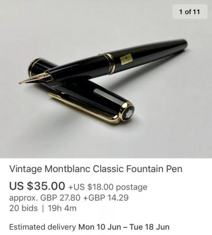
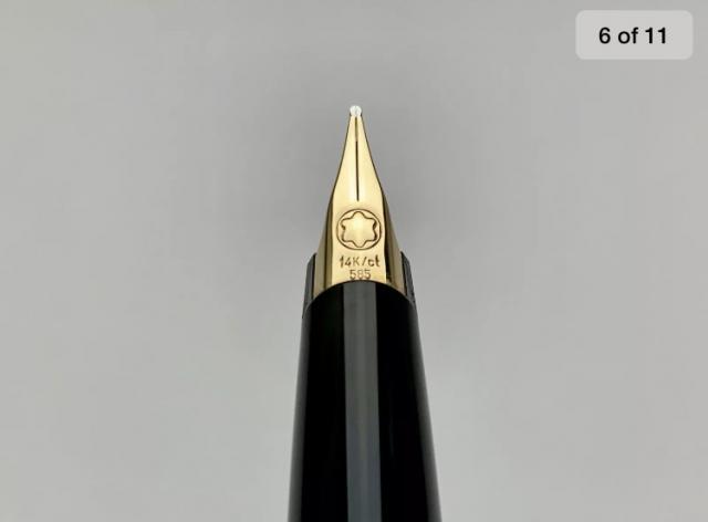
So I have had a Waterman Hemisphere and I have used it for the last 5 years since year 9 (UK) and my GCSEs and now I am in the middle of my A-levels. I dont know if it just me but I feel like there is way to much centennial value in the pen so I dont want to take it to uni and lose it. I need a new pen I have always wanted a Mont Blanc but as a student didnt have the funds however eBay being amazing has given me hope. There is a seller whos location is in the US but the pen is coming from Japan and he has a lot of feedback. I just want to work out if its a good idea to buy it I have attached photos of the ad
-
Mont Blanc - Web Grey (Heritage Spider Metamorphosis) When Mont Blanc brings out a new pen, you can be sure that there is an LE ink to accompany it. With the MB Heritage Spider pen release comes the accompanying Limited Edition ink "Web Grey". The grey colour of the ink is inspired by the silvery grey of a spider's web. The ink's packaging looks lovely, with a stylized spider on the box. A light grey band at the bottom reflects the colour of the ink within. Looks promising... let’s find out whether the ink matches the aesthetics of the box... Web Grey is a rather cool neutral grey with a hint of purple-green undertones. This is especially noticeable when your writing is still wet, the ink then quickly dries to a nice neutral grey. I appreciate the colour, which has a pencil-like quality. The ink is very light though, and feels undersaturated in finer nibs. This makes it a bit difficult to comfortably read your words. You need a broad and wet pen to bring out the real character in this ink. The ink shades nicely when using M-nibs and above. With fine nibs, this lovely shading is mostly absent though. The ink lacks a bit of lubrication, especially in drier pens like my Lamy Safari. I also tested the ink with my wet Lamy Dialog 3, which mostly solved this. The colour span of this grey is wonderfully broad: it ranges from a whispy faint light-grey, to a very dark almost black grey. To illustrate this, I did a swab on Tomoe River paper where I really saturated portions of the paper with ink. This beautifully illustrates the ink's dynamic range, which is quite impressive. On the smudge test - rubbing text with a moist Q-tip cotton swab - the ink behaved perfectly. Water resistance is amazing - the ink effortlessly survived even longer exposures to water. Kudos! This is also apparent from the lower part of the chromatography, which shows that the darker components of the ink remain on the paper. If you need a water-resistant ink, Web Grey certainly fits the bill. The chromatography also shows that this is a wonderfully complex ink, with purple & green undertones. This bodes well for my inkxperiment later on in this review. Web Grey is a fast-drying ink - with typical drying times in the 5-10 second range with my Lamy Safari (M-nib). Also: fast drying times and water resistance make the ink well suited for the workplace, although it may be too light for business correspondence. This can be remediated by using a wet pen with a broad nib. I've tested the ink on a wide variety of paper - from crappy Moleskine to high-end Tomoe River. On each scrap of paper I show you:An ink swab, made with a cotton Q-tip1-2-3 pass swab, to show increasing saturationAn ink scribble made with a Lamy Safari M-nib fountain penThe name of the paper used, written with a Lamy Safari B-nibA small text sample, written with an M-nibDrying times of the ink on the paper (with the M-nib)Web Grey looks really nice on white papers, but personally I feel this grey ink is not a good match for more yellowish paper, like e.g. Life Noble notebook paper. For me, this is an ink that deserves pure white paper, where it looks real classy. With the exception of the horrific Moleskine paper, I didn't notice any feathering or bleed-through. Web Grey is a well-behaving ink. Writing with different nib sizesThe picture below shows the effect of nib sizes on the writing. All samples were written with a Lamy Safari, which is typically a dry pen. I also added a visiting pen - my wet Lamy Dialog 3 with a golden M-nib. With this pen, the ink leaves a much more saturated line. Related inksI have recently changed my format for presenting related inks. My earlier presentations of related inks lacked enough information to be really useful. I therefore changed to a nine-grid format, with the currently reviewed ink at the center. The new format shows the name of related inks, a saturation sample, a 1-2-3 swab and a water resistance test – all in a very compact format. I hope that you'll find this way of presenting related inks more useful. It's a bit more work, but in my opinion worth the effort for the extra information you gain. Inkxperiment – Rolling HillsAs a personal experiment, I try to produce interesting drawings using only the ink I'm reviewing, keeping things simple and more-or-less abstract. I find this to be a fun extension of the hobby, and have found such single-ink drawings a nice challenge. It also gives you an idea of what the ink is capable of in a more artistic setting. For this drawing I used 300 gsm rough watercolour paper. I started off with the rolling hill background, applying Web Grey after I wetted the paper with water. This lets the ink bleed out a bit, showing its beautiful purple-green undertones. I then painted in the darker accents with pure ink, and - once the paper was dry - penned in the trees with my Lamy Dialog 3 with M-nib. Web Grey is beautifully complex, and you can bring out quite nice effects when using this ink for drawing. ConclusionMont Blanc's Web Grey is a cool neutral grey ink, that looks really nice on pure white paper (but as a personal note: the ink doesn't work for me with more yellowish paper). Web Grey is a bit light when used with finer nibs, but with wet pens and broader nibs you get a beautiful ink with nice shading, that is also very water resistant. This makes it a great ink for the workplace. The real strength of this ink comes into play when you use it for more artistic purposes. The ink has a fabulous composition, with purple & green undertones that easily surface when drawing. Technical test results on Rhodia N° 16 notepad paper, written with Lamy Safari, M-nib Backside of writing samples on different paper types
- 16 replies
-
- mont blanc
- web grey
-
(and 1 more)
Tagged with:
-
Hi! I'm quite new to collecting pens, but trying to learn as much as I can. I've recently inherited a couple Mont Blanc fountain pens, and I'm having some issues with one of them - a 342. It's been working just fine for the last 6 months, but recently when I tried to unscrew the cap, the gripping section stayed in the cap, while the body came out - leaving the reservoir open. Since then I haven't been able get the front bit out of the cap. Is there any way of doing this yourself, or do I have to hand it in to professionals? Thanks a lot in advance!
- 7 replies
-
- mont blanc
- 342
-
(and 3 more)
Tagged with:
-
Mont Blanc - Velvet Red When Mont Blanc brings out a new pen, you can be sure that there is an LE ink in its wake. Accompanying the release of the MB Writer's Edition William Shakespeare pen in 2016, came the aptly named corresponding LE ink "Velvet Red". This ink is probably difficult to find today, but I'm still doing the review for its comparison value. The ink's packaging looks lovely, and shows the Bard with his writing instrument. The feathered pen shows off the blood-red colour of this ink. In the box you'll find a very nice 35 ml bottle of Velvet Red. To my eye, Velvet Red is what I would call a blood-red colour. But still reasonably oxygenated blood... meaning it's still more red than brown-leaning. Personally I like the colour. It's a non-vibrant, dusty red that nicely captures the ambiance of a renaissance period writing chamber illuminated by candlelight. The ink is well-saturated, and looks great in all nib sizes. Being a non-vibrant dark red ink, it even works surprisingly well as an everyday writing ink, that makes for easy reading. Shading is prominent but not overdone, with just the right amount of contrast between the light and darker parts. Velvet Red has an average dynamic colour span. To illustrate this, I did a swab on Tomoe River paper where I really saturated portions of the paper with ink. This beautifully illustrates the ink's colour range. The ink moves from a light blood-red to a very dark brown-red. On the smudge test - rubbing text with a moist Q-tip cotton swab - the ink behaved reasonably well. There is quite some smudging, but the text itself remains perfectly readable. Water resistance is quite good. The red colour disappears completely, but you are left with a grey ghost image that is still readable without too much effort. This is also apparent from the lower part of the chromatography, which shows that the grey components of the ink remain on the paper. Velvet Red is also a fast-drying ink - with typical drying times in the 5-10 second range with my Lamy Safari (M-nib). As such, this ink is also suitable for lefties (when using finer nibs). Also: fast drying times and good water resistance make it a perfect ink for the workplace. And the ink's classy looks will certainly draw attention. I've tested the ink on a wide variety of paper - from crappy Moleskine to high-end Tomoe River. On each scrap of paper I show you: An ink swab, made with a cotton Q-tip 1-2-3 pass swab, to show increasing saturation An ink scribble made with a Lamy Safari M-nib fountain pen The name of the paper used, written with a Lamy Safari B-nib A small text sample, written with an M-nib Drying times of the ink on the paper (with the M-nib) Velvet Red looks really nice on all my test papers. This is an ink that looks good on any type of paper, both the white and more yellow ones. With the exception of Moleskine, I didn't notice any feathering. With lower-quality paper, you get some see-through and even a bit of bleed-through. All-in-all though, this is a well-behaving ink. Writing with different nib sizes The picture below shows the effect of nib sizes on the writing. All samples were written with a Lamy Safari, which is typically a dry pen. I also added a visiting pen - a wet Pelikan M101N Red Tortoise with an F-nib. Here the ink leaves a much more saturated dark-red line. With Velvet Red, wet pens definitely show a darker red compared to the colour you get from a dry pen. The ink works well with all nib sizes, and shows off a subdued & serious colour. Combine this with good water resistance and relatively fast drying times, and you have an ink that is quite suited for office-related note taking. Related inks To compare Velvet Red with related inks, I use a nine-grid format with the currently reviewed ink at the center. This format shows the name of related inks, a saturation sample, a 1-2-3 swab and a water resistance test - all in a very compact format. I hope that you'll find this way of presenting related inks useful. It's a bit more work, but in my opinion worth the effort for the extra information you gain. Inkxperiment - Enlightenment As a personal experiment, I try to produce interesting drawings using only the ink I'm reviewing, keeping things simple and more-or-less abstract. For me, this significantly enhances my experience of the hobby. It is great fun to explore an ink's colour range in a more artistic context. For this drawing I used HP Premium photo paper. I started off by submerging the paper in water, adding a few drops of Red Velvet to obtain a rose-red background. I then painted in the stairs & temple complex using a few different concentrations of ink/water. For the hilly foreground, I spread out some ink using lots of water. Finally I added blobs of water above the horizon line, to which I added some droplets of ink. After drying, these produced the trees. Overall I'm quite pleased by the use of the photo paper as a medium for ink paintings - the ink's character shows off really well. Conclusion Mont Blanc's Velvet Red LE ink is a classy-looking blood-red ink, that is at home with all types of nibs and all types of paper. The ink totally fits my taste: dark & dusty, and with non-aggressive shading. And as a welcome bonus: fast-drying and fairly water-resistant. A pity that this is an LE ink, that is no longer available. Technical test results on Rhodia N° 16 notepad paper, written with Lamy Safari, M-nib Backside of writing samples on different paper types
- 11 replies
-
- mont blanc
- velvet red
-
(and 2 more)
Tagged with:
-
Hello, I am looking for advice on repairing the broken psiton rod that came with this Monte Rosa. I am not sure I will be able to find a replacement and the rubber seal appears to in very good shape still. It is broken and has chucks missing in the upper section so if I twist the piston all the way down it disconects from the threads and gets stuck in the barrel. Is there an optimal way to glue this or something? Your help is much appreciated
- 3 replies
-
- mont blanc
- monte rosa
-
(and 2 more)
Tagged with:
-
Hi, I take it "Alimentador" just means ink feeder in the world of Mont Blanc 149 fountain pens? I've noticed that 149's can come with a variety of feeders and I'm wondering what that's all about. Do some deliver ink to the tip better than others? Another thing is the ebonite feeder as opposed to the plastic feeder. What's the difference if any? thanks, Robert
- 4 replies
-
- mont blanc
- feeder
-
(and 2 more)
Tagged with:
-
I recently acquired this Mont Blanc Meisterstück from a family member and have no true interest in keeping it. If anyone has any idea of the model, year, price and where to sell I would greatly appreciate it. Around the top of the pen labels XY2006108 Metal GERMANY And near the bottom MONT BLANC - MEISTERSTÜCK Ive attached a few photos - It has no box. Shoot me a pm or just comment below, thanks 👍🏻
- 2 replies
-
- mont blanc
- meisterstück
-
(and 3 more)
Tagged with:
-
Wanted to give a brief report on the LeGrand Blue Hour with OM nib for which I waited patiently for almost six months. I inked it with Blue Hour ink and used it at work yesterday. The pen is much heavier than a 149 and just as long, but the OM nib is excellent, and the ink matches the color of the pen very nicely. It should do just as well with the Tolstoy Sky Blue. I am very grateful to La Couronne du Comte for their usual excellent service, as well as their pricing that enabled me to obtain this pen. Mont Blanc quality shows through all around with this magnificent pen.
- 2 replies
-
- mont blanc
- blue hour
-
(and 1 more)
Tagged with:
-
This looks ok to me, but I don't have the eye that many of you do, so would be grateful for your opinions on this Tribute to the Mont Blanc please. The last photo shows the stars on a Jungle Eyes Mozart (MoP), the Tribute (Quartz) and a 146. Thank you!
-
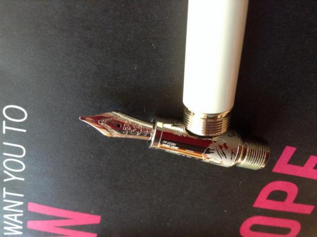
I am cleaning my Mont Blanc 145 and I saw on a Mont Blanc video that it appears you need a mont blanc tool to remove the nib and feed. I think I got it pretty clean just by flushing warm water through it many times. (I haven't used it in years and didn't clean it before I put it down-- I know better now). Does anyone know if the nib and feed pull out or screw out and/or does it take a special tool to remove the nib. The good news is that the piston seems to be working fine. Thanks, Ed This is my only good pen. All of my others I bought for <$60. This one some one gave to me in 1982. Now I see they cost >$400.


