Search the Community
Showing results for tags 'Fountain Pen'.
-
Below is a photo of my Cross pen collection. Pens 1-3 are Century ballpoints, 4-6 are Century rollerballs, and 7-8 are Century fountain pens. These are trios of matte black, burgundy, and navy blue with gold trim. The one pen I can't seem to find is a matte navy blue (with gold trim) version of the fountain pen to complete the FP trio, and match the other trios. Did Cross ever make such a pen? Am I searching in vain?
-
Bril is a company based in South India known for producing very good inks. They generally do not produce pens(Somebody can correct me if this is wrong). So, I was pleasantly surprised when I had an opportunity to buy a Bril Pen and immediately grabbed it. I bought it from Sreekumar, who is a nibmeister with a bunch of other pens. The price of this pen is just 50 INR(<1$). At this price range, I was blown away at how smooth the nib performs and how pleasantly it writes. The Bril pen is a all plastic body pen and the plastic is sort of cheap looking. It comes with 2 Bril catridges filled with Bril Royal Blue. It does not fit an international converter, but a parker piston converter fits rather well. The pen is rather small at 12cm capped and 15cm posted. The weight of the pen must be less than 20gms. The nib is a steel nib, rather plain looking with just F written on it. It draws a fairly dry western F line. But the nib is very smooth with no feedback and worked well outside the box with no tweaking. The pen cannot be eyedropper converted as there is a hole in the bottom. Some more pictures: [url=https://www.fountainpennetwork.com/forum/uploads/imgs/fpn_1430210527__img_20150428_133429584.jpg][/url] Verdict: For 50 Rs, the pen has performed beyond my expectations. I do not know whether it is still available or not. I am very happy with this pen. If you want this pen, you have to contact Sreekumar(he goes by S-K on FPN) [EDIT: Bril does produce a lot of office stationaries. The pen is mentioned here:http://www.brilindia.com/school_product_list.php
- 15 replies
-
- bril
- fountain pen
-
(and 1 more)
Tagged with:
-
Review Of Kanwrite Heritage - In Medium And Fine
TheVintagelife posted a topic in Fountain Pen Reviews
So here are some thoughts on my two Kanwrite Heritage pens - One in Green marbled pattern and the other in Blue marbled. One with a Fine nib (currently the blue, but it changes), and one with a medium. I will also talk a bit about writing with the KW Fine Flex nib which had brought separately for another pen (this is I think the same nib as the Noodler's flax pens). TLRD: the pens are great value for a price of under $30; the nibs (and feeds) and ergonomics are the real stars. Filling mechanism is dependable. The body is pleasing to the eye albeit without feeling premium (but acceptable quality for this price). Review: Intro and Choices available. The Kanwrite Heritage is a largish piston filler pen from Kanwrite or Kanpur Writers, a pen nib manufacturer based out of Kanpur, India. The pens come into a huge variety of colors, solids, translucents and certain marbled patterns. I find the marbled patterns the most pleasing to the eye, and out of a shortlist which also included the excellent looking red marbled variant, I chose the green and blue marbled versions (mainly because I have an OCD of matching inks to pens, and I have (and write with) a lot more of greens and blues than red. Another combination that I personally would wish to see would be one with a black cap and burnt-orange body - I think it would look great on this pen. I haven't seen one around, but if you wish, the there are black pens and burnt-orange pens readily available for a cap-swap (if you are willing to be stuck with another pen with the reverse combination...). Kanwrite makes their own nibs, and as I will talk in detail below, they are generally very good. They have a huge variety of nibs, not only the usual F,M and B, but unusually for the sub INR 2000/USD 30 market, they also offer EF, BB, Fine flex, and an extra-fine flex also. All choices, however, may not be available with all retailers. They also have a 14K gold nib which looks very similar to an Aurora 88 and is excellent (however, I find the gold nib an overkill for a pen in this range - I would get it for a custom hand turned pen (as I have), for which there are lot of good options in India. To make matters easier, Kanwrite will send you the nib, on your request, pre-fitted into a Bock or JoWo housing. Appearance & Design (1-10) – 8 The pens come in marbled plastic bodies with gold accents. there is a thick cap ring, a clip supported by a visible clip ring and a ring between the barrel and the cap protecting the piston knob. Uncapping the pens, one finds an ink window (very useful since its an opaque body piston filler) rimmed by two more gold rings, cap threads and a girthy and reasonably long section that slopes down gently and flares slightly, but abruptly near the nib. Both the marbled patterns are quite attractive, to say the least. These are injection moulded CAB plastic though, not PMMA/ acrylic, let alone hand turned, so lacks the visual depth and chatoyance of marbled resin. The marbling is on the surface itself and does not glow from within like the latter material. That said, I find it very pleasing to the eye on its own right. The marbled patterns are multi-colored (not just white, but veins of other colors too) and this creates various points of interest while looking at the pen. From a design perspective, whether consciously or otherwise, there are some similarities wit the Aurora Optima family of pens; especially the shape of the clip and clip ring, the cap band and bands on both sides of ink window and above the piston knob, and, the size and placement of ink window itself. These are not unique design concepts however, and the pen retains enough individuality to stand apart as a unique design. For one, it is more than a full centimeter (about half an inch) larger than the Aurora (coming in at 140cm closed to the Aurora's 127) - a much nicer size for my preference. Also the piston knob cap and top finial have the same color as the rest of the body. But the most 'interesting' departure is the shape of the top of the cap - instead of a regular softly squared off design, Kanwrite has gone for a slightly weird reverse cone top sitting rather awkwardly over the clip ring - I am not sure it works as a design choice - it seems stuck on as an afterthought. Nevertheless this is a substantial looking, attractive pen. Apart from that off-putting cap-top, everything comes together very well. the choice of gold accents work well with the marbled colors. the nib is perfectly proportional to the body. the proportions of the various segments and the angles and slopes are spot on from any angle. Interchanging the caps makes for a fun look too! 2. Construction & Quality (1-10) – 8.5 Coming back to the CAB plastic material, it doesn't feel as dense and premium as resin, but it is indeed sturdy and durable. At this price point, you are not likely to get premium materials - though some stuff out of China can feel as though they are)The same can be said of the metal trims - well if they are metal at all - apart from the clip, I am not sure. But the plating seems well done and likely to last. The pen looks like it can take rough use and that is the most important thing at this price range. None of the components or the pens as a whole, feel 'cheap' (though you probably couldn't fool anyone its high end either - unlike the case with some Moonman/PenBBS pens in the same range. opening the cap reveals a plastic knob to activate the piston. The knob and the piston itself are clear(ish) plastic - again nothing fancy, but feels solid and up to the task. Weight Dimensions & Ergonomics (1-10) – 9 This is a largish pen without stepping into the oversize territory. To get the numbers out of the way, these are: Length capped = 140-141 mm (5.5") Length uncapped = 129-130mm (5.1") Length Posted = 161 cms (6.3") Ink window = 5mm (0.2") diameter at section = 11-12mm (0.4 - 0.5") weight capped/posted = 21gms weight uncapped = 15 gms Here is a comparison of the pens posted and unposted: I like pens which I can comfortably use unposted, and this usually means a sweet sweet between (capped/ uncapped) 125/135mm and 150/160mm - so this is right in the sweet spot for me. Here is a comparison with some other pens of this price range range that I find very comfortable to hold (well, probably a stretch including the TWSBI in this price range, but what the hell!) the pens are also very light and the caps do not add much to the weight if you are fond of posting. Ergonomics is one area, where, at least for me, the pens really excel. They just has that right combination of length and light-weight to act as an EDC. The pens balance well in the hand, whether un-posted or posted (which they do securely) and the section shape and girth are comfortable for me also. Well to nitpick, I'd have have preferred a more gentle upward curve to the rim (nib-side) instead of the slightly abrupt ridge; but this is relevant only for those, like me, who hold the gen very low. Even then, its not uncomfortable as such (since the ridge is not sharp), but you know its there. Nib & Performance (1-10) – 9.25 The nibs are broad shouldered understatedly attractive Indian #35 (#6 type) nib and is perfectly swappable into Bock or JoWo housings (and vice versa, I would assume). In fact the same KW nibs are offered pre-fitted in Bock or JoWo housing by Kanwrite. Since there are two nibs on review, I will discuss them in turn: The fine is about a half a size finer than a typical Jowo or Bock fine (though some Bock fines I have used are similar) - its similar to a sailor MF. It has a pleasant sort of feedback but is not scratchy or unpleasantly toothy. with very dry inks (like my Krishna Ghat Green), the sense of toothiness may increase so better to use with well lubricated inks. I really do like this KW fine very much - with a Pilot Iroshizuku or Sailor Shikiori inks, it really shines. the nib has is quite hard, though it has slightly more spring than a jowo - about same as a bock. the feedback this nib gives is excellent for a controlled handwriting. The medium is closer to a JoWo medium but probably a hair finer; hence a more typical medium line width. It is smooth and tuned very well right out of the box. There is nothing to dislike about the medium nib Between the two, I personally prefer the fine by a hair's width, but that is just down to writing preference. Many will prefer the medium. Both nibs wrote well out of the box. Both pens were tuned very well for optimum wetness. The feeds are thick ebonite ones which seems to regulate flow quite well; though there are very occasional overly wet starts when the pen has been moving around int he bag (this is common and not a problem) Nibs are easy to change out as the whole housing disengages by unscrewing it from the section. Kanwrite nibs, where available, are quite affordable. As a case in point - I had also (earlier) separately procured a KW 'Fine Flex nib'. It is probably the same as used in Noodler's flex nibs. I wouldn't use it for these pens as it steel colored (though these are also available in two tone) while these pens have gold trims. I am currently using it in a Moonman T1 where it performs very well (though only after I adjusted the Moonman feed to supply the extra flow required). In hindsight say the extra-fine flex would have been preferable for exploring the full breadth of line variations possible... Filling System & Maintenance (1-10) - 8.75 It is a piston filler; which while (thanks to the Chinese) is not exactly unheard at this price point these days, is nice to have. The piston works smoothly. I get about about 2ml ink into it per fill (give or take) which I think is quite optimal - more than that is probably not ideal for someone like me who has more than one, couple of, quite a few pens inked at one time! Cleaning thoroughly is possible as disassembly is quite easy. the plastic knobs feels a little flimsy but its protected, and not something would need heavy handling. Cost & Value (1-10) – 8.5 In India, the KW Heritage is likely to cost around INR 1700-1800 (about USD 25); but expect to pay about $5-10 more if buying outside India, which is understandable because of customs, logistics and shifting exchange rates etc. While at this price, it is most certainly a 'good' value, the exact score is a little tricky, because, frankly, getting a great value pen at around $30 is no longer unheard of (as it was a few years ago) due to the introduction was several great models at this (or even lower) price points by the likes of PenBBS, Moonman and Wing Sung (among others). For example: 1) Moonman T1 is a piston filler made of attractive anodized aluminium which feels more premium in build but is cheaper 2) The materials in PenBBS piston, vac fillers and other special-filler pens (especially the quality of acrylics used; and also metal pistons, vacuum plungers etc) such as the 309, 456, 355 and 500 feel more premium and 'high-end' So, as a value proposition, it would not be fair to say that the KW Heritage is miles ahead of the competition. However, and this is a big point, at least for me, I feel that the nibs in these pens are at a different class from all the Moonman & PenBBSnibs I've tried. I've had to change the nib on every, but one, of my PenBBS+Moonman pens into JoWos/ Bocks (or in the case of the T1 - the KW Fine flex!) . I found those pens to generally have dry and less than satisfactory feeds as well - no comparison to the one the one on the KW (ebonite or otherwise) in terms of flow regulation. Some may like these pens out of the box, but for those opting for a nib change, that's an added cost to be factored for these Chinese pens. Another thing is that Kanwrite provides various nib options from EF to BB as well as F and EF in flex. Most Chinese pens at this range come only in a couple of widths (F and one of EF or M). So, overall, considering the writing quality and nib options, this is still an extremely good value. Conclusion (Final score, xx/6) - 8.55 I find these pens to be good looking, sturdy and comfortable to write with. They are dependable and affordable. They write very well every time. So overall, I would recommend these pens heartily as an EDC or for your collection. Some writing samples showing the line widths of the various nib sizes I have are below:- 18 replies
-

Waterford Powerscourt Fountain Pen early review
donnweinberg posted a topic in Other Brands - Europe
I recently purchased on Ebay for USD$150 a gold-plated Waterford Powerscourt fountain pen with a fine 18K/750 nib and have used it for a week, writing with it at least twice each day. Here are photos, to be followed by my impressions at this relatively early stage. The pen is very attractive and feels nice in the hand. It has a solid feel and nice weight; the pen is of average length and weighs 41 grams. It fills easily with its included converter. I used Noodlers Green ink. It took awhile for the pen to write consistently; at first, it skipped a bit. The fine nib writes with a relatively dry line. The nib is on the firm side and makes an easily audible sound when writing on decent quality paper. My "gut" feeling is that the Powerscourt is an attractive pen that feels nice in the hand but writes in an uninspiring manner. I gather that for my tastes, a medium or broad nib (which I generally prefer) would feel better. However, my guess is that the Waterford line is more about looks than about the writing experience. What are the experiences and impressions of others who have written with this pen or other Waterford pens? Am I being unfair to this pen and brand?- 5 replies
-
- waterford
- powerscourt
-
(and 2 more)
Tagged with:
-
I request all fellow users to show off the Ebonite only pens here.... Show us your ebonite beauties here .... Would really love to know what all we have....
- 356 replies
-
- made in india
- ebonite
-
(and 2 more)
Tagged with:
-

Fritz Schimpf by Scribo Limited Edition Piuma Passione fountain pen
Fritz Schimpf posted a topic in The Mall
Fritz Schimpf by Scribo Limited Edition Piuma Passione cartridge/converter fountain pens exemplify the Italian word for passion. This passion for the designs, colours and nibs of the highest quality writing instruments, is shared by Scribo and Fritz Schimpf, resulting in the Piuma Passione. The elegance of form is reinforced by the gracefully shaped, silver-coloured clip and the subtle Scribo logo on the cap. Crafted using a refined acrylic resin, the contours of the Piuma Passione provide a fascinating depth effect with harmoniously warm reddish tones. The flexible nib is fully rhodium-plated, crafted from 14-K gold in nib size "F" (fine), which has received the widely respected Fritz Schimpf Italic grind. The combination of nib flexibility with our Italic grind results in exceptional writing characteristics. Due to the exquisite rounding of the writing edge and the lateral corners, the pen’s comfort zone is wide, therefore rapid writing is accomplished with ease. When written without pressure, the nib offers a vertical stroke width of approx. 0.60 mm and a horizontal stroke width of approx. 0.20 mm. With pressure, the vertical stroke width may be increased to a stroke width of approx. 1.20 mm. Flexible italic nibs are ideal due to their ability to make emotions visible, expanding handwriting, conveying a writer’s passion with visual flair. Engraved on the nib’s upper surface is our historic Fritz Schimpf Tübingen (FST) seal logo. This seal was used daily in our shop from the early 1950s until 2010 to officially seal insured letters, parcels and love letters, before they were delivered to the local post office to begin their journeys to those in all corners of the world. We are deeply grateful to Scribo for their magnificent cooperation and shared dedication to the highest quality. The Fritz Schimpf by Scribo Limited Edition Piuma Passione fountain pens are limited to 50 pieces worldwide, which are exclusively available from us, Fritz Schimpf in Tübingen. https://www.fritz-schimpf.de/Neuheiten/Fritz-Schimpf-by-SCRIBO-Limited-Edition-Piuma-Passione-Patronenfuellhalter.html- 18 replies
-
- fritz schimpf
- scribo
- (and 6 more)
-

Taylor Swift Tortured Poets Department Fountain Pen
donnweinberg posted a topic in USA - North America
Does anyone know what type of ink cartridge corresponds to a description of “2.6mm inner diameter” ink cartridge? On eBay, as a gift to my daughter-in-law, I purchased a new Taylor Swift Tortured Poets Department (TPD) fountain pen. It came with a single cartridge and no documentation of the type of cartridge to be used. I asked my eBay seller, who asked TPD customer service, which provided the “2.6mm inner diameter” information. Frustrating. Just to experiment, I used my own Diamine short cartridge, which is an International Standard type cartridge. It fits, but the portion that goes into the barrel, although it fits into the section, fits snugly, and I’m concerned that in warm conditions it might detach when unscrewing the barrel from the section. It took a good amount of time for the pen to write. The cartridge that came with the pen has an overall slimmer and longer profile, although not as long as, say a Levenger long cartridge that has two different puncture ends. I am unable to fit an International Standard converter into the pen. In any case, it appears that any standard size converter is too long for the pen. Help!- 12 replies
-
- fountain pen
- taylor swift
-
(and 2 more)
Tagged with:
-
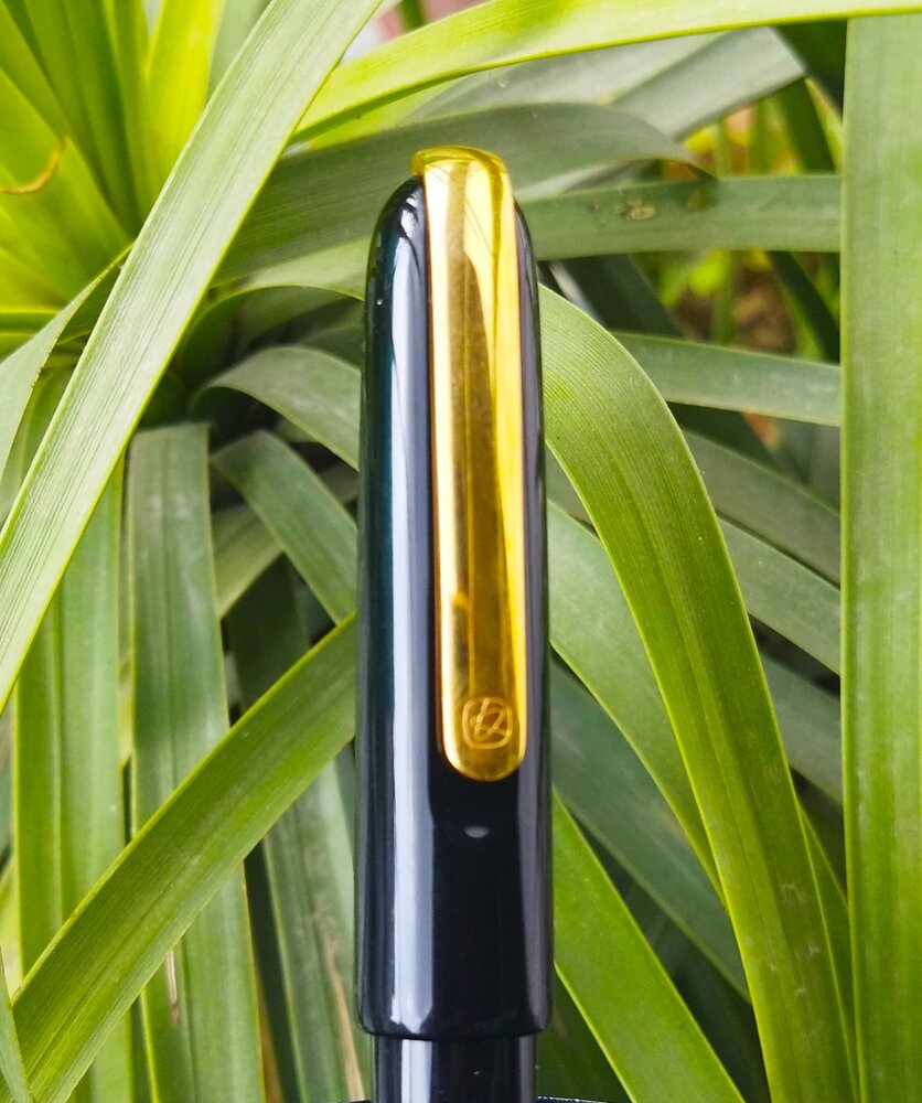
Introduction This is a review of the "Master" from Kaco. I saw precious few reviews of this pen while I was researching for it, for possible purchase, either on youtube or written. I took a chance based on a few comments regarding the quality of the nib, and I am very glad that I did. This is one of those occassions where a gamble pays off. This is one of the best, if not the best, Chinese pens that I own - compared to 5 pens form PenBBS, 5 from Moonman and a couple of Wing Sungs and Jinhaos. This is also the most expensive Chinese made pen that I own, beating the 14K WingSung 698 and the Bock nibbed Moonman 800 (another excellent pen); however at $80, its not expensive for what you get. This pen cost around $80 on one of the discount weeks on Aliexpress. However, the price tends to fluctuate quite a bit from mid 80s to even up to $140...so try to catch a good deal if you can. For anything less than $100 - this pen is an absolute steal. Both for the elegance and ergonomics of the design as well as for the surprisingly springy and precise gold fine nib (which though an interesting quirk to keep in mind as I discuss below). Appearance & Design - This pen as a cigar shaped design (with the cap slightly more rounded than the barrel) which is a classic. The material is a glossy black resin polished to a high shine. there is only one visible accent which is a substantial metal clip. The clip is one of the defining features of this as it is spring loaded; and attached to the top of the cap. The clip also fit into a clip-shaped recess in the cap, so that the clip is almost (but not exacly) flush with the surface of the cap. the clip also has the only visible logo on the pen (besides the nib which I shall come to). Due to the spring mechanism, the clip is extremely ease to operate and very functional; if you care to post a pen this big. Other than that; the pen is understated and elegant. It seems perfect for use at workplace (will I use my most colorway acrylic pens in the workplace with impunity, but some workplaces are more stuffy I am told ;-)) . This seems to be a theme with Kaco - they seem to prefer to make 'business gift' oriented pens in solid colors and have seemingly eschewed colorful resins till now. the pen comes with an oval dedicated pen case, which can be stood upright, whereby it also operates as a pen holder. It has a foam insert with a hole cut out to rest the barrel so that the resin pen does not court scratches from the metal sides of the holder. Apologies as this was left in my office, and I could not fetch that (and a lot more things) given that lockdown was imposed in our country on a weekend night with 4 hours notice! So this link should give a fair idea Opening the cap, one sees an ample hourglass shaped section, followed by a number 6 14k nib in Fine with a minimalist design - just two lines parallel to the shoulders and the logo and below that, the words 14k. there is a broad thermoplastic feed which is similar to (but not same as) as Jowo #6 feed. the section is long and the threads for the cap are precise. The nib seems perfectly proportioned to the size of the pen. Overall, the pen looks stellar and understated. It reminds one of high end Urushi pens from across the East China Sea. It made me renege on my decision to not buy another black black for a while; so that's something. I just wish they offered this model in other solid colors (on this note, there is a steel nibbed, slightly smaller, version of this pen which cost about $30 and is also available in appealing red and white versions. Wonder why they didn't provide options for the 14k model...I'd have loved me a red version...). I also like that it does not look like an obvious rip off any other design - various influences are there (for example the clip is similar (though not identical) to that in the Lamy Imporium, and the body is similar to several Japanese ebonite and urushi pens, it is distinct enough to be an unique design. Construction & Quality– Construction is top notch. Forgot $100; it would not disappoint in a pen worth $300. There is no squeak in turning the threads (either of the barrel or the cap). The polish in the resin body and gold plated clip is top notch with a mirror like finish when new. On the flip side, this causes any gathered lint or dust to stand out, and may highlight even the smallest scratches (which it does; if you are one inspects obsessively). One that note, while the gold plating is of good quality, it does feel a bit soft and scratch prone; I have been accordingly, careful of how I place of the cap on the table etc. The nib and feed attach into a housing which doesn't appear to be removable. At least I was not able to. The nib and feed though can be pulled out with some effort. Weight, Dimensions and ergonomics This is a big pen, bordering on oversize. Smilar to MB149 and Sailor KOP Profit; However, most of the girth is in the cap; the barrel is actually, reasonably slim. Length; weight (capped): 154mm (6.06"); 28gms gms (1 oz) Length; weight (uncapped) : 135mm (5.3”) (measured from tip of nib); 14gms (0.5 oz) Length; (posted) : 161mm (6.34") Section length : 25mm (1”) Section diameter: 11mm to 13mm (0.43 – 0.5 inch) [this is a rough calculation). In short, it is large but not egregiously so. Further, the cap weighs exactly half the total pen weight (due to the substantial clip and the significantly larger diameter); hence it is very light and comfortable when used uncapped. I stress: this pen is perfect as far as ergonomics go. the section is perfectly contoured and the length and weight (uncapped) is just right. Some comparison pictures are below: This is what it looks like next to the PenBBS 380 and the Pilot Justus - both similarly large black pens pens at around 145-150 mm (5.8-6"") posted. This is a comparison with some other pens (left to right: TWSBI 580AL, Sailor Pro gear slim, Kaco Master, Montegrappa Fortuna teak, PenBBS 456) It posts deeply but not securely. You wouldn't need to post this pen; but you can subject to cap possibly falling if you suddenly turn it around. Nib & Performance - Cue: customary bokeh shot of nib It has a very well-tuned #6 nib which extremely springy and relatively soft, for a modern nib. the odd thing is that it has a significant forward curve; this creates an ...interesting sensation, as the apparent angle of the pen to paper is different from your normal holding angle. the forward curve can cause the pen to catch to paper in sudden down-to-up movements; such as rounding a 'g' or bottom-extension of an 'f'; this is more so on rougher papers. This seems to be a conscious design choice, as the pictures in the web listing suggest that this helps appreciate/ fully utilize the springiness of the nib. Even with this, I really do enjoy the nib - it is springy and soft, and really smooth with the required traction to have sufficient control over the written word. While springy, this is not a flex nib, and I wouldn't feel comfortable trying to coax out line variation. Pic of pronounced forward curve of the nib: The feed is a jowo type wide shoulder one; but is perfectly tailored to the curve of the nib. It was a little dry at first, but after a little adjustment, is providing uninterrupted generous supply of ink. Filling System & Maintenance – This is a simple C/C system. The converter is interchangeable with a schmidt K5 converter. The supplied one looks slightly larger but I could be mistaken. Disappointingly, it does not have metal reinforcements at the mouth. the plastic also is slightly cloudy and not crystal clear. However, it is perfectly functional. It is good that it uses the K5 standard, as one can use cartridges in a pinch. (apologies for the bubbles - it was a hurried fill) The nib is a true fine. When I think of fine, I think of this line width. Since this pen supplies, it makes me satisfied. Here is a comparison to well known nibs with similar line widths, namely European fines and Japanese Medium, with the same ink in all (Pilot Iro Yama Guri): As you can see, this nib writes very similar to a Jowo or Bock fine; and also similar to a pilot 14K and Sailor 14K Medium. The Kanwrite F is slightly finer, and the penBBS F is way fatter (its actually closer to a western medium). the Moonman is between the Kaco and the PenBBS. Some longer writing samples; one on Rhodia and the other on ITC classmate (a low cost, but really good, student notebook) Cost & Value – I paid about $80. This is on the lower end for this pen and usually available during sales. At this price, it is a phenomenal deal. I would say, given the quality, ergonomics and writing experience, anything below $125 is a good deal. Conclusion – This is a pen which ticks most boxes. I find it among the most comfortable pens to hold, and the writing experience, even with the quirky angle on the nib, is pleasurable. The build quality and finish is superb. Only concern for me is finding replacement feeds/ nibs in case of damage and the lack of color and nib width alternatives, which would prevent it from being a pen appreciated by a broader spectrum of FP users.
-
Introduction I'm no great reviewer, but since I so wanted to read more information about this pen before buying it, have decided I should at least post something for others now I have one. The pen is the Hermes Nautilus. It was designed by fellow Sydney-sider Marc Newson, was his first fountain pen (before the Montblanc M) and it's my love of his design that drew me to it. The pen is available as a ballpoint and a fountain pen, with much the same look, feel and casing. Both styles are available in blue, 'Hermes' red, black and aluminium/silver. Pictured below is the ballpoint version in black and the fountain pen in blue. The reason I actually have two is the cost, strangely enough. Because I'm not a natural fountain pen user and because the fountain pen version of the pen is 30% dearer, I initially told myself that I could live with just the ballpoint. I picked up the ballpoint from Hermes Germany (online), having it on-shipped to Australia. The price for the fountain pen is 1150 Euro, which is about 1250USD and 1700AUD. The ballpoint is 'only' 950 Euro. I loved the ballpoint and therefore subsequently snagged the next fountain pen that came on eBay used for about half the new price. This would be a good idea if you are looking to pick up this pen, except for the fact that I've had an eBay search for 'hermes nautilus' for about a year now and only two have come onto the market in that time. Anyway, the pen is expensive and also hard to get, unless you walk into a Hermes shop or live in the US. I believe Australia only stocks the silver model and the only place online with all four colours in stock is the US Hermes site (which sells the fountain pen for 1670USD -- a 25% mark-up on European on-line prices). Build and Quality I don't know quite what to say. The Nautilus satisfies. It satisfies like a solid, but not heavy, metal pen should. I just bought a Lamy Joy this morning and could scarcely bring myself to even use it for a few lines because it just felt cheap and plasticky in comparison to what I'm now used to. I had already bought the Montblanc M fountain pen and, while I like it, picking it up to compare and the first thing that hits me is that it doesn't feel well balanced -- the nib end has much more metal and heft to it, while the butt doesn't feel cheap, but is nevertheless all a bit too 'hollow' somehow. If I'm generally to compare Marc Newson's two attempts at the genre and the Nautilus is much more satisfying: two other issues with the Montblanc M are the ridges at the grip which can be a bit grating and the lack of any satisfactory way of inking it up without cartridges. Neither are a problem for the Nautilus. The other pens I should compare the Nautilus to are Pilot vanishing points, Lamy Dialogs and all others with retractable nibs. Because, if you didn't already know, that's the main 'gimmick' of the Nautilus too. Except, I can't really call it a 'gimmick' because it is such a fundamental part of this pen. The magnet on the Montblanc M is a gimmick. It is slightly fun, but has little practical use and isn't even dual use to allow posting (the M can't). The retractable nib on the Nautilus is integral. This is the first and only 'minimalist' pen I have come across that pulls it off. I simply can't persuade myself to try any others having bought the Nautilus, because the others do it worse -- at least from an aesthetic point of view. I don't want a clip in my way when I'm writing. I don't want a Frankenstein's monster pen where the nib emerges from the 'wrong end'. I don't actually want a clip at all. The retractable nib is there, for me, as a design decision by a designer wanting a pen that takes all excess away. Lamy haven't done that and Pilot haven't either. The Nautilus has. When you turn the butt of the pen 360 degrees to start writing, there is no cap to post. There is no clip to worry about. There is the nib to write and the shaft to grip and nothing else. The only thing more satisfying in a way than knowing this is when you have finished writing. To make the nib (or ballpoint tip, for the other model) protrude you have to complete a full turn of the mechanism, but retracting and you just need a slight anti-clockwise nudge for the butt to seamlessly complete its turn and align again perfectly. It is slightly magical in the sense that it's never entirely clear where the potential energy comes for this process, but it works every time and has the solidness that it will be working just as well in fifty years time -- there is no complex mechanism that is prone to failure, just a well-engineered design. One final comment on the build and that is the shape. The pen's cross-section is halfway between a rounded triangle and an oval cut in half. While I'm not a natural writer and grew up with a non-standard pen grip (I didn't use a triangle grip), I therefore thought I might struggle to even hold the nautilus correctly as the body isn't round. Well, I've had no problems there. I find it immensely satisfying and comfortable to write with. Nib and Writing I don't actually propose to go into this. There's a picture of a fine medium above. Hermes use Pilot's vanishing point nibs and even sell them separately (with a Hermes mark-up built in). I normally go for a medium, but the fine-medium pictured is just great. I think Hermes sell 6 different nibs from XF to B, but really these are interchangeable with Pilot and won't write any differently to Pilot. One thing I can say, again to eulogise this pen, is that I picked up just the nib apparatus by itself before buying the Nautilus. I tried writing with it on its own and was distinctly underwhelmed -- not because it was a bad nib, but because without the heft and glory of a beautiful pen, the nib on its own is robbed of any chance to shine. Final Comments I can write more, but not for now, so will post this as a rather stream-of-consciousness review. One last note for those of you thinking of maybe buying the ballpoint version, a Pilot nib and saving a bit of money -- don't. You can't. I haven't posted it here, but the interiors of the two pens are slightly different -- the fountain pen has room in the butt for the cartridge or converter (I use a CON-40 at the moment) and a 'notch' in the front section to take any Pilot (or Hermes) vanishing point nib unit. The ballpoint is different for both sections, so the two pens are not interchangeable. They are, as pictured, exactly the same size and will take the same leather sheaths though. I mainly posted this all because I wanted anyone in a similar position to have a bit more information on this fine pen. So, feel free to ask questions or for any more specific pictures and I'll try to come to the party.
-

Customized “Lemon” Titanium Duofold Centennial Fountain Pen
donnweinberg posted a topic in Fountain & Dip Pens - First Stop
A few months ago, I purchased on eBay a Parker Duofold look-alike that is branded as “Lemon,” is made of titanium, but has a vintage, flexible Waterman Hundred-Year Pen nib. Here are photos I took, including my writing sample using the pen with Montblanc Irish Green ink: I really like this pen, particularly the way it writes with the Waterman nib. It is heavy, and I don’t post it, but it feels good in the hand when writing. The cap is a screw-type, and it takes about 5 turns to get it completely on or off. It always writes immediately and smoothly with nice flex. Has anyone else seen another pen with this “Lemon” branding? Does anyone know anything about the folks who made this?- 10 replies
-
- customized
- lemon
-
(and 4 more)
Tagged with:
-
Can anyone please tell me anything about this Red Parker 45 Flighter - it's not something I have come across before with matching red section and end tip on a brushed steel Flighter body with gold trim. Pen was made in the US but I purchased it from Japan. Fine 14K Gold nib fitted when I got it. Was this a standard colour? Any idea of dates ... anything would be useful! Thank you. http://pencollect.co.uk/personal/45red.jpg
- 13 replies
-
- parker 45
- fountain pen
-
(and 1 more)
Tagged with:
-

Initial Review of Majohn T6 City Light fountain pen
donnweinberg posted a topic in China, Korea and Others (Far East, Asia)
I am providing an initial review of the Majohn (aka Moonman) model T6 "City Light" fountain pen. The T6 is available in 6 versions, divided into 2 overlay styles. I am showing only the "City Light" overlay style here, but all 6 versions of the T6 have the same size, weight, shape, etc. I purchased the three T6 City Light fountain pens from an Ebay seller in China. I inked up the one with the clear acrylic, illustrated as the right-most of the three shown below and called the "Yu Ye." The amber acrylic one on the left is called the "Deng Huo," and the light blue acrylic one in the middle is called the "Mu Lan." The overlay is stainless steel ("SS"). The pen is a piston-filler and features an iridium-tipped SS nib that I purchased in a Medium width. The pen, full of ink, weighs 54g, and the cap contributes 22g to that total. The length capped is 5.625" and 5.25 uncapped. The cap does not post on the end of the barrel, which has the piston turner there. The piston is an internal piston, which turns very smoothly. I filled it with Diamine Ancient Copper ink, and it wrote immediately, but even better after I set it down for a few minutes to allow the collector and feed to do their work. The nib is firm without audible feedback and feels smooth on good paper. The pen lays down a western medium line. Here are more photos, the first three of which come from Majohn's own marketing materials. I was attracted by this pen because of its unique overlay. As a picture "is worth a thousand words," I won't belabor the point by "using my words" to describe it. Were it not for this unique and attractive overlay, I wouldn't have any particular interest in this pen, as there is nothing truly special about it otherwise. When writing with the pen, I can feel some of the somewhat "rougher" parts of the inside of the overlay on my thumb, but nothing is sharp or likely to cause cuts. Had this been a much more expensive pen, then there likely would have been more rounding/smoothness to the open areas. But at the price paid, I am more than satisfied. My initial impression, thus, is that this is a pen worth having for its unique appearance, but not for its writing characteristics. In my next post, I will tell you what I paid for each of these three pens. -
PRELUDE In the search of suitable replacements for a Meisterstuck Doue FP 145 My meticulously planned fountain pen hiatuses are occasionally disrupted by the well-meaning members of my family. Instead of appreciating my carefully timed fountain pen acquisitions, they enthusiastically offer advice on investments, the time value of money, and everything in between. To add a twist to the tale, they threw me a curveball last year by gifting a Meisterstück Doue FP 145 LE, even though I had only bought a total of three fountain pens in the last three years. If we exclude the Opus 88, then it's just two. The Doue 145 is undeniably a beautiful pen, but I found myself wondering if I could ever use it with its slim metal section and rather shortish nib. Determined to find a more suitable replacement, I revisited the local MB Boutique. While Montblanc's customer service remains top-notch for pens within the two-year warranty period, they seem to derive more delight from pens outside the warranty period than their customers do. Faced with the task of choosing two pens to match the value of the pricier Doue, I was drawn to a Naruto LeGrand 146. Then, the salesperson revealed his secret NOS drawer, housing various pens, including a Great Characters Walt Disney FP. Opting for the Montblanc M, not only because its 2018 price, combined with the Naruto, matched the total credit value for the Doue, but also because it simply looked nicer. And here goes the review.... If you like a pictorial blogger view, here is the link: A Review of the Montblanc M in Red PRESENTATION (6/6) Usual MB The usual MB single pen box. The standard Montblanc single pen box with no customisation, with the only variation being the red cardboard sleeve that encases the box. The RED collection boasts a charitable initiative, contributing less than 1% (€5) towards fighting HIV/AIDS programs. It's almost as if Montblanc is tackling HIV/AIDS single-handedly, making minuscule donations of €5 at a time, all while charging the end customer a whopping €540+. As Master Yoda famously said, “Do or do not. There is no try”. The pen securely nestles within a cushioned and somewhat snug slot inside the box, accompanied by a complimentary cartridge filled with black ink. However, it seems that most of the ink inside the cartridge had evaporated during its 5 years of shelf-living. DESIGN (6/6) From the likes of the Apple Watch The Montblanc M, available today in three finishes—Ultra Black, RED, and RED Signature—has been designed by Marc Newson, renowned for his work on the Apple Watch. Newson has successfully blended functionality with elegance, anchoring the design firmly outside the tradition for Montblanc. The shape of the pen is particularly appealing in modern pen terms. It boasts a perfect cylindrical shape with zero taper and rounded ends, except for the flat section, commonly referred to as the “plateau” at the end of the barrel. The platinized clip is a personal favourite; it avoids the cheap look of the Safari, perhaps because it's not oversized and doesn't unlawfully occupy a third of the cap's surface area. The glossy and bright red finish mirrors background lights and hues effectively. Upon uncapping, one notable feature is the novel use of magnets to secure the cap. The snap cap rotates itself to align its magnetic poles perfectly, ensuring the clip and plateau on the barrel are perfectly aligned on a plane. A soft snap securely seals the cap, earning full marks here. According to Red Dot Project award records, the snowflake emblem made of white resin is ultrasonically welded onto the plateau and then milled with a diamond tool to maintain flatness. The design reflects a harmonious flow and is truly eye-catching. The cap, adorned with the snowflake emblem on top like regular Montblanc pens, exhibits impeccable overall quality of work. In certain lighting conditions, the magnetic insert is faintly visible inside the cap. The knurled platinized metal section adds enough weight to balance an otherwise light barrel. Due to the flat plateau on the barrel, the cap cannot be posted. The section, embossed with the MONTBLANC brand name five times on the visible rear ring where the cap snaps on, is somewhat short and not ideal for longer writing sessions. More on that later. FILLING & CLEANING SYSTEMS (4/6) Cartridge & No Converter This is where, like many other fountain pen users, I express my concerns. It's worth noting that this pen only supports standard international short cartridges, and none of the available converters are compatible due to the featured plateau on the barrel. On the positive side, the pen accepts short international cartridges or proprietary MB cartridges, limiting its cartridge capacity to 0.5 ml. The form of the pen, while aesthetically pleasing, somewhat restricts its functionality as part of the design. Perhaps because the pen was conceived in this digital age, the designer didn't anticipate it being used extensively. Additionally, cleaning the section with running tap water is an easy process. NIB - ALL THAT MATTERS (6/6) The two toned rhodium ruthenium stunner The 14k nib is claimed to be handcrafted by Montblanc in a series of 30 steps. Rhodium-coated with a dark grey ruthenium-coated inlay, this nib is a stunner. I particularly love the shape of the nib, which comes in two widths - Fine and Medium, as far as I know. A dazzling cylindrical flow of silvery rhodium bounds the dark grey ruthenium inlay with well-defined contours. Just below the circular breather hole, the 'M' logo rests within an encircled star. The tail end specifies the composition 'Au585' of the gold-alloy, and the brand name 'MONTBLANC' rests just above the tail. Between those, a hallmark of 'StOD' inside a crossed ellipse adds a touch of elegance. As always, the nib itself doesn't mention the width explicitly, but a sticker at the piston end of the barrel provides all the necessary details. Once you turn the nib, you'll behold a somewhat unconventionally shaped black glossy feed that seamlessly matches the curvature of the pen. Apart from an air hole, there is nothing else in the feed, although the nib runs almost medium wet. PHYSICS OF IT (5/6) – RELATIVELY SPEAKING The Newtonian Laws The overall capped length is around 14 cm. As perhaps mandated by Mr. Newson, I have to use the pen un-posted. Although the section has a somewhat comfortable girth, the shortest length of the section of around 2 cm with a step from the barrel does make it less than ideal to use it as a workhorse. The metallic section balances the weight of 19g pretty well. Below are the pictures along with a Conid Minimalistica for a comparative reference. The Minimalistica is super comfortable for me, here are the dimensions for the Montblanc M. Uncapped Length ~ 12.5 cm Total Length ~ 14 cm Exposed Nib Leverage ~ 1.6 cm (A #6 nib has typically 2.4 cm) The weight of the pen is comforting even without the cap. Overall Max Weight ~ 27 g (with a cartridge, without cap ~18.75 g) ECONOMIC VALUE (0/0) FOC for me No comments. No rating, as I paid nothing WRITING & FINAL COMMENTS (5.4/6) Writes well The writing experience is quite pleasant, albeit with a relatively stiff nib. It does possess a hint of tooth and precisely the kind of control you'd expect from a well-tuned nib. There is a certain degree of softness in the nib, though minimal line variation occurs with pressure. Lines dry in 30 seconds with MB Toffee brown ink on Endless Regalia 80 GSM paper, and the line width is sufficient to display some shading. The nib skipped on the black cartridges (the salesman included a couple of cartridge packs), but it performs flawlessly on the brown ones, offering a steady ink flow with no drying issues. However, the length of the section, along with the step, leaves something to be desired in an otherwise excellently designed fountain pen. The nib leverage is minimal, so you inevitably touch the step from the barrel. With sweat, the knurling on the grip loses efficiency, unlike a Conid Kingsize with a titanium section. The weight, balance, and aesthetics of the Montblanc M surpass present standards. I believe Montblanc has successfully created a modern pen. Thank you for going through the review. You can find other pen and paraphernalia reviews here. REFERENCES Mark Newson - M Red Red Dot Project PS. I am posting a fountain pen review after 4 long years and my 2 year old keeps me totally occupied.
- 21 replies
-
- montblanc
- marc newson
-
(and 3 more)
Tagged with:
-
My biggest complaint about the Scribo Feel is that it doesn't post. Does anyone know if Scribo's Piuma model posts? There is another model called the La Dotta that looks (and is priced) similar to the Feel. What's the difference? Thanks!
-
Kaco Master 14k Fountain Pen- Best Chinese Pen Ever with a great Soft Springy Gold Nib
punjabi posted a topic in Fountain Pen Reviews
This is a review of “Kaco Master”. It’s the best Chinese Fountain pen I have come across till now.Kaco is a young company which makes some great products. Kaco since its inception in 2011 have launched many pens & accessories . This “Kaco Master” is among their most premium offerings .This has German Made Gold Nib , it doesn’t feel like it’s made by Jowo or Bock. It feels a bit different from those both. I think they are made by special order or made by some other company ! Pros- – Great 14k Gold Nib – Well Tuned Out Of The Box – Soft & Springy Nib – Minimalistic Design – Top Notch Construction – Great Price – Great Packing & Presentation – Hourglass Shaped Section – Have Premium Look – Suitable For Long Writing Sessions Cons- – Only comes in one colour i.e. Black for gold nib. Although the steel nib version comes in many colors. – Don’t post securely. – I can’t expect anything more at this price !!! Packing- Great, The pen comes with a great grey metallic case, which comes in a black box over which “Kaco” is engraved. The metallic oval case has a foam insert in it where the pen can rest. This foam ensures that the pen doesn’t get scratched with the sides of the metal case. Specifications- – Nib Size -Fine Nib 0.5mm – Filling Mechanism: standard cartridges and converter – Capped Pen length: 154mm – Section Length: 25mm – Section Diameter: 12.5 mm – Uncapped Pen Length : 133mm – Diameter: 16.5 mm – Pen weight: 27.5g Appearance & Design- Good, The pen has a classic design. It’s made of great quality black resin which has been highly polished. The clip is of gold color & fit into a clip-shaped recess in the cap & almost aligns with the cap of the pen .The clip is strong & is very functional. It is unique & looks good in my pocket. The clip has a small logo of “Kaco” over it .The pen size is around 133 mm uncapped & 154 mm capped. It doesn’t cap securely.This pen is made in very nice black resin, it is super shiny & feels premium in hand . I wish they had other colors too. It has an hourglass-shaped section & a number #6 14k nib in Fine with “Kaco” logo engraved over. It has a plastic feed. The section is long & threads of the cap are precise. This nib looks good & is similar to JOWO nib but it’s not JOWO. The nib suits the pen size & looks good. This pen is very comfortable for long writing sessions too. Construction- Very Well Made, The construction of this pen is top notch.The pen has been polished well & has been given a mirror like finish on both clip as well as body. It looks pleasing to the eyes , but as a result it attracts dust & micro scratches may be noticeable. The pen is elegant & is a perfect minimalistic office pen. Filling System- This is a simple C/C pen. The converter is interchangeable with a Schmidt K5 converter. It has metal reinforcements in the mouth & it is perfectly functional. You can use standard international cartridges too Nib Performance- Amazing , Kaco Master has #6 nib which is very springy and relatively soft.It is surely better than JOWO/BOCK nibs. This nib has a slight forward curve which makes a different writing angle which is different from others, I think it’s some unique Chinese grind. This is very smooth & gives a distinctive feel while writing. The nib is similar to European Fine Nibs.On the box, it’s written the nib is made in Germany but nib doesn’t look like common nibs i.e. JOWO or BOCK . Conclusion- True Master, This is the best Chinese pen I have ever used & one of the best pens available at this price. I bought it for around $120. The pen is very well made & has a great 14 k gold nib. It has a minimalistic look,which is amazing. The glossy black color looks good but I feel there should be more color options in this pen. I really can’t expect anything more at this price. It is true value for money given the quality, ergonomics and writing experience. It’s a masterpiece about which most people don’t know about !- 8 replies
-
- fountain
- fountain pen
- (and 7 more)
-
Posted a review video for the Kanwrite Desire Marble Red (dual tone steel #6 medium nib with gold plated trims on the cap) on Youtube, available here. You may find the featured pen here: for purchasing in Indian Rupees / for purchasing in US Dollars. A special mention of the ink I use for the writing sample: Sulekha Selam 21. It is a tribute from Sulekha to commemorate the occasion of 21st February, which is observed by UNESCO as the International Mother Language Day to honour the martyrs of this day in 1952 among the student demonstrators of the University of Dacca (now University of Dhaka) who were protesting against policies imposing Urdu as the lingua franca in the Bengali-speaking majority East Pakistan (now Bangladesh). You may find the ink here.
-

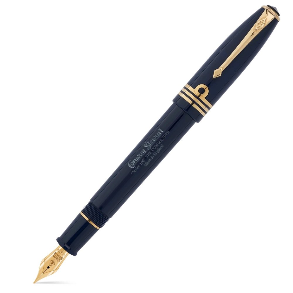
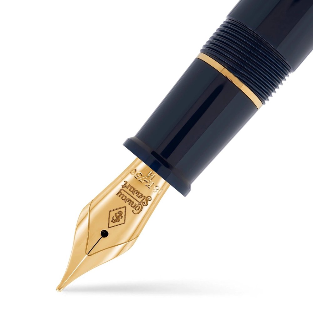
Initial Review: Conway Stewart Series 100 "The Commander" Fountain Pen
donnweinberg posted a topic in Great Britain & Ireland - Europe
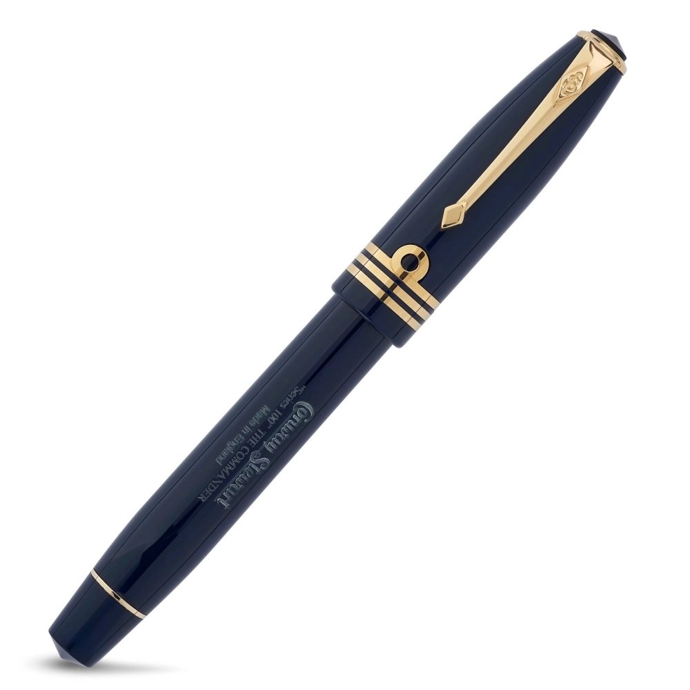
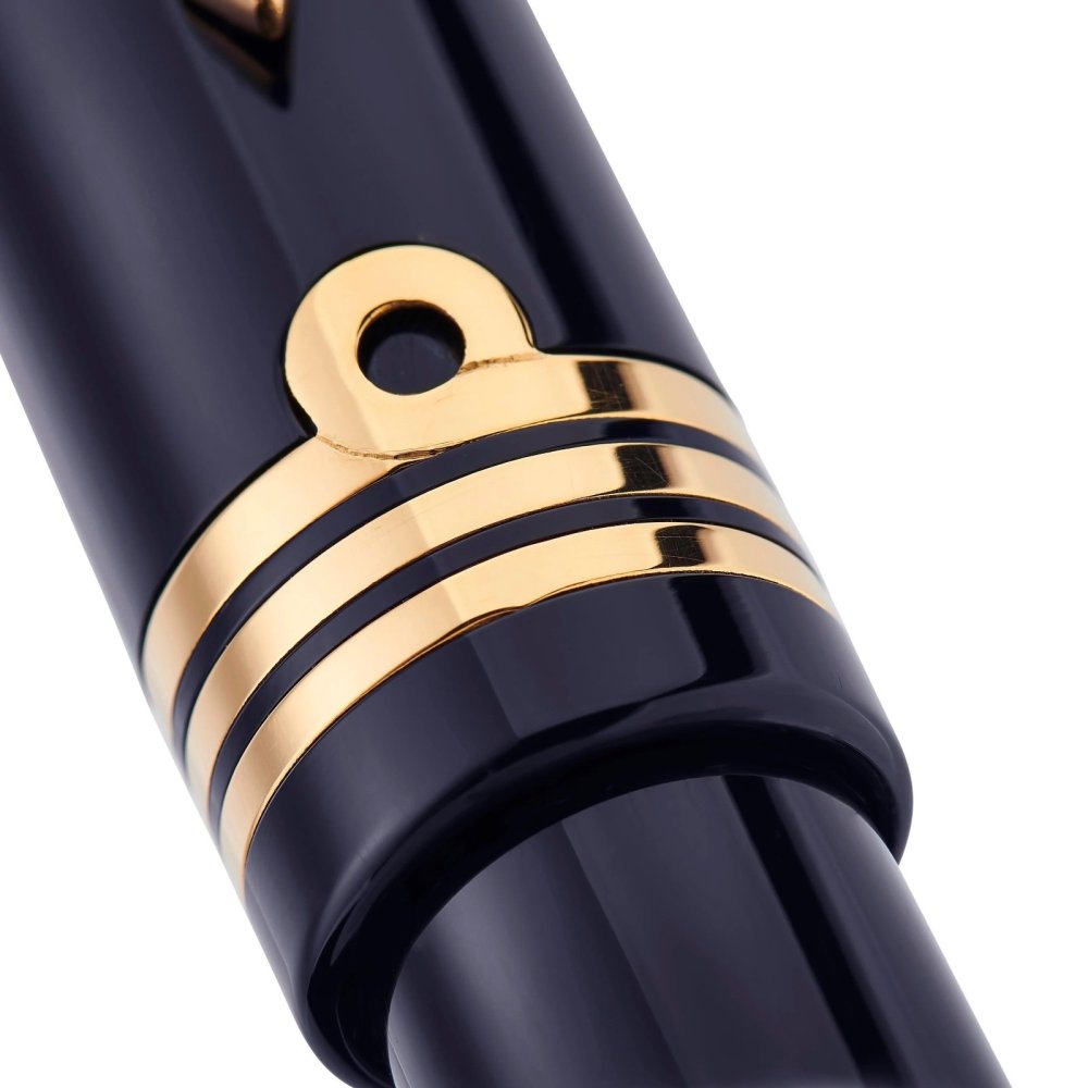
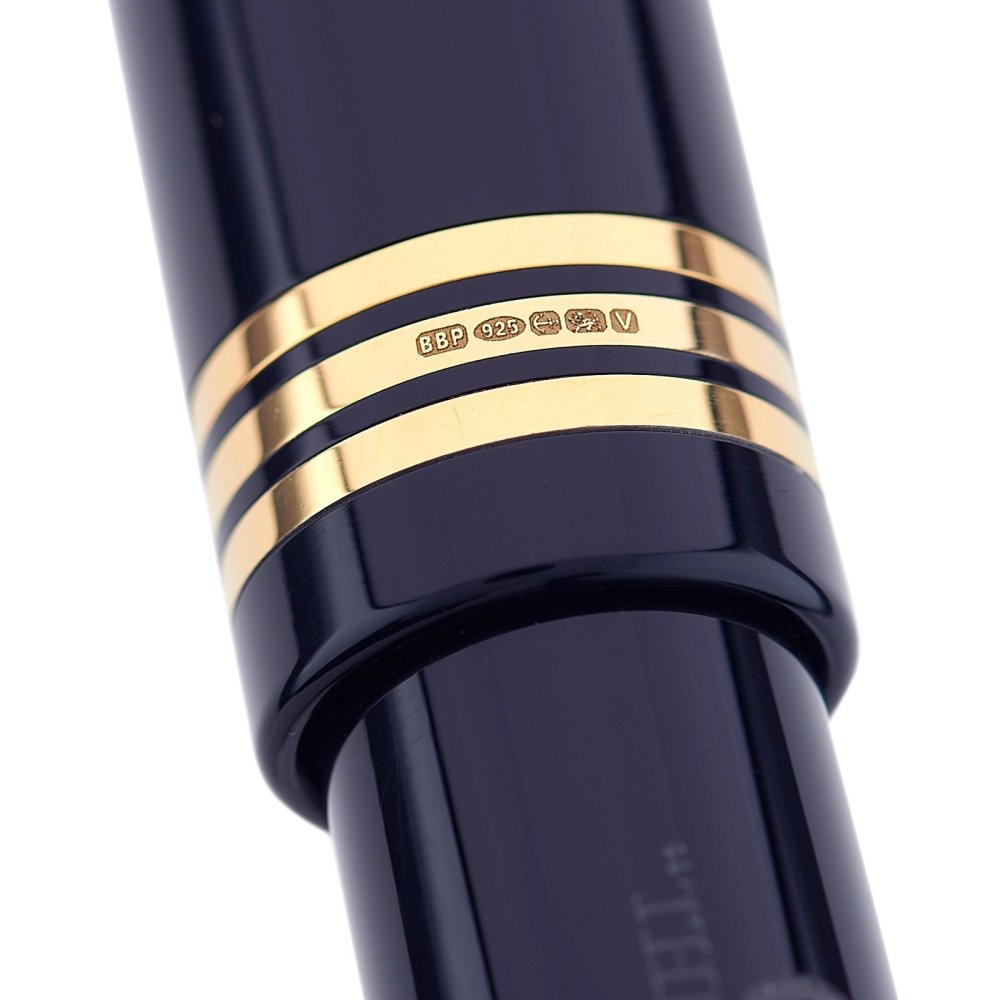
This is a review of a brand new Conway Stewart Series 100 - The Commander, in a Navy Blue color with Gold trim and an 18K CS Broad Nib. It fills either with an included screw-in converter or International Standard cartridges. Here are ten photos of the pen and its packaging, from the CS site, as the CS photos are far superior to the ones I took: I filled the pen with Birmingham Pen Co. "Cold-Steel" ink, a blue-black, by injecting the ink into the converter with a hypodermic needle, screwing the converter into the section, and moving some ink into the section with the screw converter. Then, I dipped the nib in some Fountain Pen Flush to get the flow going. After writing with the pen for a few lines, the ink began to darken. This process is cleaner than dipping the nib and part of the section in the ink and then wiping off the excess. Here's my initial writing sample: I am very impressed with this pen. It is beautiful to look at, wonderful to hold because of its relative lightness and balance (I never post the cap on the barrel), and has a springy nib that writes a wet, broad line. The objective measurements of the pen, supplied by Conway Stewart, are as follows: LENGTH: Capped 5.42"/137.8mm ; Posted 6.70"/170mm ; Barrel/Section/Nib only 5.08"/129mm ; Cap only 2.48"/63mm. BARREL DIAMETER: 0.52"/13.2mm CAP DIAMETER: 0.61"/15.5mm WEIGHT: 20g/0.71oz I got the pen with a broad nib, but also available for no extra cost are EF, F, M. The 18K gold CS nib was $70. The pen also is available as a Rollerball, with either fine or medium point. The cost of the pen as a RB is $514, so if you get the FP, the cost is $584 (i.e., the extra $70 for the 18K nib). Options I didn't get are as follows: Special Nib Options ($56), such as stub, italic, oblique. Special Engraving ($25) (name or initials) After putting this nice pen through the paces some more, I'll report back on its longer-term performance. So far, so very good.- 6 replies
-
- conway stewart
- series 100
-
(and 3 more)
Tagged with:
-
Posted a review video for the Kanwrite Heritage Marble Swirl (dual tone steel no. 6 medium nib with gold plated trims on the cap and barrels) on Youtube, available here. You may find the featured pen here: for purchasing in Indian Rupees / for purchase in US Dollars. You may find the ink featured here. Part 2 of this video reviewing the Kanwrite Desire Marble Red I bought along with this to be out soon.
- 4 replies
-
- fountain pen
- review
-
(and 1 more)
Tagged with:
-
Posted a review video for the Kanwrite Heritage Marble Swirl (dual tone steel #6 medium nib with gold plated trims on the cap and barrels) on Youtube, available here. You may find the featured pen here: for purchasing in Indian Rupees / for purchase in US Dollars. You may find the ink featured here. Part 2 of this video reviewing the Kanwrite Desire Marble Red I bought along with this to be out soon.
-
- fountain pen
- review
-
(and 1 more)
Tagged with:
-
How To Pay Customs Duty (If Applicable) For Pens/inks
amondalju posted a topic in India & Subcontinent (Asia)
Dear All, This is my first post in FPN. Being a fountain pen lover, I have tried to buy pens from different sources. I found that ebay is a good place to get a fair deal on pens. I use credit card for payment via paypal account. Till now I've got around 8-10 pens from abroad as of now. These costs upto maximum upto 25 USD. In order to buy premium pens, I checked the govt portal for customs. Which says customs duty is applicable for fountain pens above 100$. I would like to know your experience while importing a premium pen from abroad. 1. Did you have to pay any customs duty for any pen? 2. How did you pay such customs duty 3. Please mention the original price of pen and customs duty so that they can be compared. 4. Please share if any bad experience happened. This will help newbies like me to add some romance to the love for FP. Thanks, Aniruddha- 26 replies
-
- import
- fountain pen
-
(and 3 more)
Tagged with:




01.thumb.jpeg.9fbfc089af306a114770ca3d3634f4f1.jpeg)
02.jpeg.3e04ddf7c5949eec707b2db74fa93b64.jpeg)
03winkbottle.thumb.jpeg.8d590ccbc2a52e26a7a23c09e1e87c8d.jpeg)
04capcloseup.thumb.jpeg.0d7022b6465b68e90d54c118b2439e7a.jpeg)
05barrelcloseup.thumb.jpeg.3d5c8b6a47ae7c6d26e45f2ac51269c6.jpeg)
06nibcaptop.thumb.jpeg.fe8a15c3d305b1a7880cb0ef24a1b6c4.jpeg)
07uncapped.thumb.jpeg.8d508eb520953a4960216a5bd705ca6f.jpeg)
