Search the Community
Showing results for tags '75th'.
-
Hi, I'm William and I'm in Brisbane Australia. I found this group while googling for a solution to problems with my 75th Anniversary Aurora fountain pen. Glad to have joined and I hope someone can help. I bought my Aurora 75th anniversary fountain pen decades ago. It's been unused for a long time. Here is the problem. 1) When I cap the pen, the tip of the nib hits the inside of the cap and pushes the nib out of alignment. 2) I can see this because the nib is rotated slightly on the feeder, and there are marks on the plastic inside the cap. 3) I have tested this by re-aligning the nib/feeder and capping the pen. Same problem. 4) The nib and feeder are inserted into the pen body as far as possible (I remember this when I first bought the pen). The text "Aurora" below the "750" abuts the body of the pen. 5) I suspect the threaded section inside the cap has been moved up and into the cap - pen dropped while capped perhaps - thereby leaving insufficient "headroom" for the nib. 6) How do I pull the threaded section inside the cap outwards a bit ? Kind regards, William.
- 12 replies
-
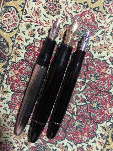
To report a bit on an experience: I'm a noob, less than 9 months since my first fountain pen. Like many noobs, I was intimidated by the broad nib and what the oblique broad meant. An oblique triple broad would be a preposterously fat tool. My handwriting in college was for equations, in medical school for furious notes. The electronic health record has largely obliterated any need for a written communication, but not quite. To my patients I hand write medication instructions from a pre-printed sheet. I have every excuse for sloppy handwriting: a C in 4th grade. An engineering undergraduate curriculum. A doctor. Yet it was my Grandma, recently deceased, who inspired in me improved handwriting. An article in last fall's Wall Street Journal advocated a simple Lamy before one splurged on an inconceivably expensive Sailor with gold nib for ~$400. Her correspondence in her last months exhibited more practiced, more beautiful handwriting despite the uneven strokes of geriatric motor control than my young nimble limbs could muster. I would like to say it was her handwriting that inspired me, her communication through the post more intimate than these electrons by beaten keyboard. Perhaps equally important was the need for change in so personal a technique as handwriting and signature in the resolution of divorce. The Lamy's nib: fine. Many fine nibs purchased before getting curious. A Montblanc Jules Verne, fine, ok, but what's this I hear about line variation? An Izumo with fine nib: too small! Better with a medium nib. A Nakaya music nib - a big, fat highlighter of a pen. I hated the music nib. In a fit of spending violating the Boy Scout's pledge to be "thrifty," I simultaneously bought a Montblanc Moon Pearl with XF nib (one foot still firmly in the fine camp) and a 90th 149 with B nib (one more toe in the land of the fat nib). The B nib I found similarly a big fat writer with none of the stubbish quality I'd heard of. So in a moment of inspiration I visited my Montblanc boutique on perhaps the last day of my 6 week exchange window and asked for the OBBB nib. OBB? No, O Triple B. Oh. We don't get many of those requests. On Penboard I found a 144 celluloid 1950s ski slope OBBB, and it is butter. It is divine. Line variation galore, sleek and slinky with the superb detail of a convex piston ring (too lazy now to find out if that's the right term). From a FPN'er I found a 75th Anniv 146 with BB nib. I'm finding I much prefer the oblique hold, still, I make do with the BB nib and far prefer it to its F and XF brethren. Four months after submission the boutique received the pen back. Reportedly, the first request for nib replacement to OBBB, it had to be special made, sent back to Hamburg. Free: no service charge, no nib charge, sent in in the waning twilight of the six-week window. Complimentary an ink fill and a test run on Montblanc paper. Sorry for the ink blobs all over your counter: I neglected to open the piston after filling to release a few drops. I'm not a surgeon. The 146 75th is a revelation of a MOP star. The yellowed 50s 144 has character. In comparison, what I perceive to be a painted white star on the 149 seems rather cheap. I'll post here and in another post (perhaps a part 2 to this post??) pictures, paper. I'm definitely an OBBB kind of guy. Pity, it's not a usual 146 grind, and it's fairly hard to find those OBBs. Still, one must have the fine nibs: bureaucratic forms allow for little expressive handwriting.
-
So I am new to this forum and I am debating on whether to purchase a vintage 149 or a 149 75th 1924. I understand the vintage ones were better made compared to the modern ones so I guess does this hold true for the 75th one as well? Is it just a decked out 149 in a modern and not as durable body like the vintage ones produced way back when. Just looking for honest opinions. What would you buy? Thanks so much for shedding light on my question.
-
So I am also looking for a 146 limited rose gold doue, but was curious to see what the more astute fp aficionados think of this pen. Is is overkill having a silver cap over a resin body? I would think the resin body is easier to write with as opposed to an all silver body which i have found to be WAY TOO expensive for my taste. Even if I could throw down that kind of bling, I think I would shoot myself before I did. Opinions on the Doue would be appreciated. Is it overkill and I should just stick with an all resin body? I know to each his/her own, but it never hurts to get a few opinions. Thanks!
- 10 replies
-
- 146
- fountain pen
-
(and 3 more)
Tagged with:


