Search the Community
Showing results for tags '58'.
-
Having just picked up my grail pen, I was astounded by its size and thought a post such as this would be a useful reference. Take a look at the comparisons with a green Dinkie 540 (c.1950) and with its larger counterparts, a #77 (c.1958) , #58 (Red Herringbone c.1958 & Silver hatch c.1955) as well as with the c.1940s flat topped #1200 and the mighty Onoto Magna Classic (2019). The heart-breather nib design suggests my pen is a first edition. The #100 was released to coincide with the Golden Jubilee of Conway Stewart in 1955. Later models featured one band, no bands and a Duro point with a circular breather hole, like the #77 and the Herringbone #58 you see here. Please add to this post with your own comparisons, if not for the sake of usefulness then do it for the eye-candy!
- 2 replies
-
- 100
- conway stewart
-
(and 7 more)
Tagged with:
-
Hi, took a break from collecting my victories.. (not many coming to the market), was researching colours similar to that which was manufactured in the 30's & 40's. Ended up looking at some Stephens twist fill pens and ended up buying one or two.. have some more on their way from the States. Are there many other collectors of these... I know of at least two in the UK. both of whom i have been in touch... Here is my selection atm. best wishes Rick
-
Dear all, I have recently came across this thread: https://www.fountainpennetwork.com/forum/topic/155782-lamy-cp50-vs-cp1-black/. It caught my attention. Not that I particularly like the pen, but I like the differences between first generation and the pen that is still in production today. So I went to my “collection box” and found this: https://www.flickr.com/photos/lamy_fp/albums/72157670817086128 And it made my day. I knew I had a cp1, but I believe that this pen is the first generation LAMY cp 1black - modell 58 with the original convertor J The 58 model is not on sale anymore, if I am correct. Seems like a gold nib as well. Jupííí … Kind regards, Jan
-
Hi Waterman experts and aficionados! Can you please advise on really good and reputable Waterman's pen(s) restoration/repair person? Explanation: I presume it would be equally appropriate to ask/post this question in Repair and... etc - group on this forum, but this is Waterman specific question - thus I feel more comfortable asking here first. I have recently bought one Waterman 58 - and to date, this is my ... rarest, biggest, most precious Waterman pen. I'm still waiting for the package, it should be in my hands in a few days. From what I was told by a seller, it belonged to her grandfather who was a book-keeper and the pen was, understandably, his prized possession. He rarely used it, but given that he got the pen after high school, after several (six or seven) decades - it can be considered well used. The seller is not a pen person, thus - no information on general condition. Through photos I have deduced few things. I anticipate some work would be necessary, changing the sac and cleaning of the pen and the nib - the least of it. In any other case - I would do this myself. However - it is Waterman 58. The nib may need some attention, some polishing and... well, this pen deserves a proper work by someone who has experience. So, please suggest whom should I get in touch with? There are several names being mentioned in several posts on this forum, but no feedback to who is the right person to take care of Waterman 58 for an example. Thank you! P.S. as soon as I receive the pen, I'll post few photos ... for "before"
- 26 replies
-
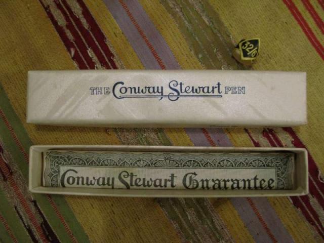
. INTRODUCTION: This 58 is the first “vintage“ FP I bought. The moment I first saw the pictures of this iconic Conway Stewart, I was impressed by the classic old-fashion design. When I found one in near mint condition (at about 120 UK pounds) I was happy. The overall aspect is a high quality one. Inside its cardboard box (even this near mint), there was the FP and the original warranty sheet. The pen has even the original price tag (32 shilling and 6 pence), useful for dating purposes (until 1952 the price has been 31/6) . Appearance & Design (10-10) – This Conway Stewart pen has a classy and traditional appearance. It shows the classic glossy black with yellow gold plated accessories and a yellow 14 Kt. gold nib. A good example from the fifties. Construction appears solid (the FP body and cap are made in celluloid, and even the filling lever is thick and sturdy). The imprint is very readable “Conway Stewart 58” and “MADE IN ENGLAND” in two rows (late production – perhaps after the 1954). The design is today unusual, being rather short and quite fat (12.7 cm long and 1.3 cm large), approaching the size of the Sailor Professional Gear FP . . Construction & Quality (9-10) – The pen appears quite delicate, since it is celluloid and more than fifty year old. In the hand the feeling is warm, and the overall feeling is really pleasing. I can’t see any manufacturing flaw and only few very light scratches (I would define this pen as a new old stock; I see no signs of use – e.g. the dreadful posting rings- but there are the unavoidable signs of time). I imagine that the surface be delicate and I prefer to lay down my pen on a microfibre cloth than in its own original box. The gold layer appears heavy on the clip, the rings and the lever, without evident brassing. When dismantling the cap (warning, you need a custom modified screwdriver) the clip appears substantial, and the heavy plating is appreciable on the entire surface of the clip complex. . Weight & Dimensions (9.5-10) – The size and the weight of the pen are exactly what seen in the specialized literature. Closed it measures 127 mm, I don’t know (and i don’t want to know…) how long it may be when posted. The diameter is about 13 mm at the largest point and the weight is comfortable even if unposted. I feel ok with the balance in my hand (I have average hands). As above, I would relate the overall size to the Sailor Professional Gear, even if the 58 is a trifle thinner. It managed well even in long writing sessions. . Nib & Performance (9-10) – The nib appears to be the original Conway Stewart Duro 58. It appears as a Medium size. The tines are in superb shape and well aligned. This translates in good performance and smoothness. Iridium on the tips (or whatever white metal it may be) had been employed unsparingly. The feeder is flat (ebonite ?). Other than smooth, my nib writes with good flex . It has a quite wet behaviour with the Diamine Mediterranean Blue ink I employed until now. The nib writes medium as expected (actually on the medium/broad side), being able to put down good variability both on xerox paper and on high quality Fabriano Fabria paper 100 gr/sqm. The nib is able to write smoothly as a fine one when turned 180 °. . Filling System & Maintenance (9-10) – The filling system is a classic lever-filling one. The lever has to be pulled at 90° and then repositioned along the body for a complete sac filling (one movement appears to be sufficient). Today the lever-filling system seems completely outdated. I had suspicious expectations about this, nevertheless the lever is a simple and straightforward method to charge the pen (and not a flimsy one…) . Cost & Value (10-10) – I saw many samples of CS 58 on eBay and vintage pen websites. Prices are quite variable from few UK pounds to some hundreds, depending on both the condition and the finish. I believe I paid a fair price for my NOS sample. The signed for, international parcel arrived safely in three days from Great Britain to Italy (Royal Mail and Poste Italiane were the carriers) at a cost of 10 UK £. I think this is not only a delicate collection piece, but also a good deal for a good daily writer. . Conclusion (Final score, 56.5/60) – The overall feeling is good after some (even long) writing sessions. The pen seats well in my hands, I always had some”warm” impression and the old nib performs flawlessly. My expectations have been heavily exceeded, because I did not plan a nib so good and smooth. Even the size, the weight and the feeling of celluloid are on the pleasing side. I believe to employ this pen more and more in the future. For the next weeks it will find place on the breast pocket of my white working dress, helping me in writing prescriptions. I do not see absolutely any space to sell this pen in the future. To be heavily recommended if you can find one ! Greetings from Italy !
- 3 replies
-
- conway stewart
- 58
-
(and 1 more)
Tagged with:
-

Bexley 58 Fire Engine Red, Medium Stainless Two-Tone Nib
boybacon posted a topic in Fountain Pen Reviews
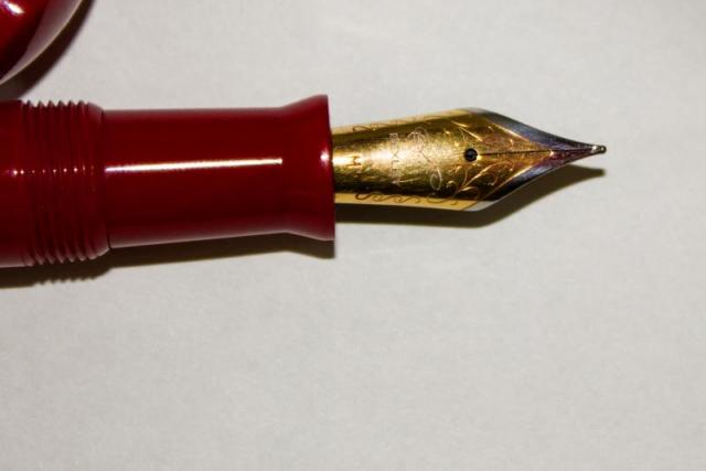
This is my Bexley 58 in Fire Engine Red. This pen was purchased on eBay as an NOS Bexley from a discontinued line. This is the second pen that I purchased after my Edison, and my second "Made in the USA" pen. The pen arrived well packaged with a larger sized box in a sleeve. Good thing that the box was larger than the Edison...because this is a big pen! 15.25cm / 6 inches when closed/capped. The box was very nice, again in contrast to the box that Conklin uses. Generally speaking, I take a pen out of it's box and keep it in a cigar box with pen trays, then put the box in storage. I know that some people store their pens in boxes, so I try and leave a review of the box as well. This pen is a pretty red acrylic, described as Fire Engine Red. It came with a cartridge converter, and also an o-ring so it could be used as an eyedropper. Originally I had planned on doing the review using the converter, but due to circumstances beyond my control, you get the eyedropper review (with a different ink than intended, also!). The cap fits well, and the overall look is nice. For some reason, the gold band looks a little "meh". Not sure why, or what it is about the band, but, to me, it just looks a little chintzy (hard to explain, and probably a personal preference). Maybe it's too wide for my tastes. The clip is nice, and holds the pen in the pocket. It's a tight clip, so it is usable with a thinner dress shirt...with one caveat. There is about 1.75cm / .67 inches of pen cap that stick up above the pocket line. It's a little more than I like peaking up out of the pocket. If your pockets have flaps, then it's an awkward pen to to carry, as it props the pocket flap open. For as big as this pen is, it's not a heavyweight. It's fairly light, and if you write unposted it's nimble, as well. Posting the pen while writing makes it a little unbalanced (in my hand). The nib is nice, and lays down a wet line. This is noticeably wetter as an eyedropper with the Diamine ink than with the converter and Noodler's Purple. With the Noodler's ink, I had some dry starts and a little skipping until it settled down. Not the case with the Diamine ink. I let the pen sit capped for 5 days, and it started without even hesitating. The medium is smooth and writes well for me. I would put it on par with my Edison nib but a bit wetter. It fits well in my hand unposted and you definitely notice the pen's girth. It's not uncomfortable to write with, and it mimics the old Waterman pens of yore, according to the Bexley website. I don't have an old Waterman pen, so I cannot speak to that. The writing sample in the photo was done in a hurry, due to the dreaded disease called "lack of time". In summary: Appearance: 8/10 - The gold band isn't quite right for my tastes. Not sure why. Clip is nice, but there is a fair amount of cap above the clip. Wetness: 9/10 - It writes wet. Noticeably wetter with the Diamine ink as an eyedropper than the Noodler's with a cartridge converter. Smothness of nib: 9/10 - It's a JoWo nib, I think, like the Edison nibs. I'm guessing that it gets tuned before it leaves the Bexley factory, though. Very nice. Ergonomics: 9/10 unposted, 8/10 posted: Posted this pen is too long. Unposted, it's about right and fits my hand without any issues. Sealing: 10/10 as an eyedropper. Cap keeps the pen sealed against drying, no issues. Weight: 10/10 - For it's size, it's not a heavy pen. My Conklin Duragraph is a heavier pen. Overall: 8.75/10 - Because I wear casual clothing to the office, many of them have pocket flaps, and the cap is just too long for those. It's a nice, big pen and would probably be better in a desk drawer, or on a desk display than in the pocket. The red color is nice, and the gold clip goes good with the two-toned nib. It's in my regular pen rotation, that's for sure.


