Jump to content

Search the Community

Showing results for tags '2020'.

  • Search By Tags

    Type tags separated by commas.
  • Search By Author

Content Type


Forums

  • FPN Community
    • FPN News
    • Introductions
    • Clubs, Meetings and Events
    • Pay It Forward, Loaner Programs & Group Buys
  • The Market Place
    • The Mall
    • Market Watch
    • Historical Sales Forums
  • Writing Instruments
    • Fountain & Dip Pens - First Stop
    • Fountain Pen Reviews
    • Of Nibs & Tines
    • It Writes, But It Is Not A Fountain Pen ....
    • Pen History
    • Repair Q&A
  • Brand Focus
    • Cross
    • Esterbrook
    • Lamy
    • Mabie Todd Research/Special Interest Forum/Group
    • Montblanc
    • Parker
    • Pelikan
    • Sheaffer
    • TWSBI
    • Wahl-Eversharp
    • Waterman
  • Regional Focus
    • China, Korea and Others (Far East, Asia)
    • Great Britain & Ireland - Europe
    • India & Subcontinent (Asia)
    • Italy - Europe
    • Japan - Asia
    • USA - North America
    • Other Brands - Europe
  • Inks, Inc.
    • Inky Thoughts
    • Ink Reviews
    • Ink Comparisons
    • Co-Razy-Views
    • Th-INKing Outside the Bottle
    • Inky Recipes
  • Paper, and Pen Accessories
    • Paper and Pen Paraphernalia
    • Paper & Pen Paraphernalia Reviews and Articles
  • Creative Expressions
    • Pen Turning and Making
    • Pictures & Pen Photography
    • The Write Stuff
    • Handwriting & Handwriting Improvement
    • Calligraphy Discussions
    • Pointed Pen Calligraphy
    • Broad (or Edged) Pen Calligraphy

Blogs

  • FPN Board Talk
  • Incoherent Ramblings from Murphy Towers
  • The Blogg of Me
  • FPN Admin Column
  • Rules, Guidelines, FAQs, Guides
  • Musings on matters pen
  • Marketing & Sales
  • Iguana Sell Pens Blog
  • Newton Pens' Blog
  • Peyton Street Pens Blog
  • holygrail's Blog
  • A Gift For Words
  • I Don't Have a Name; So This Will Do
  • Karas Kustoms' Blog
  • Debbie Ohi's Inky Journal
  • Sus Minervam docet
  • Crud!
  • Clut and Clutter
  • Federalist Pens

Product Groups

  • FPN Pens
  • FPN Inks
  • FPN Donations
  • Premium/Trading/Retailer Accounts

Categories

  • Fonts
  • Tools & Software
  • Rules for Notepads & Paper

Find results in...

Find results that contain...


Date Created

  • Start

    End


Last Updated

  • Start

    End


Filter by number of...

Found 8 results

  1. Another one of eight new ink colours Sailor introduced in the second release of its “overseas exclusive” Manyo line of inks. Close-up: Colour: dark khaki / olive / murky green Flow: moderate Feathering: Not observed on Rhodia Dotpad 80g/m² paper, looking closely at the thinnest hatching lines, and words/glyphs ‘reverse-written’ with the nib upside-down (i.e. the bottom of the feed facing up) Show-through: Low to nil Bleed-through: Not observed Drying time: 18–20 seconds Smudging after fully dry: Didn't happen when I rubbed my thumb over the hatching/stippling panel and the largest Chinese hanzi chharacters Water resistance: Good, as far as retaining legibility in the face of a spill or a dunking goes Shading: Moderate, without having too drastic a delineation between lighter parts and darker parts along the same pen stroke; can be seen even in very narrow ink marks (i.e. when writing with the equivalent of an Extra Fine nib) Sheen: None observed Shimmer: None My thoughts: I like its desaturated colour, and that it's a largely sheen-free ink good for where distractions from the written content is undesirable, but for the market price I don't know whether it stands head and shoulders above other murky green inks I have to compel me to buy more.
  2. A Smug Dill

    Sailor Manyo Ume - A Lazy Review

    Wetness: I'd say moderate. Bleed-through: None that I could see. Feathering: None that I could see. Shading: Plenty, even along very thin lines of ink. Sheen: None that I could see. Water resistance: Very good. Legible grey marks remain after prolonged soaking. The colour that gets lifted off the page upon contact with water can end up making the general area quite pink, but the grey marks will stand out against it. The red that washes off Sailor Manyo Ume isn't quite as staining as the blue in Sailor Manyo Chigaya. Overall: I like it as a sheen-free alternative to Sailor Shikiori yodaki and okuyama.
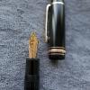
  3. Montblanc Meisterstück Le Petit Prince Special Edition 146 Petit Prince and Planet EF “Je suis un jardinier” ~ For several months Fountain Pen Network has been unavailable in the area where I work and live. In order to post this thread with images, it has been necessary to send them to a trusted friend in Africa, who has logged into FPN as me. After he uploads this post, I'm uncertain if I'll be able to see it or see any comments posted because FPN remains inaccessible here. On an overcast afternoon of intense rain, which was the Qingming (Tomb Sweeping) National Holiday, I visited the Montblanc boutique in downtown Shenzhen’s MixC. My purpose was to inquire about the two recently released Special Edition inks which I’d noticed on the Montblanc China Web site. While in the boutique I was told that both inks had arrived two days ago, selling out that very day. The sales staff graciously sold me their last remaining bottle of one ink, assuring me that the other ink would be restocked next month. Immediately upon walking in the entrance I saw in front of me the newly released Montblanc Meisterstück Le Petit Prince Special Edition 146 Petit Prince and Planet. I’d been interested in that particular model after spotting it on the Montblanc China Web site. The prominent ink windows were a feature of high interest. I asked to see and hold the pen. The pen’s solid mass appealed to me, because heft in a smaller fountain pen adds momentum to my cursive handwriting. When looking at the pen’s photos on the Internet, I’d wondered if the golden piston knob might be off-putting. Handling the pen in the boutique, I found that the golden piston knob adds balance. Marketing materials have described this model as being burgundy red resin with champagne gold fittings. That seems to be fairly accurate to my old eyes. As it happens, I’m a lifelong gardener, since my earliest school days. The nib engraving on this model powerfully attracted me due to its connection with gardening. It depicts Le Petit Prince weeding the baobab seedlings sprouting on his planet, which is designated in the book Le Petit Prince as Asteroid B-612. Having seen baobab seedlings in East Africa, I appreciate the diligent husbandry of Le Petit Prince as depicted on the nib. The bright golden nib sets off the subdued deep burgundy red of the pen itself. The color combination has the sort of understated elegance which I enjoy. While I was admiring the M nib display model, they offered to sell me their remaining bottle of Montblanc Homage to Moctezuma I Pierced Sky ink. I thanked them and agreed to buy it. Supposing that was the extent of my boutique business for the afternoon, but hesitant to step back out into the downpour, I light-heartedly asked if they had other nib sizes in stock for the pen model I’d been admiring. Looking in the stock drawer, every box was marked with M. They said that an F could be ordered as a nib exchange. Ridiculously I asked them if there might be an EF in the drawer. They looked and told me that there was indeed a single EF. As soon as I held it, I knew that it was destined for my writing desk. It was my first Montblanc fountain pen purchase since 2018. When I was leaving they kindly offered me a Montblanc umbrella, which I declined with thanks as I already have two Montblanc umbrellas. The Meisterstück Special Edition 146 Prince and Planet is a deep red resin the color of certain cherry varietals whose color explores the darkest tones of red. The champagne gold fittings are plain and understated. Around the upper cap band a quote is engraved: “On ne voit bien qu’avec le coeur.” On the nib Le Petit Prince is shown with his hoe, as well as two stars in the sky and four baobab seedlings. The yellow star on the clip is distinctive, as is the ink window. The pen feels solid in the hand…sturdy. The piston knob turns with ease. The EF sticker on the piston knob is a nice touch. In recent months my work has increasingly required detailed notes in small spaces. I’ve also been writing several hours of French every day, which necessitates appropriate diacritical marks. From the outset of my experience with Montblanc writing tools, I’ve written with EF nibs, which were consistently stellar. Far too many of my EF nibs were gradually repurposed into much broader nibs, leaving my writing desk with few Montblanc EF nibs. Adding the Meisterstück Special Edition 146 Prince and Planet to my writing desk opens 2020 with an especially pleasing daily writer for work purposes. The EF nib is smooth, precise with steady ink flow. It’s ideal for my needs. This rainy afternoon was especially fortunate, providing me with a “rainy day pen”. Following is an image series showing the pen and ink, for anyone who might be interested. Tom K. Bag From the Shenzhen MixC Montblanc Boutique Two Acquisitions Montblanc Homage to Moctezuma I Pierced Sky Ink Le Petit Prince Special Edition Made in Germany Within the Presentation Box First Look Meisterstück Special Edition 146 Petit Prince and Planet EF EF Sticker Meisterstück Cap Band Engraved Le Petit Prince Quote and Montblanc Snow Star 146 Ink Window and EF Nib Le Petit Prince Weeding His Planet, Asteroid B-612 Black Feed
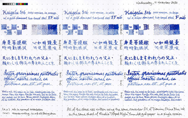
  4. From the album: Nib comparisons

    This 300dpi scanned image has been colour-corrected in post-processing. Originally (downsized and) posted here: https://www.fountainpennetwork.com/forum/topic/344512-diamine-china-blue-not-as-expected/?do=findComment&comment=4372628

    © A Smug Dill


    • 0 B
    • x
  5. A Smug Dill

    Sailor Manyo Chigaya - A Lazy Review

    Sailor has doubled the number of ink colours in its Manyo line of inks recently, by adding another eight in the second half of 2020, after first introducing the product line in 2019. I don't have any of the first eight, but with COVID inspiring all that panic buying, and a significant discount on offer for pre-orders for the new colours, I ordered the four relatively more subdued and/or sombre ones; and, after much delay, they finally arrived. Chigaya, which is probably the most sombre looking of the lot, was the first bottle I opened. (When I was developing the chromatography strip for this ink, I though a Dementor from the world of Harry Potter was going to come at me. Ridiculous!) The drawing on the bottle label seems to suggest a good range of shading out of a warm grey ink; but, writing on Rhodia Dotpad 80g/m² paper, it just looks mostly like a black ink. The Sailor Fude de Mannen pen I used struggled to write when inked with Diamine Registrar's Ink, but has no problem with Sailor Manyo Chigaya. On the other hand, it doesn't write quite as wetly or broadly as when I used KWZ Ink Warsaw Dreaming in that pen. So, I'll say the 'wetness' of this ink is moderate, somewhere between those other two inks I mentioned. There is some shading, but it is very subtle. There is no sheen that I could see. Water resistance is very good, if the measure is how legible writing would be after a looong soak. However, colour will definitely get lifted off the page on contact with water; and the bluish component of the run-off is apt to stain the area covered by that body of water. All in all, I'd say this is a decent but boring ink; and I can't think of why I would prefer it to, say, Monteverde Black Ash or Standard Bindery Stargaze.
  6. penzel_washinkton

    Diamine Reddit 2020 : Here We Go Again...

    Ok... I was surprised that this isn't a thread already here even though the post in reddit is 8 days old. (maybe I missed it in the FPN, in that case consider this thread obsolete). https://www.reddit.com/r/fountainpens/comments/en0y35/2020_diamine_reddit_ink_preliminary_round/ Time to load up your preference for the colors ladies & gentlemen. I want a really deep dark red (darker than the Cult Pens) but in the same color palette as the Oxblood. The poll will stay up for 2 weeks if I'm not wrong.
  7. Hey guys! After almost a year of waiting, i finally received my grail pen i ordered back in August 2019, the conid bulkfiller regular! I made a video going over what came with my order, some of the available accessories and some general comments on the quality of the pen and how it writes. I made it to provide some insight into how Conid's quality has changed since their order stoppage, and to show you guys waiting on your open orders or are keen on ordering one when they reopen orders, what you can expect from the company! You can find my unboxing at this video link! Thanks so much guys and let me know if you've got any questions or comments!
  8. Hello dear FPNers, Today I have something new, something German, something menthol green for you: Moctezuma 1 Pierced Sky is one of the most recent inks released by Montblanc. This ink is a complementary part of new Patron of the Art series: Homage to Moctezuma 1. It is a limited edition ink, and it has a 50 ml cube shaped bottle, which is a pretty standard bottle shape of Montblanc. I suppose this ink is very close to J. Herbin Vert Reseda, but a tad darker than it. Another similar ink is Edelstein Jade. Unfortunately, I have neither of them, because this cannot be called as my favourite shade of turquoise. However, I have Diamine Dark Green and Visconti Green, both of which are also pretty close to Moctezuma, I suppose. Here is a comparison of three inks on white Tomoe paper: They are very close indeed. But before describing the differences between 3 inks' colours, maybe I should mention about some important ink properties: Saturation: Moctezuma has a medium-to-low saturation. It is not as washed out as Herbin Vert Reseda, but still lacks some saturation in my opinion. Sheen: There is definitely no sheen with this ink. Maybe only if you pour down huge amounts on Tomoe, you may see a little bit of sheen. Shading: It has a high shading capacity, I loved it. Obviously not as much as a KWZ Honey, but still very nice shading. Wetness: Moctezuma is a dry ink, as most of you could easily guess, because most Montblanc inks tend to be so (except Elixir line, they are the wettest inks I have ever seen). It is not the driest ink in the world either; not as dry as a Pelikan 4001, but definitely on the dry side of the spectrum. Unless you have a vintage pen with an ebonite feed, or a modern pen which is tuned to write wet, most people wouldn't like this dryness combined with medium-to-low saturation in EF/F nibs I suppose. Check this out again: Lamy Safari M nib's output is not amazingly washed out, but not very legible either. I am more of a BB/OBB guy. I don't use fine nibs very often, but if I do, personally I would like to see a bit darker, or brighter line. The colour choice is already dangerous: it is a pastel menthol green, not most people's first choice of colour to easily read the written, so at least it should have been a bit more saturation in my opinion. About dryness of ink: I suppose both Montblanc and Pelikan specifically keep their nibs' tippings wide, to have them larger surface area when in contact with paper, which makes them smoother. And then they need to adjust their own inks to be a bit more viscous than a regular ink to make it flow slowly through the tines, compensating the thick tipping material's large surface and making the pen write narrower, so keeping the promise of theoretical nib size. I don't know. It is a choice of company. Pilot succeeds in having narrower tippings be smooth, maybe not as smooth as their German counterparts but still quite smooth. And they see no problem in producing a much wetter ink. I suppose most people would trust in Iroshizuku line's fluid properties more than they do for Montblanc inks or Edelstein inks in an indefinite case of which ink to use in an unfamiliar pen. I remember having hard times with some Montblanc and Pelikan inks in my EF/F nibs. Whatever. Note that the pen I used for Moctezuma is Sailor Progear Ocean with 21k Music nib: Mr John Mottishaw cut its tip into a beauuuutiful cursive italic, smooth and crisp, and tuned it to be quite a wet nib: So the wetness of nib would be able to balance the dryness of ink, I thought. Same triple comparison is also done on 80 gr white Rhodia paper, which is the industrial standard of pen world, I suppose.. Let's see the differences between 3 inks above. Here are some close shots of them on Tomoe again: Moctezuma is the lightest of them. Diamine Dark Green is a bit greener than Moctezuma, with a bit more red dye, and it is more saturated. Visconti Green actually has a very similar green-blue ratio compared to Moctezuma, but it is much more saturated. And the red dye content is definitely higher in Visconti, as a result it seems darker with some nice sheen. Sometimes I love writing with over-saturated feeds. They show the full potential of an ink. Also, if you have a moderately wet nib, it gives a clue about how the colour would be seen with a wet nib, especially with a vintage nib. A close shot of writings made with over-saturated feed on Tomoe: Lovely sheen with Visconti Green to be noted. Same thing for Rhodia: It can be said that Moctezuma gives a nice colour with a very wet nib, preferably a vintage one. Some other ink properties: Feathering: Not detected, not likely to feather. In this term, quite a well behaved ink. Bleeding: Not detected, not likely to bleed. In this term, quite a well behaved ink. Showthrough: Some distinct showthrough on Tomoe but every ink has a showthrough on Tomoe, so it shouldn't be a criteria I think: On Rhodia, it has minimal showthrough. Quite well: Note that heavy swabs or parts written with over-saturated feed will of course have showthrough, and even bleedthrough. It is normal. The concentration on normal writing should be the way in judging showthrough/bleedthrough. Water Resistance: Meh. Not so much, but who cares?? Not me, definitely.. Before water test on Tomoe: And after water test: It cannot be said that the writings have gone completely, but they are not legible either. But this situation does not bother me. Actually, I like inks which are not resistant to water. In my experience, they are much easier to clean than water-proof inks. And considering that I am obsessive while cleaning pens until water comes out completely crystal clear, this ink is a nice choice for me. I haven't tried to clean it from my pens, but I am sure it will be cleaned quite fast. CONCLUDING REMARKS If you are into menthol green colour, you will definitely like this ink. Note that it is a bit pale, pastel colour, not very vivid.With very wet nibs, it has a lovely hue of an exotic lagoon at its best. I live in an inland location, but I felt like I am in Maldives.Doesn't have sheen or shimmer, but has a nice shading.Montblanc Moctezuma 1 is not the most unique colour in the world. There are some similar colours like J. Herbin Vert Reseda, Pelikan Edelstein Jade, Diamine Dark Green, Visconti Green, etc.. You may consider them also.Price is about 35 Euros, same as Montblanc Petrol Blue. It is definitely not a cheap ink, but not the most expensive one either. I am not sure if it deserves this price. I would buy it anyway since I am an ink nerd, but I may not buy the second bottle. Besides, alternatives are much cheaper, and this ink does not have amazing specifications in terms of colour.With over-saturated feed, it provides a much more distinct, vivid colour, which means if you are likely to buy it, consider using it in your wet pens, preferably gushers or vintage pens. No need to afraid of cleaning from vintage pens. Hope you enjoyed. Thank you..


×
×
  • Create New...