Search the Community
Showing results for tags '2015'.
-
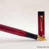
2015 New Model Hero Classic 100 (Aka Hero Glorious) Review
Prithwijit posted a topic in Fountain Pen Reviews
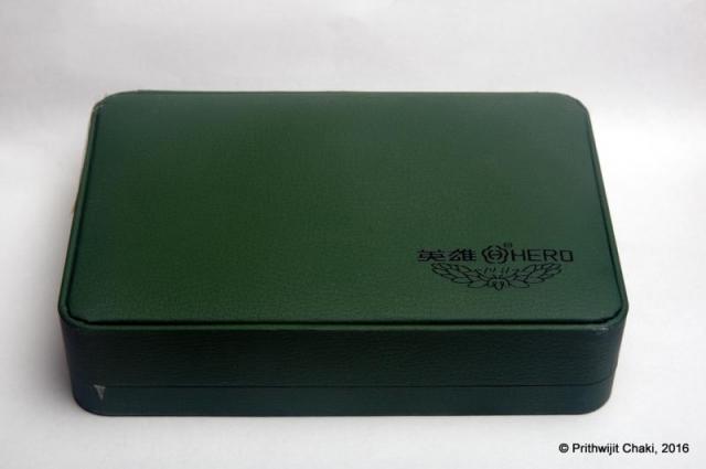
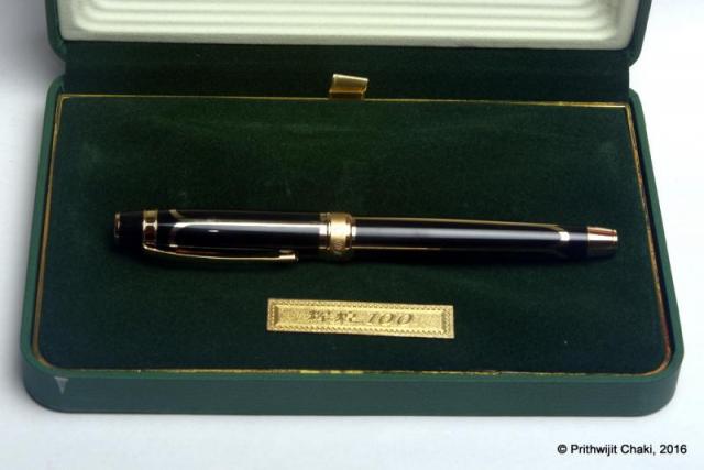
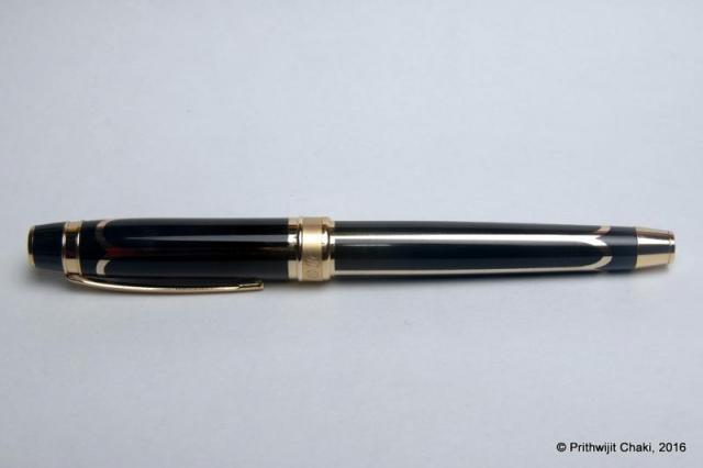
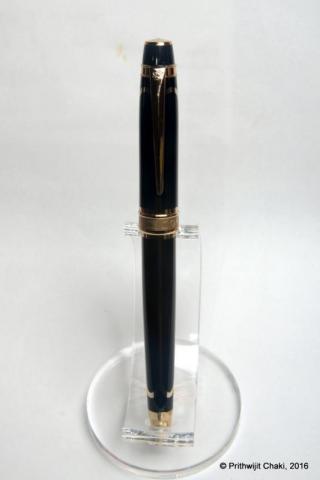
Introduction Why would anyone be mad enough to splurge $49 on a Hero 100 fountain pen, especially a Hero 100 variant that you have neither seen nor heard of? You do so because Soumitra Sanyal (@sanyalsoumitra) himself recommends it and offers to buy it for you from China during his visit there. For those of you who aren't familiar with his exploits, Soumitra-da is our resident walking and talking encyclopaedia on Chinese fountain pen matters. Just refer to his thread here to get a glimpse of his expertise and experience with the oriental pen makers and their instruments. That is how one fine day I find myself committing to buy a 2015 New Model Hero Classic 100 (aka Hero Glorious) and a few weeks later the pen lands on my desk. A big shout out to Soumitra-da, the anonymous kind-heart and L Subramaniam for taking the effort in ensuring that the pen reaches me from China. Packaging Usually I do not give too much emphasis on packaging since my interest lies with the pen rather than with the box. But I had to mention the packaging of the pen separately here since it is such a deviation from the normal Hero packaging that we are accustomed to seeing. The pen comes in a large green leatherette box enclosed within a white paper sleeve. The box has the Hero logo on the bottom right corner with 1931 (the year of founding) mentioned prominently. Once you open the box the pen is tastefully placed within a lovely green velvety bed. There is a small golden plaque with ‘Hero 100’ engraved in it. Pulling out the velvet bed, reveals a small cavity which contains the usual paperwork. Design Lately there seems to be a preference towards design that emphasize heft and a certain amount of chrome or other metallic reflective surfaces in the body of the pen. Parker IM, Sheaffer 300, Jinhao 159 or Duke Chaplin are representative of this trend. These pens are typically designed to cater to an entry/newcomer clientele base who equate weight and presence of metal with quality. The Hero Glorious squarely belongs to this club. Design wise the pen combines the traditional Hero 100 section and filling mechanism with a brass body which has been lacquered in black and inlaid with golden arches motif. The cap and body ends are fitted with golden flat ends and the cap band has a brushed metal finish. Engraved on the cap band is Hero 100 in a mix of Chinese letters and English numerals. There is a small logo engraved at the top of the clip. The black section has the traditional golden arrow inlay near the front-end. Aesthetically the pen is a mix of pleasing and over-done. The only visual mismatch that I could discern is the aluminium joint between the section and the barrel. I have no clue why they couldn’t take the extra effort and give it a golden finish as well. I suspect they were raiding the existing parts bin and did not really want to procure any new parts and fittings that this would have entailed. Size and Balance The design approach that Hero has taken for this pen unfortunately means that it is a heavy pen. While do not have a measuring scale of my own, the specifications state that it is a full 45 grams. This is a serious drawback that impacts the writing experience. There copious amount of heavy brass in the barrel and even more so in the cap. Any attempt at writing with it posted had to be immediately terminated. It was just not comfortable enough. Even writing unposted wasn’t as comfortable as the classic Hero 100 which had the weight and balance nailed down to the T. A light section and heavy barrel does throw the balance for a toss and the pen felt decidedly top heavy. The weight issue is a real pity because at 142mm capped, this is the perfect size for an EDC (Every Day Carry) pen. The section design is a classic and is known to accentuate the feeling of comfort. Nib The pen comes fitted with the classic Hero 100 nib which is made of solid 14K gold and fine in width (tip size 0.5mm). While the pen professes to be a fine, in my writing experience it was much closer to a western EF than a western F. The original Shanghai Hero company is known to make excellent nibs and this one is no different. The nib is very smooth and if you are the sort who likes EF nibs, you should have little reason to complain. The only aspect which I wasn’t too happy about was with the ink flow. I found it on the dryer side. Filling Mechanism Like any Hero 100, this pen too is an aerometric filler. It comes equipped with a long and slender pump style converter which is fixed. The brand name “hero” is inscribed in the pressbar in English while the converter itself has the pen model name inscribed in Chinese with English numerals. Since it has a fixed converter, the pen can only accept ink from bottles and cannot use any sort of cartridges. Build Quality On first glance the pen exudes the usual quality vibes that we are familiar with these days from the better Chinese pens. The fit and finish and the tolerances are nice and the pen seems built to last. I do however have some reservations with regards to the long term durability of the pen. The fact that it has a simple plastic section paired to a heavy brass barrel and the two are joined via an aluminium threaded joint seems to me a potential failure point. During use, the heavy metal is likely to put stress on the plastic. Assuming the section design is the same for the classic Hero 100, I do not expect the section to be designed to withstand such weight/stress. In fact, quite a few other reviews have reported sections developing cracks in the plastic section. Writing Experience The original Shanghai Hero company has been in existence for long and during the period it has developed quite an impressive following of its own. The fact that it seems to be the most faked pen in China means that the original pen has got something right and has a great writing experience. The Hero glorious obviously benefits from using the same ‘business side’ of the pen. The nib despite being extra thin is very smooth and glides on paper. There is no scratchiness even on coarse or cheap paper. It is however hard as a nail and any thought of softness or flex has to be summarily banished. Such a smooth nib is however let down by a feed that is too dry. I had loaded the pen with Pilot black ink and the pen was visibly having trouble keeping up the supply even for such a thin nib. This meant that the sensation of a well lubricated nib gliding on paper was sorely missing. Had that been there, it would have shot right at the top of my EF nib collection. The other drawback to writing pleasure is the sheer weight of the pen. You don’t buy this pen for a better writing experience than the original classic. Price and Value I have observed that the price of this pen seems to be fluctuating a lot. My pen was purchased from mainland china for $49 and at the time the same pen was being sold on Aliexpress for around $80 - $120. Currently there are a couple of listings available for as low as $20 but these pens don’t come with the box. That may mean any one three things - either I paid for a $29 box or counterfeits are coming into the market or the price of the pen is genuinely coming down after the initial period is over. Whether the pen is VFM or not depends a lot on what the final price comes to be. For a brass bodied solid pen with a genuine 14K nib, the sum of $20 seems very reasonable while $49 is stretching the case a bit. Any figure above $60 would in my opinion make the pen non VFM since QC is not known to be equivalent to western standards. Specifications The measurements mentioned in this section were not taken with any precision measurement instruments and you would have to settle for the approximate measurements I made using a normal ruler. However, the measurements I am providing should give you a clear indication of what to expect from the pen. Length (capped) – 142 mm Length (uncapped) – 121 mm Length (cap) – 63 mm Length (section) – 43 mm Maximum width – 12 mm Weight – 45 gm (Not measured and as per specifications) Conclusion This is the section where I usually summarize my findings and either recommend or reject the pen. Frankly speaking, I am a bit conflicted on this pen for a variety of reasons. Firstly because of the ongoing price fluctuations, I would advise a wait and watch approach to see it pans out. Secondly the design of the pen and the weight won’t suit everyone. I personally found it a bit too over the top for my taste and the weight a bit tiring. But if you are of the sort that such models, then you would be delighted by this pen. Nitpicking aside, it’s a relatively nice writer and the brand itself has an impressive legacy. The size is just ideal to make it an EDC (Every Day Carry) pen and it fulfills that role fabulously. Should you go for it, I have no doubt that you would enjoy it.- 10 replies
-
- prithwijit
- review
-
(and 4 more)
Tagged with:
-
Just over a year ago I purchased a brand new Montblanc 149 and almost to the day I bought another one. Why? Well, they are somewhat different. I will get my bias out of the way first. While the 149 is not my favourite pen of all time (I appreciate a bit of bling) I do recognise that it is possibly the most perfect pen ever made. It is quality without being overly blingy. The size and balance (to me anyway) is perfect, the nib; a thing of beauty. The filling system, great. The first Montblanc I bought was a medium nib but I had a little fight to get it adjusted so that it was wetter as a writer (it skipped and dried a bit). The second one is a fine nib. So, one being new and the other being from the late 60's, I thought I'd have a bit of a face off to see which is best. Below is a list of the differences and similarities with a conclusion at the end that hopefully some may find helpful. I'm no expert, so if there are inaccuracies in this, please do correct them. Number 1 is the first one I bought (the modern one) and number 2 is the recent purchase (the late 60's model). Nib. 1. Medium nib. Writes very wide for a medium, but I did have it adjusted for maximum wetness. It has a plastic feed with fins cut right across it. 18K gold with gold inner portion, then silver and then gold to the flanges. It is very firm but has a distinctive tooth that is very pleasing. 2. Fine nib. Writes nicely wet, but not overly so. It has a rounded ebonite feed that actually looks quite nice in comparison to the other, with fins either side. 14K gold with gold flanges only (maybe 'wings' is a better term than flange? Hopefully you know what I mean). The imprint on the nib seems more distinct and deeper to the eye on this one. It is soft and somewhat flexible. It's not quite a semi-flex but it is very pleasant to write with and provides nice line variation. It is very smooth and the distinctive 'toothless' is considerably less, although this may be more to do with age and use. The nib appears to be slightly wider (at the widest point), but sadly I lack the precision instrument to measure this, so it may be a trick of the eye. Cap & Barrel. 1. The gold furniture is bright, the imprint on the cap band is crisp with the 'Pix'. The cap has the snow peak. There is a gold ring at the piston nob. There are six rings for the screw on cap. The ink window is slightly smoked in appearance and not always easy to see the ink inside. The point where the nib meets the barrel has a flat section of one piece with two rectangular holes opposite each other and a matt collar up onto the barrel. 2. The gold furniture is somewhat dulled, which is to be expected of an older pen and the imprint on the cap band seems a little less crisp (although this may be age and wear) and there is no 'Pix'. The snow peak, to the eye at least, seems to be a fraction larger. The gold ring at the piston nob, again to the eye only, seems a tiny hair thinner. There are six rings for the screw on cap but they are placed much closer together, therefore less noticeable under the fingers when writing and there is a fine line directly underneath them. There is a tiny touch of play to the cap and barrel, but again this could be age and wear, but it's not significant enough to worry about. The ink window is very bright and clear, seems a little fraction longer and the faceting is much easier to see. The ink inside is clearly visible. The point where the nib and feed meet the barrel appears to have a cut section parallel to the nib and feed (possibly made of two parts?) and there is no collar, but there is a ridge on the barrel at the end of the grip. Filling System. 1. The piston mechanism is brass and feels sturdy and a small bit stiff. You can't really see the piston moving in the barrel through the ink window even when doing a flush to change inks. It adds a good bit of weight to the back of the pen, but not so much as to annoy me in any way. 2. The piston mechanism is black plastic and very smooth and easy to use. There is no stiffness and while it seems perfectly fine it does not feel as 'sturdy'. You can clearly see the piston coming down the barrel through the ink window. The weight is notably less due to the plastic piston and when posted, the balance of the pen is about as close to perfection as you could get in my book. Conclusion. I love my modern 149, but the late 60's model (at least I think it is late 60's!) just tips it to the post. Aspects of it feel a little better. I much prefer the softer nib and find the appearance of the nib a bit more satisfying, especially with the nice looking ebonite feed. The line variation and spring make it more interesting to use. The weight of the older model is perfection to me. Both of these pens are great and I would have no problem recommending it, but if you were looking to get a 149, I think I would strongly advise looking for a good older model. It is possible to get one at a quarter of the price of a new one with a bit of patience and a thorough search through various channels and you would end up with a pen that is probably as close to perfect as one can get. Certainly if price is a concern - and it should be, for a new 149 is not an insignificant purchase - then the older model is the way to go. I prefer the fine nib and find that it is a true European fine. I hope that makes sense, but if not and by way of explanation; I find American 'fines' tend to be 'medium' and Asian 'fines' to be 'EF's'. The older 149 wins in my book.
-
Most of my comments are above. The paper is Block Rhodia No. 18 (size A4, 80g paper). This ink is quite beautiful, I see it as a dark royal tone i.e. slightly reddish in comparison with La Reine Mauve or Murasaki Shikibu (the only other two purples I own right now). It does sometimes take a little starting in my Monteverde Invincia sometimes, but I attribute that more to my being lefthanded than to the ink or pen. Drying time seems good--by the 30 second mark it was totally dry to the touch. Shading is existent but not super obvious like in my other inks (tsuki-yo comes to mind). This will definitely be a regular of mine. I'm glad I hopped on board with this new ink. I know it's expensive, but eh... there's a collector's angle with these inks (and the bottles are gorgeous). I have some more inks coming in the mail, but they are all well known already. Can't wait! This is my first ink review. ETA: Oops, I misspelled "Pelican" in the written review, thinking of the English name for the bird. Oh well. Not the first, nor the last person to misspell the name of that company
- 13 replies
-
- ink review
- edelstein
- (and 4 more)
-
I heard a rumor at the December meeting of the Arkansas Pen Club that Henry Simpole would be at the Little Rock Pen Show, February 27th & 28th, 2015 at the North Little Rock Wyndham Hotel. For more information visit the Arkansas Pen Club website at http://www.arkansaspenclub.com/. - Grayling
-

Montblanc Writing Instruments Catalogue 2014/2015 (Free)
Appelboompen posted a topic in Market Watch
Hi FPN friends, If you are interested in the catalogue of Montblanc for 2014/2015 please sent me an email to info@appelboompennen.nl and we will ship this beautiful Montblanc book with pretty cool fountain pen pictures to you! The only contribution is to cover the shipping costs (Europe = €15, Outside EU = €25) http://www.appelboompennen.nl/image/data/Montblanc/montblanc-catalogue.jpg Link to our contact form p.s. we have enough for everyone, it is no limited edition... Kind regards, Joost Appelboom

