Search the Community
Showing results for tags '1930s'.
-
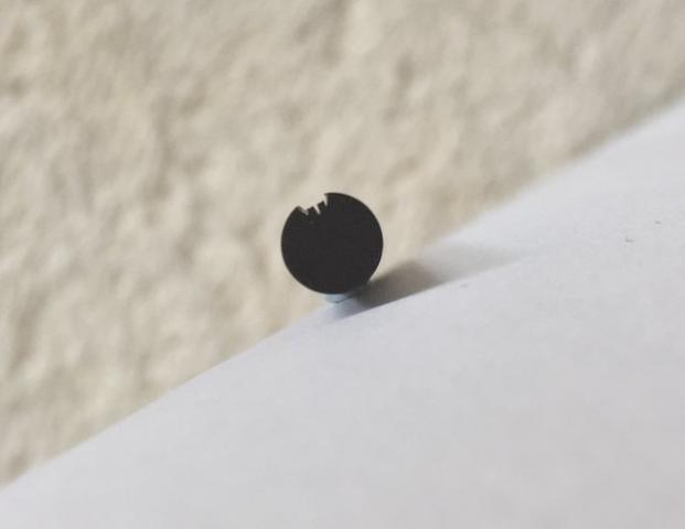
I currently have a 1930s Osmia 222 button filler on my work desk which needs a new sac. The barrel is celluloid and the section seems to be hard rubber. It's a rare pen and I need to be extra careful. What I don't know is whether the section is screwed in or only friction fit. Does anyone here have experience with button fillers from Osmia? Any info is highly appreciated.
-
desaturated.thumb.gif.5cb70ef1e977aa313d11eea3616aba7d.gif)
How-to: Set, or change, personal info that others can see about me
A Smug Dill posted a blog entry in Sus Minervam docet
It helps to explore this yourself, revisiting once in a while if need be, and keep in mind where each of those personal info fields are entered. Don't leave it until the urge to change something specific to come upon you, and only then bother to ask the question! Invest the time surveying upfront, instead of waste it later waiting for an answer from nobody in particular. Most of the fields shown above are self-evident as to what they are. I think the only ones that could do with explanation are: Security and Privacy: There is only one setting under there, and that is a toggle for whether your online status (including ‘last active’ date or time) is visible to others Content View Behavior: That has nothing to do with what others can see about you, but only where you would like to start reading when accessing content Enable status updates: This toggle enables/disables the public feed on your profile page; if you disable it, then nobody (including you) can post publicly visible ‘status updates’ or any other message against your profile, but if you enable it, then anyone — friend, foe, or complete stranger — can post something there whenever, without waiting for you to initiate and then only reply to what you wrote Notification Settings have nothing to do with what others can see about you, and so is out of scope for this article, and I'm not going to delve into those right now. (You can look here, here, and here to wrap your head around how notifications work with respect to followed content.) N.B. There is a possibility that some of the above settings and data fields may not be available to Bronze members and/or Silver members, but I have no way of testing that or scoping it out. — • — Another way of getting to the Edit Profile dialog, and the way to change your profile photo (or ‘avatar’), is here: — • — Freeform, custom member titles that one enters for oneself are long gone, and have not been a thing since FPN came back from a long hiatus and platform upgrade late in 2020.-
- fight club
- salix
-
(and 101 more)
Tagged with:
- fight club
- salix
- parker 51
- jacques herbin
- bleu austral
- bleu de minuit
- graf von faber-castell
- moss green
- olive green
- deep sea green
- gulf blue
- cobalt blue
- midnight blue
- parker urban
- night sky blue
- diamine chocolate
- platinum
- vicoh
- kanazawa
- gold leaf
- maki-e
- kanazawa-haku
- modern maki-e
- slender
- feminine
- snap cap
- penbbs
- chinese ink
- lamy 2000
- aurora
- ottantotto
- aurolide
- rose gold
- 888
- limited edition
- solar system
- planets
- jupiter
- giove
- conway stewart
- cs 58
- duro nib
- 14k
- medium nib
- green
- hatched
- sheaffer
- balance
- statesman
- 14k
- fine nib
- 1930s
- sheaffer
- balance
- statesman
- 14k
- fine nib
- 1930s
- webster gold crown
- webster gold crown
- webster gold crown
- jinhao x159
- feed diameter
- size 8 nib
- my foot!
- pilot
- plumix
- ef nib
- bb nib
- stub nib
- steel nib
- pilot
- plumix
- ef nib
- bb nib
- stub nib
- steel nib
- pilot
- plumix
- ef nib
- bb nib
- stub nib
- steel nib
- space
- stationary
- planets
- rubber
- pencil
- ruler
- vjreviews
- vjreviews
- nibsmith
- dan smith
- italic
- nibsmith
- dan smith
- italic
- lamy z52
- lamy studio lx all black
- aurora ipsilon
- faber-castell essentio
- noodlers aircorp blue black
- aircorp blue black
-
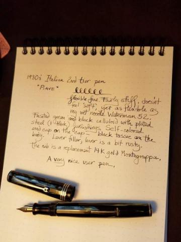
I just got this handsome pleasant Italian celluloid pen from Rick Propas aka The PENguin. He couldn't find any information on it and of course neither could I. But it is an interesting pen. Rick placed it somewhere in the 1930's, a second-tier pen of what appears to be a very obscure make. It's a lever fill, celluloid. The photos don't really capture the color very well. It's green on black, faceted. The nib is a replacement Montegrappa, an example of a very flexible but not particularly soft nib. You need to press to get the flex, but there is a whole lot of it. Without pressure it is a fine. A great user pen! The lever is a bit rusty, and at some point in its career it got a couple tiny what look like burn spots on the cap. Otherwise though it is in excellent shape for a pen in its eighties.
-
Hello, I'm trying to find a suitable alternative to this red ink. The paper is an off-white - it's slightly darker than cream. The colour rendition of my phone camera is pretty good, and what I see on a calibrated monitor is a good representation of these two samples I have in front of me. The manuscript dates from the early 1930s, and was written by someone in the UK, thus it would've been a UK-sourced ink. As you can see, it has a peach hue to it, though it feathers to a magenta where it's been exposed to damp. It looks quite a bright ink, and a little unsaturated. I don't generally look at or for red inks - Parker Ruby is still my favourite red, though for every day use I use both Diamine Majestic Purple and Montverde Horizon Blue, which is my replacement for Parker Penman Sapphire. Many thanks Richard
-
A Stunning Double Pointed F Flex + Needlepoint Tu Swan Nib
SchaumburgSwan posted a topic in Mabie Todd Research/Special Interest Forum/Group
Hi, last week a stunning Swan #2 tuned up nib arrived on a Swan L212/60 (late 1930s). It has a double pointed tipping: downside a F with good flex and on the top a real needlepoint! The L212 isn't restored yet, so I took a 6260 for a writing sample on A5 paper with 5mm squares: Some details of the nib and tipping: I haven't seen such a nib before, it seems to be a lucky find... Best Jens -
I recently acquired a beautiful little safety filler with 18 k gold overlay made by "The King" in Turino. The nib's imprint reads "RADIUS / SUPERIOR / 585". I did some research and found indications that they had ties with OMAS in Bologna but there are contradicting statements about what these relations were. I'm sure there are some experts on board here to enlighten me what these relations really were. And most curiously, I've seen a 1930s OMAS pen with a RADIUS nib recently, which puzzled me even more. Any ideas or info?
-
The pen that I'll be reviewing (or discussing) today is: "The Universal Pen Conway Stewart London No.489" I have had this pen for a bit over a month now, have used it everyday, and have found it to be a reliable writer. I managed to pick this pen up after doing some antique shop hunting, and managed to get it for only $23AUD. On that note, I think it is actually much better to go vintage pen hunting in person rather than online. It's more fun that way, not knowing what you'll find, and you probably end up with a nicer price, provided you're willing to do some relatively easy restoration work. This pen was made in England, in the late 1930s, so this is when fountain pens were generally moving away from the olympic-split style flex from the earlier period, and started featuring what I see as being *stiffer* nibs (though they still can produce very admirable amounts of line variation). It is made from a hard rubber, judging from the fact that what used to be black rubber has now faded to a dark brown, and also if you were to rub your finger on a patch of the pen and smell it, it should smell like old tires. It has a no.1, 14 carat gold nib, with what I see as a medium point (there's no markings in terms of size), and produces nice amounts of line variation. It also has an ebonite feed. Note how wide and deep the feed channel is. This means that this pen is an extremely wet writer (almost a firehose). This was very typical of vintage pens, requiring larger amounts of ink to accomodate for "flex writing". Also note the cutouts on the side. This allowed for any ink that had leaked out to be held, without dripping down the nib and forming blobs on the paper. I believe this was an attempt to mimic the spoon feed design from earlier Waterman pens, which were incredibly successful, and which was mimicked by many other pen companies. It also has a sac, very typical, and was filled via a lever on the side of the barrel. Also very typical. The pen itself is quite light, and is 131mm long capped, and 161mm posted. This pen can be posted very comfortably and securely, though whether you do so is all up to personal preference. a few notes: No, this pen is not for sale. This pen has been put through its paces, and has proved it's reliability by non-stop writing for 2 hours in English Exams, and a further 1.5 hours in that afternoon. It is VERY reliable. The iron gall ink used in the pen is wholly appropriate, due to many inks of the period being iron gall inks. Do not worry about the pen's current condition; it is part of a rigorous maintenance schedule, and is flushed out every single week. In addition, the ink used is formulated to be gentler on pens, and the pen itself, containing no metal parts excluding the gold nibs, easily stands up to it.
- 1 reply
-
- vintage
- conway stewart
- (and 4 more)
-
Beautiful German Mystery Button Filler From The 1930S - Any Idea?
OMASsimo posted a topic in Fountain & Dip Pens - First Stop
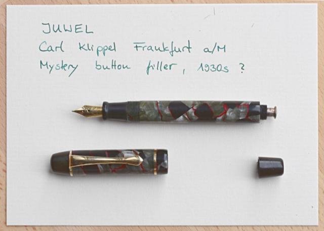
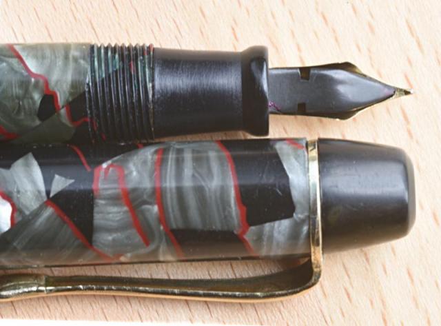
A while back I bought a pretty German button filler for a song and by now I restored it completely. Material seems to be a "red and pearl swirl" celluloid well-known in the 1930s. The imprint reads JUWEL Carl Klipperl Frankfurt a/M I could not find any info on this pen. But there was an early German manufacturer, first called Anglo-Amer and later International from the 1920s on which produced a pen with a model name "Juwel". That's the closest I can get. The construction points to the 1930s. Button fillers were rather uncommon in Germany after the piston filler was introduced in 1929. Colourful celluloid was mostly produced for export during that time. The feed is very plain without fins and rather thin. The imprint on the nib reads "WARRANTED / 14car / 1ST Quality" also common in the 1930s for imported nibs from England or the US. Does anyone here know something about it? Any info is highly appreciated.- 10 replies
-
- juwel
- button filler
-
(and 2 more)
Tagged with:
-
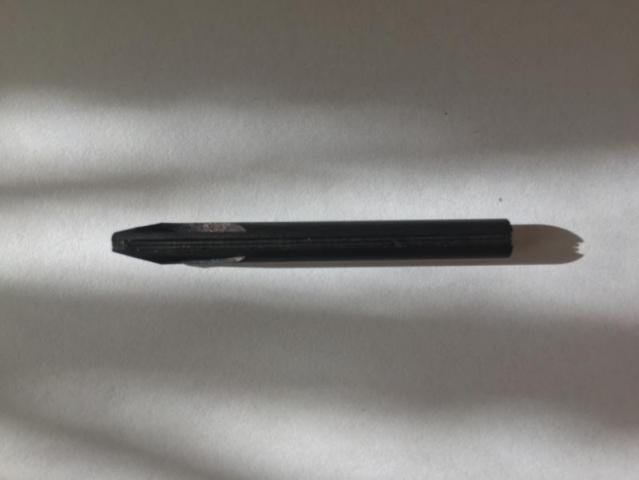
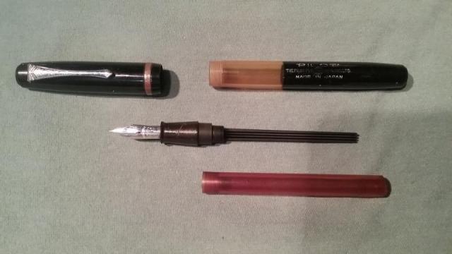
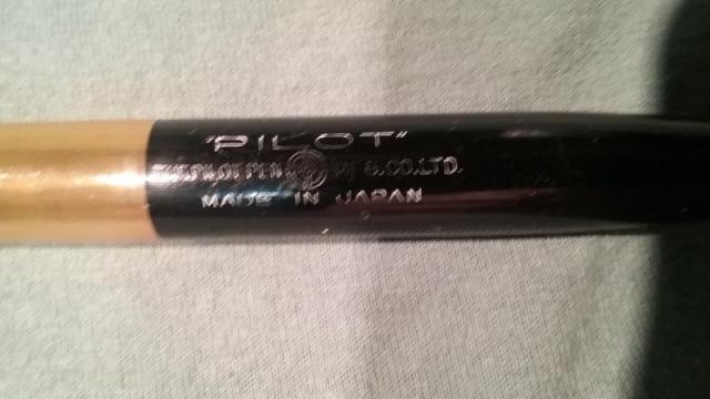
Hi Forum Folke, First off, apologies if this is posted in the wrong forum. I stumbled across this oldie at a yard sale. I wasn't expecting much based on it's looks, but I'll at least examine pretty much any fountain pen I find... you just never know, y'know? It's seen its share of use, and obviously has been banging around for quite some time, but there's no real damage, just age wear. the clip is straight and holds firm, there's no chew marks or any heavy gouges anywhere, no cracks or heavy scratching or distortions... the worst problem it had was that the gold-plating had all but disappeared due to corrosion of the brass (?) cap ring, and even that wasn't too bad... a little polishing and the corrosion became more like a browned (as opposed to blued) gun finish, with little flecks of gold here and there. Just an obviously old pen... hey, I wish I looked that good at 65! Anyway, I was very surprised to find that it had a very flexible steel nib! I immediately bought it for the princely sum of one dollar; hey, even if I couldn't get it to work as a fountain pen, it would make a nice dip pen, with a nib like that!. Got it home and tore it down... what a weird pen! The cap unscrews, the barrel is a soft friction-fit to the section, easily removed but holding rock-solid during use; I'm used to the kind of fit that requires heat and tools to remove! I'm guessing that given the way it fills, a really tight fitting section would be a sales-killer. What looks like a cartridge is actually a screw-on reservoir that is dropper-filled (more on that in a minute), and holds an enormous volume of ink, practically the full volume of the barrel. And there's this really weird feed that extends almost the full length of the reservoir, cylindrical with a flat face on it, with three parallel grooves running along its full length. The section-end of the barrel is clear for about an inch, so you can see the ink level, or would be able to, if the reservoir hadn't been so stained with ink that it's almost opaque. The barrel impression is quite legible: PILOT THE PILOT PEN (logo) MFG. CO., LTD. MADE IN JAPAN. The logo is a crossed circle with a smaller circle within, and the letter "N" inside that inner circle. Never seen it before. I believe that the "N" stands for "Namiki," but have no proof of that beyond a hunch. Contacted Pilot USA and sent them pics of the pen, with talced impression for legibility, asking for any information they might have on it. Took awhile, but I finally got a sparse reply. Turns out it's a model "N30," manufactured from 1934 to 1939. The fill system was weird, too... from the tiny picture, it appears that the barrel screwed into the special cap of the ink bottle which was then inverted... I'd love to see the instruction sheet that originally came with it. Now all I have to do is find one of those old bottles! Anyway, I'm hoping that somebody in this forum might have more information than the scrap I got from Pilot. This thing writes beautifully; I can write copperplate hand with no trouble at all; fine, fine hairlines and thick swells are no problem at all. In fact, the only problem at all is a tendency for the ink to accumulate in the feed, and eventually a drop of ink will fall from it. The first time it happened it was a problem... after that, I just give it a light 'twitch' over a napkin or something and occasionally I'll get a drop, but not too often. Forewarned is forearmed! It's a daily writer at this point. I wish it was a carrier, too, but if it gets too warm (read: left in a black car on a 90+ degree day), it will leak ink into the cap due to ink expansion and no real venting. Acceptable trade-offs, for me, given the way it writes. I have some old gold-nib flex pens that don't write as nicely as this one, with its plane-Jane Warranted steel nib. Thanks for slogging through this long post, and I'm really hoping someone can provide more info or possible leads to same!
-
Pilot Japan 1930's Vintage Lever Filler Flexible Nib Review
Pen_Noob posted a topic in Fountain Pen Reviews
I think this is a very rare find. Due to the looks and construction of the pen I dated it around 1930, but I could not find any information about these pens on the net, so maybe somebody can help out here. Appearance and size: 10/10 As you can see this is a midsize pen, comfortable to hold and by far different than the mostly bland today's Pilots. It was made I think for export since it had english letters on it. The cellulloid? is quite stunning, one of the most beautiful pens I have ever seen. Also it is in a terrific shape, doesn't seem to have any discoloration, only maybe some tiny brassing spots, to be seen better in photos, not with the naked eye. Construction: 10/10 Quite balanced pen, very well constructed. It shows to me why the current japanese pens have this good name. They started making good pens long long ago ... Filling: 9/10 Standard lever filler, easy to fill, harder to clean. So a 9 for me, since I rotate pens often. Nib: 10/10 One of the best nibs I ever wrote with. With no pressure it writes wet and smooth, a joy to use, like it a lot. And with pressure comes the flex. Joy again. It is quite flexible, probably in the superflex category. Test Drive: 10/10 Very very nice to write with. If it would be a little bigger, probably it would be my favorite pen of all Overall: 10/10 As you can see I am in love with it, so .... -
I am delighted to have acquired this rather unusual Leverless. Of course I have (and have had) 1930s Leverless Swans with No 3 nibs, but I have never seen a rolled gold one. Note also how the name is stamped - in the style of the New York models. Rgds Cob


