Search the Community
Showing results for tags '1670'.
-
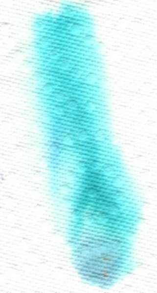
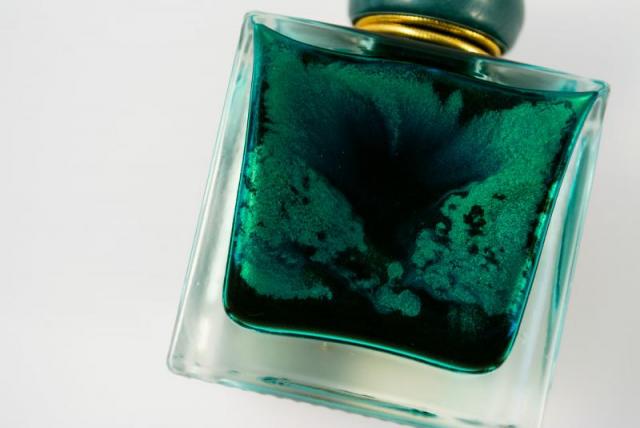
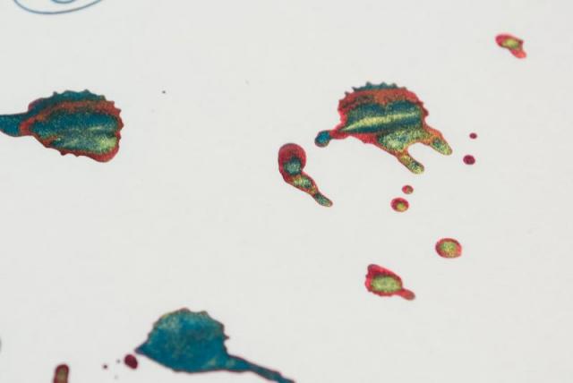
Jacques Herbin 1670 - Turquoise de Perse A pure turquoise with gold shimmer, the 8th in the 1670 series. Ink is very wet, slightly below average lubrication (like most turquoises), long dry times on Rhodia, feeble water resistant. Color can both be reminiscent of turquoise gems or domes of mosques in Persia aka, Iran. I would’ve preferred it with a silver shimmer, I cannot see turquoise with gold, but then I don’t like shimmer, so it’s immaterial. A note on the word, Perse (French for Persia) vs. Iran. Persia is derived from the word Pārsa, Pars, Fars (name of a province in modern Iran), the Iranian tribe from which, Cyrus the Great, established the first Persian empire, in 550 BC. Note how the P evolved to F. The language spoken by Persians/Iranians is Persian aka Farsi. Iran (pronounced Ēran), is derived from the Aryan, aka the lands of the Aryans (Iranian tribes), which refers to the tribes of Central Asia, who colonized India and the Iranian Plateau, some 2500 years ago, give or take. It is my understanding when one uses the word Persia, one refers to the ancient empire, much like the Roman Empire. Back to the ink, this is a pure turquoise, I don't see any green in it, despite what the scan wants you to believe. Check the photo of Iroful paper to get a good idea of the colour range. Chroma: Writing Samples: Colour is off. There's no green. Photo: Comparison: Water test: Left side 10 seconds under running water. Sample written with a B nib. Art Work: Surprisingly when added in copious amounts, there seems to be a hint of green. Note about the size of the papers. The first one is close to an A4 whilst the 2nd drawing is pocket size Part of Inktober challenge 2024. I lumped the 5 last prompts into one drawing, on a Bristol Paper. The prompt are in bold. Jumbo the elephant, took to the road with the skilled Navigator, Mr. Cat and mouse who played the Violin in search of one of most iconic Landmarks, the Eiffel tower. I used the following fountain pen inks on Bristol Paper Jacques Herbin - Turquoise de Perse (applied generously) Noodler's Apache Sunset/ Lexington Gray (Elephant/ mouse), Polar Brown (the road) Diamine Celadon Cat (landscape) Sailor Kiwa Guro (Mr. Cat) Barock Umbra (Eiffel Tower) Lighter application. Lady Tatiana having a cup of tea Paper is Talens mixed media pocket book. Jacques Herbin Turquoise de Perse, J Herbin Lie de Thé Monblanc Origin Coral/ and mixed with a bit of Lie de Thé. Noodler's Lexington Gray · Pens used: Lamy (Reverse EF/EF/F/M/B/ Stub 1.1, Kanwrite with an Ahab flex nib. · What I liked: Studying history/ etymology. · What I did not like: It’s another turquoise, price 😛 · What some might not like: Long dry times, shimmer. · Shading: Good. · Ghosting: Yes, on Hammermill paper. · Bleed through: Yes, on cheap paper. · Flow Rate: Very wet · Lubrication: Slightly below average. · Nib Dry-out: Did not notice. · Start-up: Ok · Saturation: Pastel · Shading Potential: It’s there. · Sheen: No. · Spread / Feathering / Woolly Line: Did not notice. · Nib Creep / “Crud”: Did not notice. · Staining (pen): No. · Clogging: Did not notice. · Cleaning: Ok. But the shimmer might take some time · Water resistance: Non-existent · Availability: 50 bottles. Please don't hesitate to share your experience, writing samples or any other comments. The more the merrier
- 16 replies
-
- jacques herbin
- 1670
-
(and 2 more)
Tagged with:
-
-
- jacques herbin
- 1670
-
(and 1 more)
Tagged with:
-
-
- jacques herbin
- 1670
-
(and 1 more)
Tagged with:
-
-
- jacques herbin
- 1670
-
(and 1 more)
Tagged with:
-
-
- jacques herbin
- 1670
-
(and 1 more)
Tagged with:
-
-
- jacques herbin
- 1670
-
(and 1 more)
Tagged with:
-
-
- jacques herbin
- 1670
-
(and 1 more)
Tagged with:
-
-
- jacques herbin
- 1670
-
(and 1 more)
Tagged with:
-
-
- jacques herbin
- 1670
-
(and 1 more)
Tagged with:
-
Since J. Herbin released the beautiful Rouge Hematite as the first in their the-new 1670 Anniversary line it has been through several iterations. The first release was, in my eyes, as close to perfection as Rouge Hematite could ever be; deep and rich without being dark or dull, shimmery and sparkly without being garish or gaudy. The ink's sheen was not simply caused by what we're all familiar with, which is sheen induced by (according to Nathan Tardif) drying ink crystalizing. Rouge Hematite had its sheeny component resting at the bottom of the gorgeous bottle waiting to be shaken—a minutes-long process with the bottom new and full. It looked not gold or red, but almost like a maroon-tinted wax (until shaken). And then, from the inky shadows (see what I did there?), came the whiners. The ones who know not how to maintain a good hygiene schedule for their pens. And with their ignorance came the clogging. With the clogging, complaints. So J. Herbin, listening to their customers (which is usually a good thing), took a good portion of the heavily-sheening component out. The second formulation still has the same type of sheeny bits, but just way less than the original. But since haters gonna hate hate hate, the third iteration of the once-perfect ink came soon after, with barely any of the gold-inducing sediment at all. This, as Henry Hill once said, is the bad time. The third iteration was sheen-less. The third iteration was boring. The third iteration was wrong. And thankfully, J. Herbin heard RH's faithfuls' complaints. They made the announcement that they re-instituted the sheening component to match the good ol' days. Or did they?… Yes. Well, sort of. But first, I'll backtrack. When the company released the second ink in the Anniversary series, Bleu Ocean, a lot of people, including myself, were disappointed that the ink lacked any sort of sheen. Many had wished it would be given a similar, but silver-colored, sheen component. When I tried it I couldn't even coax any good old crystal-based sheen from it. It was a nice shade of blue, but without the signature sheen, and coupled with the fact that it wasn't half as well behaved as Rouge Hematite—RH can be used with a flex nib on cheap paper and still retain its sheen and shading—it was a bust for many. More recently, us sheenoholics have praised the release of J. Herbin's Stormy Grey 1670. In contrast to the earlier Rouge Hematite, Stormy Grey has a blatantly golden pigment component to impart its sheen. With the original RH, once the sediment was shaken and integrated into the ink the only difference was that the ink took on a bit of a chalky look in the bottle; it also took quite a while for the sheen component to settle back down to the bottom of the bottle. Stormy Grey's golden component, whatever it really is, is very consistent and exceedingly easy to see as it swirls around in the ink after shaking it. It also settles back to the bottom MUCH quicker. Now, back to the most recently released Rouge Hematite version (what I dub the fourth version). The fourth version of RH seems to have the same sheening component in it as Stormy Grey. It's obviously metallic when it's at the bottom of the bottle (not waxy looking, like the original), and it settles very quickly like Stormy Grey. Instead of the original formulation's smooth "fog" of gold/green sheen that would settle over the red ink when spread with a q-tip, the newest version has star-like "pinpoints" of gold spread fairly evenly over the entire q-tip sample. I'm not going to say it's inferior to the original version (mainly because I haven't even done a writing sample with it yet), but it is different, and I think people buying it with the understanding from the company that the original formula is back need to know the differences. I'll be doing a new review of the most recent version in the next few days. When it's out I'll link to it from this thread. Now for the comparison pictures! Left to right: Original version, Second version, Fourth version: http://imagizer.imageshack.us/v2/xq90/538/1GzS1a.jpg http://imagizer.imageshack.us/v2/xq90/661/7vDUYL.jpg Original Version: http://imagizer.imageshack.us/v2/xq90/661/2RoPFk.jpg Second Version: http://imagizer.imageshack.us/v2/xq90/537/ujBGrt.jpg Fourth Version: http://imagizer.imageshack.us/v2/xq90/673/ovuTGg.jpg Left to right: Original version, Second version, Fourth version: http://imagizer.imageshack.us/v2/xq90/673/rorNxl.jpg Original Version: http://imagizer.imageshack.us/v2/xq90/661/dZq7Ha.jpg Second Version: http://imagizer.imageshack.us/v2/xq90/661/4iJYeo.jpg Fourth Version: http://imagizer.imageshack.us/v2/xq90/538/xs7Eq2.jpg Original Version: http://imagizer.imageshack.us/v2/xq90/905/8O3cbM.jpg Fourth Version: http://imagizer.imageshack.us/v2/xq90/673/q6ILau.jpg http://imagizer.imageshack.us/v2/xq90/673/XSNAOZ.jpg Here's what Stormy Grey's sediment looks like: http://imagizer.imageshack.us/v2/xq90/746/ofYoGc.jpg And now on the page: http://imagizer.imageshack.us/v2/xq90/908/GYZE0R.jpg Left to right: Fourth version, Second version, Original version: http://imagizer.imageshack.us/v2/xq90/661/I7UZzn.jpg Again, this comparison is just about the inks' properties in general; I still haven't filled a pen with the newest version yet. I'll post back when I have some more to say about the most recent version.
- 40 replies
-
- j herbin
- rouge hematite
-
(and 4 more)
Tagged with:
-
Hello there, here is my first review for a wonderful ink. Hope you enjoy Armand.D Pictures : http://image.noelshack.com/fichiers/2015/31/1438347092-review-herbin-re-2.jpg http://image.noelshack.com/fichiers/2015/31/1438347102-img-0315.jpg http://image.noelshack.com/fichiers/2015/31/1438347109-img-0317.jpg
-
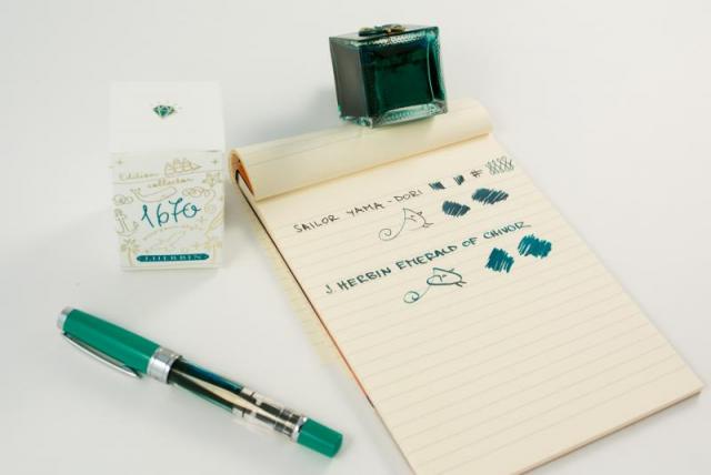
Got in my Emerald of Chivor yesterday from GouletPens (lucky lucky), and I immediately shook it up, stuck a syringe way to the bottom to get the most out of the sparkles (which settles very quickly), filled the cartridge and went to town. In a Lamy Al-Star w/ 1.5mm Stub nib on Rhodia No. 16 Dot Paper. http://i.imgur.com/4mkbAaE.png A lot less sparkly and oily-red sheen than photos online, perhaps it's my paper or pen? I don't know, would I need something like Tomoe? http://i.imgur.com/Y0u5OTy.jpg http://i.imgur.com/gWHgYxq.jpg Don't get me wrong I enjoy this ink's color alone and will write in my Master Leuchtturm 1917 lovingly as such, but I'm really curious on getting the most out of this ink's properties. Thoughts? Also later on I should be getting a TWSBI 1.1 mm nib for my Diamond 580, if not the sparkles flow from that at least I can see them swirl in the tank yeh? - GlennPen Update [8.29.2015 2:07 PM]: Does extremely well on L!FE brand paper. http://i.imgur.com/keyIrZB.png http://i.imgur.com/hDmTxUH.png And here's an upclose shot: http://i.imgur.com/6FCKS10.png and lovingly in the sun.http://i.imgur.com/djCoWo0.png Seems to me that Japanese paper is more likely to bring out the full vibrance of this ink!
- 55 replies
-
- j herbin
- emerald of chivor
-
(and 2 more)
Tagged with:
-
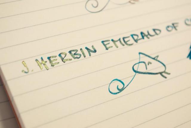
http://kephost.com/images/2015/07/23/370e744c3944c0f5d895c4916ba3b3c6.jpg I was lucky to receive a sample of the coming J.Herbin Emerald of Civor from Bureau Direct (UK)! Thank you so much for the chance to try this amazing thing! http://kephost.com/images/2015/07/23/fd647a72e524b34242c990854cfa216c.jpg http://kephost.com/images/2015/07/23/f9037bf64160cdc716cd61f9ed592190.jpg ^Tomoe River paper The process of filling up pens with this and the Stormy Grey is pretty much the same. Shake the bottle till you can't see any gold at the bottom, and then quikly fill your pen. This is the best was to get a good amount of gold in your pen. Many people only use these inks in their cheaper pens, because of the particles. I could clean the Stormy Grey pretty easily, but I haven't tried to clean the Chivor yet. So, even though I had no issues, please use these inks carefully. Here we go with some shading, sheen and gold! http://kephost.com/images/2015/07/23/9549b6700fd3883ec8d502657e32e0ce.jpg ^Tomoe River above, Canson Satin tracing paper below. http://kephost.com/images/2015/07/23/9d36565bf073c41462821780246313fe.jpg ^Sheen on Tomoe River http://kephost.com/images/2015/07/23/0269cabf3bd75ccc7c04754e1aa261c8.jpg http://kephost.com/images/2015/07/23/56fc27a198fdf816f8be3454d6602b66.jpg http://kephost.com/images/2015/07/23/c4cd841a35972011b1f69cecc816c96b.jpg http://kephost.com/images/2015/07/23/159cc57287494cce8ffd17a43c71eb28.jpg ^80g printer paper, Safari 1.5 http://kephost.com/images/2015/07/23/377a29ce537291b328d05e0f6756cab1.jpg ^ 80g printer paper, Pelikan M600 medium. No sheen on this paper, but you still have the gold! Even this was it looks pretty sweet! http://kephost.com/images/2015/07/23/27e143156a125c2be67faa698046123d.jpg ^90g Clairefontaine paper http://kephost.com/images/2015/07/23/8d9172c0c0dd709ffc713f0fa4b9b20c.jpg ^Tomoe River http://kephost.com/images/2015/07/23/413b8d413f42bd9869edd3c624c6ba1b.jpg ^Tomoe River This ink is simply amazing! It needs a good paper to come alive, but be warned that you might fall in deep love with it!
- 91 replies
-
- j.herbin emerald of chivor
- herbin
- (and 5 more)
-
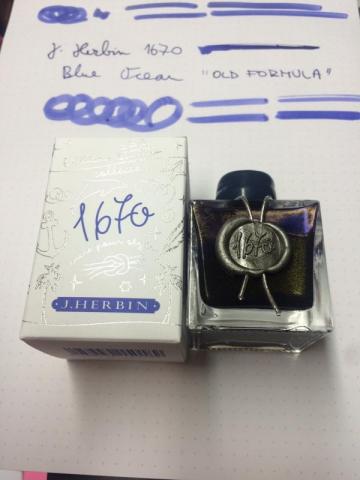
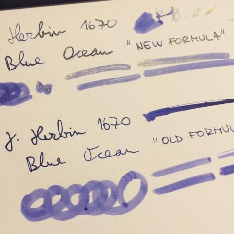
Hi folks, I don't know about you, but I have heard some rumours that J Herbin was reformulating Ocean Blue ink...must have been Stormy Grey's success So, I was expecting blue ink with silver particles...but it looks like they have opted out for gold... No indication on the bottle (of course) Here are few quick snaps of their very last batch:
-
I recently received a sample of this ink. I don't normally go for glitter inks and I wouldn't get this one. It's not bad at all, and the flow is very good. Since this was a sample I can't say whether I received the proper amount of glitter bits. It sheens amazingly on Tomoe River. Pen: Edison Premiere (M-steel) Papers: MvL=Mohawk via Linen, TR=Tomoe River, Hij=Hammermill 28 lb inkjet, Rhodia=Rhodia 90g ivory. Camera: iPhone 7 No sheen on MvL or Hij. A feeble attempt to capture the sheen. It's much more dramatic in the flesh.
-
After reading many postings on this and other forums regarding J. Herbin's 1670 inks and their apparent ability to clog pens, I decided to share my experience with them after some 6 months of usage on several pens on an almost daily basis. Hope this is helpful. Like many pen enthusiasts the world over, I became truly hooked to the idea of using J. Herbin's inks after watching some videos depicting their shinning and sheening characteristics, specially those of Emaraude de Chivor, which is without a doubt, the most fascinating ink on this earth for those of us creative types (I'm a designer and photographer). Yet, after doing my proper research on them, I came across many, many posts, stating that these inks were the equivalent of Armageddon for the majority of fountain pens. A few lone voices claimed otherwise, but the general consensus was to stay away from them. Low and behold, I ordered 3 bottles: Emaraude de Chivor, Blue Ocean, and Stormy Grey. I filled 2 Lamy Safari pens with Ocean Blue (M nib) and Stormy Grey (F nib) and then I filled an Al-Star with a stub 1.5mm nib with Emeraude. After using them for nearly 3 months (refilling the same pens or inking similar pens), I've had experienced no flow issues whatsoever. No hard starts, no skipping, no clogging of any sort. The only "issue" I got to experience is that the finer the nib, the less gold flecks that will end up on your paper. After this initial test, I decided to convert my brand new transparent Kaweco Sport Classic with an M nib into an eyedropper and the ink I decided to fill it up with was Ocean Blue. Kaweco's are known to have starting and skipping issues when brand new. Mine not only turned to be and excellent writer right away, but the conversion also helped turn the feed into a very wet one. After 3 months of constant use, I'm yet to experience issues. BTW the gold flecks look gorgeous laying on the barrel and match the pen nib, clip and markings in a lovely way! One thing that I have noted thou is that the gold flecks tend to get everywhere into the pen. My eyedropper has some flecks -with ink- stuck between the feed and the section, it also appears trapped in some parts of my converters and, needless to say, they are also present on the feeds. Yet, so far, they seem to be quite easy to clean off. The only bad experience I've had so far has been with a Kaweco AL-Sport that I filled with Stormy Grey. Right after filling it, all it came out the nib were gold flecks, not a single drop of ink! I shook the pen hoping for the specks to settle but it never worked. I had to extract the ink from the cartridge, and then it all took to clean and unclog the pen, was a standard rinse with water. This pen has since been inked-up twice with other inks and so far, it works flawlessly. The AL-Sport uses a different feed than that of the Classic, so maybe it is a bit more restrictive. I have also used the Emeraude ink on my Pilot Parallel pen without any issues. The only thing I should note here is that the gold flecks didn't show on the lettering work I did with this combination. I will fill it up again and update this post to reflect the outcome. So, to recap, I truly consider these inks to be pretty safe for most pens and they seem pretty easy to clean-off. I will refrain myself from putting them on vintage pens or expensive ones just to remain on the safe side. But other than that, they all prove why J. Herbin has been around for more than a hundred years!
-
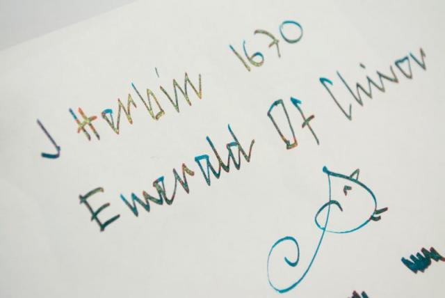
http://i900.photobucket.com/albums/ac209/jasonchickerson/20160830_0007.jpg Emeraude on Rhodia Dotpad no. 16. Title drawn with a 1.5mm Brause no. 180 nib and plenty of gum arabic. http://i900.photobucket.com/albums/ac209/jasonchickerson/20160830_0008.jpg http://i900.photobucket.com/albums/ac209/jasonchickerson/20160830_0011.jpg Undiluted (left) and diluted (50%, right) splotches. http://i900.photobucket.com/albums/ac209/jasonchickerson/20160828_0001-2.jpg http://i900.photobucket.com/albums/ac209/jasonchickerson/20160828_0001.jpg Peacock painted with Emeraude de Chivor, Sailor Souten, and a hint of J. Herbin Cacao du Brésil on Stillman & Birn Gamma Series paper. This is a review that I thought I had already done. When I set out to do it again, I realized why I never finished the first time round. Emeraude de Chivor is one difficult ink. It is oversaturated, much too wet, stains everything, and threatens to clog my pen. It also refuses to work with a dipped without plenty of gum arabic, which removes the sheen (but adds gloss). Is anyone actually writing with this ink? I'll admit Emeraude looks pretty good coming out of my wife's mint Kaweco Sport, but I won't be putting it in any of my pens any time soon. Too staining, too clogging, and it smears when dry a la Rouge Hematite. So what on earth could I ever use this for? Well, that peacock looks pretty nice, for one. I love the way three distinct colors can be gotten through dilution: gold/red/black when laid down really thick, a dark emerald green at full volume, a brilliant turquoise when diluted. And it looks great alongside the pink-sheening Souten. Looks like this one is permanently relegated to the art shelf. Now I just have to find some subject matter that requires a glittery teal...
- 21 replies
-
- j herbin
- emeraude de chivor
-
(and 8 more)
Tagged with:
-
As you may have noticed from my previous review (Diamine Shimmertastic Sparkling Shadows), I do not dislike that much sparkling inks, and I do not dislike sheeny inks either. For this reason I ordered online a bottle of J.Herbin 1670 Emerald of Chivoir, as I've been told to be something like "the Grail ink" for those who likes this kind of properties. I received instead Caroube du Chypre, and since I like browns, I just decided to keep it and give it a try. Caroube du Chypre is a well behaving brown, quite complicated colour, made by a prevalent ammount of magenta/red tones over the turquoise and yellow component. In addition to the ink there are some extremely think golden particles that leaves a glittery effect while writing. The flow is consistent and appears to be a fairly wet and well lubricated ink, my architect grinded B nib litterally glides on paper. No clogging or hard starts for this ink, quite interesting as there are particles in it. I've to say that compared to the Diamine Shimmertastic series, Caroube du Chypre seems to have thinner particles that need less effort to be mixed to the rest of the ink. Shading is quite good on all the paper I've tested it on, with better result with less absorbent ones. No bleedthrough or feathering observed. This ink has some water resistant, but I won't be advertising it as waterproof. There are still two aspect to cover about this ink, the first one is surely the sheen. This ink, on the right paper, and using a good ammount of ink, leaves on paper a lovely green sheen, wich recalls in my architect head, something like the copper rust. Even if this is not a work appropriate colour, I find this ink brilliant, because it's a clever mix between a antique looking brown, discreet golden particles, and a really perfect matching green sheen. I think that J.Herbin found a really good mix to make something glittery wich does not recall "my little ponies" or "Barbie" but something wich can be bought by an adult without being ashamed. The second aspect is related to the ink comparisons I've made: I've got a doubt over the main "ingredient" this ink is made from. I possess a bottle on J.Herbin Terre de Feu, which looks really the same ink, just without golden particles. It's that possible? The answer is "maybe". I don't know much about inks composition, but even if how the ink behaves and looks on paper makes me think that this anctually is the same ink, the fact that Terre de Feu doesn't have the same green sheen, makes me think they're somehow different. I know that this is quite irrelevant to the discussion, but I think is an interesting argument of discussion. When I'll be reviewing Terre the Feu I'll do the comparison between cromatographies and probably we'll have our answer. So, the usual final question: Is this ink worth it? I like this ink, I like this ink a lot. Behaves well, doesn't clog your fountain pen, has sheen, has everything you want if you like this particular kind of inks. So, if you're the type who like drawing, if you like making holiday card with fancy ink and so on, this is a really good option: with 20 € you have a 50 ml bottle. It's a little expensive, but the bottle is pretty (not really practical, bute really pretty) and the ink is "something else", not a common ink. If you don't like glitters, just leave it on the shelf, it's not made for you. COPY PAPER SCHIZZA & STRAPPA PAPER TRACING PAPER SHEEN GLITTER CROMATOGRAPHY INKDROP
-
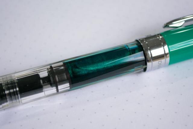
http://i900.photobucket.com/albums/ac209/jasonchickerson/image_3.jpeg http://i900.photobucket.com/albums/ac209/jasonchickerson/image_2.jpeg http://i900.photobucket.com/albums/ac209/jasonchickerson/image_5.jpeg http://i900.photobucket.com/albums/ac209/jasonchickerson/image_4.jpeg This is an ink I did not expect to like or get much use. I primarily use the 1670 inks as watercolors when painting with my daughter. She likes the gold flecks, and they do make for some interesting effects, so I purchased all of the line save Stormy Grey (which is one of the worst inks I have every personally tried) for this purpose. I put it in my daily carry pen to test for this review and it didn't come out for two weeks. So, not too bad. The gold shows up readily on high quality paper and almost not at all on the cheap stuff, so I didn't get any questions at work about my sparkly ink. Hue is identical to Herbin's own Terre de Feu, but Caroube is much wetter and a bit darker. In the end, I like it quite a bit. While not as exciting as Rouge Hematite or Emeraude de Chivor, it is much better behaved and much more useable on a daily basis. In case you missed it in the written review, I left the cap off my pen for four hours with Caroube inside and it started right up again. Cleaning it out of the pen took about three flushes. Brilliant. Paper is Rhodia dotpad no. 16. An attempt was made toward color accuracy.
- 13 replies
-
- j herbin
- caroube de chypre
- (and 5 more)
-
Just in case you need a nice summertime fix of very pretty brown n gold ink! http://www.gouletpens.com/j-herbin-caroube-de-chypre-1670-anniversary-ink/p/H150-45 Images http://cdn-tp1.mozu.com/6639-8588/cms/8588/files/d083f655-a3e4-430f-91b9-c91f4ec3cb0d/ http://cdn-tp1.mozu.com/6639-8588/cms/8588/files/2317d2a9-56bd-4256-baab-803782e93fef/
-
Register to get a bottle of the new J Herbin 1670 Caroube de Chypre Anniversary Ink coming this July. This brown with gold specks is the 5th edition of the 1670 Anniversary ink following Rouge Hermatite, Bleu Ocean, Stormy Grey, and Emeraude de Chivor. It comes in the same style packaing and square glass 50ml ink bottle. https://www.penchalet.com/ink_refills/fountain_pen_ink/j-herbin_1670_caroube_de_chypre_ink.html
-
I've been playing with a dip pen to do some ornamental writing. Since there were some mixed feelings about putting the sparkle inks into FPs I decided to use my dip pen. While it wrote fine with the 1670 trying to keep the ink shaken so the metallic dust doesn't settle seems all but impossible. The result was lovely shading but not shimmer. Has anyone found a good way to keep the shimmer while using a dip pen?
-
Hi folks, we just got back from London Stationery Show and got some amazing news for you J Herbin have announced the new colour for 1670 Anniversary range: Caroube de Chypre Here is the short info we were given by lovely people from J Herbin: "It is said that J. Herbin was very fond of dried carob pods and that is the reason he lived so long!As the other merchants sailing the Mediterranean sea, he would pick them up in Cyprus, on his way back home.The carob bean is the fruit of the carob tree and was cultivated in the Mediterranean countries since ancient times..Carob pods are known for their great therapeutic properties and were marketed throughout Europe as the “black gold of Cyprus”.This new Anniversary ink is called “Caroube de Chypre” because of its intense and deep brown with a hint of red, and of course its gold specks". The official launch date is 14th of July 2016. J Herbin have a very solid brown line-up, so creating a red-brown with gold specs sounds amazing!!!! What do you think? All the best, Mishka
- 59 replies
-
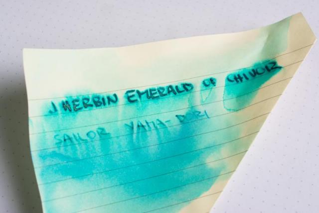
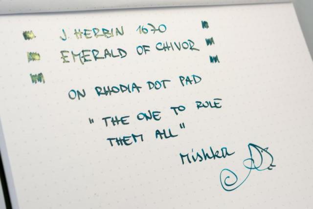
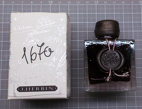
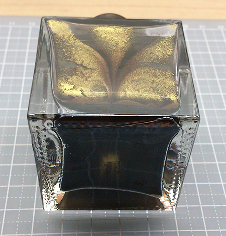
Hi, we have just got in a sample of J Herbin's Emerald of Chivor ink and it deserves a quick review. I will say this up front : this one is a game changer. J Herbin caused a revolution last year with Stormy Grey. The anticipation was incredible, the sales were over the roof...and mostly...it got people talking and writing again. Turns out, Stormy Grey was just the beginning. This year J Herbin have opted for a green coloured ink with gold specs. Here is the official info: After the 1670 Hematite Red, Ocean Blue and Stormy Grey, we now have Chivor Emerald.In the middle of the XVI century, when the Conquistadors discovered the Colombian emerald mines, in particular the Chivor mine renowned for its emeralds with bluish tints. From then on, because of their exceptional qualities, they conquered the imperial courts of Europe thanks to the Indian traders.Later, J.Herbin continued his journeys to India. It is said that he always kept an emerald with him as the virtues of this precious stone are thought to protect the traveler… It is very difficult to photograph and describe, but I will do my best. Post might be a little picture heavy The bottle is the same as other 3 Anniversary inks. Teal seal with golden thread. Specs in the bottle remind me of nail varnish. Emerald describes the colour very well. Shading goes from Vert Reseda to dark teal. Ink flow is excellent! Ink has a heavy outer contour purple sheen (just like Sailor's Yama Budo), but there is also light green metallic sheen (colour similar to Fisher's Green Space Pen). This two-coloured sheen is in my opinion unheard (un-seen) of! Just like Stormy Grey, this ink is water-resistant. Not water-proof, but if you use it to write the address on the envelope, it should be OK. So here it is...over-all very exciting ink... What do you think? Is it your cup of tea? Would you get a bottle (or two)? I have been trying to find The One and accumulated almost 100 different colours (mostly green, turquoise, gold) of ink. This one will rule them all! Mishka
-
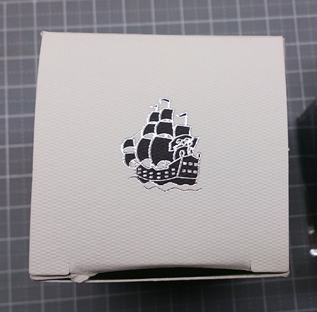
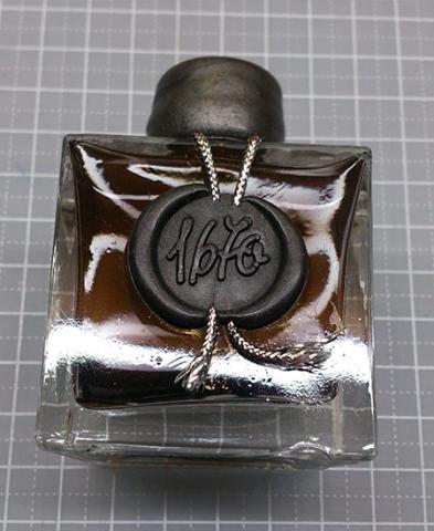
Sorry that the pictures of my last two posts had some problems showing.... This time I'm trying the "Attach files" function and photobucket, hope they both work! (they seem fine in preview, though...) ---------------------------------------------------------------------------------------------------------- J. Herbin 1670 Stormy Grey A grey ink with gold flakes, released in late 2014 by J. Herbin. This is my first bottle of shimmering ink, and I'm sure it will stay on my fascination list for a while. Look at the box and bottle design---even if you are not actually using the ink, it makes perfect decoration on the desk. It's said that the 1670 bottles are handmade, thus imperfectly shaped. I love this. (and I accidentally cracked the seal) There is a thick layer of gold flakes. I tried to take a picture of it but it sank really fast.... ....and formed an interesting pattern.... On cheap calculating paper, with Noodler's Creaper: http://i651.photobucket.com/albums/uu239/chingdamosaic/1670storm08_zpshyqjzjqq.jpg the color is a pure and clean grey, comfortable to read. When it dries, it gets a little brownish or purplish, depends on the paper you use. I didn't give it enough shake, so there weren't a lot of gold flakes here. Only visible at certain angles, http://i651.photobucket.com/albums/uu239/chingdamosaic/1670storm10_zpsbs4vm1rx.jpg or under sun light: http://i651.photobucket.com/albums/uu239/chingdamosaic/1670storm09_zpseoitpgrr.jpg And here is what it looks like if you get too many gold flakes: (with dip pen, on sketch paper) http://i651.photobucket.com/albums/uu239/chingdamosaic/1670storm11_zpsmb6npe2m.jpg You get a thick layer of gold shimmer..... and the grey ink vanishes. BTW, the bottom line is a diluted version; kind of looks purplish. And on another grid paper, with Noodler's Creaper again: http://i651.photobucket.com/albums/uu239/chingdamosaic/1670storm12_zpser4abb8j.jpg close-up 1: the shades http://i651.photobucket.com/albums/uu239/chingdamosaic/1670storm14_zps70ci3zed.jpg close-up 2: shimmer shows when tilting the paper. http://i651.photobucket.com/albums/uu239/chingdamosaic/1670storm15_zpsepobt7qx.jpg close-up 3: more shimmering http://i651.photobucket.com/albums/uu239/chingdamosaic/1670storm16_zpsyzxr4wtn.jpg Water resistance test, on MUJI grid paper with dip pen: http://i651.photobucket.com/albums/uu239/chingdamosaic/1670storm13_zpsovc5rkjo.jpg Unintentional ink drops: http://i651.photobucket.com/albums/uu239/chingdamosaic/1670storm17_zps1o2xdwkp.jpg Doodle with syringe, water, and Noodler's Creaper: http://i651.photobucket.com/albums/uu239/chingdamosaic/1670storm18_zpsfag4kzkd.jpg http://i651.photobucket.com/albums/uu239/chingdamosaic/1670storm20_zps9yair86e.jpg http://i651.photobucket.com/albums/uu239/chingdamosaic/1670storm19_zpsmkwkgzis.jpg http://i651.photobucket.com/albums/uu239/chingdamosaic/1670storm21_zpsnpfbyf37.jpg http://i651.photobucket.com/albums/uu239/chingdamosaic/1670storm22_zpsrnblcjmi.jpg AAAAAND notice the brown/bronze sheen!! (Not gold flakes) I love it but it doesn't appear all the time. And on tissue paper: http://i651.photobucket.com/albums/uu239/chingdamosaic/1670storm23_zpstjul6iae.jpg I'm surprised at the blue and violet hue, because so far these two colors never show on any pen/paper I try with. Conclusion: Very nice ink, with good flow, practical color and beautiful shimmer. Not very hard to clean from the pen. Great decoration on the desk. Recommend!! BUT if you are specifically looking for a "grey ink with gold shimmer," maybe you should check out Diamine Sparkling Shadows first, because I've seen more than one review states that its flow and flakes perform better than J.Herbin Stormy Grey. Thanks for watching this photo-heavy review! I'll end this with an Instagram-filtered pic: For more detailed Chinese review: http://chingdamosaic.blog.fc2.com/blog-entry-55.html
- 25 replies