Search the Community
Showing results for tags '146'.
-

Montblanc 146 W-Germany with busted nib...repair or sell?
GreenMountain posted a topic in Repair Q&A
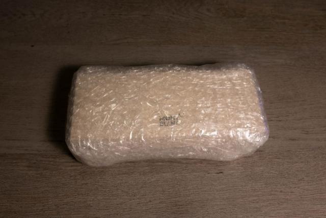
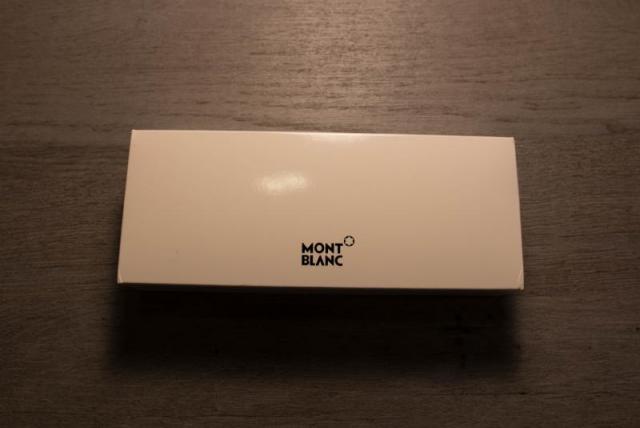
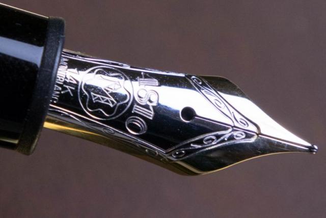
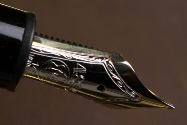
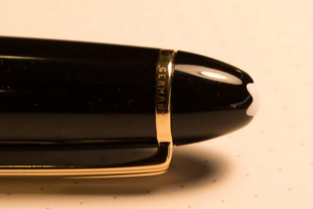
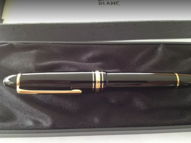
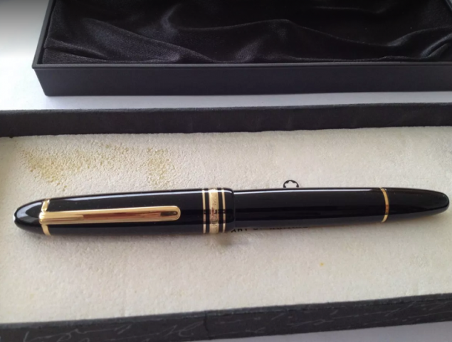
Hi! My brother asked me to dispose of a stash of pens which includes a Montblanc 146 4810 with a broken nib. Pics are attached. The pen itself seems in OK condition: some wear on the body, no nicks or big scratches, the piston mechanism works fine. I don't want to keep the pen as it is too big for me. Should I just post it on eBay, or buy a new nib and then sell it? What minimum price do you recommend, repaired or as is? The serial number on the ring is FB108683 W-Germany. Thanks much! -
Hello guys, I just bought a Montblanc pen (original i hope), used, for 200€. My pen has serial number and germany on top ring. On cap ring it has only “montblanc meisterstuck”: no pix neither n.° 146. I hope some of you guys can help me identify the year of this fountain pen (and if it is original). Thanks and happy new year!
- 15 replies
-
- montblanc
- meistertuck
-
(and 5 more)
Tagged with:
-
Here are some of my favorite fine/extra fine nibs, which I use to take notes daily. What is/are your favorite fine nib(s)? 1. Montblanc EF, 14K (as I heard a recently updated grind). Precise, sharp, and smooth at the same time. Feel like a simi-italic. I wish it could be a bit wetter (I prime it once in a while with most inks. Sailor Kobe #7 Kaikyou Blue, however, write as wet as I wish it to be). 2. Aurora F, 18K. “Responsive” to slight variations in pressure, giving a very subtle amount of line variation that won’t ruin its purpose for taking notes. Aurora pens also have the best weight-and-size balance for me, which just adds on to my love for their nibs. 3. Pilot Justus 95 F, 14K. Smooth and bouncy. Extremely reliable and present to write with. My dream pen would have a nib like this and a piston filling mechanism.
-
Two and a half years ago, I purchased a Montblanc 146 pinstripe Solitaire with an extra-fine nib. The nib wrote beautifully; but after a little while, the piston mechanism broke--despite the care with which I had treated the pen, I must add. I sent it to Montblanc for repair, as it was still in warranty. The pen came back with the piston in perfect order; but the nib had been put way out of adjustment. I then sent it to John Mottishaw, who reground it to a true extra-fine of extraordinary quality; and I have since used the pen daily. Well, this evening, the pen, which had been loaded with Montblanc Permanent Blue ink, appeared suddenly clogged and reluctant to write; so I immediately rinsed out the ink, using the piston mechanism, of course. In the process, the piston broke--again despite my gentle handling of it. I offer two questions to the experts at FPN: Firstly, is there some problem with the design and durability of the Montblanc 146 piston mechanism? Secondly, is there a problem with Montblanc's Permanent Blue ink? I should add, parenthetically, that I need to use an ink which will not wash away when exposed to moisture, rain, or spilled liquids; anything less negates the whole raison d'être of a pen, fountain or otherwise, as far as I am concerned. I should have used iron gall ink, except that I had some concerns about the effect of such an ink on the pen's sterling silver casing. I should add that I have had some very bad experiences with Montblanc's repair department in the past. They do make beautiful-looking pens, and sometimes, excellent nibs; but the company does seem to have problems which, I feel, need to be addressed better than they apparently are.
-
I purchased a Montblanc 146 from eBay. I also bought tools to remove the nib and piston units. All went well when I opened the piston end and remove the piston. I greased the barrel interior and screwed the piston unit back into the pen. Sadly, when I unscrewed the nib, I found the lip of the "feeder case" to be broken. I think I need a new feeder case. So, two questions: 1. How to I remove the existing broken feeder case from the barrel? Does it screw out from within the barrel? 2. Is there a source for buying new feeder cases? I checked on eBay, but didn't find any. To help ID my 146 year etc.: 2-tone nib, ink view with stripes, nib socket holes at 4 and 8, tracking number etched on clip, "Germany" on clip. I'm experienced with pen restoration, but I'm new to Montblancs. I know I could send the pen to Montblanc, but I'd rather fix it myself if I can get the spare part. Thanks very much!
- 12 replies
-
Hey everyone, happy Friday! simple question today, will a MB 146 nib fit the Bock housing in this pen: https://www.schondsgn.com/collections/fountain-pens/products/fountain-pens I am selling a nib of mine that I have in a Bock (250?) housing, the housing that fits a Conid Minimalistica or Regular. I am by no means an expert in anything Montblanc, or Bock, so I am just looking for some assistance here. thank you in advance, and info helps. have yourselves a great weekend!
-
Hello everyone, hope your weeks are off to a fine start. I come to you today with a very specific question: is my Montblanc 146 nib scraping its shoulders on the inside of my Conid Minimalistica’s cap? I usually use my Minimalisticas with Sailor nibs, but I have a lovely 146 nib, which I’ve had ground to a CSI, that I occasionally swap in. My question springs from the slightest scraping sensation I can feel when capping the pen fitted with the aforementioned nib. Now, both of my Conid’s are the all Delrin AVDA Phi versions, so I am unable to actually see if the nib and the inner cap are indeed making contact. I would hate to damage such a fine nib, so I am hoping someone out there with a clear capped Minimalistica is using a 146 nib and could answer my question. Thank you in advance. All the best to you and yours, Eli
-
Just got a new 146 AND my first MB in the mail! it is great, got it off classifieds. Just wanted to show it off a bit here. It is a '80-'90 146 with a full ink window (now really visible in pictures because of the ink inside) and a soft monotone fine nib. My apologies for the terrible photography (and sideways picture it seems... how to change that, I'm not sure) The only issues are some skipping problems and hard starting, which is unfortunately quite frequent, but I will try to solve that. If anyone has any suggestions I would love to hear them.
- 39 replies
-
Clash Of The Titans: M800, Homo Sapiens, 146, Justus95
TheDutchGuy posted a topic in Fountain Pen Reviews
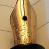
Following the discussion if someone's best pens are also their favourite pens I decided to compare my highest-pricepoint* pens: -Montblanc 146 EF ('90s pen and feed with a much earlier 14C EF nib); retails for appr. 550 euros -Pelikan M800 F ('80s pen with 18C nib); retails for appr. 500 euros -Visconti Homo Sapiens Lava Steel Midi F (23k Pd dreamtouch nib); retails for appr. 450 euros -Pilot Justus 95 M (14k nib); retails for appr. 300 euros I bought the MB146 from a local collector at a very attractive price. The M800 was a gracious gift from a friend who bought it new in the '80s and who stopped using the pen some years ago. The Homo Sapiens and the Justus were bought new in local brick and mortar stores, but with appreciable discounts. As a "challenger pen" that retails for 1/3rd to 1/2 of these pens, I added the Sailor Pro Gear Slim 'Ocean' 14k H-MF to the comparison. ^--From large to small: Justus, 146, M800, Homo Sapiens, Pro Gear Slim. Totally different design philosophies. The 146, the M800 and the Homo Sapiens are staples of pen design, the 146 and the M800 being established classics, each with its own legacy, and the Homo Sapiens already being a modern classic. The Justus and the Pro Gear Slim are more utilitarian pens where the focus is on the nib, feed and quality of writing and not so much on eye-catching design or high-end materials. ^--Uncapped size comparison. ^--Posted size comparison. The different philosophies behind these pens are also reflected in their business ends: the nibs and feeds. The 146 and the Pro Gear Slim are relatively rigid (but certainly not nails), the Homo Sapiens and the Justus are soft (but certainly not flex) and the M800 is somewhere in between. ^--Writing sample (apologies for darkness of image). A 1cm scale is included for reference. The 146 downstrokes are 0.25mm wide. Distinguishing factors As writing instruments, obviously these five pens are objectively of very high quality. All five are top-notch pens and I'd be lucky to own just one of them. Each pen does have certain positive aspects that make it unique compared to the others: -the Justus has a soft nib with variable softness control which also controls its wetness; the Justus is the largest pen in this group and it houses the much-liked CON70 converter. -the 146 EF is an architect, which was common for MB 146 EF nibs during a certain period of time. -like most Pelikan pens, the M800 has a removable nib/feed unit making it super easy to change nibs or to clean the pen. -the Homo Sapiens is made of the unique basaltic lava material from Mount Etna, which feels fantastic, and the soft 23k Palladium nib is also a distinctive element of this pen. I deliberately chose the Midi version which is still a fair-sized pen which can be used posted or unposted and fits in shirt pockets. -the Pro Gear Slim offers the unique Sailor feedback and outstanding nib/feed quality. If I were to look for objective negatives, then the following comes to mind: -my Justus had a nib that needed serious after-care, but to be fair I knew that beforehand, it explains the discount and it allowed me to tune the nib exactly to my liking; -the architect nib of the 146 isn't for everyone, nor for every style of writing: with cursive italic, the result is far, far removed from an EF line and is actually on the B-side of M. -my M800 suffers from slight baby's bottom which sometimes leads to skipping, especially on the lower half of the page (due to hand oils); -my Homo Sapiens Midi is quite sensitive to which inks it likes (and it dislikes some very common and well-behaved inks); you cannot unscrew the nib unit, nor the piston unit (at least not easily) so cleaning the pen can be cumbersome. Last but not least the ridges of the cap lock mechanism rub against my fingers sometimes. -the smallish Pro Gear Slim needs to be posted. Personal (subjective) pros and cons The M800 is my least-favourite pen in this group. There is no objective reason for this; I simply do not feel any emotion with this pen (apart that it was graciously given to me by a friend). The striped Pelikan design is not something that revs my engine, it's not my cup of tea. The nib is very smooth but devoid of character and the writing experience strikes me as somewhat clinical and sterile. Next-up is the 146 EF, which is delightful under controlled circumstances (such as journaling or correspondence) but unsuited to circumstances where you might change the writing angle (such as quick notes at work). That's how it is with architects. I like the 146 much more than the M800, I admire it as a quality pen with a timeless design and I adore the old 14C nib. But I do not grab it all that often. Next-up is the Pro Gear Slim. It was perfect out of the box and it is still perfect to this day. Spot-on, constant flow. Consistent, spot-on performance. No fuss, no maintenance. I don't care much for how it looks and the MF writes a very fine line by western standards, which makes it less suitable for quick jots at work - I need to concentrate a bit, slow down a bit, to prevent wavering and sloppiness. Fantastic pen that puts a smile on my face every time I use it. The Visconti and the Justus are so close that it's hard to pick a favourite. If you put a gun to my head then I'd pick the Visconti because its design and materials are totally unique, it writes like a dream and offers almost the same softness and line variation as the Justus. If the house burned down, the Visconti is the one I'd save. Having said that, the Justus is much lighter and fits into the hand much better. Best vs favourite The M800 is top-tier pen that I just don't care for as a writing instrument (apart from how it came to me; I'll always cherish it for that). The Visconti has some drawbacks, as mentioned, but I'm extremely attached to it. And given its price point, it's hard not to declare the Sailor as the "winner". *I have about 20 pens, the remaining 15 being in lower price brackets. Some of those I love as well, such as my Leonardos or trusty Kaweco AL Sport. I restricted myself to the five most high-end pens that I own, realizing full well that I do not own "real" high-end pens like Scribo, Nakaya, Namiki, etc.)- 29 replies
-
- m800
- homo sapiens
-
(and 3 more)
Tagged with:
-
i recently purchased 2 montblanc 146s both from japan. 1 is the Montblanc 146 Platinum in "Fine" nib (stated in the box with the F sticker), and another monotone nib Montblanc 146 in "Medium" nib (stated by Kingdom Note). When i received them i believe there is an error somewhere. The platinum should be in M and the monotone nib in F/EF? Variances between them that made me think that either one of them might be fake? Monotone Nib Montblanc 146 White Logo on cap has slight protrusionsTop cap trim just stated GermanyNo inner clip engravingsBottom cap trim stated Montblanc meisterstuck no 146 (note the font differences)Nib writes like EF/F but stated to be M by sellerpiston filler Feed differsSkipping/Irregular Ink Flow Platinum Montblanc 146 White logo on cap does not protruteTop cap trim states serial number onlyInner clip engraving stated Made in Germany METALbottom cap trim stated Montblanc Meisterstuck (note the font differences)Nib writes like M but stated to be F due to F sticker in the boxpiston fillerFeed differs
-
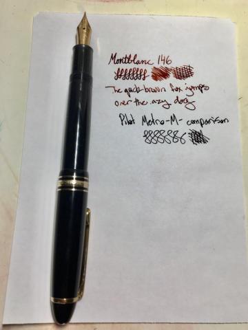
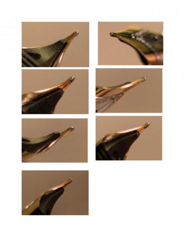
I have recently got a new Montblanc 146 EF via ebay bidding and it was quiet a good deal. I am currently looking for nib adjustment to both of my Montblanc 146s: one in EF and one in F. It is very likely that I will have them being taken care of at the SF pen show. I want to share with you guys some close-ups I took for the 146 nibs. I also included my brief thoughts of the nibs and a comparison of these nibs to the other pens I own. I also included a small writing sample at the end. I would love to hear your thoughts. Thank you! The Montblanc 146 in F Through the fountainpennetwork website, I was told that this pen was the model from the late 90s. I absolutely enjoyed the grind of the nib. It has a very special shape and I absolutely enjoyed it. The very slight feedback of the nib makes me never want to stop writing with it. I have to say that when it comes to smoothness vs. feedback, this pen is my absolute best – there is no second. The only issue I have with it is that after writing with it for a long period of time, the flow of it could decrease and it causes hard-starting issues. My current solution is to prime the feed by using the piston. It is impressive to note that I actually prime the feed even if the pen hasn’t hard-start yet. I have to say that I enjoy a bit wetter feel - it allows the ink to show it’s beautiful color variations. The Montblanc 146 in EF Through what I have learned so far, I believe this pen is manufactured quite recently. It has a very different grind than the older Montblanc nibs. Instead of looking like a “tear-drop” like my other 146 in F, the nib is flatter and more square-like. Although I never own any italic nib, the quite different writing experience makes this 146 seem like one to me. It is very fine - as fine as my Justus 95 in F. When writing in my most comfortable angle (about 45 degrees from the surface of the paper), I found the horizontal strokes are slightly narrower than the vertical ones. Furthermore, when writing with a smaller angle to the paper, I found it gives me a wider line - it can be as wide as the 146 in F. The nib also has very characteristic feedback. The feedback is less than my Sailor 1911L in MF while more obvious than my Justus 95 in F. To put the thoughts together, this nib is rather special. I like it. However, I have to actively think about “how to write well” when I use it - different from my 146 in F, which I can just write with more ease. The solution to this in my mind is to probably make it a bit smoother and wetter. I obviously need more suggestions on this since I’m not very sure about it. Comparing these to pens to my other pens I will talk about what I like about my other pens in this section so that you can have a better understanding of what I enjoy. First is my Lamy 2000 in EF. It is very smooth and the perfect has the wetness. The width of the pen is perfect. The downside is that it is can scratch the paper when slightly rotated and the weight of the pen is not the best for me (on the light side) When it comes to my Pilot Justus 95 in F, I have to say it is near perfect for me. The pen is smooth and writes as soon as it touches the paper. I love how sensitive the nib is and enjoy the wetness of it when it is set to the softest setting. The only downside of the pen is that I would prefer a piston filling mechanism than a converter. I also want to talk briefly about my Custom 823 in M and Sailor 1911L in MF. The 823 is my most smooth nib and it can hard start sometimes (which I am also interested in fixing, I also would prefer a slightly finer nib). The Sailor 1911L is very wet, and I love it. I also enjoy its special feedback - but I would not want that on every nib of my pens. Short writing example:
-
-

Diamine Frosted Orchid Ink - Safe For 146?
Zlh296830 posted a topic in Fountain & Dip Pens - First Stop
I recently got Diamine Frosted Orchid Shimmering Ink, is it safe to use in expensive pen like montblanc 146? Will it clog the pen? Is it hard to clean? -

New Montblanc 146 From Ebay Need Help On Authanticity
Zlh296830 posted a topic in Fountain & Dip Pens - First Stop
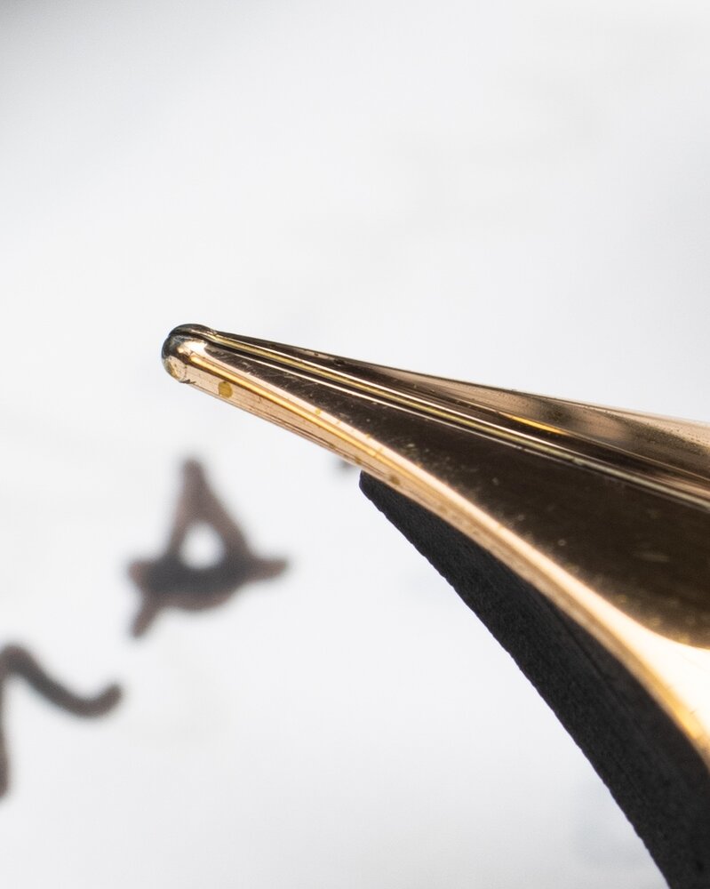
I just got this Montblanc 146 F nib fountain pen from a ebay bid. It was claimed to be new. It looked new too. But the nib was misaligned. You can see in the picture. I spend about an hour and I was able to realign the tines. I am very new to Montblanc and this is the first ever Montblanc pen of mine. I need some help conforming its authenticity. I got it for $251 plus $15 shipping from Italy to California. There were no one placing bid until the very end of the listing. Some one else placed bid before me. I won in the end. Thank you guys! Note that I did use a strong flashlight to illuminate the cap and saw that the material of the cap did had dark red light emission. The weight of this 146 is very similar to my Pilot custom 823. I would say this 146 is a tiny bit heavier. Lastly, I could NOT find "Pix" ANYWHERE on this pen. I will attach a lot of picture here just to make more opportunities for you too look at the details of my new pen. Pictures:- 13 replies
-
I just got this Montblanc 146 F nib fountain pen from a ebay bid. It was claimed to be new. It looked new too. But the nib was misaligned. You can see in the picture. I spend about an hour and I was able to realign the tines. I am very new to Montblanc and this is the first ever Montblanc pen of mine. I need some help conforming its authenticity. I got it for $251 plus $15 shipping from Italy to California. There were no one placing bid until the very end of the listing. Some one else placed bid before me. I won in the end. Thank you guys! all the details and pictures are in here: https://www.fountainpennetwork.com/forum/topic/347005-new-montblanc-146-from-ebay-need-help-on-authanticity/
-
I recently acquired a 146 Bordeaux and that has a scratchy nib. I took a look at the nib with a 10x loupe and it appears the tines are not properly aligned. Does anyone know if Montblanc will tune the nib if I send it in for servicing? Or will they consider the nib damaged and require me to do a nib exchange? Note: I'll be sending it in for servicing anyways since it's scratched all over the pen, just worried they'll write-off the nib and make me get a new one. In which case, it would be better to send it off to get adjusted and ground down to a fine first.
-
This thread is for the fans of Frankenpens like me Story short: I own a Pilot 823 with a broad nib and I like the pen but dislike the nib. So I am looking for a nib replacement and Montblanc 146 nibs are normally nice to use and can be bought individually. I already tried to fit a JoWo nib from Franklin-Christoph, but it's too long. Has anybody ever tried to fit a 146 nib in a 823? I worry more about the length of the nib since Pilot nibs are usually short. The width seems to be pretty much the same (#15 from Pilot and #6 western nib) Maybe a nice Waterman vintage nib from the 1920s to 1940s would do the job?
- 17 replies
-
- nib
- frankenpen
-
(and 2 more)
Tagged with:
-
A Tale Of The Lesser Flagship Of Montblanc : The Meisterstück 146
sannidh posted a topic in Fountain Pen Reviews
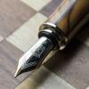
Loved the MB's flagship pen review by Betweenthelines. And then realized, I was yet to post a review on FPN for the lesser one, the 146. As for me, I came across a real Montblanc pretty much later in life, though used to love a pen called Camlin Premier during school days. It came with a 1-pen leather pouch, an additional screw-fit nib and it did have those striped ink windows. I say I loved it, but never wrote with it since it belonged to my dad and I was a small kid. Back in 1999-2000, it cost around USD 5.00 and it was a hefty price tag for any locally made fountain pen. Later I did realize that it was yet another MB 146 inspiration, when I went to a pen store in Calcutta. So here goes my review @ blogger too with some more pics: A Tale of the lesser flagship of Montblanc : The Meisterstück 146 A BRIEFER HISTORY IN TIME MONT BLANC As most of you would know, Montblanc was started in 1906 a Hamburg banker, Alfred Nehemias, and a Berlin engineer, August Eberstein as Simplizissimus-Füllhalter which means Simplistic Fountain pens, after they learnt about fountain pens with ink tanks from the US. By 1908, three other people by the name of Wilhelm Dziambor, Christian Lausen and later Claus Johannes Voss had taken over the business and the company took the name “Simplo Filler Pen Co.” which referred to a fountain pen design with a built-in ink-tank. In 1909, a safety fountain pen made up of hard rubber called “Rouge et Noir” was launched, which actually means Red and Black. The pen consisted of a red cap and a black body, perhaps inspired from a card-game. You can also find a limited edition of the same. In 1910, the company became Mont Blanc, inspired by the highest peak of the Alps (4810 m) and a pen called Montblanc was introduced with a white tip (which would later evolve into a white star in 1913). In 1926, the Meisterstück was launched. By 1929, the nibs were engraved with 4810, the official height of Mont Blanc peak, as an allusion to supreme quality and craftsmanship. The flagship Meisterstück 149 was launched in 1952, evolving from celluloid & brass mechanism to resin & plastic mechanism over the years. For the Meisterstück 146, the ink windows were modified to striped version somewhere around the 1970s from clear blue window and the the two-tone nib was introduced in 1993-94. As far as the model numbers XYZ (146) are concerned, MB did traditionally follow a naming convention, albeit in a rather loose mannerX or 1: Tier of pen, 1 - Top class or Meisterstück 2 - Medium range & 3 - EconomyY or 4: 0 - Safety filler, 2 - Button Filler, 3/4 - Piston FillerZ or 6: Nib size, 9 being the largest MB eventually stopped production of all economy pens in 1992. DESIGN (5/6) The pen is made of glossy 'precious resin' (a custom variant of Polymethyl methacrylateaka PMMA) and is adorned plated rings and bands. Glistening golden with the subtle shine of black preserve a culture while adding a modern luxurious touch. This specific cigar shape was later copied around the world by many leading pen makers, over decades till date. The cigar shape was invented by Sheaffer Balance in 1928. The 146 also comes with platinum plated trims. The resin does feel substantial to hold, but it's also prone to scratches, if due care is not exercised. http://2.bp.blogspot.com/-Bdf5EwHxYco/VaEdqGTo-GI/AAAAAAAAEw0/d-mgo1330LE/s1600/DSC_1786.jpgWith a minimalist piece of design, the clip does start with a tiny piece of elevated ramp. The cap bands and the rings follow the same equation till a ring separating the piston end concludes both dazzle and design. The clip is tension fit and carries a serial number and GERMANY along the ring. On its underside it may or may not carry the engraving of Pix, depending upon the year of manufacture. Montblanc included the trademark post 1997. There are a lot of Chinese fakes flooding both online and offline channels, which is why Montblanc has to come up with newer and innovative trademarks with every model. http://2.bp.blogspot.com/-NRQ0HCyiSbE/VaEdpgbgWkI/AAAAAAAAEww/t6HaP1PAD-I/s1600/DSC_4304.jpgThe cap unscrews with a single turn revealing a dazzling two tone nib along with a striped ink window. I like the ink-windows very much. http://2.bp.blogspot.com/-JDI6YLg1mQs/VaEeC3KPgeI/AAAAAAAAExI/PpEzAndAV40/s1600/DSC_4322.jpg The cap does mention MONTBLANC - MEISTERSTÜCK etched across the broader of the concentric golden bands, in a cross-hatched font while two thinner bands above and below render the differential aesthetics. The finial carries the white-star.http://4.bp.blogspot.com/-t_EFEBqFTIg/VaEdWzZ1XtI/AAAAAAAAEwg/tn6K260KlYI/s1600/CapC.jpg FILLING SYSTEM (6/6) The piston is distinguished by a golden band and has an easy and a hassle-free mechanism. The piston end unscrews with less than three rotations and as the white piston head moves along the ink-windows, ink gushes into the barrel. A brass connector gives the necessary weight to the barrel.http://2.bp.blogspot.com/-OOGMOsyTrIg/VaEd-CQOqHI/AAAAAAAAExA/0Y8dcje74k4/s1600/DSC_4323.jpg NIB - ALL THAT MATTERS (6/6) The dazzling two-two nib is tested by hand, and it comes in eight different widths including the common widths of EF, F, M & B. And this silvery rhodium finish provides both glitter and glamour. A golden decor runs along the shoulders of the nib and it converges across the outer tines onto an iridium tip, while the rhodium silvery finish diverges from the breather hole across the inside of the tines and over to the tail. A bounded layer of arabesques & curves segregates the rhodium and gold decors. Then, there is a dazzling white M logo resting inside the encircled star, above which rest the height of Mont Blanc peak, 4810 (m). This one is a fine nib and writes quite wet and smooth. The tail end specifies the composition (58.5% Au) of the gold-alloy used. Above it rest the specification 14K and brandname of MONTBLANC. There is no width specified on the nib itself, unlike others.http://2.bp.blogspot.com/-15f8N4cwztg/Vf0EnKnBu6I/AAAAAAAAFhM/Yve04cKG-ns/s1600/DSC_6351.jpgA standard black plastic feed with finely spaced fins (earlier ones had ebonite feeds) ensures a good ink buffer for the awesome wetness and prevents hard starts. By the way, I just love the ink windows.http://3.bp.blogspot.com/-tRJBu8G6-gw/Vf0Et4j5lZI/AAAAAAAAFhY/ffaTbAgFWvs/s1600/DSC_6360.jpg PHYSICS OF RELATIVITY (6/6) It does give a comfortable feel to write with the pen without posting the cap. The overall capped length is around 14.2 cm. The pen can be used posted without any feeling of top-heaviness as the weight of the cap is less than a third of the total weight, with a comfortable grip of 1.2 cm.Uncapped Length ~ 12.4 cmPosted Length ~ 15.6 cmNib Leverage ~ 2.4 cmOverall Weight ~ 31 g (Cap Weight ~ 9 g)Below are the pictures along with a Pelikan m805 and a Pilot Custom 823 for your reference. http://2.bp.blogspot.com/-9cEZUiQx1Ow/VaEeVgzlMiI/AAAAAAAAExQ/ebKpXBCOoak/s1600/DSC_4360.jpghttp://4.bp.blogspot.com/-b4ug3mQy5cY/VaEee7RkPyI/AAAAAAAAExg/JKVrY2iUfOc/s1600/DSC_4379.jpghttp://2.bp.blogspot.com/-IXL8Je6WvTI/VaEeZFRv8GI/AAAAAAAAExY/zsBQQ5L1UUM/s1600/DSC_4371.jpgECONOMIC VALUE (3/6) This one defies both logic & gravity and the pen retails at more than USD 750. The price puts most of the fountain pen people off, while getting a pre-owned one from your uncles (well nothing like that! or buying it at a good discount) can save some money. You can also get hold of a MB boutique sales person selling off some older generation demo pens at a good discount. When it comes to the internet, one has to be careful regarding the abundance of fakes in the online marketplaces and the best fakes are costly and are quite difficult to identify without experience. Value for money? I doubt. Heritage Value? High. You can probably pass on the pen to your next generation and they would still recognise it as a brand. Can I pass on the same emotional value with a say, Pilot Custom 845, outside of Japan? I doubt. This will probably need some internet searches, before one realizes the true value of the pen. OVERALL (5.2/6) The writing experience is amazing although I do find the pilot custom 823 and m805 being equally good when it comes to nibs of similar size and constituency. There is a hint of spring and softness in the nib and an absence of any line variation between the horizontal and vertical strokes. The lines dry relatively quickly with a MB Toffee Brown ink taking around 25 seconds on MD Paper. And you get a nice shading too!http://1.bp.blogspot.com/-dDdiKKFeJ94/Vf0ExcEcTAI/AAAAAAAAFhk/gsIvnhXgG20/s1600/DSC_6286.jpgComparatively, a custom 823 with a medium nib, draws a line, thinner than both 146 and m805 fine points and dries quickly. On a smooth MD paper with stock pelikan 4001 inks, it took more than 30 seconds to dry the dots put by the 146 (as well as the m805). Final Toffee Posehttp://2.bp.blogspot.com/-aFyTIagg_s4/Vf0EyWgzXJI/AAAAAAAAFho/-d2kcXs6_UU/s1600/DSC_6304.jpg REFERENCES Montblanc WebsiteGentleman's GazetteForbes Article Model Numbers Thank you for going through the review. You can find some more pen and paraphernalia reviews here.- 22 replies
-
- montblanc
- meisterstück
-
(and 5 more)
Tagged with:
-
Hello everyone. This is my first post, so apologies in advance for any mistakes I decided to buy my first fountain pen with a gold nib and this Montblanc 146 seems to be in a good price and condition (apart from the beaten up box which will go in the bin). I did some research and it looks real to me, but I wish someone more knowledgeable could confirm it. So... does it look real?
-
Hello all! Not new to fountain pens, but new to Montblanc (finally!). I acquired a Meisterstuck 146 Le Grand, unused, but with the signature engraving on the cap that I can not decipher. It is really very nicely done so I am wondering is it a certain edition or just a very neat personalization? I trust you will know. Thanks!
- 16 replies
-
- montblanc
- meisterstuck
-
(and 2 more)
Tagged with:
-
Call me crazy.. is it possible to swap a Montblanc nib onto a Pelikan nib unit? did some research without any findings. Looking at the Pelikan M1000, the nib looks awfully disproportionate while the Montblanc 149 nib looks asthetically more pleasant. My question is.. has anyone tried to swapping a 149 nib in a M1000? or a 146 nib in a M800? I know it's a sacrilege to do/ask that ):
-
Hi! Ive been the owner of both pens for quite some time (less than a year still) and I begin to think about re-adjusting the pens in my current collection. So far, Ive sold two 149 as the size doesnt suit my daily use. But I cant decide between platinum trim 146 and 1912. The 1912 is unique and perhaps in its own league. I used 1912 along with pelikan m800 for a while and decided to sell the pelikan. 1912 is, in my hand ymmv, just a better writing instrument (except complex filling system and a bit of what seems like an erosion inside the cap). The 146 feels slightly more reliable. Nib is decent, but lacking character if compared to 1912. Im leaning towards selling 146 as it might be more easily replaced by other pens, and is easy to acquire. (Also because I have some WEs, basically the same sizewise) But then again, it is classic and simple enough that I wanna keep. Which one do you think is a keeper?
-
Hello All, Ive just recently embarked on my journey to collect fountain pens, so please forgive me for my inexperience. Ive always loved the look of the Montblancs, and I happened to stumble upon an eBay listing for a 146 in (seemingly) good condition. However, knowing its from eBay, Im unsure if it is a genuine pen or just a high quality fake. Ive looked closely at the pictures and it seems that the engraving on the nib looks a bit off to the left. Knowing I probably cant tell the difference between a real and a fake, I need advice whether or not to purchase this pen Thanks in advance. Alan eBay listing: https://www.ebay.com/itm/FOUNTAIN-PEN-MONTBLANC-146-WITH-BOX-NIB-F-mad21/192475486965?hash=item2cd06edaf5:g:swsAAOSwBwBanwgf
-
Long-time lurker. Dropped by after viewing a pre-loved (possible) 146 in a local shop. It's up for sale for £150, but subject to offers. It comes in a nice square box with a bottle of black ink (dated 2013, use by?). The inside of the box is somewhat stained by different colours of ink in the pen storage and bottle storage areas, as though the ink bottle has been replaced when the bottle was wet or the pen put away or taken out by inky fingers. There is a GERMANY mark on the cap ring, a blue/grey non-slatted ink window and MONTBLANC MEISTERSTUCK 146 on the barrel, but I have yet to get the pen to 'glow red' when a torch is used, and I think it could be of a pre-pix and serial number vintage. The nib is full gold, marked 4810 (M) 14C and non-magnetic. A demonstration shows it will expel and draw ink when the mechanism is unscrewed/screwed revealing a black, plastic thread under the gold ring. General wisdom on here says that the piston fillers are too complicated/expensive to reproduce, and the better option is for cartridge/converter pens to be made instead, but is that still the case? I may go back for a second look later today and provide pictures (if permitted) to help confirm or debunk its authenticity. Any advice would be welcome, I may then go onto how to get my Parker Falcon to write consistently.... Thanks.
-
Received a newsletter by email this morning from Fritz Schimpf promoting a special edition MB 146 with what appears to be an italic nib. Interesting writing samples. https://www.fritz-schimpf.de/Schreibgeraete/Fuellhalter/Montblanc-x-Fritz-Schimpf-Sonderedition-Italic-100-Kolbenfuellhalter.html?utm_source=CleverReach&utm_medium=email&utm_campaign=Newsletter+Herbst%2FWinter+2017&utm_content=Mailing_10553580
- 81 replies
-
- montblanc
- fritz schimpf
-
(and 2 more)
Tagged with:


.thumb.jpg.94aa1ca9fdc0850ef60de85bd24d3169.jpg)


