Search the Community
Showing results for tags '#8'.
-
For a possible pending purchase the nib will be a Bock #8. Any user experience on the difference between the gold one and the titanium nib of that size? How do they relate on size (M to B , flex (and perhaps stub or not)? Currently I have a Bock #6 titan B in daily rotation. The new one can use some extra caracter (titan M stub, gold B,...) I suppose it will be possible to testwrite the nibs, but some user experience might be very usefull of course.
-
can anyone give me a heads up as to what gold #8 nibs people have swapped into their conid kingsize with a high level of compatibility ? thinking of buying a kingsize and wonder if there are options for nib swapping with this particular model ?
-
So, here I am, on the edge of getting a Danitrio Mikado (midori-dame) and trying to decide what nib should I arm it with. If I understand correctly, from what I have read these days, it seems that Danitrio used to offer 'soft' (semi-flex) and 'stiff' #8 nibs. But apparently they don't do that any more (since when? Why?). Their catalog, today (August, 2016), states: "#8, 18k gold nibs for Mikado, Genkai, Sho-Genka, are available with F, M, B, and Stub". I have asked the lovely people at nibs.com about adding some flex to one of these nibs and they answered that "adding flexibility (to a 18k gold nib) is not something we can do that well". So, here I am, trying to decide what stock nib to get... I love line variation. Normal writing, for me, must have some "calligraphic options". And in such a pen (wow! I'll include some pics) you better have the right nib to help your wild calligraphic fantasies blossom. So, does anyone have experience with the nibs Danitrio is currently using (that is August 2016)? Are they super-stiff? How wide is their stock stub? Could you get some line variation from the M or F nibs by applying some pressure? For comparison purposes, I have a Nakaya cursive italic that was grind by John Mottishaw from a BB. I love it (and it writes like a dream), but it is stiffer than I'd like it to be. Can someone tell his/her experience with customized Danitrio nibs? Thank you for your feedback Salute! pd. I took the photos from nibs.com (and thank them) with the sole aim of sharing the beauty of this pen. http://www.nibs.com/www/WEBSITE%20PICS/Danitrio/danitrio-mikado-without-clip-midori-dame-uncapped.jpg http://www.nibs.com/www/WEBSITE%20PICS/Danitrio/danitrio-mikado-without-clip-midori-dame-nib-detail.jpg
-

Review Of Fosfor Rajendran (Aka Desi Kop) With Jowo #8 Gold Nib
Prithwijit posted a topic in Fountain Pen Reviews
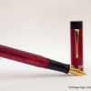
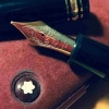
Introduction During the early phases of my renewed fascination for all things fountain pens there was one model that reigned supreme amongst my list for grail pens and that was the Sailor King of Pens. Everything about it seemed to be just about perfect – the torpedo shape, the ebonite material and the large sized fabulous Sailor nibs. It was just a matter of time before I got one for myself. Two sailor pens and their less than perfect nibs later, my enthusiasm for the KOP started to wane a bit. I had realized that the tip shape and design of the stock sailor nibs (Naginata Togi or Nagahara special nibs excepted) was something that just didn’t suit my grip. The relatively small sweet spot meant that I quickly ended up in the scratchy zone and calling it feedback wasn’t about to change my opinion. I had also realised that the KOP actually wasn’t a full ebonite what with its plastic feed, plastic section and the section-barrel joint made of metal. When fellow FPNer Sudhir allowed me to write with his stock Broad nibbed Sailor KOP, I seized the opportunity to assess my purchase decision. I decided that while I may still go for a special nib KOP later, right now I would not enjoy a KOP with any stock nib. While that decision was made, I was not about to give up so easily on getting my grail pen even if that meant getting one made to my specs and sourcing everything myself. With unwavering focus, I started procuring everything to get the pen of my dreams – I scoured for the best possible ebonite material available for pen-making and zeroed down on some vintage Italian mottled reddish-brown ebonite from a source in the Europe. For some time I toyed with the idea of going with SEM Cumberland or Eboya, but this one just seemed better.I decided to go with a Jowo #8 nib in western medium with a hand cut ebonite feed from WIN. Rather than going for the stock motifs, I decided to source an absolute plain one so that I can have my own design engraved on it.I wanted a roller clip like on my Omas or Delta rather than the stock KOP clip design. Luckily my pen-maker arranged for gold plated roller clips.In order to make the pen I approached Mr. Manoj Deshmukh of Fosforpens. He had made a few pens for me before and was willing to take up the challenge. I decided to call the pen Rajendran which means King in Sanskrit as a homage to original KOP which inspired it. Design The KOP design is a classic and all of you are well aware of it. So instead of wasting any time typing about it, I will let the pictures do the talking. http://i1097.photobucket.com/albums/g346/prithwijitchakiPrithwijit/Fountain%20Pen%20Reviews/Fosfor%20Rajendran%20Review/IMGP2148_zpsv4kcczjn.jpg http://i1097.photobucket.com/albums/g346/prithwijitchakiPrithwijit/Fountain%20Pen%20Reviews/Fosfor%20Rajendran%20Review/IMGP2142_zpsem9s8tav.jpg Size and Balance At 155mm capped, the KOP/Rajendran is the leader of the oversized pens club. But the ebonite build and absence of metal anywhere other than in the nib and the clip means that the pen is delightfully light. It is nicely balanced and is very comfortable to write for extended periods. Writing with the pen makes you completely forget it’s considerable length and the customized section design adds considerably to the comfort quotient. I don’t write with the cap posted, but it can be done if so desired. But posting such a large pen does result in a slight rearward weight bias. Nib I had looked around for a nib that would be similar in size and stature to the large Sailor nibs used in KOP and finally decided on a #8 sized Jowo nib made of 18K gold material with medium tip. The complete nib unit is sold by WIN through their distributors (Fpnibs and Asapens) and comes with a nicely finned ebonite feed. Unlike most nibs which comes with pre-embossed or engraved motifs, I actively scouted around for a nib that would be absolutely plain with no design. This allowed me to engrave on the nib a small monogram of my own. The design is one that I made myself and it is essentially my initials enclosed inside a tiny shield akin to the coat of arms of yore. http://i1097.photobucket.com/albums/g346/prithwijitchakiPrithwijit/Fountain%20Pen%20Reviews/Fosfor%20Rajendran%20Review/PC20Logo200120JPG_zpsbayvjecq.jpg Image: Monogram design – Initials enclosed inside a shield Manoj doesn’t do engraving himself, but he actually looked around for people who do so and was able to replicate my exact design on the nib. Needless to say, I am elated that my dream has finally been realized and the gamble (of a plain nib) has paid off. http://i1097.photobucket.com/albums/g346/prithwijitchakiPrithwijit/Fountain%20Pen%20Reviews/Fosfor%20Rajendran%20Review/IMGP2138_zpse1q5xpao.jpg Image: Monogram design successfully replicated on the nib – the ultimate customization Filling Mechanism I love cartridge converter pens and that is one of the reasons I like the original KOP as well. The Rajendran beats the stock KOP in this regard by using the standard international system for cartridges and compatible convertors rather than proprietary ones. I like this system better than the original because of the wide compatibility, system life longevity, value and convenience. The ebonite feed of this pen is paired with a Schmidt K5 converter to use bottled inks and it can also accept cartridges from a host of brands. http://i1097.photobucket.com/albums/g346/prithwijitchakiPrithwijit/Fountain%20Pen%20Reviews/Fosfor%20Rajendran%20Review/IMGP2147_zpsiv2mfcoa.jpg Build Quality Manoj has built a reputation for himself as a craftsman with unparalleled focus on quality. He has demonstrated that in all my pens, but has somehow managed to simply surpass all his previous endeavours with this pen. The shape, the fit, the threading, buffing/polishing and the finish are impeccable for a handmade pen. The allowance to tolerances have been kept to a bare minimum and it is obvious that the pen has been made with considerable care to ensure a very high quality product. http://i1097.photobucket.com/albums/g346/prithwijitchakiPrithwijit/Fountain%20Pen%20Reviews/Fosfor%20Rajendran%20Review/IMGP2145_zpsdnklgzno.jpg Writing Experience This where the rubber hits the road. I have always been very happy with Jowo nibs and quite naturally the expectations from this nib was pretty high. I am happy to say that the nib has met its potential and then some. This is a tad wider than #6 Jowo medium nibs but still can comfortably be considered a medium nib. It is smooth, wet and lays down a nice wet line without any skips or false starts. The pen is a superb writer and a better performer than the stock Sailor nibs as far as my grip is concerned. I have been using this pen with Waterman serenity blue for about six weeks now and six fills later, I can safely recommend it to anyone who might be interested. The ebonite feed in this pen was a revelation. There is something about good ebonite feeds that just adds magic to your pens. This feed is very much like those of OMAS and is super wet without being a gusher. The extra lubrication afforded by it makes the writing experience that much more enjoyable. I particularly like the sheen that ebonite feeds seem to exhibit as ink droplets percolate into the fins. The only drawback is that the feed isn’t flight safe like the plastic Jowo feeds and there is some leakage on high altitude flights. Price and Value The Fosfor Rajendran is not a cheap pen. No expenses were spared in procuring the best material, the best nib and the best workmanship and all of this adds to the pens price. I could have bought a few very nice and expensive branded pens for the price I paid for it. But none of them would have been able to offer me the satisfaction and the value that this pens offers. So it is only fair that I make a clear distinction between the value proposition of the pen as made by Fosfor versus the cost of materials that I have procured myself. As a standalone pen shaped like the classic KOP, it is incredibly VFM. I am aware of no other pen maker in India who offers this level of quality and individualization at this price point other than Manoj and Mr. L Subramaniam of ASA Pens. In this particular case, Manoj was simply outstanding in hearing me out, understanding my needs and wishes and what is likely to give me the sense of satisfaction and pleasure. He even went out of his way to procure taps and dies for my special nib. That must have cost him more than what I paid him for4 this pen. Such service and customer orientation remains imprinted in your mind long after the cost is forgotten. Specifications The measurements in this section have not been taken with any precision instrument or laboratory techniques but should suffice to give you a fair idea of the size of the instrument. Length (capped) – 152.5 mm Length (uncapped) – 131 mm Length (cap) – 73.5 mm Length (section) – 20 mm Maximum width – 17.5 mm Maximum section width – 13.7 mm Minimum section width – 12 mm Conclusion Not everyone can understand why I paid substantial amounts on getting a KOP made to my specs rather than getting a stock one. I guess to me the importance of the attributes of the pen far exceeded any brand name it carried. As I look back as to what I have gained over a stock pen by going the custom route, I can safely tabulate quite a few pros - True vintage Italian reddish-brown mottled ebonite rather than stock black or expensive Urushi coated models.A wonderfully wet and nicely finned ebonite feed rather than a plastic one (this may not very important in the overall scheme of things, but would certainly be useful if I ever have to do any heat setting).Complete ebonite body with no plastic or metal parts. This means the pen is very lightweight and supremely balanced despite being oversized.A section that has been designed and sculptured based on my preferences.A nice oversized and dependable (to me) western nib.The “PC Shield” that would not be possible in a normal nib.A nice and smooth roller clip.International standard cartridges and converters instead of proprietary ones.To summarize, I have certainly been able to fulfill my objectives with this pen. It is nice oversized but comfortable and well balanced torpedo shaped pen. The writing is super smooth thanks to the beautiful Jowo nib paired with the wonderful ebonite feed. The roller clip is a wonderful thing to have and Fosfor quality and finishing comes through. This is certainly the right pen for me. Whether it will be the pen for you will depend on what you value in a pen. If you would love a Sailor KOP as a brand then you should certainly go for that instead of this. But of you value your personalization and writing comfort (in such cases where it is applicable), then you can certainly evaluate this option. Useful Links Very good Woodgrain ebonite blanks can be sourced from www.theturnersworkshop.co.uk German nibs of your choice can be sourced from www.beaufortink.co.uk or www.asapens.in Pen made by www.fosforpens.com -
JoWo offers some big sized #8 nibs in 18K gold, equipped with Ebonite feeders. I am hoping members who have used this nib will share their experience with it, good or bad. Thanks! Hari


