Jump to content

Pelikan Turquoise


chkuo

Recommended Posts

  • Replies 11
  • Created
  • Last Reply

Top Posters In This Topic

  • chkuo

    3

  • gibsona9

    2

  • derkleineHerrFriedemann

    2

  • Doug Add

    1

Thanks much for the review. Another helpful tool.

May you have pens you enjoy, with plenty of paper and ink. :)

Please use only my FPN name "Gran" in your posts. Thanks very much!

Link to comment
Share on other sites

does anyone find this a bit dry?


i bought some carts for my Retro 51 Tornado (which only takes small carts) the other day. It's the pen I use at work. And it writes sooooooo dry with this. I do love the color.


EDIT: it seems to be writing better now, but I think it's another case of Pelikan inks making pens into hard starters. I had this issue with Pelikan Black in many pens.

Edited by AlejoPlay
Link to comment
Share on other sites

I like the sheen I get from this ink when it dries, and the shading. Unfortunately, I haven't used it much lately as a stand-alone ink. I have been using Waterman South Sea Blue for my turquoise.


However, it is a mainstay in my teal mix which is 6:1 Pelikan Turquoise/Private Reserve Sherwood Green.

Link to comment
Share on other sites

Very nice. I've taken to using this lately, in place of my usual blue/black/blue-black staple.

Looking to exchange ink samples! Available: Noodler's Bulletproof Black, Noodler's 54th Massachusetts, Noodler's Black Swan in English Roses, Noodler's Bad Belted Kingfisher, Noodler's Operation Overlord Orange

Link to comment
Share on other sites

  • 2 weeks later...

Just bought a bottle of Pelikan Turquoise today, and I love it.


I was really looking for an intense, royal blue color. I looked at Private Reserve American blue - too dark. Parker blue, nice blue with slight hint of purple, but too dark for what I was looking for.


Then I saw the Pelikan, and I was worried it would be more blue-green. I already own a bottle of PR Blue Suede, which is a wonderful teal, so I didn't need another teal...


But it seems, as you say, the Pelikan is more blue than turquoise...just a pretty shade, like water in the Bahamas!


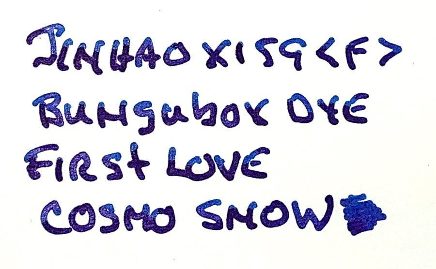
Here's a sample I made this afternoon:


Link to comment
Share on other sites

Just bought a bottle of Pelikan Turquoise today, and I love it.


I was really looking for an intense, royal blue color. I looked at Private Reserve American blue - too dark. Parker blue, nice blue with slight hint of purple, but too dark for what I was looking for.


Then I saw the Pelikan, and I was worried it would be more blue-green. I already own a bottle of PR Blue Suede, which is a wonderful teal, so I didn't need another teal...


But it seems, as you say, the Pelikan is more blue than turquoise...just a pretty shade, like water in the Bahamas!


Here's a sample I made this afternoon:

Nice handwriting! I feel so embarrassed. :embarrassed_smile:


I am searching for an intense royal blue too but haven't found one yet. Currently I use Waterman Florida Blue; it is a good ink but I want something with more "pop".

Link to comment
Share on other sites

Just bought a bottle of Pelikan Turquoise today, and I love it.


I was really looking for an intense, royal blue color. I looked at Private Reserve American blue - too dark. Parker blue, nice blue with slight hint of purple, but too dark for what I was looking for.


Then I saw the Pelikan, and I was worried it would be more blue-green. I already own a bottle of PR Blue Suede, which is a wonderful teal, so I didn't need another teal...


But it seems, as you say, the Pelikan is more blue than turquoise...just a pretty shade, like water in the Bahamas!


Here's a sample I made this afternoon:


Sorry for my ignorance, but with what kind of point has this been written? It looks very very nice indeed, the handwriting, the rich strokes the pen makes and the colour.

Link to comment
Share on other sites

chkuo: Actually, when I opened the bottle of Pelikan Turquoise, I hadn't shaken or mixed the ink at all. My first few dips came out much bluer than later when I mixed it up. The picture I posted was made after I mixed the ink, not before when it seemed bluer.


I'll see if I can scan the "bluer" words...it is an almost ideal royal blue...


Herr Friedemann: Regarding the point (nib) I used, it is a 14k gold flexible nib on a pen made about 100 years ago. To find a pen like this, look for very old "eyedropper" pens (pens before the age of internal sacs). Many of the pens from before 1920 had wonderful, flexible nibs which can produce the style of writing I posted (and much better!). For more information, see this link:


http://azfp.blogspot.com/2006_05_01_archiv...860970533801756


Thanks,


Brian

Edited by gibsona9
Link to comment
Share on other sites

chkuo: Actually, when I opened the bottle of Pelikan Turquoise, I hadn't shaken or mixed the ink at all. My first few dips came out much bluer than later when I mixed it up. The picture I posted was made after I mixed the ink, not before when it seemed bluer.


I'll see if I can scan the "bluer" words...it is an almost ideal royal blue...


Herr Friedemann: Regarding the point (nib) I used, it is a 14k gold flexible nib on a pen made about 100 years ago. To find a pen like this, look for very old "eyedropper" pens (pens before the age of internal sacs). Many of the pens from before 1920 had wonderful, flexible nibs which can produce the style of writing I posted (and much better!). For more information, see this link:


http://azfp.blogspot.com/2006_05_01_archiv...860970533801756


Thanks,


Brian


Oh this enlightening information, the link, as well as the insight on the Pelikan Turquoise ink, which I also have, because I was myself looking for such a perfect Royal colour. I'm at the moment using only studentpens by Lamy and Parker, but I only returned using FP's last month. I'm new to Lamy and am extremely happy with the Linea's. I'm saving your message for later. It's important for me and know I'll eventually venture exploring the experience of the Fountain Pen. Thank you!

Link to comment
Share on other sites

Now I had more time playing with this ink, maybe I can add some updates.


As you can see from the dry time/smear test, this is a very fast drying ink. Although fast dry time is usually a desirable feature, it can cause some problems in a light-color ink like this. When a pen is left unused for a couple of days (say over a weekend), the first few words will come out much darker with a sheen. The extent of this problem depends on the pen of course; in the best cases only the first few characters were affected (Pelikan M800, Sheaffer Snorkel), whereas in the worst cases (Retro 51 ScriptMaster) the ink in the nib/feed can dry out . So now I always remember to doodle a bit before writing with it.

Link to comment
Share on other sites

Create an account or sign in to comment

You need to be a member in order to leave a comment

Create an account

Sign up for a new account in our community. It's easy!

Register a new account

Sign in

Already have an account? Sign in here.

Sign In Now


×
×
  • Create New...