
-
Forum Statistics
353.6k
Total Topics4.6m
Total Posts -
Member Statistics
126,291
Total Members2,585
Most Online Newest Member
Ray59
Joined -
Images
-
Albums
-

namrehsnoom-16
- By namrehsnoom,
- 0
- 0
- 20
-
GlenV2
- By GlenV,
- 0
- 1
- 33
-

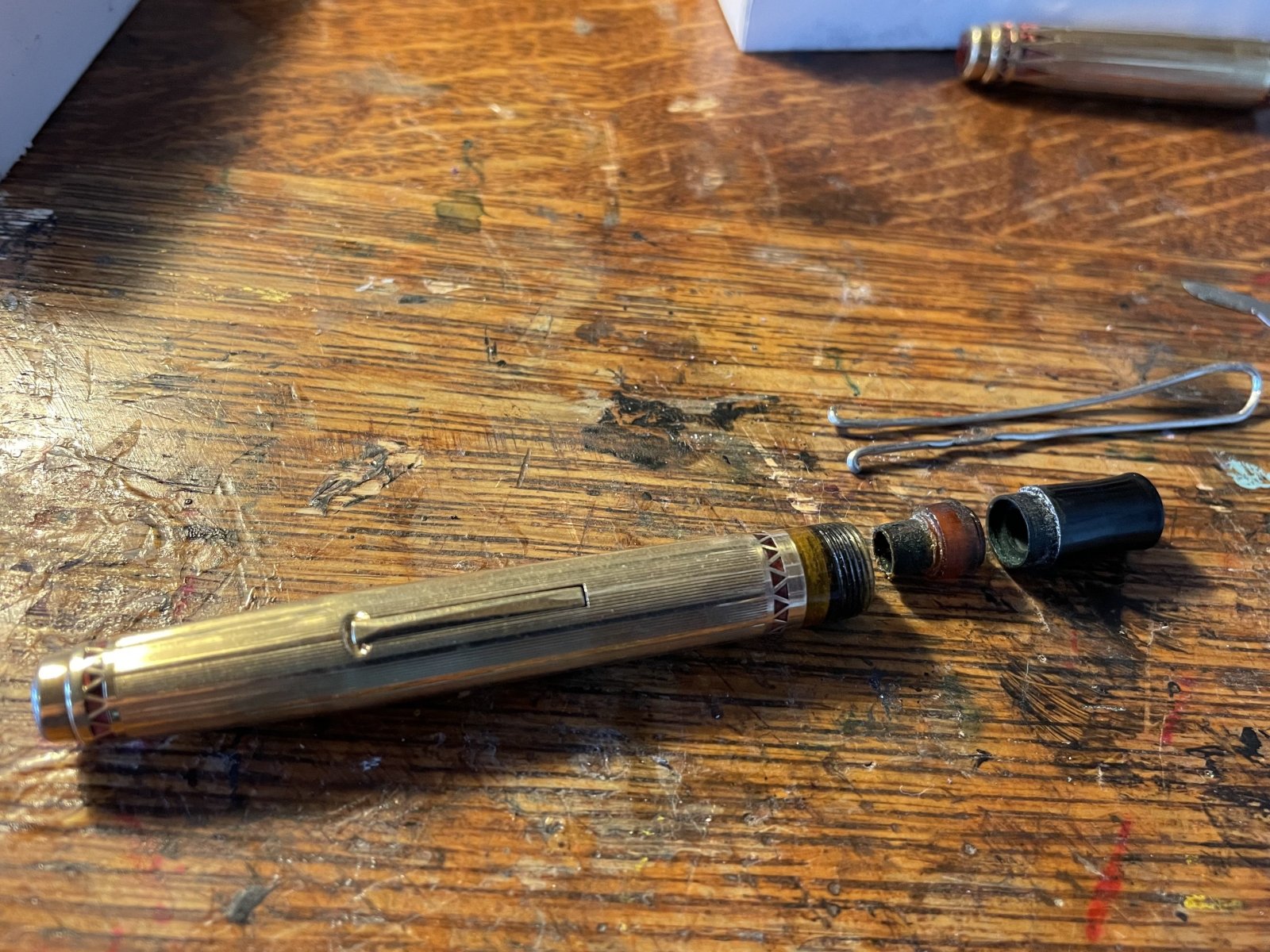
Broken things and problem pens
- By essayfaire,
- 0
- 0
- 7
-

Ink
- By Penguincollector,
- 0
- 2
- 29
-

Uploads
- By hari317,
- 0
- 0
- 38
-


-
-
Most Contributions
-
 amberleadavis
43947 -
.thumb.jpg.f07fa8de82f3c2bce9737ae64fbca314.jpg) PAKMAN
PAKMAN
33903 -
 Ghost Plane
28220 -
 inkstainedruth
27405 -
 Bo Bo Olson
26414
-
-
Upcoming Events
-
0October 12, 2024 10:00 PM
Until
October 13, 2024 12:00 AM
-
Blog Comments
-
.thumb.jpg.331e554113c33fb39d5bf3233878978a.jpg)
-

By Prof Drew · Posted
I also picked up a TUZU. I quite like the blue color and basic Sailor steel nib. It's a good basic EDC at the Japanese price. It is a quite wet writer. I imagine lefties will enjoy the nib angle customization. I haven't tried playing with that aspect. -

By irony · Posted
Thanks for posting, great information on the Tuzu by Sailor. Cannot wait for it to appear on Amazon USA. -
desaturated.thumb.gif.5cb70ef1e977aa313d11eea3616aba7d.gif)
By A Smug Dill · Posted
The way I see it now, the Sailor TUZU (with retail price of ¥4,500+tax) is positioned as a direct competitor to the Platinum Procyon (now with retail price of ¥6,000+tax, up from ¥5,000+tax when first released). Spring-loaded inner cap to better prevent ink evaporation — check. Being able to draw ink up even when the ink level in the bottle is low — check. Refreshed nib design, made better than the entry-level steel-nibbed models (for Sailor, the Lecoule, Profit Jr, and HighAce Neo; for Platinum -

By 2ouvenir · Posted
Interesting. From the sounds of it, the nib is at least acceptable.
-
-
-
Files
-


Recommended Posts
Create an account or sign in to comment
You need to be a member in order to leave a comment
Create an account
Sign up for a new account in our community. It's easy!
Register a new accountSign in
Already have an account? Sign in here.
Sign In Now